Monthly Archiv: November, 2019
Distortion effects are incredibly popular among web artists these days. Throughout the year, we saw their dominance. However, one particular effect separates itself from the others and stands on its own. And it is the glitch effect.
Once considered undesirable, this short-lived fault in a system has skillfully transformed into a modern feature that everyone wants to have in his or her project. From the ugly duckling to the beautiful swan, it has taken the long path. And now it can be called a real treasure in the web designer’s arsenal.
The great thing about the glitch effect is that, in our eyes, it has turned into a viable instrument. But in fact, it has remained true to its roots. It is the same distortion effect that interferes with the ideal picture. Nevertheless, we have grown to like it and have even found ways to benefit from it.
Let us consider some exceptional examples, where the glitch effect improves the user experience rather than ruins it, giving the website a unique appeal.
The Complete Toolbox for Web Designers
Unlimited Downloads: 1,000,000+ Web Templates, Themes, Plugins, Design Assets, and much more!
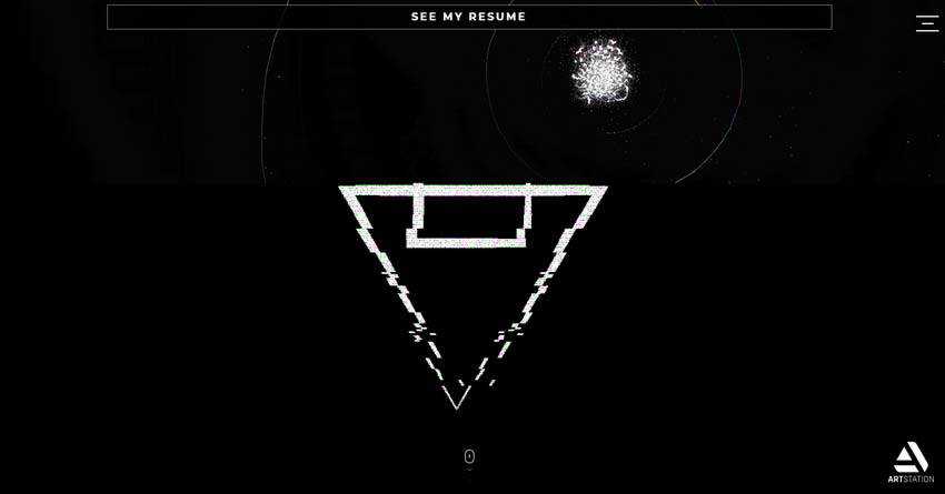
Chafik Design is an exceptional example that reveals the entire beauty of distortion effects. It shows us what can be done with smart usage of glitches.
This personal portfolio of Moucharaf Chafik impresses online visitors from the get-go. It feels high-tech and even a bit extraterrestrial, standing out from the crowd without a doubt. Here the glitch effect plays a vital role in creating a beautiful user experience.

It is the heart and soul of the project that can be seen literally everywhere. It even benefits the aesthetics of such remote corners of the website as the page that includes nothing more than just a download button.
Of course, it hints about its potential on the front page. Here, the solution enhances the logotype, 3D centerpiece, taglines and navigation. In all, every aspect of the hero area has its corrupting, yet striking touch.
The artist uses a combination of various types of glitches. There is a bit of a digital effect, a glassy effect that adds cracked and shattered elements and modern ones that add stripes and pixels in a chaotic way.
The website is a sheer source of inspiration.
If this glitch domination is not your cup of tea, then there are some other fantastic examples where its usage is more subtle. The websites listed below employ it just like an icing to top off the overall aesthetic.
Meet the Fly is a perfect case in point. Here, the glitch effect is just an accompanying tool. It is an analog kind of solution that distorts the ideal picture, feeling like an old TV.
While it can easily evoke nostalgia, here it joins forces with a sophisticated surrounding – meeting another range of emotions. Therefore, it is just a part of the performance whose task is to grab the attention and make the video player look exceptional.
Note, once again, the analog-style glitch effect perfectly cooperates with a high-end tech atmosphere.

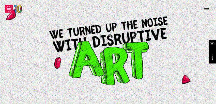
Here the glitch effect is featured only in the introductory section that precedes the main website. Much like in the previous example, this pixel distortion effect brings to mind analog TV sets that were famous for such errors. Along with a noisy background, it creates a proper anticipation that certainly ignites interest.

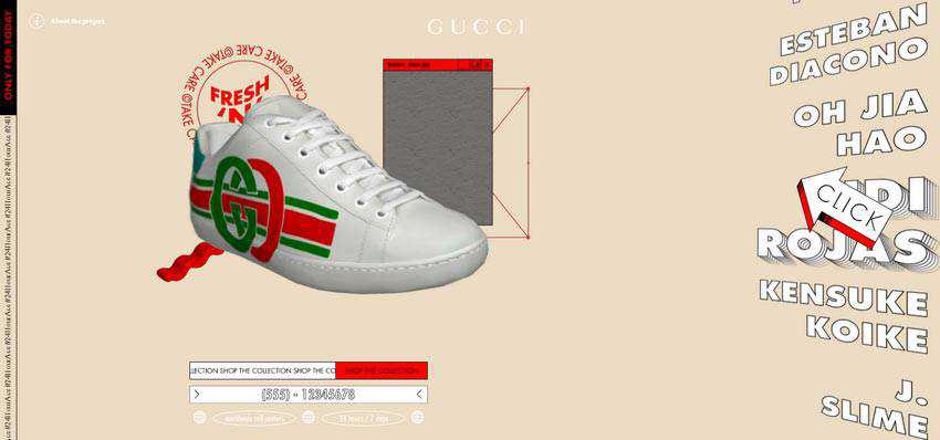
24 Hour Ace is a typical example of a website that gets the most out of the powerful side of brutality. The site feels rustic, a bit crude, yet undoubtedly epic. The team has skillfully played with 3D to recreate a bizarre environment where the products are the star of the show. Here, glitch effect goes well with the entourage, finishing off the composition.

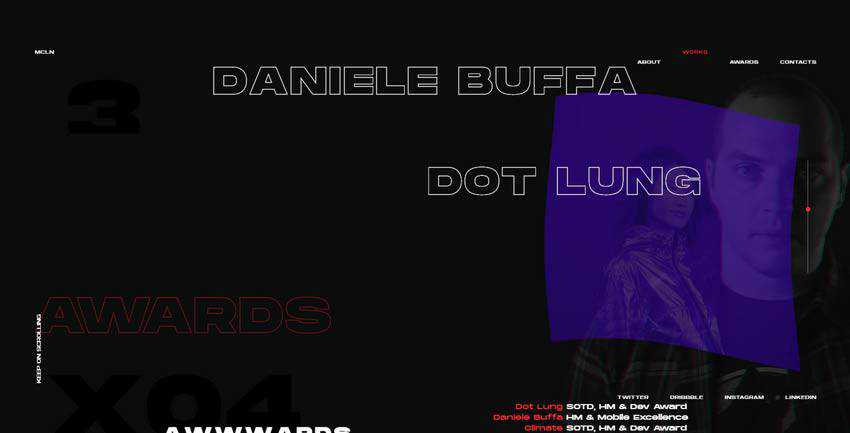
The personal portfolio of Francesco Michelini skillfully embraces chaos, making maximum use of layered aesthetics. There are many things to marvel at: elegant line-style typography, moving backgrounds, image-based hover effects, and of course, the glitch effect.
Unlike the majority presented in our collection, here the distortion is used as a transition that accompanies shifting between the slides. However, it affects not the entire screen, but only a small part of it. It occurs right where the portrait of the artist is placed, giving it an extra focus. Simple and clever.

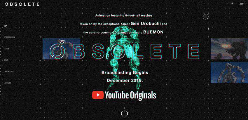
The team behind Project Obsolete has used a digital kind of glitch effect. It is here where you can see an edgy and mechanical feeling. Although it is scarcely applied, showing itself from time to time, it is enough to catch an eye and make itself heard.
Note the trend ideally blends into the high-tech atmosphere of the project, reinforcing the entire theme.

Noise and glitch are just destined to work together. When used in tandem, they produce quite a powerful impact. It feels like the picture is complete.
Whoamama Design shows this in practice. Here, we can see a solution that meets our expectations and certainly separates the website from the others.

Throughout the rest of our collection, the glitch effect interferes with the overall design. But here it is used in tandem with only one component: typography. This is another popular way to utilize the trend.
The team employs the distortion effect to finish off the play with letters. It adds to realistic appeal and makes switching between symbols look attractive and intriguing.

The Glitch as a Feature
The use of distortion effects, especially the glitchy ones, is an absolute trend these days. There are different flavors, such as noise, stretch and pixel variants. The great thing about this solution is that it fits like a glove in all of those techy and cosmic-inspired designs, as well as in ones that come from the ‘80s and ‘90s. It feels like it stands above both the trends and eras.
However, it is worthy to note that even though it seems to be a universal tool, one should remember that it is not neutral whatsoever. Therefore, it should be used with caution since it upsets the entire harmony. Overdoing it may lead to poor user experience and drastic outcomes. So, tread carefully.
The post Striking Examples of the Glitch Effect in Web Design appeared first on Speckyboy Design Magazine.
Package:
Summary:
Return Emoji characters using class constants
Groups:
Author:
Description:
This class can return Emoji characters using class constants...
Read more at https://www.phpclasses.org/package/11421-PHP-Return-Emoji-characters-using-class-constants.html#2019-11-05-00:10:32

Two more software have been added to the
Free Programmer's Editors page.
These text editors collectively feature things like bracket/brace matching (so that you don't have mismatched brackets
in your code), syntax highlighting, project management, search and replace, file comparison, hexadecimal viewing,
column editing, code folding, JSON/XML/SQL formatters, etc.
Package:
Summary:
Detect incorrectly spelled words and suggest fixes
Groups:
Author:
Description:
This class can detect incorrectly spelled words and suggest fixes...
Read more at https://www.phpclasses.org/package/11420-PHP-Detect-incorrectly-spelled-words-and-suggest-fixes.html

Market Research always aims at offering their clients an in-depth analysis and the best research material of the various market. This new report on the worldwide Global Garcinia Cambogia Extract Market 2019 Analysis, Size, Share, Growth, Trends, and Forecasts is committed fulfilling the requirements of the clients by giving them thorough insights into the market.
The worldwide Garcinia Cambogia Extract Market 2019 report is expansive research reliant on Garcinia Cambogia Extract, which inspects the raised structure of the present Garcinia Cambogia Extract all around the globe. Arranged by the adequate methodical framework, for instance, SWOT examination, the Garcinia Cambogia Extract report exhibits a total evaluation of the significant players of the worldwide Garcinia Cambogia Extract Market 2019 . The estimates for CAGR (Compound Annual Growth Rate) is calculated by the Global Garcinia Cambogia Extract Market 2019 report in terms of extent for the specific time length. This will similarly help the customer with comprehension and settle on a correct choice depends on a normal chart.
Request Free Sample Report of Global Garcinia Cambogia Extract Market 2019 Report @ http://www.marketresearchstore.com/report/global-garcinia-cambogia-extract-market-professional-survey-2019-454228#RequestSample
Some of the Major worldwide Garcinia Cambogia Extract Market 2019 Players Are : Xi’an Lyphar Biotech, Shaanxi Fuheng (FH) Biotechnology, Shaanxi Guanjie Technology, Wuhan Vanz Pharm, Hunan Kanerga Pharmaceutical Sales, TWO BLUE DIAMONDS, MARUTI FUTURISTIC PHARMA, KINAL GLOBAL CARE, NUTRA GRACE
A significant investigation of the market depends on overall patterns, which have been lately coordinated to the exploration of worldwide Garcinia Cambogia Extract Market 2019 , is additionally included in the report. The report presents a demand for individual segment in each region. It demonstrates various segments Market ProductType123 – and sub-segments Market Food Industry, Pharmaceuticals Industry, Other – of the Garcinia Cambogia Extract. besides, the statistical surveying report does estimations on the following force of the market dependent on this investigation.
The worldwide Garcinia Cambogia Extract Market 2019 is the cornerstone of the development angles and prospects, as the improvement of a specific arrangement needs numerous mechanically upheld hypothesis, thoughts, and systems. The Garcinia Cambogia Extract report contains in general successful system, confinements, and top to bottom illumination of the past information alongside the present and future needs that might concern the development.
Browse Full Global Garcinia Cambogia Extract Report: http://www.marketresearchstore.com/report/global-garcinia-cambogia-extract-market-professional-survey-2019-454228
Promising Regions Countries Mentioned In The Global Garcinia Cambogia Extract Market 2019 Report:
- North America ( United States)
- Europe ( Germany, France, UK)
- Asia-Pacific ( China, Japan, India)
- Latin America ( Brazil)
- The Middle East Africa
Worldwide Global Garcinia Cambogia Extract Market 2019 Report Provides Comprehensive Analysis of:
- Global Garcinia Cambogia Extract Market 2019 outline
- Up and Downstream industry examination
- Economy impact highlights finding
- Channels and hypothesis believable
- Global Garcinia Cambogia Extract Market 2019 challenge by Players
- Enhancement suggestions examination
Inquire more about this report @ http://www.marketresearchstore.com/report/global-garcinia-cambogia-extract-market-professional-survey-2019-454228#InquiryForBuying
The overall Global Garcinia Cambogia Extract Industry 2019 is made with the fundamental and direct conclusion to exploit the Global Garcinia Cambogia Extract and participate in business progression for imperative business openings. The correct figures and the graphical depiction of the Garcinia Cambogia Extract Industry 2019 are shown in a represented strategy. The report shows an examination of conceivable contention, current market designs and other basic characteristics all around the world.
Research Objective :
Our panel of trade contributors moreover as trade analysts across the worth chain have taken vast efforts in doing this group action and heavy-lifting add order to produce the key players with useful primary secondary data concerning the world Garcinia Cambogia Extract Industry 2019. additionally, the report additionally contains inputs from our trade consultants that may facilitate the key players in saving their time from the interior analysis half. firms WHO get and use this report are going to be completely profited with the inferences delivered in it. except this, the report additionally provides in-depth analysis on Global Garcinia Cambogia Extract Industry 2019 sale moreover because the factors that influence the shoppers moreover as enterprises towards this method.
Article source: http://industrynewshour.com/18294/global-garcinia-cambogia-extract-market-2019-xian-lyphar-biotech-shaanxi-fuheng-fh-biotechnology-shaanxi-guanjie-technology-wuhan-vanz-pharm/
While all of the talk these last few years has been around Photoshop and Sketch, Adode XD has quietly yet steadily built up a loyal following amongst web and mobile app designers. Released in December 2016 and officially exiting beta in October last year, Adobe XD has been continually updated with new features, to the point that it can now be regarded as a solid competitor to all of the other popular UI applications.
If you haven’t tried Adobe XD yet, you can use it for free here.
In this article we have collected 20 of the best free Adobe XD UI kits to help get you familiarized with the application (also some tutorials here) so that you can start creating your next great web design or mobile app now.
You might also like: 50 Free Web UI Kits, 50 Free Mobile UI Kits, 50 Free Wireframe Templates, or 20 Free Mobile UI Kits for Sketch App.
The UI Designer Toolbox
Unlimited Downloads: 1,000,000+ Wireframe & UX Templates, UI Kits, Web Templates & Design Assets

DOWNLOAD NOW
Created by UI designer Daumantas Banys, the card-styled Explord UI Kit contains everything you would need for designing a blog or portfolio website.

Designed by Vivek Popat, the Education UI kit for Adobe XD has been created so that you can quickly design the website of a school, college or university. Also available for Adobe Photoshop.

This free admin dashboard UI kit contains over 100 components, 15 data chart templates, and over 10 pages (including home, login, email, chat, calendar & invoicing).

Pawtastic is a free Adobe XD UI kit for designing an eCommerce or marketing website. As well as being bundled with 35 UI elements, it also comes with the bonus of 15 free wireframe templates.

Designed by Blackphant, the clean Cactaceae free web UI kit is choc-full of components that you can use to build any type of website.

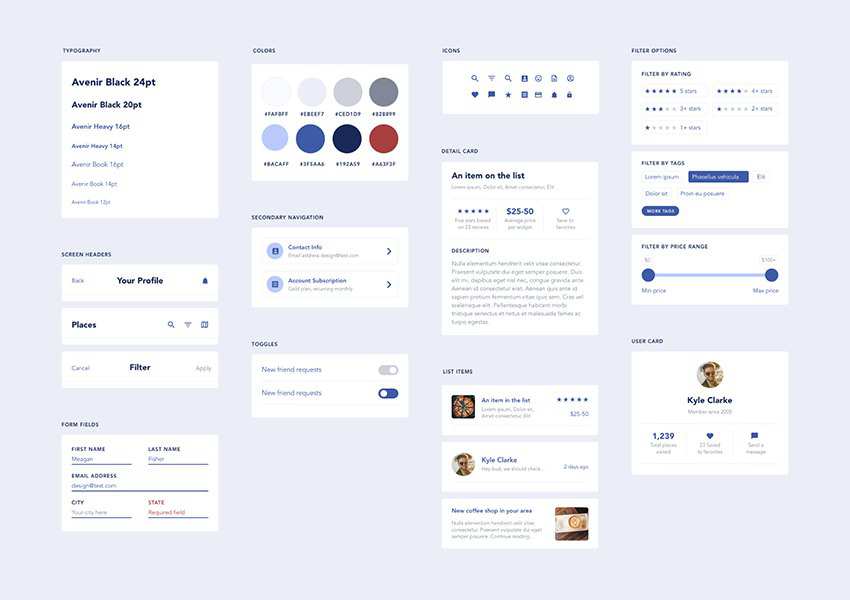
Tyler Wain has designed this free Adobe XD styleguide template to get you up-and-running quickly with your next web design project.

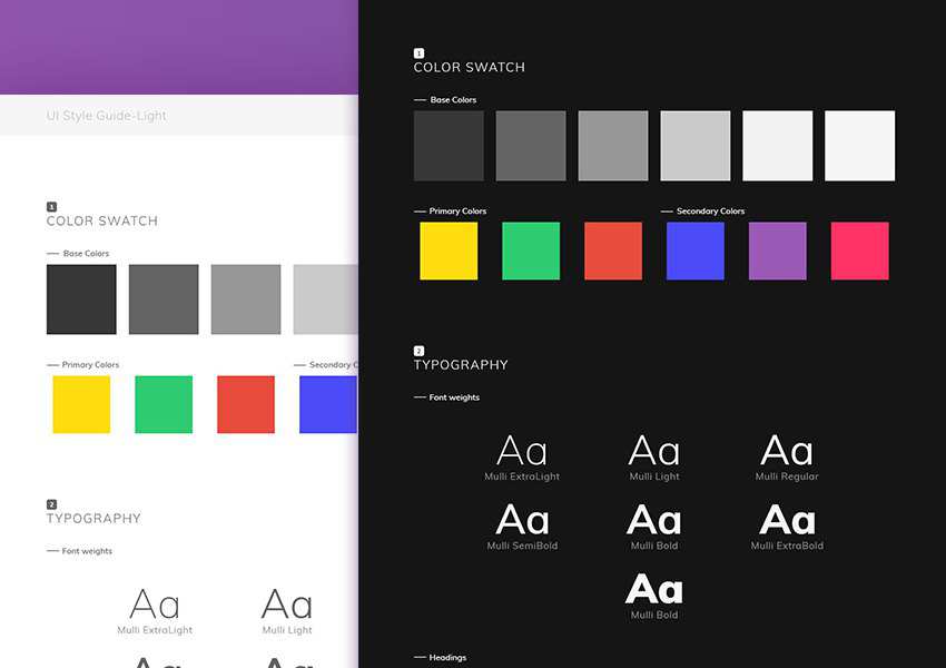
Another free Adobe XD UI kit from Vivek Popat. Available in both light and dark versions, this styleguide template includes many web elements and their states and has been built with Bootstrap in mind.

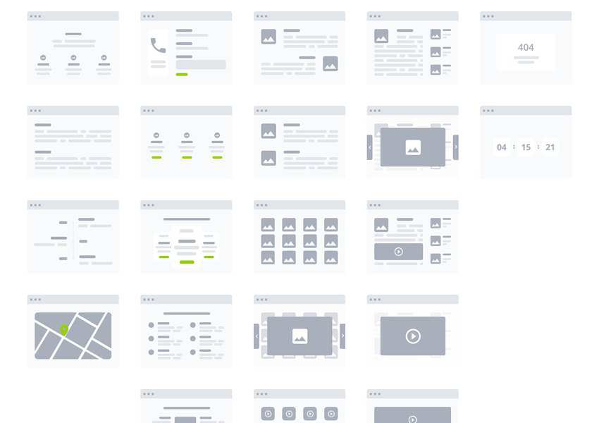
These free Adobe XD wireframe templates have been created so that you can quickly prototype a website or mobile app. In total there are 170 mobile templates, 90 web templates, 240 components and 178 icons.

Created by Ce Ali Omar, this free simplistic kit has been created so that you can quickly bring your mobile app idea to life.

To help chart out your website's flow, you can use this free Adobe XD kit with tiles for websites, eCommerce sites, and admin dashboards.

Vladimir Nikitin has created the simple 'Wareframes' Adobe XD kit so that you can rapidly prototype a website layout.

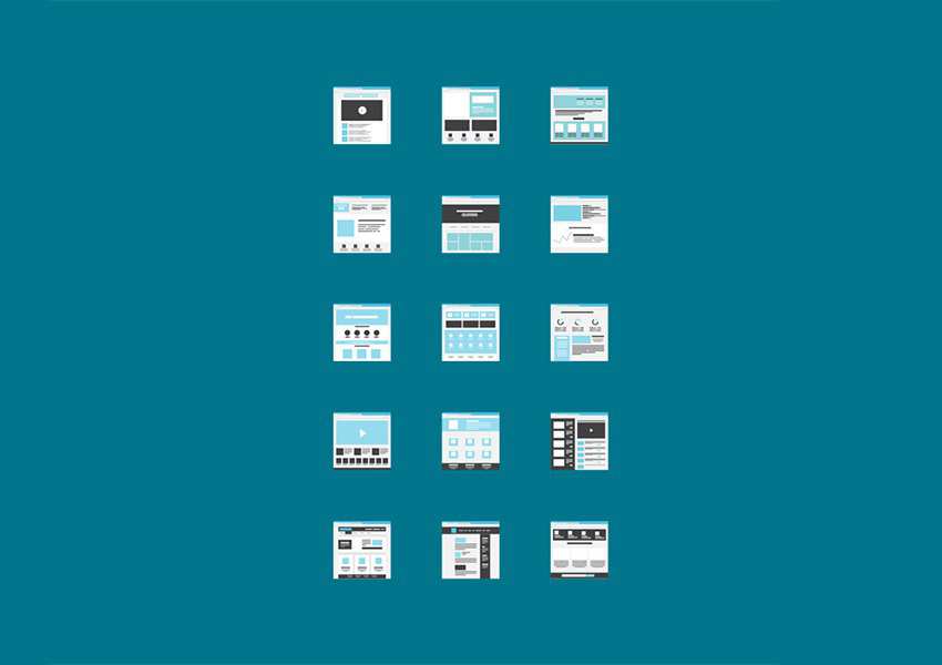
Created by UI Designer Hannah Milan has created these fantastic free miniature template tiles for both Adobe XD and Sketch.

Meagan Fisher has designed this Adobe XD starter UI kit to give you a jumpstart on your next mobile app project.

This free Material design mobile UI kit from Emma Drews can be downloaded in either Adobe XD, Sketch or Photoshop formats.

Fully customizable, 60+ screens (organized in 6 categories), and iOS-ready, the Navigo Transportation kit is the perfect free platform for designing your next iOS mobile app.

This free Adobe XD UI kit includes flows for designing cryptocurrency-themed websites or mobile apps. It includes all common form elements, graphs, charts, and so much more.

Created by Mark Vasyliev, MyWeather is a minimalistic UI kit for quickly designing mobile apps.

Mobile UI designer Ranish Chirayil has created this free iOS App Store GUI template. Only three screens, but fantastic work!


The post 20 Free Adobe XD UI Kits for Web & Mobile App Designers appeared first on Speckyboy Design Magazine.
Last month I was on PHPSW meetup in Bristol UK with Rector talk. To be honest, Nette to Symfony migration under 80 hours was not a big deal there.
To my surprise, upgrading PHPUnit tests was. So I was thinking, let's take it from the floor in one go, from PHPUnit 4 to the latest PHPUnit 8.
Note: This post is for new installations. If you have installed Apache, PHP, and MySQL for Mac OS Mojave, read my post on Updating Apache, PHP, and MySQL for macOS Catalina.
I am aware of the web server software available for macOS, notably MAMP, as well as package managers like brew. These get you...
Previously on "Deep Note via WebAudio":
- intro
- play a sound
- loop and change pitch
- multiple sounds
Nodes
WebAudio makes a heavy use of the concept of nodes. A node is something that does a thing (I know, very helpful), for example makes noise or manipulates sound somehow. Then you connect the various nodes in any way you see fit to produce the desired outcome. In Graph Theory parlance this is like the concept of vertices (nodes) and edges (links). In guitar player parlance this is like a bunch of pedals connected with cables.

Similar for modular synthesizers. In fact, WebAudio nodes seem mostly inspired by synthesizes, where you have oscillators (see part 2.1. of this series) that make sound and other stuff such as like amplifiers (similar to gain which is today's topic), equalizers and such.

Nodes in the examples so far
In the previous installment there was no mention about nodes, but they were still there. Let's look back at the very first example: playing a sound. The audio context destination is one node. The buffer source we created to play a sample was another node. When we connected them like so:
sample.connect(audioContext.destination);
Representing this graphically looks like:

Just like we had something capable of playing a file (maybe an MP3 player) and we plugged a cable from the headphone jack to something capable of producing sound, like headphones or a set of speakers.
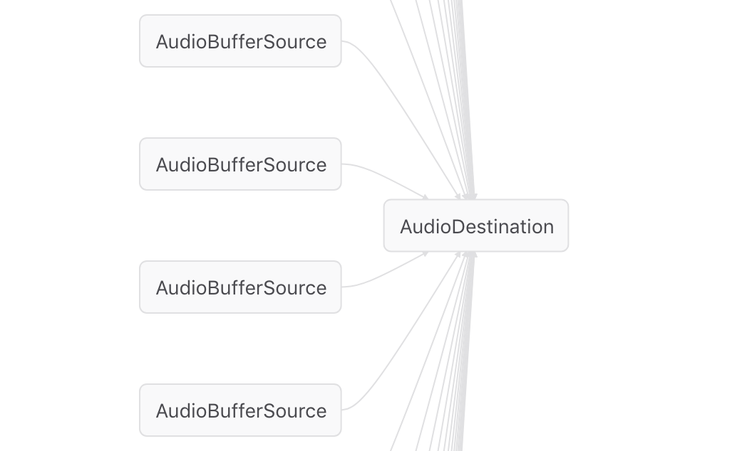
Similarly, the previous post was about playing 30 sounds together, so 30 buffer source nodes, all connected to the same destination node. Abbreviated, this visualizes like so:

Visualizing nodes
"Nice graphs!", you're probably thinking. I know, I know, I'm that amazing. In this case I just used the built-in WebAudio editor right in Firefox's dev tools. It's really helpful to be able to visualize these connections. Because it happens every once in a while that you do something in web audio (like create a node) and you forget to connect it and then you wonder why on Earth the result doesn't sound like you imagined.
Now for the bad news. This Web Audio editor has been deprecated. Chrome has a Web Audio tab in its devtools but it's not even close. There are two alternatives listed on the Firefox deprecation page, I personally didn't manage to get one of them to work (although it looks very promising), but the other one worked just fine.

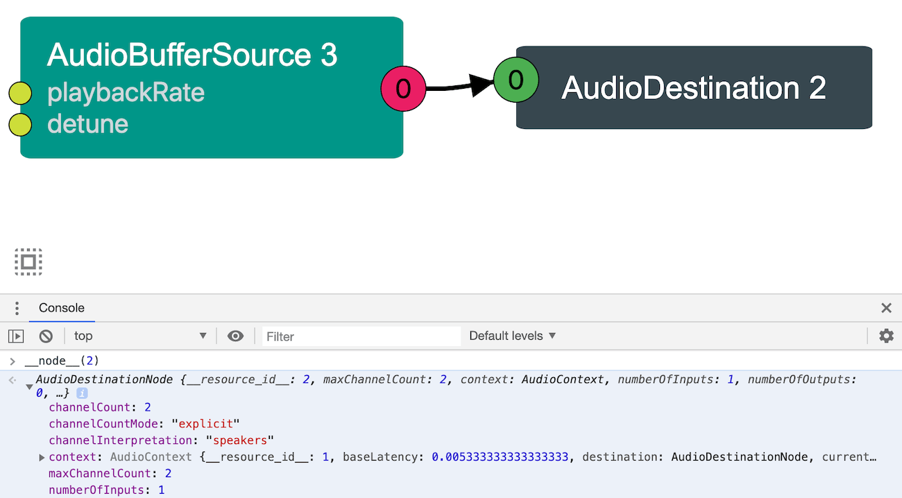
This WebAudio Inspector adds IDs to the nodes (not sure what the logic is as to the actual numbers) and you can even inspect nodes in the console with the __node__() function.
So that's it about nodes, next time - the Gain node!
Photo credits
Package:
Summary:
Calculate the size of files and directories
Groups:
Author:
Description:
This package can calculate the size of files and directories...
Read more at https://www.phpclasses.org/package/11406-PHP-Calculate-the-size-of-files-and-directories.html

