Weekly News for Designers № 511
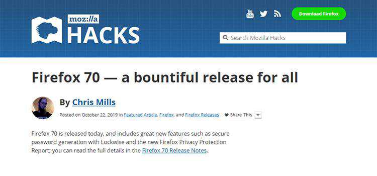
Firefox 70 — a bountiful release for all – A look at new features, including securely generated passwords.
How Ultra-Thin Lines in Web Design Can Create an Impact – Prime examples that show the power of this design trend.

Designing accessible color systems – Learn how payment processor Stripe chose colors that improve contrast and legibility.

Making Tables Responsive With Minimal CSS – Common sense approaches to making tables work on small screens.

Ghost 3.0 – Look under the hood of this latest version of the headless CMS.
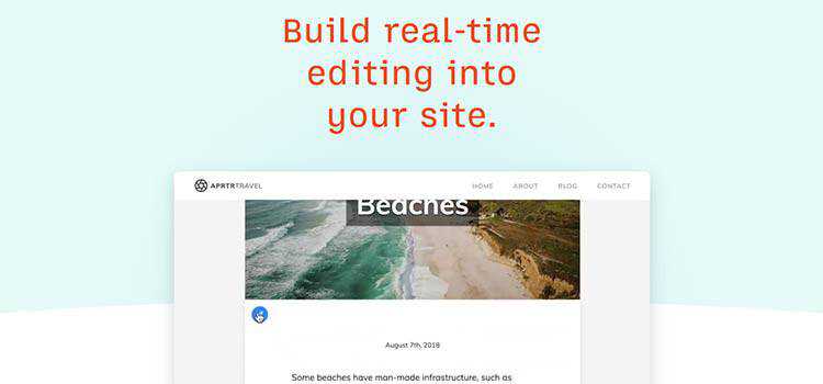
TinaCMS – An open-source site editing toolkit for React-based frameworks, like Gatsby and Next.js.
Accessible icon buttons with masks and SVG – Use this guide to create fully-accessible icons for your projects.
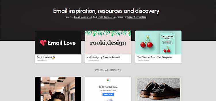
Email Love – Find email resources and inspiration here.
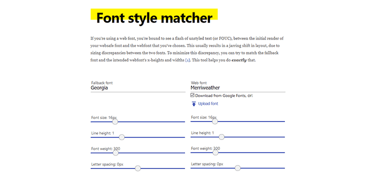
Font style matcher – A tool that helps minimize the discrepancy between a web font and its fallback.
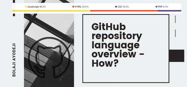
GitHub repository language overview – How? – If you’ve ever wondered how GitHub knows the languages a project is using, check this out.
Gridsome – A Vue.js framework for creating modern websites.

The Five Inconvenient Truths of Web Design – How success and sanity come from embracing the things we learn from experience.

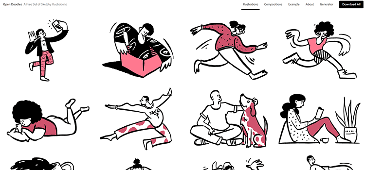
Open Doodles – Check out this free set of sketchy illustrations.
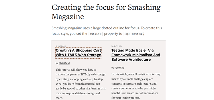
Creating a custom focus style – Add an intuitive and accessible touch to your design elements.
10 Coded Animated Scenes for Halloween Design Inspiration – There are plenty of fun tricks and treats to be had with this collection.

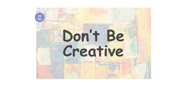
Good UX = Boring UI. Don’t Be Creative – Why creative solutions may just be getting in the way of UX.
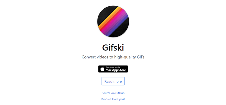
Gifski – A Mac app that turns your videos into high-quality animated GIFs.
Creating Wild and Crazy Backgrounds with CSS & JavaScript – Put on your sunglasses and check out these ultra-loud backgrounds.

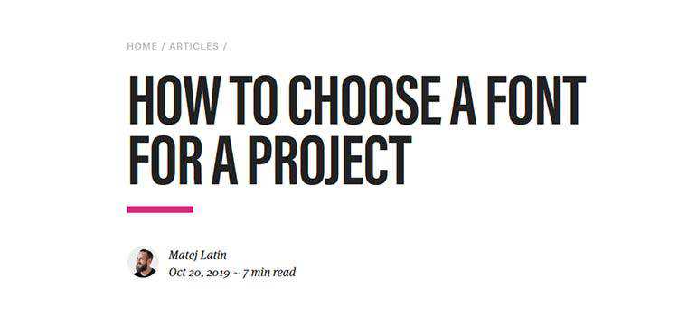
How to choose a font for a project – An example process for picking the right typography.
The post Weekly News for Designers № 511 appeared first on Speckyboy Design Magazine.
