7 Examples of Great “About Us” Pages
Your website serves several important purposes for your company — attracting customers, generating leads, and making sales, just to name a few. And as your home on the Internet, it also needs to explain who you are to the world and why they should choose you over your competitors.
However, creating an “About Us” page that accurately describes your company can be easier said than done. You can probably think of hundreds of things you want people to know, from your history to your successes to your values, but cramming all of that information on one page is overwhelming for you and your visitors.
So how can you create a compelling “About Us” page that will show customers who you are and what you do? There’s no one-size-fits-all solution, but here are seven examples of companies who got it right.
Denny’s
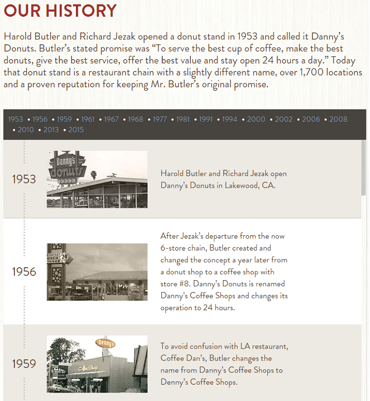
Many companies with long histories use them as the foundation of their identity, and Denny’s does a great job of displaying theirs in an interactive timeline:
They offer a brief summary of their history, then allow visitors to click through various company events over the past 62 years. The best part of the design, though, is the inclusion of photos with each piece of information. Although many companies prominently display the year the company was founded, words just can’t convey the same feeling as an authentic photo of a 1953 diner.
Trader Joe’s
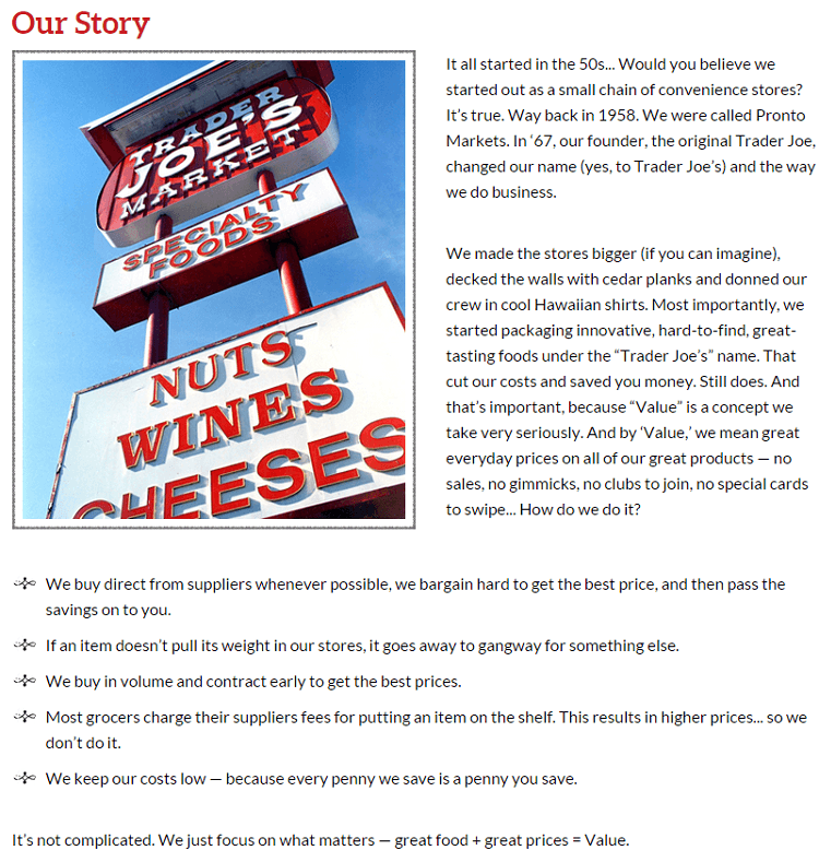
Much like Denny’s, Trader Joe’s was also founded in the ‘50s and includes their history on an “Our Story” page. But unlike Denny’s, they choose to explain their method of bringing value to shoppers:
Considering that the chain’s main draw is high quality food at low prices, it makes sense that customers might question how Trader Joe’s can afford to charge less than other brands. This short explanation answers that question, and it’s easy to see how it could be very effective at drawing new customers to their local store.
Airbnb
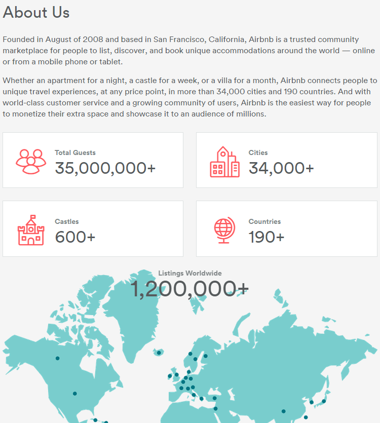
After the first two examples, you may think that older, more well-known businesses have an advantage when creating introduction pages. But as Airbnb demonstrates, a long history isn’t necessary:
Their stats are impressive by any standard, and the map of countries could spark potential customers to check out what’s available in the areas they want to visit. Plus, who wouldn’t want to patronize a company that has listings with over 600 castles?
Basecamp
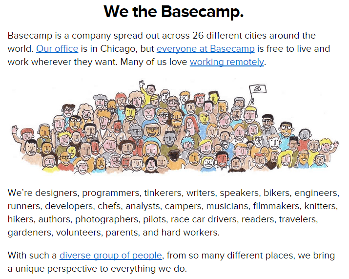
products are designed to make working together easier, so it makes sense that their about page is focused on their team:
Highlighting their diversity and various locations is a testimony to the effectiveness of the project management tools they make. If it’s possible for this successful company to work out of 26 different cities, they’re certainly doing something right.
Munchery
Another company that chooses to focus on their team is Munchery. But instead of describing them as group, they highlight individual employees with fun photos:
Many companies have employee photos on their sites (, but very few rival the originality of Munchery’s. By allowing each person to pose with something that represents their hobbies or interests, they bring a dose of personality to the site. And considering that their entire ordering system is online, that could certainly help customers feel more at ease while making a purchase.
Periscope
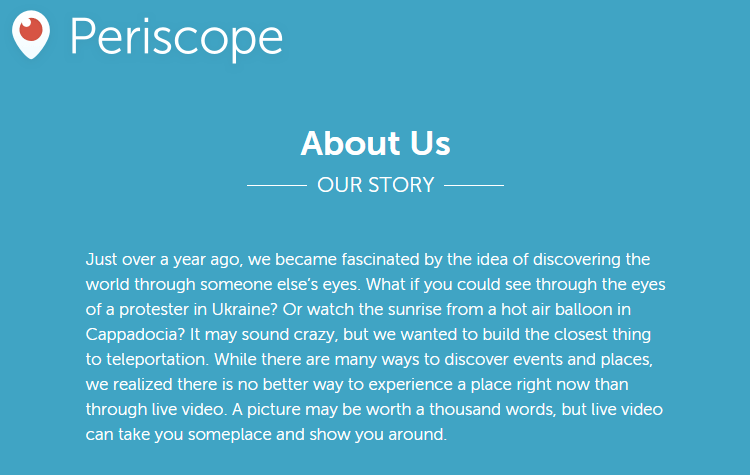
Video-streaming app Periscope has only been around for “just over a year,” so it’s important that their “About Us” page explains why their app is useful to people who may have never even heard of it:
Although the explanation is short, the examples it uses (watching a sunrise from a hot air balloon in Cappadocia!) are compelling, and so is the idea of experiencing new places in real time. And even though it’s kind of unusual to provide so little background, my guess is that this page is effective in generating downloads of the app.
WWF
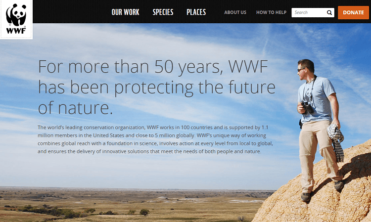
Another organization that takes a simple approach is WWF (World Wide Fund for Nature):
As an organization that works to protect the environment, it’s hard to imagine that anything could be more effective at demonstrating their mission than a photo of the land they conserve. And while they go into more detail lower on the page about their goals and strategies, the bold headline they chose is an accurate and succinct summary of what they do.
The takeaway
If you’re in the process of writing or revising an “About Us” page, the way to start is by figuring out what makes your business unique. Is it your story? Your mission? Your employees?
Visitors and customers aren’t going to be impressed by generic facts and figures, so it’s important that your page is not only accurate, but also sets you apart from the millions of other businesses online. And as the seven very different examples above demonstrate, there’s no “right” approach — so feel free to have a little fun with this part of your site!
If you have any questions about creating an “About Us” page, or know of any other great examples, let me know in the comments below!
The post 7 Examples of Great “About Us” Pages appeared first on WebFX Blog.
