3D in Hand: Beautiful Business Cards with Holographic Effects
When it comes to creating impressive business cards, we are accustomed to believing that only design can do the trick. As a rule, we bet on an illustrative approach or on some original typography or smart idea that will make our 3.5 x 2-inch piece of paper stand out from the crowd. However, as is always the case, there is a valid alternative.
This alternative lies in getting off the beaten track and playing with the material that is used as a base for your business card. We all know how the letterpress effect can turn a simple typeface into a masterpiece with an adorable 3D touch. So why not to follow the same path and conduct some experiments with the paper itself to achieve mesmerizing outcomes?
One such solution is to use holographic foils that can be genuinely transformative. Thanks to their nature, they have a bright display that ranges from light tones to dark, meeting the needs of various designs and styles. Let’s consider a selection of outstanding examples.
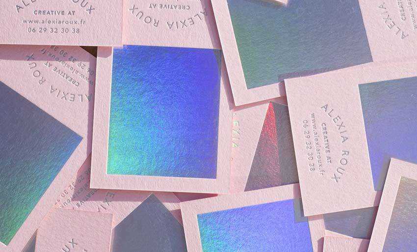
Pink and holographic
The name of the project says it all. The business card gets its beauty from two elements: a pink color and a holographic foil that occupies a significant part of the front side.
The latter is made in cold colors that perfectly balance with the pink background, keeping it from looking too girlish and schmaltzy. The foil is also applied for displaying the text. Paired with the letterpress effect, it gives the content a fantastic appearance. The business card conveys not just a feminine beauty, but also the creative soul of the artist.
Sweetland
Standing in stark contrast to the previous example, the brand identity of Sweetland proves to everyone that dark paper and holographic foil can form a potent tandem. While the black color gives the design a strong businesslike atmosphere, radiant holographic foil that features a gorgeous gradient from rose gold to royal violet makes it feel beautiful and sophisticated.

Daniel Barkle
The personal identity of Daniel Barkle shows us a perfect combination of silver foil and gradient overlay that creates a subtle holographic effect. It is used for the entire front side so that the business card quickly catches an eye.
The backside is pretty minimal and clean. All the contact information is allocated on the corners, making it feel airy and spacious. On the whole, the card looks businesslike with a chic touch.

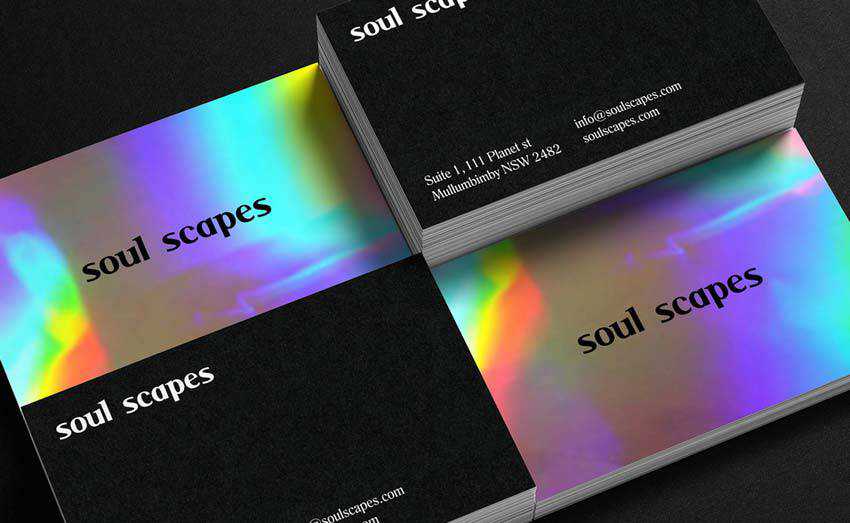
Soul Scapes
Much like the previous example, here the silver foil stands behind the aesthetics of the business card. Predictably, it produces more than just a basic metallic effect – it establishes the mood.
Both concepts look alike. However, this time, the artist uses a dark background and white color for text on the backside. This twist gives the design a particular classy appeal.
Quererlo
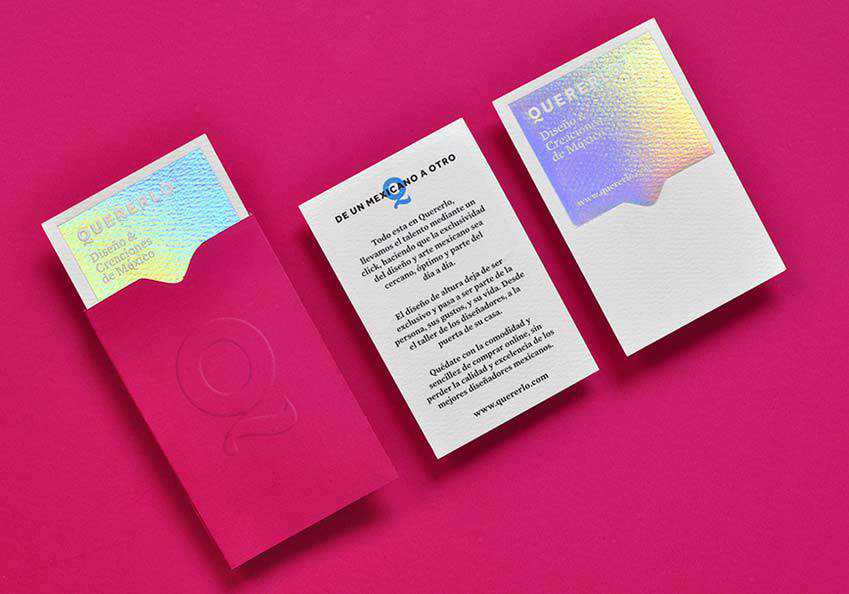
Quererlo’s brand identity has the same flavor as the personal presentation created by Alexia Roux featured at the very beginning of the collection. The holographic effect marks half of the front side.
This time, it serves as a canvas for the greeting. At some angles, you may find yourself lacking the proper readability, yet the whole idea is intriguing.
Dawn Creative
In the case of Dawn Creative, the holographic foil is used not just for decorative purposes. It’s also a means for displaying the content on both sides of the business card. Thus, the front side greets potential customers with two semi-circles that symbolize the initials of the agency.
The backside, in turn, accommodates all the contact information, which glows under various angles. Note the quality of the paper. It is just top-notch. As a result, the business card looks sophisticated and chic.

Joaquin Homs
The personal brand identity of Joaquin Homs has two variants. The first one features a radiant holographic foil that is used to display the name of the artist on the front. It serves as a base for the contact information on the back. Whereas, the second option has the same design, yet everything is made with the help of silver foil.
Both of them have their own merits. Nevertheless, the one with the holographic effect instantly commands attention with its “warm” appearance. Note, even though the black paper tries to hold back the vibrancy of the foil’s nature, you can still feel its powerful exude.

ILNP
While Joaquin Homs goes for two separate options, the team behind ILNP mixes these two materials – coming up with a pretty exciting outcome. Here, the silver foil makes the nameplate stand out from the grey background. The holographic effect saves the edges from looking primitive, giving them a nice touch of vibrant personality.
The solution is excellent for those who want to stick to a businesslike appeal, yet still provide a brand identity with an unobtrusive zest.

HBS Group
If you are not ready to get swept away in glittering effect, you can use it just for establishing natural focal points. Much like the creative team behind the HBS Group brand identity did.
They show how to sprinkle the business card with holographic magic and achieve an outstanding result. The solution transforms the logotype on both the front and back sides into an eye-catcher. It lightens the mood and enriches the dark environment with marvelous classic appeal.

Al’z Acs
If you need an idea on how to improve a minimal light design and make it pop off, then we have a suggestion for you. Use the holographic effect in the way the artist behind Al’z Acs did. They have come up with a fantastic idea.
The business card is based on a white background and a ton of white space. It is deprived of illustrations or graphics. However, it does not look insipid, thanks to the holographic panel that enriches the front side.
It has two options: cold and warm. Each one seems amazing. And each one produces its own gamut of emotions.

Borealica
Much like in the previous example, here the holographic foil is used as a panel on the front side. The creative team behind Borealica uses it as the main design feature. It instantly draws attention and produces a strong first impression.
Even though it occupies almost 90% of the front side, it does not overwhelm onlookers. On the contrary, it pleases an eye with its soothing beach-inspired gradient that starts with a serene blue and ends with golden yellow.

The Medium Makes the Message
Holographic foil is a compelling medium. It is not just a special paper with intricate coloring. It is able to create dimension and exude a gamut of light. It has a bright personality that sometimes can be difficult to handle.
Nevertheless, if you pair it with some clean surfaces, simple entourage and calm coloring, you will end up with true harmony and balance.
The post 3D in Hand: Beautiful Business Cards with Holographic Effects appeared first on Speckyboy Design Magazine.

