Monthly Archiv: May, 2019
Landing page? Check. Bid? Double-check. Ad? Better download Google Web Designer.
While Google’s ad creator can’t help your team wordsmith persuasive ad copy, it can help your business design responsive and attractive ads, which is critical in display advertising.
Ready to learn how to make the most of Google’s ad builder?
Keep reading to get started! Or, get a professionally designed ad (and a custom campaign strategy) for your pay-per-click (PPC) advertising campaigns by taking advantage of our PPC management services. Just call us at 888-601-5359 or contact us online for a free, custom quote!
1. Download Google’s ad creator
Before your team can start designing ads in Google Web Designer, you need to download it.
Google’s ad creator is compatible with several operating systems, including Mac, Windows, and Linux. If you’re using Windows, have Windows 7 or later installed on your computer. For Mac devices, you’ll need OS 10.10 or later.
Once you download and install the display ad builder, it’s time to create your first ad.
2. Choose your template or create your own
Open Google Web Designer.
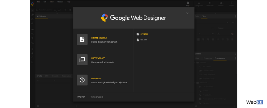
As soon as you open Google ad creator, you’ll see a pop-up menu that lets you create a new file, use a template, open a file, or ask for help. If you’re new to designing display ads, start with a pre-built ad template.
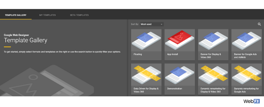
If you build your ad from a template, Google Web Designer offers more than 10 templates, including:
- App Install
- Banner
- Lightbox
- In-stream video
- Expandable
You can also filter templates by ad type, dimensions, devices, and even industries.
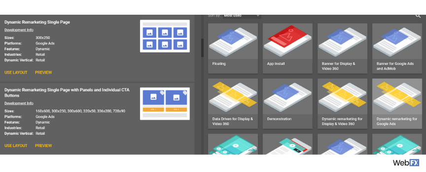
Even better, when you select a template, you can choose from different layouts. You can also preview each layout before deciding to use it. This feature of Google’s display ad builder saves time, plus makes choosing your design hassle-free.
Ok, but what if you’re creating a new file, without a template?
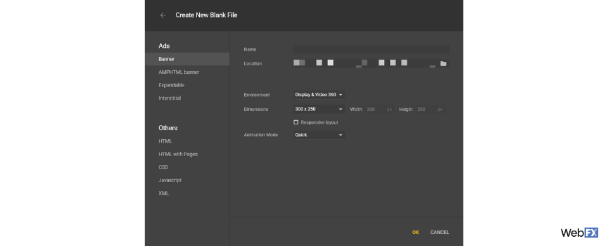
If you decide to work from a blank file, you’ll need to complete the following:
![A blank file in Google's ad builder]()
- Choose your type of ad, like banner, expandable, or interstitial
- Name your filename
- Select your save location
- Add your file dimensions
- Pick your environment
- Check your animation mode
Finish these steps and Google Web Designer will load your document.
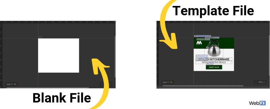
With your blank or template file loaded, you’re ready to move onto building your ad.
3. Customize your workspace
In most cases, however, you’ll want to update your workspace before starting.
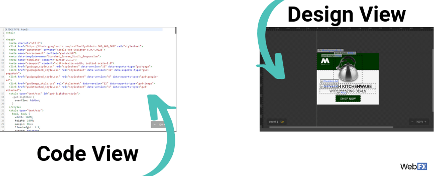
For example, you can switch between a design or code view when working on your ad. This feature makes Google’s ad creator a tool for both designers and developers, which is useful when you’re coordinating between team members.
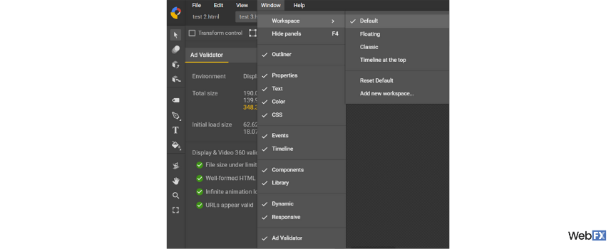
A few additional features you can change in Google Web Designer include:
- Location of menus
- Arrangement of menu items
- Visibility of menus
- Type of workspace
- Color of guides
If you use the “Window” dropdown menu, you can view your menus, plus update your workspace type.
![A screenshot of workspace options in Google's ad creator]()
For the best experience, take the time to customize your workspace. This step also helps you become more familiar with Google’s ad creator before you start working on your ad. Use this time to explore the different tools and options.
4. Create your color scheme
Now that you’re familiar with your workspace and have your document ready, your team can start designing your ad. While every designer differs in their process, it’s helpful for your team to decide on your color scheme at the beginning.
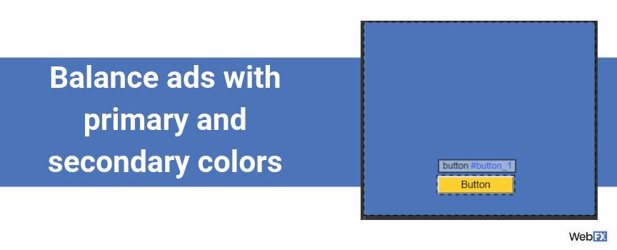
Expect to use your company’s colors in your ad. Depending on your business, you may have official primary and secondary colors to use. If that’s the case, you want to balance your ad between these two color sets.
For example, you may use a primary color for your ad’s background and then a secondary color for your ad’s button. Generally, your secondary colors feature brighter shades, likes yellow, which is why they’re excellent for call-to-action (CTA) buttons.
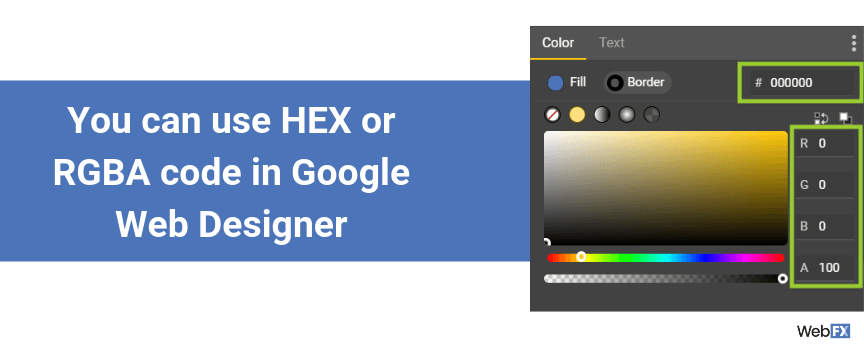
Once you have your colors picked, make sure to have their color codes on hand. In Google ad display builder, you can use the HEX code or RGBA code. You cannot use the CSS color name, like navy, unless you’re working within the code view.
5. Write your ad copy
In most cases, your team will write your ad copy before opening Google Web Designer. Sometimes, however, it’s helpful to see how your copy will look on an ad before committing to it. With a preview in Google’s ad creator, you can see what you need to change at the start of the design process.
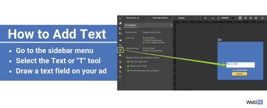
If you’re ready to add text to your design, follow these steps:
- Go to the sidebar menu
- Select the Text tool, represented by a “T”
- Draw a text field on your ad
Next, you want to add text.
After you update your text field, you can change the font, size, position, color, and format of your text. Highlight your text with your cursor, and then access the menu above your ad draft. You can also edit your text via the Properties menu.
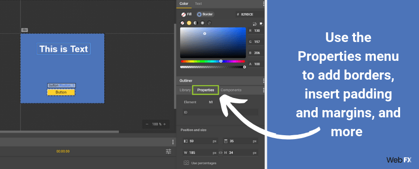
Via the Properties menu, you can also make additional updates to your text.
For example, you can change the translation, rotation, and scale of your copy. If you update the scale or size of your text field, make sure to enable the link icon, which will prevent your field from becoming stretched.
Some other ways you can modify your text field in the properties menu include:
- Add a border and change its color, size, and style
- Insert padding and margins
- Change the fill, opacity, and visibility
Once you’re satisfied, you can move onto adding any other creative elements, like images.
6. Add your images
Depending on your design, your team may use images in your ad.
If you do, Google ad creator makes it easy not only to add images but also galleries, which include:
- 360 galleries
- Carousel galleries
- Swipeable galleries
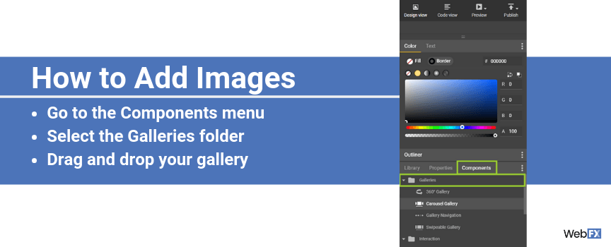
Add an image gallery to your ad with the following steps:
- Go to the Components menu
- Select the Galleries folder
- Drag and drop your gallery
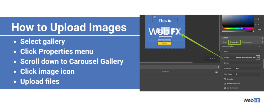
Next, upload your images:
- Select your gallery
- Click the Properties menu
- Scroll down to Carousel Gallery
- Click the image icon
- Upload your files from your computer or via URL
After you add your images, you may want to resize and align your gallery before previewing it.
7. Select your interactions
In Google’s display ad builder, you can also include interactions with your ads. Interactions can range from users tapping a button, scrolling through a set of images, tapping a checkbox, and more. While your team may not use all these interactions, some offer your ad a competitive advantage.
For example, if your business provides emergency plumbing services, you may want to use an interactive element to allow users to call your company. Or, if you manage an ecommerce store, you may include an interactive button for a product image.
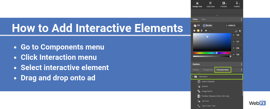
Either way, if you want to add interactive elements, all you have to do is follow these steps:
- Go to the Components menu
- Click the Interaction menu
- Select your interactive element
- Drag and drop it on your ad
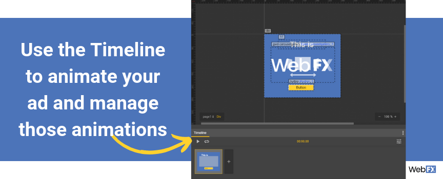
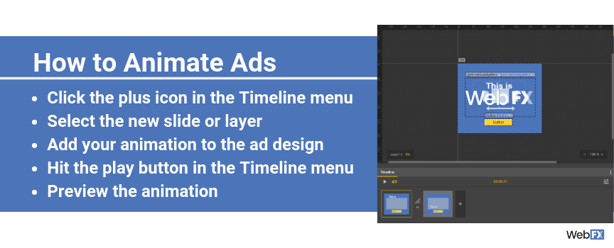
Depending on your interactive elements, as well as overall ad design, you may need to add layers to animate your ad. At the bottom of Google’s ad creator, you can animate your ad and manage those animations, with the timeline.
Animate your ad with these steps:
- Click the plus icon in the Timeline menu
- Select the new slide or layer
- Add your animation to the ad design
- Hit the play button in the Timeline menu to preview the animation
If you need to watch an animation several times, you can hit the repeat button next to the play button. It’ll loop your animation, allowing your team to check the animation and make notes for changes.
8. Preview your ad
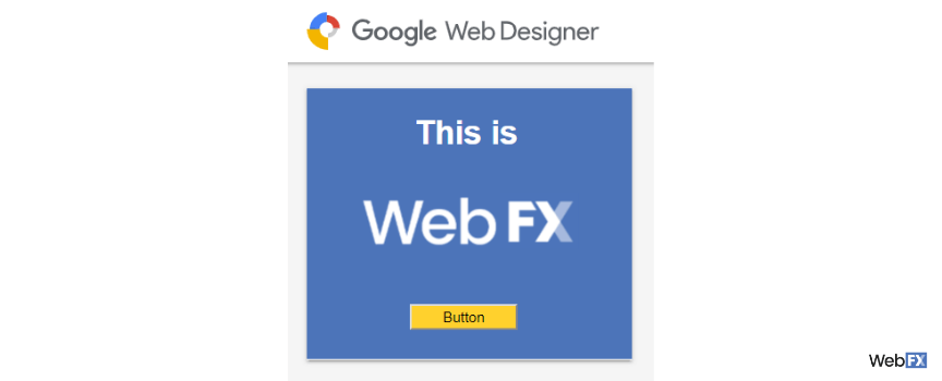
With your ad colors, copy, and creative assets added, your team can preview your ad. For the best experience with Google’s ad builder, it’s helpful to preview your ad throughout the design process. That way, you can catch and fix design issues early.
![A preview of an ad created with Google Web Designer]()
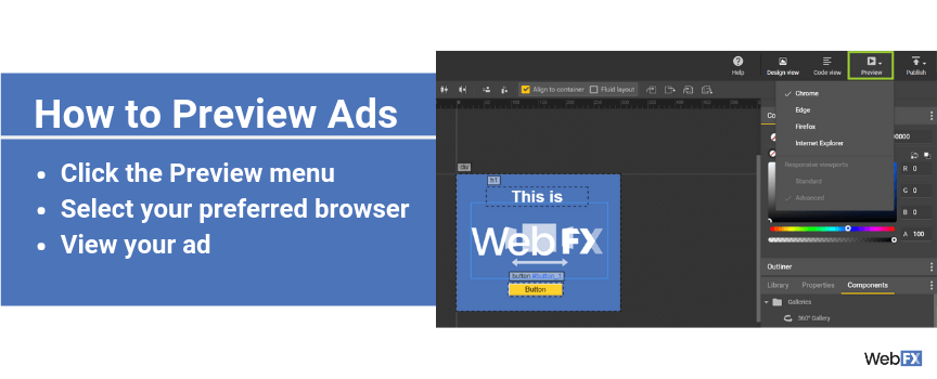
Previewing your ad with Google Web Designer is easy. Just follow these steps:
- Click the dropdown Preview menu
- Select your preferred browser
- View your ad
The best part is that your team can test the interactive features of an ad with the preview mode. For example, you can check that a button works, transitions trigger, and more. All these features make it easy for your business to launch an ad that delivers.
Bonus Reading: Leverage Google Ad Customizers
9. Publish your ad
Ready to launch your ad? It’s simple with Google ad creator.
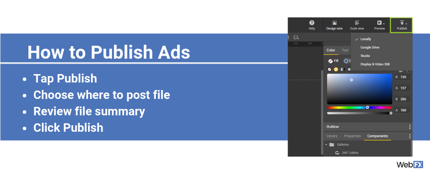
Just follow these steps:
- Tap Publish
- Choose where to post your file
- Review your file’s summary
- Click Publish
Once you publish your ad, you can upload it to Google Ads campaign.
Need help designing your Google ads?
When you’re planning a display advertising campaign on Google, your ad is essential. It needs to have not only persuasive ad copy but also an eye-catching design that makes users click on your ad and act on your call-to-action.
Google Web Designer provides your team with a robust program for designing responsive ads for your campaign. It doesn’t replace, however, the expertise of designers or developers. That’s why WebFX offers competitive PPC services, which include ad design from our award-winning team.
Contact us online today to get professional designs for your ad campaigns!
The post Google Ad Creator: How to Use Google’s Display Ad Builder appeared first on WebFX Blog.
Landing page? Check. Bid? Double-check. Ad? Better download Google Web Designer.
While Google’s ad creator can’t help your team wordsmith persuasive ad copy, it can help your business design responsive and attractive ads, which is critical in display advertising.
Ready to learn how to make the most of Google’s ad builder?
Keep reading to get started! Or, get a professionally designed ad (and a custom campaign strategy) for your pay-per-click (PPC) advertising campaigns by taking advantage of our PPC management services. Just call us at 888-601-5953 or contact us online for a free, custom quote!
1. Download Google’s ad creator
Before your team can start designing ads in Google Web Designer, you need to download it.

Google’s ad creator is compatible with several operating systems, including Mac, Windows, and Linux. If you’re using Windows, have Windows 7 or later installed on your computer. For Mac devices, you’ll need OS 10.10 or later.
Once you download and install the display ad builder, it’s time to create your first ad.
2. Choose your template or create your own
Open Google Web Designer.
As soon as you open Google’s ad creator, you’ll see a pop-up menu that lets you create a new file, use a template, open a file, or ask for help. If you’re new to designing display ads, start with a pre-built ad template.

If you build your ad from a template, Google Web Designer offers more than 10 templates, including:
- App Install
- Banner
- Lightbox
- In-stream video
- Expandable
You can also filter templates by ad type, dimensions, devices, and even industries.

Even better, when you select a template, you can choose from different layouts. You can also preview each layout before deciding to use it. This feature of Google’s display ad builder saves time, plus makes choosing your design hassle-free.

Ok, but what if you’re creating a new file, without a template?
If you decide to work from a blank file, you’ll need to complete the following:

- Choose your type of ad, like banner, expandable, or interstitial
- Name your filename
- Select your save location
- Add your file dimensions
- Pick your environment
- Check your animation mode
Finish these steps and Google Web Designer will load your document.

With your blank or template file loaded, you’re ready to move onto building your ad.
3. Customize your workspace
In most cases, however, you’ll want to update your workspace before starting.
For example, you can switch between a design or code view when working on your ad. This feature makes Google’s ad creator a tool for both designers and developers, which is useful when you’re coordinating between team members.

A few additional features you can change in Google Web Designer include:
- Location of menus
- Arrangement of menu items
- Visibility of menus
- Type of workspace
- Color of guides
If you use the “Window” dropdown menu, you can view your menus, plus update your workspace type.

For the best experience, take the time to customize your workspace. This step also helps you become more familiar with Google’s ad creator before you start working on your ad. Use this time to explore the different tools and options.
4. Create your color scheme
Now that you’re familiar with your workspace and have your document ready, your team can start designing your ad. While every designer differs in their process, it’s helpful for your team to decide on your color scheme at the beginning.
Expect to use your company’s colors in your ad. Depending on your business, you may have official primary and secondary colors to use. If that’s the case, you want to balance your ad between these two color sets.
For example, you may use a primary color for your ad’s background and then a secondary color for your ad’s button. Generally, your secondary colors feature brighter shades, likes yellow, which is why they’re excellent for call-to-action (CTA) buttons.

Once you have your colors picked, make sure to have their color codes on hand. In Google’s ad display ad creator, you can use the HEX code or RGBA code. You cannot use the CSS color name, like navy, unless you’re working within the code view.

5. Write your ad copy
In most cases, your team will write your ad copy before opening Google Web Designer. Sometimes, however, it’s helpful to see how your copy will look on an ad before committing to it. With a preview in Google’s ad creator, you can see what you need to change at the start of the design process.
If you’re ready to add text to your design, follow these steps:
- Go to the sidebar menu
- Select the Text tool, represented by a “T”
- Draw a text field on your ad
Next, you want to add text.

After you update your text field, you can change the font, size, position, color, and format of your text. Highlight your text with your cursor, and then access the menu above your ad draft. You can also edit your text via the Properties menu.

Via the Properties menu, you can also make additional updates to your text.
For example, you can change the translation, rotation, and scale of your copy. If you update the scale or size of your text field, make sure to enable the link icon, which will prevent your field from becoming stretched.
Some other ways you can modify your text field in the properties menu include:
- Add a border and change its color, size, and style
- Insert padding and margins
- Change the fill, opacity, and visibility
Once you’re satisfied, you can move onto adding any other creative elements, like images.
6. Add your images
Depending on your design, your team may use images in your ad.
If you do, Google’s ad creator makes it easy not only to add images but also galleries, which include:
- 360 galleries
- Carousel galleries
- Swipeable galleries
Add an image gallery to your ad with the following steps:
- Go to the Components menu
- Select the Galleries folder
- Drag and drop your gallery

Next, upload your images:
- Select your gallery
- Click the Properties menu
- Scroll down to Carousel Gallery
- Click the image icon
- Upload your files from your computer or via URL

After you add your images, you may want to resize and align your gallery before previewing it.
7. Select your interactions
In Google’s display ad builder, you can also include interactions with your ads. Interactions can range from users tapping a button, scrolling through a set of images, tapping a checkbox, and more. While your team may not use all these interactions, some offer your ad a competitive advantage.
For example, if your business provides emergency plumbing services, you may want to use an interactive element to allow users to call your company. Or, if you manage an ecommerce store, you may include an interactive button for a product image.
Either way, if you want to add interactive elements, all you have to do is follow these steps:
- Go to the Components menu
- Click the Interaction menu
- Select your interactive element
- Drag and drop it on your ad

Depending on your interactive elements, as well as overall ad design, you may need to add layers to animate your ad. At the bottom of Google’s ad creator, you can animate your ad and manage those animations, with the timeline.

Animate your ad with these steps:
- Click the plus icon in the Timeline menu
- Select the new slide or layer
- Add your animation to the ad design
- Hit the play button in the Timeline menu to preview the animation

If you need to watch an animation several times, you can hit the repeat button next to the play button. It’ll loop your animation, allowing your team to check the animation and make notes for changes.
8. Preview your ad
With your ad colors, copy, and creative assets added, your team can preview your ad. For the best experience with Google’s ad builder, it’s helpful to preview your ad throughout the design process. That way, you can catch and fix design issues early.

Previewing your ad with Google Web Designer is easy. Just follow these steps:
- Click the dropdown Preview menu
- Select your preferred browser
- View your ad

The best part is that your team can test the interactive features of an ad with the preview mode. For example, you can check that a button works, transitions trigger, and more. All these features make it easy for your business to launch an ad that delivers.
9. Publish your ad
Ready to launch your ad? It’s simple with Google’s ad creator.

Just follow these steps:
- Tap Publish
- Choose where to post your file
- Review your file’s summary
- Click Publish
Once you publish your ad, you can upload it to Google Ads campaign.
Need help designing your Google ads?
When you’re planning a display advertising campaign on Google, your ad is essential. It needs to have not only persuasive ad copy but also an eye-catching design that makes users click on your ad and act on your call-to-action.
Google Web Designer provides your team with a robust program for designing responsive ads for your campaign. It doesn’t replace, however, the expertise of designers or developers. That’s why WebFX offers award-winning PPC services, which include ad design from our award-winning team.
Contact us online today to get professional designs for your ad campaigns!
The post Google Ad Creator: How to Use Google’s Display Ad Builder appeared first on WebFX Blog.
This episode is sponsored by
The post Interview with Mario Peshev appeared first on Voices of the ElePHPant.

Regardless of our education, experience or skill level, every one of us will run into a situation where we could use some help. It might be a bit of code we can’t get quite right or even some confusion as to the best approach for a particular task.
This is where the web design community shines like no other. There are any number of channels where we can get help from others who are willing to share what they know. Everything from official knowledgebases, general support forums to social media affords us an opportunity to help and be helped.
But, to get the most out of the experience, there are some best practices and niceties to consider. So, before you ask for help, keep the following in mind:
First, Try to Help Yourself
If you don’t know the answer off the top of your head, it’s best to at least do a little research before reaching out to others. Odds are that someone out there has either written a blog post on the topic or has asked a similar question in a forum. You may just find the answer, or at least get part of the way there.
Even if you don’t find exactly what you’re looking for, hopefully you now have some useful background information. So, when you do ask a question, you can provide a little more context on what you’ve seen elsewhere.
This practice is also just good etiquette. Sometimes the answer is virtually right in front of you (especially if there is official documentation available). In those cases, it saves you (and those helping you) some unnecessary back-and-forth. Plus, folks like to see that you at least made an effort to solve an issue on your own.

Be Specific
So, maybe you couldn’t find the answer out there and really do need to ask a question. That’s okay – it’s why support exists in the first place. You’ll just want to be prepared to explain exactly what it is you’re looking for.
For instance, think of how many times have you viewed a support forum where a poster has proclaimed “It’s broken!” That statement alone may be accurate, but it’s also incredibly unhelpful in explaining the problem.
The more relevant detail you can provide, the better. So, we can take our previous example and change it to something like: “I’m having an issue when trying to save a post in WordPress. I write the post, then click the publish button. In the middle of the publishing process, I’m logged out of the back end.”
Of course, we could go on and expand things even further by mentioning any recent software upgrades, the type of server we’re using and so on. The idea is to better explain what you were doing, what you expected to happen (versus what actually took place) and any pertinent details.
And that last bit is also important. Before you include something in a description like the one above, think about whether or not it really is relevant to the issue at hand. Sometimes the answer will be “no”. If later on it becomes clear that you should have included a specific item, you can always add it in after the fact.
Follow up on Your Question, Even If It Has Been Resolved
Sometimes, it can seem like a good idea to post a question in multiple communities and hope for an answer. The more experts who view it, the better chance you have of getting some usable information. One downside of this strategy is that it can be difficult to keep track of each and every post (it’s wise to opt-in to a reply notification system, if the support community offers one).
Failing to keep up with these posts can cause several problems. First, you may actually miss out on someone who has a follow up question for you. In addition, abandoned posts can hurt your reputation. Leave too many of these and others may not be so willing to help you with future requests.
This is something that many of us (including yours truly) have been guilty of at one time or another. And no, it won’t (probably not) lead to the crumbling of society. But again, it’s a time waster for everyone involved.
If you do happen to find an answer, it would be a nice gesture to either delete your post or add information about what you learned. This is doubly sweet because it could help someone else down the line.

Have Realistic Expectations
It’s no fun to be in a situation where you either can’t figure out a problem or, worse yet, something’s truly broken. That being said, your expectations should be realistic.
For instance, if you’re using a free community such as Stack Overflow, realize that the people answering questions are volunteering their time. The same goes when seeking help for a free WordPress plugin. As such, be as understanding as possible if you don’t get a reply right away or if someone really can’t help you.
Paid support, on the other hand, is a different deal. Support for web hosting or commercial software should be fast and helpful. Still, that doesn’t necessarily mean that they’ll resolve every issue. Check out any support policies to find out what is and isn’t included.
And, perhaps most importantly, don’t expect anyone to write lengthy snippets of code for you. That’s an awful lot to ask, even for professional-level support. Quite often, you may be handed a piece of code that is a sort of generic and will need some further work on your part. That should at least provide you with a great starting point.

You Get What You Give
The overarching themes here are being a good person and communicating clearly. We all have different skills and strengths. So, don’t feel embarrassed if you don’t know a particular term or concept. It’s less about what you know, and more about how you approach the situation.
If you’re being polite and genuinely making an effort to communicate, others will take notice. As a result, you’re more likely to get helpful responses to your question. The key is in remembering that, on the other side of that screen, is a person just like you.
So, the next time you reach out for a helping hand, take a moment and think about the best way to word your question. From there, treat others the way you want to be treated. Hopefully, you get the answers you’re after and help to make the web a friendlier place.
The post Getting Answers to Your Web Development Questions appeared first on Speckyboy Design Magazine.
Xdebug Update: April 2019
London, UK
Tuesday, May 7th 2019, 09:17 BST
This is another of the monthly update reports in which I explain what happened with Xdebug development in this past month. It will be published on the first Tuesday after the 5th of each month. Patreon supporters will get it earlier, on the first of each month. You can become a patron here to support my work on Xdebug. More supporters, means that I can dedicate more of my time to improving Xdebug.
In April, I worked on the following things:
2.7.1 Release
The 2.7.1 release came just at the start of the month, and addressed three bugs:
-
Issue #1641: Performance degradation with getpid syscall, contributed by Kees Hoekzema.
-
Issue #1646: Missing newline in error message.
-
Issue #1647: Memory corruption when a conditional breakpoint is used.
The second bug in the list was more than just a missing newline. Xdebug's handling of connections that were aborted by the IDE was not as good as they could be. For this to be tested, I updated the test harness for remote debugger tests to be able to test for stdout and stderr as well.
I would recommend that everybody to update to this version as the last of these bugs can cause PHP with Xdebug to crash.
Bugfixes
Since the Xdebug 2.7.1 release I have worked on a few outstanding bugs that did not make the earlier 2.7 releases.
The remote step debugger allows you to change a variable's value through an IDE. Previously, this would use PHP's internal eval functionality to set the value, except in the cases where the IDE would also associate a new type with the value. I finally switched all code paths of setting new values to use eval. Due to changes introduced in PHP 7, this is now the only reliable way of doing this.
The second issue (#1656) fixes an issue with the step debugger's connect-back functionality. This functionality looks at HTTP headers to find out which IP address to connect to. In some cases, a proxy might inject a second IP address, and Xdebug could not handle this. I improved upon a prototype patch by Florian Dorn to make Xdebug now pick the first IP address in the header that it finds.
Through the implementation of issue (#1615), Xdebug now will turn off Zend OPcache's optimiser when the step debugger is active. The optimiser is really good making crappy code run fast, but it also optimises things away that normal users wouldn't expect, and that then confuses developers single-stepping through their code. Which brings me onto the last point of this update:
Resolving Breakpoints
In last month's update I introduced a new feature that Jetbrains is sponsoring. This issue, #1388: Support 'resolved' flag for breakpoints, is now implemented pending additional testing with a fresh (and experimental) build of PhpStorm. As part of the testing I'm interested in knowing how many breakpoints are usually in use in PhpStorm projects. I would be interested in knowing how many breakpoints, and which types of breakpoints (location, exception), your project has defined. Please leave a note in the comment section if you care to help me out with this.
Podcast
I have also been continuing with the PHP Internals News podcast. This is a weekly podcast where in 15-30 minutes I discuss new proposed features to the PHP language
Truncated by Planet PHP, read more at the original (another 633 bytes)
Pregnancy brings with it a wave of happiness and celebration for the entire family, but at the same time it also comes with a lot of stress, health issues and myths. Since ages there have been various myths, which are passed on from generation to generation.
Well, as we mentioned most of these myths around pregnancy just add on to the stress and fear surrounding the health of the mother and baby. Hence, we thought of sharing an insight into these myths and how far they are worth trusting.
Here are a few food myths around pregnancy you must read before following:
Dairy and nuts can be harmful for the baby
This is a common myth that the mother should avoid eating peanuts and dairy based products as it is believed to make the baby allergic.
Reality:
There’s is no harm in eating milk based products and peanuts during pregnancy. However, if the mother is allergic to such foods in that case one should avoid it. However, a few foods are not good for consumption during that time and they include raw meat or fish, raw or partly cooked eggs, and soft-serve ice cream.
Overeating for the baby
According to a common belief many people suggest eating for two during pregnancy and it is believed to provide the baby ample nutrition.

Reality:
Overeating is just not good for the body as it ends up affecting your liver. It is harmful for the mother as well as for the baby. Hence, one must avoid this practice and rather going for a wholesome healthy and balanced diet is the key to good health, and is enough to provide ample nutrition to the baby.
Avoid hot baths and use of artificial chemicals
This common myth is not exactly wrong. In fact, blistering hot water can lead to hormonal changes and can lead to discomfort and feel warmer than usual, especially during pregnancy.
Same is the case with artificial chemicals such as dyes and paints, which can be harmful for the mother as well as for the baby. One should also avoid all types of food coloring.
Copyright © 2019 Bennett, Coleman Co. Ltd. All rights reserved. For reprint rights: Times Syndication Service
Article source: https://timesofindia.indiatimes.com/city/kochi/these-natural-miracle-cures-do-more-harm-than-good/articleshow/69201009.cms
Package:
Summary:
Authorize and access servers using OAuth2
Groups:
Author:
Description:
This package can authorize and access servers using OAuth2...
Read more at https://www.phpclasses.org/package/11190-PHP-Authorize-and-access-servers-using-OAuth2.html

Another interpreter has been added to the
Free Prolog Compilers and Interpreters
page. This one is fully implemented in JavaScript, allowing you to write and run Prolog programs in your browser.
Package:
Summary:
Authorize and access servers using OAuth2
Groups:
Author:
Description:
This package can authorize and access servers using OAuth2...
Read more at https://www.phpclasses.org/package/11190-PHP-Authorize-and-access-servers-using-OAuth2.html#2019-05-06-23:20:16

