Exploring the Simple Beauty of Business Cards with Geometric Designs
When it comes to geometric designs, the first thing that comes to our mind is of course simplicity. It feels like it is one of the most primitive and easiest ways to create a design. All you need to do is to mix and match lines and shapes. However, things are not always what they seem. And artworks by Kazimir Malevich, a pioneer in abstract art, are clear proof of that.
Designs with geometric charm always stand out from the crowd. Although you can’t say that they are so real that you can feel emotions of their subjects, they make us think, encourage us to build our image of what’s happening and let us read between the lines.
Geometric art is a symbiosis of shapes of different size, weight and color. They feature such a fragile balance that you are afraid of ruining it with your breath. An intricacy and bizarreness accompany each and every piece of work. Yes, at some point they are simple – but they are also complex. And this unique combination is intriguing. It appeals to us, lures us in and ignites our interest.
Today, we’ll introduce you to a collection of stunning business cards that put geometry at the heart of their design. Let’s dive in:
Print Design Toolbox
Unlimited Downloads: 1,000,000+ Print Templates, Mockups, Brushes, Actions & Design Assets
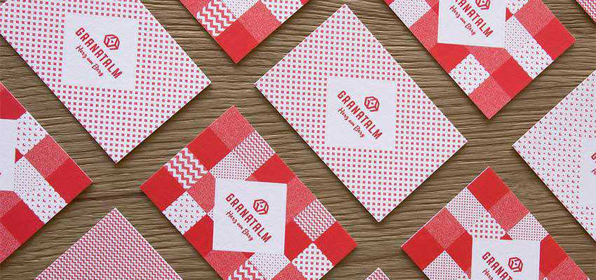
Granatalm — Heart on the mountain
Just take a look at Granatalm — Heart on the mountain. The project was created by a skilled Austria-based team for a hotel. It looks incredible. The sharp edges rule the roost here. The team uses squares, rhombus and zigzags to weave this plaid-like pattern. The design of business cards, as well as other elements of the brand identity, feel hospitable, inviting and modern.
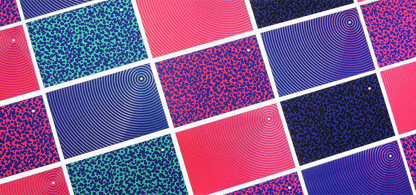
Shine Bright!
Another great example is Shine Bright!, a personal promotion created by Virgillo Silvia. You can easily distinguish two kinds of patterns. The first one is based on circles, whereas the second one is populated with spots. Bizarreness is a crucial characteristic of this artwork. Note the one with lots of rings: it feels like it is vibrating. It naturally grabs the attention and directs it towards the tiny solid circle in the upper right corner.
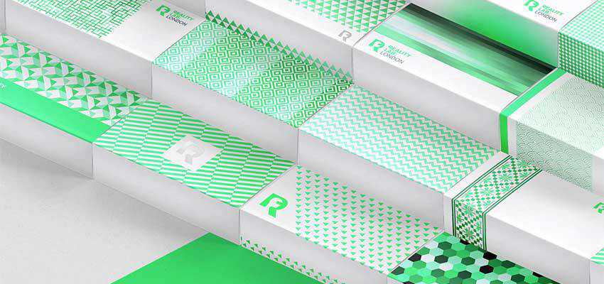
Reality Lab London
Much like the very first example in our collection, this project by Ramin Nasibov is marked by marvelous geometric patterns with a high density of details. The author has experimented with various shapes – starting with lines and ending with hexagons – thereby coming up with a fantastic range of concepts that are tied together with one idea.
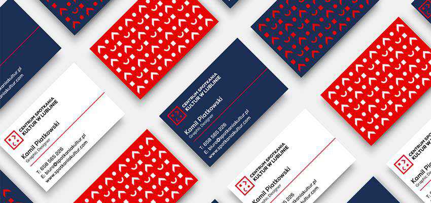
Cultural Centre in Lublin Branding
The concept instantly catches an eye with its unpretentious, yet intricate design. There is nothing fancy, yet still, it manages to draw our attention as well as unobtrusively establish an aura of creativity.
Taiheiyo Kensha Branding Project
As the author states, the brand is modern and at the same time family friendly. To my mind, it is even ultra-modern. The combination of colors creates a slight anaglyph effect that makes things visually-interesting. Simple geometric shapes such as triangles and polygons stand behind the aesthetics of the project. Without a doubt, it has a marvelous authenticity and charm.
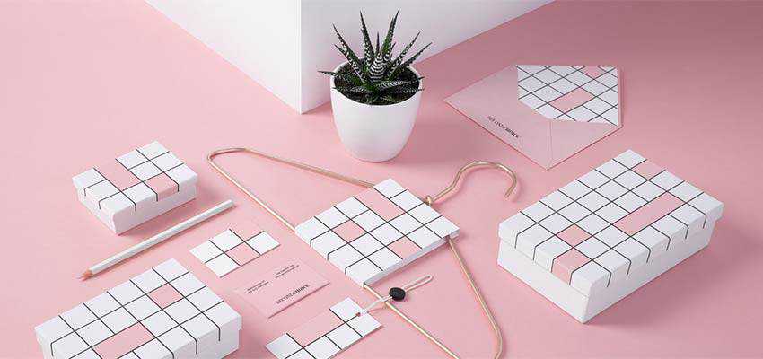
Second Choice
Noeeko Studio, the Poland-based team that has created Second Choice, shows everyone that all you need is a primitive shape and one color to make things look interesting. From the get-go it becomes obvious that this project has something to do with fashion. And based on the beautiful pinkish tone, it seems that we are talking about a shop with luxurious goods. The idea is brilliant, is not it? It is simple, yet ingenious.
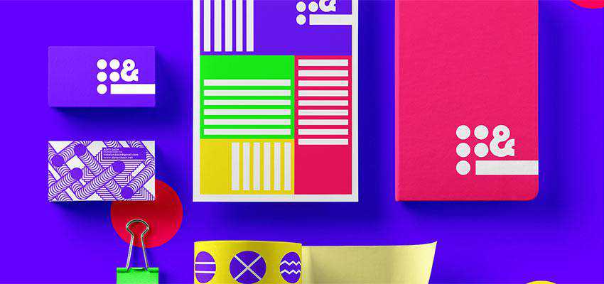
dots&dash
If you feel like a pastel or minimal color scheme is not your cup of tea, you can always try to use some bright ones, much like this concept created by dots&dash. Here you can see a real riot of tones. The coloring is vibrant, yet it does not ruin everything. On the contrary, it is responsible for the beauty of each composition. Bold geometric shapes and bright colors make this artwork so unique.
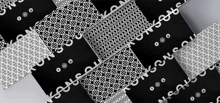
Konsou
If the previous concept is too much and you are one of those who prefer to stick to the time-proven choices, like a traditional black and white scheme, you should take a look at Konsou. Created by Kostas Lagos, the concept is just incredible. A music platform lies in the heart of this project, so it is not surprising that the design feels energetic and dynamic – even despite such a monochromatic environment. Shapes give it energy.
Unconventional Business Cards
The unconventional business card is an experiment conducted by Huan Nguye. He took the charm of the geometric world to the next level, making the business card interactive. Bearing in mind the rule of thumb that the good design should be invisible and only revealed when needed, he has managed to create a real masterpiece. Explore his presentation over at Behance to get the idea.

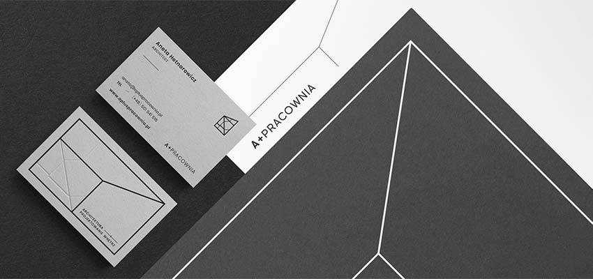
A+PRACOWNIA | Architect
A+PRACOWNIA | Architect will delight you with its marvelous minimalistic approach. It is clean, neat and straightforward. There is lots of fresh air, the colors are neutral, and the shapes are primitive. However, with all that the business card, as well as the other brand identity pieces, look interesting. They go perfectly well with the architect theme.
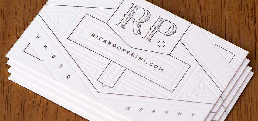
Costa-Perini Letterpress
While we are accustomed to considering geometric designs as a mixture of banal shapes, sometimes they can turn into a real beauty. For instance, let’s examine the case of Costa-Perini Letterpress. In essence, it is a well-thought-out combination of simple geometric shapes – starting with straight lines and ending with curved brackets. However, it has a certain art deco quality that, thanks to skillful play with embossed details, looks splendid. It is an apotheosis of geometric designs.
Defying Expectations
It may seem at first sight that designs where geometry runs the show are destined to be dull, primitive and insipid. However, by no means do they concede to other stylistic solutions. They can be:
- extravagant like Shine Bright!;
- bright and bold like dots‐
- authentic like Granatalm;
- ultra-modern like Taiheiyo Kensha Branding;
- traditional like A+PRACOWNIA | Architect;
- experimental like Unconventional Business Card;
- and even highly-sophisticated like Costa-Perini Letterpress;
This direction is multifaceted and provides you with lots of opportunities to show the world your creativity.
The post Exploring the Simple Beauty of Business Cards with Geometric Designs appeared first on Speckyboy Web Design Magazine.