Clicking Around: The Use of Circular Mouse Cursors
Just recently, we discussed a tiny trend in mouse cursors, exploring a dozen examples of lonely but eye-catching effects. Today it has come under the spotlight again, this time with another interesting idea.
It seems that web designers have a particular inclination towards playing around with our one and only device for moving across the screen. Undoubtedly, cursors are gaining in popularity these days. Reasons for this can vary: starting from the simple desire of getting away from everything ordinary, and ending with the burning ambition to make the web a better place.
We have stepped into an era of interactive interfaces. The mouse cursor is an integral part of all those grandiose solutions. It is only logical that it undergoes some changes in order to meet the current demands and help to create a seamless experience.
It seems that the time has come to conduct some experiments with its shape by tossing aside the boring arrow and opting for something more elegant and refined, like for example, a circle. The round shape ideally blends into modern interfaces with interactive canvases and animations. It feels natural and gracious. And, it is always looming around – unobtrusively drawing attention.
The Web Designer Toolbox
Unlimited Downloads: 500,000+ Web Templates, Themes, Plugins & Design Assets
Last Art Projects / Maraka
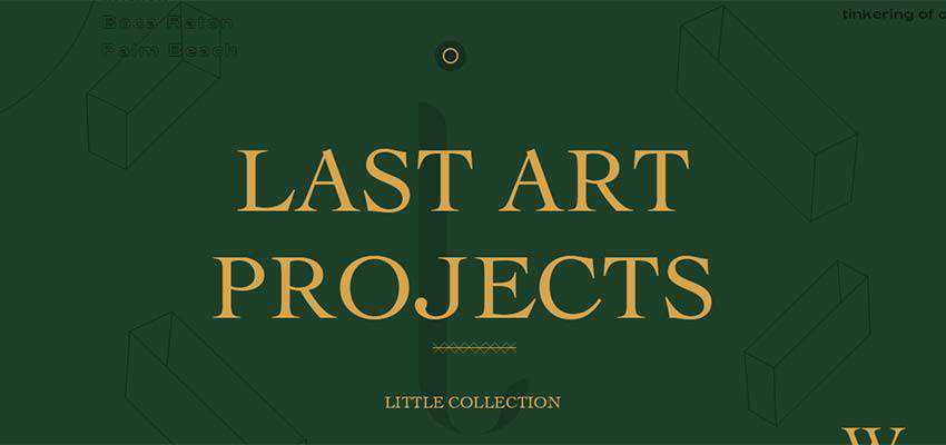
Let’s consider Last Art Projects and Maraka, whose teams use this tiny trend to their advantage.
Last Art Projects has a beautiful two-tone theme populated with line style illustrations and hollow decor. Here, the cursor perfectly matches the concept. It consists of two circles. The ring at the front is a cursor, whereas a solid dark circle in the back is a tail. Together they look like a target that naturally focuses attention on the screen.
Maraka has changed the cursor shape, but not just for decorative purposes. Here it is used as a visual cue for online visitors. Thus, it shows a left or right arrow when it senses that you want to cycle through the slides. And it turns into a regular solid circle (with a relatively big, semi-transparent secondary circle) when you hit the targeted area such as links, captions or navigation.
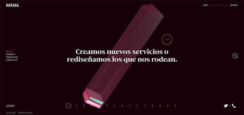
Both examples show us how a simple circular shape can do wonders. It is so natural and elegant in its behavior that it feels like an ideal partner for all of those modern extravagances. Let’s also consider some other fantastic examples.
Kwok Yin Mak
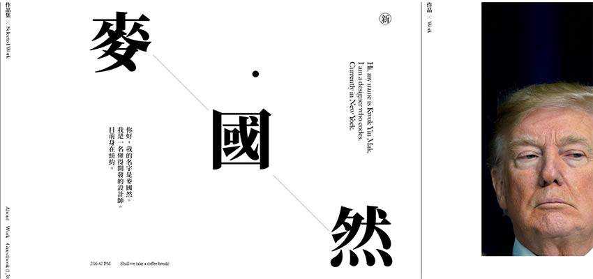
Kwok Yin Mak has a spacious design with a traditional black and white coloring and vertical rhythm. Japanese characters steal the show here. The atmosphere is refined and authentic. You have to admit, a default arrow shape would look primitive here, but a circular shape is another matter. It plays nicely with all the details and feels at home.
Prime Park Sessions
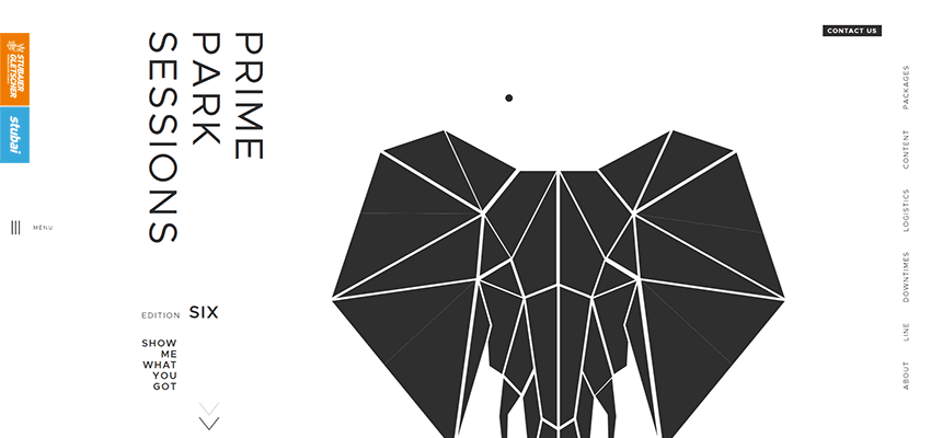
The design of Prime Park Sessions is marked by a beautiful geometric aesthetic. The intricate polygonal elephant, vertical navigation located on the sides, and a ton of white space. Here, the tiny black dot of a cursor fits like a glove, skillfully meeting the theme.
Cartesiam
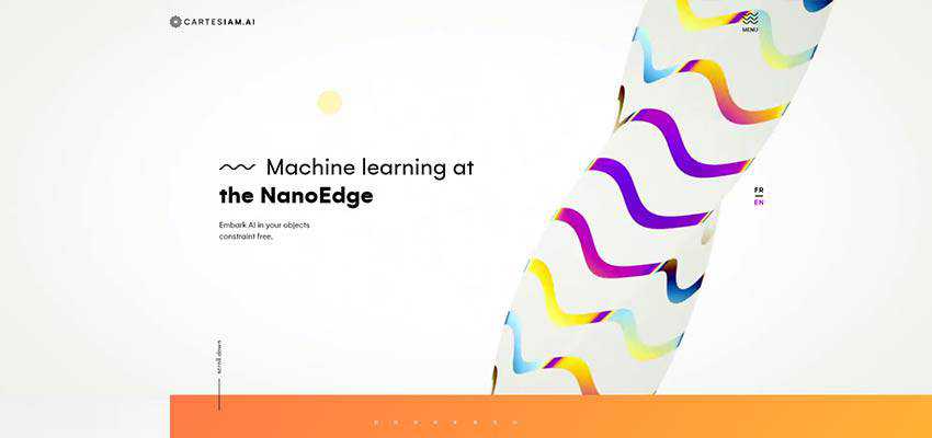
The majestic wave shape sets the tone for Cartesiam. The hero area features a beautiful abstract animation that is bright and flowing. Here the mouse cursor is a relatively big circle with a mid-level of transparency. Thanks to its divine curves and smooth behavior, it naturally catches an eye and at the same time perfectly fits the nifty entourage.
Eum Ray
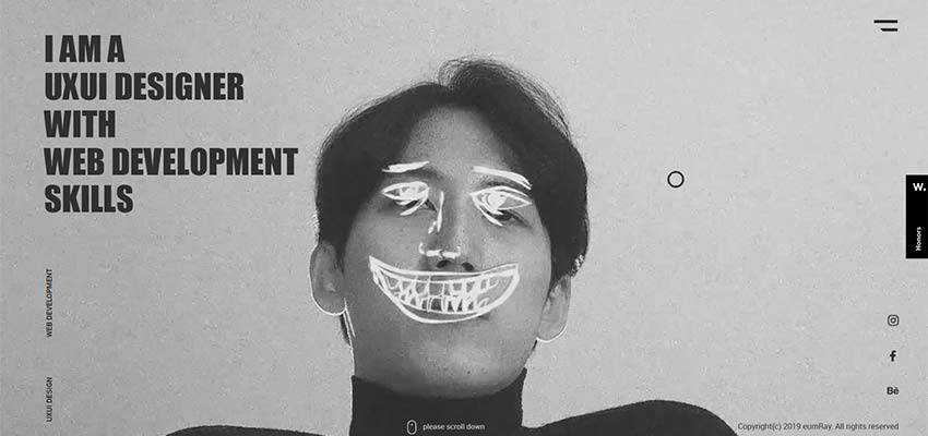
The portfolio of Eum Ray has a certain level of personality. The artist is eager to show his inner genius. So, it is not surprising that everything here is well-thought-out. Even the mouse cursor stands out from the crowd with its hollow style and circular shape.
Playground
This trend is also used to identify priorities, adding visual weight to the crucial details. Take a look at Playground.
The team behind Playground employs two circles. The small circle is used as a cursor whereas the large one serves as a “follower”. Together they make movements across the screen more prominent. And that’s not all: the pointer has two types of behavior. When the cursor hits a slider, hamburger button or link – it grows, hinting at the importance of these elements. When it leaves those areas, it shrinks back to the regular size, letting visitors explore the interface without much hassle.

Tappezzeria Novecento
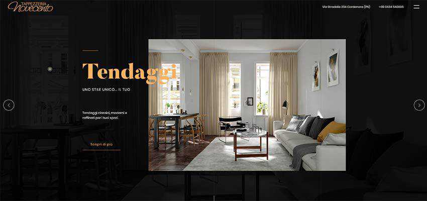
Tappezzeria Novecento has a content-heavy hero area with a big image and lots of content. It is only natural that the team behind the design has decided to make the cursor more prominent. Much like in the case of Playground, it has two circles: one is a cursor itself, and the other one is its tail. It also has a similar coloring, which makes it a perfect finishing touch.
Mallard and Claret
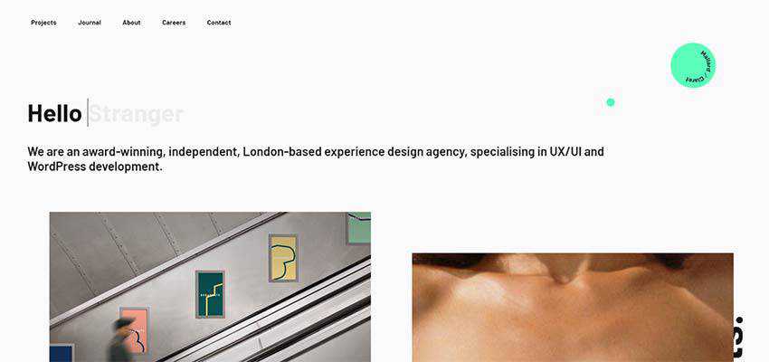
Mallard and Claret proves that a circular mouse cursor can find its place, even in the most common types of websites. Actually, you will find two round shapes. The first one is a link to the footer section, that also happens to be some kind of logotype. And the other one is a mouse cursor. It is small and brisk. It makes the user experience on this blog a bit more entertaining than usual.
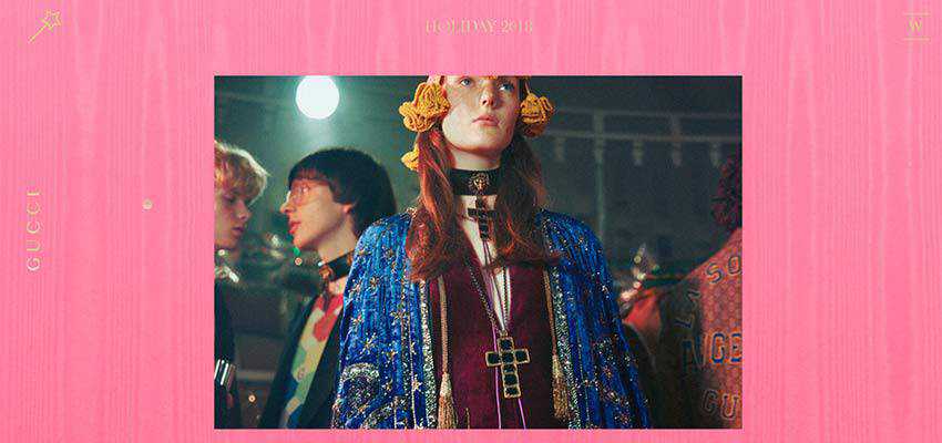
Gift by Gucci
The big name here, but unfortunately not a good example to follow. Gift by Gucci also has a circular mouse cursor. It certainly adds its charm here, and interaction with the dynamic canvas feels more natural. However, poor contrast between the background and foreground ruins the user experience. The golden circle is barely perceptible against a pink background. That is a pity.
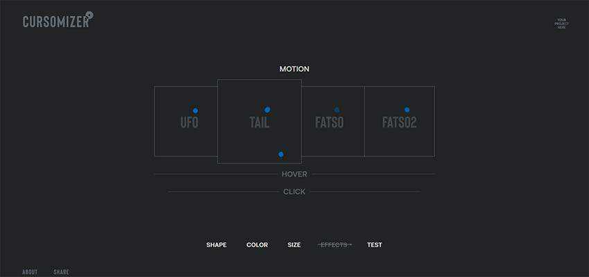
Bonus Tool: Cursomizer
If you are ready to ditch the generic arrow-shaped cursor, then we have one exciting project to check out. It is called Cursomizer. And it does what it says – lets you customize the cursor. It is a small playground where you can set size, color, hover effect and click effects for the cursor, and enjoy its final look and behavior in a live preview. It is very handy.
There’s Just Something About Circles
It is always a treat to see trivial things, which we sometimes do not give proper credit, get a second wind.
Of course, we have seen many customized cursors. However, there is something divine in circular pointers. It feels like they soar and gently move throughout the screen. In tandem with another little trend, aka circular mouse trails, they look even more sophisticated.
The post Clicking Around: The Use of Circular Mouse Cursors appeared first on Speckyboy Web Design Magazine.
