A Quick Guide to Website Photography
The inclusion of a great photo can turn a plain webpage into a visually-appealing one. But not just any old photograph will do. Deciding on the right image is something we should consider carefully.
Sometimes, however, designers don’t necessarily get to make that decision. For example, have you ever been handed a not-so-great image from a client? They may insist on using it, even if it takes away from the overall aesthetic of their website.
Even then, there’s still a chance to save the day. It’s all about better understanding the role photography can play in web design. If we can educate both our clients and ourselves, we can avoid those grainy, off-kilter images your client shot with their 10-year-old cell phone. In its place will be an attractive and relevant photo that adds to the overall experience.
With that in mind, here are some helpful tips for choosing the best photos for your website.
Consider the Subject Matter
First and foremost, a photo should reflect the subject of your content – at least, to some degree. This one is not an exact science and is often open to interpretation.
The easiest route, of course, would be to hire a professional to shoot spot-on images for you. But that’s also beyond the budget for many businesses. That leads us to the inevitable use of stock photos.
If you’re going with stock photography, you may not always hit the nail exactly on the head with regards to subject. But you can still aim to get the basic idea across (even if it’s a bit generic).
As an example, let’s say that you’ve written a blog post about the reasons to hire a piano tuner. Maybe you don’t have access to great images of someone performing the actual work. But odds are that you can find photos of a piano. Better yet, one that focuses on its internal parts.
The goal is to find images that help to keep the user’s focus on a particular subject. Perfection isn’t required, but try not to stray too far from the main theme of the content.

Think About Color and Post-Processing
Thanks to the wonders of tools such as Adobe Photoshop and even CSS, the color we initially find within an image doesn’t necessarily have to stay that way. We can change hue, saturation or even convert over to black and white.
Still, it’s worthwhile to think about which colors make the most sense for your project. Items such as the overall design of your site can be a big factor, as is the mood you’re looking to create.
If your website has a dark background and you want to make a bold statement, then a brightly-colored photo could be just what the doctor ordered. But black and white might just be perfect if you’re looking for something more serious and understated.
Any post-processing effects that you plan to use should also be a consideration. Not every image you find will be a good candidate for the specific filters you’re using.
For instance, if you’re applying a color overlay to a series of header images on each page of your site, you want to be sure that the photos you choose look consistent when the effect is applied. If a particular image looks out of place, it may not be the best fit in this scenario.

Size and Orientation Matters
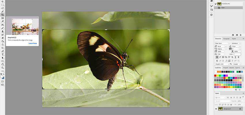
Whether you’re taking your own photos or downloading from a stock service, it’s likely that the images you choose will be cropped to a smaller size before they are added to your website. Even with broadband connections and 4k monitors, gigantic images (with equally large download sizes) aren’t very user-friendly.
Therefore, it’s important to consider how you plan to use a specific image on your site. What effect will cropping have on it? This is where the pixel size of the image and its orientation come into play.
Take, for example, a background image within a hero area. In this case, it’s often best to go with wide, landscape-oriented photographs. Trying to turn a tall, portrait-oriented photo into a short and wide one will usually leave out too many details.
At the same time, pixel size is also important. Ideally, it’s best to choose images that are larger than you need so that you have room to crop them. Blowing up small images generally leads to very poor display quality. Thus, look for something that you can bring down to the desired size.
And, don’t forget mobile! Depending on how you’re using an image, you may need to adjust styles to make things look pixel-perfect on small screens. It’s also possible that an image looks great on large screens, but really doesn’t work well on the small ones. That may mean having to find a different image that will work with your responsive template.

About Your Client’s Terrible Photo
Earlier we alluded to those situations where a client insists on using a particular photo (a.k.a. the “wrong” photo). In these cases, it’s easy to simply dismiss it as a bad idea – and maybe it is. But it’s also wise to be cognizant of both their feelings and thought process.
To get a better sense of this, you may need to do a little probing. Start off by honestly and politely stating any concerns you have about the image. Maybe the sizing won’t work or the quality just isn’t up-to-snuff. Regardless, it’s best to get your thoughts out in the open.
As you discuss it further, try to find out exactly what it is about the photo that they like. You may find that they’re using it because it’s the only one they have or that it has some sentimental value. It’s unlikely that they’re trying to “ruin” your masterpiece (although if they do claim that’s the reason, get out of there as fast as you can).
From there, you can bring up some options. Things like adding effects or making it part of a collage could help to make for a better fit. Or, if the image can easily be recreated, you might suggest a reshoot.
Much of the time, you’ll find that clients are flexible when it comes to images. And once they see that you’re working in their best interest, they’re more likely to meet you in the middle. Therefore, don’t take their initial request as a final decision – there’s likely some room for compromise.

Better Photos = Better Website
With the sheer amount of photography available at our fingertips, it’s easy to quickly grab an image and put it to use. But, is it the right one for the job?
In reality, it may take a little more effort to find the right photo. Consider your site’s subject matter, the appropriate color choices and the sizing you need. That will help narrow your search. From there, it’s all about experimenting with different options and determining the best fit.
And, in those cases where a client has their own ideas, open the lines of communication and look at ways to make the most out of the situation.
Photography is an element that can truly make your website stand out. Therefore, take your time and choose wisely!
The post A Quick Guide to Website Photography appeared first on Speckyboy Web Design Magazine.