PHP Twitter Bot (New)
Read more at https://www.phpclasses.org/package/11085-PHP-Application-to-automate-interactions-using-Twitter.html
The second release candidate for WordPress 5.1 is now available!
WordPress 5.1 will be released on Thursday, February 21, but we need your help to get there—if you haven’t tried 5.1 yet, now is the time!
There are two ways to test the WordPress 5.1 release candidate: try the WordPress Beta Tester plugin (you’ll want to select the “bleeding edge nightlies” option), or you can download the release candidate here (zip).
For details about what to expect in WordPress 5.1, please see the first release candidate post.
This release includes the final About page design. It also contains fixes for:
Please test your plugins and themes against WordPress 5.1 and update the Tested up to version in the readme to 5.1. If you find compatibility problems, please be sure to post to the support forums so we can figure those out before the final release.
The WordPress 5.1 Field Guide has also been published, which goes into the details of the major changes.
Do you speak a language other than English? Help us translate WordPress into more than 100 languages!
If you think you’ve found a bug, you can post to the Alpha/Beta area in the support forums. We’d love to hear from you! If you’re comfortable writing a reproducible bug report, file one on WordPress Trac, where you can also find a list of known bugs.
WordPress Five Point One:
It’s so slick, shiny, and new.
Lands in a few days!
As web designers, we build sites for our clients based on our own expertise. And while there are tried-and-true techniques for placing items such as navigation and calls to action, other design decisions are more arbitrary. We often end up implementing features the way we think users will want them to be.
While this is challenging for all designers, it’s especially so for solo freelancers and small agencies. Why? Because we often don’t have the budget to conduct real user testing. If you work on a lot of smaller projects, you might have to venture an educated guess or two when it comes to building a great UX. That can lead to some underperforming features.
Plus, there can also be times when our ego gets in the way. The more experience and success you attain as a designer, the easier it is to think that you know it all. This too can result in being out of step with what everyday users expect.
It’s not-so-ironic that I place myself in both of the above groups. Much of my career has been spent working with smaller clients who generally don’t budget for any extras. And, there was a time when I thought I really did have it all figured out (turns out I didn’t).
As such, I’ve tried to keep an open mind when it comes to the usability of my work. Here are a few things I’ve learned (and continue to learn) about designing with users in mind.
It’s easy to get carried away with design. Sometimes we implement features because they’re part of a hot new trend or they help us show off our great skills. It’s also quite possible to, no matter how noble our intention, completely overthink the design process.
I think it’s a common occurrence to start of with a basic idea that, on its own, works well enough. But then we start layering on effects in an effort make things “perfect” in our eyes. What we don’t realize at the time is that we may actually be making this feature harder for users to digest.
For example, tweaking text colors until they look amazing could inadvertently degrade accessibility. Or a slick animation in a navigation bar might cause chaos for those using an older browser. Then there is that quest to preserve whitespace, sometimes at the expense of hiding important information.
Even talented designers are capable of taking a good thing and wrecking it. Therefore, it’s worthwhile to keep simplicity in mind. Fancy effects are great, but they should only be used if they actually enhance the user experience. In other words, they call attention to the right things.
The key is in thinking about what it is we want a user to do. What actions do we expect them to take? From there, it’s about creating something that makes carrying out those actions as obvious and painless as possible.

User-centric design doesn’t always come easily. Sometimes, you have to fight for it. Or, at least plead your case.
Clients have been known to share their honest opinions about the designs we create for them. The trouble is that they, like us, are prone to having the wrong priorities.
We’ve all had experiences where a client insists on a feature being implemented in a certain way or with a specific placement. Sometimes, they hit the nail right on the head. Other times, the result is something that pleases them, yet makes the site more difficult to use.
The easiest thing is to defer to your client in this situation, but it’s not the right thing. This is where you’ll need to use your expert voice in a friendly way.
Explain your concerns as to why you would recommend doing something differently. For example, if the goal of the website is to get users to contact your client, show them the barriers that are getting in the way. Perhaps the call-to-action isn’t obvious enough or maybe contact information is too hard to find.
Quite often, clients don’t see things through the eyes of the everyday user. But once they do, they are usually willing to do whatever it takes to increase usability. It’s just a matter of speaking up when you need to.

Odds are that you’ve encountered plenty of good and bad experiences as a user. Just think about the websites you routinely visit (at least, the ones that you didn’t have a hand in building). How easy are they to use? What are the pain points that drive you crazy?
Each site, app or even operating system that you use can serve as a reference point. You can look back at them and say, “I love how that works” or “That made no sense at all.” That can and should play a role in your own projects.
For instance, one of my biggest frustrations is a banking site I visit at tax time. Once logged in, it doesn’t provide a clear path to the particular documents I need to access. I have to click around to various seemingly-unrelated pages before I can find what I’m looking for.
While I generally don’t design for banks, I do work on membership sites. This poor UX reminds me to make account information easier to find.
Of course, as professionals we won’t necessarily see the web the same way others do. But we can still apply our unique experiences in an effort to do better.

Regardless of whether or not we have access to detailed user testing, it’s still possible to improve the usability of our work. Some of it is plain common sense. But it’s also about being in the right frame of mind when putting a site together.
The concept of progressive enhancement should always be at the forefront of what we’re doing. That might mean sacrificing a fancy, portfolio-enhancing effect in exchange for a feature that is easier to use. So be it. That’s what we’re paid to do.
And, even if we can’t perform formal testing, that doesn’t mean we still can’t ask a client, friend or colleague for an honest opinion. While this doesn’t provide the same depth of feedback, it is useful all the same.
Afterwards, we can analyze the results and see how effective our decisions have been. We’ll still make mistakes (even resource-rich companies are far from perfect). The important thing is that we learn from them and always strive for improvement.
The post Staying in Touch with What Users Want appeared first on Speckyboy Web Design Magazine.
When we started Discourse in 2013, our server requirements were high:
I'm not talking about a cheapo shared cpanel server, either, I mean a dedicated virtual private server with those specifications.
We were OK with that, because we were building in Ruby for the next decade of the Internet. I predicted early on that the cost of renting a VPS with those specs would drop to $5 per month, and courtesy of Digital Ocean that indeed happened in January 2018.
The cloud got cheaper, and faster. Not really a surprise, since the price of hardware trends to zero over time. But it's still the cloud, and that means it isn't exactly cheap, because it is, after all, someone else's computer that you pay for the privilege of renting.
But wait … what if you could put your own computer "in the cloud"?
Wouldn't that be the best of both worlds? Reliable connectivity, plus a nice low monthly price for extremely fast hardware? If this sounds crazy, it shouldn't – Mac users have been doing this for years now.
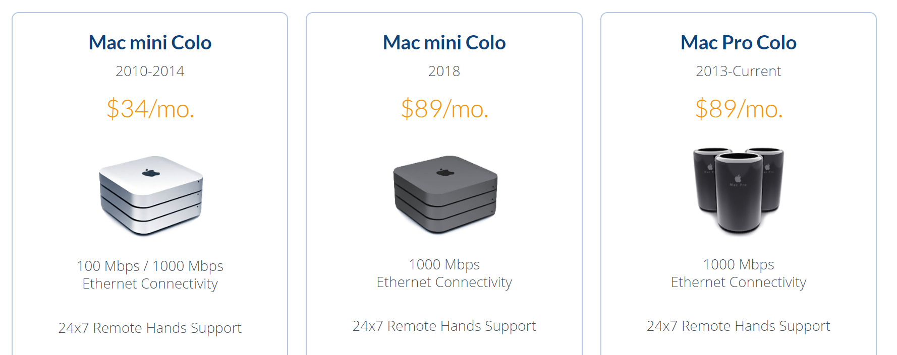
I suppose it's understandable that Mac users would be on the cutting edge here since Apple barely makes server hardware, whereas the PC world has always been the literal de-facto standard for server hardware.

Given the prevalence and maturity of cloud providers, it's even a little controversial these days to colocate actual servers, but we've also experimented with colocating mini-pcs in various hosting roles. I'm still curious why there isn't more of a cottage industry for colocating mini PCs. Because … I think there should be.
I originally wrote about the scooter computers we added to our Discourse infrastructure in 2016, plus my own colocation experiment that ran concurrently. Over the last three years of both experiments, I've concluded that these little boxes are plenty reliable, with one role specific caveat that I'll explain in the comments. I remain an unabashed fan of mini-PC colocation. I like it so much I put together a new 2019 iteration:
| 2017 — $670 | 2019 — $820 |
| i7-7500u 2.7-3.5 Ghz, 2c / 4t | i7-8750h 2.2-4.1 Ghz, 6c / 12t |
| 16GB DDR3 RAM | 32GB DDR4 RAM |
| 500GB SATA SSD | 500GB NVMe SSD |
This year's iteration of the scooter computer offers 3× the cores, 2× the memory, and 3× faster drive. It is, as the kids say … an absolute unit. 😱
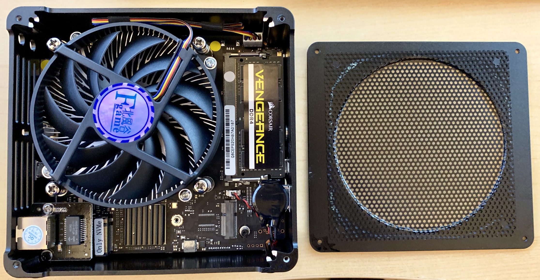
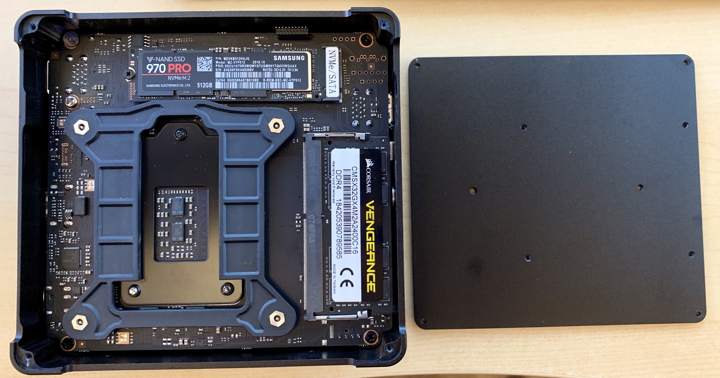

It also has a rather elegant dual-sided internal layout. There is a slot for an old-school 2.5" drive, plus built in wi-fi, but you won't see it in these pictures because I physically removed both.
I vetted each box via my recommended burn in and stability testing and they all passed with flying colors, though I did have to RMA one set of bodgy RAM sticks in the process. The benchmarks tell the story, as compared to the average Digital Ocean droplet:
Per-core performance
sysbench cpu --cpu-max-prime=20000 run
| DO Droplet | 2,988 |
| 2017 Mini-PC | 4,800 |
| 2019 Mini-PC | 5,671 |
Multi-core performance
sysbench cpu --cpu-max-prime=40000 --num-threads=8 run
| DO Droplet | 2,200 |
| 2017 Mini-PC | 5,588 |
| 2019 Mini-PC | 14,604 |
Disk performance
dd bs=1M count=512 if=/dev/zero of=test conv=fdatasync
hdparm -Tt /dev/sda
| DO Droplet | 701 / 8818 / 471 MB/sec |
| 2017 Mini-PC | 444 / 12564 / 505 MB/sec |
| 2019 Mini-PC | 1200 / 17919 / 3115 MB/sec |
Discourse rebuild
time ./launcher rebuild app
| DO Droplet | 6:59 |
| 2017 Mini-PC | 3:41 |
| 2019 Mini-PC | 3:24 |
Power consumption could be a concern, as the 2017 version had a much lower 15 watt TDP, compared to the 45 watts of this version. That 3× increase in core count ain't free! So I tested that, too, with a combination of i7z, stress, and my handy dandy watt meter.
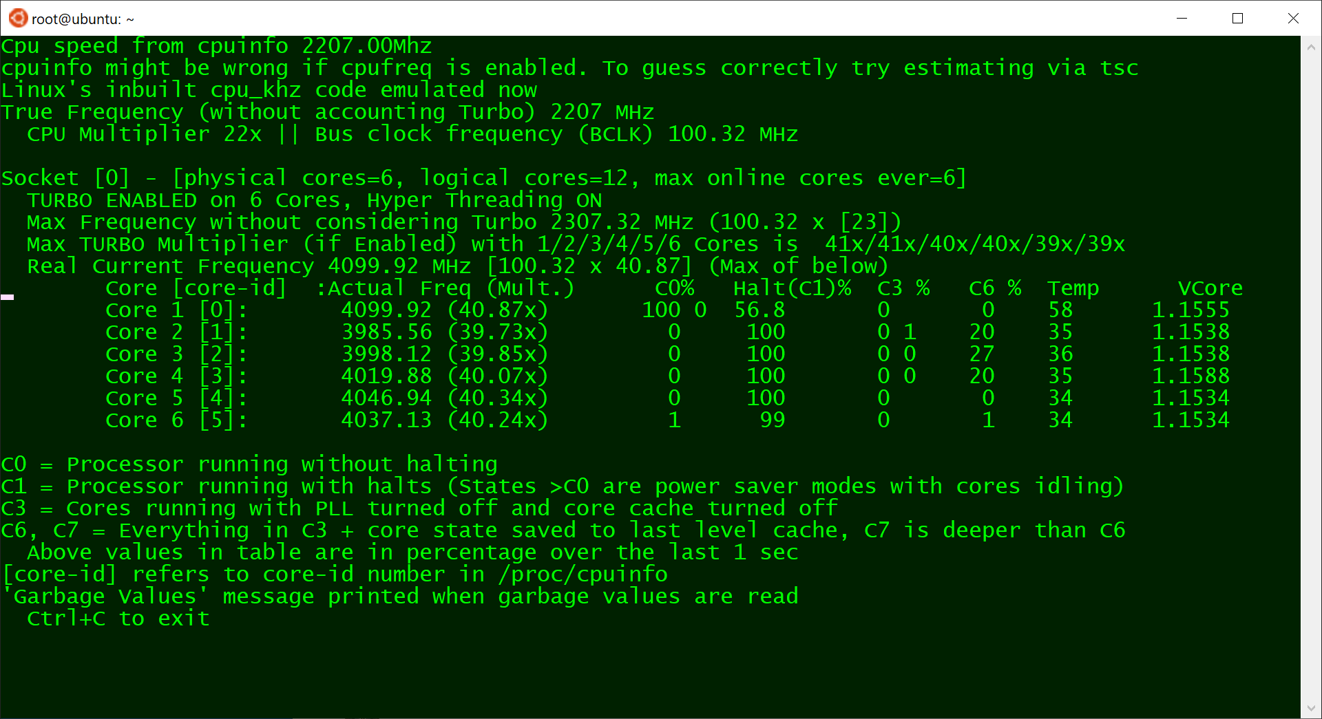
| (idle login) | 800 Mhz | 10w |
stress --cpu 1 | 4.1 GHz | 30w |
stress --cpu 2 | 4.1 GHz | 42w |
stress --cpu 3 | 4.0 GHz | 53w |
stress --cpu 4 | 3.9 GHz | 65w |
stress --cpu 5 | 3.7 GHz | 65w |
stress --cpu 6 | 3.5 GHz | 65w |
stress --cpu 12 | 3.3 Ghz | 65w |
I'd expect around 10 - 20 watts doing typical low-load stuff that isn't super CPU intensive. Note that running current-ish versions of mprime jacks power consumption up to 75w 🔥 and the overall clock scales down to 3.1 Ghz … let me tell you, I've learned to be very, very afraid of AVX2 extensions.
(If you're worried about noise, don't be. This active cooling solution is clearly overkill for a 65w load, because it barely spun up at all even under full core load. It was extremely quiet.)
So we're happy that this machine is a slammin' deal for $820, it's super fast, and plenty reliable. But how about colocation costs? My colocation provider is EndOffice out of Boston, and they offer very competitive rates, at $29/month for colocating a Mini-PC.
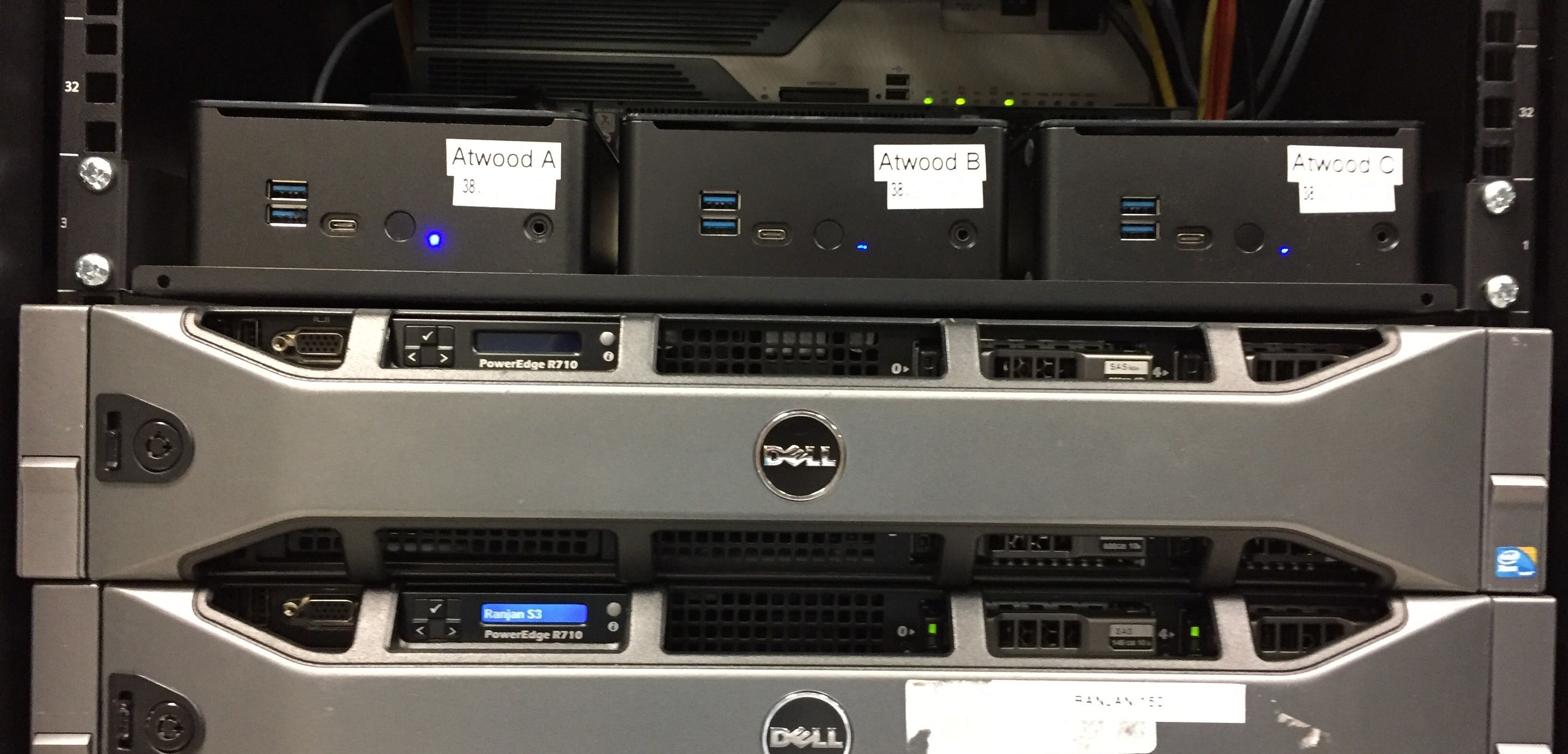
I personally colocate three Mini-PCs for redundancy and just-in-case; there are discounts for colocating more than one. Here they are racked up and in action. Of course I labelled the front and rear before shipping because that's how I roll.
Let's break this down and see what the actual costs of colocating a Mini-PC are versus the cloud. Let's assume a useful life of say, three years? Given the plateauing of CPU speeds, I think five years is more realistic, but let's use the more conservative number to be safe.
That's $2,044 for three years of hosting. How can we do on Digital Ocean? Per their current pricing page:
This isn't quite apples to apples, as we are getting an extra 140GB of disk and 2 bonus CPUs, but let's assume the CPUs are both slower and partially consumed by multi-tenancy compared to our brand new dedicated, isolated CPUs. (I was curious about this, so I just spun up a new $160/month DO instance for a quick test. The sysbench results are 4086 and 11760 respectively, considerably below the 2019 Mini-PC results, above.) Still, you pay almost three times as much for a cloud server. 🤑
I'm not saying this is for everyone. If you just need to spin up a quick server or two for testing and experimentation, there's absolutely no way you need to go to the trouble and up-front cost of building and then racking colocated mini-pcs. There's no denying that spinning servers up in the cloud offers unparalleled flexibility and redundancy. But if you do have need for dedicated computing resources over a period of years, then building your own small personal cloud, with machines you actually own, is not only one third the cost but also … kinda cool?

If you'd also like to embark upon this project, you can get the same Partaker B19 box I did for $490 from Amazon, or $460 direct from China via AliExpress. Add memory and drive to taste, build it up, then check out endoffice.com who I can enthusiastically recommend for colocation, or the colocation provider of your choice.
Get something cool hosted out there; let's do our part to keep the internet fun and weird!

The post ITBT – Speakers appeared first on Voices of the ElePHPant.