Monthly Archiv: January, 2019
Eventually, every website will require a redesign. And each one presents its own set of unique challenges.
Among the most challenging are large, content-heavy WordPress websites. Why? For starters, they often come with several different types of content to account for. Plus, their existing setup may not be as ideal today as it was when the site was originally built. And, if content is regularly added or changed, this throws yet another monkey wrench into the works.
All told, there is a lot to consider. That’s why it’s so important to plan ahead. While there will always be pain points, being prepared will make the process that much smoother.
So, before you tackle that next redesign project, let’s review some ways to get into the best position for success.
Review the Content Structure
First up, you’ll want to take a close look at how content is structured. Even if you were the one who originally built the website, it’s still a good idea to refresh your memory.
Things to look for include:
- Parent and child pages
- Taxonomies such as categories and tags
- Custom post types
- Navigation menus
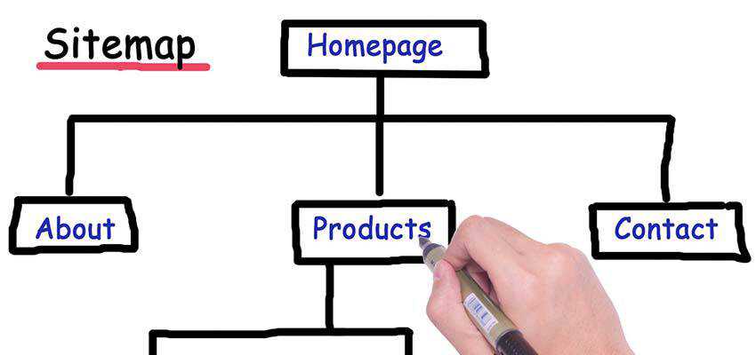
Once you have a better picture of how the existing content is set up, you can then determine whether any changes should be made. For instance, if all the site’s pages are currently at the top level, does it make sense to reconfigure some of them as a “child” page under a more generalized “parent”?
It’s also important to ensure that the site’s navigation accurately reflects the hierarchy of content. This not only looks better on the front end, but will help to avoid unnecessary confusion on the back end.
The main idea is to make sure that the site’s content is structured efficiently and in a way that makes sense for both users and content creators. Of course, there’s just about always room for improvement. But that must also be weighed against the potentially time-consuming task of making changes.

Dig into the Code
Now that you know the various content considerations, it’s time to take a look at the existing WordPress theme. This will provide you with a clearer picture of any custom functionality that may or may not need to be replicated on the redesigned version.
Among the items to look for:
- Whether the active theme is a child theme or standalone
- Any custom code or scripts being loaded within the
functions.php file
- Customized page templates that use the WordPress template hierarchy
Because a WordPress website can be put together in any number of ways, it’s vital to know the exact piece of code that is powering a specific function. While plugins may be responsible for some features, others could be the result of custom code within the theme.
For example, you might find that the site’s slider is being run by a custom jQuery script, rather than a WordPress plugin. Or perhaps there are custom fields being called in a page template – something that you would have to account for within the redesign.
Just as with the content structure mentioned above, the goal is to learn more about what you have to work with. Not every bit of custom code from the existing theme may need to be moved over. But it’s better to know this from the beginning, rather than find out it’s missing after the site has launched.

Make Note of Active Plugins
We love WordPress plugins because they help us add maximum functionality with very little effort. But just because a plugin has served us well in the past doesn’t mean it should be part of our future.
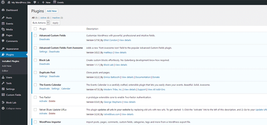
A redesign is a perfect time to perform an audit of any plugins that are currently active. Some will undoubtedly move on with you to the redesigned website. However, you may find that others are no longer necessary.
It could be that their functionality is no longer needed or perhaps they weren’t really being utilized in the first place. Then there is also the chance that there is another option out there that can do the job better.
But the most important reason to review plugins is to potentially rid yourself of security risks and dead weight. Plugins that haven’t been updated in awhile could both hurt performance and be an open invitation for hackers or bots. It’s all part of that fresh start we’re looking for.

Create an “In-Development” Plan
Most likely, you’re not going to do all of your redesign work on a production site. Therefore, the bulk of the process will take place on a staging site. That’s ideal, as you’ll have the freedom to work without fear of an inadvertent mistake causing downtime.
On a website that doesn’t see much in the way of new or updated content, the process is fairly easy. You may have to account for a few changes before launch, but it shouldn’t become a major obstacle.
However, a site that is frequently changed is certainly more of a challenge. It’s important to devise a plan to account for this.
It could be a matter of syncing the databases every so often in order to ensure that your staging site always has the latest content. Then again, there may be differences in structure that make this process more complicated.
There isn’t really a one-size-fits all solution here. So much depends on how your existing website has been built. You may be fortunate and find a plugin that does the heavy lifting for you. Or, you could be relegated to a more bespoke approach. Regardless, it should be a major consideration when redesigning a busy site.

Leave No Stone Unturned
Beyond a great look and layout, so much of a redesign’s success relies on picking up on the details. The bigger the website, the more of those important little tidbits that you’re likely to uncover. And, while the items above will have you off to a running start, there are always more places to look.
Depending upon your install, you might also want to consider things like SEO plugin settings (particularly on-page customization), custom plugins, image sizing and analytics. If any of these items aren’t accounted for, you could be missing something important when the new site launches.
But no worries, because you’ve got this! Pay attention to the details, take notes and (if necessary) ask questions. Add your terrific design skills to the mix and prepare to receive a few pats on the back for a job well done.
The post The Best Practices for Redesigning a Large WordPress Website appeared first on Speckyboy Web Design Magazine.
Package:
Summary:
Validate an option of a select input with its HTML
Groups:
Author:
Description:
This class can validate an option of a select input with its HTML...
Read more at https://www.phpclasses.org/package/11049-PHP-Validate-an-option-of-a-select-input-with-its-HTML.html

Package:
Summary:
Implement the decorator pattern using a trait
Groups:
Author:
Description:
This package can implement the decorator pattern using a trait...
Read more at https://www.phpclasses.org/package/11045-PHP-Implement-the-decorator-pattern-using-a-trait.html#2019-01-23-17:14:37

Not long ago, I was confused about doing math with money and floating
point issues. After a bunch of research and help from friends I figured out
what many already did before me: Using floating points is indeed bad. You can
get rounding issues and really want to use ‘precise math’.
After that, I realized I wanted to use the new Ecmascript bigint type as
a basis for representing money. This is supported by recent versions of Node.js
and Typescript, which is where I need it.
There’s a problem though, the bigint type only holds ‘whole numbers’ and
doesn’t do fixed-point decimal-math. I looked around on NPM for something that
would abstract this for me, but couldn’t find a library.
So I spent a couple of days writing a simple npm library called bigint-money
that wraps the bigint type. It’s written in Typescript and open-source so
it’s here for anyone to use: https://www.npmjs.com/package/bigint-money.
Major features:
Benchmark
Most ‘money’ libraries on NPM only use 2 digits for precision, or use
Javacript’s “number” and will quickly overflow.
The only comparible library I found was big-money. It’s probably
the best alternative if your Javascript environment doesn’t have support
for bigint yet.
My simple benchmark calculates a ledger with 1 million entries.
        bigint-money  |   big-money
ledger       816 ms   |   43.201 ms
%            100 %    |     5294 %
The benchmark script can be found in the repository.
I want to stress though that I can’t take credit for this (pretty good) result.
The library is fast because bigint is fast.
I did need to implement a few functions myself, and I actually feel that
somebody who’s better at writing fast code could probably do a much better job
than I did.
I imagine that specifically the moneyValueToBigInt and bigintToFixed intenral
functions could probably be optimized by someone much smarter than me.
Examples
This is how it generally works:
// Creating a money object.

import Money from 'bigint-money';
const foo = new Money('5', 'USD');
It’s possible to create a new money object with a Number as well
const foo = new Money(5, 'USD');
However, if you pass it a number that’s ‘unsafe’ such as a float, an error will be thrown:
const foo = new Money(.5, 'USD');
// Unsa
Truncated by Planet PHP, read more at the original (another 10860 bytes)
Our first web dev resources collection for 2019 comes packed with awesome JS libraries, cool productivity tools, and lots of design freebies.
Continue reading on Tutorialzine.
The questions almost sound a bit silly. But, when you book a new project, who exactly are you designing for? Are you looking to satisfy your client or add another notch to your portfolio?
You’d like to think that most designers are ethical enough to keep their focus entirely on client needs. But, we’re all human. And sometimes we add bells and whistles to a project for the wrong reasons – often without being consciously aware.
It comes down to those little decisions we make during the course of a build. They can enhance our portfolios, but still have virtually no positive impact for our clients.
Look What I Can Do!
If you will, allow me to pull out one of the many foibles from my past design adventures. I’m often fascinated by all the cool trends sweeping the web. And, when I see a feature that I think is really exciting, I simply can’t wait to use it in a project.
For example, lots of websites out there are still using parallax scrolling techniques. But nothing I had done to date used this shining example of “look what I can do”.
I found myself working on a project where I felt that I could add the feature. And I did. The end result was that, sure, it worked well enough. But the client wasn’t so thrilled and correctly pointed out that the effect was more of a distraction than anything else.
The result was that I had implemented something that didn’t make the site easier to use. It didn’t help users find what they were looking for any faster. Looking back, it was more of an avenue for me to show the world that I could execute some fancy code on a page.
This is the web designer’s equivalent of a child doing all sorts of mischief in order to get a parent’s attention. It may work in the end, but not without annoying someone along the way.

Features Should Have a Purpose
This doesn’t mean, however, that we can’t still add some slick effects to a client’s site. The key is ensuring that whatever we implement either solves a problem or improves the user experience in some way.
Microinteractions, for instance, can be a great way to help guide users along in completing desired tasks. Or, the use of animation can help call attention to an important piece of information. It’s all about picking the right time and place for their use.
The problem is when we add all sorts of extras without giving thought to what we want them to accomplish. Web design is nothing if not a “me too” industry, where we use these elements to prop up our ego and even our income.
But when we take the time to consider what a project really needs, it’s likely that many (if not all) of these extras can be left out. A good rule of thumb: If it doesn’t add anything useful to the final product, it doesn’t belong.

Design for Your Project, Not Your Portfolio
Great design is there to make things better. However, getting there takes a lot of thought and even some occasional soul searching.
In the end, it’s about finding the right solutions for the task at hand. And while having a killer portfolio means a lot to our own success, so does doing right by our clients.
With that in mind, it’s okay if your portfolio is missing an example of some fancy special effect. There may very well be an opportunity to implement it down the road.
Of more importance is that you can demonstrate how you helped a client solve problems and achieve their goals. That will mean more to your chances of future success than anything else.
The post Balancing Client Needs vs. Your Portfolio appeared first on Speckyboy Web Design Magazine.
Package:
Summary:
Support to multiple languages to PHP applications
Groups:
Author:
Description:
This class can be used to support to multiple languages to PHP applications...
Read more at https://www.phpclasses.org/package/11046-PHP-Support-to-multiple-languages-to-PHP-applications.html

Package:
Summary:
Implement the decorator pattern using a trait
Groups:
Author:
Description:
This package can implement the decorator pattern using a trait...
Read more at https://www.phpclasses.org/package/11045-PHP-Implement-the-decorator-pattern-using-a-trait.html#2019-01-22-16:23:06

Among the most important questions your online business must answer is: How are users viewing my website? Because, in order to design the best possible user experience, you need the data to back it up. Otherwise, you’re stuck playing guessing games.
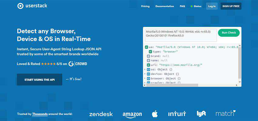
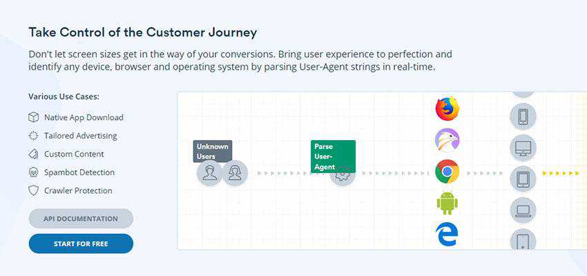
Having ready access to information such as a user’s web browser, OS and device are critical to making the right design decisions. And when you can detect these items in real-time, you can serve up a fully customized experience. The result is higher conversion rates, along with more high-fives from your team.
Gaining access to this data is as easy as implementing userstack. They’ll provide you with instant, secure user-agent string lookup over their JSON API. It’s accurate, powerful, scalable and will fit seamlessly into your existing setup.
Let’s take a look at what userstack does and how it can benefit your business.

Use Data to Guide Your Customers
The right data can help you ensure that visitors to your website will see the most relevant information. Plus, they’ll see it in the perfect format for their screen and device. What’s more, browser detection provides the ability to deliver compatible code. That means users of legacy browsers won’t have to deal with a broken layout.
userstack gives you more control over the user experience:
Display Custom Content
Tailor your site’s content based on a visitor’s device. An online store, for instance, might feature specific products for mobile or desktop users. Or, a news site could customize the number of articles shown on small screens to reduce scrolling.
Native App Downloads
Promote your app to users with userstack’s OS detection. This allows you to provide download links that correspond with the user’s system. For example, visitors using Android can be served up a link to your mobile app in Google Play. This reduces the required steps for the user and increases your odds of making a conversion.
Show Relevant Ads
Boost your advertising revenue by displaying ads that target specific operating systems or devices. userstack’s API delivers highly accurate and reliable data, so you can be confident that ads will be shown to the right users.
Detect Bots and Crawlers
Is your site getting slammed with spam bots? userstack puts you on the offensive, with the ability to detect these nuisances before they post spam. Likewise, crawler detection allows you to optimize your site for the best possible SEO outcomes.

A Powerful, Easy to Use Solution
userstack not only provides you with critical data, it’s also backed by a powerful infrastructure. The service can grow along with you and handle projects of any size. Whether it’s a few hundred or a few million requests – they can get it done quickly and efficiently.
It’s also built with accuracy and stability in mind. So, you can be sure that the service will be there when you need it. In fact, it’s trusted by some of the most recognizable brands worldwide.
Along with its rock-solid core, userstack is also incredibly easy to implement. You can be up and running in under 10 minutes! And, best of all, you won’t have to learn a new language to set things up. The REST API can be accessed through any major programming language, including PHP, Python, Node.js and Ruby.
You’ll also be thrilled to know that choosing userstack won’t cost you an arm and a leg. The service offers a very cost-effective way to detect user-agent string data in real-time, starting with up to 10,000 monthly lookups for FREE. Need more? There are premium plans available to fit every budget and use case.

Get Your Free userstack API Key Today
Better design produces better results. But you need the right data in order to make informed decisions. That’s why userstack’s API can become a critical component to the success of your business.
Their proprietary user-agent string database is refreshed several times a week in order to provide you with the most accurate information. You can place your trust in them to offer secure, reliable data for any sized project. And, it’s all backed by user-friendly documentation and support.
Sign up for your free API key today and start improving your site’s user experience immediately.
The post Perfect the User Experience with userstack appeared first on Speckyboy Web Design Magazine.
Latest PECL Releases:
