PHP AES GCM Encryption SIV (New)
Read more at https://www.phpclasses.org/package/11021-PHP-Encrypt-data-with-pure-PHP-code-for-Rijndael-AES.html
Tomas Votruba has a tutorial posted to his site showing you how to update your Symfony application to make all of your services use auto-discovery rather than hard-coded configuration settings.
Do you use Symfony autodiscovery services registration everywhere and your configs have no extra lines? Skip this post and rather read another one.But if you have many configs with manual service registration, tagging, and autowiring, keep reading. I'll show you how you can convert them easily be new Symplify package.
He starts off by talking about a few e-commerce projects he's been working with lately that define service configurations manually. He then mentions a package that's been created to help convert these over easily to autodiscovery rather than having to change them one by one. He provides the instructions to use this package and mentions some of the things that could go wrong in the conversion process to keep an eye out for.
Rob Allen has a tutorial posted to his site showing how you can run PHP using the serverless lambda functionality that Amazon Web Services provides.
There are other serverless providers, and AWS Lambda is the market leader, but until recently PHP support could most charitably described as cumbersome. That all changed at the end of 2018 with Lambda’s new runtime API and support for layers.Let’s look at the practicalities of serverless PHP on Lambda with Serverless Framework.
If you'd like to skip to the "good parts" you can check out this repository of the resulting code. Otherwise, he provides a complete walkthrough of the setup and code required to get the lambda up and running:
bootstrap file for handling requestsyml configuration for the Serverless frameworkFinally he shows how to call the "hello" function using the command line and the response you should receive.
In 2017 the company I worked for in Toronto got acquired by Yelp. The software engineers in my company (including myself) were asked to move to San Francisco. At the end of 2017 we moved, and I spent most of 2018 there. With the year coming to an end, I thought it might be a good time to reflect on my time there.
As a software engineer, it’s often suggested that you haven’t really made it to the top, unless you work in the Bay Area. I disagree with this idea, but it’s easy to see why some people feel this way.
On my first trip to SF, it was already quite telling. Flying from Toronto airport I noticed a higher than usual technology themed tees, stickers on laptops and black terminals. Pretty exciting! By chance My Uber driver to downtown told me he was applying to a free machine learning course ran by Google. On the way I noticed that the billboards next to the highways were directly targetting developers.
SF felt like the Mecca of tech, but also the center of capitalism. There is a lot of money, but not a lot of wealth. Salaries are the highest I’ve personally seen, but so is the cost of living.
As a software engineer this more or less evens out (compared to Toronto, where I’ve lived and worked for a long time), but if you’re not in the business it’s rough.
Before I moved to SF I never had the intention to move to the Bay. It just wasn’t a goal for me. But when the opportunity arose, we felt that for the trip to be worth it, we didn’t really want to lower our qualtity of living standard, and we wanted a 2-bedroom apartment and a reasonable commute. Ultimately this meant that our rent was $4250 USD per month, and a larger portion of our salary going towards rent. Had we stayed longer, we would definitely have tried to find a cheaper place to live and save more.

You can imagine that at those prices, it’s very difficult for many people to live in San Francisco. The cost of living has exploded in the last 30 years, and many people blame the tech industry for this.
Every now and then you’re confronted by this fact that there’s people who ‘hate us’. Take for instance the attacks on the Google commuter bus.
<script async="" src="https://platform.twitter.com/widgets.js" charset="utf-8"/>I #love this response to the #antitech graffiti that was trying to spread hate in #SF #MissionDistrict pic.twitter.com/jvSiw7StMV
— Eric Zandona (@EricZ_FamilyMan) June 23, 2016
Personally I can emphasize with the sentiment. Even though I don’t think that 20-something programmers in Google buses are personally responsible for the disparity, but the brandless tinted Google buses are a powerful symbol for new class system.
I’ve never seen so much poverty and homelessness before. There’s many major streets where wearing open shoes would be a big no-no, because of used needles lying around in plain sight. Seeing people shooting up on Market Street is pretty normal.
I don’t think this is necessarily a bad thing. I imagine in many cities this addiction and poverty might be more contained to certain neighbourhoods. It’s much easier that way to pretend it doesn’t exist if you don’t see it. One of the silver linings in SF is that there were lots of places to safely do drugs.
But it’s a weird juxtaposition. There are times where our engineering team would have lunch in
Truncated by Planet PHP, read more at the original (another 5403 bytes)
Michael Dyrynda has a post to his site sharing a method he's worked up for customizing the URL signing key that the Laravel framework uses to sign URLs to ensure the integrity of the URL's contents.
Since 5.6, Laravel has shipped with functionality to sign URLs. These URLs append a "signature" to the query string, so that Laravel can verify that the link has not been tampered with since it was created. This also allows you to generate temporary signed routes that expire after a configured period of time.This is useful for things like verifying account emails, or enabling passwordless logins.
Passwordless logins is something that is quite useful for an application, but what if you wanted to be able to generate a signed URL in one application that would allow you to log in to a second application?
He starts by defining the use case, requiring multiple signing keys to be used, one for customer URLs and another for admin URLs accessing the same content. He makes this work through the use of a custom key resolver, pulling the key for the signing dynamically. He also shows how to update the passthrough authentication handling, allowing the administrators (staff) of the system to bypass normal authentication handling and more directly view the user's information.
Based on the responses to a tweet he posted about the Have I Been Pwnd PHP package he created for PHP (found here), Michelangelo van Dam attempts to clear up how the package works in order to help calm some fears about how it handles passwords.
Yesterday evening I posted a Tweet about improving user entered passwords using Troy Hunt's service Have I Been Pwnd. [...] It went viral over night with many likes and retweets. But I also got a ton of questions regarding the usage and the security of this package. It turns out many people are scared to send passwords over the internet and are afraid to just use a package (like mine) for password checking.
In his post he explains how the password lookup works, sending only the first five characters of the hashed version of the password to the HIBP server (not the plain-text password). He includes a helpful graphic to illustrate the process and includes an example - not directly from the package - of how the request might work. His package makes it much simpler to perform this validation in your application.
Here's what was popular in the PHP community one year ago today:
Want to make a dramatic entrance? Want to warm up visitors before astounding them with your staggering animations, experiments with high-end libraries or just ingenious design? Then you should probably set your eyes on a splash screen.
Having come from the world of desktop software, it has managed to successfully take root in web design. It is brisk, quick, lightweight, relatively simple and powerful. We always talk about how the first few seconds can make a world of difference. Everything should be perfect from the beginning. And splash screens are one of those components of the web application that are directly linked to the success of this mission.
The majority out there think that the hero area stands behind the creation of this precious first impression. However, there are those scrupulous and diligent code artists who adore dotting the i’s and crossing the t’s, believing that every second counts. Well, that’s the way it is.
The earlier you start to butter up your online audience, the better first impression you will make. That’s why we are witnessing various original solutions in this arena. Actually and factually they open the conversation between the website and audience. And if you think that a loader does not have a capacity to show off your creativity, then splash screens certainly have some potential.
With a splash animation, the whole screen is at your service, not just a small element. They are like movie opening credit sequences that promise the audience something incredible, thereby igniting interest.
Three.js is not a good companion for creating quick and lightweight intros, yet in case of Tedd Arcuri it certainly does the trick. Here the skillfully reproduced highly-realistic smoke effect is used to enhance the appearance of the letter “T.” The latter is purely symbolic here since it can be easily changed into a logotype, mascot or a title.
.
The majority of splash screens go hand-in-hand with brand identity. For example, Splash page by Timothy Giblin. It is a 100% classic splash screen that features brand identity enriched with the creative thinking of an artist. The author shows us how to adhere to the golden mean. His concept is original and at the same time modest. It uncovers just a logotype, yet this uncovering catches an eye.
This example is less impressive than the solution by Timothy Giblin, yet it is more practical and can be seen everywhere these days. In essence, it is just lazy loading taken to the next level. It reveals the elements of the homepage one by one playfully and creatively, making things much more interesting.
There are some more exciting code snippets. Let’s explore the collection together and find the best match for your next project.
Looking to use a more tried-and-true approach to your splash screen? The examples below will help you get there.
A traditional sliding effect stands behind the beauty of Adam Blum’s solution. It includes a clean, pure background and several key phrases that appear one after another. It takes advantage of the power of anticipation: The primitive, yet viable way to drum up a user’s interest.
To make the previous solution a bit more interesting, you can add manipulations with a background like Niranjan did in this pen. His project Play On features lovely sliding transitions between the semi-transparent overlay screens applied to the image backdrop. Nice and amusing.
My Splash by Williams is another representative example of a classic splash screen. The concept has two stages. At first, the animation reveals the signature of the author at a moderate and comfortable pace. Afterward, a black screen appears. This is an elegant, sleek and businesslike solution that fits numerous projects.
Animated Splash Screen by Dmytro Lvivsky is a perfect starting point for creating your own solution. The JavaScript-powered animation has several screens and a traditional transition between each one. The latter is based on an effect where a circle leads the play.
See the Pen Animated Splash Screen by Dmytro Lvivsky (@UnforbiddenYet) on CodePen.
Here is an incredibly oversimplified solution. The routine lies in showing blocks of texts one by one, accompanied by a time-honored fading effect. However, it does everything it should. And, most importantly, it does it without “eating” your precious resources because it uses only CSS3. It is simple, elegant, modest and lightweight.
The following examples show that a splash screen can also be used to set the tone for a website from the get-go.
For example, if you are a coder then console loading animation by Andrew Tunnecliffe will establish a proper atmosphere. It is old-school, it is brutally simple and it goes perfectly well with any personal portfolio for a developer.
If you have a statistics-based or data-driven project in mind, then Falling Numbers by Thibault Jan Beyer is a good start for your storytelling experience. The animation opens with falling numbers that eventually hit the ground and open the main screen. It has a geometric charm enriched with some digital spice.
For many people, Stan Lee will always be “Bruce Lee’s nerdy brother”. For us, he is an icon who was standing behind a universe where good triumphs over evil, and who will be in our hearts forever.
Marvel Splash Screen by Matt Feinstein is not a tribute exactly, but all the superhero fans will enjoy it. The title speaks for itself. His splash animation has a marvelous comic book vibe. It is a replica of an opening sequence for Marvel movies that looks incredible.
Splash screens can be used as an alternative to loaders – unless of course, they are heavy. Unfortunately, there are still people who take them too seriously and try to transform them into an action-packed part of a play.
Splash screens in web design are effective as long as they are quick, short, lightweight and straight to-the-point. Of course, they give you the whole screen for showing your genius. Still, you should stick to its original mission. They are splashes that should stir up interest and immediately pass the baton to a more exciting solution.
The post 10 Dramatic Examples of Splash Screen Design appeared first on Speckyboy Web Design Magazine.
In the past, the admin section of a web application tended to be built solely for functionality, with not much, if any at all, consideration for design. Thankfully things have changed. Powerful functionality and beautiful design, especially over the last few years, have been merging nicely. And with the massive rise in popularity of the Bootstrap framework, creating a beautiful and functional admin panel has never been easier.
Why would you choose to use Bootstrap at all? Well, with Bootstrap, you know exactly what you are getting. It is relatively easy to customize mobile-first framework that includes ready-made design patterns and comes packaged with a vast library of components and widgets. And perhaps more importantly, your Bootstrap build will look consistent across all screen resolutions and platforms. So it does make sense to build the dashboard or the admin panel of your web application with something that you know works well.
All of the free Bootstrap (mostly version 5) admin and dashboard templates and themes below have been pre-built to be used as a complete solution so that you can rapidly create the front-end dashboard of your web app. As well as all of Bootstrap’s handy collection of widgets, they all include many extra addons, plugins, and features (plugins for charts and graphs, calendars, file managers, and so much more). Everything you will ever need for building professional and responsive dashboards.
And on top of all of those features, these free templates have all been beautifully designed as well.
Table of Contents
More Free Bootstrap Templates & UI Kits
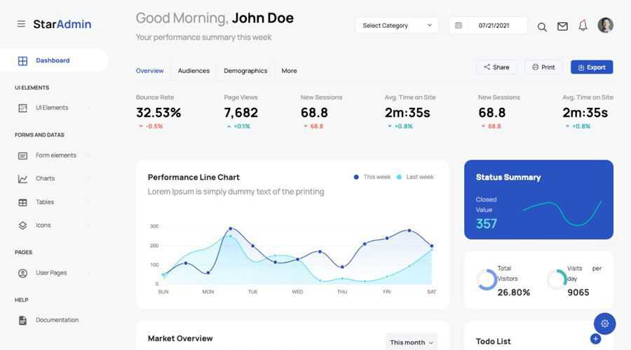
Star Admin 2 is the new and much-improved version of the hugely popular Star Admin Pro. Now, powered by Bootstrap 5, the free template comes bundled with a multitude of layouts, widgets, components, and so much more.
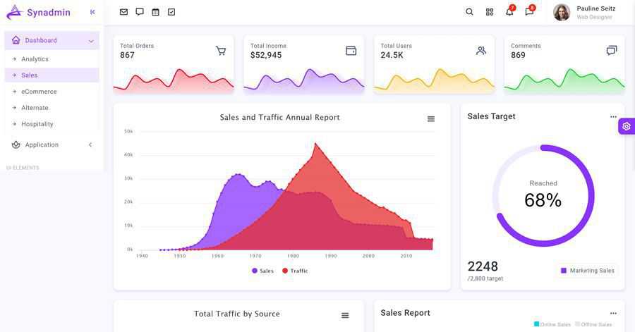
The Bootstrap 5 powered Synadmin dashboard template comes bundled with over sixty HTML page templates, a huge collection of UI components (including multiple charting options), making it flexible enough to be used on any type of project.
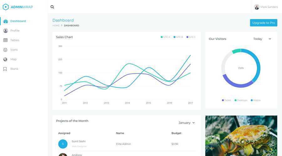
The simple and beautifully designed AdminWrap dashboard template comes with everything you would ever need for building powerful, user-friendly web applications.
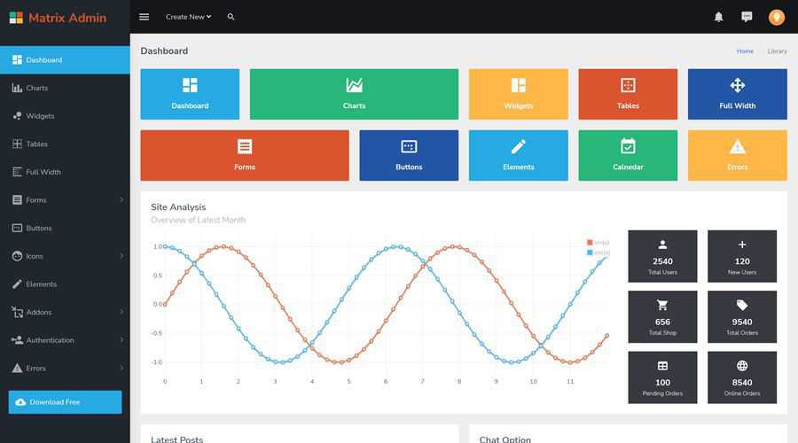
Powered by Bootstrap 5, the Matrix Admin is a fairly basic dashboard template but does offer everything you need to get the backend of your web application up and running quickly.
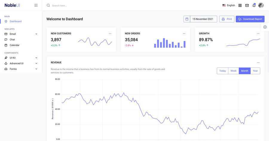
NobleUI is a lightweight and beautifully designed Bootstrap 5 powered dashboard template that includes a huge collection of reusable UI components and widgets, including charting options (ApexChart, ChartJs, Flot, Sparkline, and more).
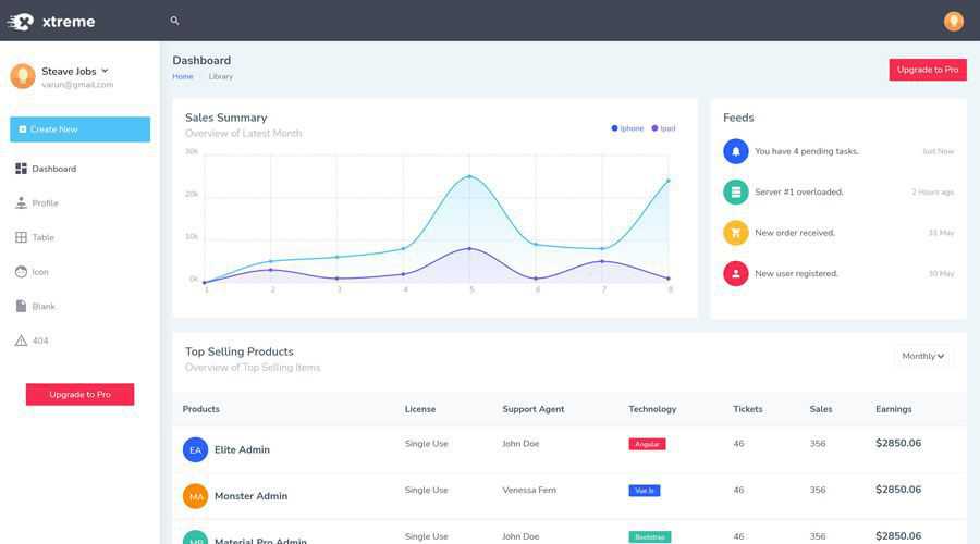
The minimally designed Xtreme Admin is a Bootstrap 5 powered dashboard template that will allow you to display, track and manage all of your data in an efficient way. There is a Pro version available, but Lite does give you everything you need to get started quickly.
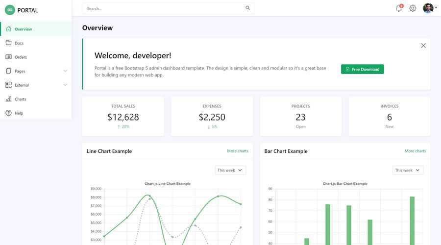
Portal is a clean and modern Bootstrap 5 dashboard template that offers modularly written code, making it much easier for you to edit and change the template to suit the needs of your application.
Rocker is a well-documented Bootstrap 5 admin template that comes bundled with over seventy pre-built page templates, and also includes color, light, and dark versions.

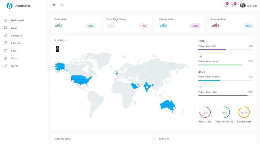
The Adminator is a free Bootstrap 5 Admin Template that boasts a clean and simplistic design and offers a vast collection of copy and paste code snippets, utilities, custom pages, components, and widgets.
This free Bootstrap 5 template has been heavily inspired by the design aesthetics of Google’s Material Design. It comes with 60 pre-designed components and a multitude of pre-built design blocks making it a fantastic starting point for your next dashboard design.

The Vue Material Design is a Bootstrap-based admin UI kit. It includes more than 500 elements, hundreds of icons, and plenty of templates and tutorials to help you design the perfect Material-inspired admin dashboard.
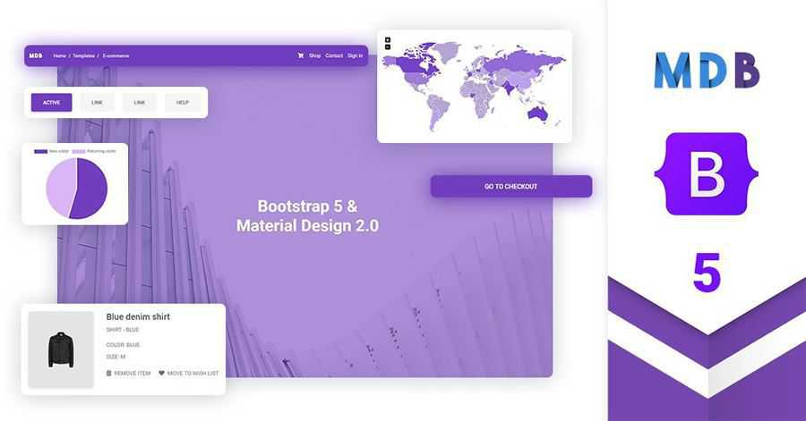
Built with Bootstrap 4, Vibe is a free React.js admin template that offers a clean interface and plenty of UI elements and components to help you create a beautiful dashboard for your application. You will find a few helpful starter page templates as well.
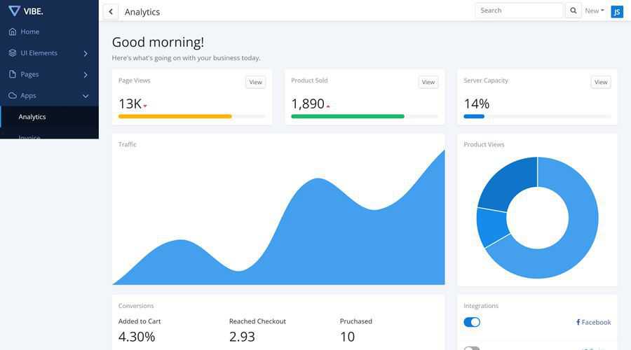
The Amanda Bootstrap 4 admin dashboard template features a beautifully designed corporate look and feel. It comes with a collection of starter page templates, and various charts widgets, email templates, toggle switches, time pickers, and many other components, elements and plugins.
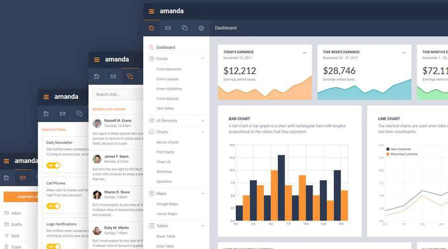
Now UI is a Bootstrap 4 admin dashboard with a beautiful color scheme, elegant typography, a vast collection of pre-designed components and widgets, and seven pre-built HTML page templates.
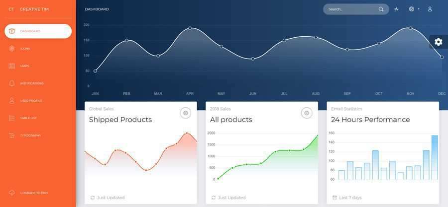
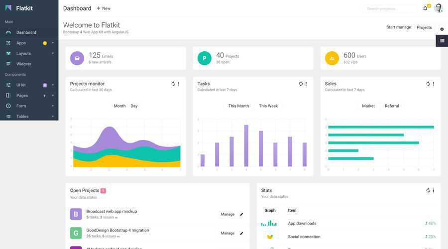
If you love flat design, you will love this Bootstrap admin template. It comes with six prebuilt layout templates and all the necessary UI elements and components to create the admin dashboard of your web application.
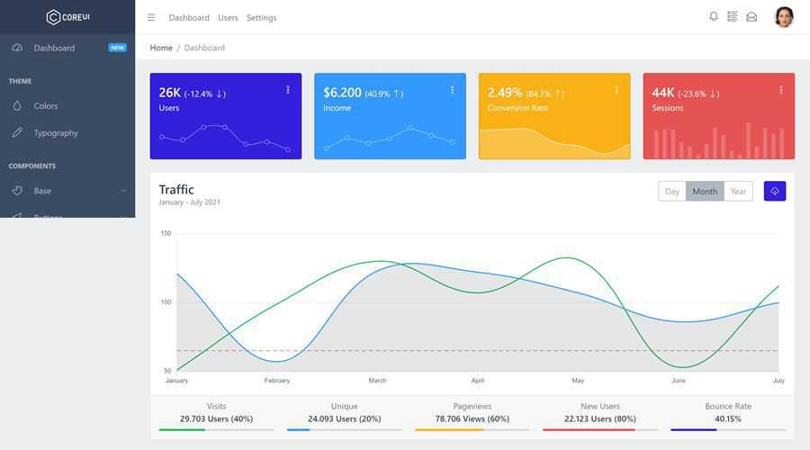
CoreUi is a free Bootstrap 4 admin template with a simple and modern color scheme. It comes with all of the components you would expect from Bootstrap, such as breadcrumbs, accordions, buttons, code editors, and more.
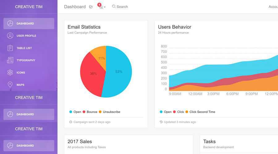
Gentelella is an elegant admin template that features three dashboard variations and a collection of starter page templates. You will also find various UI elements, forms, tables, multi-level menus, a set of useful extra pages, and more.

The Light dashboard template has a spacious and minimal design. You will find tables, user profiles, icons, and Google Maps integration. The template is fully responsive and has been designed so that you can get the dashboard of your application up and running quickly.
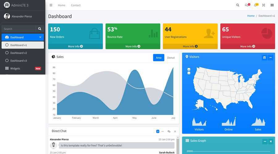
The lightweight AdminLTE Bootstrap 4 admin template comes with six pre-designed skins, and includes a multitude of components, plugins, and page templates to help you quickly create a dashboard for your web application.
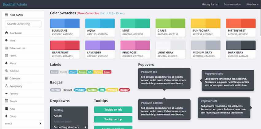
Bootflat Admin is an open source flat dashboard template. It’s based on Bootstrap 3 and it comes equipped with numerous templates and UI elements that will help you design a beautiful and colorful admin interface.
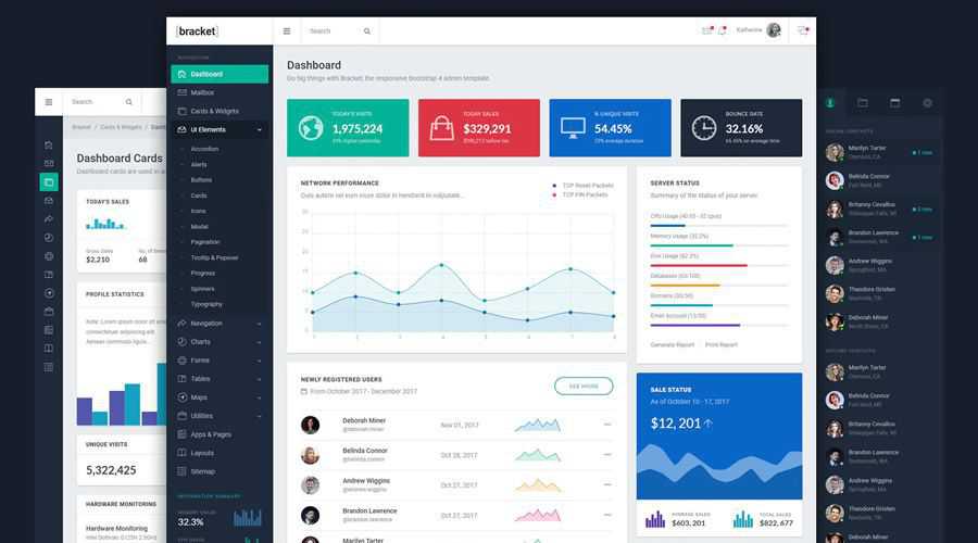
Bracket Bootstrap Admin is an admin and dashboard template with a corporate look and feel. It comes with starter pages as well as various charts, email templates, toggle switches, time pickers, and many other elements.
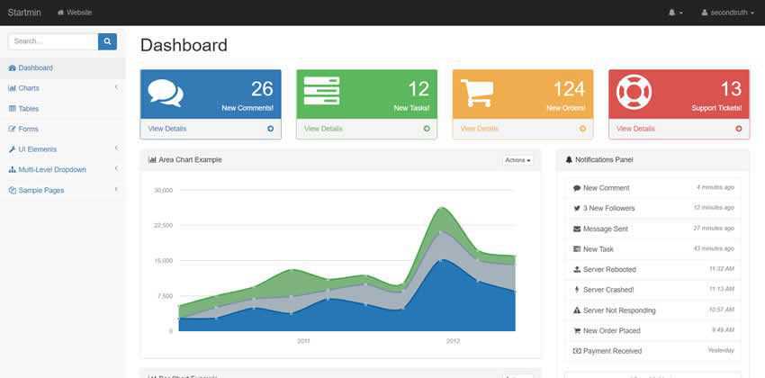
Startmin is an open source admin dashboard template based on Bootstrap 3. It features a modern design and comes with charts, tables, form elements, and a useful set of starter pages.
If you’re looking for a Bootstrap 3 admin dashboard template with material design, look no further than Admin.io. This dashboard template also includes vector maps, flowcharts and graphs, icons and styling.
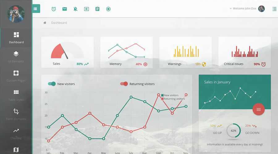
Paper dashboard is a clean and minimal admin template based on Bootstrap 3. The template comes with 16 different components, 4 customized plugins, and 4 example page templates.
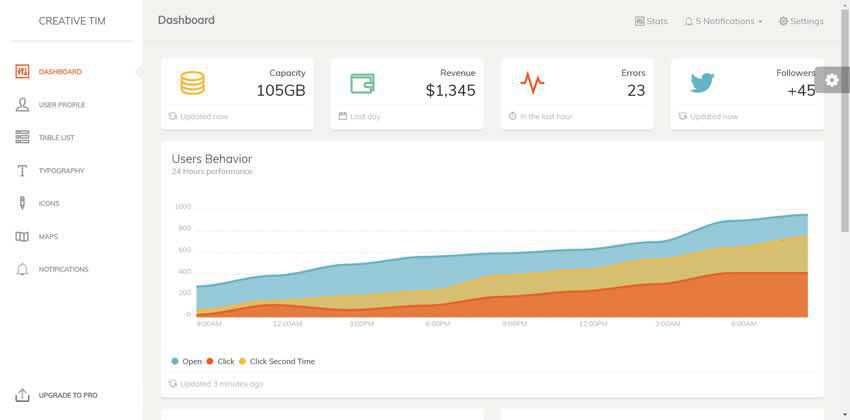
The SB Admin 2 dashboard template comes with an elegant, corporate design. It comes packaged with tons of UI elements, various charts, forms, tables, and a set of demo pages that you can use as a starting point.
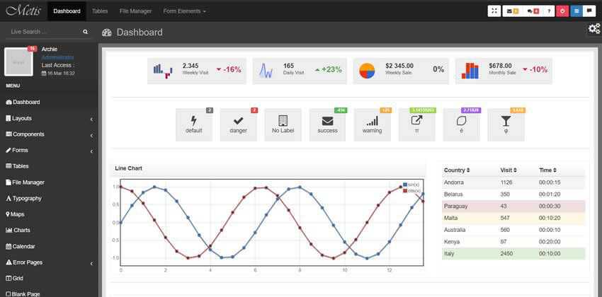
The Bootstrap 3 Lumino dashboard template has a fresh and clean design. It comes with dozens of widgets including forms, charts, UI Elements, panels, alerts, tooltips, menus, and much more.
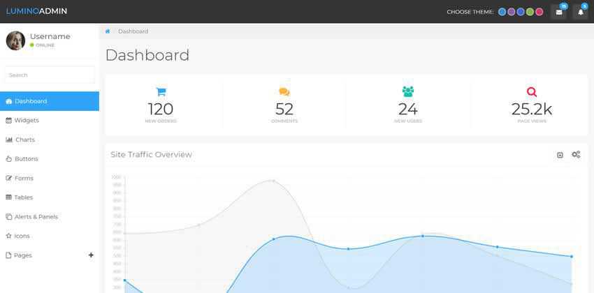
The Klorofil admin template features a clean and professional design. It comes loaded with all the necessary page templates, UI elements, and components for creating any type of dashboard design.
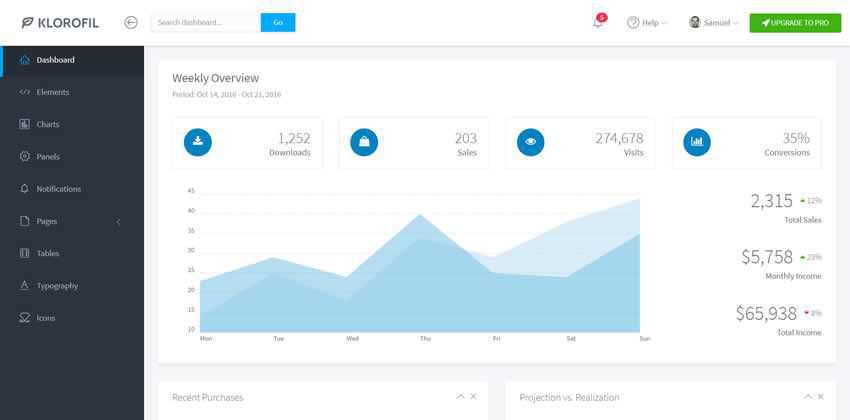
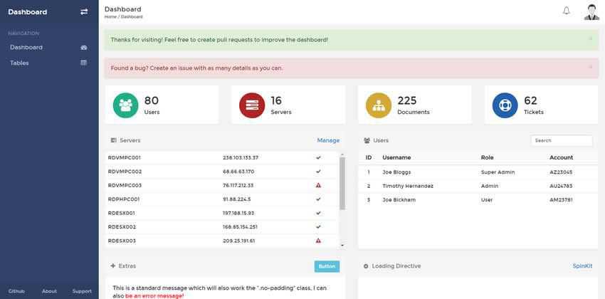
RDash Angular has been built on Bootstrap 3 and Angular JS. It comes with a nice set of UI elements, tables, and a responsive, colorful design. It’s a great choice if you need a straightforward, simple interface.
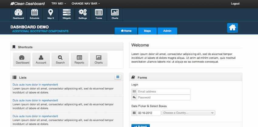
As the name suggests, the Clean Dashboard template has a clean design. The Bootstrap 2 dashboard template includes several unique UI elements that aren’t usually included in the Bootstrap package.
The post 25 Free Bootstrap Dashboard & Admin Templates appeared first on Speckyboy Design Magazine.