Interview with Brandon Savage
Video
Audio
Show Notes
The post Interview with Brandon Savage appeared first on Voices of the ElePHPant.
The post Interview with Brandon Savage appeared first on Voices of the ElePHPant.
The post Interview with Brandon Savage appeared first on Voices of the ElePHPant.
404 Not Found hardly needs an introduction. It’s by far the most seen
status by developers and non-developers alike. 404 is emitted when a
resource doesn’t exist, never existed or if the server doesn’t want a client
to know that a resource exist.
If the server knows the resource doesn’t and will never exist again,
410 Gone might be more appropriate.
Sometimes the 404 response is incorrectly used as a successful response to
a DELETE request. The logic behind this is that the resource no longer
exists after deleting, so the server should report this state.
However, this is technically wrong. Any response in the 400-499 series always
means that there was a (client) error. Even successful DELETE requests should
get a 200 Ok or 204 No Content response.
HTTP/1.1 404 Not Found
Content-Type: text/html

<h1>404 Not found</h1>
All is fair in love and the fight for clients, especially in the digital world. Unlike the real one, where you can use various psychological tricks to foist the goods and talk customers into buying something, the internet is still impersonal. You don’t have to look someone in the eye and say “No.” You just shut down the browser tab – despite all the promising perks and sales talk, and happily move on without feeling guilty.
For the majority potential customers, it is a big relief. For agencies, companies and vendors it is a huge obstacle that is difficult to overcome. It is here where you need to work your fingers to the bone, to say nothing about investing a not-inconsiderable sum of money in converting visitors into real clients. This thorny path involves numerous stages, pitfalls and tricks. And, everything begins with creating the first impression.
As a rule, the first impression is a decider in whether visitors leave or stay and give you a chance to talk them over. So, before starting to show pop-ups with discounts and special offers, you should take care of the “face” of your website. It sets the tone and mood for the first seconds of a user’s stay.
These days you can literally go for any option – starting with oversimplified static, minimalistic hero areas that lure users with simplicity, neatness and elegance. Or, you can opt for super-duper action-packed WebGL-powered animations that catch an eye with a great techno vibe and sophistication.
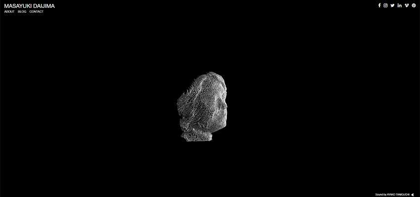
If you are not ready for radical actions or consider it a bit inappropriate for your targeted audience, you can always stick to golden mean balancing between oversimplification and sophistication. One way to do this is to choose a clean and relatively simple overall design and enrich it with a dynamic centerpiece. Like Masayuki Daijima did in his mysterious personal portfolio.
The home screen of his website is oversimplified: Clean monochrome black canvas, tiny pack of social icons, 3-item navigation and copyrights carefully placed in corners. All the essential elements give way to the WebGL-powered “head” located in the heart of the page. It naturally draws overall attention, screaming out the creativity and professionalism of the owner.
Today, we’ll focus on this approach. It is a small trend among creative agencies that could not resist the power of modern technologies, but want to stay reasonable in terms of resources. The websites below direct overall attention towards the heart of the screen where small, yet still mind-blowing animations lie.
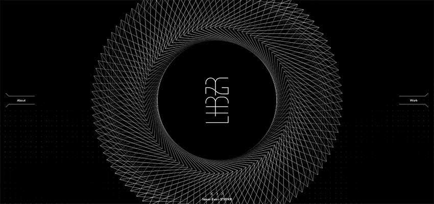
Luis Henrique Bizarro of LHBZR and Uprising, the team behind IGOODI, have adopted the same approach as Masayuki Daijima.
The home area of Luis Henrique Bizarro’s website is marked by neatness, cleanness, and scarcity of elements. However, the 3D circle made of hundred thin lines that extend from top to bottom maintains the attention on the center where the logotype is located. Everything is techy-techy.
IGOODI has a big and bold personality with its high-tech interface. There are even flash-like features such as block reveal effects and sounds on mouse hover. In comparison to the previous example, the design is a bit crowded. Nevertheless, all eyes are on the accompanying visual material provided for each section. Even though each animation is dark and seamlessly integrated into the design, still it catches an eye with its futuristic and sophisticated appeal.

There are even more websites that follow the same route. Let’s consider them.
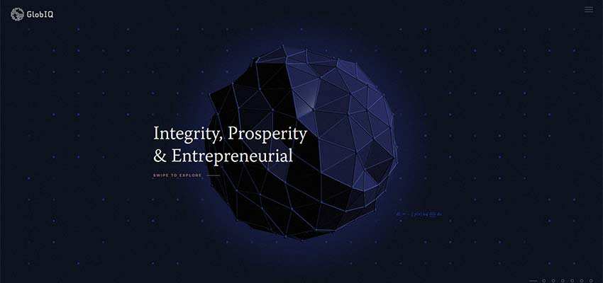
GlobIQ looks like IGOODI at first sight; but it has its own aura. The multi polygonal sphere is the heart and soul of the hero area. It rotates on its axis, unobtrusively calling attention. The home screen is mesmerizing and alluring.
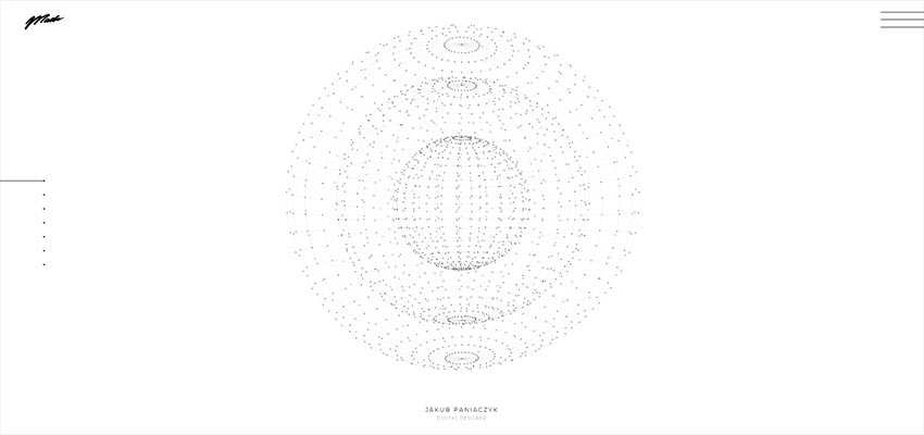
If you think that websites from this mainstream all have dark aesthetics, then set your eyes on a website by Jakub Paniaczyk. It is the same approach, yet it was brought into a light environment. While the above interfaces have a certain mysterious appeal caused by dark coloring, this one, on the contrary, feels open, inviting and clear. There are several beautiful globes made of a ton of particles and inserted into each other. The composition enhances the user experience and contributes to the high-end aesthetics.
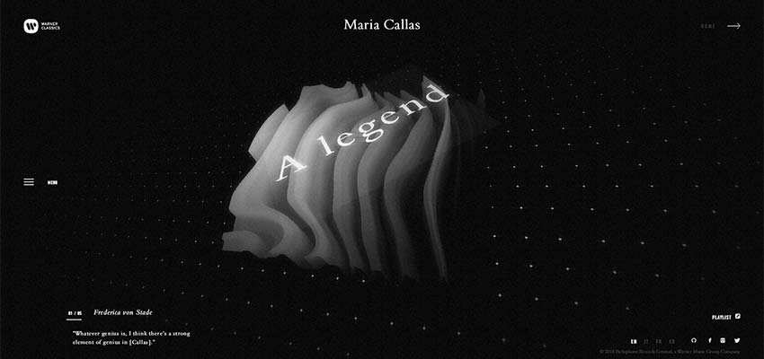
While we have featured websites with globes, spheres and 3D polygons, you can find different concepts. For example, check out the website of Maria Callas.
The hero area features an enigmatic square-shaped animation that you can partially explore from various perspective views. The solution evokes mixed feelings that force you to stay and explore the website.
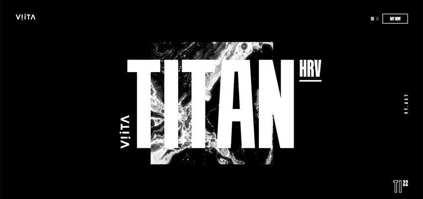
Much like the previous example, the creative team behind the promo website of VIITA TITAN opts in favor of a rectangle shape and offbeat textures that seem alive thanks to wavy behavior. The central part of the screen is so “heavy” and eccentric that it hypnotizes and magnetizes.
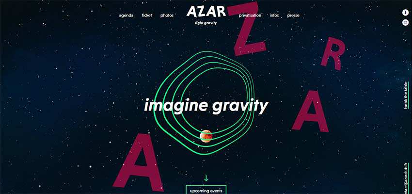
If you have an overloaded homepage but still want to draw overall attention towards the focal points, you can use the same trick as the team behind Azar Club. The hero screen of their website is populated with important and not-so-important stuff. Nevertheless, all eyes go to the heart of the page. This is due to 4 relatively thin, uneven neon circles: They naturally appeal to the audience.
The home screen of We Virtually Are is marked by the interfusion of high-tech atmosphere and artistic charisma. The overall design looks neat, modest and in some way “serious”. However, the video with the flowers has a subtle touch of natural beauty and playful tone – separating this website from the others.

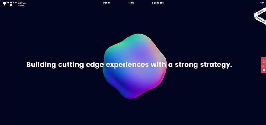
Miew Creative Studio delivers a powerful first impression elegantly and subtly. Here, the centerpiece is a breathing and morphing 3D sphere. It skillfully breaks the monotony of the clean and solid background and visually supports the tagline.
The dynamic solutions are seen everywhere these days. Animations of different nature, exciting findings, experiments with physics and other inspiring concepts populate websites. However, with great solutions come great responsibilities. So, to prevent a collapse, sometimes you need to stick to the golden mean. And using small centerpieces instead of full-screen solutions is indeed a way to strike a balance and please everyone. The more so, there are so many fantastic ways to do it.
The post 10 Fantastic Examples of Dynamic Centerpieces in Web Design appeared first on Speckyboy Web Design Magazine.
Here is a quick howto upgrade default PHP version provided on Fedora, RHEL or CentOS with latest version 7.3.
On Fedora, standards repositories are enough, on Enterprise Linux (RHEL, CentOS) the Extra Packages for Enterprise Linux (EPEL) repository must be configured, and on RHEL the optional channel must be enabled.
wget http://rpms.remirepo.net/fedora/remi-release-29.rpm
dnf install remi-release-29.rpm
wget http://rpms.remirepo.net/fedora/remi-release-28.rpm
dnf install remi-release-28.rpm
wget http://rpms.remirepo.net/enterprise/remi-release-8.rpm
rpm -Uvh remi-release-8.rpm
wget https://dl.fedoraproject.org/pub/epel/epel-release-latest-7.noarch.rpm
wget http://rpms.remirepo.net/enterprise/remi-release-7.rpm
rpm -Uvh remi-release-7.rpm epel-release-latest-7.noarch.rpm
subscription-manager repos --enable=rhel-7-server-optional-rpms
wget https://dl.fedoraproject.org/pub/epel/epel-release-latest-6.noarch.rpm
wget http://rpms.remirepo.net/enterprise/remi-release-6.rpm
rpm -Uvh remi-release-6.rpm epel-release-latest-6.noarch.rpm
rhn-channel --add --channel=rhel-$(uname -i)-server-optional-6
wget https://dl.fedoraproject.org/pub/epel/epel-release-latest-7.noarch.rpm
wget http://rpms.remirepo.net/enterprise/remi-release-7.rpm
rpm -Uvh remi-release-7.rpm epel-release-latest-7.noarch.rpm
wget https://dl.fedoraproject.org/pub/epel/epel-release-latest-6.noarch.rpm
wget http://rpms.remirepo.net/enterprise/remi-release-6.rpm
rpm -Uvh remi-release-6.rpm epel-release-latest-6.noarch.rpm
Since Fedora 29 and RHEL-8 beta, you can simply use the remi-7.3 stream of the php module
dnf module install php:remi-7.3
Needed packages are in the remi-safe (enabled by default) and remi-php73 repositories, the latest is not enabled by default (administrator choice according to the desired PHP version).
yum install yum-utils
yum-config-manager --enable remi-php73
dnf install dnf-plugins-core
dnf config-manager --set-enabled remi-php73
By choice, the packages have the same name than in the distribution, so a simple update is enough:
yum update
That's all :)
$ php -v
PHP 7.3.0 (cli) (built: Dec  4 2018 16:12:20) ( NTS )
Copyright (c) 1997-2018 The PHP Group
Zend Engine v3.3.0-dev, Copyright (c) 1998-2018 Zend Technologies
    with Zend OPcache v7.3.0, Copyright (c) 1999-2018, by Zend Technologies
The upgrade can fail (by design) when some installed extensions are not yet compatible with PHP 7.3.
See the compatibility tracking list: PECL extensions RPM status
If these extensions are not mandatory, you can remove them before the upgrade, else, you will have to be patient.
Warning: some extensions are still under development (xdebug...), but it seems useful to provide them to allow upgrade to more people, and to allow user to give feedback to the authors.
If you prefer to install PHP 7.3 beside default PHP version, this can be achieved using the php73 prefixed packages, see the PHP 7.3 as Software Collection post.
You can also try the configuration wizard.
The packages available in the repository was used as source for Fedora 30 (self contained change proposal, is already accepted and testable).
By providing a full feature PHP stack, with about 130 available extensions, 5 PHP versions, as base and SCL packages, for Fedora and Enterprise Linux, and with 200 000 download per day, remi repository became in the last
Truncated by Planet PHP, read more at the original (another 1216 bytes)
Another encryption library has been added to the Free Encryption / Cryptographic Libraries page. This library lets you add encryption and authentication services to the computer programs that you write, even if you are not experienced in cryptography. It works on many operating systems, including Windows, Mac OS X, Linux, FreeBSD, and others, and can be used from C, C++, C#, Delphi, Java, Python, Visual Basic, etc.