PHP Create Form (New)
Read more at http://www.phpclasses.org/package/9860-PHP-Compose-and-output-form-HTML-programmatically.html
Another online malware scanner has been added to the Free Antivirus Software and Online Virus Scanners page. This one is from Google, and it allows you to scan files that you have downloaded to your system as well as URLs (web addresses) using multiple antivirus software in one go. No installation needed.
It’s 8:30 in the morning and employees are trickling into the office kitchen, bleary-eyed and cocooned in thick scarves. Soft greetings are whispered over the tinkling of Cheerios.
What they don’t notice is Alan, one of our product managers, beaming from the center of an extravagant display of breakfast pastries.

“Get your bagels! Muffins! Croissants!” Alan shouts. Within seconds, people swarm the table.
Terry, a Scrum master, starts taking orders. “How would you like to pay?” he asks.
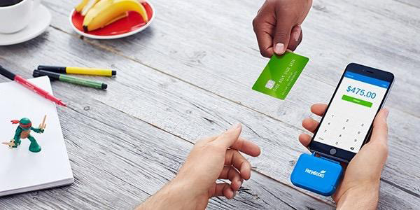
In Terry’s hand is a prototype of our new card reader, connected to an iPhone. He swipes a credit card, hands the phone over for a quick signature, and relinquishes a pastry.
“How was your experience?” I ask the customer, once breakfast is safely in hand. “If you had to give this experience a rating between 1–7, what would you give it?”
For everyone else, it was time for breakfast. For my team, it was time to learn.
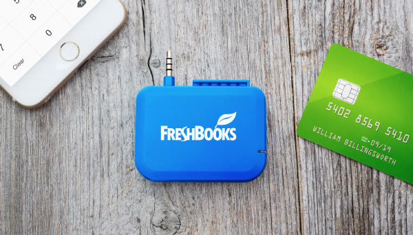
Released earlier this year, the FreshBooks Card Reader is a mobile point-of-sale device for freelancers and small business owners. It’s our team’s first ever physical product.

For my product team, this uncharted territory presented some challenges.
For example, typically, we would have direct access to our end-user, letting us test and get feedback at every stage of the design, and to better understand their needs and goals. But, because the product was in stealth mode, we weren’t yet openly sharing it outside of our Toronto office.
The lengthy hardware production cycle also meant we often didn’t have a card reader in our hands for much of the design process.
So, without access to either the end-user or hardware, how were we to uncover the insights we needed to create an exceptional user experience?
The solution, it turns out, was not to simply test our prototypes with our own employees. Instead, we recreated not only the scenario, but also an environment in which a card reader transaction might take place, in order to better understand the real-world implications of our design.
So we built a café in our kitchen.
The kitchen café proved to be both delicious and informative. Below are a few ways this experiment helped us design a better product.
We were able to see the real-world dynamics between people.
We knew that the experience had to be simple and usable from both the merchant’s and customer’s perspective. The problem was that we weren’t sure exactly what “simple and usable” meant in this context (because it’s uncharted territory for us), and how that interaction would feel.
These were the types of questions we wanted to answer through the café experiment:
By the end of the morning, we had observed dozens of simulated transactions and closed up shop with a much better understanding of our product’s role in the merchant/customer interaction.
It revealed emotions and usability issues that arise in stressful situations.
At 8:45 a.m. the café was fairly quiet. But 15 minutes later, the floodgates had opened and business was booming.
Observing an experience in a quiet, controlled environment can be helpful. But apply just a wee bit of chaos and you can unlock insights into real-world behaviors and emotions. This gave us insight into how a merchant could be affected by external factors and stress. Would they rush through the transaction? Would the customer feel the pressure and swipe their card the wrong way, ignoring our on-screen instructions?
We were able to better consider the interplay between hardware and software.
While we were able to test the software easily enough, we were still missing one important part: The card reader itself.

For most of the product development cycle, we had no stand-in for the final product in our scenarios. How would we confidently grade the experience when we were missing such a key component?
Well, we recreated that too. Although we didn’t have the device, we had the specs and we promptly sent them off to a local 3D printer who spooled out a replica of the card reader within a day. A coat of paint and a few stickers later, and we had something that looked and felt pretty close to the real thing.
We were able to use this crude replica to gauge how the device would sit in the customer’s hand, how easy it was to swipe or insert a credit card, and the emotional reaction to the overall design including branding and color.
It helped us focus our efforts when it came time to test and monitor the product with real users.
It should go without saying that testing our product internally did not — and could not — completely replace testing with our end-users. Even though our Toronto employees provided us with plenty of lessons and served well as temporary stand-ins for real users during our café experiment, they were not our actual customers.
Although we were able to draw out many valuable insights by recreating real-world scenarios, nothing could be answered conclusively. The most we could ask for was the emergence of new questions, a little more empathy, and indicators of what should be rigorously tested and monitored in the future.
Therefore it was essential that we understood what exactly we wanted to learn before we tested anything internally. The types of questions that we asked, and the kinds of behavior we wanted to observe, were influenced by the understanding that we were watching fiction.
By the end of the morning, once the dust had settled, we had sold everything but a lone cream cheese bagel and a plain croissant.
Although we were tired and frazzled, we were also very happy. By conducting a simple, short experiment, we had learned things we could have only previously speculated.
The proof was in my hands — a clipboard bursting with valuable feedback and observations.
As we walked back to our desks amidst the clamor of a routine Monday morning, our conversation was buzzing with new insights, new questions, and new problems to solve.
While we still had a long way to go, recreating real-life scenarios proved to be an invaluable way to start challenging our assumptions and build empathy for our customers in a short amount of time.
And we didn’t even have to leave our office.
The post How Selling Pastries Helped Us Design a Better Product appeared first on WebFX Blog.