Building a Personal [Origami] Website in 2021 – Useful tips for those who want to create their own personal website.
![Example from Building a Personal [Origami] Website in 2021](https://speckyboy.com/wp-content/uploads/2021/05/weekly-news-for-designers-may-23-01.jpg)
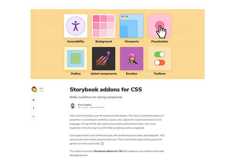
Storybook addons for CSS – Tools that streamline the CSS debugging process.

Iconoir – A free, open-source collection of 900+ SVG icons to use in your projects.

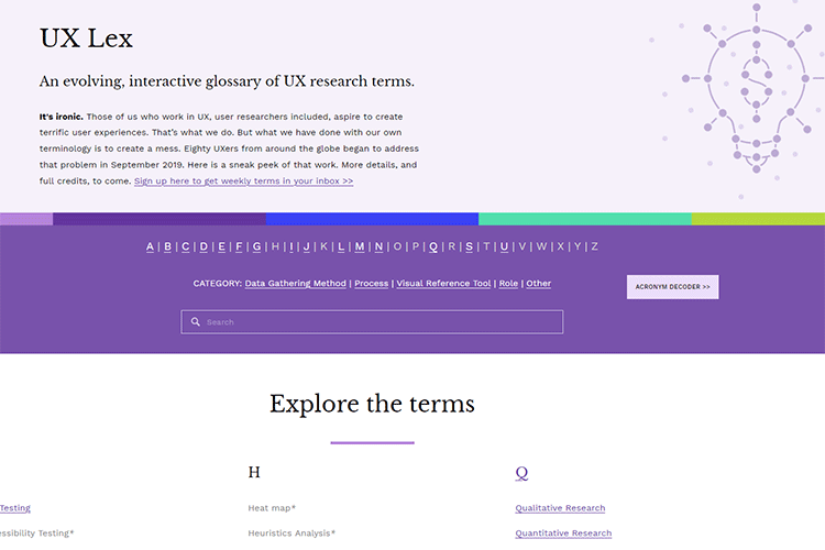
UX Lex – Stay up-to-date with this evolving, interactive glossary of UX research terms.

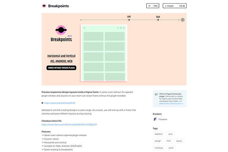
Breakpoints – Use this Figma plugin to preview your responsive page layouts.

Signflow Free WordPress Theme – A free startup & technology WordPress theme that could be used for building startup web sites, web services, businesses, internet services, and so much more.

As a Freelance Designer, What Is Your Unique Selling Point? – How designers can harness the power of a USP (Unique Selling Point).

5 steps to faster web fonts – Take control of your fonts with these tips for fine-tuning your font files and optimizing loading strategy.

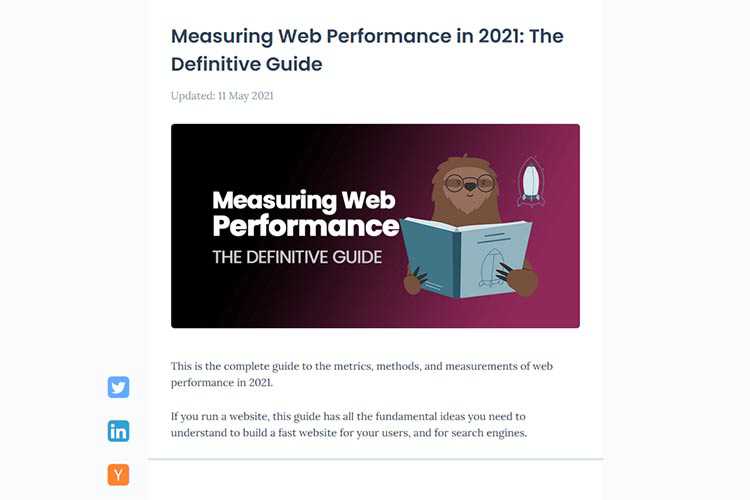
Measuring Web Performance in 2021: The Definitive Guide – A guide with all the fundamental ideas you need to build a fast website for your users, and for search engines.

Sketch: in 2021 and beyond – Have a look at some big updates coming to the Sketch platform.

A Focus on the Basics: Must-Have Features for Your eCommerce Website – Put all the bells and whistles aside and provide the features your customers want.

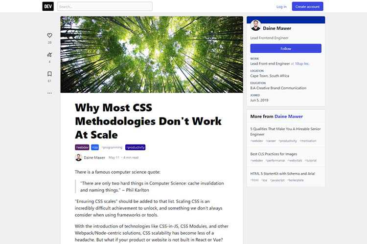
Why Most CSS Methodologies Don’t Work At Scale – Scaling CSS is an incredibly difficult achievement to unlock, and something we don’t always consider when using frameworks or tools.

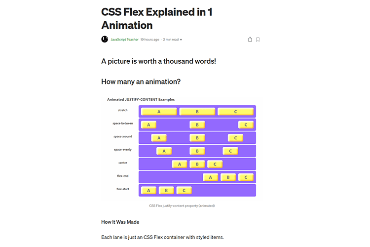
CSS Flex Explained in 1 Animation – A visual guide to CSS Flexbox properties. Very useful!

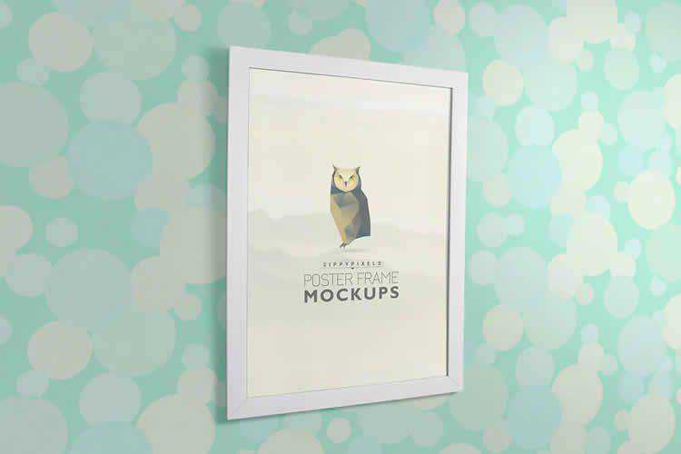
30 Poster Frame Mockup Photoshop PSD Templates for 2021 – These mockups are an incredible asset for increasing your sales and turning your art into a reality.

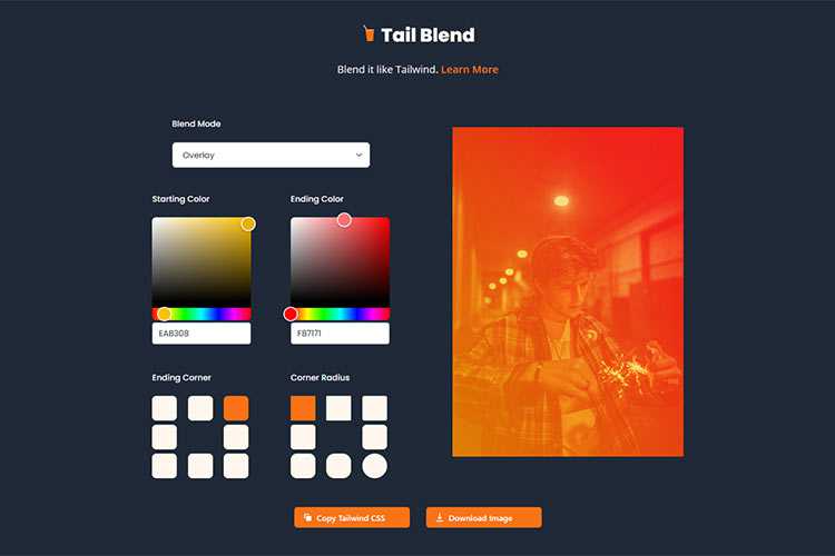
Tail Blend – Use this online tool to create beautiful photo blend modes for Tailwind CSS.

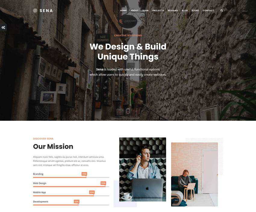
Sena – Free MultiPurpose WordPress Theme – An easy to use versatile and free multi-purpose WordPress that will help you create beautiful multipurpose business websites.

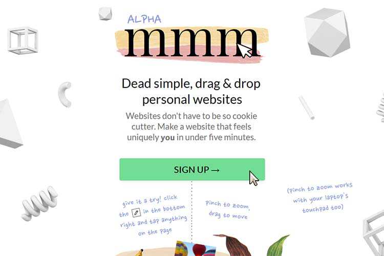
mmm – Check out this tool for crafting dead simple, drag-and-drop personal websites.

40 Elegant Wine Label Design Examples for Inspiration – A wide-ranging collection of attention-grabbing wine labels.

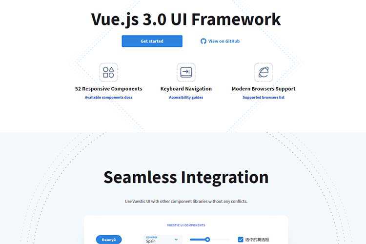
Vuestic UI – Grab this Vue.js 3.0 UI framework. It’s accessible and includes 50+ responsive components.

The post Weekly News for Designers № 593 appeared first on Speckyboy Design Magazine.
Package:
Summary:
Store and retrieve HTML to use in Web page layouts
Groups:
Author:
Description:
This package can store and retrieve HTML to use in Web page layouts...
Read more at https://www.phpclasses.org/package/12085-PHP-Store-and-retrieve-HTML-to-use-in-Web-page-layouts.html

Lace up your boots and let’s travel back in time! We don’t even have to travel far. Vintage and retro are coming back, big time. More and more photographers, designers, and clients are charmed by the appeal of vintage aesthetics. From soft palettes, to gently faded filters, vintage effects are more popular than ever before!
So if you’re thinking of editing your photos and graphics to look more vintage, you don’t have to spend hours in Photoshop or Lightroom. You just need a little help from our friends: The best Photoshop actions for creating retro and vintage effects!
We’ve gone through thousands of presets, actions, and other graphic goodies to compose this collection. You’ll find absolutely everything you need for stunning, vintage-inspired photos and graphics within these collections: Actions that give you a variety of filters to make your photos even more beautiful. From landscape photography to portraits, they’ll help you create unique and authentic photos with a dash of vintage and retro charm.
So if you or your clients are vintage lovers, stop stressing. Instead, scroll down and find the perfect Photoshop action, preset, or effect for your next project. They’re the bee’s knees!
More Actions:
3D Effects,
Art Effects,
B&W Effects,
Bokeh Effects,
Cinema & Movie Effects,
Comic & Cartoon Effects,
Duotone Effects,
Dispersion Effects,
Double Exposure Effects,
Glitch Effects,
HDR Effects,
Ligh Leak Effects,
Sketch Effects, or
Text Effects.
Give your photos a nostalgic look with these vintage cinematic Photoshop actions and presets for Lightroom. This massive bundle composed of 50 assets offers vintage filmic colors, dark filters for night photos, vibrant and saturated effects, and a lot more. You’ll also get vintage LUTs for video editing.

Light leaks, date stamps, and more! This retro Photoshop action collection has everything you need for nostalgic and funky images. You’ll get 15 retro film Photoshop actions inspired by vintage camera styles, 10 light leak overlays, and more. If you love retro, add this pack to your kit!

Capture gorgeous shots, and then add some indie charm to them. These indie camera Photoshop actions come with 17 actions, over 110 gradient maps, as well as 21 PNG effects for light leaks. You’ll create a nostalgic atmosphere for your images, perfect for portfolios, magazines, and social media!

Turn your images into watercolor art, or simply create a vintage atmosphere with these highly detailed vintage watercolor and pencil Photoshop actions. You’ll get brushes, patterns, 20 presets, and everything else you need for interesting images. All it takes is one click and you’ll be set!

Get the authentic analog and retro contrasts and vignetting with these Photoshop actions. You’ll get 10 Photoshop actions to create an analog and retro atmosphere in your images, which is perfect for portfolios, magazines, and social media. You’ll get subtle tones that will amaze your audience.

All you need to travel back in time is Adobe Photoshop and these vintage actions. This collection of vintage Photoshop actions helps you transform your standard images into vintage works of art. You can fine tune the actions’ details to get old camera effects, or create a full-on masterpiece.

From the faded 60’s, to the vibrant 70’s, this set of retro Photoshop actions has every look you’d ever want! You’ll get 7 editable Photoshop actions, as well as textures and light leak overlays. Easily create a beautiful lookbook, image, or poster!

Elegant and authentic, these retro text effects for Photoshop are perfect for your next project that draws inspiration from the 50’s and 60’s aesthetics. You’ll get 10 unique, 3D styles. They’re 100% editable so you can fine tune all the little details.

Create polaroids without a Polaroid camera! This Lomocam retro photo generator helps you tweak all the little details to create vibrant lomography results. You’ll get 31 film effects that mimic the original Polaroid photos perfectly. You can also pick a colorful frame, and add special effects like fisheye.

Transform your image into a work of art with this vintage art Photoshop action. With brushes, splashes, and color grading, you’ll easily create a vintage atmosphere from even the most modern photos. You can use them for anything from books and magazines, to social media and marketing campaigns.

Perfect for wedding photographers, these vintage Photoshop actions will give your clients an unforgettable wedding album. This vintage wedding Photoshop action will give your original shots a soft atmosphere. It works best with natural light, and you just have to press ‘Play’ to apply it to your images.

Give your photos a retro feeling with these light leaks Photoshop presets. This particular light effect works best for vintage and retro-themed photos, but it can be a great addition to adventurous photos, as well. You’ll get 25 light leak effects to work with and amaze your audience.

If you want to create gorgeous retro videos, you don’t have to travel back in time with your camera. You just need these animated retro vintage film Photoshop actions. You’ll get 24 different color options, with animated light leaks, camera shakes, and other important atmospheric details.

Create awesome vintage photos and graphics without spending days in Photoshop. Simply download these vintage photo effect actions and you’ll get the unmistakable vintage charm after just one click. These vintage Photoshop actions are perfect for a variety of purposes; from stylish fashion editorials, to engaging social media.

Stylish and authentic, these retro and vintage text Photoshop actions are perfect for flawless typography. You’ll get 18 high-quality Photoshop actions that offer creative text effects for a variety of projects; from flyers and posters, to cinematic titles and covers. You can easily use them via smart objects.

Create gorgeous flyers, covers, and other materials with these vintage text effects. You’ll get 9 different styles to work with; from old-school cafe signs, to funky 3D text effects. You can easily add your own content in just a few clicks with the smart objects system in Photoshop.

Get the toning just right with these vintage and retro color effects for Photoshop! These 21 effects work as Photoshop actions, so all you have to do is play them, and you’ll be set! You’ll also get unique effects such as: vignette, noise effect, and more.

Turn your original photos into works of vintage art with this retro art Photoshop action. In a just few clicks, you’ll completely transform your images into masterpieces, complete with vintage splashes, typography, effects, and colors. This is a plug and play; you just have to apply the action.

These vintage film Photoshop actions are perfect for professional photo shoots and magazine photos. You’ll get 10 Photoshop actions to convey a vintage atmosphere while retaining the beauty of your original shots. They were inspired by films such as Agfa, Fujifilm, and Kodak, with grain and vintage effects.

Create retro prints with these Photoshop actions. Inspired by retro art, this collection includes brushes and patterns to create unique images. All you have to do is brush over the parts of the image that you want to transform, and play the action. Take your audience’s breath away!

We’re all about vintage and retro in 2020! Some things never go out of style. No matter if you or your clients are inspired by the 70’s funky charm, or want to travel a little farther to the eras of petticoats and distinct typography, you’ll find the perfect fit in this collection of the best Photoshop actions for creating retro and vintage effects.
From Lightroom presets to turn your original shots into vintage masterpieces, to Photoshop actions that add dynamism to your images and graphics, there’s plenty to pick from! All you have to do is download the collections you’ve been eyeing, and add them to Photoshop. From there, your work is cut out for you. Some of these assets work as smart objects, so you just have to add your own content.
Save time, and impress your audience!
The post The 20 Best Photoshop Actions for Creating Retro & Vintage Effects appeared first on Speckyboy Design Magazine.
Package:
Summary:
Get details and manage videos using YouTube API v3
Groups:
Author:
Description:
This class can access and get details and manage videos using YouTube API v3...
Read more at https://www.phpclasses.org/package/12086-PHP-Get-details-and-manage-videos-using-YouTube-API-v3.html#2021-05-19-23:50:43

Internet Explorer 11 (IE11) was released over 7 years ago and is currently used by less than 1% of all users on the Internet with usage rapidly declining. A large majority of popular websites have already stopped supporting IE11 (including Microsoft Teams in 2020), and even the Microsoft 365 apps and services will be dropping support later this year.
When WordPress 5.8 is released in July of this year, Internet Explorer 11 will no longer be supported.
If you are currently using IE11, it is strongly recommended that you switch to a more modern browser, such as Google Chrome, Mozilla Firefox, Safari, or Microsoft Edge. IE11 users have been shown a warning that IE11 is considered outdated in the WordPress dashboard for the last 17+ months.
If you are already using one of the more modern browsers above, you will only be positively impacted by this change, as there are performance benefits to dropping IE11 support. However, if any other users of your site are still using IE11, it’s possible they will be affected.
What does “dropping support” mean?
When support for a browser is removed from WordPress, new features are no longer tested on those browsers and are not guaranteed to function optimally.
Automated tools that generate parts of the WordPress Core source code are also updated to exclude unsupported browsers. This means that any feature relying on these generated files will likely have bugs or stop working for users of those browsers.
The block editor will be the area of WordPress most heavily impacted by this change because almost all of the files related to the block editor are compiled using these automated tools. Other areas of the WordPress dashboard also use CSS built with these tools and their appearance will potentially be impacted when using IE11.
All other areas of the code base that are IE11 specific will need to be identified, evaluated, and removed on a case-by-case basis as the rest are manually maintained. This process will begin in the WordPress 5.9 release, and will likely happen gradually over several major releases. Additionally, any bugs which are reported for IE11 will not be fixed.
How will this affect themes?
No changes will be made to any of the default bundled themes as a result of this plan. No code related to IE11 support (or any other browser that may have been supported when each theme was released) will be removed from default themes. However, any new features added going forward will not be tested in IE11.
If you are not using a default theme, it’s still unlikely that your theme will be affected by this change. Themes typically have their own browser support policies, and changes in WordPress Core do not affect those. It’s possible that your theme author may have removed support for IE11 already.
If IE11 support is important to you and you are unsure whether your theme supports IE11, it is recommended that you reach out to your theme’s developer to confirm.
More information on this change can be found on the Making WordPress Core blog.
Anyone here have a bunch of strange, unusual, or, shall we say, “quirky” hobbies? Perhaps you like to collect bottle caps from around the world and photograph them as found typography. Or maybe you recycle old computer parts to fashion into handmade art pieces?
Come on, you’re designers – I know there’s something juicy you work on when you’re not putting your nose to the old grindstone!
If you do, excellent! If you don’t, you should really find something to do and share with others. Personal projects are not only fun and inspiring to you – they can also have the same effect on your paying clients. Having interesting side projects in your portfolio can help you make the leap from forgettable, all-purpose designer to industry superstar.
Charting A Course For Future Success
By having interesting personal work, you’re not just relieving stress or pursuing an oddball passion. You’re setting a path for your entire career. Think about it: if your career as a freelancer is focused simply on just getting your next paycheck, you’re missing out on 99% of what’s possible as a design professional. Ask yourself what you really want to accomplish in the design world. Setting high goals for yourself includes taking your personal passions into account.
A great way to determine what your real career goals are is to play what I like to call the “so that” game. For example: you’d like to build up your portfolio so that you will be more attractive to higher-quality clients. And you’d like to attract higher-quality clients so that you can network your way to a high-profile assignment. So that you can wear a jewel-studded crown and have crowds of people in togas lavishing you with adulation…
Wait… that may have been a dream I had once!
You want more high-profile assignments so that you can have a bunch of people in turtlenecks clamoring to see your work at a gallery show. There; that sounds more like a designer’s life. Once you run out of “so thats,” that’s when you’ve arrived at your true goal. In case you couldn’t tell, this can be pretty lofty. Perhaps your final “so that” is to change the world, or give back to your community, or even to be the best possible creative person you can possibly be.
Knowing the true reason why you’re doing all of this can help keep you on track when things get tough.

More Creativity Attracts More Creative Work
There are thousands of potential clients out there who you could be working for. How many of them do you need to make an impression on in order to have an amazingly successful career? The answer may surprise you – it’s a lot fewer than you think.
Your ideal clients are special individuals who are looking for uniqueness, not commodity. The main thought that goes through a design client’s head, if they’re at all savvy about design (and thus someone you want to work with) is: I wonder if I will be surprised today? Usually the answer is no; most design portfolios, unfortunately, bring more of the same ho-hum boring stuff day in and day out.
The reason for that is not because most designers are just that uncreative. Most people are capable of far more creativity than they allow themselves to get away with – because they are concerned with making a “good impression.” Well, when you’re a creative freelancer, the last thing you want to do is try to make a “good impression” by being less creative.
People are often afraid to put too much of themselves in their professional work, but as you’ll see, I believe this is a mistake. I’ve never had a problem displaying “too much” personality in my approach to a professional project. In fact, it’s been just the opposite – my clients greatly appreciated my unique perspective and loved the response my work got from their customers.
In much the same way, I love it when I hire a designer who can complement my weirdness with their weirdness. We can have a big old weirdo party and make our customers deliriously happy.

What They See Is What You Get
Your potential clients can only judge you as a designer by what you show them. If the only thing in your portfolio is bland, boring work that you only took to pay the bills, that will profoundly affect how you will be approached and what kind of work you will be offered.
No one offers an exciting, once-in-a-lifetime assignment to someone they don’t trust to put their heart and soul into it.
Think about it – if I’m a high profile client in the market for a star designer, who do you think I’m going to choose: the technically good but bland designer who only has one size fits all solutions to show me? Or the maverick designer who shows me their brilliant creativity in the form of a compelling personal project?
If you only show ‘meh’ work, you’ll only get more of that ‘meh’ work. So embrace your crazy side and make time to work on something awesome.

In Conclusion
Your portfolio is a chance to tell your personal story. Aim to take people on an emotional roller coaster ride whenever they see your work. Yes, it’s important to display your competence, but 90% of design is knowing how to think, not how to do technical stuff.
Of course you need to be able to do the technical stuff too, but that’s what’s called a “minimum requirement.” If I’m a highly desirable client, I’m not going to stop and think about whether or not you have the skills for the job. I already assume you have them, and if you don’t, I’m not even going to consider hiring you. What clients are interested in is whether or not your brain is on.
If it is, they’ll be able to see that in your work.
The post Why You Should Include Your Personal Passions in Your Design Work appeared first on Speckyboy Design Magazine.
Package:
Summary:
Create and manege NoSQL database
Groups:
Author:
Description:
This package can be use to manage the creation and access to a database with using SQL...
Read more at https://www.phpclasses.org/package/12070-PHP-Create-and-manege-NoSQL-database.html#2021-05-18-21:06:03

Package:
Summary:
Render templates using Bootstrap for presentation
Groups:
Author:
Description:
This package can render templates using Bootstrap for presentation...
Read more at https://www.phpclasses.org/package/12084-PHP-Render-templates-using-Bootstrap-for-presentation.html#2021-05-18-16:24:29

Package:
Summary:
Render templates using Bootstrap for presentation
Groups:
Author:
Description:
This package can render templates using Bootstrap for presentation...
Read more at https://www.phpclasses.org/package/12084-PHP-Render-templates-using-Bootstrap-for-presentation.html#2021-05-18-16:24:29

Latest PECL Releases:
- ast 1.0.12
- Support parsing 'docComment' on php 8.1 enums
- swoole 4.4.26
Fixed
---
* Fixed special case OnClose event missing while listening for writable events
- swoole 4.6.7
Enhancement
---
* Supported call Process::signal() in Manager process and Task synchronous process (#4190) (@matyhtf)
Fixed
- Fixed signal cannot be registered repeatedly (#4170) (@matyhtf)
- Fixed build on OpenBSD/NetBSD (#4188) (#4194) (@devnexen)
- Fixed special case OnClose event missing while listening for writable events (#4204) (@matyhtf)
- Fixed native curl with Symfony HttpClient (#4208) (@matyhtf)
- Fixed HttpResponse::end() always return true (swoole/swoole-src@66fcc35) (@matyhtf)
- Fixed PDOException generated by PDOStatementProxy (swoole/library#104) (@twose)
Kernel
- Refactored worker buffer, add msg id for the event data (#4163) (@matyhtf)
- Changed the log level of "Request Entity Too Large" to warning (#4175) (@sy-records)
- Deleted inet_ntoa and inet_aton calls (#4199) (@remicollet)
- Adjusted output_buffer_size value to UINT_MAX (swoole/swoole-src@46ab345) (@matyhtf)
- couchbase 3.1.2
PCBC-761: fix return interface for expiryTime methods.
PCBC-760: expose error messages in query exceptions.
PCBC-759: take into account 'decoder.json_arrays' INI setting when decoding Query rows.
PCBC-758: raise exception if invalid CAS passed to unlock.
PCBC-729: update URLs for Collections management API.
- protobuf 3.17.0
No new changes in 3.17.0
- gRPC 1.37.1
- gRPC Core 1.37.1 update
- protobuf 3.16.0RC2
No new changes in 3.15.7
- datadog_trace 0.59.0
### Added
- [ZAI SAPI] Zaitrigger_error() SAPI function #1212
- Autocomplete Makefile target names in buster dev images #1224
Changed
- Use new buster containers in CI #1210
- remove _tmp suffix from development buster images #1217
- Tidy the components/ #1216
- Tidy up the docker-compose file a bit #1223
Fixed
- Disable PCNTL in forked processes #1196
- Updated contributing and fixed typo on Makefile::test_all #1218
- Fix ingestion control reporting #1222
- Skip tests that have development environment dependencies #1215 (thanks for the report @remicollet)
- Always resolve curl class entry symbols at runtime (PHP 8) #1209 (thanks for the report @metaxy)
- protobuf 3.16.0
* read_property() handler is not supposed to return NULL (#8362)
* Changed parameter type from long to integer (#7613)
* fix: README supported PHP version for C extension (#8236)
- xhprof 2.3.2
- PHP8 JIT support #51
- Allow to override xhprof.output_dir via env XHPROF_OUTPUT_DIR
- Set SVG render as default for callgraph.php
- protobuf 3.17.0RC1
No new changes in 3.17.0
- mysqlnd_ngen 8.0.25
Release
- mysql_xdevapi 8.0.25
Release
- protobuf 3.17.0RC2
No new changes in 3.17.0
- gRPC 1.38.0RC1
- gRPC Core 1.38.0 update
![Example from Building a Personal [Origami] Website in 2021](https://speckyboy.com/wp-content/uploads/2021/05/weekly-news-for-designers-may-23-01.jpg)
