Complex PHP Form Design and Generator
Read more at https://www.phpclasses.org/package/12088-PHP-Display-and-process-complex-HTML-forms-HTML-forms.html#2021-06-04-05:51:46
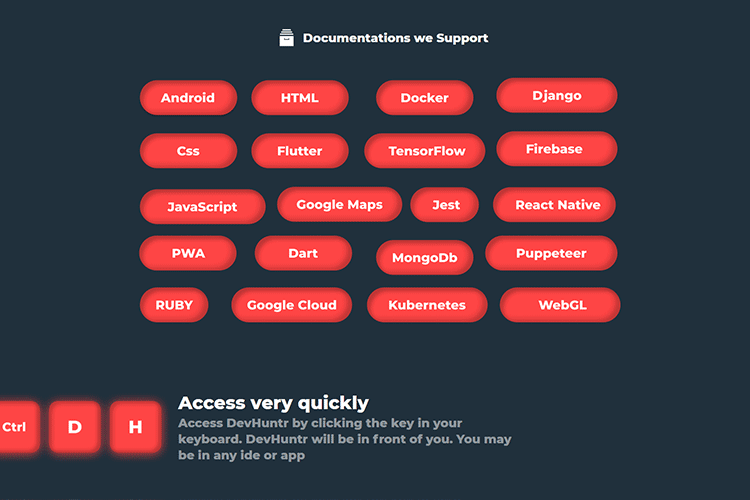
DevHuntr – Quickly search through repos, documentation and more with this handy tool.
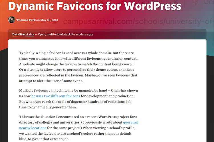
Dynamic Favicons for WordPress – Generate as many different favicons as you’d like with the help of PHP and SVG.
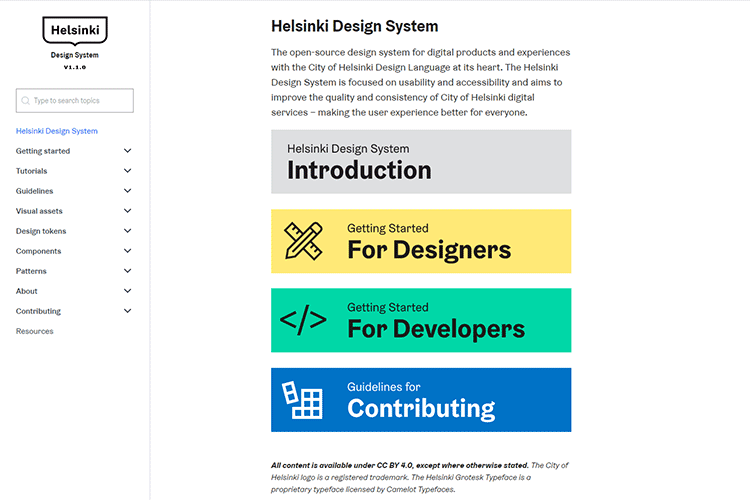
Helsinki Design System – This open-source design system is focused on usability and accessibility.
Idiosyncrasies of the HTML parser – An eBook that covers the many strange behaviors of the HTML parser.

Fabius – Free Resume WordPress Theme – A free one-page resume WordPress theme which would be perfect as the personal portfolio of any digital professional.
Why Web Design Is Never Simple – Exploring some ways to both understand and communicate the complexities of a well-built website.

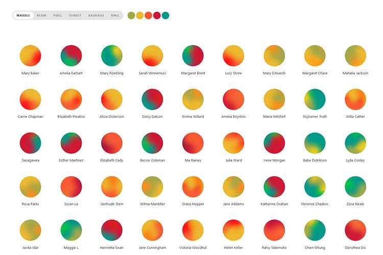
Boring Avatars – A tiny JavaScript React library that generates custom, SVG-based, round avatars from any username and color palette.
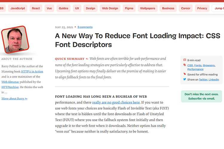
A New Way To Reduce Font Loading Impact: CSS Font Descriptors – How upcoming font options may finally deliver on the promise of making it easier to align fallback fonts to the final fonts.
25 Years of CSS – Eric Meyer looks back at his first experience with CSS – way back in 1996.

Getting Past the Limitations of Your Design Skills – Explore reasons why designers can hit creative stalemates and what can be done to get past their limited design skills.

Giving a damn about accessibility – Make accessibility a priority with the help of this practical handbook.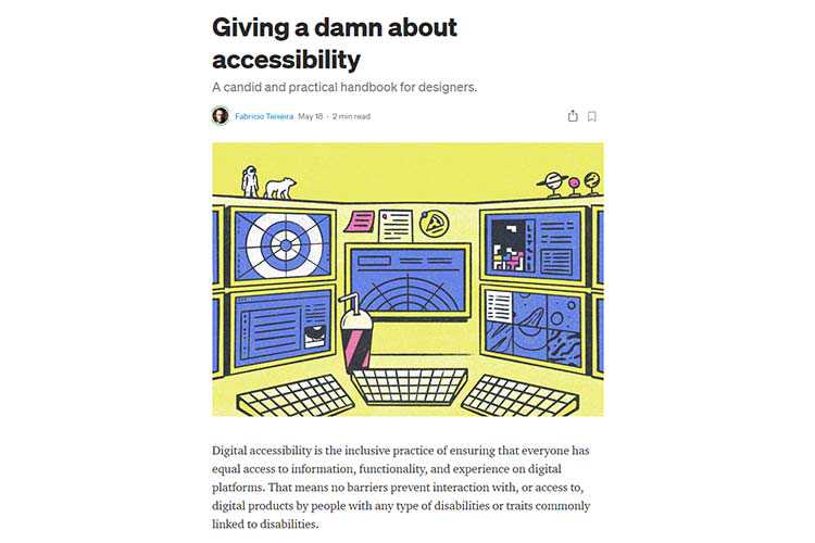
Portfolio Air Free WordPress Theme – A free lightweight portfolio WordPress theme for creatives with a clean and minimal style, and smooth user experience.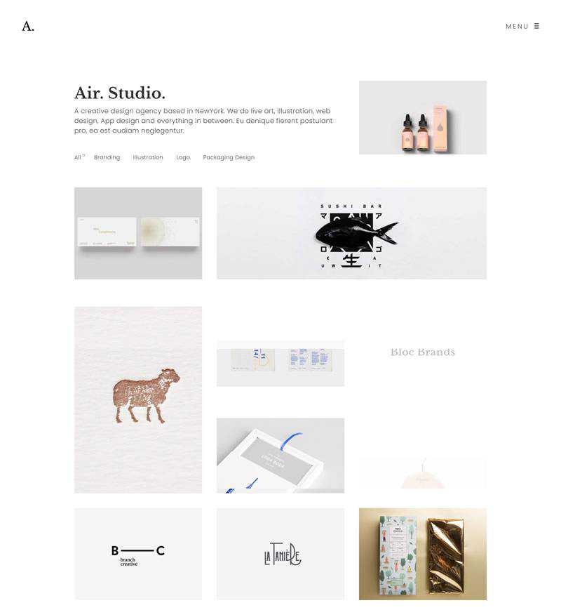
vanilla-extract – Write your styles in TypeScript (or JavaScript) with locally scoped class names and CSS Variables, then generate static CSS files at build time.

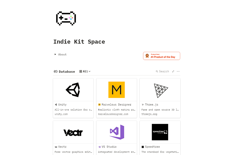
Indie Kit Space – A curated resource of tools for indie artists, designers and game developers.
Inspiring Examples of Brand-Related Splash Screens in Web Design – Check out some prime examples of websites that make use of splash screens highly effectively.

UI & UX Micro-Tips: Volume Five. – Tiny changes can make a big difference. Dive into this selection of easy to put into practice UI & UX micro-tips.

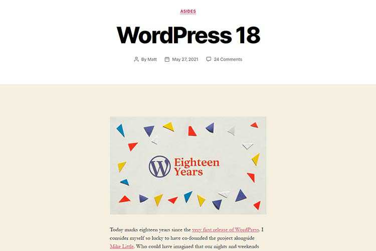
WordPress 18 – WordPress co-founder Matt Mullenweg shares his thoughts as the CMS turns 18 years old.
The Cat’s Meow: 8 CSS and JavaScript Code Snippets Celebrating Our Feline Friends – Get your paws on this collection of code snippets that celebrate cats.

The post Weekly News for Designers № 595 appeared first on Speckyboy Design Magazine.
After many years of a tidy, white-space filled design on WordPress.org/news it’s time to bring new life to the way we present our content. So much has changed since this site was first created: the people who read it, the type and variety of what is published, even the way WordPress works has changed.
Which means it makes sense to change our theme.
Earlier this year, Matt requested a new design from Beatriz Fialho (who also created the State of the Word slides for 2020). The design keeps a clean, white-space friendly format while incorporating a more jazzy, playful feeling with a refreshed color palette.

More detail on this modern exploration have been posted on make.wordpress.org/design. I encourage you to stop by and read more about the thoughts behind the coming updates; and keep an eye out for the new look here and across WordPress.org!
In this episode of "PHP Internals News" I chat with Nikita Popov (Twitter, GitHub, Website) about the "Deprecating Ticks" RFC.
The RSS feed for this podcast is https://derickrethans.nl/feed-phpinternalsnews.xml, you can download this episode's MP3 file, and it's available on Spotify and iTunes. There is a dedicated website: https://phpinternals.news
Hi I'm Derick, welcome to PHP internals news, a podcast dedicated to explaining the latest developments in the PHP language. This is episode 87. Today I'm talking with Nikita Popov about a much smaller RFC this time: Deprecating Ticks. Nikita, would you please introduce yourself.
Hi Derick, I'm Nikita, and I'm working on PHP core development on behalf of JetBrains.
Let's jump straight into what this RFC is about, and that's the word ticks. What are ticks?
Ticks are a declare directive,. You write declare ticks equals one at the top of your file, and then PHP we'll call a tick function after every statement execution. Or if you write ticks equals two, then as we'll call it the function after every two statement executions.
Do you have to specify which function that calls?
Of course, so there is also a register tick function and unregister tick function and that's how you specify the function that should be called rather the functions.
How does this work, historically, because the RFC talks about the change being made in PHP seven?
Technically ticks work by introducing an opcode after every statement that calls the tick function depending on current count. The difference that was introduced in PHP seven is to what the tick declaration applies. The way PHP language semantics are supposed to work, is that declare directives are always local. The same way that strict types, only applies to a single file, ticks should also only apply to a single file. Prior to PHP seven, it didn't work out way. So if you had declare ticks, somewhere in your file, it would just enable ticks from that point forward. If you included the different file or even if the autoloader was triggered and included a different file that one would also make use of ticks. That was fixed in PHP seven, so now it is actually file local, but that also means that the ticks functionality at that point behaviour became, like, not very useful. Because usually if you want to use tics you actually want them to apply it to your whole codebase. There are ways around that. I'm afraid to say that people have approached me after this RFC and told me that they actually do that. The way around that is to register a stream wrapper. It's possible in PHP to unregister the file stream wrapper and register your own one, and then it's possible to intercept all the file includes and rewrite the file contents to include the declare ticks at the top of the file. I do use that general mechanism for real things in other places, but apparently people actually use that to like instrument, a whole application with ticks, and essentially restore the behaviour we had in PHP 5.
What was the intended use case for ticks to begin with?
Well I'm not sure what was the intended use case, but at least it was the main use case, and that's signal handl
Truncated by Planet PHP, read more at the original (another 10264 bytes)
Working with clients is always an adventure. Whether it’s last-minute changes to a project or design politics, there’s plenty to keep web designers on their toes. And you never quite know when the next surprise will rear its head.
One thing you can count on, however, is that there will come a time when a client has trouble (real or perceived) with their website. This could be the result of an actual problem or a simple misunderstanding. Either way, it can seem impossible to replicate or track down the source.
It’s what I like to call “unexplained website phenomena”. The phrase may conjure up images of UFOs and other assorted science fiction scenarios. That’s fitting, as there is a tinge of the paranormal to these issues. For example, a client sees something that you can’t. Or a blog post they were working on vanishes without a trace. Spooky, right?
And just like a good sci-fi thriller, these types of problems are never quite what they seem. For web designers, it means looking past the rhetoric (and maybe even panic) in a quest to put things right again.
So, put on your space helmet as we look at ways to help your clients unravel these mysteries. We’ll even count down some of the most common of these “stranger things”.
The first step in our mission is to find out what exactly a client is experiencing. If your client is fairly tech-savvy, this part might not be so bad. They might point you towards an error message or some other clue that lets you move on with the investigation.
But if they’re decidedly not a friend of technology, things get harder. Much like encountering beings on a strange planet, you may not speak the same language. In that case, you’ll want to ask a lot of probing questions:
Of course, there are all sorts of questions to ask. And some things might be assumed based on the situation. The goal is to understand what went wrong, or at least what your client thinks may have gone wrong.

With some basic information now in hand, we can turn our attention to experimentation. That takes the form of retracing a client’s steps to try and reproduce the reported problem. What, were you expecting a spacewalk?
Sometimes you’re fortunate to reproduce an issue in a way that leads you right to a fix. But since we’re talking about unexplained website phenomena, that’s more the exception than rule.
So much can depend on a user’s choice in web browser and operating system. Not to mention the possibility of browser extensions or security software that could be interfering with their ability to perform certain tasks.
That’s why attempting to replicate an issue can be so difficult. One system’s configuration may cause errors, while others seem to work just fine.
Timing can also play a factor. Your client could have attempted to do something right as a server or connectivity problem occurred. A temporary DNS outage can also wreak havoc.
If retracing a client’s steps doesn’t yield results, these other factors need to be considered.

Every website related problem has a cause. Yet it’s not always clear why something went haywire. Those times are by far the most difficult to explain to a client.
Technology is so often about having concrete answers. If the data says this, it must mean that. This what web designers are developers are used to talking about. When things aren’t so cut-and-dry, it’s hard to know what to say.
About the best you can do is report back with a truthful answer: You don’t know why this terrible/annoying/inconvenient thing occurred. Perhaps it sounds a bit pathetic, but better than the alternative of making something up.
That said, it’s still acceptable to speculate. Along with your “I don’t know” monologue, you could include a list of possibilities. This will at least provide a client with something to think about. And you won’t have to suffer the shame of a failed mission.

What would the web design life be without a little mystery and intrigue? Let’s take a look at a few of the more common gremlins that invade our Zen and put us into battle mode:
Cache can be a beautiful thing, as it helps to make your website lightning quick. But it can also be the cause of many unseen issues. As in, your client can’t see the update you just posted – because they’re viewing an older version of a page that’s stuck in cache.
It’s also a bit of an intergalactic shapeshifter, in that the offending cache could be stored locally or on the server. Either way, its spell must be broken (er, cleared).
Even the smallest of JavaScript errors can be dangerous. All it takes is a single outdated piece of code to cause usability issues. Whole sites can be rendered a buggy mess due to a library update or even a simple typo.
For clients, JavaScript is downright stealthy. All they see is a broken website – never really knowing what caused the issue. Thankfully, we have the browser console to help us squash any bugs that arise.
Wonky hosting can bring even the most elegantly-built website to its knees. Prolonged downtime is awful, but intermittent problems are even worse. For example, those few error-prone seconds when your client was trying to save a post or upload a file and – crash.
The unpredictable nature of such problems can make them hard to track down. Why, it might even lead you to chalk it up as one of the unsolved mysteries of the universe.

If anything, the web can be an extremely unpredictable place. And while web designers may be used to navigating this hazardous black hole, our clients usually aren’t. Therefore, they often have a different reaction when facing issues with their website.
Clients won’t always know, for example, to look for specific error messages. And they may not realize the impact software, such as an outdated web browser, can have on their user experience. Accurately communicating what they’re seeing and doing is also a challenge.
Providing a fix is often a matter of picking out the most useful bits of information you can gather. From there, it’s about trying to piece together enough clues in order to reproduce a problem. Sometimes it works, other times luck won’t be on your side.
You probably won’t have an answer every single time. That’s OK. It’s a great big web out there. As such, some things are just unknowable.
The post Helping Your Clients with Unexplained Website Phenomena appeared first on Speckyboy Design Magazine.
It’s really fun to contribute to something larger than yourself.
Matt Mullenweg’s words in “The Commons of Images” episode of the WP Briefing podcast exemplify the core philosophy of the WordPress project, especially as we inch closer to the next major release (version 5.8). This post covers exciting updates from the month of May.
WordPress celebrated the 18th anniversary of its launch on May 27, 2021. To celebrate 40+ releases and WordPress’ support of 40% of the web, the team released 40 milestones to celebrate the anniversary of the software. Here’s to the next 18 and beyond!
Creative Commons Search has officially joined the WordPress project. Creative Commons Search (CC Search) is a CC0 image search engine with over 500 million openly licensed images. The search product, which is being renamed to Openverse, will eventually live on the URL: https://wordpress.org/openverse. Contributors working on CC Search will continue their work as part of a new dedicated Make team: https://make.wordpress.org/openverse. Check out “The Commons of Images” podcast episode for more information.
WordPress version 5.7.2, a short-cycle security release, came out on May 13. Get the latest version directly from your WordPress dashboard or by downloading it from WordPress.org.
Want to contribute to WordPress core? Check out the Core Contributor Handbook. Don’t forget to join the WordPress #core channel in the Make WordPress Slack and follow the Core Team blog. The Core Team hosts weekly chats on Wednesdays at 5 AM and 8 PM UTC.
Gutenberg version 10.6 and version 10.7 were launched this month. Version 10.6 features experimental Duotone filters (which are shipping with WordPress 5.8), block pattern suggestions in placeholders, and enhancements to the table block. Version 10.7 adds a responsive navigation block, block design tools, and the ability to load block patterns from the directory.
Want to get involved in building Gutenberg? Follow the Core Team blog, contribute to Gutenberg on GitHub, and join the #core-editor channel in the Make WordPress Slack. The “What’s next in Gutenberg” post offers more details on the latest updates. If you are unfamiliar with the Gutenberg plugin, learn more in this post.
Don’t miss the latest Full Site Editing (FSE) Outreach program testing call on building portfolio pages using the Template Editing feature shipping with WordPress 5.8! The deadline is June 9. The team has published a recap of the Query Quest FSE Testing call, which shares some interesting results. The answers to round two of FSE questions are also out.
The countdown to one of the most anticipated WordPress events, WordCamp Europe 2021 (Online), has started! The full schedule of the event is now available, and the team has exciting plans! Don’t miss this event: get your tickets now before they run out!
Have a story that we should include in the next “Month in WordPress” post? Please submit it using this form.
The following folks contributed to May’s Month in WordPress: @meher and @chaion07
Dough. Apples. Sugar. Spices. These are all the ingredients you need to make a classic apple pie. Some recipes will call for extra ingredients to make things extra fancy, but none of those ingredients are necessary to create the delicious, simple, comforting dessert we all know and love.
Why am I talking about pie on a design website? Well, because I think that designers, of any kind, can learn a lot from bakers who skip over the fancy trimmings to give people what they want most – an uncomplicated plate of minimalist goodness.
Apple pie has endured through the years because it’s something people easily understand. In the same way, a simple, classic design that doesn’t require your audience to think too hard to understand the message will still be relevant after years of fancy fluff and bad trends have come and gone.
Apple pie is something you can’t really mess up – unless you start adding things that don’t really need to be there. It might not be easy to create the perfect design, but simplifying your “recipe” of features and information is one of the most important steps toward creating the best user experience possible.
The best recipes for apple pie, in my opinion, are the ones that keep things basic. In culinary terms, this allows the flavor of the main ingredient – apples, in this case – to shine. The apples are the “selling point,” so to speak. When you sit down to design a website, flyer, or brochure, make sure your audience knows exactly what they’re looking at.
In America and most of Europe (with a few exceptions), apple pies are covered with a crust. This crust is traditionally either flat or plaited into a lattice, and it sends a signal to hungry folks that the fruit they’ll find inside is probably going to be apples.
Make sure your selling point in a design is as clear as the apples in a pie. Determine exactly what your users are looking for and what they want. Ask them, if you can. The more testing you can conduct before publication, the higher your probability of creating a design that speaks to your users’ specific needs.

If, for example, you’re designing a clothing website, do your users want to search based on the types of clothing (shirts, dresses, shoes, etc.) or the types of materials (silk, cotton, leather, vinyl)? The only way you’ll know the answer for sure is if you ask.
Getting feedback from friends and acquaintances is a time-honored way of gathering “market” research in the initial stages of a design. Ask them specific questions about their experience – is something missing that they’d like to see? Can they digest the information they need clearly and without any assistance? If you’re bound by confidentiality agreements (or you have no friends), it’s perfectly acceptable to ask your client to produce this research for you or enable you to do it yourself.
This will probably be a terrible pun/cliche combo for both this article and this topic (forgive me), but Apple is the leader in the area of simple design and streamlined user experience. The Apple website and store are specifically designed to lead you, the user, through the buying experience with as little hassle and stress as possible.
The product images are big; the text is short and obvious. Additional information is available at the click of a mouse, but if you don’t click the links, you never need to worry about it. You’d better believe that the web design department at Apple spent hundreds of hours figuring out the things their users wanted – and needed – to see in order to complete the sale. And well, cliches just mean that something is extra-extra true!

There are plenty of things you can put on top of a pie: ice cream, sugar, whipped cream, syrup, cookies, cherries – the list goes on and on. Some people might think this makes the pie taste better, but in my opinion, if you have to add that many extra things to your pie to improve the taste, you’re starting from the wrong end of the plate.
Similarly, extra bells and whistles usually only serve to clutter up a design and obscure the fact that it wasn’t very good to begin with.
I’m not saying you should never add, say, an extra column, widget, or typographic treatment if you really need to, or even just really want to. But it’s important to start with a good “base.” Make sure the fundamental message of your design gets through loud and clear. Don’t give your users extra options they don’t need or aren’t looking for.
Don’t make it harder for them to get to where they need to go. Make your users’ main goal your top priority, and add in the “toppings” only once you’re sure the main event is a treat. And hey, toppings can be delicious. My favorite is apple pie à-la mode!

You know what they say: if your Grandma can’t figure out how to navigate through your design, it’s too complicated. Elderly people tend to have less patience, ability, or desire to sift through tons of unnecessary information. That makes them perfect starting points for determining exactly what’s needed for your design and what’s simply taking up space.
Let’s say, for example, that you’re testing a design for a web template store. Is your objective clear (instant download of PSD files)? Will it be easy for your customers to find exactly what they’re looking for? Is the font size large enough for most people to read? Is there too much text? Too many ads? Is the shopping cart/payment method simple to find and navigate through?
Simply put: is there anything standing in the way of your user getting exactly what they want? If so, Grandma might just get up and head down to the record store. (Assuming there still is one in her neighborhood!)
Remember to run your design past your grandmother (or your uncle, your great aunt Matilda, or anyone who’s not so “tech-savvy”) and see if she gets it. If so, perhaps she’ll bake you a nice apple pie!
The post How Simple, Classic Design Should Work appeared first on Speckyboy Design Magazine.