Is your ecommerce store loading slowly? Has your product line outgrown your website’s capabilities? Is your business falling behind its competitors? It may be time to move to a new ecommerce platform.
In this ecommerce platform migration guide, we’ll cover everything you need to know about moving your site to a new platform, including:
What ecommerce platform migration is
Deciding whether to migrate your ecommerce site
Choosing an ecommerce platform
Deciding whether to migrate your site yourself or work with a third party
Steps for migrating your ecommerce site to a new platform
Ecommerce platform migration, also called ecommerce replatforming, is the process of transferring your ecommerce website from one platform to another.
You might transfer your site from one website builder, such as WordPress or Shopify, to another. You could also move your site from an ecommerce platform to a custom-built site or vice versa.
Should you migrate your ecommerce site?
Why do businesses switch their ecommerce stores over to new platforms, and is this something you should do?
Migrating your site is a big decision. It can be expensive and require significant time and effort. It also comes with risks and requires a transition period while your team learns how to use the new platform and you work out any bugs with your new site.
However, staying with a platform that isn’t working for your business can be much more costly in the long run.
You’ll need to weigh the costs and benefits of migrating your website to determine if it’s worth it for you.
Here are some of the reasons you might need to upgrade to a new platform.
Poor performance: If your site isn’t performing well due to the platform it’s on, you may need to upgrade it. Perhaps your site loads too slowly, or you experience frequent technical difficulties.
Outdated technology: Technology changes rapidly, and if you’re using an old, outdated platform, you may need to upgrade to keep up with the competition, especially if your site is missing important modern features.
Business growth: As your company, sales, and product line grow, you might find that your old platform isn’t powerful enough for your needs.
Opportunities for increased efficiency: Consider migrating your site if a new platform would give you significant improvements in efficiency, whether through additional automation capabilities, enhanced analytics, or simpler content management.
Evaluate the benefits your company will gain in the above areas. Then, compare those benefits to the costs, including:
The platform you choose to migrate to is, of course, a crucial decision in the ecommerce replatforming process. You need to pick the right platform to make the changeover worthwhile and ensure you get the most value from your ecommerce platform migration.
Consider factors such as the following when choosing a new ecommerce platform:
Input from multiple stakeholders: Talk with various stakeholders and departments and find out what they want from your website’s ecommerce platform.
Platform features and capabilities: Compare the features and capabilities each platform offers and look for those that best fit your company’s needs.
Compatibility and integrations: Make sure the platform you choose integrates well with any other tools you currently use and can work with any you plan to use in the future.
The capabilities of your team: While it will always take some time to set up and learn a new platform, try to choose one that matches reasonably well with your team’s knowledge and abilities.
Long-term outlook: Take a long-term view when choosing a new ecommerce platform. Select one that will meet your needs well into the future and one that’s likely to keep up with changing technology.
Customer support: Consider the quality and accessibility of each platform’s customer support.
Should you migrate your site yourself or work with a third party?
One important question to consider when it comes to ecommerce platform migration is whether to complete the migration yourself or hire professionals to assist you.
If you choose to complete the site migration yourself, you’ll need to dedicate sufficient time to planning your migration. You must carefully prepare for and execute the changeover to avoid losing data.
Consider how comfortable and experienced you and your team are with the tasks required, such as setting up a new site, backing up data, and transferring data to the new platforms.
If you don’t feel comfortable completing the migration yourself or would rather leave it to the professionals and spend your time elsewhere, hiring a data migration company is an excellent option.
Some companies that perform data migration services can also help you design your new site. You might choose to hire a web designer and transfer the data yourself or work with one company that can handle the whole process.
Team of Experts Crafting Dazzling Designs
Collaboration is in our DNA at WebFX and your web design project benefits from dozens of subject matter experts working together on your site.
Project Manager
q/a
seo
content research
designer
developer
site speed
copywriter
editor
Steps for migrating your ecommerce website to a new platform
What steps should you follow when migrating your ecommerce website to a new platform? Take a look at this ecommerce migration checklist and read about each step in our ecommerce platform migration guide in more detail below:
Outline the steps of your ecommerce platform migration
Catalog your existing content
Design your new site
Back up your data
Migrate your data
Connect plugins, email, and other tools
Test your website
Launch your new site
Communicate your migration to existing customers
Monitor your results
Outline the steps of your ecommerce platform migration
Ecommerce replatforming requires careful planning. The first step of the process is outlining everything your migration will include.
What changes will you make to your site? Are you moving everything over exactly as is, or are you going to alter your site’s navigation, product categorization, or other elements? Consider creating an ecommerce migration checklist to assist you with the transition.
Also consider the following factors:
Domain: Make sure you have access to your domain That way, if you’re changing your website’s host, you can point your domain name server (DNS) record to the correct servers.
Secure sockets layer (SSL) certificate: Also check on your SSL certificate to make sure you can transfer it to your new server and that it will be compatible.
URLs: Will your URLs change after you migrate your site? If they do, you’ll need to set up 301 redirects. It’s crucial to complete this step correctly to avoid losing search engine rankings and to make sure users who access your new site via links get to your new pages.
Catalog your existing content
To successfully move everything over to your new site, you must organize all the content you want to move over from your old site.
Create an outline showing all your pages and where they’re located on your site. This list will help you keep track of all your content as you move it over to the new platform.
Design your new site
Before you can start moving your data, you’ll need to have the design for your new site ready. Design your site with your new platform in mind and set it up on a staging site — a website that isn’t live where you can test your new design.
Back up your data
Before you start migrating any of your data, make sure you back up your site. You’ll be happy you have a backup of the most recent version of your website if something goes wrong during your ecommerce data migration.
Migrate your data
Next, you can start migrating your data. Begin by migrating part of your site and test it to make sure everything works correctly. If it does, you can continue your ecommerce data migration.
You can use a file transfer protocol (FTP) agent such as FileZilla to transfer static files. If you have a dynamic site that runs on a database, you can import your database to your new web host or platform.
If the new platform’s structure is different than that of your old platform or you want to change your content, the migration process will be more involved. You’ll either manually reformat and move your data or have a developer write a custom script that automatically reads and reformats the data across platforms.
You may need to map out a separate migration process if you keep customer accounts or order histories on your current platform.
Connect plugins, email, and other tools
Once you’ve migrated your content, you can start connecting any other tools you use on your site, such as your checkout platform, chatbot service, shipping platform, and email.
If your email is hosted on your old platform’s server, you’ll need to set up your new email and have mail forwarded from your old account to the new one. Before moving your email account, back up the account, including your contacts and messages.
Test your website
Testing is essential throughout the ecommerce replatforming process. Thoroughly test pages, site elements, and functionalities as you move them over to your new site.
Some important elements to test include:
Your website’s key pages
Product filtering and search functions
Website navigation
Checkout process
Email
These are just a few examples of the items you should test during your ecommerce platform migration. Your testing should be as comprehensive as possible.
Launch your new site
Once your content is moved over to your staging site and everything is set up, you’re ready to launch your new website. Ideally, you’ll want to launch your site at a time when few customers are online, such as late at night or early in the morning.
Once you launch your site, check your most important pages to ensure they’re working correctly and double-check that your robots.txt file allows search engines to crawl your site. Also, verify that you’re receiving form completion and checkout notifications.
Any time you make a major change to your website, you’ll likely encounter bugs. Be prepared to fix these issues quickly to make the transition as smooth as possible. Keep a backup of your old site in case anything is missing on your new site.
Communicate your migration to existing customers
You’ll also want to let your top customers know about your ecommerce platform migration. They’ll appreciate being kept in the loop, and it will keep them from getting confused when they see your site and it looks different than usual.
Monitor your results
An essential final step in our ecommerce platform migration guide is monitoring your results. In the months following your ecommerce replatforming, keep an eye on your website’s traffic, search engine rankings, conversions, and other metrics using tools like Google Analytics, Google Search Console, and MarketingCloudFX.
It’s normal to see a dip in metrics like rankings and traffic immediately following your migration, but if you completed the migration correctly, your site should recover over time.
Measuring what matters most
Are you interested in custom reporting that is specific to your unique business needs? Powered by MarketingCloudFX, WebFX create custom reports based on what you care about most.
Leads
Calls
Transactions
Revenue
Maximize your ecommerce platform migration’s benefits
Ecommerce platform migration is a huge job, but if you plan your process carefully and follow this guide, you’ll be on your way to success.
With 94% of first impressions relying on web design, you must create a beautifully crafted website for your business. But when you get started with web design, you may not know what approach to take with your website. What types of web design are best for your business?
Luckily for you, we’ve got all the answers. Keep reading to learn about six types of web design and the pros and cons of each. Plus, we’ll cover the different types of websites you can create, so you can determine which one is best for your business!
Need some marketing inspiration? Join 150,000+ savvy marketers by subscribing to our email newsletter for the latest tips and tricks!
We don't just want to tell you about the beautiful work we do.
Ready to build your website but aren’t sure which web design format is best? Here are six of the most common web design layouts for your business and the pros and cons of each.
Web design format #1: Static page layout
One of the most basic types of website design is static page layout. With this layout, you build a website with pre-set page dimensions — it has a permanent width. Static layouts stick to these dimensions, regardless of the browser or device type.
Static layouts have phased out with the rise of mobile usage. Since these sites don’t adapt to devices, they don’t provide a positive user experience on smartphones or tablets. While static layouts are still an option, you typically don’t want to use them unless you’re creating a completely separate mobile version of your site.
Pros of static page layout:
Easy to set up
Cons of static page layout:
Not responsive to devices or browsers
Requires creating a separate mobile site (more work)
Web design format #2: Liquid design layout
Next on this list of types of website design is liquid design layouts. This layout, also known as fluid design, uses flexible units rather than the fixed units static layouts use. Since the units are flexible, the page will always fill the width of the device’s screen, regardless of what device it is.
Because user experience is critical to your site driving and engaging traffic, liquid layouts have also started to phase out as a viable option for businesses. While you can still use this layout, you risk delivering a poor user experience from your site stretching too far or squishing information together on the page.
Pros of liquid design layout:
Easier to set up than responsive design
No information gets cut off on pages
Cons of liquid design layout:
If a browser is really wide, information gets stretched to fit the screen and can look unappealing
If a browser is smaller, information gets smooshed together to fit the screen, making it difficult to read and browse
Web design format #3: Adaptive website layout
One web design format you can use for your site is adaptive website layout. As the name implies, this website uses CSS queries to adjust the website’s size to detect the size of the browser. Adaptive websites will automatically alter the website’s layout to provide the best user experience for visitors.
With adaptive website layouts, there are set parameters for how a website will adjust. For example, a set parameter may look like this: “If the browser is 500 pixels wide, set the main content container for 400 pixels wide.”
For example, if you have a website with a two-column layout, the adaptive layout would change into a single-column design on a small browser screen.
Pros of adaptive website layout:
Easy to set up
Takes less development time than responsive layouts
Can adjust your website according to each browser size
Cons of adaptive website layout:
Device widths in between set points can cause your site to have too much space or not enough space
Isn’t fully responsive
Web design format #4: Dynamic website layout
When you’re looking at a list of the types of web design, you’ll see that the dynamic website layout is an option. Dynamic website layouts are great for people who don’t have extensive HTML knowledge. These websites can deliver different content to website visitors, even if two separate people look at the same page.
With a dynamic website layout, you build a database of information and features. Then, when a user requests a page, the web coding automatically works to put the components together from your database to form the webpage.
Pros of dynamic website layout:
Interactivity with users
Increased functionality for users
Less coding skills required
Cons of dynamic website layout:
Can be more complex to set up with different functionalities
Tend to load slower because of all the different elements and page compositions
Web design format #5: Responsive design layout
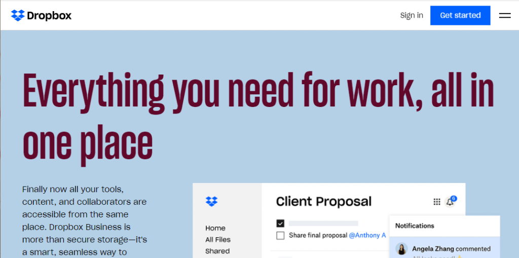
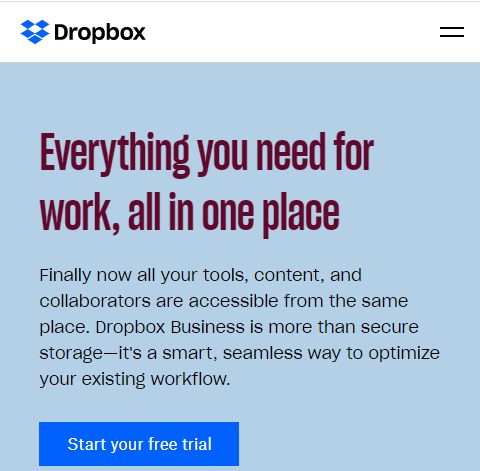
Next on our list of types of website layouts is responsive design layout. This layout format is the most popular type, as it allows your site to accommodate all devices and fill the browser size perfectly.
Responsive design is built with a mobile-first approach. You create your mobile layout first, and then you expand your website for bigger browser sizes. So instead of trying to trim down your website and make it smaller, you start small and build it bigger.
You can see a great example of responsive design from Dropbox. Here’s how their site looks on a large desktop browser:
When you look at it on mobile, the entire site is adjusted to fit the mobile browser size, which delivers a great user experience.
Pros of responsive design:
Get a website that’s built for mobile users
Delivers a seamless experience on all devices
Don’t have to build a separate mobile site
Cons of responsive design:
Takes more time to build and develop
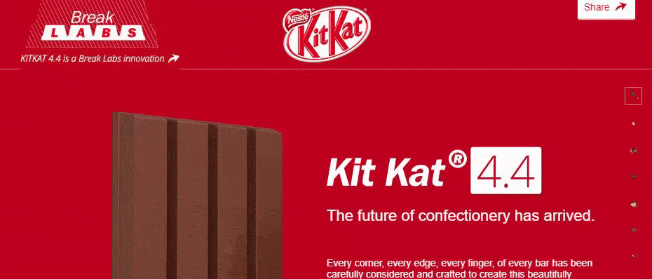
Web design format #6: Single page layout
The last item we’ll cover on our list of types of web design is a single-page layout. As the name implies, single-page layouts use only one page that users scroll down to find information about your products or services.
With this design layout, you can have a “navigation menu” with links to specific points of your page. KitKat is a great example of this single-page layout.
Pros of single-page layout:
Easy to create
Can help you create a clean and simple website
Cons of single-page layout:
Cannot be used for businesses that sell products online
Cannot be used for companies that need multiple pages
Can deter people away if the single page is too long and requires too much scrolling
Types of websites: 4 types of websites you can create
In addition to narrowing down your list of types of website layouts to the best one, you also must determine what kind of website you need to create for your business. Every business has different needs, which means your site type may differ from others.
Here are four types of websites you can create for your business:
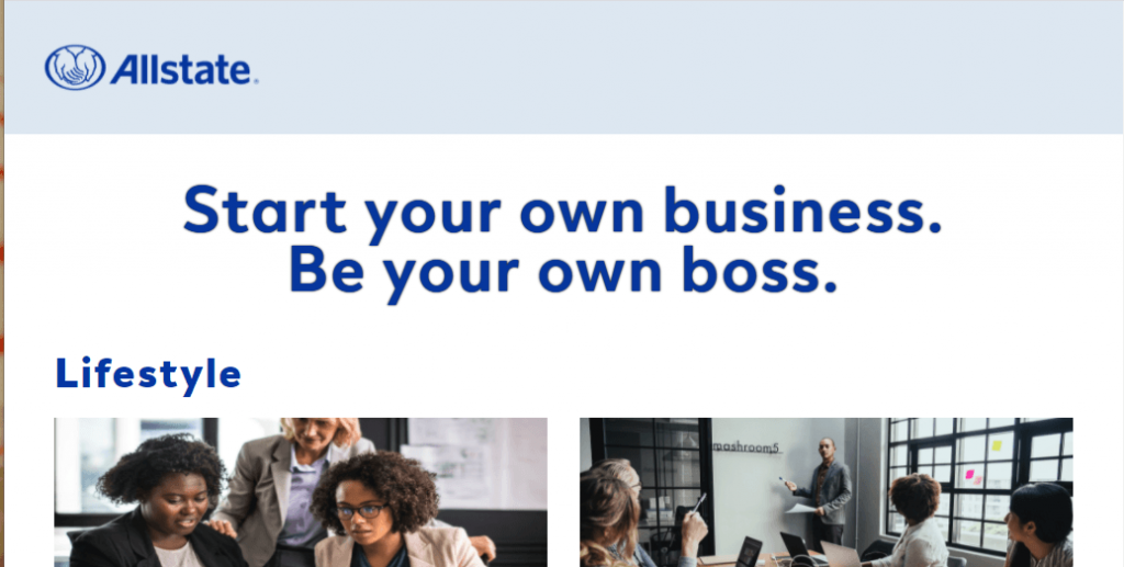
1. Blogs
First on our list of types of websites is blogs. Blogs are websites that share helpful information with readers about topics in their industry.
While a blog may not be your company’s primary website, you may consider creating a blog site if you’re doing content marketing. Content marketing is a crucial strategy for helping your business grow online and build trust with your audience.
You may consider having a separate blog website, like Allstate, or integrating it into your core website to help you take advantage of the benefits of content marketing.
This website type can use any type of web design format, except for single-page layouts. The best types of web design layouts for this website type are adaptive and responsive.
2. Ecommerce websites
Another type of website you can create for your business is an ecommerce website. This website type is best for your business if you want to sell products on your site.
Ecommerce sites are built to host product pages, add products to a cart, and complete transactions. If you’re looking to sell products, this website type is best for your business.
In terms of the best types of web design for an ecommerce website, responsive and adaptive are most suitable for an ecommerce site.
3. Business websites
Another type of website you can create is a business website. A business website is a standard site — it contains information about your company and the services you offer. If you don’t sell products online, you may also build a business site just to showcase what you offer.
These sites are simple and serve as a hub for people to learn about your business. You can use this website type if you’re not selling products on your website.
For a business website, you can use any of the types of web design listed above — you’ll want to choose the ones that help you deliver the best experience for your audience.
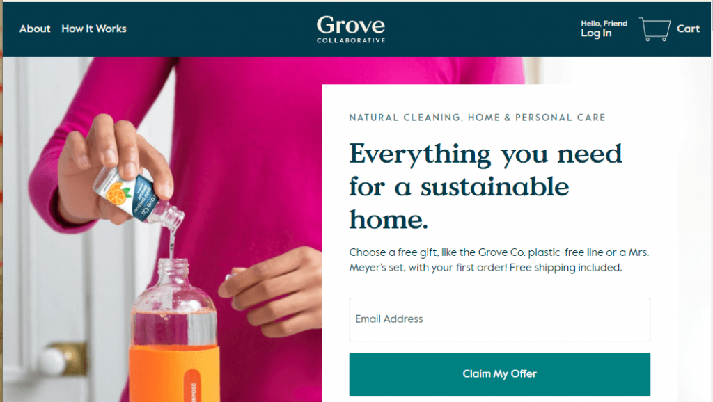
4. Membership websites
The last type of website you can create is a membership website. With this website type, you have a paywall for people to enter. Only people who have a membership can enter your site and see your products.
Grove.co is a membership website example. You must create an account and pay the membership fee to see all their products.
If you want to use this website type, you can use two types of web design layouts: adaptive or responsive. These layouts will work best for hosting products for members.
Need help figuring out which type of web design is best for you?
With so many types of web design available, it’s challenging to know which type is best for your business. If you’re feeling overwhelmed with building the best website, WebFX can help you create a beautiful web design for your business.
We’ve designed over 1000 websites and won dozens of awards for our website design. Our team of over 300 marketing experts can help you craft a beautifully designed website that delivers the best experience for your audience.
The act of clicking around a multipage website can become monotonous over time. Adding page transition effects to the mix can help to kick things up a notch. They’re great for keeping the user’s interest as new content loads while maintaining a minimal impact on performance.
With that in mind, here are 10 examples of page transitions that can add a little something special to your next project:
Vue.js Variety
With the help of the Vue.js framework, the examples here sport a quick and slick set of transitions. There’s a nice mix here of basic transitions (fade, zoom) and a few that are a bit unique compared to what we normally see (flipX, flipY and slideUp).
Intentional or not, this transition is reminiscent of an old CRT television being turned off. The colored background shrinks down to a single line, much like what my old TV did after a night of watching MTV (when they still played music, that is). Then, the transition finishes off by reversing the effect (as my TV did when I woke up the next morning).
A circular SVG is used in this transition to add a clock-like effect. The movement adds a cinematic quality that seems like a perfect fit for a multimedia site.
If you’re going to use page transitions in multiple places throughout your site, then they’d better be quick. That’s what is so cool about this example. There’s a colorful animated preloader that quickly makes way for the content to reveal itself. It’s interesting to look at while not wasting precious time.
This is quite a unique effect, as clicking a thumbnail image transitions to a modal using that very same image as a full-screen background. The effect is a combination of CSS transitions and Angular.js.
A good old wipe effect has been a staple of TV and film transitions for decades. Here, we see a variation of it activated with CSS and a tiny bit of jQuery.
GSAP is a library that enables super-fast animations. This example utilizes it to create a “slide up” transition effect, along with some animated background fun.
With a cool “splash” effect, this responsive modal transition will certainly get a user’s attention. It’s quick, colorful, and fun. It’s built with Lottie, which brings Adobe After Effects transitions to the web.
There’s something about the dystopian glitch effect that is just timeless. Countless sci-fi shows and movies wouldn’t be the same without it. This example from nclud shows how they built a page transition with all kinds of glitchy goodness.
Imagine that each page on your site is a panel on a cube (or pentagon, or hexagon, etc.). Going to the next page is just flipping that shape around to show the correct panel. That’s kind of the point behind this rotating cube effect that utilizes jQuery and Velocity.js.
Page transitions have come such a long way in recent years. They’ve gone from simple fades and color changes all the way to effects that wouldn’t look out of place in a movie.
The combination of CSS, along with the right JavaScript library, can produce compelling visuals. When used responsibly, transitions can a fun way to enhance UX.
There are a number of reasons why WordPress has the biggest market share among content management systems (CMS). For some developers, it’s the massive ecosystem of available themes and plugins that draws them in. Others may cherish the opportunity to create their own custom addons.
The most common thread here is flexibility. WordPress is capable of powering virtually any type of website one imagines. Everything from a simple blog to an eCommerce shop and beyond are possible.
But, as with all technology, there is a certain level of responsibility that comes with using WordPress. It’s something to consider when choosing how you want to build a website. Because, while the CMS is capable of great things, there are scenarios where it may not be the right option.
Let’s take a closer look at some times when it may be wise to steer clear of WordPress – or any CMS, for that matter.
When There’s No One to Maintain the Website
As a designer who has inherited a number of WordPress websites, I’ve seen it before: a website was built several years ago and hasn’t been touched since. A client knows their website needs some work, but doesn’t realize the depth of the underlying problems.
There can be a myriad of issues involved. For one, severely outdated versions of WordPress core, themes and plugins. This is a potential nightmare in terms of security. And it’s not uncommon to find that a site in this situation has been compromised.
Upgrading the software isn’t always so straightforward, either. Some items may have been abandoned, or have to be updated a version at a time to avoid complications.
Unfortunately for the client, there could be a significant cost in cleaning this up. All because their website wasn’t properly maintained in the first place.
The trouble is, most website owners aren’t going to know about the importance of WordPress maintenance unless a designer informs them. Too often, designers simply hand over the keys without a whole lot of instruction. But even when they do, clients may either ignore the advice or forget about it.
The truth is that WordPress does need to be regularly maintained. For the sake of both security and functionality, updates need to be applied in a timely manner.
Therefore, if an organization doesn’t have anyone (or are unwilling to pay someone) to maintain their website, it may be better off not utilizing WordPress. In these situations, a static HTML website or even a managed proprietary CMS could be more sustainable options.
And yes, WordPress can be auto-updated. However, it’s still important to have someone knowledgeable regularly checking in on the site. Otherwise, something could break and be left that way indefinitely.
Your Project Doesn’t Need Content Management Functionality
Having new and ever-changing content is a great way to keep users engaged. Yet not every organization is going to make that commitment. Sometimes there’s no budget for original content, other times there simply may not be enough time to create it.
Of course, one of the key selling points of WordPress is the ability to create and organize content with ease. Whether that’s building a slick page layout in the Gutenberg block editor or adding an ongoing archive of recipes, this is what a CMS is built for.
But what if your project doesn’t require any of this? The traditional “brochure-style” website is still alive and well. Their purpose is to supply users with the information they need and way to get in touch. Beyond that, there may not be much call for the kinds of functionality a CMS provides.
In this case, implementing WordPress may be overkill. First, there’s the potential for higher startup costs – especially if a custom-built theme is involved. Then there are also the aforementioned maintenance requirements.
If there’s not much content and it’s not likely to change, a CMS is completely optional.
You (or Your Client) Have No Desire to Learn the Inner Workings of a CMS
Over its many releases, WordPress has made big strides in usability. It has had a keen focus on newcomers. But for some users the dashboard still offers a lot of clutter.
Even a website that looks simple enough on the front end can be complex behind the scenes. Users have to know where different types of content reside. Beyond pages and posts, there could be any number of custom post types implemented. Then there are plugins like photo galleries, sliders and shopping carts to navigate.
For a non-designer to manage content effectively within WordPress, it often takes some training. In most cases, I’ve found clients to be very receptive to learning. But there are also a few that have very little desire to dig in.
These folks may benefit more from a system that is dead-simple and more limited in scope. One that offers front-end content editing by default and has few settings to tweak.
WordPress offers users the world. However, it’s important to remember that some people prefer to stay within their own backyard.
With a Great CMS Comes Great Responsibility
In some ways, I feel a bit silly in discussing reasons not to use WordPress. After all, it’s a tool I use almost exclusively.
But I also think it’s healthy to talk about the responsibilities that come along with using it. While the software is free of charge, it does require a few things from us:
Regular maintenance;
A willingness to learn how to use it;
That may not seem like an awful lot. But in reality, it is a bridge too far for some people. And there are also times when the functionality WordPress offers just isn’t necessary. In those cases, there’s nothing wrong with adopting the simplest solution.
The ability to meet these minimum user requirements is a key to whether or not WordPress is right for your project. If they can’t be met, then you might want to look elsewhere.