A designer can never have enough fonts in their toolbox, especially calligraphy fonts that are all the rage now. Calligraphy fonts add a touch of elegance to any design project, not to mention they are also great for expressing personality and character.
Moreover, calligraphy fonts can be used in a variety of projects, from logos and branding to invitations, posters, and more.
The good news is that you can find tons of quality, free calligraphy fonts online that can be used in both commercial and personal projects. Start by browsing our selection of the best free calligraphy fonts listed below.
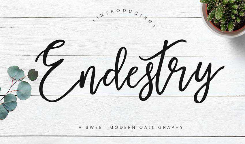
The Endestry font was designed by Creatype studio and features a great flow. It’s a perfect choice for logos and branding projects as well as letterheads, invitations, social media posts, and more.
The Billowing Script is a modern calligraphy font that was inspired by nature. It has a bouncy feel and features 243 glyphs and 64 alternate character along with stylistic alternates, standard ligatures, and other OpenType features.
The Naira Script is a great and free calligraphy font with bold strokes and many alternate characters and ligatures so you can truly add character to your designs. This font would be perfect for artists’ branding or to make your social media posts stand out.
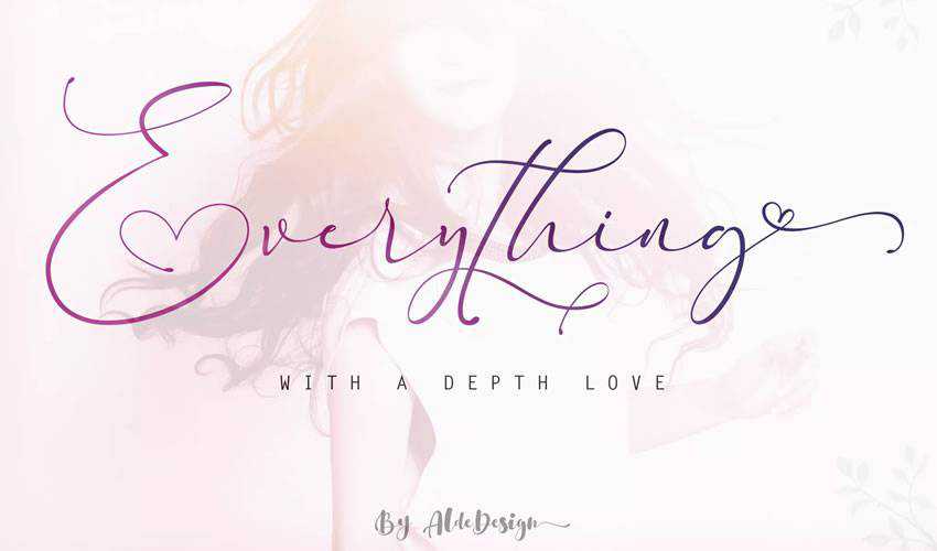
The Everything Calligraphy font features varying baseline which gives your art a bouncy and playful feel. This font comes free with your Envato Elements subscription and is a great choice for wedding invitations.
Try the Fabfelt Script font if you are going for a slightly vintage look. The font features neat characters and was designed by Despinoy Fabien. It can be used for personal and commercial purposes.
The Anjani font is another font that you can download when you subscribe to Envato Elements. The font features a modern and romantic look so it’s a good choice for wedding invitations, logos, t-shirt designs, and letterheads.
The Woodlands font is a brush calligraphy font with a slightly rugged look. It’s a great choice for any branding project that has to do with outdoors or nature-oriented products. It’s free for both personal and commercial use.
This font is another great choice if you’re looking for a versatile font. The Mustahe Brush Script font comes with three font styles which include script, rounded, and smooth. You can mix and match those styles to achieve a unique yet harmonious look for your designs.
Consider the Playlist font if you want a little variety in your designs. You’ll get 3 font styles which include script, ornament, and caps which you can mix and match to create a unique design. Playlist Free Font can be used in both personal and commercial projects.
The Rosnita font has a bouncy and flowy feel. With this font, you’ll get an elegant script and a sans-serif font. Pair those two together in your designs for a well-matched, yet unique look. The font would work well as a signature or accent font as well as a quote font for Instagram posts.
The Frutilla script was designed by Ianmikraz Studio and features an elegant and classic look. The font includes more than 250 glyphs and loads of OpenType features, as well as ornamental characters which make this a highly versatile font. This font is free for personal and commercial use.
The Feelsmooth Script is perfect for branding and logos. It features an elegant and flowy feel thanks to its varying baseline. It features 350+ glyphs and 167 alternate characters.
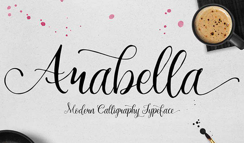
The Arabella script is a playful and romantic script font that can be used in personal projects completely free. The font is a great choice for logos as well as invitations, and t-shirt designs.
The Buffalo font is a free script font that can be used for personal and commercial projects. It has a slightly vintage yet elegant feel and quite a unique look. Use it for branding purposes, signage, and any promotional material.
Hello Stockholm is a modern brush script font inspired by Scandinavian minimalism. You can use it for wedding invitations, street ads, Instagram posts, t-shirt design, branding, and more. The font includes uppercase and lowercase alternates as well as a bonus sans serif font with a multilingual support.
Try the Carosello font if you’re on the lookout for a marker font. Thanks to its retro look, the font is perfect for vintage projects. The font can be used for free in any personal project.
The Aprillia script is a modern and bold script font that’s perfect for social media posts, logos, and t-shirt designs. The font is free for personal use.
If you want an elegant and sophisticated look, then the Olivia Script font is a perfect choice. The font comes with an impressive 351 glyphs and can be used in commercial and personal projects.
The Noelan font includes elegant swashes that automatically connect at the end or at the beginning of a word. The font is free for commercial and personal projects and includes many alternates as well as international characters.
What makes the Alex Brush font unique are its short descenders which makes this font more legible than other similar script fonts. The font is free for commercial and personal projects.
The Salmela font is a beautiful brush font that has a modern and bold look. The font would be perfect for lettering projects, wall art, and posters. It’s free for commercial and personal projects.
One look at the Allura font and you’ll realize this font is perfect for wedding invitations and stationery. The font features an elegant and classy look and can be used for commercial and personal projects.
The Autery script has a playful look and would be a great choice for branding projects that include products or brands geared for younger audiences. The font is free for commercial and personal projects.
The Easy November font is a great choice for branding projects and promotional campaigns. The font includes elegant stylistic swashes and can be used for personal projects.
Calligraphy fonts add style and character to your designs. They are also versatile enough to be used in branding projects, t-shirt designs, letterheads, stationery designs, and wedding invitations.
As you can see from the examples above, there is plenty of high-quality calligraphy fonts that can be used in both personal and commercial projects, so be sure to check them out.
Imagine if you walked into a store to grab a few things and found none of the aisles were labeled. It would feel like a chaotic mess — you would have no clue where to go to find what you need and may end up leaving the store to go somewhere else.
Your navigational structure plays a critical role in determining whether people can find what they need on your site. That’s why we’ve compiled this list of seven website navigation examples to help inspire your website’s navigation!
Keep reading to get your dose of design inspiration!
For even more digital marketing advice, sign up for the email that more than150,000other marketers trust: Revenue Weekly.
Website navigation is the structure of your website that enables users to find pages and information. It serves as a guidance system to help users move around your site. Your website navigation also helps organize different sections of your website so users can find critical pages fast.
7 website navigation examples to inspire you
Need some ideas for designing your navigation? Check out these seven examples and get inspired!
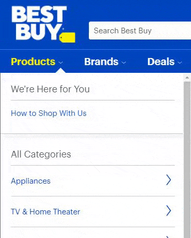
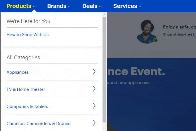
Website navigation example #1: Best Buy
Defining feature: Organization
First on our list of examples of website navigation is Best Buy.
Best Buy offers multiple electronic products for their customers, which leads them to have an extensive navigation. Despite all these product offerings, Best Buy has an incredibly organized navigation that makes it easy for customers to find what they need.
Once you click on a category, Best Buy breaks the navigation down even further to help you refine your search. For example, if you click on “Computers & Tablets,” you’re taken to a navigation with a list of computers and tablets. Then, if you click Tablets, you can see your product options for tablets.
This navigation is extremely organized, which makes it easy for people to find what they need.
Takeaway: When you create your website navigation menu, ensure it’s organized. Categorize your products logically to make it easy for your audience to find what they need. The critical thing to remember is that you’ll want to organize your navigation in a way that makes sense to your audience.
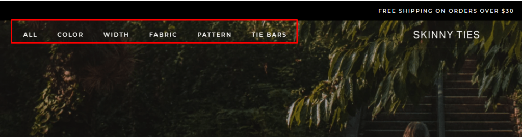
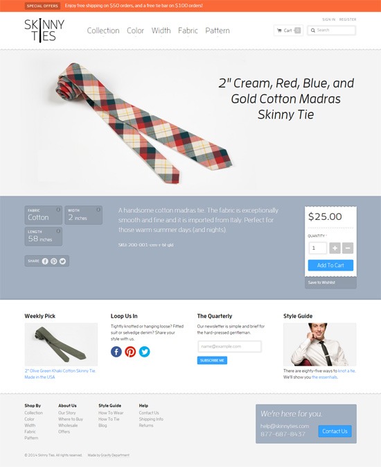
Website navigation example #2: Skinny Ties
Defining feature: Simplicity
Next on our list of navigation examples is Skinny Ties. Skinny Ties offers a simple navigation that makes it easy for visitors to find the products they need.
When you look at their navigation, it’s broken down into categories:
Color
Width
Fabric
Pattern
When someone visits their site, this simplistic navigation makes it easy for shoppers to find the tie they need.
Takeaway: Keeping your navigation simple is critical if you want to see success with your site. If your navigation is too busy, your audience will feel overwhelmed when trying to find what they need. A clean and straightforward navigation is best if you want to see success.
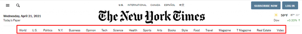
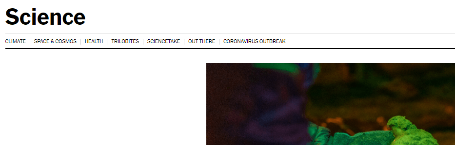
Website navigation example #3: New York Times
Defining feature: Ease of use
Next on our list of navigation examples is the New York Times. Their navigation is simple and easy to use, as it lays out all the headings across the top.
And the ease of use doesn’t stop there.
Once you click on a heading, you’re taken to a page with a more refined mini navigation. For example, if you click on the “Science” tab, it takes you to a Science category page, where there are more navigational links to narrow your focus.
This navigation setup makes it easy for users to find what they need fast.
Takeaway: Creating an easy-to-use navigation is critical for delivering a positive user experience. The easier it is for people to find the products or services they need, the more likely they are to stay engaged with your business.
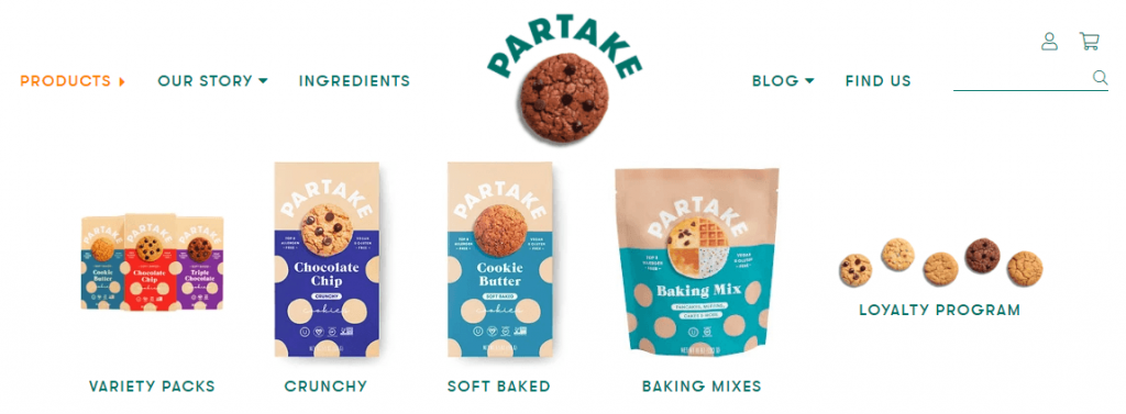
Website navigation example #4: Partake
Defining feature: Visuals
One of the best website navigation examples is Partake. Partake, a baking company, has a simple but visually appealing navigation. When you navigate to their products, you can see a visual for each type of product.
These visuals help customers get a sense of what their products look like, which can also help them navigate to the correct pages. It also adds an element of engagement by making the navigation more visually attractive.
Takeaway: When you create your navigation, consider adding some visual interest to it. While you may not be able to add a photo or graphic for every product you offer, you can add a single visual that represents the entire category to make it more interesting.
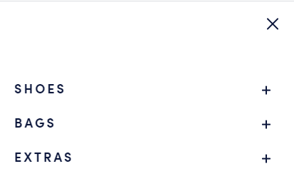
Website navigation example #5: Rothy’s
Defining feature: Mobile-friendliness
Next on our list of examples of website navigation is Rothy’s, a women and children’s shoe company. Their navigation is an excellent example of mobile friendliness.
They use a hamburger menu to make it easy to open their navigation on mobile devices. Once you open the menu, you can see it organized by shoes, bags, and extras.
Rothy’s offers multiple product categories that make it easy for mobile users to sift through their products.
This navigation makes it simple and easy for mobile users to browse products on their site.
Takeaway: When you build your navigation, make sure you offer a mobile-friendly version of your navigation. A mobile-friendly navigation ensures people can find the products or services they need while browsing on mobile.
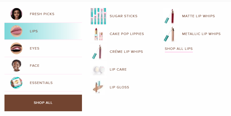
Website navigation example #6: Beauty Bakerie
Defining feature: Consistency
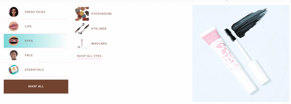
One of the visual website navigation examples is Beauty Bakerie. They highlight their products in their navigation to help people find what they need.
With this navigation, users can rely on visuals to help them find the beauty products they need on Beauty Bakerie’s website. Most importantly, though, all the icons are the same size, which allows for a consistent look and feel.
The consistency makes it easy to look through the navigation and find products users need.
Takeaway: If you decide to use visuals in your navigation, make sure they’re consistent to create a clean navigation. It will help you deliver the best user experience for your audience.
Website navigation example #7: Verve
Defining feature: Consistent branding
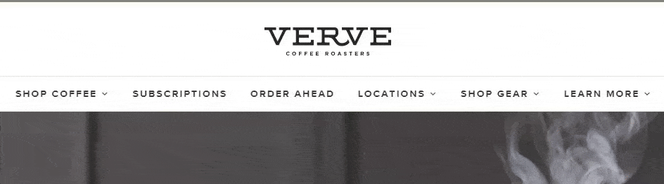
The last item on our list of website navigation examples is Verve. Verve is a coffee company that offers multiple coffee products for its customers.
Their navigation is a prime example of carrying your brand’s style into the navigation. With Verve, they use a similar font style and color scheme with their navigation to create a modern look and feel.
Takeaway: If you want to deliver a positive user experience, you need to align your navigation’s design to fit with your business’s style. It will ensure your site looks clean and cohesive.
Need help building your website navigation structure?
Your website navigation structure is critical to ensuring your audience can find the products they need on your site. But if you aren’t sure how to build the best navigation for your site, WebFX can help. As an award-winning web design company, we know how to craft navigation bars that keep people engaged.
Our team of experts can help you craft a website design that drives results.
In the past five years, we’ve driven over $2.4 billion in sales and over 6.3 million leads for our clients. You can feel confident our team will build a website navigation menu that keeps leads engaged and checking out your products or services.
Ready to boost engagement on your site? Contact us online or call us today at 888-601-5359 to speak with a strategist about our web design services!
The first release candidate for WordPress 5.8 is now available!
Please join us in celebrating this very important milestone in the community’s progress towards the final release of WordPress 5.8!
“Release Candidate” means the new version is ready for release, but with thousands of plugins and themes and differences in how the millions of people use WordPress, it is possible something was missed. WordPress 5.8 is slated for release on July 20, 2021, but your help is needed to get there—if you have not tried 5.8 yet, now is the time!
You can test the WordPress 5.8 release candidate in three ways:
Install and activate the WordPress Beta Tester plugin (select the Bleeding edge channel and then Beta/RC Only stream)
Directly download the release candidate version (zip)
Using WP-CLI to test: wp core update --version=5.8-RC1
Thank you to all of the contributors who tested the Beta releases and gave feedback. Testing for bugs is a critical part of polishing every release and a great way to contribute to WordPress.
What is in WordPress 5.8?
The second release of 2021 continues to progress on the block editor towards the promised future of full site editing with these updates:
WordPress 5.8 also has lots of refinements to enhance the developer experience. To learn more, subscribe to the Make WordPress Core blog and pay special attention to the developer notes tag for updates on those and other changes that could affect your products.
Plugin and Theme Developers
Please test your plugins and themes against WordPress 5.8 and update the Tested up to version in the readme file to 5.8. If you find compatibility problems, please be sure to post to the support forums, so those can be figured out before the final release.
The WordPress 5.8 Field Guide, due to be published very shortly, will give you a deeper dive into the major changes.
If you think you have found a bug, you can post to the Alpha/Beta area in the support forums. We would love to hear from you! If you are comfortable writing a reproducible bug report, file one on WordPress Trac, where you can also find a list of known bugs.
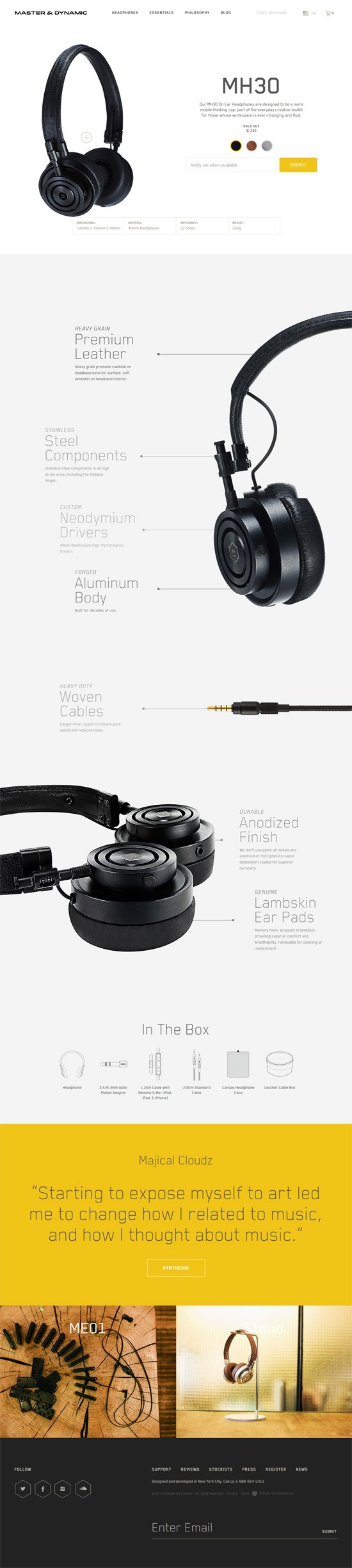
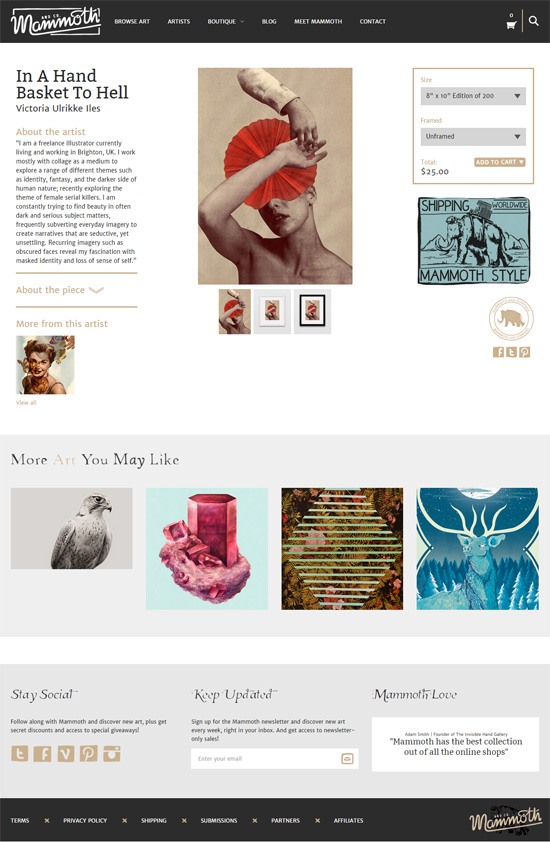
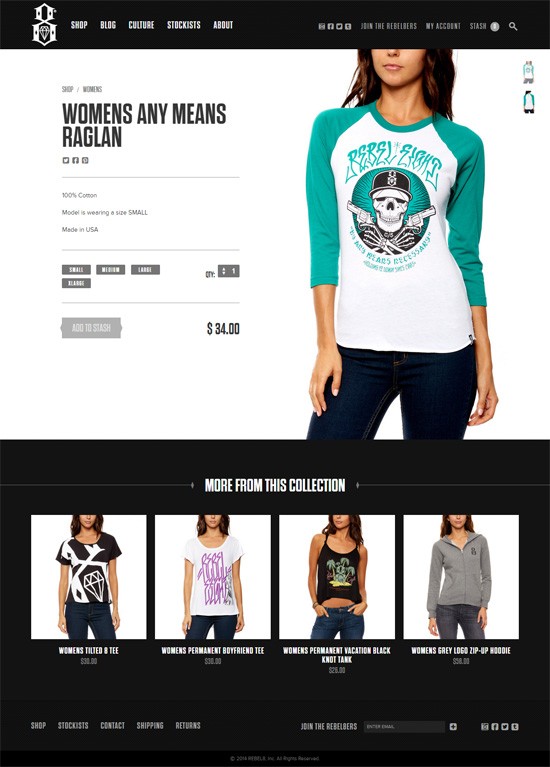
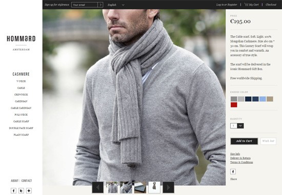
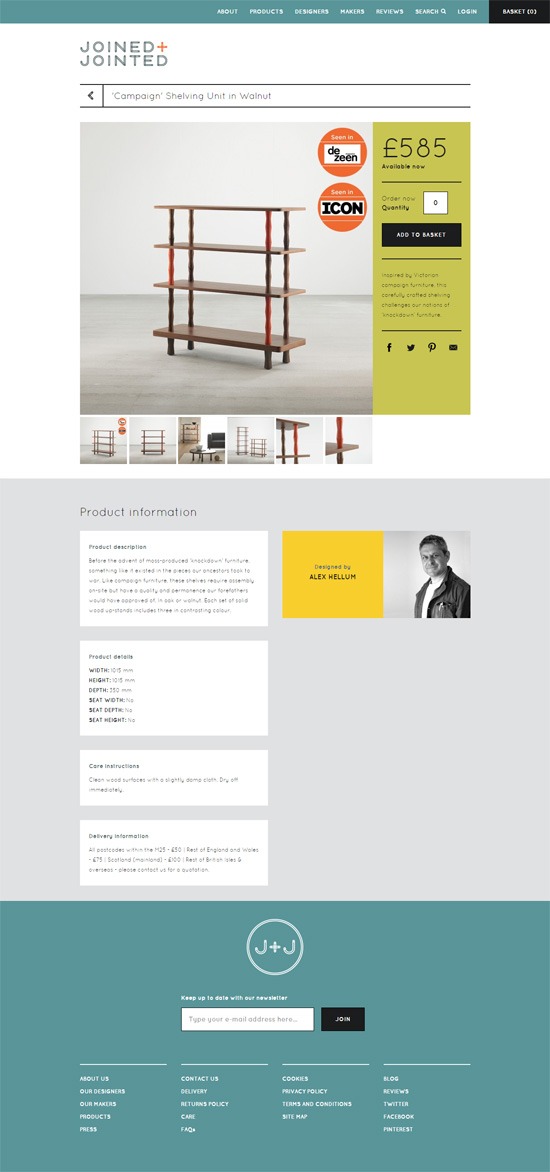
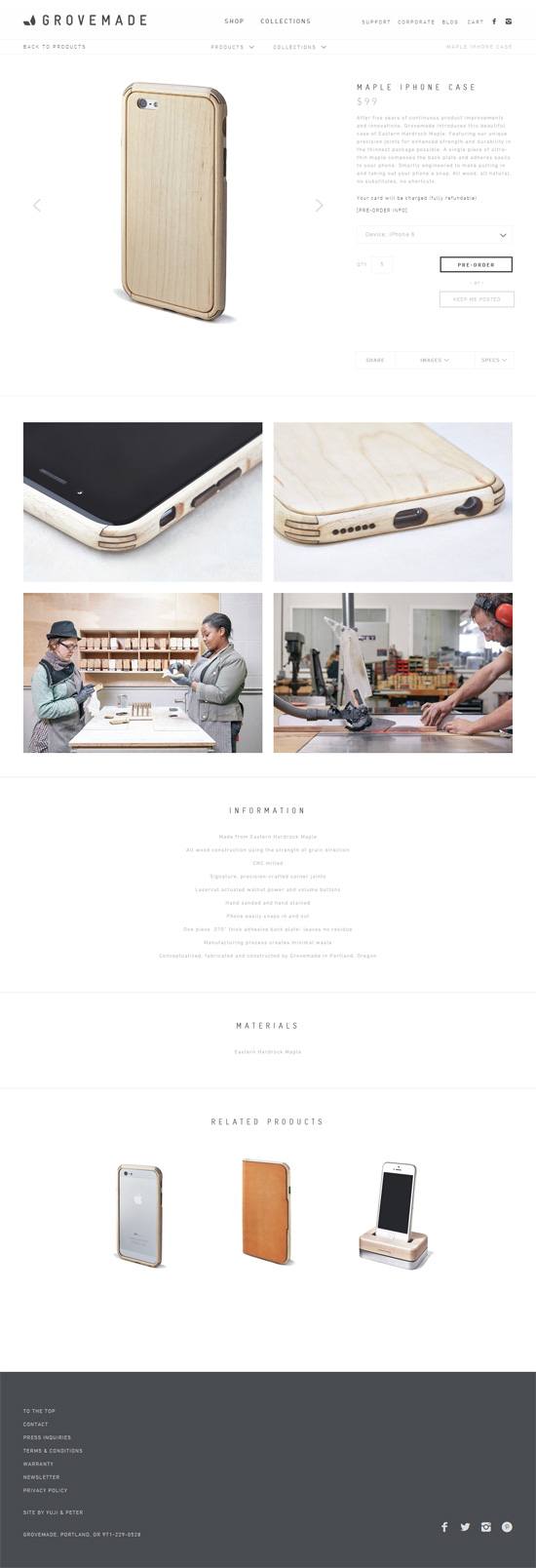
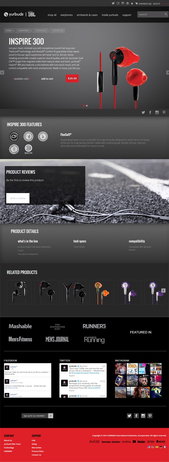
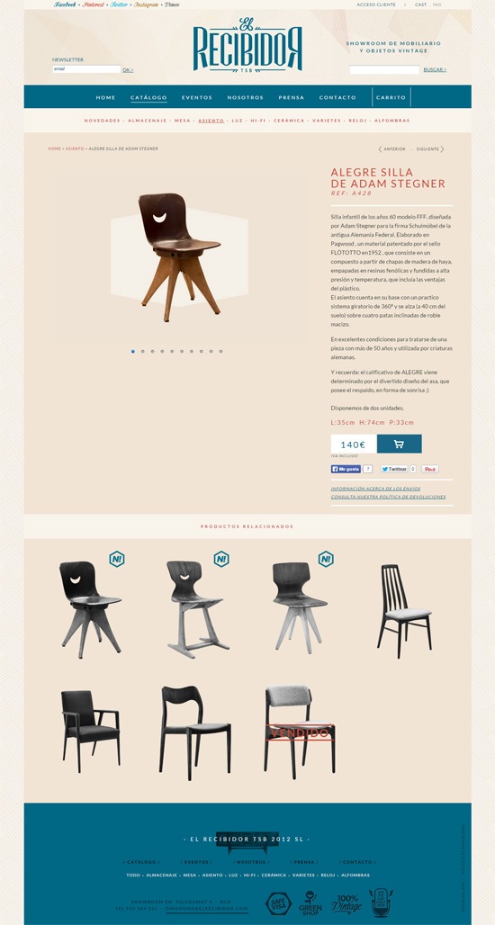
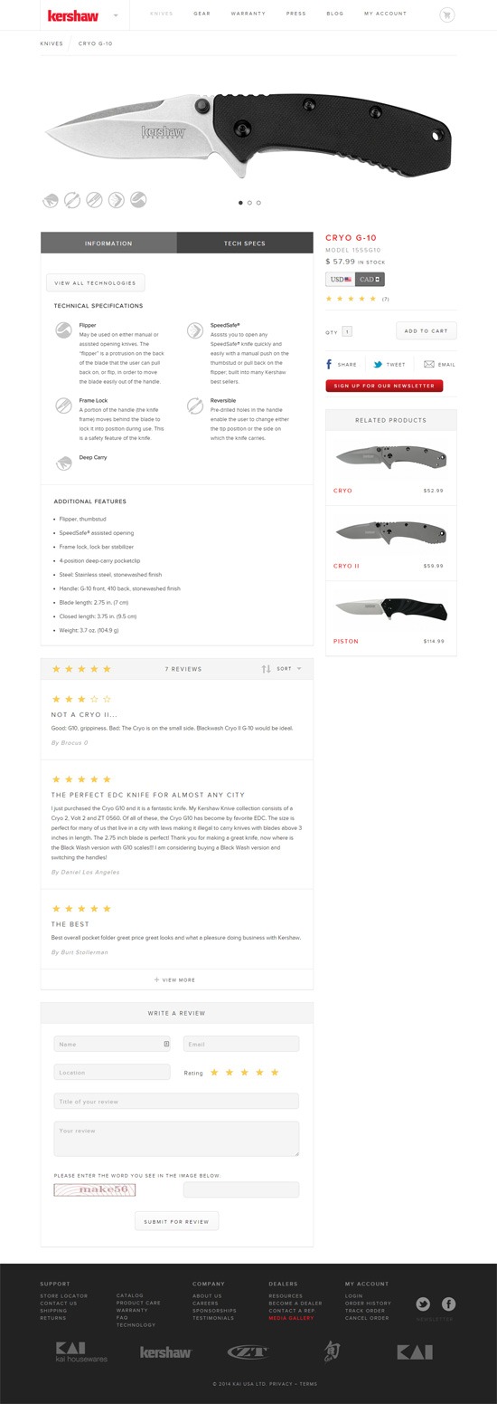
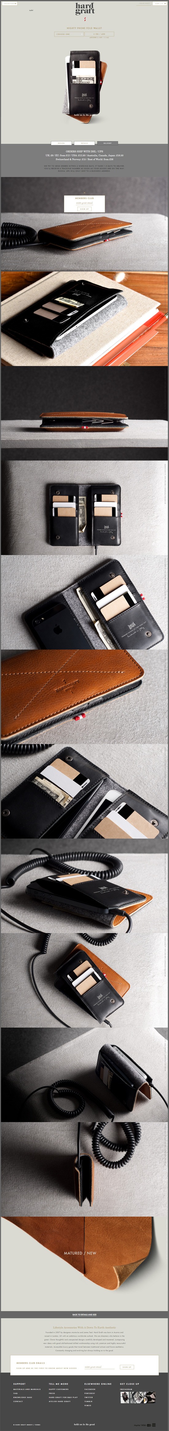
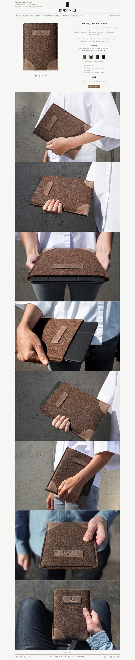
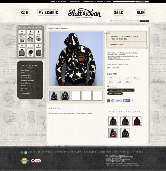
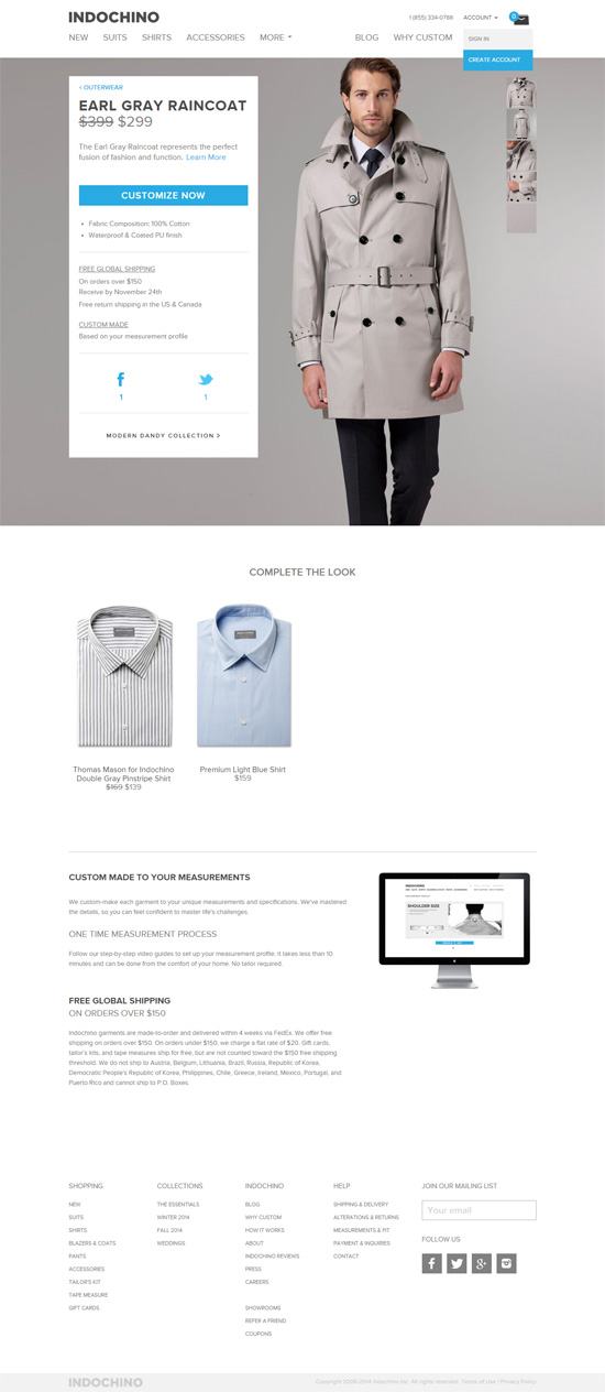
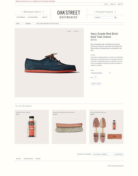
For an online store, the design of product pages is important to get right. The product page is the place where a purchase is likely to happen, and so its form and function can dictate the success of an ecommerce site.
Make extension compatible with Zookeeper 3.6 (Thanks to camporter, GH PR #43)
Make extension compatible with PHP 8 (Thanks to John P. Bloch, GH PR #44)
var_representation 0.1.0
* Fix handling of dumping arrays created from $GLOBALS in php versions prior to 8.1
* Move the C var_representation_ex API to var_representation.h
awscrt 1.0.0
Initial development release of awscrt API bindings.
Making decisions can be difficult. Yet, some people have a harder time than others. Such fear of commitment can affect multiple areas of life – including business.
In particular, the process of building a website is rife with important decisions to be made. Because of that, a commitment-phobic client may become overwhelmed. Having to make choices on a color scheme, features and functionality could potentially bring about anxiety.
If not managed effectively, it might also lead to a stalled project. When clients can’t make the necessary decisions regarding their website, there’s very little a designer can accomplish. Thus, we sit and wait for things to resolve themselves.
Not so fast! While fear of commitment and web design go together like oil and water, you don’t have to settle for such a quagmire. The following are some ways to help even the most skittish of clients move forward.
Share Research and Data
A modern website is going to require commitments to various tools and applications. For instance, a content management system (CMS) is usually a key component. From there, you’ll have to talk about plugins, themes, or any necessary custom code. And let’s not forget about web hosting and other third-party service providers.
It’s a lot to consider – especially for a client who isn’t well-versed in these subjects. Frankly, it’s no wonder that the process can stress people out.
One way to ease a client’s mind is to back your suggestions up with data. This helps to establish trust and proves that you do indeed know what you’re talking about. It also shows that they’re not alone in utilizing a particular tool or technology.
There are many useful tidbits to mention. Market share can be an important factor when it comes to a platform like WordPress. But so are examples of organizations using similar setups. Demonstrating a product’s longevity and history can also boost the comfort level.
The main idea is to show that the items chosen were done so with care and logic. That may be enough to convince a client that they’re on the right path.
Discuss the Importance of Stakeholder Buy-In
You may run into instances where a client is hesitant to provide input. They simply want you to pick out website technologies and run with them. Sometimes this is a result of having full trust in you as an expert – that’s great. But it can also be a sign of someone who doesn’t have the confidence to commit.
For smaller projects that don’t need a lot of advanced functionality, that may be fine. But passing the buck this way on a large website can be problematic.
Stakeholders should be aware of and approve of the tools powering their website. It’s not that they need to know every last detail. Rather, a basic grasp of what items are being used and why they are in place is often enough.
Why is this important? It’s all about commitment. A client who hasn’t bought into their project’s roadmap is less likely to fully understand the capabilities and limitations involved. This can lead to short-sighted decision-making that hurts the outcome.
By attaining a working knowledge of the various pieces in play, clients can better see things rationally. This makes things easier for everyone involved.
Identify Key Concerns
Sometimes having relevant data and a broad view of a project isn’t enough. A client may still have a difficult time making big decisions. They may not even understand why.
If you still find that a project is going nowhere fast, it’s time to take a different approach. It starts by identifying the pain points and starting a conversation. You don’t have to do anything dramatic – just a friendly email or phone call can get the ball rolling.
Mention that you’ve noticed some hesitancy regarding the website. Offer to answer any questions your client may have. Let them know that you’re happy to hear out their concerns.
The process of talking through such roadblocks can work wonders. Like any other problem, getting your thoughts out there tends to bring a feeling of relief. Once that kicks in, your client may be in a better place to start making decisions.
Stay Patient and Kind
Projects don’t always move as quickly as we’d like. And when a client is unable to commit to a particular path, it can be highly frustrating. We’ve all been there.
But it’s still important to maintain a calm demeanor. Passing your stress onto someone else is not conducive to getting things done.
Instead, aim to stay patient, kind, and helpful. Provide the kinds of data and background information that will bring comfort and confidence to stakeholders. Look for clues as to why a certain decision may be problematic and offer your assistance.
The good news is that this approach can pay off. Once a client begins making the required commitments, they start to fall like dominoes. Before you know it, the project is finished off – and with a successful outcome.
From there, you can sit back with a beverage and pat yourself on the back for a job well done!