Web designers are fortunate in that our work can be done from just about anywhere. That said, most of us still tend to gravitate towards either home or commercial office space. Why? Because dealing with coffee shop Wi-Fi just isn’t conducive to getting things done. Plus, the whole pandemic thing made sitting amongst strangers a no-go for most of the world.
But not just any old office setup will do. There are some items that go hand-in-hand with comfort and productivity. Things that web designers either can’t or shouldn’t go without.
As someone who has worked from home for over 20 years, I can attest to the importance of a well-thought-out space. I’ve managed to put together an area that helps me battle stress and lapses in creativity. It’s also a solid spot for doing some actual work when the need arises.
Today, I’m going to recommend some things that every web designer should have in the office. They range from the basics to the frivolous. But, in my experience, they’re all worth the investment. Here we go!
Ergonomic Furniture and Peripherals
If you spend hours a day sitting at your desk, ergonomic furniture and peripherals are essential. Yes, they’re often more expensive than the standard fare. But they’ll save both your health and your wallet in the long run.
For starters, think about your chair and desk setup. If they don’t promote good posture, you’re likely to feel it in your wrists, neck, and back. Let it go for too long, and you run the risk of injury.
In the early years of my business, my posture was less than ideal. I paid for it in the form of carpal tunnel syndrome and some wicked neck pain. That brought along doctor visits and some physical therapy.
It was a hard lesson, but one I took to heart. I invested in an ergonomic chair, keyboard (I still love the old school Microsoft Natural Ergonomic Keyboard), mouse, wrist rest, and specialized typing gloves. Perhaps I look like an armored computer geek, but my body feels much better. In my book, that’s a fair trade-off.
That’s not to say you have to go for a fancy stand-up desk or a chair that’s worth more than your home. But shop around and find things that feel right. You spend a lot of time in your office – you may as well be comfortable while you’re there.

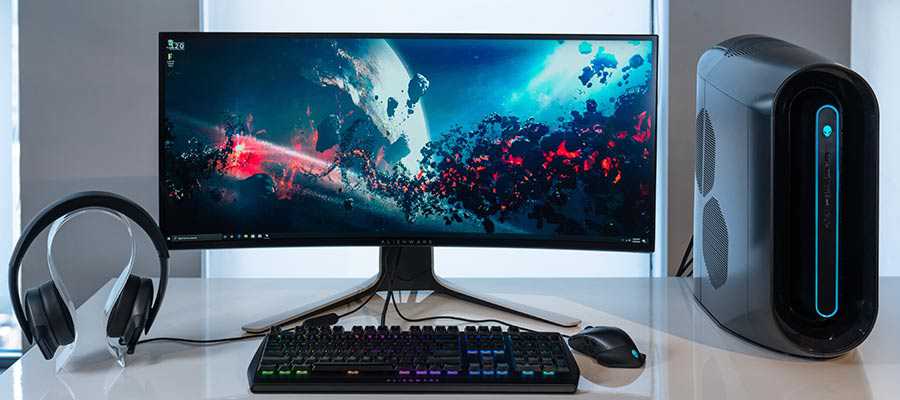
A Big Screen
If you’ve worked with computers for a long time, you probably have some memories of what monitors used to be. Small (yet, incredibly bulky) CRT screens with a decided lack of workspace. Tiny, pixelated text that led to eyestrain. It wasn’t a pretty picture.
Thankfully, there have been a lot of advancements in hardware since those days – and monitors are no exception. We now have a massive number of screens to choose from. There are a variety of sizes, resolutions, and features available.
As a web designer, your eyes might be glued to a monitor for 40+ hours a week (and that doesn’t even include your phone). Therefore, it pays to acquire the best one you can afford.
Look for something that offers enough screen real estate to work comfortably with your favorite design and coding apps. In addition, text should be crisp and easy to read.
However, you don’t have to go overboard in spending. I managed to level up from my previous 22-inch screen to a solid 27-incher for a modest sum. The difference was immediately noticeable.
Audiophile Speakers or Headphones
It’s amazing what your favorite music can do. Hearing a great song can lift your spirits, inspire creativity and bring all kinds of positive energy. There aren’t many things in life that have such an immediate impact.
The audio equipment we use plays a huge role in shaping the listening experience. A cheap set of speakers or headphones just won’t cut it these days.
We no longer live in a world where fuzzy, compressed MP3 files are in vogue. The combination of broadband connectivity, lossless codecs, and high-fidelity streaming means that you can hear music as you never have before – all without leaving your desk.
Personally, I’d been utilizing the same low-end set of speakers with my computer’s motherboard sound controller for years. The COVID-19 pandemic got me thinking of going bigger. If I couldn’t leave the house, I at least wanted to try and make the home office more entertaining.
With that, I grabbed a premium set of PC speakers and a digital-to-analog converter (DAC). The results have been stunning. The clarity and precision bring out details in songs I’d never noticed before. Albums I’ve been listening to for years suddenly sound brand new.

Collectibles and Kitsch
An office can be a rather dull place (even with the music at full blast). And it’s not just those sterile commercial spaces that can suffer from a case of the blahs. Home offices, often tucked into a tiny bit of free space, can also weaken the spirits of creative professionals.
Don’t fall victim to a boring office! Just by adding a selection of fun or meaningful objects, you can significantly lighten the mood.
For example, my office includes a small bookshelf. I’ve filled with all sorts of goofy and fun items. Sports memorabilia, CDs signed by favorite musicians and a big helping of other oddities. While it may cause an interior decorator to run out the door screaming, it does give me something to smile about.
Just as importantly, these items are a great way to reflect your personality. They bring comfort and a connection to the outside world. This is something a drab cubicle couldn’t possibly achieve.

A Workspace That Feels Like Home
Don’t settle for being uncomfortable at work. It harms productivity and can make you dread going into the office. This holds true whether your commute is 20 miles or 10 steps. How can you grow as a designer in that type of environment?
Instead, aim to craft a space that brings you comfort and joy. Surround yourself with items of importance. Place your backside in a chair that promotes good posture. And entertain your eyes and ears with high-quality peripherals.
Remember that creating a workspace that feels like home is an ongoing process. You don’t need to splurge on all of these items at once. Rather, you can acquire them over time.
The idea is to put yourself in the best position to be both creative and productive. A great office can go a long way towards helping you fulfill that goal.
The post Items Every Web Designer Should Have in Their Office appeared first on Speckyboy Design Magazine.
It often seems like the most popular things can also be among the most divisive. That holds true for web design, just as it does in life. One prime example of this is the slider.
Various types of sliders or slideshows have been deployed on websites for years. And there was a time when it was difficult to find a modern site that didn’t use them. All of this despite a vocal backlash against the feature from the design community.
I admit that I was once a proponent of sliders. The argument that they allow for showcasing several content pieces within a single area was appealing. As was the opportunity to add both movement and interactivity in a fairly straightforward manner. There was a lot to like.
Having said that, I also find myself trying to avoid their use whenever possible these days. There are many reasons – including performance, accessibility, and the whole cliché factor.
That got me wondering: should web designers finally put the slider into the recycling bin?
A Way to Condense Content and Wow Users
Developing an effective content strategy is one of the great challenges in web design. Designers and their clients are forever searching for ways to display content in an attractive, easy-to-digest format. Great focus is also placed on ensuring that users don’t miss out on the important stuff. This is critical to making conversions.
Sliders came into popularity in part because they enabled us to place all of the must-see items right at the top of the home page. Want to display all of your big product sales? Need a way to get your latest news items above the fold? A slider provides a simple means to do so.
Presentation is also a pretty big deal. The more advanced slider implementations offer complex animation and special effects. It may well be the easiest way to add some expensive-looking interactivity to even low-budget projects. All told, there certainly can be a jaw-dropping quality to this sort of feature.
Put it all together, and it’s no wonder that sliders became ubiquitous. What’s not to love?

How Evolution and Harsh Reality Burst the Slider’s Bubble
Unfortunately, a lot of that initial luster has been lost. That’s because a number of harsh realities have come to light.
Take, for example, the studies that show users aren’t really waiting for or clicking through each slide. Then there’s the performance hit that displeases Google’s Core Web Vitals, among other metrics.
The web has also evolved to the point where both accessibility and mobile compatibility are major concerns. Sliders aren’t always so great in these areas.
And don’t forget the software developers who, in a competitive market, jam as much JavaScript and other bloat as they can into slider plugins. It turns out that these bells and whistles do have a cost.
What we’ve ended up with is a clever idea that has perhaps gone way past its initial intention. Despite this, clients still ask for sliders and seem perplexed when we advise against them. Sigh…

Slider Alternatives for Modern Websites
Sliders came along during a period of transition for the web. Robust content management systems (CMS) and powerful JavaScript frameworks were just beginning to take hold. The promise of CSS3’s advanced layouts were only starting to blossom.
So many web technologies have evolved to a point where there are now plenty of alternatives to the good old slideshow or carousel. Below are a few that stand out. They can be utilized separately or even combined to form a successful content strategy.
Hero Areas
A hero area can be just as attention-grabbing as a slider. But, since they tend to focus on a single thing, they can be built to focus on conversions without hurting performance or accessibility. Plus, the inclusion of standard HTML content is likely a boon for SEO as well.
Card Layouts
Multicolumn card layouts have long been a thing. But advancements in CSS layout techniques have made them much easier to create and manage. They can be both visually appealing and adjust beautifully to smaller screens.
Complex CSS Grids
Even if cards aren’t your thing, you can still create some amazing layouts with CSS Grid. A responsive design pattern that creatively highlights your top content is very much possible. Span multiple rows or columns, craft a highly visual space for your latest blog posts. The biggest limit here might be your imagination.
Video
While no one will accuse video of being great for load times, it can be an effective slider alternative. Just think: it adds interactivity and allows you to make several key points in a single space. Add in some great production, special effects and captions to make the experience a positive one for users.

The Slider’s Place in Web Design
While a slider may not be the most efficient solution for showcasing your top content, that doesn’t mean there isn’t a place for it in web design. There are still some great niche uses.
An interactive display of photos or (gasp!) presentation slides are great examples. This more or less serves the original purpose of a slideshow. Other creative possibilities, such as a portfolio or timeline, are also worthy of experimentation.
Anecdotally, at least, it appears that slider use may be on the decline as a homepage centerpiece. That’s great to see. The web has come a long way since the feature first started popping up. It only makes sense that designers move on to better solutions.
The post Is It Time for Web Designers to Retire the Slider? appeared first on Speckyboy Design Magazine.
Package:
Summary:
Provide text translations to use in model classes
Groups:
Author:
Description:
This package can provide text translations to use in model classes...
Read more at https://www.phpclasses.org/package/12146-PHP-Provide-text-translations-to-use-in-model-classes.html

Package:
Summary:
Provide text translations to use in model classes
Groups:
Author:
Description:
This package can provide text translations to use in model classes...
Read more at https://www.phpclasses.org/package/12146-PHP-Provide-text-translations-to-use-in-model-classes.html
Package:
Summary:
Export MySQL records to a file to import in Excel
Groups:
Author:
Description:
This package can export MySQL records to a file to import in Excel...
Read more at https://www.phpclasses.org/package/12148-PHP-Export-MySQL-records-to-a-file-to-import-in-Excel.html#2021-07-10-18:01:47

Package:
Summary:
Send a newsletter to users stored in a database
Groups:
Author:
Description:
This package can send a newsletter to users stored in a database...
Read more at https://www.phpclasses.org/package/12147-PHP-Send-a-newsletter-to-users-stored-in-a-database.html#2021-07-09-16:17:57

Your navigation bar is one of the most important parts of your website — that’s because it provides users with a roadmap of the most important pages you provide.
Not only that, but a well-designed UX navigation bar will also showcase the products and services you offer.
So, what are UX navigation best practices in 2021? On this page, we’ll talk about:
- The definition of UX navigation
- Importance of great UX navigation
- UX navigation best practices 2021
- UX mobile navigation
If you want to dive into your site’s UX navigation, but aren’t sure where to start, contact us online or give us a call at 888-601-5359 to learn more about our UX design services!
What is UX navigation?
“UX” is a shortened version of “user experience.” When UX precedes a design element, like navigation, it means that you’re designing something with the user in mind to ensure that they have a fantastic experience.
That said, a well-designed UX navigation is created so that the user has the best experience traversing through a website.
Importance of great UX navigation
There are a few reasons why your UX navigation is important to your website. Here are a few:
UX navigation ensures that users can find all the most important pages on your website
The purpose of a navigation bar is to serve site visitors your most important pages on a silver platter.
A well-done UX navigation design will serve users exactly what they’re interested in and keep them from bouncing from your website.
To determine the most important pages of your site, consider why you want users to visit your site in the first place — is it to sell a product, inform them about your business, beat out the competition?
If you offer products or services, those pages are crucial to your UX navigation. If your brand message and values are important to your product, you should consider adding that to your nav bar as well. If you’re looking to beat out the competition, don’t be scared to create a page called “What makes us better than the competition?” and add it to your navigation.
By giving users what they want in the navigation bar, they’ll have a fantastic experience on your website.
UX navigation outlines your products and services
If you offer products or services, adding a tab in your UX navigation structure is paramount. Not only does this strategy teach site visitors what you offer, but it also creates a hub of product and service info for users — no matter where they are on your site.
Check out the way Hand and Stone Massage uses tabs to separate their services and outline what they offer.
![]()
The purpose of a homepage is to interest and engage users, and to do so, sometimes a product or service list appears below the fold. Above the fold is typically reserved for a flashy animation, a form, or a video of the agency at work.
That said, adding a product and service tab to your UX navigation structure is the perfect solution — enabling you to show site visitors exactly what you offer right off the bat, and as a resource on every page they browse.
UX navigation keeps users from bouncing and increases engagement
If users can’ find what they need, they’ll bounce from your site. Bounce rate is a metric that measures how many people visit your site and then leave after only viewing one page.
A high bounce rate is a signal to Google that you don’t provide the information that users are looking for and could cause them to rank you lower in search.
Providing UX navigation also increases engagement with your site, which improves dwell time.
Dwell time and bounce rate are both metrics that Google considers when ranking your website.
comcast
-9
industry average
16
apple
72
webfx
83
UX navigation best practices 2021
Below are some UX navigation design best practices that will ensure a successful navigation bar.
Consistency is key
This sentiment holds true in baking, fitness, and your UX navigation.
A navigation bar should be consistent in two ways:
- Consistent with your site’s design
- Consistent on every page
Your UX navigation should flow with the rest of your site’s design, and mesh well with every page. Your web designer can help you with this!
Speaking of every page, you should use the same UX navigation on every page — and we don’t just mean the tabs of your navigation. For example, you shouldn’t have a full mega navigation on your home page and then switch to a hamburger menu navigation on your other pages.
Be consistent with the placement and design of your UX navigation for the best results.
Simplicity is best
When you’re looking at a map, chances are you don’t want to see every restaurant and hotel within a five-mile radius of your destination — after all, that would clutter your map and make it difficult to find what you want.
That said, simplicity is best when it comes to UX navigation.
Of course, your navigation bar’s design should match the rest of your site, but it’s best to leave out patterned backgrounds and loads of graphics. You should design your navigation bar with two to three colors and fonts to promote consistency.
Short and sweet gets the job done
Have you ever visited a website that had a drop-down navigation bar that showed, seemingly, every page on their site? As a site visitor, a loaded navigation bar can be overwhelming, and may even deter a user from sticking around.
As a UX navigation best practice in 2021, opt for a short and sweet navigation bar that only outlines your most important pages. There’s no need to list every single product and service, but instead, batch them out into categories.
For example, if you sell platform heels, stilettos, and square heels, you can simply categorize these as “heels.”
Not only does it simplify your UX navigation, but you’ll avoid overwhelming site visitors.
Mobile-friendliness is paramount
When creating navigation for your site, you have to keep UX mobile navigation in mind as well. In fact, it should be at the top of your list of things to consider when designing your navigation bar.
That’s because your UX mobile navigation can make or break your site for mobile viewers. If done incorrectly, your navigation will make it difficult for users to find what they’re looking for, and it could even hinder their view of your website altogether.
As a UX navigation best practice, you should always ensure that you have a mobile version as well and keep UX mobile navigation top of mind.
We don't just want to tell you about the beautiful work we do.
WE WANT TO SHOW YOU
We've built over
1000
Websites in industries like yours
WebFX can help you create the ideal UX navigation
We create with the user in mind, and the design of your UX navigation is no exception. Not only can we create a UX navigation design that fits your brand, but we can build an entire website around your products and services.
Our web design services are customized based on your needs. We offer a web design cost calculator that allows you to plug in:
- Number of pages you need designed
- Number of pages that need copywriting
- Style of your web design
- How many keywords you want to rank for
- If you need database integration
- If you need a responsive design
- If you need ecommerce functionality
- And more
These numbers allow us to give you a custom quote based on your unique needs and vision for your new website.
We’ve won a variety of awards for our web designs, and we can’t wait to add yours to the list!
If you’re looking for a website design, redesign, or just need help creating an effective UX navigation structure, WebFX is here for you. Contact us online for a free quote or give us a call at 888-601-5359!
The post UX Navigation: Your All-In-One Guide to UX Navigation Design appeared first on WebFX Blog.
Schema API for the Semantic Web – Use this tool to view the web just like Google does, by fetching the structured data of any webpage.

How to Help Your Clients Overcome Fear of Commitment – Tips for keeping both your clients and projects on task.

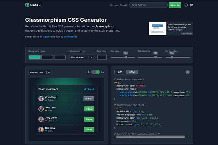
Glassmorphism CSS Generator – Create a beautiful glass effect with the help of this handy tool.
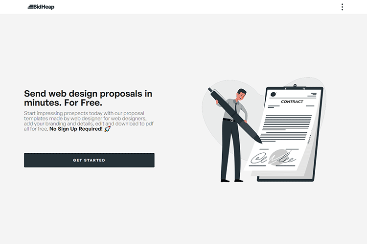
BidHeap – Download customizable web design proposal templates for free.
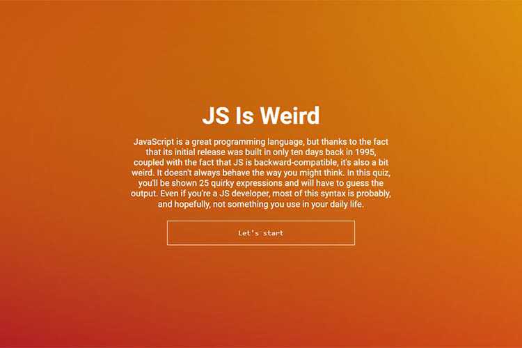
JS Is Weird – Take a quiz spanning 25 quirky JavaScript expressions and try to guess the output.
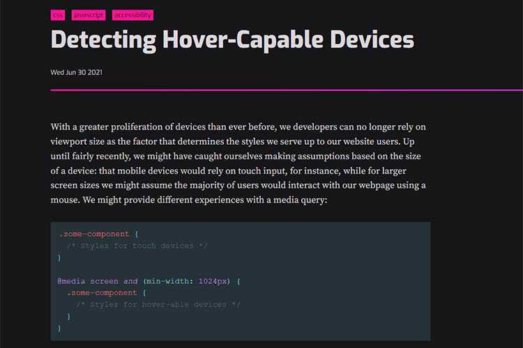
Detecting Hover-Capable Devices – Learn how CSS Level 5 Media Queries will allow developers to detect hover capabilities.
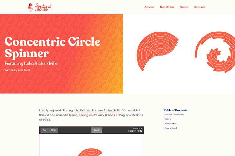
Concentric Circle Spinner – The ingredients of a surprisingly-robust loading animation.
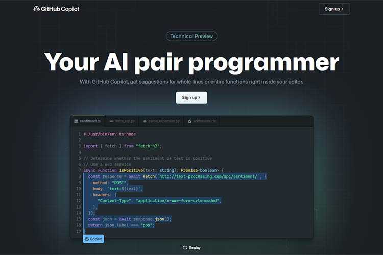
GitHub Copilot – This new feature will provide suggestions for whole lines or functions within your code editor.
10 CSS & JavaScript Snippets for Creating the Parallax Scrolling Effect – Stunning examples of parallax scrolling that you can implement on your own website.

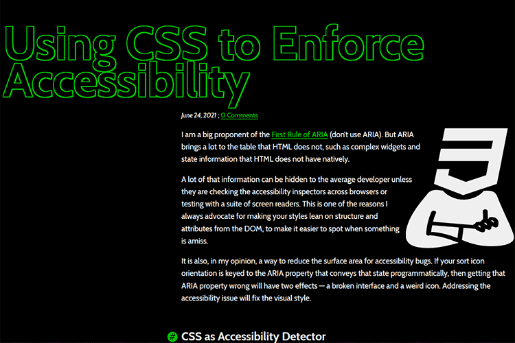
Using CSS to Enforce Accessibility – A look at ways CSS can be used in conjunction with ARIA states.
The 15 Best Free Calligraphy Fonts – Add a touch of elegance to your projects with these outstanding free fonts.

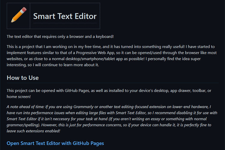
Smart Text Editor – This browser-based text editor can be opened via GitHub pages or installed directly on your device.
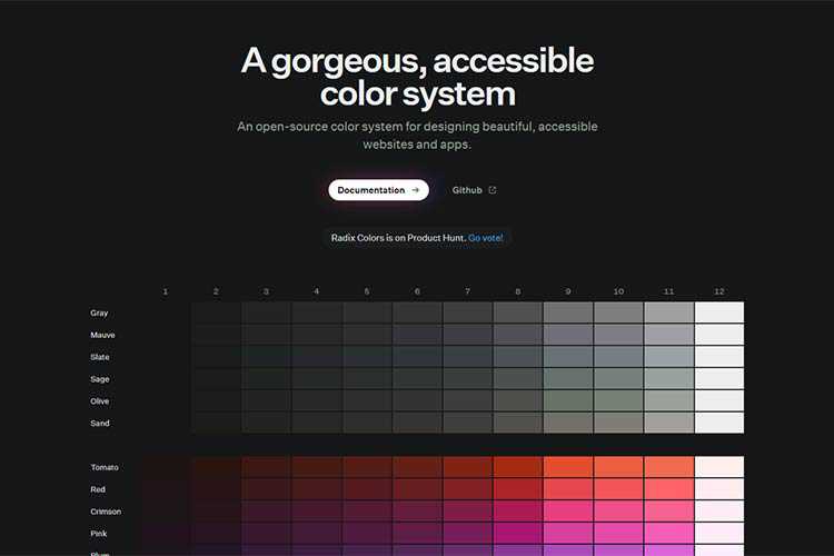
Radix UI – An open-source color system for designing beautiful, accessible websites and apps.
The WordPress Widgets Screen Joins the Gutenberg Era – Take a sneak peek at the new Widgets screen coming to WordPress 5.8.

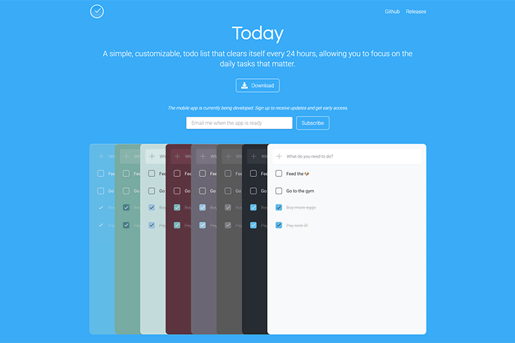
Today – This minimalist to-do list clears itself out every 24 hours.
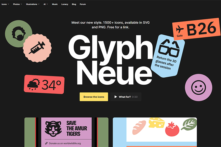
Glyph Neue – Check out this massive collection of 1500+ SVG/PNG icons.
Dealing with Terrible Business Ideas from Your Clients – Learn how to spot startup clients that may not last.

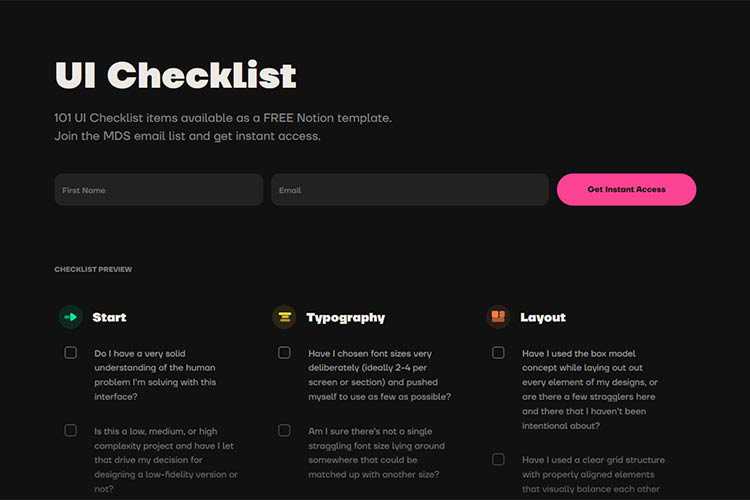
UI Checklist – Keep this handy checklist close at hand to ensure an awesome UI.
The post Weekly News for Designers № 600 appeared first on Speckyboy Design Magazine.
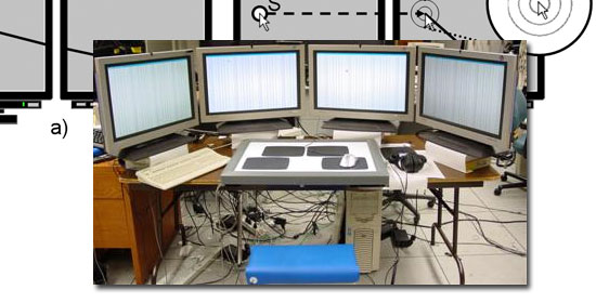
As a developer or designer, it is often helpful to have multiple monitors to increase the amount of screen real estate you have, which in turn can lead to higher productivity. For instance, you may have one screen as your primary monitor where you perform your work, and another one that has your email client, Skype, IM client, Twitter client, and other communication apps that you can easily monitor and switch to.
We’d like to share several freeware and open source tools available for download to help you harness the power of multi-display setups and get you up and running quickly. We hope that you might find the perfect dual monitor software free tools for you!
![Synergy]()
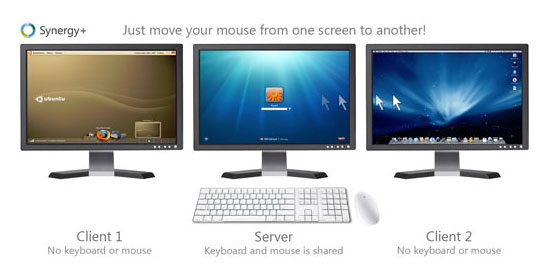
Synergy is free dual monitor software that lets users of multi-monitor workstations share a mouse and keyboard between several displays. All you have to do is move the mouse cursor off the edge of one display to have it on another adjacent display. It also creates a single virtual clipboard to allow the copy and pasting across the many displays. With Synergy comes a handy module for synchronizing your screensavers across multiple displays so that they run in tandem. If there is a password required after screensaver mode, you only have to type in the password into one monitor to activate all the others. There is also a fork of Synergy called Synergy+ that you can check out on Google Code.
![Input Director]()
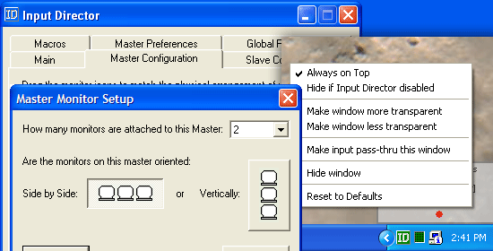
Input Director is multi-display software that grants you the ability to use a single keyboard and mouse on a multi-computer set up, making it the ideal solution for networked computers, a common situation where professionals have more than one computer (such as a desktop and laptop). All you have to do is move the pointer off the edge of the display and it appears on the adjacent monitor on that side, making it the active monitor.
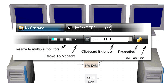
![UltraMon]()
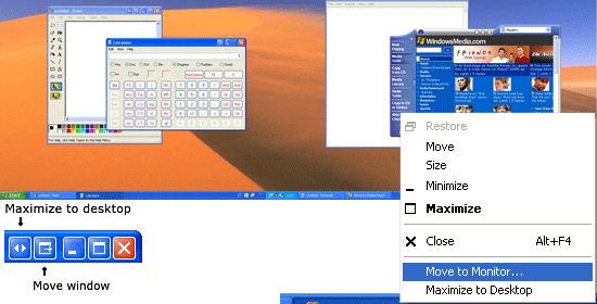
UltraMon is a great tool for multi-display computer configurations that can support up to 10 monitors. It allows you to set custom features for each monitor such as resolution, wallpaper, and taskbar settings. UltraMon allows for the moving of running programs from the primary display to the secondary (and vice versa). Each of the monitors will have their own taskbar showing you the applications running on them. You can predefine and save monitor settings, as well as position where a program opens from the shortcut menu to help speed up your workflow. It also has a feature for easily turning off secondary monitors to conserve electricity consumption when you don’t need them and to reduce distraction when they’re not in use.
Multi Monitor Mouse (M3)
![Multi Monitor Mouse]()
This app saves you from the hassle of having to drag your mouse off the desk as you try to get to the farthest monitor in a multi-monitor environment. It immediately warps your cursor across the borders of the display on demand and runs in the background to avoid taxing the systems resources. It is accessible from the system tray where you can change the settings at will. It also speeds up mouse targeting by an estimated 30%. The convenience that it creates makes it one of the best multi-monitor software choices.
![MultiMon Taskbar]()
MultiMon Taskbar lets you have unique taskbars for each monitor, helping you to easily organize your applications across multiple computer screens. It has a move-to-monitor button accessible from all Windows programs for convenience and ease of movement from one monitor to another. In addition, MultiMon has a clipboard extender module for synchronizing your clipboards across multiple displays, making copy and pasting between networked computers a breeze.
Do you use multiple monitors? Are you looking into using multiple monitors? Do you hate multi-monitor setups? Share your thoughts, opinions, and advice in the comments.
Related Content
The post Five Free Tools for Multi-Monitor Computer Set-Ups appeared first on WebFX Blog.
Package:
Summary:
Check a password's complexity to get its strength
Groups:
Author:
Description:
This class can check a password's complexity to get its strength...
Read more at https://www.phpclasses.org/package/12144-PHP-Check-a-password-s-complexity-to-get-its-strength.html#2021-07-08-12:38:45