This is part 4 of an ongoing study of web font file sizes, subsetting, and file sizes of the subsets.
I used the collection of freely available web fonts that is Google Fonts.
In part 1 I wondered How many bytes is "normal" for a web font by studying all regular fonts, meaning no bolds, italics, etc. The answer was, of course 42, around 20K for a LATIN subset
In part 2 I wondered how does a font grow, by subsetting fonts one character at a time. The answer was, of course 42, about 0.1K per character
Part 3 was a re-study of part 1, but this time focusing on variable fonts using only one variable dimension - weight, i.e. a variable bold-ness. This time the answer was, of course 42,: 35K is the median file size of a wght-variable font
Now, instead of focusing on just regular or just weight-variable fonts, I thought let's just do them all and let you, my dear reader, do your own filtering, analysis and conclusions.
One constraint I kept was just focusing on the LATIN subset (see part 1 as to what LATIN means) because as Boris Shapira notes: "...even with basic high school Chinese, we would need a minimum of 3,000 characters..." which is order of magnitude larger than Latin and we do need to keep some sort of apples-to-apples here.
Then subset all of them fonts to LATIN and drop all fonts that don't support at least 200 characters. 200 and a bit is what the average LATIN font out there supports. This resulted in excluding fonts that focus mostly on non-Latin, e.g. Chinese characters. But it also dropped some fonts that are close to 200 Latin characters but not quite there. See part 1 for the "magic" 200 number. So this replicates part 1 and part 3 but this time for all available fonts.
This 200-LATIN filtering leaves us with 3277 font files to study and 261 font file "rejects". The full list of rejects is rejects.txt
Finally, subset each of the remaining fonts, 10 characters at a time to see how they grow. This replicates part 2 for all fonts, albeit a bit more coarse (10 characters at a time as opposed to 1. Hey, it still took over 24 hours while running 10 threads simultaneously, meaning 10 copies of the subsetting script!). The subsets are 1 character, 10, characters, 20... up to 200. I ended up with 68,817 font files.
It works well, however Safari doesn't yet support ascent-override, descent-override, nor line-gap-override in @font-face blocks. It does support size-adjust though.
Since my code requires all 4, the results with size-adjust-only look bad. Worse than no overrides. Easy-peasy I thought, I'll target Safari and not give it any of the 4.
I wanted to use @supports in CSS to keep everything nice and compact. No JavaScript, no external CSS, all this is for a font fallback, so it should be loaded as early in the page as possible, together with the @font-face.
Unfortunately, turns out that for example both
@supports (ascent-override: normal) {/* css here */}
and
@supports (size-adjust: 100%) {/* css here */}
end up with the "css here" not being used.
In fact even the amazing font-display: swap is not declared as being @support-ed.
Using the JavaScript API I get this in Chrome, Safari and Firefox:
Huh? Am I using @supports incorrectly? Or browsers forget to update this part of the code after adding a new feature? But what are the chances that all three make the same error?
It's not like anything in @font-face is not declared @support-ed, because font-style and font-stretch are.
Clearing out my confusion
Ryan Townsend pointed out what font-style and font-stretch work because they double as properties not only as font descriptors. So turns out font descriptors are not supported by @supports. Darn!
For now I came up with 2 (imperfect) solutions. One that uses JavaScript to check for a property, like
'ascentOverride' in new FontFace(1,1); // true in Chrome, FF, false in Saf
Not ideal because it's JavaScript.
The other one is to target non-Safari in CSS is with a different property to use as a "proxy". Using the wonderful Compare Browsers feature of CanIUse.com I found a good candidate:
@supports (overflow-anchor: auto) {
  @font-face {
    /* works in Chrome, Edge, FF, but not in Safari*/
  }
}
It's not-ideal to test one thing (overflow-anchor) and use another (ascent-override) but at least no JavaScript is involved
In this post, I talked about the letter frequency in English presented in Peter Norvig's research. And then I thought... what about my own mother tongue?
So I got a corpus of 5000 books (832,260 words), a mix of Bulgarian authors and translations, and counted the letter frequency. Here's the result in CSV format: letters.csv
Here are the results (in alphabetical order) in a graph:
And another graph, with data sorted by the frequency of letters:
ChatGPT gives a different result, even startlingly so (o is the winner at ~9.1% and a is third with 7.5%), which makes me like my letter count research even more
After publishing part 2 of my ongoing web fonts file size study, I got feedback on Mastodon to the effect of hey, what about variable fonts?
Good question! I speculated in part 2 that there may be savings if we can combine font variants (bold, italic) in a single file, sprite-style. And that's just what a variable font is (and more!)
Rerun them scripts
Following the process described in part 1. I grabbed only fonts from Google fonts that have [wght] in the name and subset them to the LATIN subset, throwing away those with fewer than 200 characters. Also I removed all fonts with "Italic" in the name.
Why [wght] only and not stuff like AdventPro[wdth,wght]?
I wanted to keep only one variable dimension so we can see apples-to-apples as much as possible. And [wght] seems to be the most popular dimension by far.
Why no Italic?
I wanted to keep fonts kinda diverse. Chances are AlbertSans-Italic[wght].ttf and AlbertSans[wght].ttf are designed by the same person (or people). So they are using similar techniques, optimizations and so on. And I'm looking for what's "out there" in general.
In part 1 one of the conclusions was: the median file size of a regular web font with Latin-extended subset of characters is 19092 bytes. Where "regular" means no bolds, no italics, etc.
Here we see that the median file size of a variable web font with Latin-extended subset of characters is 34744 bytes
The sum is smaller than the parts. A variable font that has both normal and heavy (bold) weight (and also everything in between) is slightly smaller than two regular fonts. Assuming that a bold font file is as big as a regular (we'll check on that assumption later), then 19092 * 2 = 38,184 is greater than 34,744
The file size difference is not big but we can still see a saving probably because of duplicate metadata and some other similar elements in two files vs one. And there there's also the delivery saving - 2 HTTPS requests vs one.
Potential skew-age?
Smaller subset: here we're looking at the median file size amongst 335 files vs 1009 files in the original study.
Uneven number of characters: the median number of characters here is 222 where in the the original study it was 219. Not a big difference but still... Also overall the total number of characters is random (but over 200) in both studies. We can control for this (in a followup) by comparing only 200-char subsets for example.
Google fonts only: well yeah, that's an easy corpus of fonts to download and mess around with.
Next?
In the spirit of part 2 I'd like to study the sizes when incrementing the number of characters in a subset (as opposed to a catch-all LATIN). This will address potential skew #2 above. Probably not increments of 1 but of 50 to save some processing.
I'd also like to experiment with ALL the fonts available. So far I've been looking at "Regular" and [wght] only. But I should just do it all and then have people smarter than me (such as yourself, my dear reader) slice the results and draw conclusions any way you want.
The zebra jumps quickly over a fence, vexed by a lazy ox. Eden tries to alter soft stone near it. Tall giants often need to rest, and open roads invite no pause. Some long lines appear there. In bright cold night, stars drift, and people watch them. A few near doors step out. Much light finds land slowly, while men feel deep quiet. Words run in ways, forward yet true. Look ahead, and things form still, yet dreams stay hidden. Down the path, close skies come, forming hard arcs. High above, quiet kites drift, fast on pure wind, yanking joints.
What's so special about the nonsense paragraph above? It's attempting to match the average distribution of letters in texts written in the English language.
This article by Peter Norvig discusses a 2012 study of letter frequency using Google books data set. And the distribution look like so:
For font-fallback matching purposes (more on this later) I want a shorter paragraph, representing roughly similar distribution. One can, of course, just create a paragraph like "Zzzzzzzzz" (9 Zs), followed by 12 Qs and so on, all the way to 1249 Es. But where's the fun in that? Plus texts have spaces and punctuation too.
So after some tweaking and coaching AI, this is a paragraph that came out that looks more realistic and matches the letter frequency pretty well.
Here's a CSV that shows:
each letter,
the Norvig's frequencies (based on 3,563,505,777,820 letters in the dataset) and
my frequencies too (based on mere 424 letters, once you take out spaces and punctuation)
Similar to the nonsense etaoin shrdlu used by typesetters, this paragraph can be used to find out the average character width of a font.
Just render the paragraph in a non-wrapping inline-block DOM element, measure the width of the element and divide by the length of the text.
How is this useful? Welp, to set the size-adjust CSS property of a fallback font to match a custom web font. Further write up is coming, stay tuned!
Close enough
As you can see in the graph, the two lines do not match exactly. I think this is OK. It's extremely unlikely that any text on your page will have the exact average distribution of letters in it. So we're talking about an approximation to begin with. May also be site-dependent. E.g. in an adult site maybe the X character will occur more often than the average book.
Also Norvig's analysis doesn't mention spaces and punctuation. In my paragraph, these exist, maybe making it possible to match the average text on a web page just a little bit closer.
Aside: why not just Lorem Ipsum
Well, it doesn't attempt to match the character distribution in English. (Duh, it's not even English!)
Here's what it looks like in the same digram:
Note: no K, J, Z, W or Y. Barely any H.
Steam Audio has been added to the
Free Audio Libraries and Source Code
page. This is an open source, cross-platform C library with plugins for Unity, Unreal Engine and FMOD Studio.
If you haven’t been able to keep up with my blistering pace of one blog post per year, I don’t blame you. There’s a lot going on right now. It’s a busy time. But let’s pause and take a moment to celebrate that Elon Musk destroyed Twitter. I can’t possibly say it better than Paul Ford, so I’ll just refer you there:
Every five or six minutes, someone in the social sciences publishes a PDF with a title like “Humans 95 Percent Happier in Small Towns, Waving at Neighbors and Eating Sandwiches.” When we gather in groups of more than, say, eight, it’s a disaster. Yet there is something fundamental in our nature that desperately wants to get everyone together in one big room, to “solve it.” Our smarter, richer betters (in Babel times, the king’s name was Nimrod) often preach the idea of a town square, a marketplace of ideas, a centralized hub of discourse and entertainment – and we listen. But when I go back and read Genesis, I hear God saying: “My children, I designed your brains to scale to 150 stable relationships. Anything beyond that is overclocking. You should all try Mastodon.”
It’s been clear for quite some time that the early social media strategery of “jam a million people in a colosseum and let them fight it out with free speech” isn’t panning out, but never has it been more clear than now, under the Elon Musk regime, that being beholden to the whims of a billionaire going through a midlife crisis isn’t exactly healthy for society. Or you. Or me. Or anyone, really.
I tried to be fair; I gave the post-Elon Twitter era a week, thinking “how bad could it possibly be?” and good lord, it was so much worse than I could have possibly ever imagined. It’s like Elon read the Dilbert pointy-haired-manager book on management and bonked his head on every rung of the ladder going down, generating an ever-growing laundry list of terrible things no manager should ever do. And he kept going!
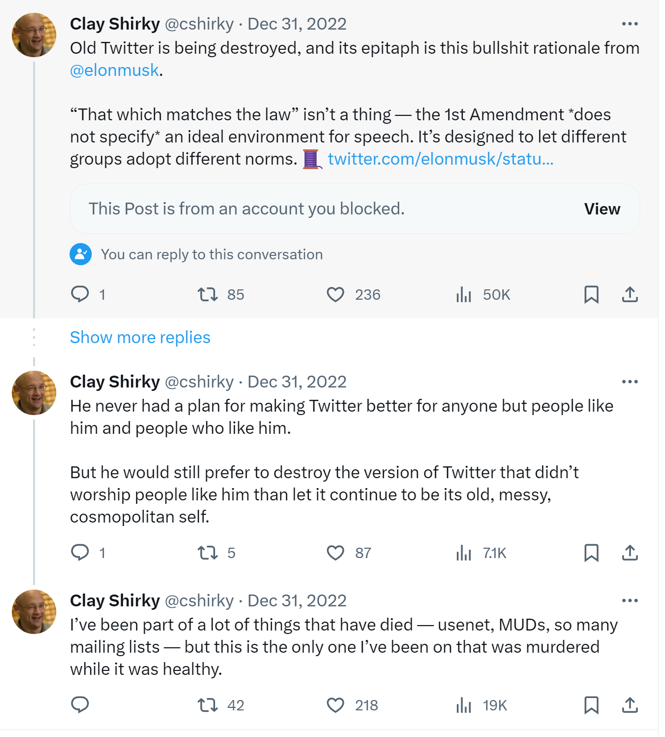
It’s undeniably sad. I really liked Twitter, warts and all, from 2007 onward. In fact, it was the only “social network” I liked at all. Even when it became clear in the Trump era that Twitter was unhealthy for human minds, I soldiered on, gleaning what I could. I’m not alone in that; Clay Shirky’s moribund signoff at the end of 2022 reflected how I felt:
Indeed, Twitter was murdered at the whims of a billionaire high on Ketamine while it was (mostly) healthy, because of the “trans woke virus”.
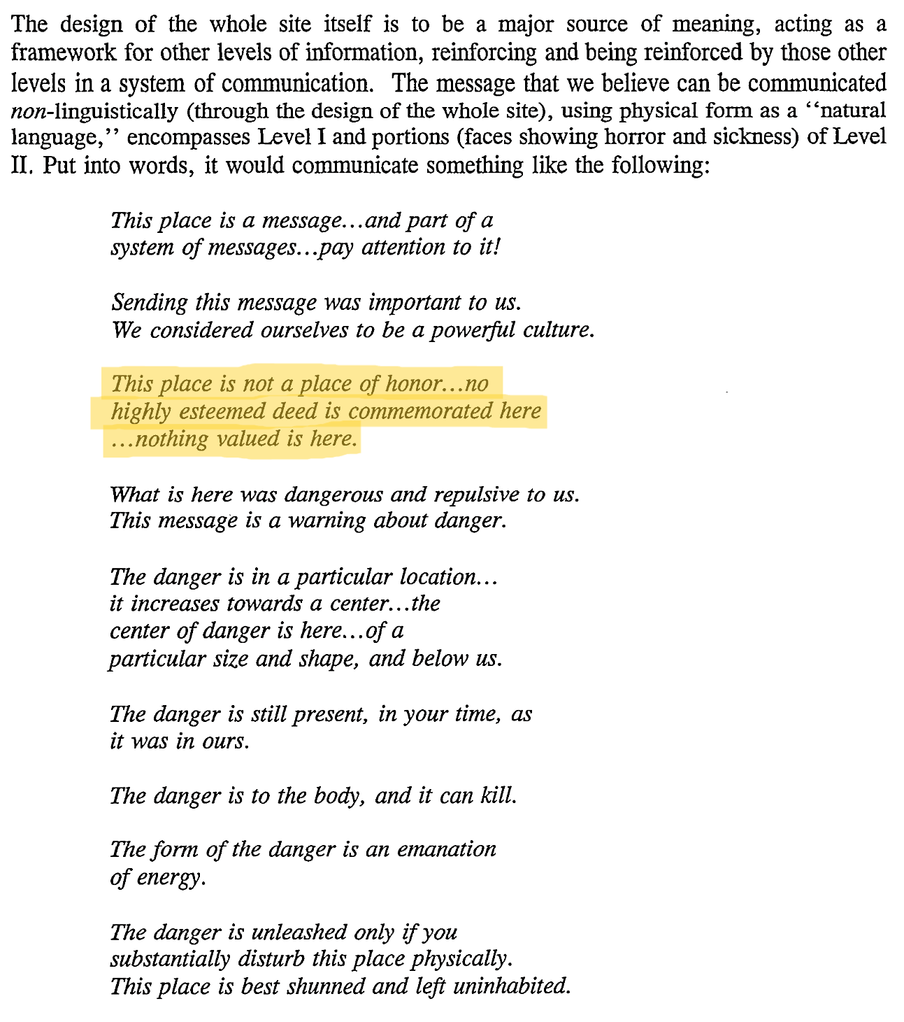
I urge you, all of you, to disavow Twitter and never look at it again. No one who cares about their mental health should be on Twitter at this point, or linking to Twitter and feeding it the attention it thrives on. We should entomb Twitter deep in concrete with this public warning on its capstone:
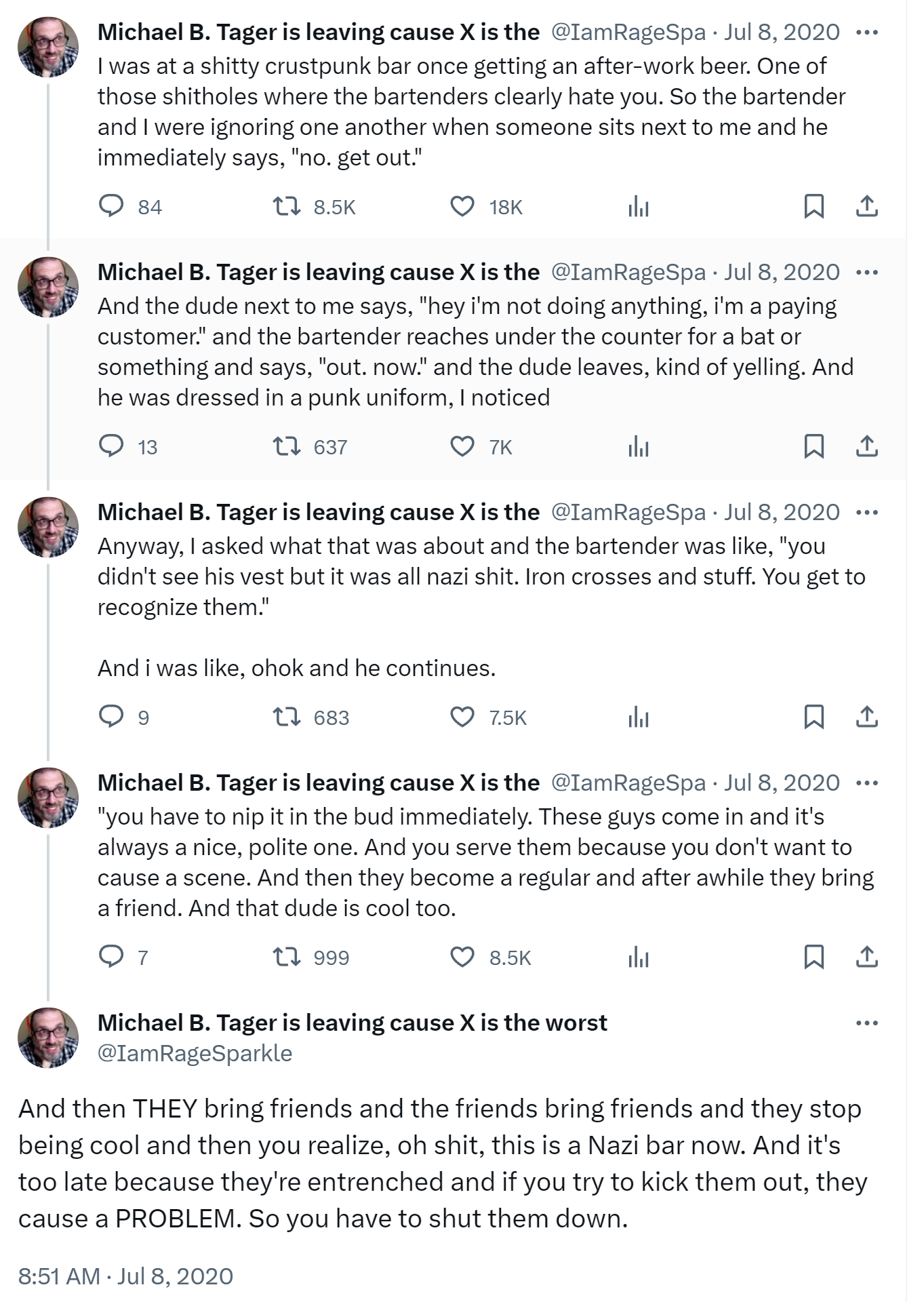
In the end, I begrudgingly realized, as did Paul Ford, that Elon unwittingly did us a favor by killing Twitter. He demonstrated the very real dangers of any platform run by a king, a dictator, a tyrant, a despot, an autocrat. You can have all your content rug-pulled out from under you at any time, or watch in horror as your favorite bar... slowly transforms into a Nazi bar.
I’ve been saying for a long time that decentralization is the way to go. We can and should have sane centralized services, of course, but it’s imperative that we also build decentralized services which empower users and give them control, rather than treating them like digital sharecroppers. That’s what our Discourse project is all about. I propose collective ownership of the content and the communities we build online. Yeah, it’s more work, it’s not “free” (sorry not sorry), but I have some uncomfortable news for you: those so-called “free” services aren’t really free.
Which, again, is not to say that “free” services don’t have a place in the world, they do, but please don’t harbor any illusions about what you are sacrificing in the name of “free.” Grow up.
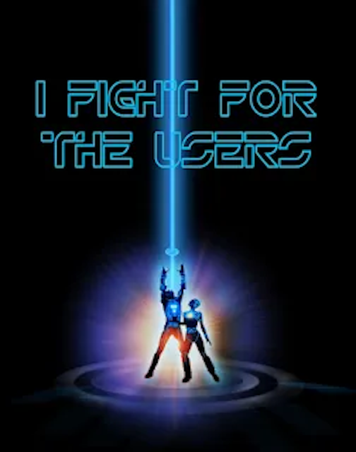
I take a rather Tron-like view of the world when it comes to this stuff; in the software industry, our goal should be to empower users (with strong moderation tools), not exploit them.
So I encourage you to explore alternatives to Twitter, ideally open source, federated alternatives. Is it messy? Hell yes it’s messy. But so is democracy; it’s worth the work, because it’s the only survivable long term path forward. Anything worth doing is never easy.
I’m currently on Mastodon, an open source, federated Twitter alternative at https://infosec.exchange/@codinghorror – I urge you to join me on the Mastodon server of your choice, or quite literally any other platform besides Twitter. Really, whatever works for you. Pick what you like. Help make it better for everyone.
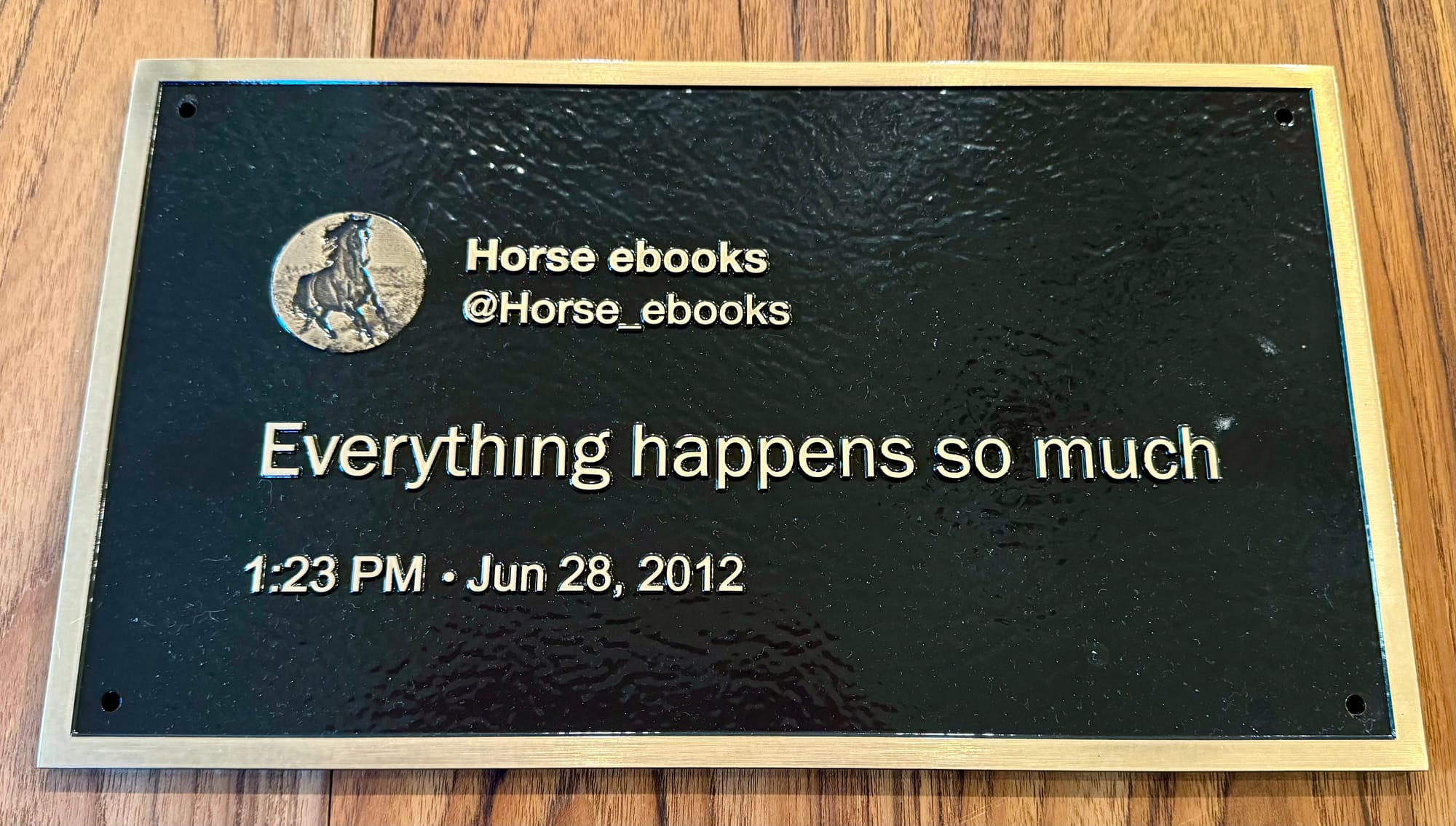
To inspire that leap of faith, I am currently auctioning off, with all funds to benefit The Trevor Project which offers assistance to LGBTQ youth, these 10 museum quality brass plaques of what I consider to be the best tweet of all time, hands down:
(Blissfully, @horse_ebooks is also on Mastodon. As they should be. As should you. Because everything happens so much.)
If you’d like to bid on the 10 brass plaques, follow these links to eBay, and please remember, it’s for a great cause, and will piss Elon off, which makes it even sweeter:
(Apologies, I had to cancel the old auctions because I forgot to allow international shipping – I’ve also made shipping free, worldwide.)
Added Intel's open source monospace font to the
Free Programmers' Fonts
page. This one is designed to reduce developers' eyestrain and fatigue, and was made with people with poor eyesight
in mind as well.
A cross-platform open source C++ GUI library has been added to the
Free GUI Libraries and Source Code
page. It lets you code an application that can be compiled on Windows, macOS, Android, etc.
A new Python compiler has been added to the
Free Python Compilers
and Interpreters page. This one compiles your code to native machine code, without any
runtime dependencies.