After restarting my RSS subscriptions, I’ve been on a constant lookout for good RSS readers. There’s an overwhelming amount of them out there, an aftermath of a race to fill the void Google Reader left when it was shut down.
Here’s a review of the 10 best free online RSS readers I’ve come across so far.
1. Digg Reader
Digg Reader is a free online RSS reader that has a clean user interface and all the features you need for reading and managing your RSS feeds. This RSS reader integrates with other web services such as Instapaper so that you can bookmark posts that you want to read later.
Feedreader Online is a simple and free RSS reader. It has two types of viewing modes, a feature called Starred Items for saving RSS feed items, and a filter for displaying unread items. In my opinion, these are truly the only features you need for a good RSS reading experience.
3. CommaFeed
CommaFeed is a free RSS reader inspired by the now-defunct Google Reader. This free RSS reader is open source; you can download its code and host it on your own server.
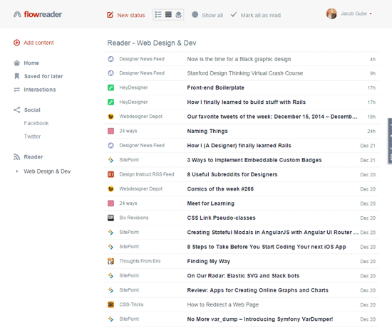
4. FlowReader
FlowReader is what you’d get if you combined RSS and social media. It’s a great option for people who want to see all their content sources in one place.
Feedly is an online RSS reader with a clutter-free user interface. It has an Add Content feature which aids you in quickly finding new content sources to subscribe to. Though Feedly is free to use as-is, it does have a paid subscription plan that costs $5 a month. The paid plan unlocks some more features such as integration with web apps like Evernote and Dropbox.
Inoreader is a feature-rich RSS reader that has a ton of configurable options. For example, it lets you craft custom rules that will perform actions such as “Send to email” or “Send to Instapaper”. It has four view modes and four UI themes. Beyond Inoreader’s free subscription plan, it has paid subscription plans that start at $2.99 a month.
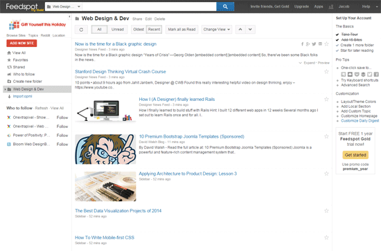
Feedspot is a free RSS reader with an integrated search feature that allows you to search your content sources. It can recommend sites to subscribe to based on your interests. Feedspot has a paid subscription plan that costs $24 a year, and it gives you an advertisement-free experience.
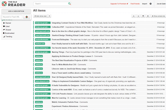
The Old Reader has all the features you expect from a good RSS reader: Keyboard shortcuts, various viewing modes, all that good stuff. One thing that makes it different is it’s also a social network: You can connect with other users and share content with each other. The Old Reader is free for up to 100 subscriptions, then you’ll have to upgrade to a premium subscription plan that costs $5 a month.
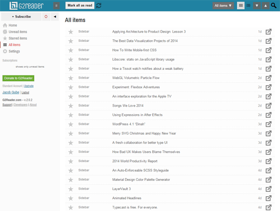
9. G2Reader
G2Reader is another RSS reader that has the essentials. G2Reader is free only up to 100 subscriptions. It will cost $29 a year beyond that.
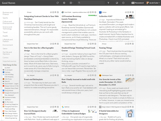
Good News aggregates all your content sources in one place. This means you can read your RSS, favorite sites, and social media in a centralized way. It has a total of 12 alternative viewing modes for your convenience.
Summary
The RSS reader I’m currently using is Digg Reader. Digg Reader has a clean user interface, is lightning fast, and works well on laptops/desktops (which is where I read my RSS). But I constantly review my options to make sure it’s still the right tool for the job. Feedreader Online is another option that matches my needs.
Some people need a more comprehensive web-content-reading experience. My two suggestions for all-in-one content readers are FlowReader and Good News.
If you’re concerned about privacy, you can host your own RSS reader using the free and open-source CommaFeed.
ev 1.1.4
Fixed tests with PHP versions 8.1.0beta (both NTS and ZTS) and 5 ZTS. Thanks to Remi Collet.
ev 1.1.3
Fixed #43: watcher was not stopped on an uncaught exception in the callback.
igbinary 3.2.4
* Forbid serializing classes that deny serialization/unserialization (anonymous classes, CURLFile, etc.) even when subclasses implement '__serialize' and '__unserialize'
ast 1.0.14
- Support php 8.1 readonly properties with the flag 'MODIFIER_READONLY'
- Support php 8.1 first-class callable syntax, add the node kind 'AST_CALLABLE_CONVERT'
- Change the current AST version from 80 to the new version 90. AST version 85 is no longer experimental.
imagick 3.5.1
- Better detection of appropriate OpenMP library to use, i.e. GCC or Clang.
datadog_trace 0.62.0
### Added
- ZAI env #1250
- Add ZAI component for reading headers #1256
- (PHP 8) Add proper exception and error reporting #1272
- (PHP 8) Register SpanData->exception property and store exception info there instead of internally #1281
### Changed
- Refactor internal span objects to be allocated together with their internal data #1254
- Enforce metrics to be floats in internal serializer #1258
- Allow for global debug mode, add zai testing to Makefile and more minor testing improvements #1265
- Move DDTraceFormat to src/api #1271
- Moving spans from userland to extension #1262
### Fixed
- Fix msgpack serialization of empty arrays #1259
- Set SECBIT_NO_SETUID_FIXUP to prevent crashes after setuid() calls #1276
- Apply original curl headers when curl_setopt_array() fails #1279
- Fix owner of files included in the distributed .tar.gz archive #1280
- Fix tests: Pin Symfony 4 tests to laminas/laminas-code < 4.4 #1266
imagick 3.5.1RC1
- Better detection of appropriate OpenMP library to use, i.e. GCC or Clang.
Perhaps it sounds ironic, but one of the hardest parts of a web designer’s job occurs before the project actually begins. Figuring out website project requirements can stump even experienced designers.
Why is that? Quite often, it comes down to communication. Clients can understandably struggle with articulating their needs. Terminology is one part of the equation. But so is a grasp of how websites work in the first place. That’s why they hire a web designer.
Therefore, it’s usually up to designers to sort out the details – which can also be problematic. When two parties aren’t speaking the same language, it’s only natural that something gets lost in translation. And, even when you do have a solid idea of what a project needs, there are still items that seem to pop up unexpectedly.
None of this is an exact science. But some strategies can help you paint a clearer picture of what a website project will require. Below are a few ideas to point you in the right direction.
Look Beneath the Surface of Feature Requests
When discussing project requirements with a client, it’s rare that a feature is self-explanatory. These things always tend to be more than meets the eye.
For example, the weather forecast may tell you that it’s going to rain. But there’s a difference between a passing shower and a torrential downpour—the details matter.
Likewise, the mention of a shopping cart might sound simple enough. But eCommerce is an incredibly broad subject. What that term conjures up in your client’s mind might be decidedly different than your vision.
It’s not sufficient to simply know that a shopping cart is needed. There also needs to be a clear definition of what that cart is expected to do. As such, you’ll want to gather as much information as you can – with details like:
What products and services are being sold?
How will payments be processed?
Is shipping needed? If so, how will that work?
Will taxes/VAT need to be collected?
What features will be implemented to provide customers with the best possible shopping experience?
The above questions are just scratching the surface. But the idea is to continue to unravel the various layers of the project. A few simple queries will get that process started.
Use Your Experience to Help Guide Clients
As we mentioned, communication is a crucial factor in understanding a website project’s needs. And you have a secret weapon at your disposal that can help: your past experiences. They’re something you can use to improve both dialogue and direction.
One benefit of experience is the ability to recognize red flags. These are items that a client mentions that are either misguided or otherwise vague.
Consider a client who asks for a website – but only mentions desktop devices. Experience tells you that a modern website needs to work on all screen sizes. Thus, this is something to bring up in conversation. It may be that your client forgot to talk about mobile design or didn’t realize it was important.
This is another example of how a client’s stated requirements can often miss key components. Thankfully, you can lean on your experience to help fill those gaps.
Find Relevant Examples
Sometimes it’s easier to show someone a website feature than it is to explain it verbally. This is especially the case when it comes to more in-depth items like shopping carts or navigational UIs. But it could be useful for virtually everything else as well.
It also fits in with existing strategies. At the beginning of the design process, some designers ask clients for a list of websites they like. This provides us with solid ideas for various layout and design aspects. And it can also be great for determining website requirements as a whole.
For clients, features they’ve utilized on other websites often informs their own expectations. They can point to specific interactions or functionality that appeal to them. And, just as important, they can tell us what they don’t want. Perhaps an example website is only a portion of what they’re looking for. But it offers a starting point from which to build.
This also works both ways. Even if your client hasn’t provided you with any examples, you can introduce your own. Either way, it adds clarity with regards to project needs.
Getting the Whole Picture of Your Project
A website’s project requirements touch every area of the design and build processes. First and foremost, they determine the initial cost estimate. This ensures that you’re being paid fairly for the work that is being done.
Second, they also help to avoid the always-dreadful scope creep. By having a detailed list of requirements in hand, you’re less likely to run into items that were previously overlooked.
Make no mistake: it’s near-impossible to cover every potential need. Plus, there’s always a chance that requirements will evolve along with the project itself.
But improving communication and paying attention to detail can make a huge difference. By taking the steps above, you’ll gain a more complete picture of your projects. And that’s something that will benefit everyone.
Marketing buzz has never been a true reflection of reality. No, the “right” drink won’t make you more desirable. A new car won’t bring your family a higher level of togetherness. And a WordPress theme can’t possibly fulfill every single need.
The myth of that last one has persisted throughout the years. Theme developers position their products as one-size-fits-all. Whether you’re a baker, a plumber, or a multinational corporation – a singular theme has you covered.
It’s easy to understand why themes have been marketed this way. WordPress powers 40% of the web and has a very broad user base. The desire to reach every corner of it is strong.
Still, the reality is often something altogether different. While a theme could theoretically be utilized for any purpose, this doesn’t mean it’s a good fit. But maybe that’s about to change.
The introduction of Full Site Editing (FSE) could be the thing that makes a “multi-purpose” theme more than just a positioning statement.
If you’re unfamiliar with WordPress Full Site Editing, you’ll want to check out our writeup on the feature. It will give you a background regarding what it does and how it might be useful for users and developers alike.
More Flexible, Less Opinionated Themes
Part of the challenge with building themes for a mass audience is balancing “opinionated” design with flexibility. Until now, that has seemed like a losing battle.
In this realm, flexibility tends to be defined as having a lot of readymade site templates. For example, a theme may come with demo websites for a construction company or an electronics retailer. But just because you throw in a few relevant stock photos and change the layout doesn’t mean it’s at all appropriate for the user’s needs. That’s more like opinion disguised as something else.
Full Site Editing brings something different to the table. Since it allows every portion of a compatible theme to be customized directly within WordPress, it could potentially redefine the role of a theme developer.
Instead of offering completely rendered designs, a theme might include an array of options for the header, footer, navigation, and content area. From there, a website owner can choose the options that best fit their needs and fill in the blanks with content.
Since block patterns have become an established part of the Gutenberg block editor, they are a natural fit for FSE themes. Theme authors can include relevant patterns and maybe even some custom blocks that enhance functionality.
Design assets like photos and icons can still be included to provide a polished look. However, they’ll be easier to swap out thanks to the block editor.
Reducing Theme Bloat
As it stands, finding a WordPress theme that doesn’t include massive amounts of code is difficult. Bulky option panels, “required” plugins, libraries, and custom templates all take up space. They also add to the maintenance burden. More code means more potential for bugs to pop up.
Because FSE is an extension of the Gutenberg experience, there’s hope that it will help themes jettison bloat. For example, many themes bundle in a page builder plugin. However, this should become unnecessary as a theme can now take advantage of the native editor.
The aforementioned block patterns and custom blocks could take the place of additional templates and plugins, respectively. This further reduces the size of a theme package and might ease maintenance requirements.
To be fair, custom blocks also tend to be placed into their own plugins. But rather than bundle a half dozen separate plugins (like we tend to see today), blocks could be combined into a single package. Even better if they’re theme-agnostic and can be used down the road with other themes.
Hopefully, FSE leads to leaner themes that are better optimized for performance.
The Big Question: Will Theme Developers Buy into FSE?
The potential of FSE seems quite large. It represents a major shift in the way we build and maintain WordPress themes.
But success will require some buy-in from theme developers. And there’s no guarantee that the larger theme shops will immediately jump on board.
Commercial themes built with Gutenberg in mind aren’t nearly as plentiful as those that rely on page builders. Then again, early versions of the block editor were clunky and constantly changing. Perhaps FSE will be the feature that pushes developers to finally embrace the new way of doing things.
The transition will take some time. Developers have a lot invested in existing products and are obligated to continue supporting them. Then there is the learning curve that comes with FSE and Gutenberg.
Once a few popular FSE-capable themes prove themselves on the market, you can expect other developers to join in the fun. Until then, we can dream about what WordPress themes can and should be. Maybe this will be a major turning point.
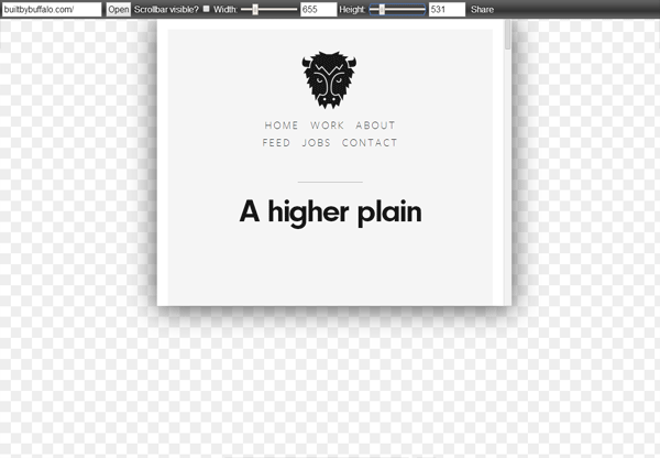
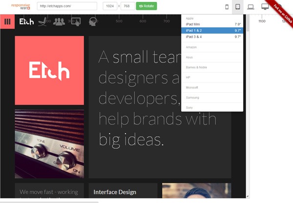
This open-source tool (repo is on GitHub in case you want to set it up locally) lets you see how a web page will render in various screen sizes. There are lots of devices supported by ResponsiveTest, such as iPhone, Blackberry, Samsung mobile phones, Dell laptops, and much more.
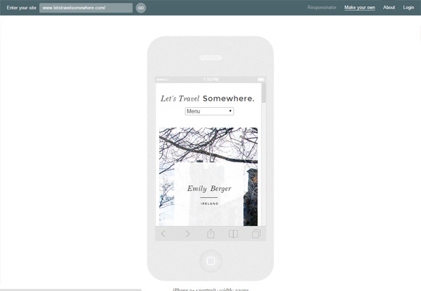
Responsinator takes in a URL and then outputs a sequence of device mockups with the web page rendered in them so you can get an idea of how the page layout will be experienced by your users in various devices.
Responsive
A useful feature this tool has is it gives you keyboard shortcuts (for example, pressing T will show you the tablet preview). This is handy if you like quickly switching back and forth between various device previews.
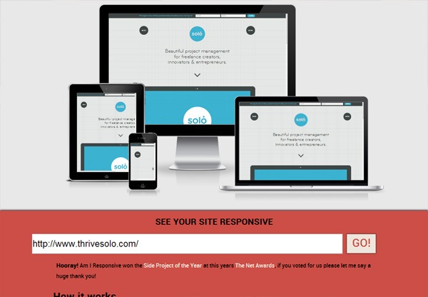
This is a simple Web tool for testing the responsiveness of any site. Plus, the preview image it renders can be a great visual for your presentations, design meetings, etc.
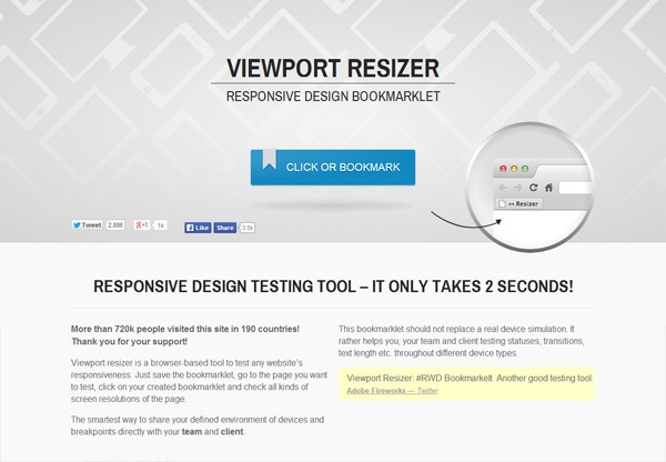
This useful bookmarklet simply lets you resize your browser to a specific dimension, e.g. the dimension of an iPhone 5, or Amazon Kindle Fire, or any one of Viewport Resizer’s 47 screen size presets.
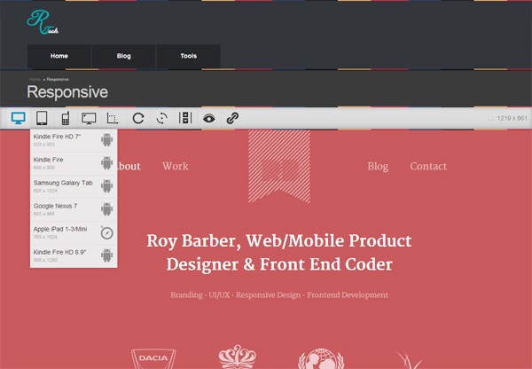
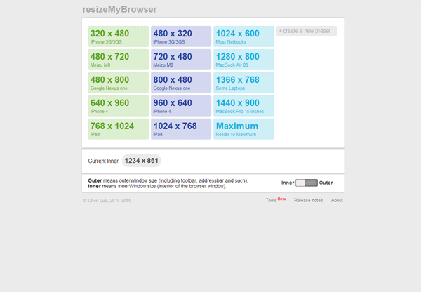
This tool lets you resize your browser based on any of the 15 default sizes that match up with some popular devices (MacBook, iPad, etc.). You can also set your own custom dimensions, and it also tells you what your current browser window size is.
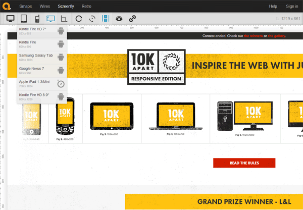
Just like some of the other tools in this list, Screenfly takes in any URL and then gives you a preview of the web page under various preset screen dimensions.
Like Responsinator, this responsive web design testing tool by pixeltuner.de allows you to enter a URL which is then rendered inside several device mockups.
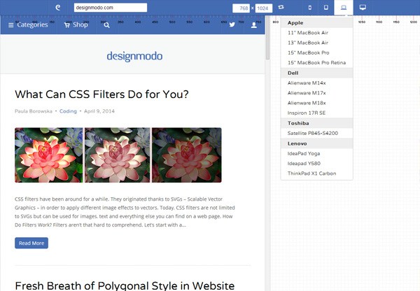
responsivepx can work with your local files. What I would do is just open your HTML document in your web browser and then copy-and-paste the URI into responsivepx. This is useful when you’re working on a responsive design project on your computer.
Which Tool Should You Use?
Many of these responsive design testing tools work pretty much the same way, so picking one over another is really just about personal preference.
I recommend playing around with all of them and then choosing the one you like most.
What’s your favorite responsive design testing tool? Share and talk about it in the comments.


