The process of launching a website can be a daunting endeavor. There are many things you want to do, but not enough time and resources to do them. However, even though it might seem like a herculean task, as long as you keep some fundamental things in mind, you can ensure a hassle-free website launch.
In this article, I’ll share with you some tips for launching a website based on the experience of our own launch of Design Instruct. Read on to learn how to launch a website.
This article is part of Design Instruct Week, a weeklong celebration of our newly launched site, Design Instruct. This week on Six Revisions covers topics that deal with running websites and design, written by the founders/editors of Design Instruct and Six Revisions. Be sure to check out the Design Instruct Week Twitter Giveaway, which gives out different prizes every day of Design Instruct Week.
1. Have scalable web server resources
With today’s high-availability and cost-effective content distribution solutions such as Amazon S3, and on-demand instant scalability offerings of hosting providers such as VPS.NET, you can affordably have web servers that can take a beating from high-burst traffic.
Not only will having scalable solutions prepare you for the high-traffic that a website launch can generate, but it also future-proof’s your set-up as your website grows. High-availability, metered set-ups give you the ability to pay for just the resources you need right now.
For Design Instruct, we set up a CDN for distributing static files for our content-heavy pages, and scaled up our VPS resources temporarily on the day of the site launch because we were anticipating a huge burst of traffic.
Regardless of how big or small you think the traffic you’ll get is, it’s never a bad idea to get a web hosting solution that will scale—they’re tremendously affordable and you pay only for what you intend to use.
Don’t risk having your website crash and your launch day ruined because of a shoddy web server. Make sure this tip is high on your website launch checklist!
2. Get all of your social media accounts beforehand
Nowadays, social networking is integral to a website. Don’t wait the last minute to sign up and set up your social network accounts on Twitter, Facebook, MySpace, and any other site that you’re planning to engage in.
This guarantees that your preferred account name will be available before you become known and gives your visitors additional ways to communicate with as soon as they arrive at your website.
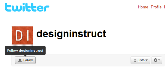
On Design Instruct, our social media accounts were established well before the site’s launch date. For example, we had our Twitter account set up close to a month ahead of our site launch.
3. Have content ready to publish for at least a month
The early stages of a website is filled with many tasks. One timesaving deed you can do is to have content ready to publish so that you can follow up your launch with great content. This also frees you up for the many other activities involved in this stage of your website’s growth.
For Design Instruct, we set out to have 10 tutorials ready to go before we launched the site. We didn’t quite make that goal before our launch date, though we had enough to comfortably go ahead with the launch. This enabled us to focus on tasks that needed to be tended to without fear that we wouldn’t have great content to publish.
4. Drop hints about the upcoming launch to build anticipation
Let people know that there’s an event that’s going to occur to help create some hype. If you want to keep the details undisclosed to the public—that’s fine—you can still let people know that something on some date is going to happen.
In Design Instruct’s case, we wanted to wait until the actual launch before revealing what the site was. That didn’t prevent us from dropping hints that there was something coming soon. We did it through interviews and on Twitter a month ahead of the actual launch date.
This type of subtle hinting can pique the interests of your long-time supporters and fans. And those are the people that count the most when your website launches.
5. Plan your tasks for at least a month after the site launch
The worst question to have after a site launch is, “Now what?” You need a clear goal and direction on how you intend to follow through your site’s launch. If you’ve planned for a big site launch, don’t let the initial interest fizzle out by not having a plan. Before you launch, you should know exactly how you want to proceed right after.
For example, on Design Instruct, we had a laundry list of things we wanted to work on. Having content ready to publish, we were able to focus on growing the site and improving the user experience for our readers.
6. Triple-check the technical details before going live
Measure twice, cut once. Better yet, measure thrice. Making certain that your early visitors will have the best experience possible when first arriving at your site means that everything needs to be working correctly.
Check to make sure that all hyperlinks work. Make ultra-sure that contact forms, email accounts, commenting systems, and all the other things that your users will interface with, is working properly.
One of the late quick fixes we had to implement just hours before Design Instruct’s launch had something to do with category pages.
Users visiting a category page from the sidebar links that didn’t have an associated tutorial under it simply said that the page could not be found. It gave the impression that there was something wrong.
We had to revise the message to say, “There aren’t any posts in this category yet. We’re working on it though, so please check back soon!” to let users know that the pages do work, just that there aren’t anything in them yet.
7. Launch on schedule
Whether you’ve announced your launch date or not, you should release your website to the public when you say you’re going to. This forces you to stay on point and work towards a goal. What can cripple and delay a website launch is the attitude of “It’ll be ready when it’s ready.”
When you’re nearing launch day and you think you won’t have the site fully completed, launch anyway (as long as it’s presentable and usable).
Websites aren’t like conventional consumer products—you can update and upgrade them any time you want.
At Design Instruct, we were delayed with some of the site features we wanted to implement, such as a comment rating system and a post rating system.
We still went ahead with the launch and created a malleable and constantly updated Upcoming Features page that listed the things we wanted to do in the future. We would curate this list by adding and removing items based on what our users want.
8. Contact your friends and family about the site launch
The first thing to do after a site has launched is to contact your friends and family. Let them know that you’ve launched the site so that they can be the first to see it.
Our friends list is just a bit larger than most people just starting out. However, we still sent personal emails to our friends at Smashing Magazine, Abduzeedo, Envato and others. We announced the site launch here on Six Revisions so that our regular readers would be the first to know about our new site.
It doesn’t matter how big your list of friends and family is, they should be the first to know about your site’s launch.
9. Provide easy ways of contacting you
When you first launch a site, you have to give visitors ways to communicate with you easily. Your initial visitors are early adopters, and as such, they’ll be critical and will help you find things that might be wrong with the site, as well as suggest ways you can improve the site for future users.
For Design Instruct, we had several modes of communication available: email, Twitter, the comments section in the announcement post on Six Revisions, and the comments section in the welcome post on Design Instruct.
This enabled us to find out what early adopters thought about the site, and what they wanted to see in the future.
10. Show site visitors a roadmap of what’s to come
Perhaps the most important thing you can do when you launch a site is to show your initial users that there’s more to come.
No one gets a site right on the first day. Unless you release your website, anything you think your users will want and need is just a guess. The people who will best help you figure out what works for your users are your users.
So we’ve set up an Upcoming Features page and asked our users to tell us what they want and what they don’t want.
We’ve periodically polled our supporters and fans through Twitter to determine what we should do next.
We also track all of our site changes publicly through our changelog and version history to show our readers that we are indeed moving forward with their suggestions.
Let your users see that you have more tricks up your sleeve and that they should stay on for the ride as your website continues to grow.
Share your own tips for launching a website in the comments.
Starting in WordPress 5.8, a new tool — “theme.json” — is available to use in your theme. Maybe you’re hearing about it for the first time, or maybe you’re testing and developing themes with it already. Either way, I’m glad you’re here because it’s an exciting time for WordPress themes.
This post provides a quick introduction to this new framework, and describes what’s possible by sharing a few practical tips and examples.
What’s theme.json?
Technically, theme.json is just a file that lives at the top-level of a theme’s directory.
Conceptually, it’s a major shift in how themes can be developed. Theme authors now have a centralized mechanism to tailor the WordPress experience for site authors and visitors. Theme.json provides theme authors fine-grained control over global styles, block styles, and the block editor settings.
By providing these settings and controls in a single file, theme.json provides a powerful framework that brings together many aspects of theme design and development. And as the block editor matures and adds more features, theme.json will shine as the backbone for themes and the editor to work together.
Why Use it?
It’s the future! But if you’re like me, you might need something more tangible to be convinced. Here are a few reasons why you might use theme.json today:
Control editor settings like color, typography, spacing, and layout, and consolidate where these settings are managed.
Guarantee that styles apply correctly to blocks and elements across your site.
Reduce the amount of boilerplate CSS a theme used to provide. Theme.json won’t replace your stylesheet completely — there will be instances where CSS is needed to give your theme that extra flare (transitions, animations, etc.). But it can greatly reduce the base CSS needed from the theme.
I hope this gives you a sense of what’s possible and where themes are going. The above examples just scratch the surface of what kinds of theme design configurations are possible, and I’m very excited to see what theme authors create.
“Coming soon” pages are a great way to tide over your visitors until you finish your new website. They can be used as a teaser for your future website, or places to simply put your information where people can get to it while you are under digital construction. We are going to look at a collection of how websites are successfully using “coming soon” pages.
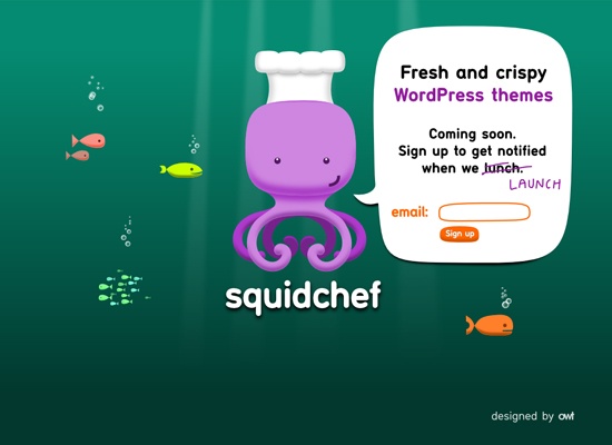
1. SquidChef
SquidChef has a cute under-the-sea theme and an illustrated squid character to go with their name “SquidChef”. Having a character illustration like this almost ensures that the site is going to have a friendly feel. (Check out some more illustrated character designs). I also like the idea of putting all the information into the talk bubble.
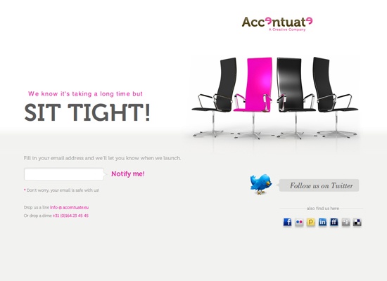
2. Accentuate
I like the color scheme of this “coming soon site”. It’s a simple theme that uses pink to highlight important areas. The colors go well with the simple layout of the website and the image of the chairs makes the website more interesting than just having text.
Having an illustrated look to a website usually gives it more of a fun and laidback feel. It has a bright and welcoming color palette, and I like how the headings in the three sections in the footer are different colors. It makes the color flow throughout.
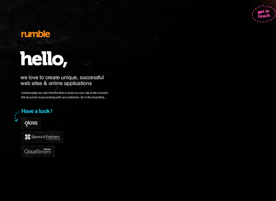
4. Rumble Labs
Usually when you say “hello” right off the bat, it gives off a friendly vibe, and despite the dark background, this page gives that endearing feeling. The bright highlight colors help emphasize that point, as well as the arrow and dotted lines.
I like the hovering logo – it creates a sort of 3D look, which gives the page a little more dimension. Also, what makes this site interesting is that when you hover over the logo and Twitter icon with your mouse, it displays more information. (Learn how to create 3D text via this tutorial).
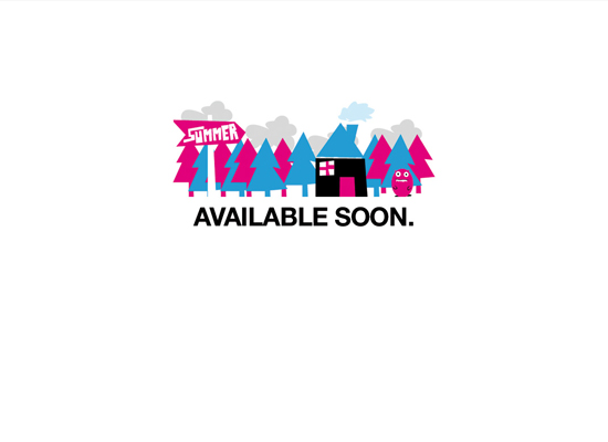
The brightly colored quirky illustration gives a good sense of what the style of work could be, or at the very least, gives a fun laidback feel. The sign that says, “summer” integrated into the illustration gives a hint as to when the website will launch.
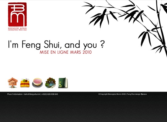
7. Berengere Monin
This website has a very nice clean and simple look. I like the Asian-inspired style, with the tree/plant on the right and the black, white and red color scheme. It gives the “coming soon” page a nice sense of simplicity.
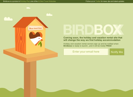
8. Birdboxx
This is a successful illustrated “coming soon” web page. This site pours out a peaceful and calming character with the green colors and the white dove.
I like the sketchy style of this soon-to-launch page. Not only is it a fun layout, but it is also useful, with the “be updated” mixed into the design. This “coming soon” page gives you ways of keeping in touch, by including Twitter and email options into the composition.
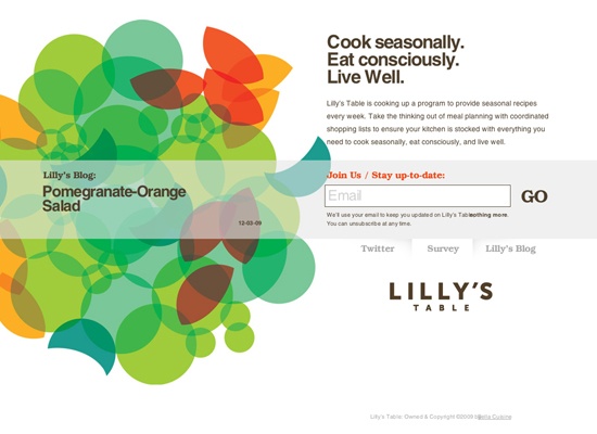
The color palette is what really draws me to this website. The colors have a slightly retro feel (learn how to create a retro color scheme), but it still gives off a bright, clean, vibrant feel. In addition, I like how the last post from their blog is displayed on the left.
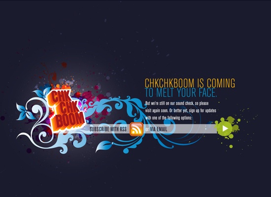
I like the paint splatter effect, which they use to draw attention to the important parts of the layout. They also use some bright colors to emphasize certain areas like the headline, and the green play button which is used for the RSS email feed.
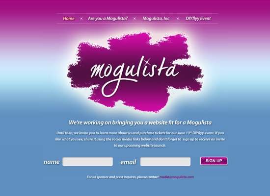
12. Mogulista
This website gives off a glamorous countenance, and that is probably because the business is geared towards women, who typically find these sorts of themes appealing. What really struck me about this “coming soon” site was the navigation. They use a nice animation that keeps you on the same page but rolls in and out the new text below the logo.
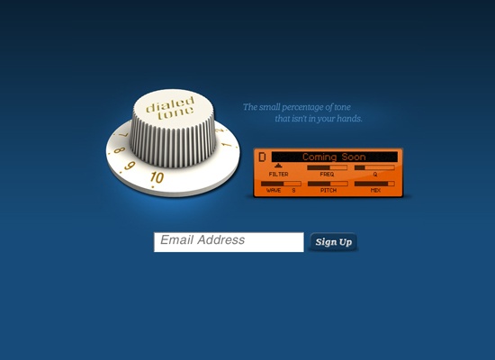
13. Dialed Tone
I like the usage of the 3D dial, as well as the shadows on the “coming soon” box and the sign up button, which give the site a lot more dimension.
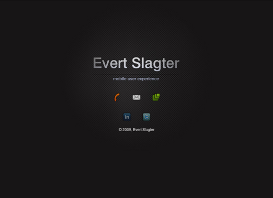
14. Evert Slagter
The icons are a nice touch considering they work with mobile user experience. I also like the simplicity and the subtle light glow in the background that gives it a little more depth than just having a black background.
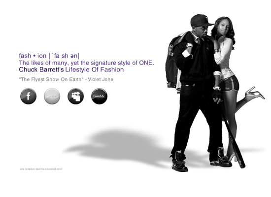
15. Chuck Barrett
I think when I look at this, I immediately get an idea of what kind of style of fashion will be on the future website with the black and white photo. I also like the idea of having the icons in grayscale, which goes with the photo, and how, when you hover over them, they change to colored.
16. Jon Ward
At first glance, this is your run-of-the-mill name, logo, and title “coming soon” page, but if you stay on it for a second or two, you’ll notice that where the job title is, is actually an animation that rotates the title, email and phone number. It’s a great way to present that little bit more information, and at the same time keep the page as simple, but engaging, as possible.
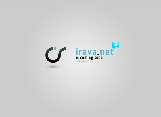
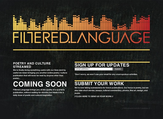
The logo has a techno look to it, which was why it drew me to the site in the first place. It turns out that it’s for a poetry publication. Regardless, the logo, which gives this “coming soon” page a nice dose of color, is spectacular.
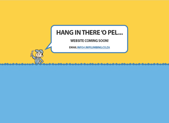
18. Johnny Walker Plumbing
I love how simple the look is, but you can still get the impression that he is a plumber at someone’s house fixing their flooded toilet or sink. It is simple but effective.
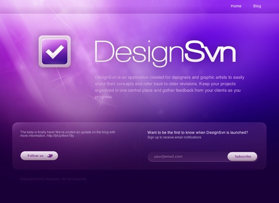
19. DesignSvn
I always love good Photoshop lighting work, and this website has it working really well with the web 2.0ish Twitter and subscribe icons.
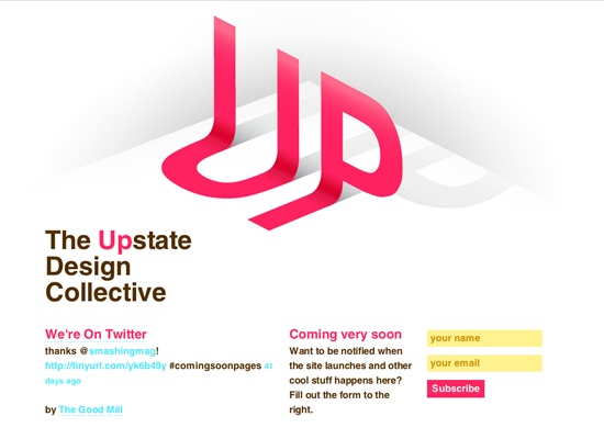
20. Upstate Design Collective
Other than the 3D effects, I really like how the bright fresh colors make the website stand out.
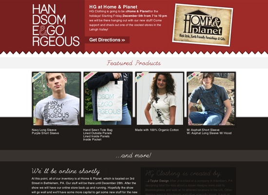
21. Handsome and Gorgeous Clothing
I think that it is important to showcase your merchandise, even if your website isn’t finished yet. I also like the use of the jagged edge, giving it a layered fabric feel, which is appropriate for what they are selling.
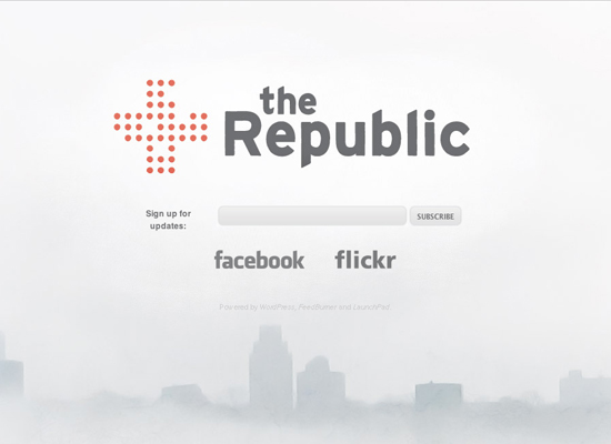
22. The Republic
I like the white design with the subtle cityscape at the bottom; it gives it an interesting look. I also like how they use gray colors instead of the typical black on white, which gives it a less harsh look and helps to make the logo mark stand out more.
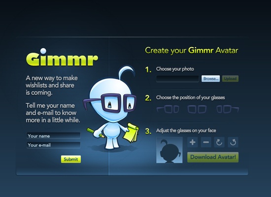
23. Gimmr
Not only does this “coming soon” page have a color scheme that I really like, but it also has a unique feature. You can upload a photo of yourself and add glasses to your portrait so you can look like the character/mascot to the left (which you can then use as your avatar).
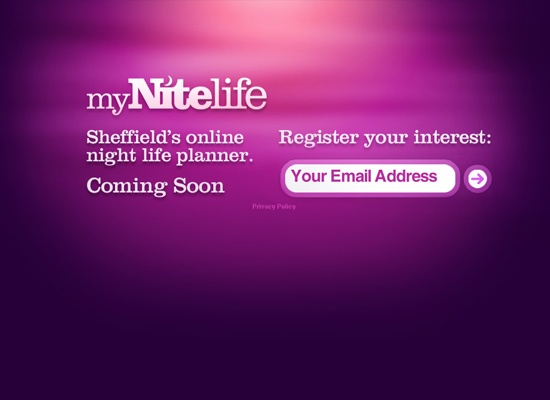
This is another website that uses some nice lighting effects, and the purple colors give it a night feel that goes perfectly with their name (myNightlife).
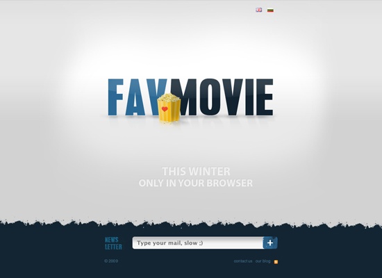
It seems like they are using their “coming soon” page as more of a teaser, not really saying what they’re all about. All I can gather is that it has something to do with movies (probably). If you want to find out, you can sign up for email updates.
The ability to work from virtually anywhere is one of the true benefits of being a web designer. It affords us the freedom to get out of the office and still remain productive. And it might even be a way to boost creativity.
Some freelancers take advantage by hitting the road and setting up shop wherever they happen to be. Location doesn’t matter so much as making time to get things done. If it suits your personality, it may just be a new way of life.
But even if you aren’t ready to commit to a fully nomadic existence, working on the go is still valuable. It can come in handy when a work situation arises during vacation or if you have to unexpectedly leave the office for a period of time.
That’s all well and good. But it’s not just a matter of getting up and going. It’s important to prepare for the inevitable bumps that come along with working on the road. Below, we’ll share some ideas for making the most out of the experience.
Keep Your Favorite Apps (or Alternatives) Within Reach
Access to a laptop computer or tablet device is a must-have. And you’ll want to load it up with your frequently used apps.
Besides a web browser, you’ll want to think about the other key software that helps you get things done:
That sounds simple enough. But apps can be a bit tricky, particularly if you use commercial software. Some licensing may only allow you to legally install an app on a single device. Or it may only be available on select operating systems. If your laptop or tablet doesn’t fit within these parameters, you may be out of luck.
However, web design is a field where there are a number of different software options. If you don’t have a license to use your favorite code editor on a second device, you can always find an open-source alternative.
The same goes for photo editors. For times when Photoshop isn’t available, you might be able to get by with a tool such as GIMP or even a browser-based solution.
Don’t want to pay for that expensive office suite? The free Libre Office package can open all of your text documents and spreadsheets without the extra cost.
The goal is to have a collection of apps that will mimic what you have in your office. This will enable you to take care of whatever work comes your way while on the road.
Bring along Your Logins
The web is nothing if not complicated. The average person likely has dozens of logins to remember. And web designers? Well, that number can easily hit triple digits.
Accounts for third-party service providers, web hosting, and content management systems (CMS) can pile up rather quickly. It’s more than most humans can possibly remember.
This is what makes password management apps so attractive. A good one will securely store your various logins and allow you to take them with you across devices. For example, that means the same usernames and passwords you have saved on your desktop device can also be accessed via your phone or laptop.
It’s an absolute necessity if you plan on doing much work outside of your office. Being caught without a particular login can become troublesome if a change has to be made immediately.
There are plenty of apps that provide this functionality. But if you’re looking for something super-simple, both Chrome and Firefox have them built right in. They’re connected to your account with either Google or Mozilla, respectively. Thus, signing in on a new device will give you access to all of your saved logins.
You’ll also want to take note of anything you need to satisfy any two-factor authentication (2FA) requirements. Quite often, this is your phone. But it could also be an email account or something a bit more obscure.
Have Multiple Connectivity Options
It seems like traveling and spotty WiFi service goes hand-in-hand. For instance, you might book a hotel that promises free connectivity. Only when you get there, you find that broadband speeds cost extra – if they’re available at all.
Some places are even worse. This writer once spent a weekend at a campground where a sloth-like connection hung like a dark cloud over everything. Streaming wasn’t possible, and even email took minutes to load. It’s great if you want to go off-the-grid. Otherwise, it’s a disaster.
When possible, it pays to have more than one option for internet access. That could be as simple as gathering a list of local coffee shops that have WiFi.
You might also opt for a mobile phone plan that includes hotspot functionality. It may not be perfect, but it could become a lifeline to productivity.
Stay Secure
Security needs don’t decrease just because you’re on the road. They’re just as important as ever. Therefore, you’ll want to take steps to keep both your devices and data safe.
First, keep your devices in a secure location (like your backpack or a locked hotel room) and password-protect them. The last thing you want is for a curious stranger to see your laptop lying around and have instant access to your system. Even a small barrier like a password can be the difference in whether your data is exposed.
Security software is also vital. Both antivirus and anti-malware apps can help protect your device from the risks of an open WiFi network. Speaking of which, it may be worthwhile to invest in a virtual private network (VPN) service to wall off your connection from potential dangers.
Lastly, be careful about where you decide to work. If you’re dealing with sensitive information, find a private space away from prying eyes. Most people are good, but do you really want to take a chance?
Web Design, Wherever You Are
Being away from the office doesn’t mean that you have to sacrifice productivity. In fact, web design and development can be done from anywhere you have internet access.
To do it right takes preparation. You’ll need a high-performing device loaded with the apps you’ll need to perform a variety of tasks. A way to access and manage all of those pesky logins is also a necessity.
Beyond that, plan for both connectivity and security. Ensuring that you’ll have a number of ways to get online is vital to getting things done. That being said, it’s also important to protect your data from falling into the wrong hands.
Put it all together and you have the freedom to work in a way that suits you. Establish a solid routine, and your clients may not even know the difference.


 .
.