Developbat PHP CRUD (New)
Read more at https://www.phpclasses.org/package/12172-PHP-Show-pages-to-manage-table-records-using-Bootstrap.html
WordPress is global in reach and open source in nature. And you would assume that what allows the software to be used by anyone would also enable it to be built by anyone. After all, your location doesn’t matter, and who employs you also doesn’t matter. And your relative social standing certainly shouldn’t matter. As long as you can communicate with the others contributing to the project, there should be no obstacle to your participation.
That was Josepha Haden on the “Cherishing WordPress Diversity” episode of the WP Briefing Podcast, speaking about the importance of diversity, equity, and inclusion within the fabric of the WordPress project. Her statement captures the spirit of the WordPress open source project, and we hope it resonates with you. Now, let’s dive in!
WordPress version 5.8, “Tatum,” came out on July 20. Version 5.8 is a major release that offers features like block-based widgets, a host of new blocks and patterns, a template editor, a duotone feature to stylize images, theme.json, and support for webP images, to name a few. Read more in the release post, the field guide, and the talking points post for meetup groups.
Want to contribute to WordPress core?
Contributor teams released the 11th version of Gutenberg on July 9. Version 11.0, which focuses heavily on backports and bug fixes, showcases some cool features such as an editing overlay for template parts and reusable blocks, and support for CSS shorthand properties in theme.json and block attributes. Version 11.1 was also shipped this month, on July 21. The release adds custom block borders as block supports and adds “drag and drop” to the list view.
Want to get involved in building Gutenberg? Follow the Core Team blog, contribute to Gutenberg on GitHub, and join the #core-editor channel in the Make WordPress Slack. The “What’s next in Gutenberg” post offers more details on the latest updates.
The Community Team kicked off work to bring back in-person WordPress events. The team recently announced that in-person WordPress meetups can be organized in a region if the local public health authority allows in-person events and if the region passes the in-person safety checklist. If the region does not meet guidelines on page one of the safety checklist, organizers can plan events for fully vaccinated, recently tested (negative), or recently recovered community members. Subsequently, the team also shared a proposal for the return to in-person WordCamps in places that meet the safety guidelines and the vaccination/testing requirements. Please share your feedback on the post if you have any thoughts. For more context, check out the “In Person!” episode of the WP Briefing Podcast.
Want to contribute to the Community Team? Follow the Community Team blog, or join them in the #community channel in the Make WordPress Slack.
The BuddyPress team is busy! Within barely a month of their last major release (version 8.0), the team shipped version 9.0 on July 19. Key features of the release include widget blocks and updates to the BP REST API. Download it from the WordPress.org plugin directory or check it out from its subversion repository. Want to help build BuddyPress? Follow their developer relations blog, check out their handbook page, or join them in the #buddypress channel in the Make WordPress Slack.
Please help these WordPress contributor teams by answering their research requests:
Have a story that we should include in the next “Month in WordPress” post? Please submit it using this form.
The following folks contributed to July’s Month in WordPress: @webcommsat @chaion07 @jillbinder @lmurillom @meher
Are you designing your very first portfolio website? Do you need motivation to redesign an existing one? Your portfolio website is one of the first things your clients will see, so it’s important to get its design just right. You want to differentiate yourself from the competition by creating a great portfolio website that will showcase what you are capable of. Find a creative way to express yourself — check out these excellent portfolio website examples for fresh ideas and inspiration.
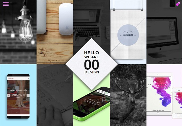
00 Design
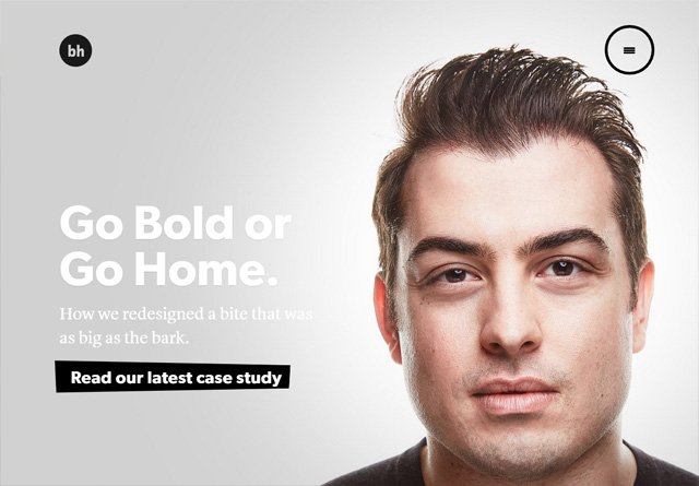
Brian Hoff Design
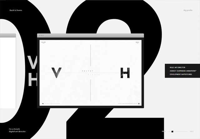
This Also
Flavien Guilbaud
Frank Chimero
Hello Monday
Anton & Irene
adaptable
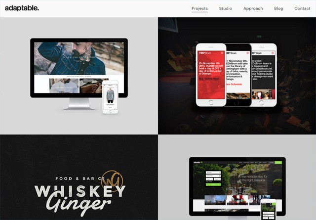
The Uprising Creative
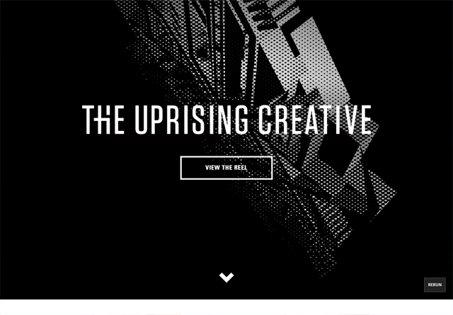
Fixate
Nathan Riley
Violaine & Jérémy
Build in Amsterdam
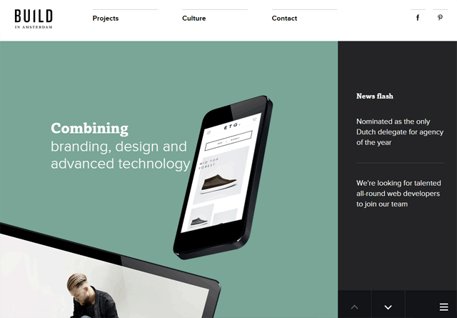
Lionel Durimel
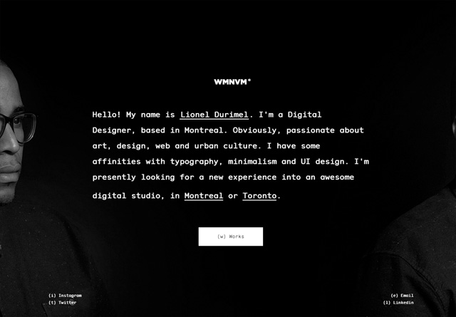
Mike Kus
WILD
Matt Farley
Olly Moss
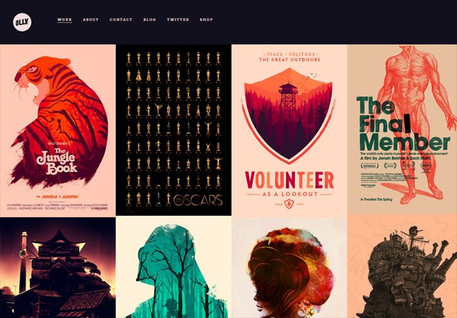
Retrofuzz
Gaspard+Bruno
Elias Sebastian Tinchon
Councl
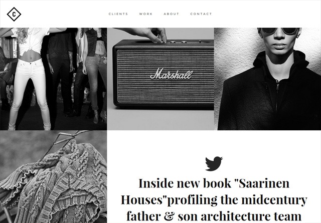
Kelsey Dake
Amber Creative
Tilted Square
Dogstudio
Redel Bautista
Kevin Haag
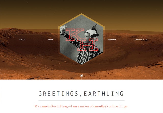
Typeset Design
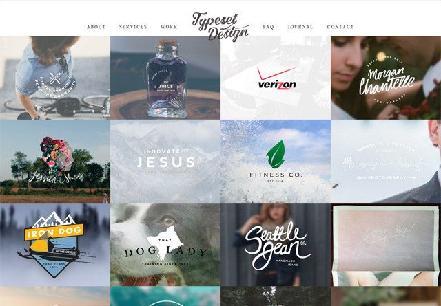
Hinge Ltd
Melanie Daveid
Creature Seattle
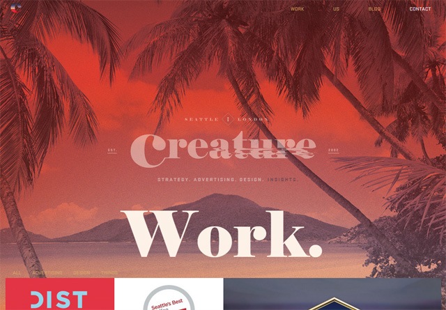
Green Chameleon
Malika Favre
Bad Assembly
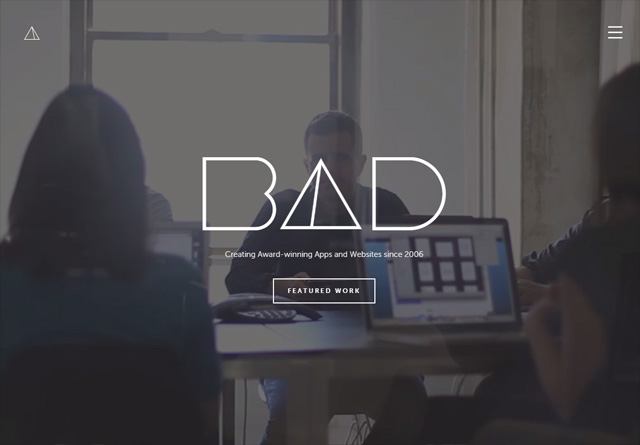
The Beast Is Back Inc
Hatch Collective

Limitless
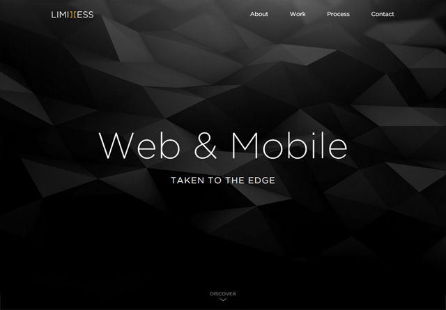
Thierry Ambraisse
Mike Ingham Design
Paradox Design Studio
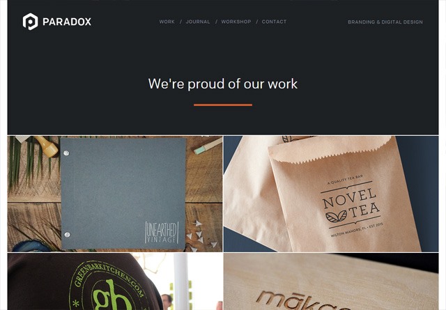
Oddbee
GODE
Angry Bear
Moruba
Kahuna Webstudio
Jan Finnesand
COBE
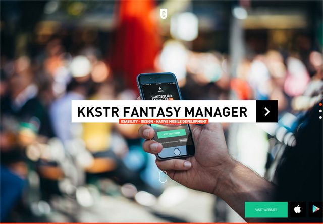
Cleverbird Creative
The post 50 Creative Portfolio Websites for Inspiration appeared first on WebFX Blog.
Latest PECL Releases:
In this episode, Josepha Haden Chomphosy discusses the nuances of building accessible software, the differences between access, usability, and accessibility, and how this all applies to the WordPress project.
Have a question you’d like answered? You can submit them to wpbriefing@wordpress.org, either written or as a voice recording.
[contemporary intro music]
Josepha Haden Chomphosy 0:10
Hello, everyone, and welcome to the WordPress Briefing, the podcast where you can catch quick explanations of the ideas behind the WordPress open source project, some insight into the community that supports it, and get a small list of big things coming up in the next two weeks. I’m your host, Josepha Haden Chomphosy. Here we go.
[musical interlude]
Josepha Haden Chomphosy 0:28
This is the second of my big scary topics for this month. I’ll be talking about accessibility, which much like Diversity, Equity and Inclusion, or DEI in the last episode, is one of those areas where the work is never finished. Also, like DEI in last episode, I feel strongly about accessibility and the need for accessible experiences in the world, but I’m aware that this is an area where I’m still learning.
Josepha Haden Chomphosy 1:04
WordPress has both an accessibility statement and team, which makes a lot of sense given that the software supports so many different people, and industries, and cultures. But if you’re not quite bought into the idea that software should be accessible, or that accessible software can’t also be usable, then this is the episode for you.
Josepha Haden Chomphosy 1:25
Before I joined the WordPress project, the majority of my work with accessibility was in the context of the digital divide. Now, when talking about the digital divide, there are three concepts around quote-unquote, “getting things to people,” and those are access, usability, and accessibility. Sometimes these words seem interchangeable, but ultimately they have nuanced differences that address different problems. And I like to think of them this way.
Access is making sure that someone can obtain something.
Usability is making sure that the user experience is understandable or coherent.
And accessibility is making sure that it’s usable by the largest number of people.
I have always considered each as a subset of the one that came before it. So having something everyone can access is good, but easy to access and easy to use is better. Easy to use is good, but easy to use and easily accessible is better.
Josepha Haden Chomphosy 2:27
After joining WordPress, I discovered that accessibility in the context of software building is well, substantially more complicated. There’s no such thing as perfect accessibility, or a site that is 100% accessible, and many aspects are pretty open to interpretation. It turns out that accessibility, like so many things in WordPress, is a complicated intersection of art and science.
As an example, there’s a rule that says, “Ensure that links are recognizable as links.” A fast shorthand to accomplish that, that we see all over the internet, is to underline all links or put that icon next to it that says, “This opens in a new tab.” You know that icon that’s a box with an arrow? That definitely has a name, that I definitely don’t know? That icon. [laughing] But those solutions don’t necessarily fit every context that you’ll find a link in, and that’s where we see that intersection between the art of communication and the science of necessity.
Josepha Haden Chomphosy 3:32
If you came with me earlier on the idea that accessibility is a subset of usability, and it’s not a far leap to say that the choices around accessibility implementations should always include design and the overall user experience.
I know that some of you are thinking, “But we have guidelines! Like, that’s why we have the guidelines, so that not everything has to be a gray area.” And on the one hand, yeah, that’s true. There are a lot of guidelines. There are guidelines for the code, and what the code produces, and the design elements. But I worry that when a solution is driven solely by rules, rather than reasons, we run the risk of throwing out the good along with the bad.
Josepha Haden Chomphosy 4:15
Accessibility has been a consistent topic of debate in the project for as long as I can remember, and based on all of this, it’s really clear why. There are a few big picture questions that still deserve some sort of canonical answer for WordPress, and where possible I dig in and research the positions that everyone has taken in the past. But I also have questions about how to move everything forward, especially as the editing experience gets more and more standardized across the software, which reduces cognitive load, shortens the learning curve, etc.
What is the future possibility for having a series of more niche admin interface options?
What would it be like to be able to account for functional limitations in a way that lets site builders select what is needed for their clients or organization, or just individual situations they know their sites would be maintained under?
What more could we do if part of the setup flow of WordPress was to select some bundle of potential add ons for neuro diversity, or colorblindness, or dyslexia, and more?
It’s a really big question I have.
Josepha Haden Chomphosy 5:26
And I have to be really transparent here and share that my foundational understanding of accessibility and usability is 10 plus years old, and I learned it in the context of people in education, not software. So a lot of my questions about the future of accessibility and WordPress is the result of old knowledge exploring new spaces, which means they are a little untested. And I’m so grateful for the contributors who point out what the current research and thinking is, in this incredibly complex field.
Josepha Haden Chomphosy 6:00
I normally like to wrap up the briefing with a tidy takeaway, but this particular topic doesn’t really lend itself to that. So I’ll leave you with this. I really believe in WordPress’ mission to democratize publishing. And I, for one, will never stop learning about what gives people more access to the software, and what makes the software more usable, and especially how we can combine usability with accessibility in a way that puts form and function on a level playing field.
[musical interlude]
Josepha Haden Chomphosy 6:40
And now, that brings us to our small list of big things.
Thing one, it’s that time of year where many of our community members take a short break to relax and refresh. I’ll be taking a bit of a break during the month of August, and so the WP Briefing will return again starting in September.
And thing two, huge thanks to the production crew that helps me make this podcast every couple of weeks, but a special shout out to our editor Dustin Hartzler, who makes quick work of all of my rambling thoughts.
Josepha Haden Chomphosy 7:09
And that is your small list of big things. Thank you for tuning in today for the WordPress Briefing. I’m your host, Josepha Haden Chomphosy, and I’ll see you again in September.
[contemporary outro music]
React is an open-source JavaScript library by Facebook that allows for building user interfaces. Its use has spread like wildfire. Not only will you see it when scrolling through the social network, but it’s also been integrated into popular software applications like WordPress.
The hallmark of React is its ability to create highly-interactive, data-driven UIs that are also incredibly quick. They appear natural and seamless to the end-user, picking up where AJAX left off.
Developers are putting these capabilities to good use. They’re routinely taking everyday elements like shopping carts, forms and multimedia and propelling them to another level.
Want to see the impact React can have on a UI? Here are some prime examples that demonstrate what this library is capable of.
eCommerce can really benefit from what React has to offer. Just take a look at this fictional shoe store. Instead of using traditional form elements, it offers a modern and colorful UI. The result is that shoppers can customize their orders in style.
See the Pen React Shopping Layout by Dilum
Here, React is used to bring enhanced looks and a higher level of context to standard checkboxes. These elements stand out, while helping to guide users.
See the Pen ReactJS Checkbox component with custom CSS by myleneb
We previously mentioned React’s ability to efficiently deal with data, and this is a perfect example. Type in your GitHub username and this snippet will quickly load in your profile. Likewise, this type of functionality could be used to vastly improve a website’s search feature.
See the Pen ReactJS:GitHub User Cards by Simon Vrachliotis
User registration forms can be a pain. How can you ensure that users are following the security guidelines you’ve set? This form is designed to help make those expectations crystal-clear. As guidelines are met, they are immediately crossed off the list displayed below the form.
See the Pen UI + React by Sasha
Online calendars and date pickers tend to be a bit tedious. They’re often bogged down by a clumsy UI that makes it harder for users to interact with them. This date range picker, however, is a breath of fresh air. Click the first date within your desired range, then click the last. It’s that simple.
See the Pen React date range picker by Rob Vermeer
Visualizing data is one of the true strengths of React. To demonstrate, check out this incredibly slick savings goal progress chart snippet. It provides a clear visual representation of how close you are to your target. Not only that, it’s completely interactive. You can add to your total or even tweak the goals. The progress indicators automatically change along the way.
See the Pen Savings Goals – ReactJS by Kelly H
This snippet goes above and beyond. Sure, it’s possible to throw a list of file links on your page. But why settle for that when you can go all-out with a gorgeous React audio player? Its intuitive UI is the perfect way to get your visitors to tune in.
See the Pen Music player ReactJS by Olga
Here’s a great way to simplify an interface. This service listing allows users to add/remove items with a click and watch their total update immediately. The experience just seems so natural.
See the Pen React Price List by Olga
The common thread among these snippets is how they take everyday web UIs and turn them into something better. Even if the visual elements were already in place, React makes the experience more pleasant for users.
The result is a snappy interface that just works. And by increasing the intuitiveness of an element, you might also increase conversions. That’s a pretty powerful thing.
If you’d like to see more examples of React in action, check out our CodePen collection.
The post 8 React JavaScript Snippets That Enhance Everyday UI Elements appeared first on Speckyboy Design Magazine.
Title sequences are essential to any video, as they help convey important information and set the tone for the content. However, creating sequences from scratch can be time-consuming, especially if you’re unfamiliar with After Effects.
Luckily, there are free, pre-designed templates available that you can use to create professional titles quickly and easily. These free AE templates can save you a lot of time and effort while allowing you to customize the sequences to suit your specific needs and aesthetic.
In this video collection, we share ten of the best free titles templates for After Effects. Whether you are a professional motion graphic designer or a novice just starting, these free templates are an excellent resource for creating stunning titles for your next video or presentation.
From bold and dynamic to elegant and minimalist, there’s a title sequences template to suit every project.
Free to Download
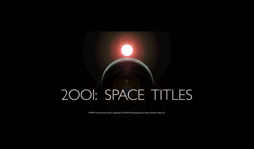
This free title template recreates the 2001 Space Odyssey film’s familiar typography style and effects in After Effects. You can quickly adjust the text size and spacing for unique branding while honoring the original 2001 look.
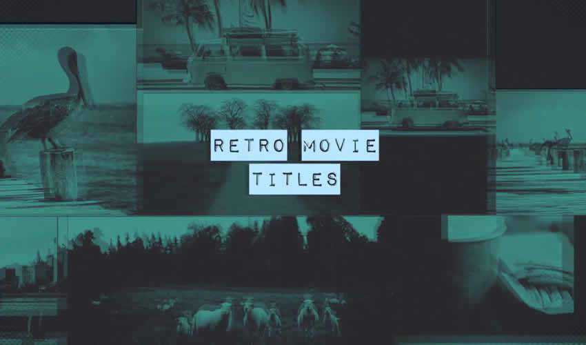
Try the Retro Movie Titles template if you’re looking for retro-style typography. The template comes with easily editable layers and full color control, making it easy to customize the title to match your brand.
Free to Download
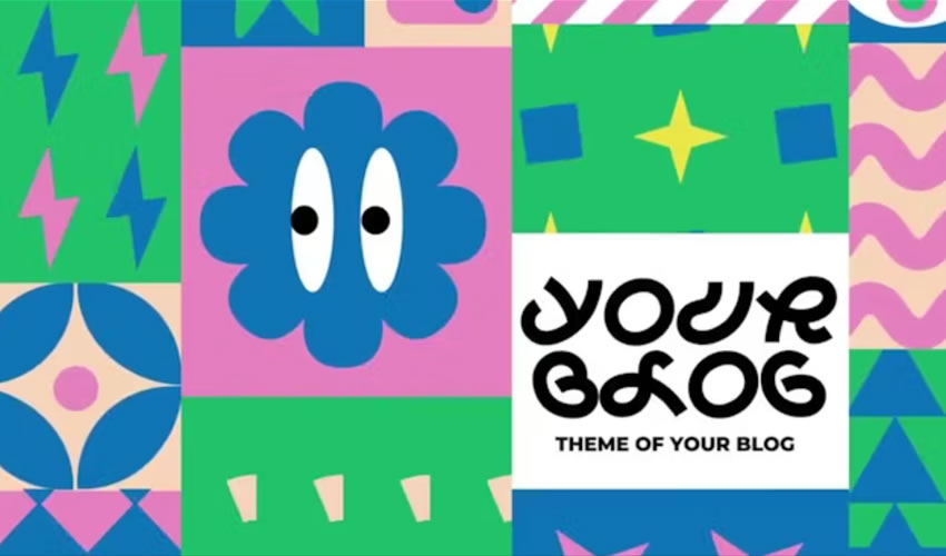
The free Funny Shapes title templates give you playful and bouncy text animations. The package includes five compositions and seven text placeholders. The shapes move in amusing patterns, giving your video a nice touch of fun.
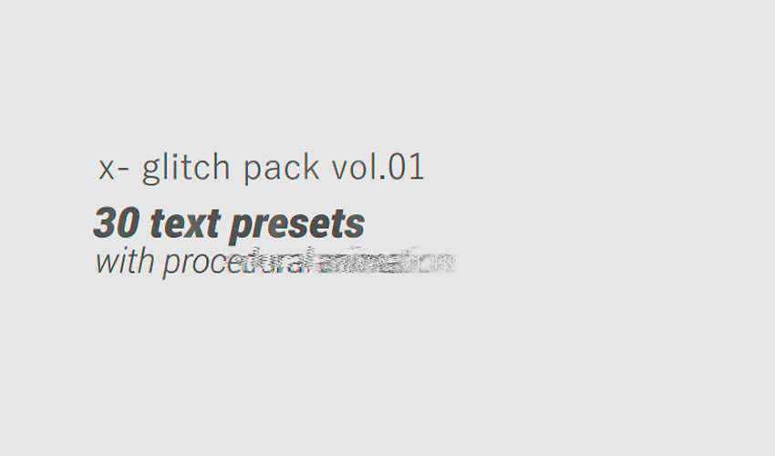
The glitch effect will help make your videos stand out. This template pack makes it easy to add your own text and is a perfect choice for anyone looking for a retro or vintage effect.
Free to Download
This free kinetic title template includes seven scenes with two media placeholders. Each element is labeled to help speed up the editing process, and the design is suitable for various purposes, including corporate slideshows and personal videos.
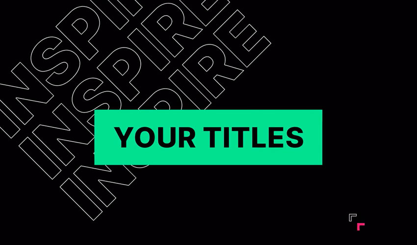
This well-organized title animation opener template is ideal for promoting anything. It contains 110 animated elements pre-rendered into .mov files with a JPEG + Alpha codec. It also includes nine pre-designed text scenes, and you can easily add more.
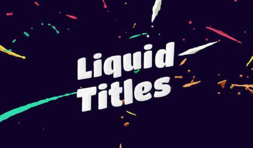
Free to Download
Flipped Titles is a clean and well-organized free template for After Effects. It includes seven unique full-screen titles with some cool and creatively animated effects.

This After Effects pack includes over 60 different titles. The titles are modern and minimal, making them suitable for most projects.
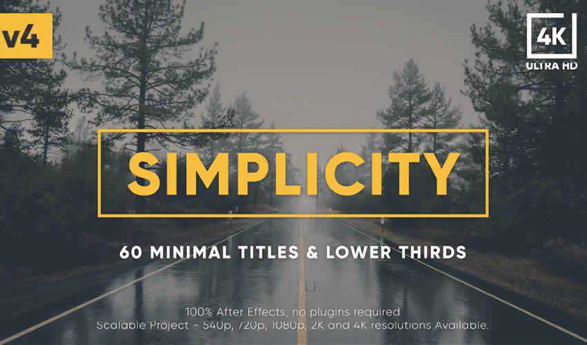
Free to Download
Add a simple yet impressive title to your next video project with this free swirling letters titles template. Easily add a video, edit the text, and match your colors to make this title template your own.
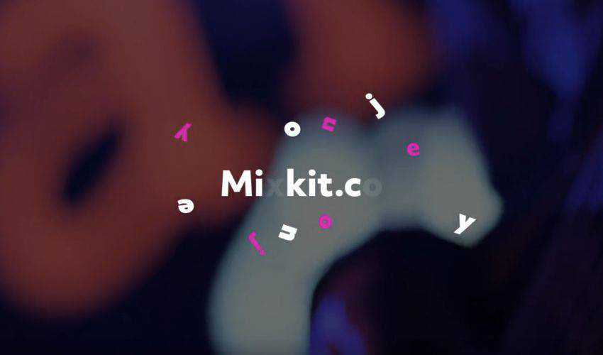
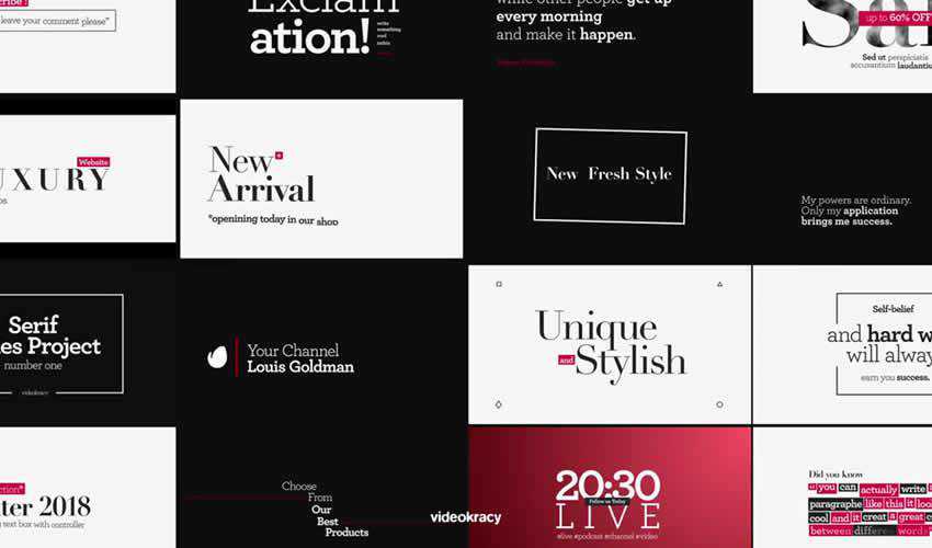
If you’re looking for an elegant After Effects Title template, look no further than this template pack. It includes 16 different typography styles and a detailed help file to help you customize the project to your needs.
Free to Download
These title templates will come in handy if you want to give your titles an abstract look and feel. The template includes nine different titles and graphics, and it is easy to customize with your own colors.

Free to Download
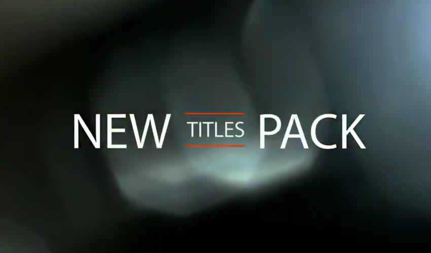
This Free Minimal Titles pack includes 20 animation styles and titles and a royalty-free music track that can be used even in commercial projects. To use it, you just need to add your text and render the file.
Free to Download
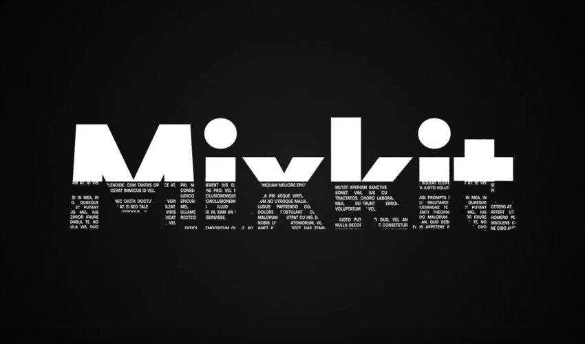
Make your headlines pop with this bold titles template. It is a collection of 25 free-to-download titles that can be quickly customized to match your brand.
Free to Download
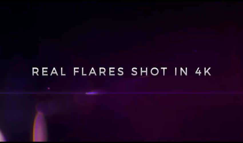
This style library for After Effects and Adobe Premiere is a great way to add style to your titles without wasting time creating them from scratch. You can quickly download and import this style library and use it in your projects.
Free to Download
If you’re looking for stylish typography, use this free pop-up title template for After Effects. The template allows you to edit the text and customize your titles’ colors and duration.

Free to Download
Free Classic Kinetic Titles is a universal and multi-purpose title template perfect for your company’s business presentations. The project includes a color controller for quick changes and editable text layers.

Free to Download
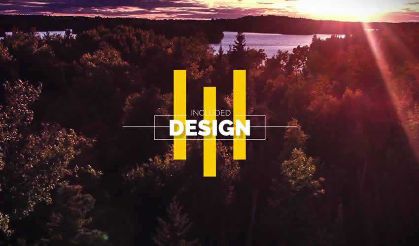
If you’re looking for a smooth and elegant title pack, check out this pack of six free After Effects titles. The titles feature a fresh and modern style that’s perfect for young startups and small businesses.
Free to Download
If you’re looking for a title template that is big and bold with smooth and energetic animation, this is the template for you. It is very easy to use. Change the text, make color adjustments, and render.

Free to Download
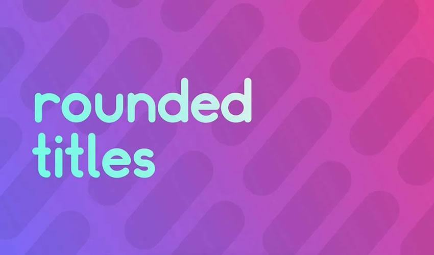
This simple template is perfect for adding clean titles to your video project. The free download includes various styles of rounded motion graphics and can be used as lower thirds, large typography, or basic text.
The post 15+ Best Free Titles Templates for After Effects in 2025 appeared first on Speckyboy Design Magazine.