In this episode, Josepha Haden Chomphosy discusses the nuances of building accessible software, the differences between access, usability, and accessibility, and how this all applies to the WordPress project.
Have a question you’d like answered? You can submit them to wpbriefing@wordpress.org, either written or as a voice recording.
Credits
References
Transcript
[contemporary intro music]
Josepha Haden Chomphosy 0:10
Hello, everyone, and welcome to the WordPress Briefing, the podcast where you can catch quick explanations of the ideas behind the WordPress open source project, some insight into the community that supports it, and get a small list of big things coming up in the next two weeks. I’m your host, Josepha Haden Chomphosy. Here we go.
[musical interlude]
Josepha Haden Chomphosy 0:28
This is the second of my big scary topics for this month. I’ll be talking about accessibility, which much like Diversity, Equity and Inclusion, or DEI in the last episode, is one of those areas where the work is never finished. Also, like DEI in last episode, I feel strongly about accessibility and the need for accessible experiences in the world, but I’m aware that this is an area where I’m still learning.
Josepha Haden Chomphosy 1:04
WordPress has both an accessibility statement and team, which makes a lot of sense given that the software supports so many different people, and industries, and cultures. But if you’re not quite bought into the idea that software should be accessible, or that accessible software can’t also be usable, then this is the episode for you.
Josepha Haden Chomphosy 1:25
Before I joined the WordPress project, the majority of my work with accessibility was in the context of the digital divide. Now, when talking about the digital divide, there are three concepts around quote-unquote, “getting things to people,” and those are access, usability, and accessibility. Sometimes these words seem interchangeable, but ultimately they have nuanced differences that address different problems. And I like to think of them this way.
Access is making sure that someone can obtain something.
Usability is making sure that the user experience is understandable or coherent.
And accessibility is making sure that it’s usable by the largest number of people.
I have always considered each as a subset of the one that came before it. So having something everyone can access is good, but easy to access and easy to use is better. Easy to use is good, but easy to use and easily accessible is better.
Josepha Haden Chomphosy 2:27
After joining WordPress, I discovered that accessibility in the context of software building is well, substantially more complicated. There’s no such thing as perfect accessibility, or a site that is 100% accessible, and many aspects are pretty open to interpretation. It turns out that accessibility, like so many things in WordPress, is a complicated intersection of art and science.
As an example, there’s a rule that says, “Ensure that links are recognizable as links.” A fast shorthand to accomplish that, that we see all over the internet, is to underline all links or put that icon next to it that says, “This opens in a new tab.” You know that icon that’s a box with an arrow? That definitely has a name, that I definitely don’t know? That icon. [laughing] But those solutions don’t necessarily fit every context that you’ll find a link in, and that’s where we see that intersection between the art of communication and the science of necessity.
Josepha Haden Chomphosy 3:32
If you came with me earlier on the idea that accessibility is a subset of usability, and it’s not a far leap to say that the choices around accessibility implementations should always include design and the overall user experience.
I know that some of you are thinking, “But we have guidelines! Like, that’s why we have the guidelines, so that not everything has to be a gray area.” And on the one hand, yeah, that’s true. There are a lot of guidelines. There are guidelines for the code, and what the code produces, and the design elements. But I worry that when a solution is driven solely by rules, rather than reasons, we run the risk of throwing out the good along with the bad.
Josepha Haden Chomphosy 4:15
Accessibility has been a consistent topic of debate in the project for as long as I can remember, and based on all of this, it’s really clear why. There are a few big picture questions that still deserve some sort of canonical answer for WordPress, and where possible I dig in and research the positions that everyone has taken in the past. But I also have questions about how to move everything forward, especially as the editing experience gets more and more standardized across the software, which reduces cognitive load, shortens the learning curve, etc.
What is the future possibility for having a series of more niche admin interface options?
What would it be like to be able to account for functional limitations in a way that lets site builders select what is needed for their clients or organization, or just individual situations they know their sites would be maintained under?
What more could we do if part of the setup flow of WordPress was to select some bundle of potential add ons for neuro diversity, or colorblindness, or dyslexia, and more?
It’s a really big question I have.
Josepha Haden Chomphosy 5:26
And I have to be really transparent here and share that my foundational understanding of accessibility and usability is 10 plus years old, and I learned it in the context of people in education, not software. So a lot of my questions about the future of accessibility and WordPress is the result of old knowledge exploring new spaces, which means they are a little untested. And I’m so grateful for the contributors who point out what the current research and thinking is, in this incredibly complex field.
Josepha Haden Chomphosy 6:00
I normally like to wrap up the briefing with a tidy takeaway, but this particular topic doesn’t really lend itself to that. So I’ll leave you with this. I really believe in WordPress’ mission to democratize publishing. And I, for one, will never stop learning about what gives people more access to the software, and what makes the software more usable, and especially how we can combine usability with accessibility in a way that puts form and function on a level playing field.
[musical interlude]
Josepha Haden Chomphosy 6:40
And now, that brings us to our small list of big things.
Thing one, it’s that time of year where many of our community members take a short break to relax and refresh. I’ll be taking a bit of a break during the month of August, and so the WP Briefing will return again starting in September.
And thing two, huge thanks to the production crew that helps me make this podcast every couple of weeks, but a special shout out to our editor Dustin Hartzler, who makes quick work of all of my rambling thoughts.
Josepha Haden Chomphosy 7:09
And that is your small list of big things. Thank you for tuning in today for the WordPress Briefing. I’m your host, Josepha Haden Chomphosy, and I’ll see you again in September.
[contemporary outro music]
Package:
Summary:
Generate documentation for packages in GitHub
Groups:
Author:
Description:
This package can generate documentation for packages in GitHub...
Read more at https://www.phpclasses.org/package/12165-PHP-Generate-documentation-for-packages-in-GitHub.html#2021-08-02-00:53:58

React is an open-source JavaScript library by Facebook that allows for building user interfaces. Its use has spread like wildfire. Not only will you see it when scrolling through the social network, but it’s also been integrated into popular software applications like WordPress.
The hallmark of React is its ability to create highly-interactive, data-driven UIs that are also incredibly quick. They appear natural and seamless to the end-user, picking up where AJAX left off.
Developers are putting these capabilities to good use. They’re routinely taking everyday elements like shopping carts, forms and multimedia and propelling them to another level.
Want to see the impact React can have on a UI? Here are some prime examples that demonstrate what this library is capable of.
Squeaky-Clean Product Layout
eCommerce can really benefit from what React has to offer. Just take a look at this fictional shoe store. Instead of using traditional form elements, it offers a modern and colorful UI. The result is that shoppers can customize their orders in style.
See the Pen React Shopping Layout by Dilum
Not Your Average Checkboxes
Here, React is used to bring enhanced looks and a higher level of context to standard checkboxes. These elements stand out, while helping to guide users.
See the Pen ReactJS Checkbox component with custom CSS by myleneb
Git Your Profile Card
We previously mentioned React’s ability to efficiently deal with data, and this is a perfect example. Type in your GitHub username and this snippet will quickly load in your profile. Likewise, this type of functionality could be used to vastly improve a website’s search feature.
See the Pen ReactJS:GitHub User Cards by Simon Vrachliotis
Form Conditions
User registration forms can be a pain. How can you ensure that users are following the security guidelines you’ve set? This form is designed to help make those expectations crystal-clear. As guidelines are met, they are immediately crossed off the list displayed below the form.
See the Pen UI + React by Sasha
Easy Date Range
Online calendars and date pickers tend to be a bit tedious. They’re often bogged down by a clumsy UI that makes it harder for users to interact with them. This date range picker, however, is a breath of fresh air. Click the first date within your desired range, then click the last. It’s that simple.
See the Pen React date range picker by Rob Vermeer
Goal Progress Charts
Visualizing data is one of the true strengths of React. To demonstrate, check out this incredibly slick savings goal progress chart snippet. It provides a clear visual representation of how close you are to your target. Not only that, it’s completely interactive. You can add to your total or even tweak the goals. The progress indicators automatically change along the way.
See the Pen Savings Goals – ReactJS by Kelly H
High-End Audio Player
This snippet goes above and beyond. Sure, it’s possible to throw a list of file links on your page. But why settle for that when you can go all-out with a gorgeous React audio player? Its intuitive UI is the perfect way to get your visitors to tune in.
See the Pen Music player ReactJS by Olga
Interactive Service Price List
Here’s a great way to simplify an interface. This service listing allows users to add/remove items with a click and watch their total update immediately. The experience just seems so natural.
See the Pen React Price List by Olga
Adding Speed and Interactivity with React
The common thread among these snippets is how they take everyday web UIs and turn them into something better. Even if the visual elements were already in place, React makes the experience more pleasant for users.
The result is a snappy interface that just works. And by increasing the intuitiveness of an element, you might also increase conversions. That’s a pretty powerful thing.
If you’d like to see more examples of React in action, check out our CodePen collection.
The post 8 React JavaScript Snippets That Enhance Everyday UI Elements appeared first on Speckyboy Design Magazine.
Package:
Summary:
Save and load variable values in cache containers
Groups:
Author:
Description:
This package can save and load variable values in cache containers...
Read more at https://www.phpclasses.org/package/12167-PHP-Save-and-load-variable-values-in-cache-containers.html

An After Effects title added at the right time can add more clarity to your videos and make your videos more interesting. Creating a great title in your After Effects projects can be time-consuming. If you want to save time while working on your project, consider using an After Effects title template.
In this article, we’re featuring the best Adobe After Effects title templates that are not only easy to customize but will save you hours of time.
More Free After Effects Templates:
More After Effects Resources:
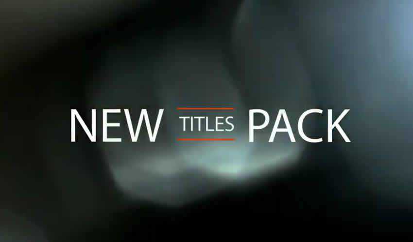
This Free Minimal Titles pack includes not only 20 different animation styles and titles but also a royalty free music track that’s free to use even in commercial projects. All you have to do is add your own text and render your file.
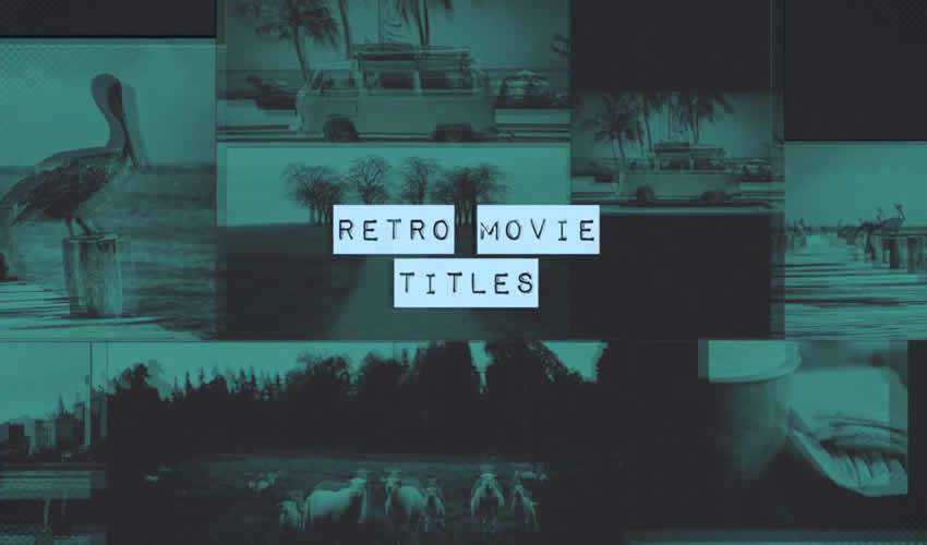
Try the Retro Movie Titles if you’re looking for a retro style titles. The template comes with easily editable layers and full color control that makes it easy to customize the title to match your brand.
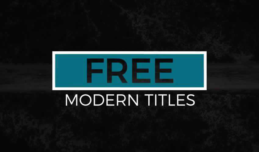
This title pack includes 12 free modern titles featuring smooth and minimal style. They’re easy to use and can be quickly styled to match your own brand, thanks to the full color controller.
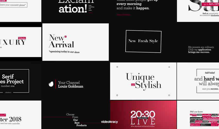
If you’re looking for an elegant After Effects Title template, look no further than the 16 Ready Typography Scene template pack. This title pack includes 16 different title styles and a detailed help file to help you customize the project to your needs.
If you’re working on a wedding project, this free wedding title pack will come in handy. The template comes with 5 ready-made titles that are easy to customize. You can add your own text and customize the colors, then render the project.

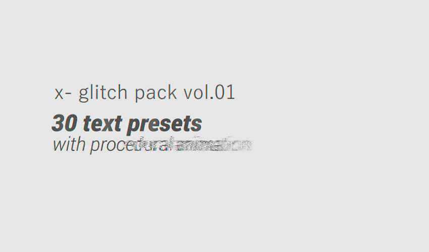
A glitch effect is sure to make you stand out and get your audience to pay attention to your videos. This template pack makes it easy to add your own text and it’s a perfect choice for anyone looking for a retro or a vintage effect.
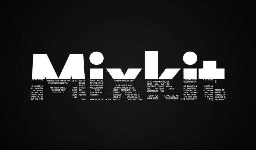
Make your headline pop with this bold title template from mixkit.co. This template is 1 in a collection of 25, free to download and easy to customize to match your brand.
This completely well- organized title animation opener is ideal for promoting just about anything. It contains 110 animated elements which are pre-rendered into .mov files with a JPEG + Alpha codec. It also includes 9 premade text scenes and you can easily add more.

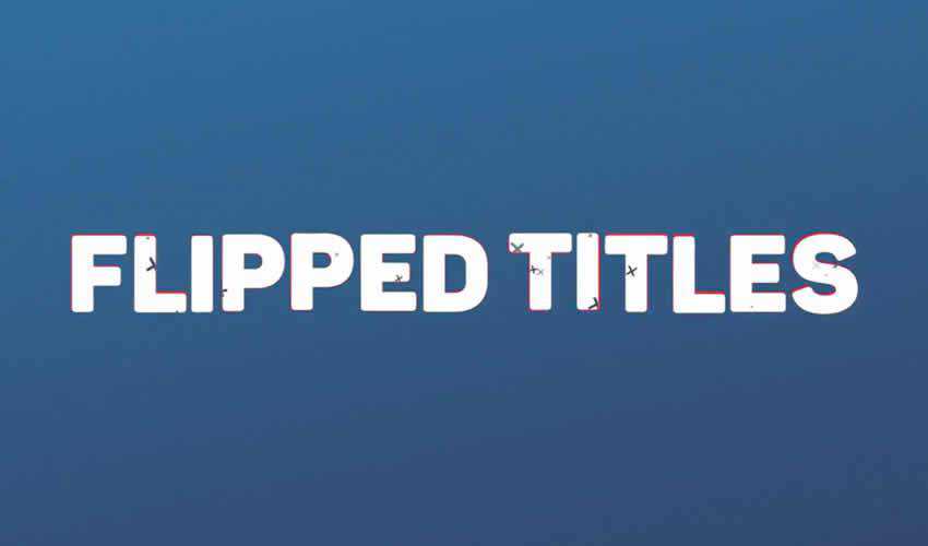
Free Flipped Titles is a clean and welloorganized template for After Effects. It includes a total of 7 unique full screen titles with cool and creatively animated effects.
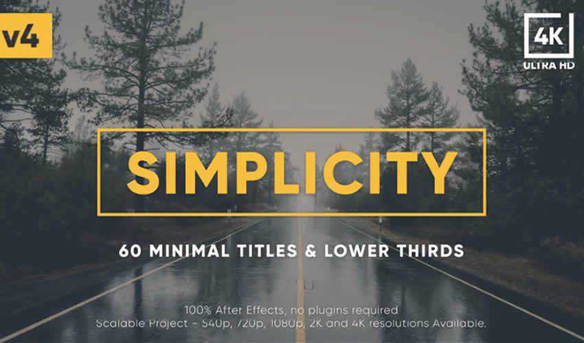
The Simplicity Title Pack includes a grand total of 60 different title templates. The titles feature a modern and minimal style which makes them suitable for all kinds of projects.
Add a simple yet impressive title to your next video project with this free swirling letters title template from mixkit.co. Easily add a video, edit the text and match your colors to make this title template your own.

If you want to give your titles an abstract look and feel, then these title templates will come in handy. The template includes 9 different titles and graphics. The template is easy to customize with your own colors.

This style library for After Effects and Adobe Premiere is a great way to add style to your title without wasting time and creating them from scratch. You can easily download and import this style library and use it in any of your projects.

Use this free Pop Up Title for After Effects if you’re looking for a stylish title styles. The template allows you to edit the text, customize the colors, and the duration of your titles.

Free Classic Kinetic Titles is a universal and multi-purpose title template that’s perfect for business presentations of your company. The project includes a color controller for quick changes and editable text layers.

If you’re looking for a smooth and elegant title pack, definitely check out this pack of 6 free After Effects titles. This template features a fresh and modern style that’s perfect for young startups and small businesses.

A great set of titles can spice up your videos and make them more interesting and engaging. However, you don’t have to start from scratch. Use a pre-made After Effects Title template to speed up your video editing and creation process.
The post 10 Free Adobe After Effects Titles Templates appeared first on Speckyboy Design Magazine.
Most designers wireframe their designs in one way or another, even if it just involves them making quick sketches on the back of some scratch paper. Wireframing is an important part of the web design process, especially for more complex projects.
Wireframes can come in handy when you’re communicating with clients, as it allows them to visualize your ideas more easily than when you just describe them verbally. Marketing is no longer just direct mail and billboards, it’s much more than that. You must be able to impress your clients by showing care and dedication to their marketing efforts, or they will just go to another agency. This is why wireframing is so important.
This guide covers everything you need to know about website wireframes to get started.
Why You Should Wireframe Your Web Designs
Wireframing is really the first step in the design process. Unless the site you’re designing is incredibly minimal and simple, wireframing helps clarify exactly what needs to be on the different page types of your website and assures to the client that they are getting their money’s worth with their online marketing effort.
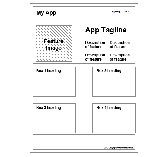
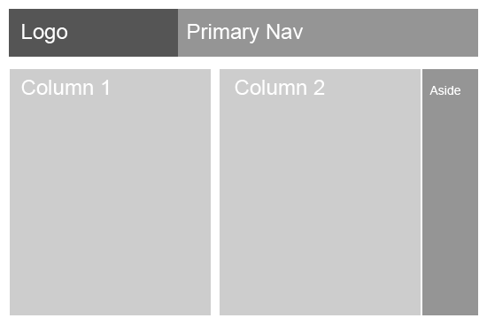
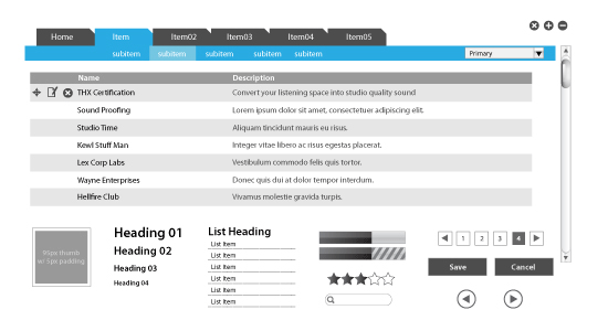
![Why you should wireframe your web designs A simple wireframe example]()
By taking the time to create at least a basic wireframe, you can make sure that your designs will take into account all the different page elements that need to go into the design, and that they’re positioned in the best possible way.
Wireframes are also cost-effective by saving you potential time lost due to revising a high-fidelity comp. Wireframes can easily be revised or discarded.
Wireframes give your page layouts a great starting point and a solid foundation.
Wireframe vs. Mockup vs. Prototype
Wireframes, mockups, and prototypes are sometimes used interchangeably, but they are three different things (though there is sometimes some overlap between them). Each one has a slightly different purpose that it gives to the design process.
Wireframes are basic illustrations of the structure and components of a web page. This is generally the first step in the design process.
Mockups generally focus on the visual design elements of the site. These are often very close or identical to the actual final site design and include all the graphics, typography, and other page elements. Mockups are generally just image files.
Prototypes are semi-functional webpage layouts of a mockup/comp that serves to give a higher-fidelity preview of the actual site being built. Prototypes will have the user interface and are usually constructed using HTML/CSS (and even JavaScript for showcasing how the front-end interface works). This stage precedes programming the business logic of the site. While they might not have full functionality, they generally give clients the ability to click around and simulate the way the site will eventually work. Prototypes may or may not also include finalized design elements.
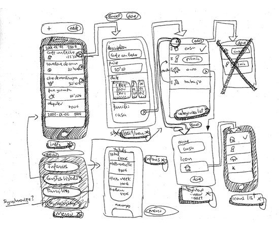
![Wireframe vs. Mock Up vs. Prototype Rough sketch of user interface flow]()
Rough sketch of user interface flow on a mobile app. Image by Fernando Guillen.
Wireframes come first. What follows — either prototypes or mockup models — is largely going to be dependent on the type of site you are building. If it’s a web app rather than a simple static website, it’s likely going to benefit from prototyping.
How to Create a Wireframe
Creating a wireframe can be as simple or as complicated as you want. In its most basic form, your wireframe might be nothing more than a sketch on some graph paper. Other “wireframes” are created digitally and are really more like prototypes, with clickable objects and limited functionality. Usually, it’s pretty simple for a site with just a few pages such as a local restaurants website, but more diverse sites, such as one for a college, will have a more complex wireframe.
The type of wireframe you create will depend on what the individual project requires, as well as what your own workflow is like. More complicated projects will likely have more complicated wireframes, while simple sites might have simpler wireframes.
What to Include in a Wireframe
Your wireframes should include enough information to reflect what needs to appear on each page of your website. Think about the general elements of most web pages: headers, footers, sidebars, and content areas.
Then think of additional elements your specific project will have: dynamic widgets, basic site features such as search bars and navigation, graphics, and so forth.
Once you have an idea of what your site will include, start creating your wireframes based on those elements.
How detailed you want to get will again depend on the project and the purpose of the wireframe. If your wireframe is just going to serve as a guiding document for your own reference, then you don’t want to get too involved in the wireframing process. On the other hand, if it’s going to be used by more than one designer or developer, or presented to your client, then it needs to be more formal.
Low-Fidelity vs. High-Fidelity Wireframes
You have a couple of options when it comes to the style of your wireframes. Some designers opt for low-fidelity (low-fi) wireframes that are basically just lines on a plain background with some labels. These include both hand-drawn and digital wireframes, and they’re usually very simple.
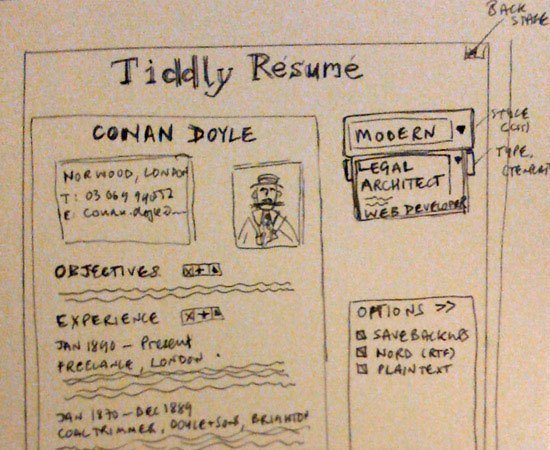
![Low-fi Wireframe An example of a low-fi wireframe for a web app]()
An example of a low-fi wireframe for a web app. Image by Paul Downey.
High-fidelity (hi-fi) wireframes go one step further, using certain design elements within the wireframe. This might include the logo or some other basic graphics, as well as the color scheme and other visual design elements.
Wireframes like this start approaching the level of mockups, but they can be invaluable in conveying a sense of what the website will look like, especially to clients who might have a hard time visualizing what a website will look like based on a low-fi wireframe.
Wireframing Techniques
There are dozens of different ways to create wireframes, ranging from simple, pen-and-paper sketches to more complex diagrams that look almost as polished as production websites.
There are also different approaches to the purpose and reasoning behind creating wireframes, depending on the needs of individual designers and projects. Here are some resources about different procedures for creating website wireframes.
Wireframing with InDesign and Illustrator
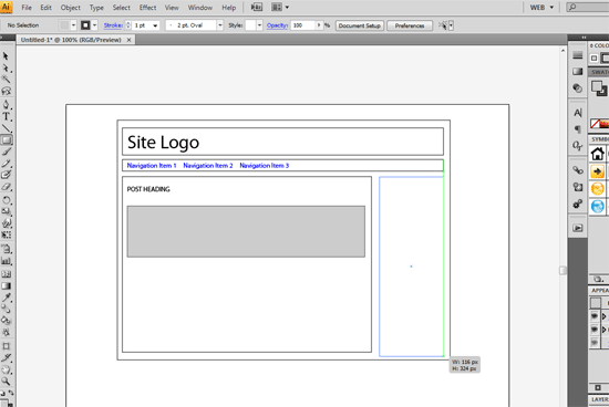
![Wireframing with InDesign and Illustrator Wireframing with InDesign and Illustrator]()
UXmatters has a great article on how to wireframe using Adobe InDesign and Illustrator. They talk about what led the to the decision to use InDesign and Illustrator over other products, as well as how they go about using these two applications to create their wireframes.
Grey Box Method
![Grey Box Method Wireframing using the Grey Box Method]()
Jason Santa Maria has a fantastic post about the “Grey Box Method” of creating wireframes. He outlines his entire process for creating wireframes, from sketching on paper to creating a grayscale wireframe in Illustrator. He includes examples from a couple of different sites to illustrate his points.
The Future of Wireframes
While this post isn’t dedicated entirely to the process or method of creating wireframes, it does include some valuable information on both, especially in terms of how to make the wireframing process better for designers, developers, and site owners.
20 Steps to Better Wireframing
This post from Think Vitamin lays out in 20 steps exactly what you should be doing to create awesome wireframes. It’s a fantastic post to check out whether you’re completely new to wireframing or just unhappy with your current process.
The Wireframing Process
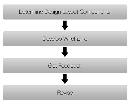
While it varies for everyone, there are a handful of fundamental steps to creating a wireframe.
You’ll likely start out with a list of things the site needs to include or a formal design specification document. Some designers might dive right in from there, ticking things off their list as they add them to the wireframe, either in an app or by drawing on paper.
Others like to start out with a “big picture” look at the overall design, adding details in once they’ve got the basic layout foundations pinned down.
Whether you decide to sketch things out on paper or work with software initially, don’t rule out either method. Some designers make rough sketches on paper and then move over to software to create more polished wireframes. Others go straight for the software. Still, others stick purely to hand drawn paper wireframes.
Just remember that if you get stuck, changing formats can work wonders for your creativity.
You’ll probably want to try a few different ideas in your wireframes before you settle on one design. Wireframing is the best stage to do this, as you have the least amount of time and energy invested and can more easily make changes and try new/experimental things.
Once a basic wireframe is created, you may send it around to other team members for feedback or put it away for a day or two to review again.
Once you’re happy with it, it’s time to either share it with the client for feedback or to start working on mockups based on the wireframe.
![The Wireframing Process Step-by-step Wireframing Process]()
Tools for Wireframing
There are many great tools for wireframing available at your disposal. Some are specifically made for wireframing, while others are more general-purposed but work particularly well for the task.
The tools you decide to use will depend on personal preference and project requirements. There is no “best” tool for wireframing; it’s whatever you’re comfortable using and whatever works for you.
Pen and Paper
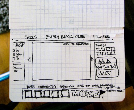
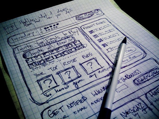
Pen (or pencil) and paper are the most basic tools you can use to create a wireframe. Graph paper works particularly well, as it allows you to create relatively clean wireframes without having to break out a ruler. It’s also useful to have grid lines to create elements in proportion.
![Pen and Paper A wireframe sketch on a gridded notebook]()
A sketch on gridded notebook paper. Image by John Manoogian III.
You might want to use a pencil for your initial sketches, so you can erase things without having to start over. Then, as you finalize different parts, you can trace over them with a pen to prevent erasing the wrong elements.
You may even consider using colored pens and pencils to differentiate between elements or to add more meaning to your wireframes by color-coding things; for example, one color for a group of elements can be helpful, as it helps instantly identify items within your wireframe as they’re moved around on different page layouts.
![Wireframe using Post-it notes. Using post-it notes for quick prototyping]()
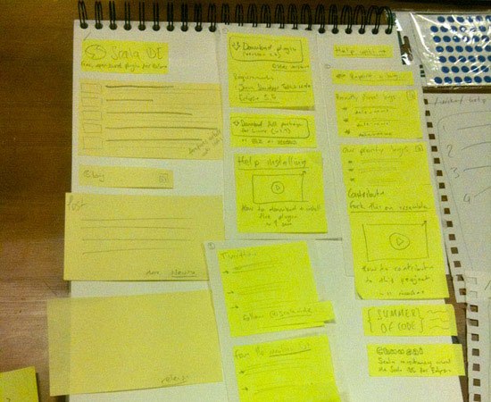
Using Post-it notes for quick prototyping. Image by Richard Dallaway.
Using Post-it notes/sticky notes in your paper wireframing process makes it easy to rearrange different design elements without having to re-sketch the whole thing.
Web-Based Tools
Web-based wireframing tools almost always include the ability to share wireframes with other team members or clients. They also have the added advantages of being accessible from anywhere and being cross-platform compatible. Following are a few examples of browser-based wireframing tools.
Mockingbird
![Mockingbird wireframing tool Mockingbird wireframing tool]()
Mockingbird works in Safari, Firefox and Chrome and has a number of unique features. One of the better time-saving features is that it has automatic text resizing: If you change the size of a button or similar element, Mockingbird changes the text size to match. It also lets you create multi-page wireframes with links.
Lovely Charts
![Lovely Charts wireframing Lovely Charts for wireframing]()
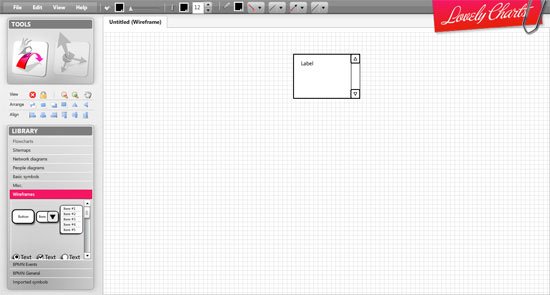
Lovely Charts can be used for wireframes or a variety of other charts. It has an intuitive, drag-and-drop drawing interface, which makes it incredibly easy to use. It also makes assumptions based on the type of chart you’re creating, to help you create charts faster.
Cacoo
![Cacoo wireframing Cacoo for wireframing]()
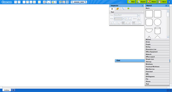
Cacoo is another free online wireframing tool that uses drag-and-drop elements to speed up the wireframing process. It includes publishing options for your wireframes that lets you share them publicly with anyone who knows the URL, though editing and managing of wireframes is all handled through an SSL connection for privacy.
Lumzy
![Lumzy wireframing Lumzy for wireframing]()
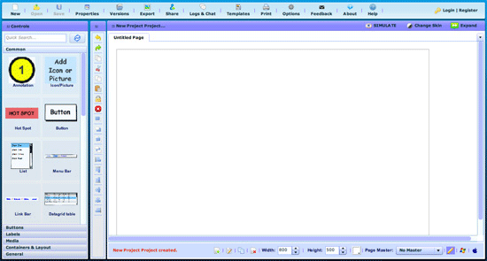
Lumzy can go beyond just wireframing and into a fully-featured prototyping tool that lets you add events to controls, put controls inside other containers and emulate the finished project with triggers caused by user actions. It also includes live chat, real-time collaboration and an image editor.
Jumpchart
![Jumpchart wireframing Jumpchart for wireframing]()
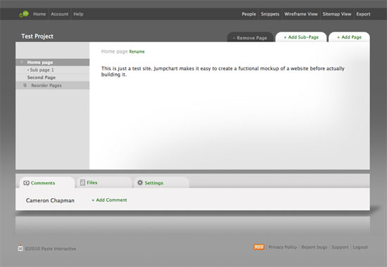
Jumpchart works for both wireframing and prototyping, with plenty of tools for showing page hierarchy and relationships between pages. There’s a free plan that allows for up to two projects and two collaborators. Jumpchart also lets you export your finished prototype to WordPress (with the paid version).
Balsamiq Mockups
![Balsamiq Mockups wireframing Balsamiq Mockups for wireframing]()
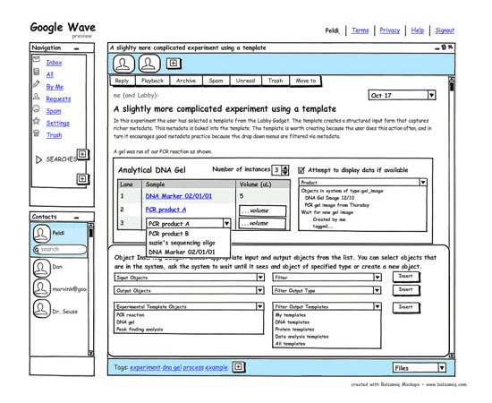
Balsamiq Mockups aims to reproduce the experience of sketching wireframes, and because the end results look more like sketches than formal designs, it maintains the metaphor of sketching out a wireframe on paper. Balsamiq Mockups has plenty of collaboration and sharing tools as well.
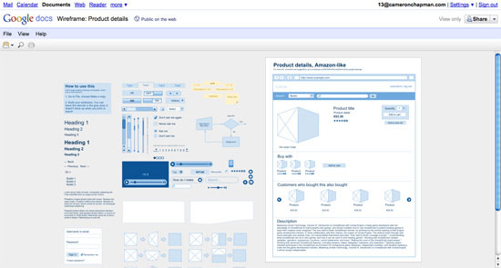
Google Drawings
![Google Drawings wireframing Google Drawings for wireframing]()
Google Drawings is just starting to gain some traction as a viable wireframing app. It’s part of the Google Docs suite of software, and is completely free to use. It works similarly to other online drawing apps, with predefined shapes and the ability to add text. What really makes it useful, though, is that there’s a set of templates (from Danish UX designer, Morten Just) specifically for Google Drawings that you can use to create website wireframes. Drawings also lets you work collaboratively with multiple people, and even allows sharing your drawings publicly online.
JustProto
![JustProto wireframing JustProto for wireframing]()
JustProto is designed for prototyping of web and desktop apps, though it can also be used for wireframing websites. It includes over 200 icons and banners you can use in your wireframes and you can create master pages to use as a framework to avoid repetitious work. There’s a free plan available that lets you manage one project, while paid plans start at $19/month.
Creately
![Creately wireframing Creately for wireframing]()
Creately is a diagramming app that includes a library of objects and shapes and a drag-and-drop drawing interface. It includes a variety of collaboration tools, including versioning and short URL publishing.
Desktop and Hybrid Apps
Most desktop wireframing apps have some way of sharing wireframes between team members, although it sometimes requires others to download special software, or wireframes are just shared as flat images, which makes team editing much more difficult.
Hybrid apps, on the other hand, generally have both online and offline modes, offering the best of both worlds.
MockFlow
![MockFlow wireframing MockFlow for wireframing]()
MockFlow is an online/offline hybrid app that lets you create and collaborate on wireframes. It includes a large library of mockup components ready for you to use, as well as a variety of publishing options (including PDF and PowerPoint export). The free plan allows for one mockup with up to four pages and two collaborators.
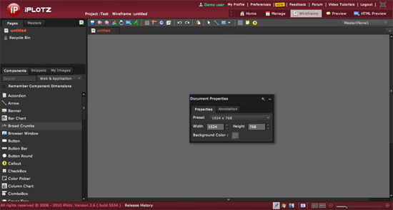
iPlotz
![iPlotz wireframing iPlotz for wireframing]()
iPlotz is another online/offline hybrid that has a downloadable desktop client. It has both collaboration and project management features, making it a great choice for teams. The online version includes a free plan as well as paid plans; the desktop app is $75.
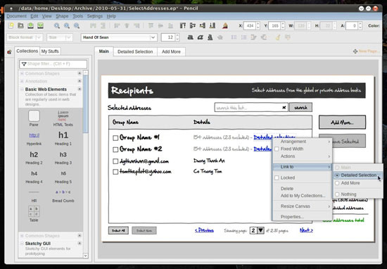
Pencil
![Pencil wireframing Pencil for wireframing]()
Pencil is a Firefox plugin for creating wireframes and prototypes. It includes an on-screen text editor (with rich text format support), export to HTML, PNG and other file formats, built-in stencils, and more. Because it’s a Firefox plugin, it’s operating-system-independent. There are also standalone builds of Pencil for Linux and Windows.
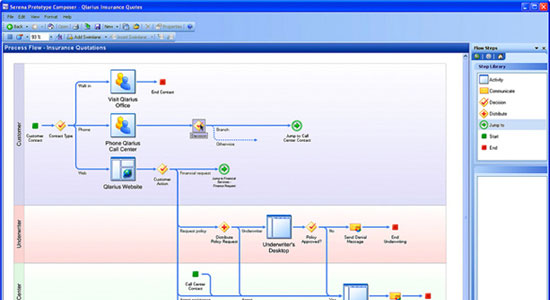
Prototype Composer
![Prototype Composer wireframing Prototype Composer for wireframing]()
Prototype Composer is a web app prototyping program. It lets you build usable applications that closely mimic the experience your end-users will have, all with a graphical UI that doesn’t require coding knowledge. There are Professional and Community (free) editions available.
HTML Wireframes
The big advantage to using HTML and CSS for your wireframes is that you’re giving yourself a head-start on coding your actual pages. The downside is that it’s easy to get sucked into actually designing and coding the site, rather than just creating a quick wireframe. Your wireframe can very quickly become a mockup or full-fledged prototype much earlier than it should.
But again, wireframing with HTML does give you a head start on the design and coding process. If you can resist the urge to do too much, it’s a fantastic option. To learn more about HTML-based wireframing, check out the following article:
HTML Wireframes and Prototypes: All Gain and No Pain
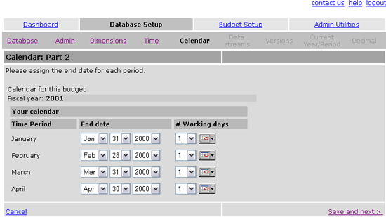
![HTML Wireframes and Prototypes: All Gain and No Pain HTML Wireframes and Prototypes - Dashboard setup]()
This article on Boxes and Arrows, a leading site on the subject of design, discusses the benefits of wireframing and prototyping using HTML.
Wireframing Templates
Using templates and stencils for your wireframes can greatly speed up the process, especially if you opt to use pen and paper for wireframing, or programs that weren’t specifically created for wireframing (like Adobe Illustrator). Below are more than a dozen templates and stencil kits, all free to use.
OmniGraffle Wireframe Stencils
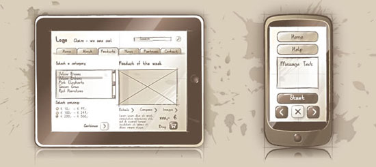
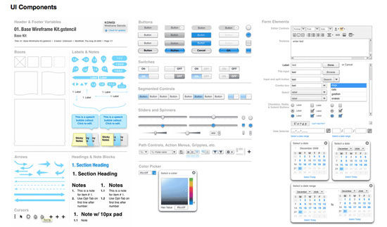
![OmniGraffle Wireframe Stencils OmniGraffle wireframe stencil set]()
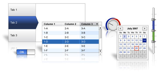
This OmniGraffle stencil set from Konigi includes pretty much any UI element you might need, including browser chrome (borders around a web browser window), controls, basic shapes, tabs, video players, and more.
Free Web UI Wireframe Kit
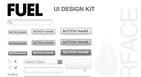
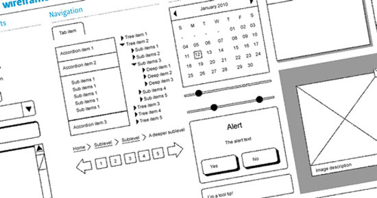
![Free Web UI Wireframe Kit Free wireframe kit from Fuel Your Interface]()
Fuel Your Interface offers this free wireframe kit that includes a variety of UI elements, including buttons, breadcrumbs, dialog boxes, and more.
Yahoo! Developer Network Design Stencils
![Yahoo! Developer Network Design Stencils Yahoo! free UI stencils]()
Yahoo! offers these free UI stencils for a variety of applications, including OmniGraffle, Visio, Adobe Illustrator and Adobe Photoshop. The stencils include everything from grids to ad units to menus and buttons.
Wireframe Symbols
![Wireframe Symbols Wireframe kit from Johnny Nines]()
This wireframe kit from Johnny Nines includes a variety of shapes and elements, like buttons, headings, lists, and tables, for creating wireframes in Adobe Illustrator.
6 Pages Template
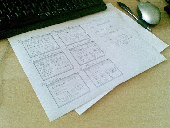
![6 Pages Template Printable stencil for hand-drawing wireframes]()
Here’s a printable stencil for hand-drawing wireframes that includes six browser windows, plus space for notes.
Free Sketching & Wireframing Kit
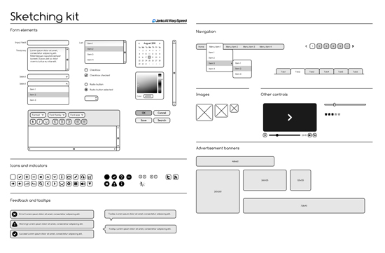
![Free Sketching & Wireframing Kit Set of sketched wireframing stencils from Janko]()
Janko at Warp Speed offers up this set of sketched wireframing stencils, available in a number of file formats: Adobe Illustrator, SVG, PDF and EPS.
Grids for Sketching
![Grids for Sketching Set of grids for sketching wireframes]()
Ben Martineau has released this set of grids for sketching wireframes. Included are 16-column, 12-column, 10-column, 5-column, 4-column and 3-column grid structures.
A4 Sketching Paper
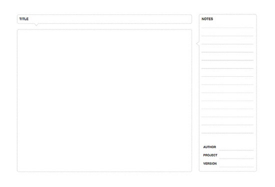
![A4 Sketching Paper A4 sketching paper template]()
This sketching paper template includes a basic grid with browser chrome and an area on the side for your notes.
Sqetch
![Sqetch Adobe Illustrator toolkit called Sqetch]()
Sqetch is an Adobe Illustrator toolkit that includes a number of templates and elements, including iPad and browser chrome, GUI elements, and form elements.
Wireframe Template
![Wireframe Template Basic wireframe template]()
Here’s a very basic wireframe template, with space for sketching, and title, and notes.
Konigi Graph Paper
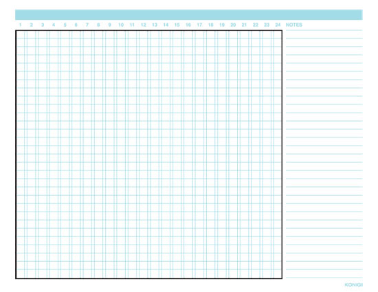
![Konigi Graph Paper Printable graph paper templates from Konigi]()
Konigi offers a few different printable graph paper templates, including a storyboard (with and without notes), portrait and landscape wireframes, and a wireframe with notes.
Dragnet Website Wireframes Kit for Adobe Fireworks
![Dragnet Website Wireframes Kit for Adobe Fireworks Free wireframe stencil kit for Adobe Fireworks]()
Dragnet offers this free wireframe stencil kit for Adobe Fireworks that includes a variety of UI elements like buttons, drop-downs, and tabs.
Free Wireframe Stencils for Keynote
![Free Wireframe Stencils for Keynote Free Wireframe Stencils for Keynote]()
Here’s a great set of wireframe stencils for Apple’s Keynote program. It includes all the basic UI elements you’d expect to find: buttons, modal windows, tabs, headings, dialog boxes, and more.
Using Wireframes to Think Through a Design
Sketching out wireframes can be a great way to think through the design of your website without spending hours working on mock-ups in Photoshop or coding preliminary designs. Wireframing can let you work through a number of design and layout ideas quickly and at little cost but your time.
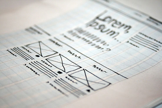
![Using Wireframes to Think Through a Design Wireframe sketched with pen on grid paper]()
Wireframe sketched with pen on grid paper. Image by John Manoogian III.
Take a look at the design specification documents you have that tell you exactly what elements you need on the site. Then just dive in and start arranging them on the wireframe. Don’t be afraid to try non-traditional things at this stage. Remember, it’s just a wireframe. A mistake or a failed attempt at this point isn’t going to set you back drastically. Crumple up the piece of paper, chuck it in the recycling bin, and then start over. Release your creative inhibitions at this stage.
Wireframes as a Project Deliverable
Presenting wireframes to your clients can be a valuable way to make sure everyone is on the same page prior to creating the actual design mockups. It’s much easier to change around the position of elements on the page when you’re working with wireframes than it is with Photoshop designs or coded pages.
Wireframes as a deliverable also display the craftsmanship you put in your work. Be sure to, however, bill appropriately for the additional time that wireframes tack onto your design process.
Of course, if you’re going to be using your wireframes as deliverables, you’ll want to make sure they’re professionally devised and not just scribbled on some plain paper or the back of an invoice (unless your client expects it to be that way).
The tools we already mentioned above can all work to create more professional-looking wireframes for showing your clients.
Polished vs. Sketchy
One of the biggest considerations when creating deliverable wireframes is how polished they should look. There are generally two schools of thought on this.
One viewpoint of the “polished vs. sketchy” debate asserts that anything going to a client should be as polished and formalized as possible.
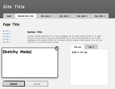
The other viewpoint argues that offering the client a polished wireframe makes them less likely to request changes because things feel more “finalized.” In other words, sketch-style wireframes feel less formal and are more likely to get honest feedback.
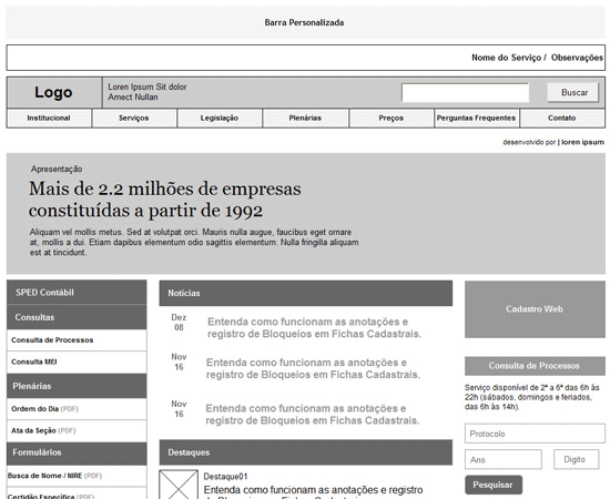
There are pros and cons to either approach. Polished wireframes can often help a client better visualize what the site’s layout will eventually look like. Adding in things like color or minimal graphics can go even further toward this end. However, you run the risk that your client won’t offer honest feedback because they feel the project is too finalized already.
![Polished vs. Sketchy Example of a polished wireframe]()
Example of a polished wireframe. Image by Rodrigo Teixeira.
On the other hand, sketchy wireframes come across as more like “rough ideas” and seem more inviting to client feedback. The downside here is that clients who aren’t particularly visually oriented or creative, or who lack familiarity with what website wireframes are, may have a hard time imagining what their site is going to look like or might be confused as to why their site looks like it was hand-sketched.
![A sketchy-style wireframe A sketchy-style wireframe]()
A sketchy-style wireframe that is good as a project deliverable. Image by Aaron T. Travis.
Combining both polished and sketchy wireframing styles may work best for some. You could also use sketchy wireframes combined with a mood board that gives an idea of how the color scheme, textures, typography, and other visual elements will look.
Wireframing Resources
To conclude this guide, here are a handful of web resources dedicated to design wireframing for you to peruse.
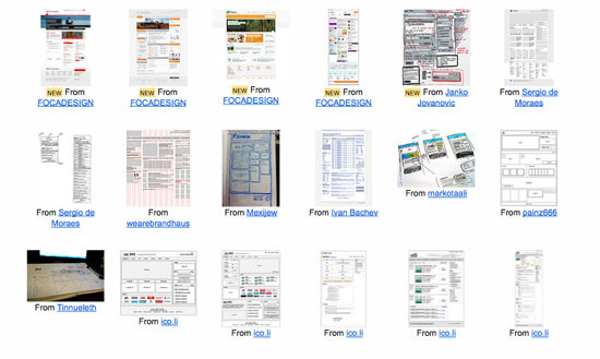
I Heart Wireframes Flickr Group
![I Heart Wireframes Flickr Group Wide variety of wireframes from designers around the world]()
I Heart Wireframes is a Flickr group that showcases a wide variety of wireframes from designers around the world. They currently include more than 780 wireframes and have over 1,800 members.
I Heart Wireframes Tumblr
![I Heart Wireframes Tumblr Tumblr blog showcases outstanding wireframes]()
This Tumblr blog showcases outstanding wireframes from all over, and is also associated with the I Heart Wireframes Flickr group above.
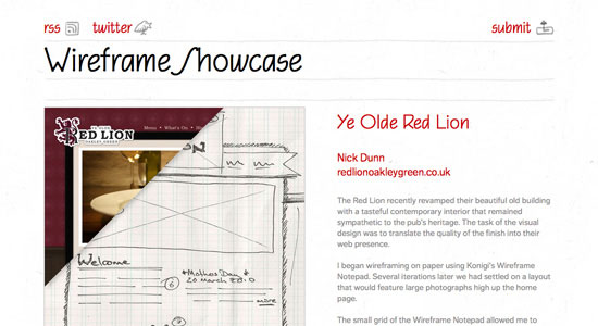
Wireframe Showcase
![Wireframe Showcase Gallery site that features wireframes alongside the completed designs they represent]()
Wireframe Showcase is a gallery site that features wireframes alongside the completed designs they represent.
Wireframes Magazine
![Wireframes Magazine Wireframes Magazine covers all things wireframe-related]()
Wireframes Magazine covers all things wireframe-related, including tons of stencils and wireframing templates, as well as examples and inspiration.
Web.Without.Words
![Web.Without.Words Antipodal approach to wireframing]()
Web.without.words takes a sort of antipodal approach to wireframing, showing a different popular site each week and reverse-engineering a wireframe for it by blocking out the actual content.
Related Content
The post Ultimate Guide to Website Wireframing appeared first on WebFX Blog.
The number of learning methods has drastically changed between now and the time I first learned how to build websites. There’s YouTube, digital books for your mobile devices, blogs, and immersive online course platforms like Treehouse and Udemy.
But I still believe that one of the best ways to learn web design for those of us who are self-taught is through reading books.
If I had to restart the whole journey of educating myself on how to build websites, but with the ability of knowing what I know now, the following books would be what I’d buy for myself today.
I recommend reading these web design books sequentially or based on the level of web design proficiency you have now.
Whenever I learn something new, I want to see results as fast as I can, and I don’t want to get bogged down by the technical aspects of the subject.
When I’ve decided the subject is something I really want to master, that’s when I’ll put in the time to learn it inside-and-out.
HTML and CSS: Design and Build Websites allows you to start learning the essential concepts and basic techniques of creating websites.
The presentation method of the subject is engaging, with lots of visuals. The writing is not intimidating, which is great, so that you won’t get discouraged to push through and complete your learning experience. That’s precisely why I recommend this book as your first web design book for beginners.
![HTML and CSS: Design and Build Websites]()
$19 on Amazon.com
After you feel like you’ve gotten a good command of the basics, it’s time to pick up a more technical and complete book so that you can really start to master the concepts.
When it comes to comprehensiveness and technical mastery through books, nothing else beats an O’Reilly book.
Learning Web Design is a big book, over 600 pages long, but it’s well-written and will give you a good, solid foundation on the subject. It has a ton of exercises, and I urge you to do all of them to get you in the habit of testing and experimenting with code.
In this book, you’ll go beyond HTML and CSS and start getting into JavaScript as well as web graphics.
Though this book is designed for the absolute beginner, I feel like, just like with most other O’Reilly books, it shouldn’t be your first book on the subject especially if you’re not coming from a programming background.
![Learning Web Design: A Beginner's Guide]()
$20 on Amazon.com
Now that you have a solid command of HTML and CSS from the two books above, it’s time to learn professional-level techniques and concepts.
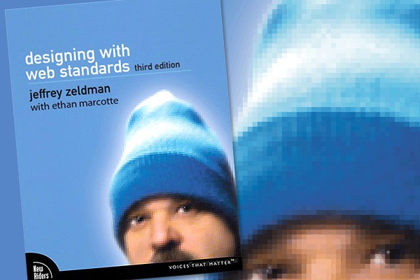
You will learn the how’s and the why’s of writing standards-compliant HTML and CSS through this book, Designing with Web Standards, as well as techniques for dealing with common web design issues.
I’m glad that this book was refreshed recently, and with the involvement of Ethan Marcotte (the person who coined the term Responsive Web Design) this time around
![best_web_design_book_03_designwebstandards]()
$32 on Amazon.com
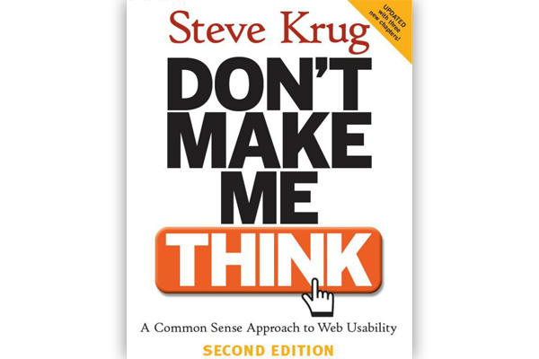
This book is ancient — it’s 8 years old, so it may as well have been written in the 14th century, in the context of a continually evolving profession like web design.
However, the concepts covered in this book are timeless. While the books I’ve mentioned earlier show you how to build websites, this website designing book will show you how to build it in the most effective way for your website users.
Don’t Make Me Think is a truly ground-breaking book, and I promise you that you’ll have a lot of “aha” moments as you read it.
The refreshed version of this book will be available December 2013 (though you can pre-order it now).
![Don't Make Me Think: A Common Sense Approach to Web Usability]()
$25 on Amazon.com
This book contains practical techniques for dealing with common web design problems that you’ll encounter. To really appreciate this book, buy it after you’ve spent hours/days debugging and rewriting your website’s HTML and CSS. This book will bring you one big step closer towards professional-level mastery of web design.
This is the only book I have two copies of. I thought I lost my first copy, so I bought another one. Now I have an extra to lend to friends and family.
![]()
$26 on Amazon.com
Why I Chose These Web Design Books
I chose these web design books based on:
- My own experience as a self-taught web designer/developer
- What I’ve found to be effective educational sequences for web design while I was on the field training other web designers and developers
- My interactions with our readers interested in becoming web designers, here on Design Instruct and on Six Revisions
I’m not affiliated with any of the books I’ve discussed above.
I tried to choose the best books on web design that you can read in sequence as you advance in your knowledge and expertise of web design.
There are plenty of web design books out there, and I recommend looking at all your options before you make a decision on how you’re going to tackle the task of self-educating yourself towards becoming a professional web designer.
After this, you might want to explore other areas of web design/web development such as JavaScript, server-side scripting languages and frameworks like PHP and Rails, relational databases like MySQL, developing solutions on top of content management systems like WordPress, and so forth. There are tons of options for moving forward. The industry has so many things to offer you.
Let your interests dictate what you learn next. But if your intention is to be a professional web designer or web developer, I recommend building on top of a solid foundation consisting of HTML, CSS and web design best practices in order to really get the most out of the more complicated stuff like JavaScript and PHP.
What Books Would You Recommend for Learning Web Design?
What books have helped you learn web design? Please share your thoughts in the comments below.
The post 5 Great Books for Learning Web Design the Right Way appeared first on WebFX Blog.
No man (or woman) is an island – and this statement can’t be any truer if you’re a designer or developer. Though paid/subscription services like Basecamp and Zimbra are great, individuals strapped for cash have a ton of alternatives that provide similar (if not better) features.
In this article, you’ll find 15 free tools to help you facilitate remote/web-based collaboration. Whether you need basic whiteboarding/brainstorming tools or fully-featured project management applications – you should be able to find a tool or two that’s worth checking out.
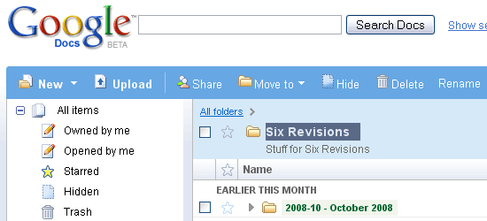
![Google Docs - screen shot.]() Google Docs is an excellent web based collaboration tool. You can share documents and spreadsheets and collaborate with your team/clients in real-time. Being a browser-based application – the requirements to get up and running is very minimal. Storing your work online means they’re readily available anywhere with an internet connection. Check out the user examples of Google Docs to gain some ideas on how to use Google Docs.
Google Docs is an excellent web based collaboration tool. You can share documents and spreadsheets and collaborate with your team/clients in real-time. Being a browser-based application – the requirements to get up and running is very minimal. Storing your work online means they’re readily available anywhere with an internet connection. Check out the user examples of Google Docs to gain some ideas on how to use Google Docs.
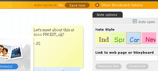
![Stixy - screen shot.]() Stixy is a flexible, online “bulletin board”/drawing board. There’s little structure and it’s up to you how you want to use it, so it’s a great whiteboarding application. One of the useful ways to use Stixy is mocking up or wireframing web pages – your team member or clients can then go in and modify the design or post notes on particular aspects of the design.
Stixy is a flexible, online “bulletin board”/drawing board. There’s little structure and it’s up to you how you want to use it, so it’s a great whiteboarding application. One of the useful ways to use Stixy is mocking up or wireframing web pages – your team member or clients can then go in and modify the design or post notes on particular aspects of the design.
Project2Manage
![Project2Manage - screen shot.]() Project2Manage is a fully-featured, free, hosted solution for project management and collaboration (similar to Basecamp). You can set up different roles and permissions to limit what each team members see, write in your milestones to show everyone your goals, and be able to manage unlimited projects.
Project2Manage is a fully-featured, free, hosted solution for project management and collaboration (similar to Basecamp). You can set up different roles and permissions to limit what each team members see, write in your milestones to show everyone your goals, and be able to manage unlimited projects.
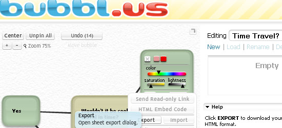
![bubbl.us - screen shot.]() bubbl.us is a free, web-based collaboration tool for collaborative brainstorming. You can create beautiful mind maps that you can share with team members. You can save, email, and print your mind maps or even embed them directly onto a web page.
bubbl.us is a free, web-based collaboration tool for collaborative brainstorming. You can create beautiful mind maps that you can share with team members. You can save, email, and print your mind maps or even embed them directly onto a web page.
Dabbleboard
![Dabbleboard - screen shot.]() Dabbleboard is a robust, online whiteboard that’s easy to use. Use Dabbleboard to create wire frames of your user interface, draw flow charts, and create network diagrams, among other things. You can create Toolkits (a set of reusable drawing objects) or use pre-made Toolkits.
Dabbleboard is a robust, online whiteboard that’s easy to use. Use Dabbleboard to create wire frames of your user interface, draw flow charts, and create network diagrams, among other things. You can create Toolkits (a set of reusable drawing objects) or use pre-made Toolkits.
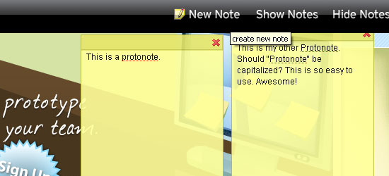
![Protonotes - screen shot.]() Protonotes is a free annotation widget for your HTML prototypes. All you need to do is plop in a JavaScript onto your web page and voila – it just works. Usability testing, design critiquing, and quality-assurance testing are just some of the things that you can use Protonotes on. To get alerted when a new note has been posted, you can subscribe to your team’s notes RSS feed. You can export your data (your “protonotes”) as a CSV file which can be opened by spreadsheet applications like Google Spreadsheets or Excel or even use your own MySQL database to store your data.
Protonotes is a free annotation widget for your HTML prototypes. All you need to do is plop in a JavaScript onto your web page and voila – it just works. Usability testing, design critiquing, and quality-assurance testing are just some of the things that you can use Protonotes on. To get alerted when a new note has been posted, you can subscribe to your team’s notes RSS feed. You can export your data (your “protonotes”) as a CSV file which can be opened by spreadsheet applications like Google Spreadsheets or Excel or even use your own MySQL database to store your data.
ProjectPier
![ProjectPier - screen shot.]() ProjectPier is a self-hosted, open-source, PHP-based project management application. Manage your tasks, team members, and projects under one interface. The interface is very simple and lacks the “whiz-bang” features of other solutions, but its does project management and collaboration quite well. If you need more convincing, read the 10 reasons for using ProjectPier straight from the creators.
ProjectPier is a self-hosted, open-source, PHP-based project management application. Manage your tasks, team members, and projects under one interface. The interface is very simple and lacks the “whiz-bang” features of other solutions, but its does project management and collaboration quite well. If you need more convincing, read the 10 reasons for using ProjectPier straight from the creators.
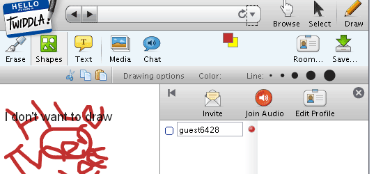
![Twiddla - screen shot.]() Twiddla touts itself as a free, web-based meeting playground. Twiddla is an exceptional, no-hassle whiteboard solution for collaborating online. You can browse websites and draw on them, share files, and chat with your team. There’s even an “audio” option so you can communicate verbally (great for people who don’t draw well). Whether you’re critiquing a design or surfing the web for design inspiration, you’ll definitely find a use for Twiddla.
Twiddla touts itself as a free, web-based meeting playground. Twiddla is an exceptional, no-hassle whiteboard solution for collaborating online. You can browse websites and draw on them, share files, and chat with your team. There’s even an “audio” option so you can communicate verbally (great for people who don’t draw well). Whether you’re critiquing a design or surfing the web for design inspiration, you’ll definitely find a use for Twiddla.
Wetpaint
![Wetpaint - screen shot.]() Wetpaint is a freeform online collaboration tool that brings in features from wikis, blogs, forums, and social networks. Because it’s simple to use and requires no technical expertise, it’s an excellent platform for generating content from different sources which you can use “as-is” or on your website.
Wetpaint is a freeform online collaboration tool that brings in features from wikis, blogs, forums, and social networks. Because it’s simple to use and requires no technical expertise, it’s an excellent platform for generating content from different sources which you can use “as-is” or on your website.
![Skype - screen shot.]()
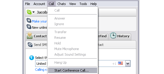
If you’ve been a web worker for a significant period of time, there’s little chance that Skype has evaded you. In case you haven’t heard of it, Skype is a web based collaboration software that allows you to make telephone calls over the internet (the technology is called Voice over Internet Protocol – or VoIP). You can make free calls to other Skype users and toll-free numbers, and even landlines/cell phones for a small fee. Aside from its VoIP feature, there are also built-in features for instant messaging (IM), video conferencing, and file sharing.
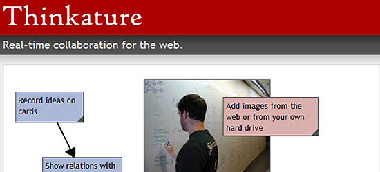
![Thinkature - screen shot.]() Thinkature is an excellent, free web based collaboration tool. You’re given a workspace to help you visually communicate via chat, drawing, or grabbing content from around the web. Its flexibility allows you to dictate how you want to use it.
Thinkature is an excellent, free web based collaboration tool. You’re given a workspace to help you visually communicate via chat, drawing, or grabbing content from around the web. Its flexibility allows you to dictate how you want to use it.
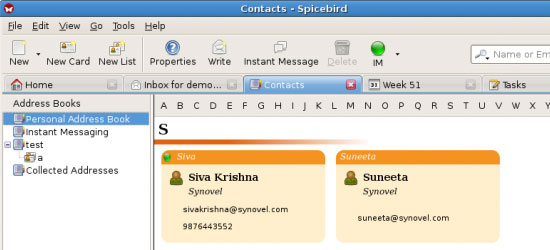
![Spicebird - screen shot.]()
If you want to manage projects using a desktop application to conduct your remote/web-based collaboration, check out Spicebird – a robust, open-source platform for all your collaboration requirements. It has a built-in instant messaging chat system, a group calendar, an address book to place your team’s contact information, and much more. View the video demonstration to get a feel for what Spicebird is all about.
Mindquarry DO
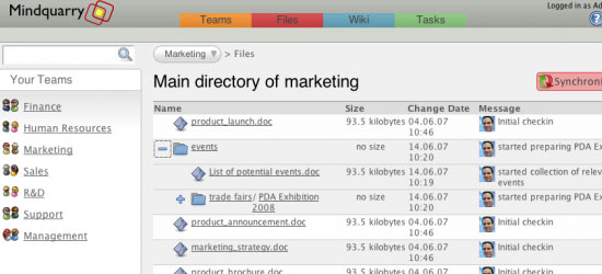
![Mindquarry DO -screen shot.]() Mindquarry DO is an open-source collaboration application written in Java (J2EE). They’ve discontinued the Mindquarry GO which used to be an online version of Mindquarry, but Mindquarry DO is still available for download. Check out the requirements specifications to make sure your server has what it needs to run Mindquarry.
Mindquarry DO is an open-source collaboration application written in Java (J2EE). They’ve discontinued the Mindquarry GO which used to be an online version of Mindquarry, but Mindquarry DO is still available for download. Check out the requirements specifications to make sure your server has what it needs to run Mindquarry.
Vyew
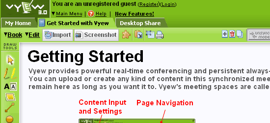
![Vyew - screen shot.]() Vyew is a web-based conferencing application that’s free to use for up to 20 participants. You can share your desktops, use the built-in screen capture tool to save sessions, customize your Vyew by adding your company logo, utilize useful plug-ins like DiagramVyew to create diagrams to share with everyone, and much more.
Vyew is a web-based conferencing application that’s free to use for up to 20 participants. You can share your desktops, use the built-in screen capture tool to save sessions, customize your Vyew by adding your company logo, utilize useful plug-ins like DiagramVyew to create diagrams to share with everyone, and much more.
Writeboard
![Writeboard - screen shot.]() Writeboard by 37 Signals is a simple, web-based collaborative writing solution that’s free and easy to use. You start by creating your own Writeboard, invite your team members (if you want to collaborate), and then just start writing. People can see updates, edits, and changes in real-time. You can save, track revisions, create versions, and roll back to previous versions of your Writeboard.
Writeboard by 37 Signals is a simple, web-based collaborative writing solution that’s free and easy to use. You start by creating your own Writeboard, invite your team members (if you want to collaborate), and then just start writing. People can see updates, edits, and changes in real-time. You can save, track revisions, create versions, and roll back to previous versions of your Writeboard.
Summary
There are a number of free online collaboration tools out there that are great for web design projects. Here at WebFX, we use basecamp, but we have a number of people involved in our website planning, web design, and internet marketing processes. For smaller projects, a free tool should suit your needs just fine. To learn more about WebFX’s web design, check out our industry-specific pages, such as this one on hotel web design!
What’s your web-based collaboration tool?
Is your free project collaboration tool/app not on the list? Share it with us and tell us why we should check it out in the comments!
Related Articles:
The post 15 Free Tools for Web-based Collaboration appeared first on WebFX Blog.
Package:
Summary:
Parse commands to get parameters of multiple types
Groups:
Author:
Description:
This package can parse commands to get parameters of multiple types...
Read more at https://www.phpclasses.org/package/12170-PHP-Parse-commands-to-get-parameters-of-multiple-types.html#2021-07-31-13:55:36











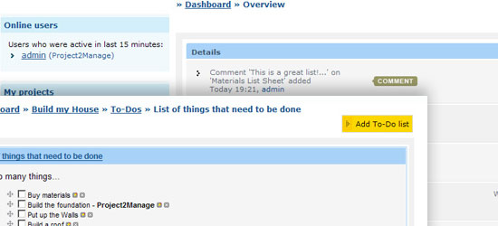 Project2Manage is a fully-featured, free, hosted solution for project management and collaboration (similar to Basecamp). You can set up different roles and permissions to limit what each team members see, write in your milestones to show everyone your goals, and be able to manage unlimited projects.
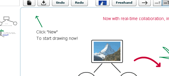 Dabbleboard is a robust, online whiteboard that’s easy to use. Use Dabbleboard to create wire frames of your user interface, draw flow charts, and create network diagrams, among other things. You can create Toolkits (a set of reusable drawing objects) or use pre-made Toolkits.
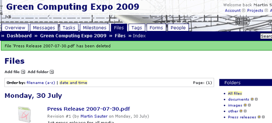 ProjectPier is a self-hosted, open-source, PHP-based project management application. Manage your tasks, team members, and projects under one interface. The interface is very simple and lacks the “whiz-bang” features of other solutions, but its does project management and collaboration quite well. If you need more convincing, read the 10 reasons for using ProjectPier straight from the creators.
 Wetpaint is a freeform online collaboration tool that brings in features from wikis, blogs, forums, and social networks. Because it’s simple to use and requires no technical expertise, it’s an excellent platform for generating content from different sources which you can use “as-is” or on your website.
 Mindquarry DO is an open-source collaboration application written in Java (J2EE). They’ve discontinued the Mindquarry GO which used to be an online version of Mindquarry, but Mindquarry DO is still available for download. Check out the requirements specifications to make sure your server has what it needs to run Mindquarry.
 Vyew is a web-based conferencing application that’s free to use for up to 20 participants. You can share your desktops, use the built-in screen capture tool to save sessions, customize your Vyew by adding your company logo, utilize useful plug-ins like DiagramVyew to create diagrams to share with everyone, and much more.
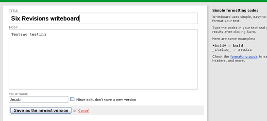 Writeboard by 37 Signals is a simple, web-based collaborative writing solution that’s free and easy to use. You start by creating your own Writeboard, invite your team members (if you want to collaborate), and then just start writing. People can see updates, edits, and changes in real-time. You can save, track revisions, create versions, and roll back to previous versions of your Writeboard.