PHP Read Time
Read more at https://www.phpclasses.org/package/12162-PHP-Estimate-the-time-for-a-person-to-read-an-article.html#2021-08-06-05:20:01
A framework for building Open Graph images – A look at GitHub’s new Open Graph image generator.

There Is No Such Thing As A CSS Absolute Unit – Learn why CSS units aren’t so absolute after all.

UI patterns & design inspiration from real products – Browse this curated library of screenshots & interaction patterns from the world’s best digital products.

Learn How to Determine Website Project Requirements Like a Pro – Strategies that can help you paint a clearer picture of what a website project will require.

uxbullshit – Read some not-so-recommended UX quotes.

Image optimisation: the ultimate guide – Learn the ins and outs of getting the best performance from your images.

The State of Developer Ecosystem 2021 – Annual look at the latest trends in the tech industry, as well as interesting facts about tools, technologies, programming languages, and many other facets of the programming world.

Will Full Site Editing Help WordPress Themes Finally Reach Their Potential? – How Full Site Editing (FSE) could bring a one-size-fits-all approach to WordPress themes.

Layout with Reveal Animations and Content Preview – Learn to create experimental reveal animations on typographic elements as a repeating pattern.

Prevent unwanted Layout Shifts caused by Scrollbars with the scrollbar-gutter CSS property – How a new CSS property could be a solution to a common problem.

A Web Designer’s Guide to Working on the Go – Tips for staying productive and secure when you’re away from the office.

Advanced CSS Gradient Editor – This free CSS design app is full of useful features.

8 CSS & JavaScript Code Examples for Creating Interactive Timelines – Top examples of timelines that are both attractive and engaging.

Project Hunt – A resource for finding the latest no-code projects.

Is it Time to Ditch the Design Grid? – Why the design grid feels more like a hangover from print than ever.

Thinking About The Cut-Out Effect: CSS or SVG? – Which approach works best for a cut-out effect? Here’s a look at the benefits and drawbacks of each.

The post Weekly News for Designers № 604 appeared first on Speckyboy Design Magazine.

Building beautiful and functional things is only part of a web designer’s job. Providing maintenance and support for our creations is also a key part of the equation.
This is often the more difficult task. After all, support can be a years-long commitment. Plus, it requires both technical knowledge and people skills – an important combination.
Support also plays a role in developing customer loyalty. Even if you’ve built an amazing website for your client, poor support is likely to damage the relationship. This could be a deciding factor in whether or not they stick with you for the long haul.
So, what goes into providing great support? Let’s look at a few ingredients for keeping your websites running smoothly and your clients happy.
Waiting is no fun – especially when you have a technical issue or question. Therefore, our first rule of client support is to quickly respond to that initial message.
This doesn’t mean you have to resolve things immediately. It’s more of a common courtesy to let your client know that their request has been received. Knowing that they’re on your radar helps to build trust and confidence.
Ideally, a personal response is preferred. Bonus points if it adds any follow-up questions to get the ball rolling on taking care of the request. But even a well-written auto response is acceptable.
The important thing is confirming that you’re aware of their message. That starts the entire support process off on the right foot.

When a client approaches you with an issue, it’s easy to jump to conclusions. Sometimes it takes the form of thinking you know the answer before they’ve even finished talking. In other cases, you might be quick to dismiss their claim as a case of simple user error.
It may come from good intentions (or a desire to get back to your other projects), but has the potential to rub your client the wrong way. You might be seen as terse or even rude.
Taking the time to listen is a much more effective approach. While it may eat up a bit more of your schedule, it demonstrates that you care about what your client has to say.
Besides, listening is the best way to gather information. You’ll be less likely to miss out on any important details that will help you resolve the issue. And you can always ask questions afterwards.
Exercising patience has a lot of side benefits. It helps to establish a positive rapport with clients. And they’ll feel more comfortable coming to you when they run into a problem. This is especially important for those who are technically-challenged and intimated by the situation.

Clients come to us because they’re hoping we have answers. In an effort to provide comfort and certainty, web designers may resort to speculation. Taking wild guesses as to what’s causing a specific problem or the timeline for fixing it is meant to bring peace of mind. The reality is that it is more likely to cause frustration if you guessed wrong.
Of course, this doesn’t mean you can’t offer up a laundry list of potential causes. But they should be noted as possibilities – not certainties. And, until a proper diagnosis, timelines should reflect investigating an issue rather than fixing it.
In other words: speak in generalities until you know what you’re dealing with. Don’t let your eagerness to please a client get in the way of finding honest answers.
Immediate solutions aren’t always possible. Thankfully, most people are willing to wait for you to look into an issue or research a question. Give them (and yourself) the chance to do so.

Complex issues may take a while to resolve. But that doesn’t mean clients should be left in the dark. Periodically checking in with the latest information (even if there aren’t any new developments) goes a long way towards keeping everyone on the same page.
While this may sound relatively simple, it’s not always easy. For example, we web designers often find ourselves acting as liaisons between clients and third-party service providers. If the provider doesn’t keep us in the know, it will make our job that much harder. It can also make us look bad.
Frankly, there’s no need to shield providers from accountability. Thus, if they’re the reason progress is being held up, don’t be afraid to say so. Just keep honesty and fairness in mind when reporting the situation. Painting an accurate picture is still important.
But regardless of who’s in charge of tackling the issue, stay in touch with clients. They must be kept in the loop throughout the entire process.

All of these tips can be tied together by a single word: professionalism. It’s something we expect from those who provide us with support. And our clients expect it of us as well.
It requires us to be honest, responsive and willing to go the extra mile. And, above all, a commitment to keeping clients abreast of what’s happening.
Of course, it helps to have loads of technical knowledge. But there’s more to it than knowing code and design. It’s the people skills that enable you to build a solid relationship. And a combination of both is what makes for top-notch support.
You don’t need to be perfect to succeed in this area. Rather, it’s about putting in the effort to take care of your clients. It may just convince them to stick with you for years to come.
The post How to Provide Great Support to Your Web Design Clients appeared first on Speckyboy Design Magazine.
WordPress is global in reach and open source in nature. And you would assume that what allows the software to be used by anyone would also enable it to be built by anyone. After all, your location doesn’t matter, and who employs you also doesn’t matter. And your relative social standing certainly shouldn’t matter. As long as you can communicate with the others contributing to the project, there should be no obstacle to your participation.
That was Josepha Haden on the “Cherishing WordPress Diversity” episode of the WP Briefing Podcast, speaking about the importance of diversity, equity, and inclusion within the fabric of the WordPress project. Her statement captures the spirit of the WordPress open source project, and we hope it resonates with you. Now, let’s dive in!
WordPress version 5.8, “Tatum,” came out on July 20. Version 5.8 is a major release that offers features like block-based widgets, a host of new blocks and patterns, a template editor, a duotone feature to stylize images, theme.json, and support for webP images, to name a few. Read more in the release post, the field guide, and the talking points post for meetup groups.
Want to contribute to WordPress core?
Contributor teams released the 11th version of Gutenberg on July 9. Version 11.0, which focuses heavily on backports and bug fixes, showcases some cool features such as an editing overlay for template parts and reusable blocks, and support for CSS shorthand properties in theme.json and block attributes. Version 11.1 was also shipped this month, on July 21. The release adds custom block borders as block supports and adds “drag and drop” to the list view.
Want to get involved in building Gutenberg? Follow the Core Team blog, contribute to Gutenberg on GitHub, and join the #core-editor channel in the Make WordPress Slack. The “What’s next in Gutenberg” post offers more details on the latest updates.
The Community Team kicked off work to bring back in-person WordPress events. The team recently announced that in-person WordPress meetups can be organized in a region if the local public health authority allows in-person events and if the region passes the in-person safety checklist. If the region does not meet guidelines on page one of the safety checklist, organizers can plan events for fully vaccinated, recently tested (negative), or recently recovered community members. Subsequently, the team also shared a proposal for the return to in-person WordCamps in places that meet the safety guidelines and the vaccination/testing requirements. Please share your feedback on the post if you have any thoughts. For more context, check out the “In Person!” episode of the WP Briefing Podcast.
Want to contribute to the Community Team? Follow the Community Team blog, or join them in the #community channel in the Make WordPress Slack.
The BuddyPress team is busy! Within barely a month of their last major release (version 8.0), the team shipped version 9.0 on July 19. Key features of the release include widget blocks and updates to the BP REST API. Download it from the WordPress.org plugin directory or check it out from its subversion repository. Want to help build BuddyPress? Follow their developer relations blog, check out their handbook page, or join them in the #buddypress channel in the Make WordPress Slack.
Please help these WordPress contributor teams by answering their research requests:
Have a story that we should include in the next “Month in WordPress” post? Please submit it using this form.
The following folks contributed to July’s Month in WordPress: @webcommsat @chaion07 @jillbinder @lmurillom @meher
Are you designing your very first portfolio website? Do you need motivation to redesign an existing one? Your portfolio website is one of the first things your clients will see, so it’s important to get its design just right. You want to differentiate yourself from the competition by creating a great portfolio website that will showcase what you are capable of. Find a creative way to express yourself — check out these excellent portfolio website examples for fresh ideas and inspiration.
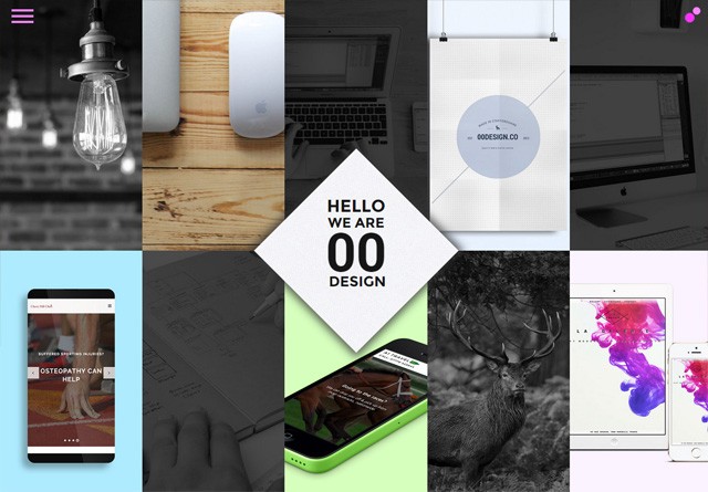
00 Design
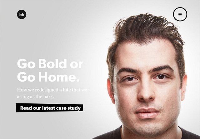
Brian Hoff Design
This Also
Flavien Guilbaud
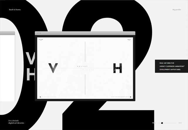
Frank Chimero
Hello Monday
Anton & Irene
adaptable
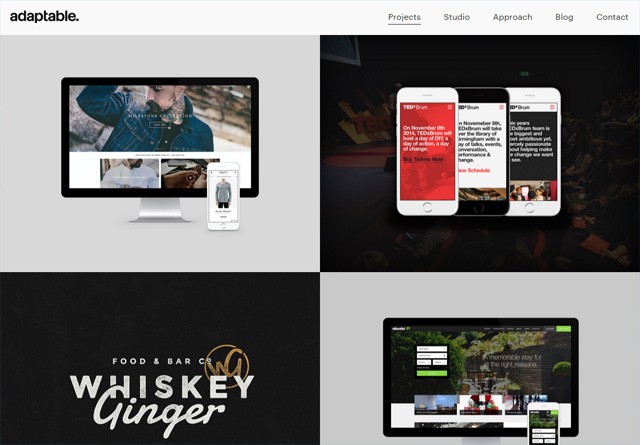
The Uprising Creative
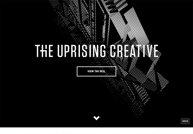
Fixate
Nathan Riley
Violaine & Jérémy
Build in Amsterdam
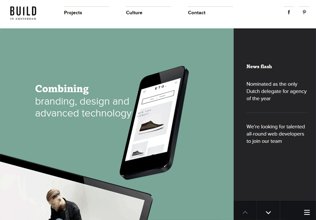
Lionel Durimel

Mike Kus
WILD
Matt Farley
Olly Moss
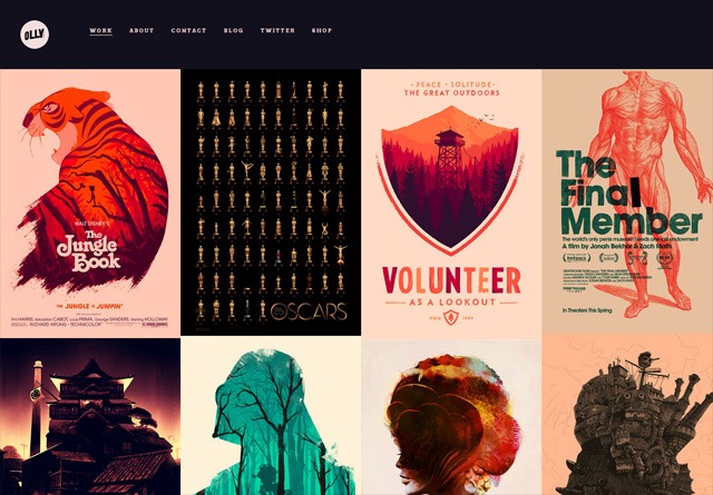
Retrofuzz
Gaspard+Bruno
Elias Sebastian Tinchon
Councl
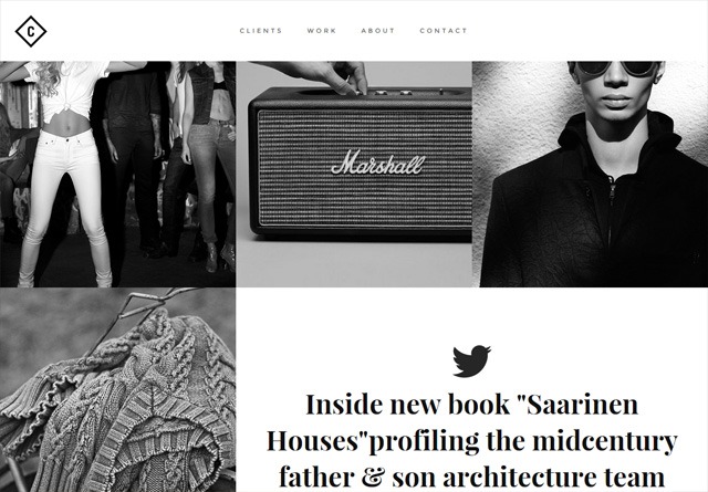
Kelsey Dake
Amber Creative
Tilted Square
Dogstudio
Redel Bautista
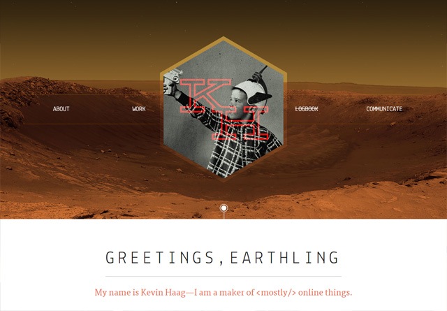
Kevin Haag
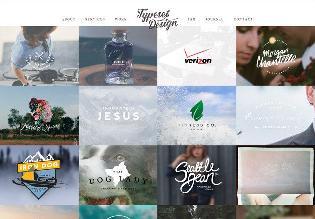
Typeset Design
Hinge Ltd
Melanie Daveid
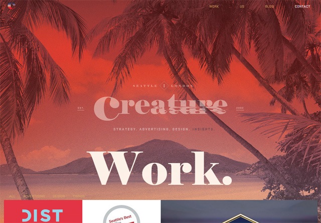
Creature Seattle
Green Chameleon
Malika Favre
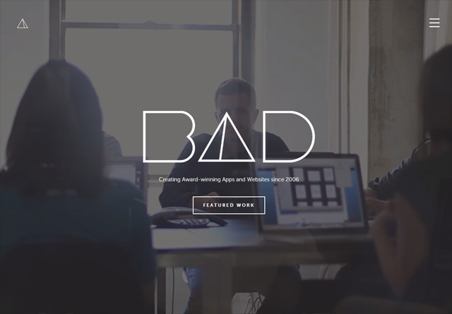
Bad Assembly
The Beast Is Back Inc
Hatch Collective

Limitless
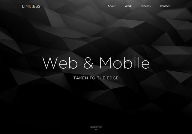
Thierry Ambraisse
Mike Ingham Design
Paradox Design Studio
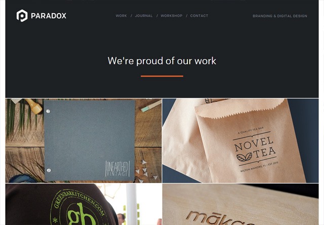
Oddbee
GODE
Angry Bear
Moruba
Kahuna Webstudio
Jan Finnesand
COBE

Cleverbird Creative
The post 50 Creative Portfolio Websites for Inspiration appeared first on WebFX Blog.
Latest PECL Releases: