One of the most amazing features of WordPress is its priceless price tag. In other words: It’s free. That provides virtually anyone with an opportunity to learn the CMS and all its inner workings without investing a dime. At the same time, it enables our voices to be heard – regardless of our financial status.
The same also applies to a whole lot of WordPress plugins. Most are free and offer up a variety of functionalities. However, there are also some amazing commercial plugins that go the extra mile. They include professional-grade features that bring our sites to that next level.
But sometimes you don’t need everything a commercial plugin has to offer. There are situations where perhaps one particular premium feature is all you need. It may not even be 100% necessary, but would still make life easier.
Today, we’re going to let you in on a little secret. There are indeed ways to get that one little feature you’re after without spending money. No, it’s not through anything unseemly. Rather, it’s by employing a piecemeal approach and, in some cases, a little elbow grease.
Curious? Read on to enhance your penny-pinching ways.
There’s something to be said for a plugin that does just one or two things and does them really well. Free of bloat or half-baked features, these plugins aim to provide niche functionality. They can also serve to fill in the gaps between the free and premium versions of another plugin.
Take, for example, The Events Calendar. It is one of the most popular and powerful calendar solutions for WordPress. The free version is plenty useful, but the premium version offers a few niceties that make it tempting. In addition to some gorgeous calendar views, it also brings with it the ability to set up recurring events and make use of some handy shortcodes.
Need only some of these features? There are some compelling options:
The Events Calendar Shortcode (which does have free and premium versions) will let you display custom event queries via shortcode without hacking templates.
The Events Calendar Shortcode and Templates (again, with free and premium versions) brings both the shortcode capabilities and adds some unique calendar templates to the mix.
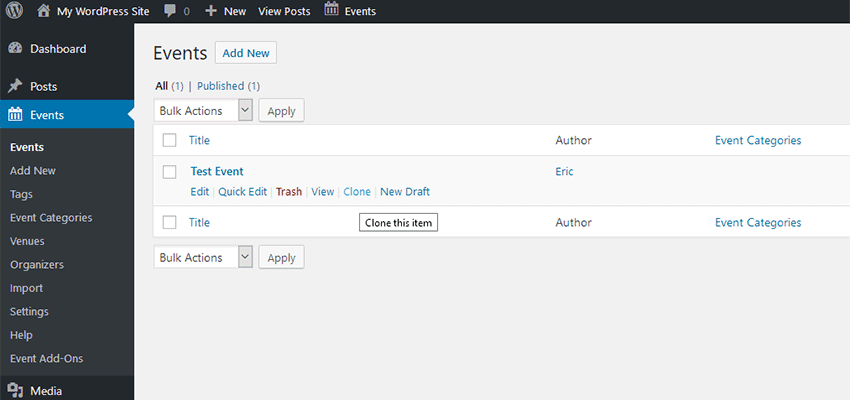
And, while Duplicate Post won’t exactly provide recurring events, it does allow you to easily clone existing ones. From there, it’s just a matter of going in and tweaking the dates.
This is just one example. And not every plugin is popular enough to have its own ecosystem of community created add-ons. But even more generic choices, such as the aforementioned Duplicate Post, can help add those missing bits of functionality that you’re after.
We should mention that there are a few downsides to this piecemeal approach. One is that it takes research, trial and error to find acceptable solutions. Second, piling plugins on top of each other this way can open the door to compatibility issues. So, think about the risks before you hit that install button.
Build It Yourself
You don’t always have to rely on other plugins to add that one specific feature. If you know a little bit of PHP and/or JavaScript, odds are that you can create your own solutions.
A great example of this is WooCommerce. Yes, there is a huge ecosystem of third-party niche plugins to extend functionality. But there is also a massive library of hooks and filters that you can build upon. This gives you some flexibility in terms of customizing plugin functionality to suit your needs.
Even if the plugin you’re using isn’t quite so thoroughly documented, you’re not necessarily out of luck. Try opening up source files and seeing how things work. You might find just the hook you need in order to start building.
And, Google can be your best friend in these situations. A quick search for what you’re looking to do could lead to an existing answer. Between support forums and GitHub, another developer may have already done the dirty work for you.
Conversely, if all you need is a custom query of data, that’s already built right into WordPress. Use the documentation or a code generator to build it. Then, add in some CSS to style things to your liking.
Of course, custom development isn’t for everyone. And it may end up costing you more in labor than the premium plugin in question. Therefore, you’ll want to weigh the pros and cons accordingly.
Cheap and Good (Enough)
Quite often, the best (and easiest) solution is to pay the money and buy that premium plugin. This not only gets you the top-of-the-line features you want, but also supports further development of the plugin itself.
Still, there are times when that might not be possible. You may not have the budget to make the purchase or only need that one extra feature to make your project shine. In those cases, there’s a good chance that you can approximate (if not exactly replicate) a specific bell or whistle. In a way, it’s even a bit of a fun challenge to see how far you can take things.
So, the next time you really wish you had that premium functionality, think hard and take a look around. You might just find that you won’t need that credit card, after all.
The intro to Good Work starts with a simple statement:
We love the web.
This sentiment is core to the vision of Faculty. It is also a common thread that ties together most of the professional endeavors throughout my career.
My love of the web has led me to do something I’ve never done before. Faculty is sponsoring a conference. Not just any conference, of course. New Adventures.
For a new company, any expense (even a small token of support) is a big decision. Here are a few of the reasons we decided it was a good idea:
We share a similar ethos. The company you keep reflects who you are. It’s important for us to align ourselves with those who share our values.
Our friends deserve our support. When I started Faculty, it felt like starting over. Although my career spans more than two decades, Faculty itself is new. I’m sure bringing New Adventures back after all these years feels a bit like starting over. I have benefitted from the support of my friends. I want them to benefit from my support, too.
I miss it. I attended New Adventures all three years (2011, 2012, and 2013), during the heart of the Brooklyn Beta years (2010–2014). There’s heavy overlap between our communities. I’m confident the return of New Adventures can refresh our optimism and spirit.
We need this. We’re no longer standing on the shoulders of giants like we once were. We need to ground ourselves in the lessons of the past to reach new heights. By sharing our experiences, we can help newcomers get a head start and push the web forward.
There are many conferences I love. (I’m looking at you, Webstock.) It’s possible we’ll sponsor more conferences in the future. For now, we’re incredibly excited to be heading to Nottingham in January.
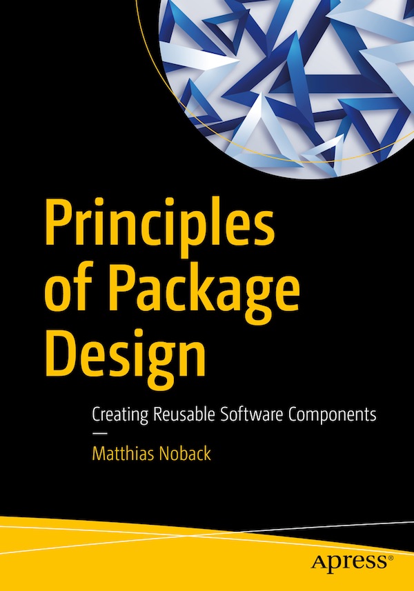
All of a sudden it became book-writing season. It began in August when I started revising my second book, "Principles of Package Design". Apress had contacted me about adopting it, and they didn't want to change a lot about it. However, the book was from 2015 and although I had aimed for it to be "timeless", some parts needed an update. Furthermore, I had happily pressed the "Release" button back then, but it's the same as with software development: the code you wrote last year, you wouldn't approve of today.
Upgrades
Because Apress has their own pipeline for manuscript to book conversion, I had to take the original Leanpub-flavored Markdown manuscript, export it to html, then copy it into Mac Pages, and finally export it as a Word document. That was already a lot of work. Then I started reading the book and collected all the issues, creating post-its along the way. Having every little issue on display was a nice trick. It made progress visible, and made it feel like a project I could finish.
Re-reading my own book was a very interesting experience. I noticed how often I'd been lazy and skipped a proper argument for a piece of advice. I also noticed how some advice wasn't very clear and could easily be misinterpreted.
In that regard, it was very, very helpful to have Ross Tuck on board as a technical reviewer. He pointed out several issues where the reader, given this or that background, could have difficulty understanding a section, or take unintended advice from it. Ross put in a lot of time and effort, so from this place, thanks again!
Besides revising, I've also added several new sections, most notably about the following topics:
The reuse of code from the Domain layer, with a discussion about Domain-Driven Design.
Why "final" classes should be preferred, and how composing objects should be the preferred way of changing the behavior of existing objects.
When to introduce an interface for a (packaged) class.
Because there are many people who have read the first edition, who I don't want to "force" to buy the second edition as well, I've already published several articles that cover more or less the same ground:
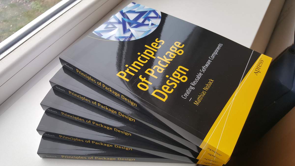
So, here we are. The release of the second edition of Principles of Package Design! The book is available on Apress,com and Amazon, but it's also a "regular" book, so your book store should be able to order it as well.
I'm very curious about your opinion. If you've read the book (first or second edition), please let me know what you think of it. It would be great if you could submit a customer review on Amazon.
If you'd be interested in writing a review on your website, blog, etc., send me an email at info@matthiasnoback.nl, so I can send you a review copy.
Also, if you see this book in a store somewhere, it'd be very cool if you could send me a picture!
Infographics are one of those elements that have become equally popular in both print and web design. Regardless of the medium, these graphics help readers to better understand a concept or process. At their best, infographics take something complicated and turn them into a highly visual, yet simplified experience.
The web offers its own unique advantages for infographics: Interactivity and responsiveness. Instead of a plain old graphic, these storytelling elements can become even more user-friendly. Animation can be used to demonstrate an idea. And, infographics built with web technologies can also greatly improve accessibility.
We’ve put together a collection of snippets that aim to do more with infographics. Some may not necessarily feature a traditional composition. But they still seek to make information easier to understand.
Big Steps by Ana Tudor
Outlining a multistep process is something quite common on the web. However, it takes some work to make things easy to understand. What’s great about this snippet is that the numbered steps are both bold and highly detailed. They also degrade nicely on smaller viewports.
Sometimes, it takes creative solutions to get your point across. This circular chart rotates, outlining various ways to combat climate change. The format is both fun to watch and easy to follow. It also demonstrates how we can go that extra mile to make information more compelling for users.
Simple, intuitive and easy on the eyes, this pie chart makes great use of interactivity. Click on the company logo and its container opens to up reveal more information. It’s colorful and integrates some slick animation.
Television news and sports programs love to dazzle us with animated statistical presentations. Here we have a series of animated charts that is reminiscent of what we often see on TV. This snippet utilizes movement and bold styling to grab attention.
Interactivity is on full display here, as you can adjust both the numbers and colors used on this stunning 3D chart. Pop in a hexadecimal color of your choice for each entry and use a slider to play with percentages. As a bonus, you can also reposition it on the screen!
This is a really unique way to build an infographic and make it interactive. It’s a series of CSS content cards that are displayed in an overlapping and staggered format. Hover over a card and an animation reveals more info. You could conceivably make each card clickable, leading users to related content.
Here we have an interactive infographic where clicking on an icon loads relevant content within the green sidebar. This type of implementation would be great for a full-screen presentation, allowing users to learn more in an immersive format.
At the most basic level, an infographic should be attractive and easy to understand. This CSS-only example accomplishes both quite nicely. The illustrated coffee cups not only look tasty, but they are also representative of their ingredients. That, along with the flavor scale and ingredient key all come together beautifully.
Static text or images aren’t always enough to help users better understand your message. Just as they have for decades in the print universe, infographics offer a more user-friendly means of communicating data on the web.
When combined with the latest CSS and JavaScript techniques, we can create infographics that go beyond just a fancy layout for statistics. Instead, they can become an interactive and immersive experience that both entertains and educates.