PHP License Key Generator Class
Read more at https://www.phpclasses.org/package/12204-PHP-Generate-random-string-to-use-as-license-key.html#2021-09-02-01:34:54
You see them every time you go to the supermarket. Chances are, you’ve used one recently. Shopping carts have been a matter of course for supermarkets, grocery stores, and many retail outlets for decades, but did you know that Sylvan Goldman, their inventor, struggled with some of the same problems you face as a designer?
We’re going to explore the history of the humble shopping cart, taking lessons from its design, marketing, and even the psychology of use, that you can start applying to your design process today.
A couple of ordinary folding chairs were the inspiration that spawned the early prototypes of today’s shopping cart. This was an invention that helped revolutionize the retail grocery business. But it wasn’t perfect at first. Sylvan Goldman and his associate revised the design of the shopping cart many times before it began to resemble the modern cart we know today.
They had to work through safety issues – the little space for children was developed after observing how mothers would put their children in the early carts, which was dangerous and which also left little room for their groceries (and thus defeated the entire purpose of using the cart in the first place).

I know designers love to complain about client-initiated revisions (and I’m definitely including myself here), but designer-initiated revisions are extremely important to the design process. Vital, even.
Many designers often rely on the first or second idea that comes to them, which may get the job done and be “good enough” for the client, but it’s terrible for fostering true innovation and creativity.
Challenge yourself to be your own worst critic for each job you take on. Begin training yourself to look for areas you can improve on and ideas that could be developed further, and you’ll start to see glaring errors you wouldn’t have noticed before.
Nowadays, shoppers are most likely to complain about inefficient steering on their shopping carts, making it nearly impossible to turn corners or pivot to avoid other shoppers or freestanding food displays. But back in the 1930s, grocery store owners were very interested by the small amount of space Goldman’s new shopping carts took up.
Before Goldman’s invention, people placed their groceries in heavy, bulky baskets made out of wicker or wire. Once filled up with groceries, they got so heavy and cumbersome that store clerks would approach struggling shoppers and provide them with a new, empty basket, taking their full basket to the check stand for them.
These baskets took up a lot of room in the stores as well, so Goldman’s upright, foldable carts were a very welcome boon to store owners.
As a designer, it’s always important to consider the selling points of your designs, not just to your clients, but also to your client’s eventual users, audience, or consumers. The shopping cart solved a problem both for the store owners (took up less space) and for customers (were less heavy and cumbersome).
If you make your client happy, that’s a good thing. They will pay you and send you on your merry way. But if your design fails to make your client’s users happy, your client will be calling you back, possibly demanding a refund.
Goldman experienced exactly this phenomenon firsthand when his client (the grocery store) attempted to sell their customers on the idea of the shopping cart.
Believe it or not, Goldman and his associate had the most difficulty not with developing the shopping cart model itself, nor with perfecting its functionality. The biggest problem they faced was in getting store shoppers to actually use them.
Female shoppers of the day thought they too closely resembled baby carriages – they refused to push yet another cart on wheels and add to their daily drudgery.
And male shoppers were too macho to use a dainty little cart on wheels when they could just use their “big strong arms” to carry around one of the old-fashioned baskets. Who knew shopping carts weren’t considered manly in the early 20th century?
The only users who actually liked the idea of shopping carts at first were older people. Not good.
So, how did Goldman get around this marketing obstacle? If you guessed ‘use plants to manipulate shoppers into using the new carts via peer pressure,’ give yourself a prize!
Goldman hired several “pretend” shoppers of various age groups to use the carts in the store. He then proceeded to suggest to real shoppers that “everyone” was using the new carts, which created a social imperative to fit in.
Almost instantly, the new shopping carts were a hit – everyone began using them within a few weeks.

Is it unethical to persuade your target market to consume your products or information by appealing to their need for social acceptance? Absolutely not. Companies, as well as everyday people, do it all the time.
When you and your friends are deciding where to go out to dinner, and one friend is holding everyone up by not making a decision, what’s the first thing you do?
If you’re anything like me and my friends, you’ll appeal to the “majority rule” and try to persuade your friend to choose what everyone else has chosen. This is exactly how companies have persuaded people to have televisions in every room of their house, or purchase hideously ugly shoes that no sane individual would ever spend their hard-earned money on.
The power of social persuasion is nearly limitless, and as a designer, you should definitely be using it to your advantage whenever appropriate. If you have to resort to an obvious persuasive tactic or two, that means you’re using your power as a creative professional to sway public opinion and generate profits for your client.
Either that, or you’re just a big jerk. Who knows, really?
First came the “folding basket carrier,” the initial prototype for the shopping cart perfected by Goldman and his people. After ten years of successfully marketing this cart to stores, there came the “nest cart,” which included the new mechanism of being able to nest itself inside the next cart in front of it.
This mechanism should be familiar to you if you’ve seen those long lines of “nesting” carts at cart kiosks or drop-offs.
Shopping carts have gone through many, many changes over the years. You may have been grateful for the shelf underneath your cart, which allow you to select heavy objects without having to lift them too high, or irritated at the security measures stores have taken in recent years to prevent theft (the carts in my neighborhood store automatically lock down the wheels of any cart that wasn’t cleared by the system, which has taken me by surprise more than once).

Sylvan Goldman died in 1984, but his innovations have lived on in the imaginations of countless product designers, and there are now more versions of the shopping cart than even he lived to see.
Just because you finish a design job with one client, that doesn’t mean the research and testing you conducted for that project has no further use. If you work to narrow down your focus to a particular market or two, you can collect research data from each future job you take on, accumulating a database of knowledge and experience which will allow you to innovate faster and more efficiently with each passing year.
In a couple of years, you’ll have far surpassed those designers who ignore the goldmine of business, marketing, and psychological insight they have at their fingertips through their clients and their clients’ users.
The post Taking Inspiration from the Humble Shopping Cart appeared first on Speckyboy Design Magazine.
Minimalist design became popular in recent years and shows no signs of going away any time soon. However, minimalist design can sometimes be tricky to get just right. Luckily, there are hundreds of templates created with this design trend in mind that can help you save time.
In this roundup, we’ve gathered the best minimally designed logo templates that are free for personal and commercial use that can be used as an inspiration or as a starting point for your design.
More Logo Templates:
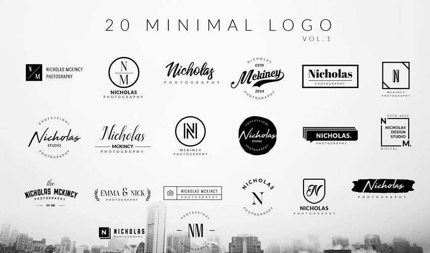
The first logo pack is a collection of 20 elegant minimalistic logos that are primarily type-based. However, if you want to spice up the design a tiny bit, you’ll also find logos that pair typography with minimalist lines or dots for extra flair.

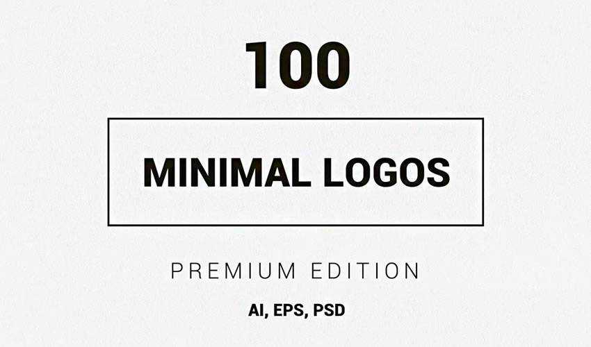
If you want a lot of variety in logo designs, check out this collection of 100 minimal logos from Envato Elements. The logos come in Photoshop and Illustrator formats and you can easily edit the designs.

This collection features 15 different logo designs that were made in Adobe Photoshop. You can easily customize the typography as well as the colors.

This pack contains a grand total of 25 unique minimalist logos that can be used as a starting point for your design or as an inspiration. The logo files can be edited using Photoshop and Illustrator.

The logos in this collection are perfect if you need to work on a monogram logo or a logo for a business with a very short name. The logos are in Photoshop and Illustrator format and have well-organized layers for easy editing.

The Camelia collection of logos is a perfect choice for projects that revolve around natural and organic brands. The logos feature delicate floral elements and you can easily modify the fonts thanks to layered files.

This collection of 10 minimal logo templates is another versatile collection that’s suitable for several niches. The logos were designed in Photoshop and include layered files that are easy to customize.

This impressive collection of 100 minimal logos is a great choice no matter what type of project you’re working on. You will find fully editable, layered files as well as a help file that lists all the fonts used in the templates.
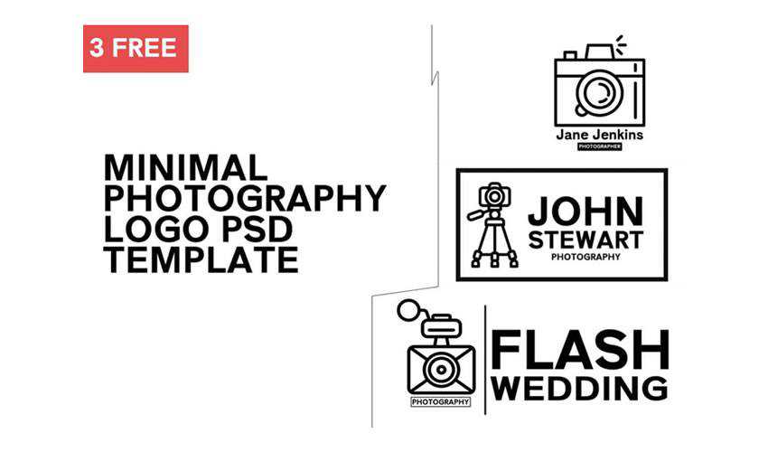
If you’re working on a logo design for a photography business, this collection of 3 minimal photography logos will come in handy. The logos can be edited with Photoshop and use free fonts.
When you subscribe to Envato Elements, you will be able to download this collection of 20 minimalist logos. The logos come in Photoshop and Illustrator format and are fully editable.
This modern collection of minimal logos include 20 unique logos which are fully editable with Adobe Illustrator. The logos use free fonts and you will get a file that contains links to the font files.

Consider this collection of 50 minimal logos if you’re looking for a variety of designs. You’ll find monogram logos as well as wordmarks. The logos can be edited using both Photoshop and Illustrator.
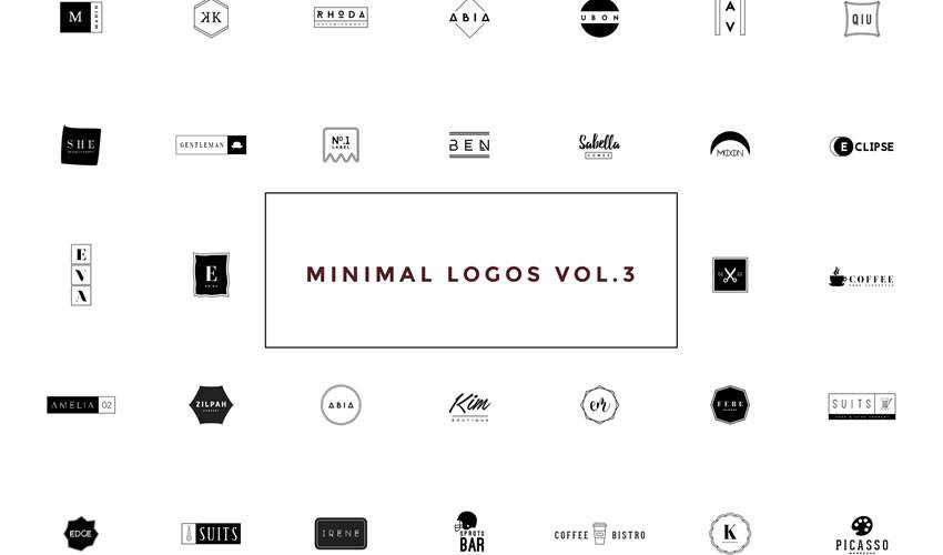
Minimalist logos will make it easier for the final logo to be memorable and versatile enough to work in various settings. With that said, be sure to check out the logo templates on this list and download them so you can save time on your branding projects.
If you’re looking for free vintage or retro-styled logo templates, take a look at this collection.
The post 7 Free Collections of Minimally Designed Logo Templates in 2021 appeared first on Speckyboy Design Magazine.
In the web design industry, it’s rare that a tool stays relevant for a decade or more. Things tend to change so quickly that the useful life of an app or framework usually isn’t very long. However, Twitter’s Bootstrap has defied those odds.
Now in existence for over 10 years, the self-described “front-end open source toolkit” is used on over 22% of all websites. And we see it included everywhere from customized UI kits to WordPress themes.
Why has Bootstrap been able to reach such heights? For one, it comes packed with virtually everything designers need to craft a clean, responsive UI. Plus, the fact that it continues to be actively developed and evolve means that web professionals can reliably come back to it again and again.
With a decade under its belt, this is a good time to look at the overall impact Bootstrap has had on the web. Has it been a blessing, curse, or somewhere in-between?
The biggest advantage Bootstrap provides is the ability to implement an established look and feel. Right out of the box, you have a set of UI elements and components that cover just about every use case. It doesn’t matter if you’re selling t-shirts or blogging about your favorite video games – the framework gives you a massive head start on the design.
In addition, Bootstrap is extensible. It’s built with customization in mind, making it a fairly straightforward process to change various components to meet your needs. Creating your own components is also possible.
That goes beyond individuals performing one-off tweaks for a specific project. It also extends to theme developers. They can leverage the framework to bring a familiar front-end UI to content management systems (CMS).
Yet, customization is still optional. If your goal is to design and deploy a project quickly, just installing Bootstrap (or an offshoot UI kit) and familiarizing yourself with its contents is all you need.
This level of convenience and flexibility has undoubtedly played a large role in Bootstrap’s enduring popularity.

Bootstrap does its intended job quite well. Perhaps a little too well.
As we mentioned, the usage statistics point to nearly a quarter of all websites utilizing the framework. When a UI is so widespread, it’s bound to lead to some sameness when it comes to design.
Much like the early days of the CMS, it’s often easy for the trained eye to pick out elements of Bootstrap within a website. You start to notice the same buttons, navigation styles, and pricing tables. Even sites that don’t use it may well attempt to duplicate certain aspects of the look.
To be sure, it’s generally clean, accessible, and easy to read. While that can be considered a good thing, there’s also a bit of a downside. And it isn’t necessarily an issue with Bootstrap itself.
Rather, it’s about designers either accepting its default styles or changing them only minimally. The result is a web that is becoming increasingly homogeneous.

Perhaps it’s a testament to how well put together Bootstrap is. There aren’t a bunch of shortcomings that need fixed. Everything works as intended right from the start.
With that, some designers may not feel the need to radically change anything. One could even argue that it goes against the very point of the framework in the first place.
Unlike a lot of tools aimed at the web design community, Bootstrap has a universal appeal. There is no particular niche that it can’t fit into. That’s a key to its massive adoption rate. And it has inspired an entire category of CSS and JavaScript frameworks.
Other worthy competitors have popped up in recent years, such as Tailwind CSS. It has a similar appeal. However, it differs in that it’s more “utility” based. The various elements are all there, but depend on the designer to customize them to fit a need.
Bootstrap is unabashedly opinionated in its design. Tailwind CSS goes in the opposite direction. If anything, this provides designers with two great options, depending on their own preferences.
Design from the ground up or implement a completely polished UI – the choice is yours.

Maybe the most impressive aspect of Bootstrap’s 10-year rise is that it’s a completely developer-focused tool. That is, you interact with its code and view the results on the front end. That’s opposed to, say, WordPress, where users create content and install custom functionality via a back-end dashboard.
The framework is generally of interest to professionals. Thus, it relies on web designers for growth. It doesn’t have the same public-facing profile of a CMS.
That says a lot about what Bootstrap has done right over the past decade. To win over a sizeable portion of this industry is no small task. To maintain it and continue to grow for this long is even more telling.
What will the future bring? We don’t have all the answers. But, whatever happens, it’s likely Bootstrap will still play a significant role in web design for years to come.
The post Bootstrap Turns 10: A Look at Its Impact on the Web appeared first on Speckyboy Design Magazine.
Email marketing should be one of the key components of your customer retention strategy. Engaging in regular communication will keep subscribers informed about your latest news and promotions. So it’s vitally important that your website focuses on enticing people to opt-in to your mailing list.
WordPress is an ideal platform for collecting data. There are many plugins available that allow you to connect with your favorite email marketing service. You can even run your own service directly through your website.
Whatever your ideal setup, we’ve collected 10 of the best plugins for managing your email marketing through WordPress.
MailPoet started out as a free/premium plugin that turns your WordPress install into a mailing list service. Their new version continues this (free up to 2,000 subscribers), but also offers to deliver email for you.
This solves one of the tough issues with running your own lists – ensuring messages don’t get caught in spam filters. For that matter, your host server could get blacklisted as well. So sending through your own server in the free version is best left to smaller lists that don’t send very often.
The nice aspect of MailChimp for WordPress is that you have the option of creating signup forms directly through the plugin or integrating with other plugins (Contact Form 7, Gravity Forms, Ninja Forms, BuddyPress, WooCommerce and Easy Digital Downloads – to name a few).
Advanced WooCommerce integration is one of the features of the premium edition.

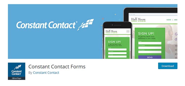
Using Constant Contact Forms, you can enable visitors to easily subscribe to your email list. The plugin also lets you create custom fields so that you can collect additional data.
You can even use the plugin without having a Constant Contact account – but obviously, the features are geared towards those who do use the service.
Hustle provides a means to not only connect with popular services such as MailChimp, Campaign Monitor, Constant Contact, GetResponse and Mad Mimi, it also lets you target users through slide-ins, popups, widgets and shortcodes.
So it’s more of a complete marketing suite that you can use to encourage subscriptions, along with other functionality. It also provides nifty features like social sharing and statistical data regarding opt-ins.

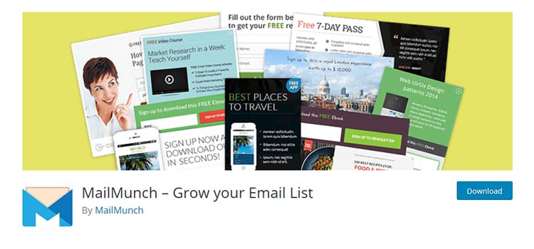
It’s fair to say that MailMunch and Hustle are somewhat similar in scope. Where they differ is that MailMunch really is solely focused on email marketing. You can create a variety of different opt-ins ranging from popups, embedded forms, top bar, scroll box and sidebar.
The plugin is compatible with many third-party services (AWeber, Campaign Monitor, Constant Contact, GetResponse, InfusionSoft, and MailChimp). You can also take advantage of A/B testing and analytics.
With Email Subscribers & Newsletters, you can take a more holistic approach to email marketing. You’ll be able to collect user information and send out HTML newsletters through your WordPress website.
But you can also set up automatic email notifications when new posts are added to your site. That provides an incredibly easy way to keep users engaged with your content.

Beyond your standalone opt-in form, it’s a great idea to integrate subscription options into other existing forms on your site. Contact Form 7 Campaign Monitor Extension is one of many available plugins that will do this for you. Compatible with the ever-popular Contact Form 7, users who are filling out a form on your site are just a click away from also subscribing to your Campaign Monitor list.
The very same plugin author has similar offerings for AWeber, GetResponse, iContact and MailChimp.
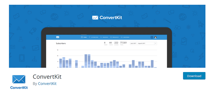
ConvertKit is a bit of a unique service, as it is geared towards bloggers. It offers some automation features that will help keep your readers in the loop. Their WordPress plugin allows you to connect to your ConvertKit account via API and easily add opt-in forms either globally or on a post-by-post basis.
Overall, it’s a nice option for content creators.
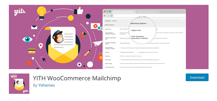
An online store’s checkout is the perfect opportunity to offer your customers a place to subscribe. After all, if someone is willing to spend some hard-earned cash on your site, there’s a mutual interest in forming a relationship.
Yith WooCommerce MailChimp will hook up with the mailing service and enable customers to subscribe to a list of your choosing via a simple checkbox on the front end.
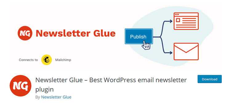
A relative newcomer, Newsletter Glue enables WordPress site owners to create email newsletters directly within the CMS. The unique selling point is that the plugin connects to an outside email service provider via an API. You write the newsletter in WordPress and send it through the provider. The result is a familiar content creation UI and a more reliable way to actually deliver those newsletters.
The free version connects to your MailChimp account. The pro version has more sending options, along with the ability to embed social media and WordPress posts.
MailOptin aims to be a complete solution for email marketing via WordPress. It connects with a wide variety of third-party providers (MailChimp, Constant Contact, etc.). But it also enables you to create list signup forms that can be implemented in several ways and even let you send mail to your lists from within WordPress. You can run your entire email marketing operation without leaving your website. A premium version adds automation capabilities, like sending out new post notifications, enables mail scheduling and more.
The plugins profiled above provide some flexibility with how you collect and distribute information through email marketing channels. Some even allow you to create a channel that’s all your own. This wide array of options allows you to tailor things to match your needs and philosophy.
What’s really great is that you can reach people on any part of your site. Whether through a traditional sidebar widget or an option on your checkout form, you can encourage visitors to build a relationship.
If you’re just getting started with email marketing, think about the various ways you can implement it into what you’re already doing. For example, if people are already interacting with a specific feature (like a contact form), then it makes perfect sense to add an opt-in. But you may also want to approach them at other times, like at the bottom of a blog post or through a popup window.
Wherever and however you want to reach out, there are WordPress plugins out there to help make it happen.
The post 10 WordPress Plugins for Email Marketing Management appeared first on Speckyboy Design Magazine.
Latest PECL Releases: