Colorful schemes and geometric solutions were named two leading trends in the graphic design sphere earlier this year. Many respectable artists and analysts have bet on these two approaches to prevail in 2019. And their predictions are coming true. Bright visual identities as well as those that feature clever geometric compositions appear here, there and pretty much everywhere.
Even though these two trends perfectly exist on their own, offering designers a vast scope of opportunities, it seems that they can make a cute couple and produce an even more significant impact together. This alliance is not just a colorful scheme used in tandem with a geometric approach. It is a true symbiosis where splashes of color are enclosed within various geometric frames.
Sometimes they interact with each other, sometimes they work separately. Nevertheless, together they create unique abstract scenery that adorns the backgrounds of various elements of brand identity – starting with business cards and ending with packaging. Colorful and shaped designs are a trend-within-a-trend that excites the audience and encourages designers to practice their creativity.
Let’s consider some exciting projects as examples.
The Complete Toolbox for Designers Unlimited Downloads: 500,000+ Print & Web Templates, Actions, Brushes, Mockups & Much More!
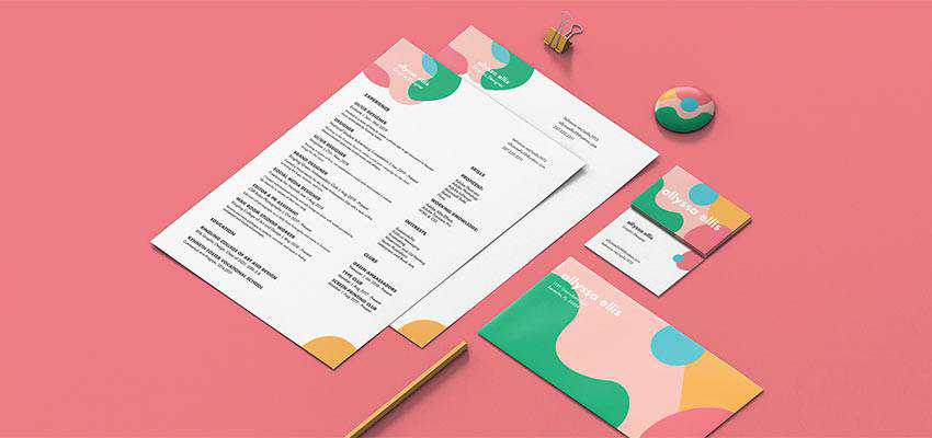
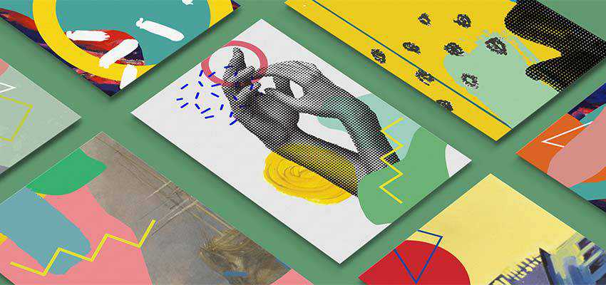
We are going to start our collection with a representative example, Personal Branding by Allyssa Ellis.
The goal behind this branding was to introduce Allyssa’s bright, fun and charismatic personality to the audience. And she has nailed it. The brand identity establishes a positive mood from the first look here. The shapes are smooth and feel elegant, whereas the color scheme is pastel. That adds to the feminine atmosphere. The project is fully in line with the artist’s creative thinking and character.
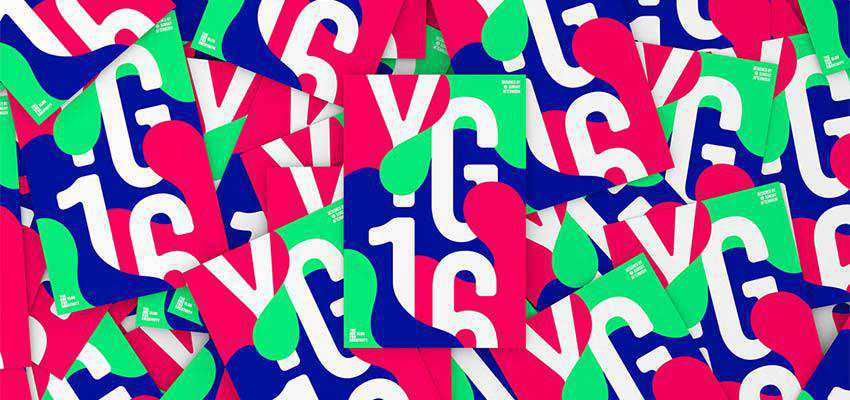
The design will take you aback with its bright personality. Even though the chaotic explosion of vibrant tones has been coordinated here, nevertheless it feels like an artistic outbreak. The project aims to represent young creatives, so it is not surprising that it has such a bold and a bit strange appearance. Note how the colors overlap letters here, erasing the border between foreground and background. The idea is just brilliant.
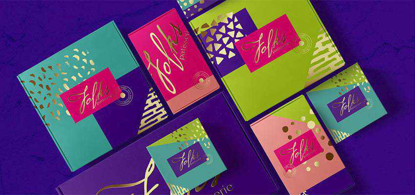
Unlike the two previous examples that exude eagerness of youthfulness on all fronts, this brand identity project looks mature and stately. Golden blotches of various shapes give the composition a bit of luxury feel. Note how easily and naturally the artist managed to combine such drastic colors as lime and turquoise. They have pulled off a fantastic result.
Created by Kristina Hristova, this project looks positively odd. It certainly has an artistic quality that sets the tone to an appropriate one for the museum theme. It seems like one of the installations from the modern art gallery.
Each flyer strikes an eye with its intricate design, with well-thought-out layering and color combos. At some point, it even reminds us of a scrapbook style. Yet with some modern tricks and moderate usage of layers. This project naturally breaks away from the rest of the crowd.
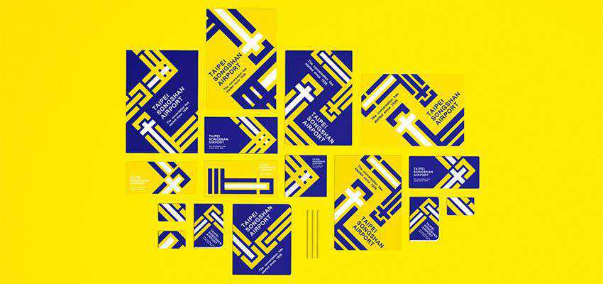
Deriving colors from the airport terminal design and inspired by traditional Chinese window lattice, this is an outstanding project. There are only sharp angles and rectangles: they make the visual identity look techy and business-like. The coloring adds to the overall aesthetics and makes things appealing to the eye.
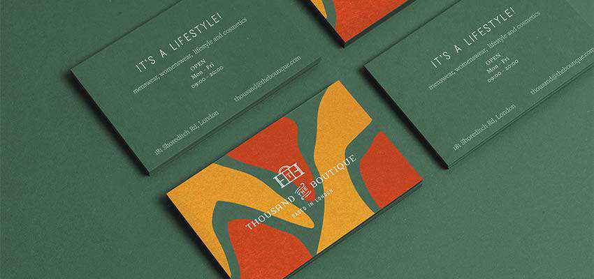
Guided by the client’s aim to cultivate the idea of luxury living and a spirit of the citadel of traditions that is London, Cansu Merdamert has dealt with one of the most beautiful and challenging color combinations out there.
Beautiful green, yellow and red conveys the deluxe atmosphere without feeling posh. The smooth shapes make the design feel friendly and inviting, as well as meet the business side of the project.
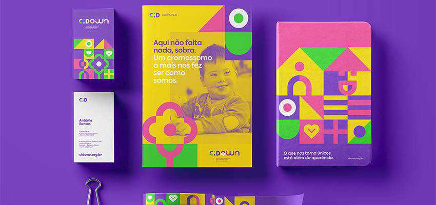
John Dias’ project is just amazing. Bright colors, with purple used as the primary, along with a bunch of primitive geometric shapes. They look childish, but skillfully establish a positive feeling here. The duotone photography made in beautiful yellow and green perfectly blends in and pleases an eye from the first glance. The design sets the proper tone for the company as well as makes the message sound “loud”.
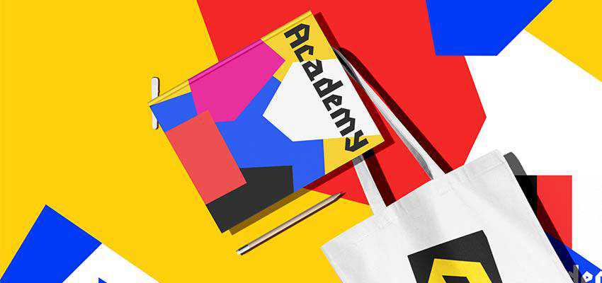
While all of the previous examples have more or less sleek aesthetics, the brand identity concept created by this Cairo-based artist certainly looks sharp – literally and figuratively. Various colorful polygons form the scenes here. The typography with acute letterforms completes an ensemble. Targeted at youth, the project easily meets Generation Z with its bold and daring look.
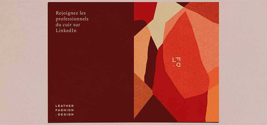
Much like the previous example, LFD’s brand identity also has many sharp angles and irregular polygons. They also overlap each other, creating an intricate layered complexity.
However, this time the color scheme is not as daring as in the case of Academy. On the contrary, the tones perfectly complement each other, creating a true harmony in the design. The beautiful patchwork that reminds of raw pieces of leather effortlessly portrays the fashion industry that stands behind this project.
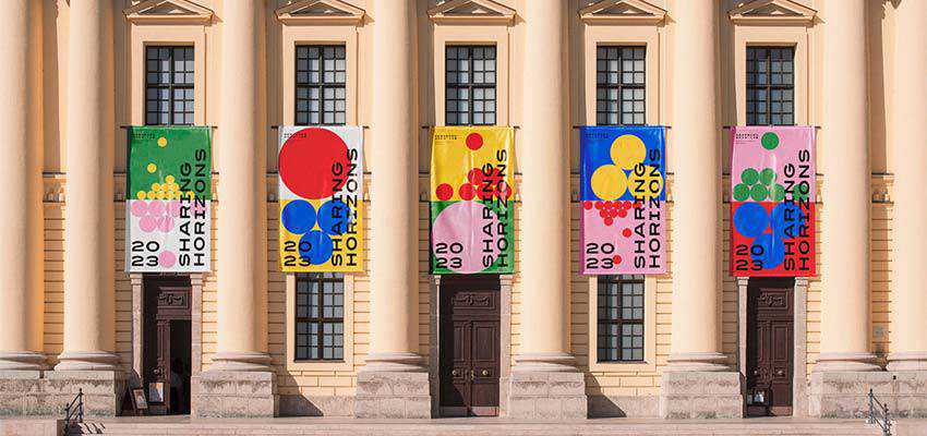
Circles, circles, circles. The divine geometric shape takes center stage in this visual identity, working dynamics and metaphors into the project. You will find bright colors that are shaped in primitive geometric forms. Whereas horizontally split layouts identify the horizon to enhance the idea, beautiful photos make the concept closer to people.
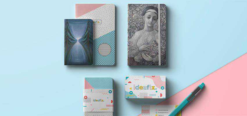
The beauty of Ideafix lies in a fantastic mixture of lovely soft colors and various geometric forms. There are waves, zigzags, circles, checkered patterns, polka dots and so on. The typeface with shifted coloring nicely finishes off the design, making the composition feel complete. The project looks simple yet attention-grabbing.
Tandem Trends
Each trend has its pros and cons. Both are able to draw and maintain the user’s focus on brand identity. They can be used to create a magnificent design that borders with the artwork. Each one has its own life. However, when working together, they become a powerful couple.
The bright scheme in tandem with a geometric approach does not produce an ornate outcome. On the contrary, the primitivism of shapes, especially circles, softens an impact generated by the vibrancy that comes from the coloring.
Geometry helps to create order out of chaos and, at the same time, achieve an outstanding abstract art that conveys emotions and feelings. Add this to the fact that these two solutions are currently in fashion, and you end up with a powerful tool for grabbing attention.
Version 5.2 of WordPress, named “Jaco” in honor of renowned and revolutionary jazz bassist Jaco Pastorius, is available for download or update in your WordPress dashboard. New features in this update make it easier than ever to fix your site if something goes wrong.
There are even more robust tools for identifying and fixing configuration issues and fatal errors. Whether you are a developer helping clients or you manage your site solo, these tools can help get you the right information when you need it.
Site Health Check
Building on the Site Health features introduced in 5.1, this release adds two new pages to help debug common configuration issues. It also adds space where developers can include debugging information for site maintainers.
PHP Error Protection
This administrator-focused update will let you safely fix or manage fatal errors without requiring developer time. It features better handling of the so-called “white screen of death,” and a way to enter recovery mode, which pauses error-causing plugins or themes.
Improvements for Everyone
Accessibility Updates
A number of changes work together to improve contextual awareness and keyboard navigation flow for those using screen readers and other assistive technologies.
New Dashboard Icons
Thirteen new icons including Instagram, a suite of icons for BuddyPress, and rotated Earth icons for global inclusion. Find them in the Dashboard and have some fun!
Plugin Compatibility Checks
WordPress will now automatically determine if your site’s version of PHP is compatible with installed plugins. If the plugin requires a higher version of PHP than your site currently uses, WordPress will not allow you to activate it, preventing potential compatibility errors.
The minimum supported PHP version is now 5.6.20. As of WordPress 5.2*, themes and plugins can safely take advantage of namespaces, anonymous functions, and more!
With the addition of webpack and Babel configurations in the wordpress/scripts package, developers won’t have to worry about setting up complex build tools to write modern JavaScript.
*If you are running an old version of PHP (less than 5.6.20), update your PHP before installing 5.2.
The Squad
This release was led by Matt Mullenweg, Josepha Haden Chomphosy, and Gary Pendergast. They were graciously supported by 327 generous volunteer contributors. Load a Jaco Pastorius playlist on your favorite music service and check out some of their profiles:
Also, many thanks to all of the community volunteers who contribute in the support forums. They answer questions from people across the world, whether they are using WordPress for the first time or since the first release. These releases are more successful for their efforts!
The stock of NUTRAFUELS INC (OTCMKTS:NTFU) registered an increase of 192% in short interest. NTFU’s total short interest was 14,600 shares in May as published by FINRA. Its up 192% from 5,000 shares, reported previously. With 100,800 shares average volume, it will take short sellers 0 days to cover their NTFU’s short positions.
The stock increased 0.20% or $0.0004 during the last trading session, reaching $0.1743. About 27,175 shares traded. NutraLife BioSciences, Inc. (OTCMKTS:NTFU) has 0.00% since May 7, 2018 and is . It has underperformed by 4.37% the SP500.
NutraFuels, Inc. manufactures and distributes oral spray nutritional and dietary products to retail and wholesale outlets. The company has market cap of $19.17 million. The companyÂ’s products include sleep spray to support a healthy sleep cycle and improve the quality of restful sleep; energize spray to enhance energy, and restore vigor and vitality; and garcinia cambogia spray, an appetite and weight management spray. It currently has negative earnings. It also offers NRG-X extreme energy spray to enhance energy and stamina; headache and pain spray to relieve headaches and pain; and hair, skin, and nails spray to nourish and encourage hair, skin, and nail growth.
Receive News Ratings Via Email – Enter your email address below to receive a concise daily summary of the latest news and analysts’ ratings with our FREE daily email newsletter.
WebDAV has a concept of ‘properties’ that are associated with resources.
They are a little bit like extended file attributes, which is a feature
on many modern filesystems
WebDAV uses the PROPPATCH HTTP method to update these. Many can be
updated in 1 single HTTP request.
Generally HTTP requests are ‘all or nothing’. In other words, they should
either completely succeed or completely fail.
WebDAV uses HTTP status codes in response bodies to indicate if a property
update was successful or not. If a PROPPATCH was issued, and one property
update failed (with for example 403 Forbidden) then automatically every
other property update will also fail with 424 Failed Dependency.
424 Failed Dependency will therefore never appear on a HTTP response
status line, and only ever in HTTP response bodies that have a
207 Multi-Status response code.
Symfony provides more than 60 decoupled components to solve common needs of
web and console applications. New Symfony versions usually introduce new
com...
Matt Trask and Amanda Folson are joined by Ryan Weaver to take a look at the landscape of the Symfony Ecosystem.
They discuss a few new packages from the Symfony team such as Mailer, HTTP Interface, API Platform as well as discussing the EU’s funding of a 48 hour hackathon that Ryan woke up ...