Weight loss is a common goal for many women. You may want to lose that extra fat because summer is coming or you just want to look and feel good.
There are a number of ways available today that could help you reduce weight. There are different kinds of strict diets and workout routines you can choose.
But eating the right food or actively visiting the gym may not be enough in some cases. That is why there are weight loss pills that are designed to assist you in achieving your weight loss goals.
This report explores the top and highly rated weight loss pills for women. The list is based on the highest number and most positive reviews from consumers who are already enjoying the benefits of such supplements.
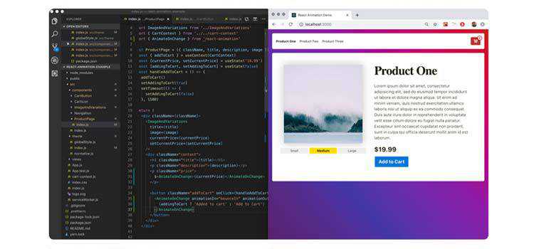
In the third part of this tutorial series on developing PHP on Docker we'll lay the fundamentals to
build a complete development infrastructure and explain how to "structure" the Docker setup as part
of a PHP project. Structure as in
folder structure ("what to put where")
Dockerfile templates
solving common problems (file permissions, runtime configuration, ...)
We will also create a minimal container setup consisting of php-fpm, nginx and a workspace container that we
refactor from the previous parts of this tutorial.
Finding the perfect domain name for your new website is not as easy as it sounds. With over 348 million registered domain names across all top-level domains (TLDs) already in use worldwide, you’re going to need to put a little extra thought into what you name your website if you want to stand out.
There’s a lot that goes into your site’s domain name, whether you’re starting a blog, running an online business, or opening up an eCommerce shop. In fact, your domain name needs to be relevant to your brand (think keywords!), recognizable by your target audience, and of course, available.
That’s why utilizing a reliable domain name generator when it comes to naming your website is so helpful. Today we’re going to take a look at what a domain name generator is and which ones you should be using when it comes to naming your website.
What is a Domain Name Generator?
A domain name generator is an online tool that makes it easy to find a domain name that’s not currently in use.
It also helps you create a name that is:
Catchy enough to be remembered, but also conveys your brand’s essence
Relates to your business, while remaining consistent with the topic of your website
Short and simple (under 15 characters), so people can remember it
Easy to spell, so people can find your site with ease
A domain extension that resonates with your visitors (e.g., .com, .net, .org, .ca)
If you’re planning to operate only within your country, consider using a relevant extension. For example, if you are based in Canada, use the .ca domain name extension. That said, if you’re looking to build an international brand, stick with general and more well-known extensions like .com or .net.
Now let’s take a look at the list of the best domain search generators we’ve found:
LeanDomainSearch is one of the best domain name generators around. This tool was created by the team at Automattic, the company behind WordPress.com, meaning they know a thing or two about picking a domain name and launching a website.
To use it, all you have to do is enter a keyword that relates to your industry, brand, or niche, and see what pops up.
Once you enter your keyword(s) and click search, you’ll have access to hundreds of different domain name ideas. You can sort the domain name ideas into alphabetical order, by popularity, or even length. You can also filter search results based on your keyword’s position in the domain name.
You’ll even see whether the Twitter handle that matches the domain name is available, which is helpful for those looking to build a strong social media presence.
NameQL’s interface is slick, simple, and modern and is perfect if you’re looking into no-fuss domain name generators. As soon as you start to type in the search bar, the generator instantly kicks in, as you can see in the example below:
For more domain name options, either continue typing your keyword(s) into the search bar or click on the arrow to the right of your screen to see more. To save or buy a domain name, simply click on the name you like.
Bust A Name is not known for its simplicity. But it’s a strong contender for those who are interested in performing more advanced searches.
Here are just some of the things you can do with this comprehensive domain name generator:
Domain Search: add a few keywords and let Bust a Name create a custom domain name combining the terms. Or, run a quick domain name check if you already have an idea for a domain name. You can also include/exclude certain domain extensions, prefixes, and domains that are currently for sale.
Domain Maker: input a single keyword, define the character length, extensions, and availability, and see what’s available. You can also save domain names you like.
When you click on a domain name you like, you have the option to save or buy right away. You can also later purchase your domain name from the ‘Save Domains’ column if you want. The neat thing about this tool is that when you want to buy a domain name, you’ll see competing domain name registrars, so you know you’re getting the best deal possible.
Despite it’s name, the Shopify Business Name Generator can be used for more than business domain names. That said, if you’re creating an eCommerce store, this is one of the best domain name generators around. To use this tool, enter a keyword and see what pops up.
You’ll see right away which domain names are available. You can even set up a Shopify shop right then and there if you’re ready. And with a 14-day free trial, there’s really nothing to lose if Shopify interests you.
Pros:
You can build a Shopify shop immediately after finding the perfect domain name
10 domain names load at a time so you can concentrate on your choices before moving on to others
There are lots of domain name extensions to choose from
Cons:
Easily confused with Shopify’s Business Name Generator, which has the same layout but very different results
You cannot register you domain name through Shopify without setting up a Shopify shop
There are no filtering options, so you might have to scroll through a lot of options to find something you like
NameStall is another feature-rich domain name generator. It comes as a suite of tools including the domain name generator, 3 words domain name generator, rhyming domain name generator, random keyword domains, and domain brainstorm.
Using the NameStall domain name generator tool is easy. Just enter a keyword and then select your ‘Word Group’. For instance, NameStall will create a domain name using your keyword and: Common Smart Misspells, Basic English Words, or 1,000 Top Keywords, just to name a few. You can also choose whether to include the keyword at the end of your domain or allow hyphens. Lastly, pick from tons of extensions so your domain generates just the way you want.
Pros:
There are lots of customization options thanks to the word groups
Plenty of extensions are available for your search results
Other helpful tools make domain name generation easier, especially if you aren’t sure where to start
You can view domain name registration price comparisons
Cons:
There are so many tools you might overwhelm yourself when trying to create a unique domain name
Nameboy claims to be “the oldest and most popular domain name generator in the world,” thus making it one of the best domain name generators around. Plus, it’s easy to use. Just enter one or two keywords and Nameboy will deliver you a list of suggested domain names that are available.
This tool also includes some tutorials on how to start a blog or create a website, which is helpful for beginner website owners.
Pros:
You can enter two keywords and get great combination ideas for your domain name
Cons:
Clicking ‘View Details” just leads you to Bluehost, and not additional details about the domain name
There is no way to tell whether the domain is available or not
No filtering options, extension or information, or ways to register your domain with Nameboy
Domain Wheel is a website name generator, URL generator, and business name generator all wrapped into one, Just add your keyword(s) and see your results; it’s as simple as that.
View domain names with different extensions, view alternative keywords spellings that might work for your brand, see random suggestions, and even check out rhyming words that can help you if you’re stumped. Looking for a specific domain extension? Click the dropdown in the search bar and select which extensions to include.
Pros:
Only domains that are available show up in search results
Impossibility is one of the simple domain name generators that lets you input a keyword, add multi-letter (4-, 5-, or 6-letter) adjectives, nouns, and verbs, and decide where to add those extras (at the start or end of your domain name). You can even decide to let the generator add in a mix of anything.
Your results will reveal customized domain names that meet your criteria and links to the places you can purchase it (GoDaddy or Namecheap).
Pros:
Simple tool to navigate
Plenty of customization options
Very creative domain names for those with time to experiment
Cons:
You can only enter one keyword
The “creative” domain names can be a little irrelevant
Panabee is a domain search tool, business name generator, and domain name generator. Start by entering you keyword (the tool recommends two for the best results) related to your niche and see what Panabee reveals.
You’ll immediately see which domain names are available and how much they cost. Plus, you can choose a different extension from the dropdown. And if there’s a domain name that isn’t available, click on it, visit GoDaddy, and see if they have domain name extensions available that will work for you.
Pros:
Check out related terms and social media names that match the domain name you want
Brightly colored interface is nice to look at and easy to use
Panabee has teamed up with GoDaddy and offers excellent first-year domain name registration pricing
NameMesh is a comprehensive domain name generator that works well if you have multiple keywords in mind for your domain name. When you search for a domain name using your keyword(s), NameMesh will generate domains based on the following categories:
Common
New
Similar
SEO
Short
Fun
Extra
Mix
There’s also a premium section if you want to purchase an existing domain. There are lots of filter options, such as extension, registrar, registered/non-registered, and maximum character count, which helps you narrow the options. NameMesh will also suggest other keywords to help you with your domain name creation.
Pros:
Multiple categories for narrowing your search
Choice of registrar so you get the best possible deal
Social media availability
You only see available domains in your results
Cons:
Not enough extension options (only .com, .io, .co, and .net)
There is no related terms category
Final Thoughts
And there you have it! The very best domain name generators around helping you choose the best website address for you new website.
If you’re looking for a simple solution that will get you some domain name ideas, we recommend domain name generators such as NameQL or Impossibility!.
If customizing your search results and having a variety of extensions are most important to you, we suggest using Bust A Name or NameStall.
And lastly, if brand consistency is the key to your success, you should definitely check out LeanDomainSearch, or Panabee, both of which will check your domain name against social media names and handles to see if they’re available.
Remember, after you choose a domain name, you’ll need to pay for it and register it with a domain name registrar such as Namecheap, GoDaddy, or Wix (be sure to check out some real-life Wix examples!). And if you’re using WordPress for your website, your hosting provider might even register your domain name for you (and at a discount!), so be on the lookout for that too.
Have you ever used any of the above-mentioned domain name generators to choose your site’s identity? Is there a tool we left off that you think should be included? We would love to hear all about it in the comments below!
Wix, founded in 2006 as an all-in-one platform designed to give people a simple way to build and manage websites, currently boasts over 148 million users. It hosts all your data, requires zero coding skills, and lets you launch both a blog and eCommerce shop.
But perhaps one of the most appealing features Wix offers website owners is the library of 500+ pre-designed templates. No matter what type of website you’re looking to launch, Wix has a template for you. You also have access to a drag and drop interface that makes site building a cinch. And while Wix doesn’t offer the same level of functionality and flexibility that a self-hosted solution like WordPress does, there’s no denying that Wix gives beginners an easy way to build a site from scratch with no technical knowledge.
If you’re thinking about using Wix for your website, or just need a little inspiration for your existing site, check out our roundup of some real-life Wix examples to see just what you can accomplish.
Monica Pack Pilates is a website dedicated to fitness and uses one page site design mixed with smooth parallax effects. It has a large background image to catch your attention right away. And as you scroll, you are met with a variety of beautiful pastels color schemes, relevant imagery, and links that lead you to additional information.
To make booking a Pilates session easier on clients, Monica Pack Pilates adds a convenient contact form not only in the navigational menu, but at the bottom of the page too. Not to mention, the navigational menu is sticky, so readers can easily see all the content they want with ease.
Seven Grams Caffe is one of the best restaurant websites and Wix examples around. It starts off by displaying a large, fullscreen image to give site visitors an idea what the site is all about. After scrolling to the bottom of this one page site, you’ll see an impressive footer section, complete with location information, social media icons, and sticky buttons for ordering online. And don’t forget the beautiful image gallery mid-scroll that shows off Seven Grams Caffe’s shops, food items, and of course, delicious drinks.
The eCommerce portion of the site is opened in a separate tab so as not to ruin the overall user experience. It includes product images, social sharing, variable product options, and more, all using the popular Square payment gateway that easily integrates with Wix.
Jordan Likes Birds is a simple Wix website that acts like a landing page for prospective clients. Click on illustration, vis dev, graphics, or stories/boards categories to be taken to extensive portfolios of Jordy Farrell’s best work. In addition, if you select the Books menu item from the dropdown, you’ll be taken to a list of Amazon affiliate books you might be interested in purchasing. Affiliate marketing is a great way to monetize your already successful Wix website.
Follow Jordy on Instagram by clicking the social media icon in the header section. And most unique of all, find a link to a secret portfolio by clicking on the custom icon in the header.
Calvin Pausania is a director, photographer, and designer that uses Wix to highlight his projects and give people a way to get in touch. To start, he makes a powerful statement by using a predominantly black color scheme with pops of color throughout to grab people’s attention and make them want to know more. And if you want to explore his website, all you have to do is click on the Menu button and navigate the lightbox that pops up.
The portfolio images found in this website are large and bold, and reading about Calvin’s story in the dedicated About page is more than captivating.
Jérome Studio is an online shop that sells elegant handbags. The team behind this chic Wix website provide site visitors with both a sticky header and footer section. In other words, there are two navigational menus at once, separated so as to not overwhelm the customer. In addition, you can check out which items are in your cart in the upper right hand corner, click your favorite product to learn more and buy, and even log in if you’re a registered user.
Want to create a sense of urgency in your own Wix shop? Do what Jérome Studio does and add a small banner on the top portion of your website. Here, you learn that Jérome Studio donates 5% of every purchase to children in need. This strategy not only helps the community, but generates more sales too. Your banner can be customized however you like so you garner more sales in less time.
Helena Krüger is an illustrator that seeks to showcase her best work to the public so that businesses and private clients alike will hire her for their own custom illustrations. Her use of whitespace causes her grid of illustrations to pop out in a clean and modern way. In addition, after getting to see a little bit of her best work, Helena presents site visitors with links to her best-selling products and online store for more.
She makes it very clear what type of work she does and how to get in touch for a quote. And if you aren’t quite sure exactly what you want, you can always link to her photo gallery modules and see each piece of work up close and personal in the lightbox popup.
Adam McCain has a beautiful website built on Wix that shows people who he is and what he does. There’s a large background image that shows Adam’s personality. In addition, he gives people a chance to connect on social media, link out to images in his gallery, and even book him as a speaker for your event.
Wix gives Adam a way to connect people to his YouTube channel. It’s powerful features even give Adam a way to highlight featured speakers that you can learn more about and reach out to on multiple channels such as Facebook, Instagram, and Twitter.
Marco de Haunt is part of our Wix examples roundup because it has a landing page like homepage and lets site visitors check out the music or graphic/photography categories. The large background image on the homepage is dark and brooding, which gives the impression that the work found here is darker and more serious than other artists.
Check out extensive photo galleries, complete with the ability to like or share via social media or email. And if you want to get in contact, all you have to do is click the contact CTA button and find the contact form to fill out. You’ll also find additional information, such as an email and address if you need to know that too.
Leandro Pedretti’s Wix website is a neutral one page site that shares with others the type of work he does, services he provides, and social networks he frequents so you can connect. Click on a link in the services module to view additional information and a stunning slider gallery.
In addition, notice how the imagery blends well with the text and standout video image that meets the eye once you click on the website. It’s details like this that Wix offers website owners that are trying to push ahead of the competition and encourage people to convert.
SoFlo Cake & Candy Expo does an excellent job of taking an overwhelming amount of information and displaying it to site visitors in an organized and easy to understand way. Plus, the color scheme they use is fun and bright, which is perfect for bakers that want to bring joy into the lives of others.
People can buy tickets to the next cake and candy event, check out their online shop and get the ingredients they need, and even advertise their own businesses in the ad sections offered throughout the website. Lastly, as a way to build a bigger email list and get more subscribers, the creators of the SoFlo Cake & Candy Expo offer 10% off tickets for signing up.
Eat Sleep Live is a food blog that caters to French cuisine. It makes use of Wix’s ability to handle image-heavy sites without sacrificing site speed or performance. In fact, after scrolling a bit down the homepage, you’ll notice a full width slider that shows exquisite detail on all the featured food recipes that loads fast and makes you hungry for more.
This food blog also makes connecting via social media, contacting the team for advice, and navigating the website easy thanks to the detailed footer section.
Tobias Becs knows how to introduce himself to the world at large, even when they are so many other people doing the exact same thing. He uses a bold image to showcase himself and his skills (as a football freestyler), takes advantage of the sticky navigational menu and social media icons, and most notably includes large images mid-scroll that link to his Facebook, Instagram, and YouTube channels.
Because Tobias uses Wix as his CMS, he is able to create a daily vlog section that his loyal followers can watch. And since video content is so popular these days, this approach to “blogging” increases site engagement and creates a stronger community.
Kome Waza is another wonderful restaurant site using the Wix platform as a CMS. To start, the fullscreen image seen on the homepage leaves a great first impression. Plus, it’s fading effect gives a different vibe than a traditional slider gallery.
If you scroll down to the bottom of the homepage, you’ll notice the site has creative footers. First, check out the restaurant’s address, complete with a small image section that continually changes. Next, view the restaurant’s physical location on the map module, and access the phone number, email address, and social media icons for staying connected.
BeardTamer is a website that showcases just how Wix lets site owners use parallax effects on their homepages to leave a lasting impression. There’s a stunning background image with text overlay that follows you as you scroll down this one page eCommerce site.
Adding to that, BeardTamer includes large imagery throughout their site to highlight their product and their message. Lastly, notice the use of creative fonts in the company logo, navigational menu, contact form, testimonial section. Though they are all different, thanks to the flexibility Wix offers, they also complement each other in a harmonizing way.
Lousie Whitehouse takes her artistry seriously, as you can read about in her About section. She takes a minimal approach to her web design and showcases her best work to convince people to buy. In addition, she loves to share stories in her blog that are not only heartfelt, but valuable. Plus, this site is an excellent example of a stunning black website.
A beautiful grid like layout is used in the portfolio section of this website. It comes complete with plenty of whitespace so there are zero distractions. Her blog posts have large featured images that pique interest before you even set out to read the post itself. And connecting with her via social media is easy thanks to the dark social media icons that appear throughout her website.
Stolen Goods is an online clothing store that uses simplicity to stand out. From the pale color palette to the vertically centered web design leading people to their online shop, Stolen Goods is the epitome of minimalism.
Once you enter the online shop, you are presented with organized product images. Not to mention, there’s a navigational menu that will take you to the category of your choice and social media links so you can stay connected. Buying from this online shop is super simple thanks to the PayPal payment gateway that Wix supports.
The Ancient Mariner is one of the truly unique Wix examples on our list. As a port side restaurant made to mimic being out on the open sea, The Ancient Mariner focuses on the user experience both on their website and in their restaurant.
To start, they use a map module to show you their exact location. Additionally, they provide links to external reviews on Tripadvisor and a link to the restaurant’s full menu. This menu is complete with large images, full descriptions, and prices. Because of this you get excited about the unique dining experience you’re about to sign up for.
Lera Mishurov(a) is the perfect example of a Wix website being used to sell a skill. Illustrators, animators, etchers, and other creatives can take inspiration from this website. For instance, the images found throughout the website are custom drawings by the freelance artist herself. This shows potential clients a bit of her work and her personality in an attempt to convince them to buy.
You’ll notice that each webpage has a Wix module displaying the number of Facebook likes the site has. This happens to be an effective form of social proof. Lastly, you can check out the clickable Contact menu item that takes you to the built-in contact form for staying in touch with prospective clients.
Stylists in Crime is a company that deals with advertising, fashion, magazines, brands, music, and television. They aim to reach a global audience, and have an extensive portfolio filled with editorials, video clips, commercials, and elite brand advertisements.
Get in touch via social media, even lesser-known ones like Behance, by clicking the icons that appear throughout the site. In addition, view the portfolio images, displayed in neat grid columns and get a feel for their work. Also, contact the stylists in crime that are responsible for such breathtaking work.
IAMEVE is a singer, songwriter, and storyteller that taps into geometry and surrealism. Bu doing this, she hopes to inspire people to learn to balance the masculinity and femininity in the world. She also works hard to express her deep desire to share heartfelt music with the world by using dark, mysterious imagery.
Subscribe to her newsletter using the subscribe box module and connect via social media by clicking the social network icons. Learn more about IAMEVE’s musings by reading her blog. You can even register for upcoming events and shop in the online store for merch and music. And lastly, make sure to check out IAMEVE’s video content modules that are nothing short of mesmerizing.
John Harris Wedding Films is a great website to take inspiration from if you’re a videographer or photographer. It uses a modern and clean font and light pastel color schemes that are reminiscent of wedding days. Plus, there are plenty of images and video content to showcase just what the team at JHWF can do.
This simple Wix website turns what could be a lot of information into organized chunks of text. For instance, there’s a portfolio, testimonial, contact form, and pricing section making it clear to people what to expect from JHWF.
Animal Music is an impressive portfolio that catches your attention from the start. To start, it has a fullscreen video module that occupies the entire header section of the homepage. From there, the grid layout of video clips make it easy for you to see individual pieces of work completed by the team at Animal Music. What’s more, you can also like and share the clips with others.
Want a neat way to get people to subscribe to your newsletter? Give out some free swag from your company like Animal Music does (free t-shirt anyone?) and get people to sign up. In addition, create a team specific webpage and put some faces to the names and set up a contact form for people to get in touch with your company.
Balloon Rouge is a Wix website that utilizes the format of a landing page to guide people around. On the homepage, you see a fullscreen image providing a glimpse into the creativity Balloon Rouge offers clients. You’ll also have access to contact information and links to the rest of the site in the footer section.
Once you enter the site, you are presented with a one-of-a-kind navigational menu in the shape of a tree. Just click on any one of the menu items to be lead to a portfolio of related works. And the best part about this website has to be the small, attention-grabbing animations that appear every time you click on a new page.
Thank God It’s Monday is a sleek and cool website that has a lot going on at once. For example, it has a variety of font styles, imagery, animations, and sections for site visitors to view. It also comes with a non-traditional vertical slider that lets visitors click through the homepage content.
When you click on the different types of branding work the creator of Thank God It’s Monday does, you are met with smooth parallax effects, stunning background images, and plenty of text overlay that are convincing enough to even the most skeptic marketer. And the cool thing is, you too can do the same with your Wix website.
Le Tigre Tents is a wonderful example of how a simple service can not only be lucrative, but exciting too. And after you take one look at this website, you’re sure to feel the same excitement. Fabulous custom imagery, inspirational font pairings, video content, and lightbox popups of the tents in action are the norm on this Wix site.
And don’t forget the staples site elements. For instance, social sharing, social media counts, a built-in contact form, and vertical sliders are all included in this website.
Amber Schormans take a minimal, subtle approach to promoting what they have to offer, which is portrait and fashion photography. Each portfolio section that highlights different works or events takes advantage of the Wix lightbox gallery. This way users can see beautiful photos up close and personal.
This website has no dedicated blog section, contact form (just an email), or eCommerce shop. Instead, the focus always remains on the message the photographer’s trying to portray and her related works.
Brown Owl Creative uses Wix to create a dynamic website full of colorful animations. Plus, it comes with grid layouts and smooth parallax effects as people explore portfolios, the blog, and the CTA button.
One way Brown Owl Creative keeps things consistent across their Wix website is with video content. Some people prefer video over written text. So, adding these clips help boost site engagement and your overall SEO efforts.
Final Thoughts
And there you have it! Over 25 of the best real-life Wix examples found on the internet today.
Wix is a powerful platform that offers poeple a great way to promote their products and publish their blog content. Plus, since it’s a comprehensive CMS, it eliminates the need to hire a professional developer.
If you need some more web design ideas, be sure to check out our roundup of stunning Squarespace websites and see if there is any design inspiration you can get from those too.
Have you ever had success using Wix to create a website? If so, we would love to hear all about it in the comments below!
The Garcinia Cambogia Extract market research report we have published is detailed report for any company to kickstart industry Garcinia Cambogia Extract business
It is a common practice to mix and match typefaces in order to find the perfect pair for a website. As a rule, designers choose one font for the header and another one for body text. The first one is fancy and bold in order to make the titles attention-grabbing. Whereas, the second one is often simple to make the text easily readable.
There are even popular options and trendsetters here. This stage of website design sits well with the creative crowd, although sometimes it requires a refreshing and renovation to keep moving forward. And most recently it has gotten a shot in the arm.
The combination of hollow and solid lettering is a brand-new trend in web design typography.
The Complete Toolbox for Web Designers Unlimited Downloads: 500,000+ Web Templates, Themes, Plugins & Design Assets
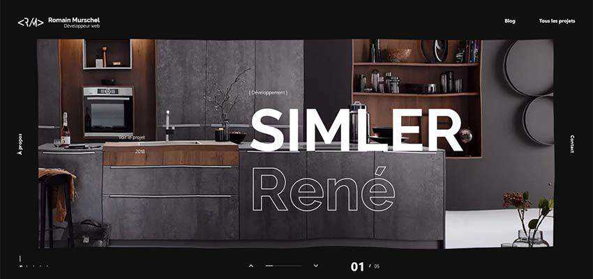
The personal portfolio of Romain Murschel is a perfect example of this little mainstream idea that tries to compete with big old players in the arena.
Here the hollow and solid styles are used to highlight the names of each project presented in the slider. This trick catches an eye with its originality and intricate beauty. And it also goes perfectly well with the ultra-modern design of the website, along with some innovative features, such as the liquid-like behavior of the canvas.
What’s more, note that the title is relatively large, but it does not overwhelm nor overpower visitors. Neither does it distract attention from the beautiful image in the background; it just sits pretty and does its job quite well.
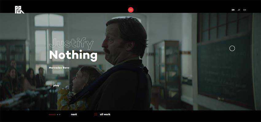
Production Portugal is another excellent example. Here, the hero area is marked by a fantastic video background, and the slogan of the campaign is presented as two words. “Nothing” strikes you from the first moment, and then “Justify” joins the impact – resulting in a favorable outcome.
Much like the previous example, Addict Rave also features a video background. To stand in contrast, the title was not only set in a large size, but also divided into two vivid parts using solid and hollow stylistic choices. “Addict” is an obvious star here, whereas “rave” is a perfect addition.
The trend has a sound foundation for thriving. It has some good real-life applications. First and foremost, this combination can be used to place emphasis on the selected word – like in the case of Coveo Music.
Here we can see an intricate take on a slider. A list with names of works is first to greet us. When you hover over the title, an image shows up, and the title changes its state from solid black to hollow, signaling that it is the current selection. Neat and smart.
As you may have guessed, the solid and hollow stylistic options used together can quickly liven up a single word. It provides a larger visual weight and slightly dims another one by making it visually lighter. However, the hollow shape still catches an eye because of its elegant and sophisticated look.
Consider Tilt Story. The team behind the project uses this trick to do just that. They highlight the name of the work and still dress the nameplate of the agency into something fancy and voguish. The first thing that you read here is “Biting back”, but still the upside down “Tilt” is the second thing that strikes an eye.
The second reason for this trend to thrive lies in its ability to naturally place accents and set up complementary elements without going the extra mile.
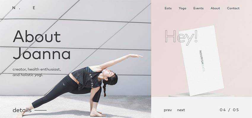
Consider NourishEats. The front page greets the audience with an asymmetrical split screen, where the left side has a priority over the right. We can see it thanks to several things. Obviously, the size of the section indicates that. What’s more, the style of the lettering also clears this up. “About Joanna” looks more solid and bold than fragile and airy “Hey”.
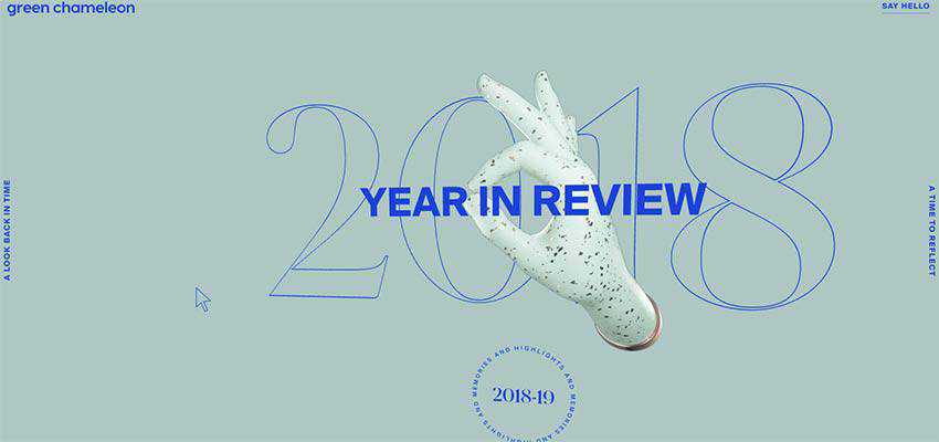
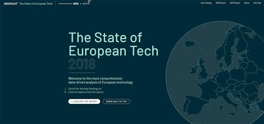
Year in Review by Green Chameleon and The State of European Tech employ the same tactics. Both websites feature solid lettering to display the name of the project and hollow lettering to indicate the year.
While in the first example the year is placed in the background, in the second example it is an integral part of the text block. In both cases, they look relatively prominent, serving as perfect additional elements.
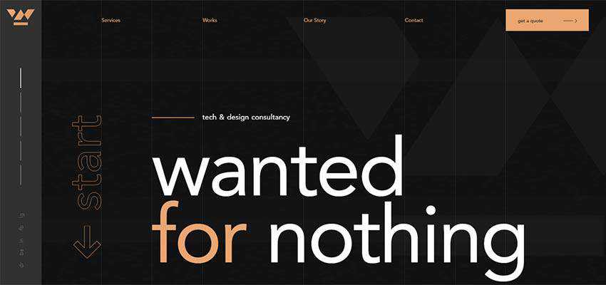
In the case of Wanted for Nothing, you stumble upon a solid title that mutes other items on the screen. However, thanks to the hollow appearance of the word “start”, it naturally occupies its proper place in the composition, stirring users into action.
And finally, this trend is a great way to make the typography look decorative and the message speak louder. Consider Dolly – Agency, Vincent Saisset, and Betamatters.
The creative team that stands behind the design of Dolly Agency plays with the trend within one word, instead of two. As a result, we can see an interesting take that makes the title perfectly blend into the environment and, at the same time, make a statement. It is a mixture of the bold and robust “start” and delicate and elegant “end” that easily wins attention.
The website of Vincent Saisset employs this solution to save the portfolio section from being banal. Here the regular list of titles not only presents artworks, but also plays a decorative role – adding to the overall artistic atmosphere.
Betamatters has a visually-massive hero area, nevertheless this does not stop the nameplate and welcome message from standing out. This is another fantastic tandem of hollow and solid typography in action.
Note the digitally-inspired entourage with lots of wires and cylinders. The name of the company is hollow and dimensional – it fits here like a glove. The welcome message is set in solid typeface and also goes well with the composition. It naturally stands out from the crowd.
An Effective Combination
We are accustomed to seeing a combination of type families in hero sections that are used to dish up the header and the welcoming block in an inviting way. Today, we can witness some changes in this practice.
These changes are not something brand new, but they are clever and smart. Mixing hollow and solid styles for typography is so simple and elegant that users accept it effortlessly. This small solution has given the time-proven everyday practice a facelift.
This technique makes things interesting in an unobtrusive way and, at the same, time skillfully highlights essential details. It also has some real-life applications. So, in the right hands it can be turned into something both incredible and practical.
Researchunt has launched a fresh research report on Garcinia Cambogia Extract market. The study will help those involved in the sector since it offers some information on not only the current status but also on the outlook in the forthcoming years. The report provides vital knowledge on major players including manufacturers and distributors apart from strengthens and flaws of the industry as a whole.
Global Garcinia Cambogia Extract revenue was xx.xx Million USD in 2013, grew to xx.xx Million USD in 2017, and will reach xx.xx Million USD in 2023, with a CAGR of x.x% during 2018-2023.
The authors of the Garcinia Cambogia Extract market have provided a comprehensive analysis of the industry. This included the existing market conditions, central or critical regions, the price of the product, capacity, production, demand and supply, profit, growth pace and the outlook. The study has presented recent project SWOT analysis apart from investment feasibility analysis. In turn, a review of the investment return has also been provided to help the stakeholders and any possible new entrants.
The study has provided insightful analyses and comprehensive understanding, as well as, the commercial landscape at the international level. It has assessed the processes adopted for production by key players besides focusing on critical issues and solutions. It offers market strategies to be taken for leading organizations for more fruitful results. The Garcinia Cambogia Extract market is witnessing rapidly changing dynamism of the market. This apart, it provided analysis on manufacturers’ gross margin, critical factors in price changes, margin and marketing prices.
Key geographical regions covered for Garcinia Cambogia Extract Market :
North America United States Canada Mexico Asia-Pacific China India Japan South Korea Australia Indonesia Malaysia Philippines Thailand Vietnam Europe Germany France UK Italy Russia Rest of Europe Central South America Brazil Rest of South America Middle East Africa GCC Countries Turkey Egypt South Africa Rest of Middle East Africa
The important market players whose activities are covered in the report include-
Xi’an Lyphar Biotech Shaanxi Fuheng (FH) Biotechnology Shaanxi Guanjie Technology Wuhan Vanz Pharm Hunan Kanerga Pharmaceutical Sales TWO BLUE DIAMONDS MARUTI FUTURISTIC PHARMA KINAL GLOBAL CARE NUTRA GRACE
Types covered in the Garcinia Cambogia Extract industry are :
0.5 0.6 Other
Applications covered in the report are:
Food Industry Pharmaceuticals Industry Other
The authors have provided analysis for every geographical region in terms of sales, market share percentage by application types, production, consumption and import, and export analysis. The report has provided an outlook for the period starting 2018 to 2023 and has historical data in it. The critical regions covered in the study included Europe, United States, South America, Southeast Asia, South Africa, Japan, China, India, and others. This suggested that the report focused on both the developed and developing markets.
The Garcinia Cambogia Extract market report contains not only key data but also opinions from industry experts. It has taken into consideration the most recent progressions, as well as, developments that are taking place in the industry. The significant point is that the authors have analyzed by product type and their market standing like revenue, market share, and gross margin. The report will be useful for investors, new entrants, private equity firms, venture capitalists, analysts, and strategic business planners. It has covered government regulatory topics and research organizations apart from end-use industries.
Reasons to buy the Garcinia Cambogia Extract Market Report:
To gain insightful analyses of the Garcinia Cambogia Extract Market and have a comprehensive understanding of the global market and its commercial landscape
Assess the production processes, significant issues, and solutions.
Market strategies that are being adopted by leading respective organizations
The report gives specific analysis for the rapidly changing dynamics of Garcinia Cambogia Extract Industry.
To understand the future outlook and prospects for the Garcinia Cambogia Extract market with Marketing Price (Price and Margin, Factors of Price Change, Manufacturers Gross Margin Analysis)
Sections 14. Research Findings and Conclusions of Garcinia Cambogia Extract Market.
Sections 15. Appendix.
In the end, Garcinia Cambogia Extract Industry report provides the central region, market conditions with the product price, profit, capacity, production, supply, demand, and market growth rate and forecast, etc. This report also Present new project SWOT analysis, investment feasibility analysis, and investment return analysis
About Us:
Researchunt is a one-stop destination for diverse industries, companies and country reports. We have a good repository of latest industry reports, top niche company profiles, along with the latest market statistics released by both the public and reputed private publishers. In a sense, MRQ is a comprehensive collection of all the market intelligence products and services found under the sun. Here one can find market research reports from all the leading publishers keeping abreast to the daily updates coming in this domain for our clients. So, our clients can have the access to this database while they benefit the best from expert insights on Global industries, products, and market trends.