Animation has carved out a niche for itself in the web design sphere. We see it everywhere. Not only does it enrich hero areas but also other sections, inner pages, and standalone components.
It is no longer a tool for making the first impression only. It efficiently collaborates with other elements, having dramatically expanded its sphere. Yes, it has lost its novelty factor – it’s now a normal thing like the hamburger button, video background, or parallax scrolling. However, even though it is no longer an extravaganza, it still has an ability to impress online visitors.
Much like any integral element of the user interface, the animated approach is subject to trends. Several years ago, we witnessed numerous particle animations, then GSAP animations were running the show.
These days developers prefer to use short animations rather than long ones. The reason is simple. The world moves fast and people prefer quick solutions. They want to get answers promptly. And short animations ideally blend in.
They offer a pretty fast and unobtrusive way to reach an online audience. They will not take up much time and hit straight to-the-point. Moreover, they make an impression, and at the same time, let the content occupy the leading position. They are ideal tools for reinforcing messages that you want to convey.
Let’s consider some fantastic examples where developers get the most out of short animations. They skillfully exploit this tiny trend to make their projects look stylish as well as make the user experience enjoyable.
The Complete Toolbox for Web Designers
Unlimited Downloads: 500,000+ Web Templates, Themes, Plugins & Design Assets
DOWNLOAD NOW
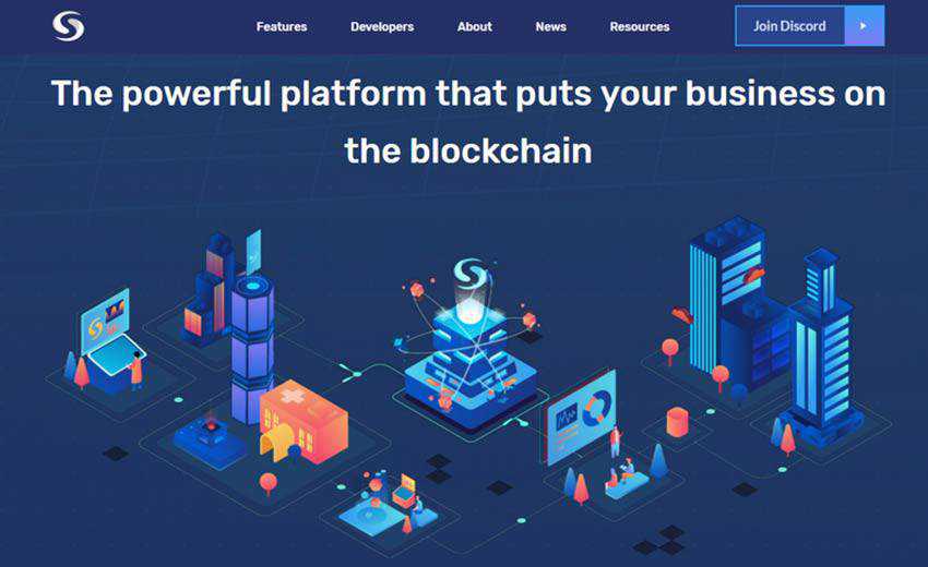
Syscoin deals with blockchains, a topic that can be a little bit intimidating for technically-challenged people. Here, short animation is used to lighten things up, support the tagline in the hero area, and bridge the gap between the service and regular users. Paired with numerous fancy illustrations that are scattered throughout the website, it turns complex concepts into simple ones. This makes the project closer to its audience.
Unlike the previous example, The Digital Panda is a standard corporate website of a creative agency. There is nothing ambiguous about it. However, the team has decided to use the animated approach to make things even more apparent. They use it to show the daily routine of their company in a fanciful way. Here you can see a short animation where two lovely pandas are involved in the development process.

The team behind CAMO has adopted the same tactic. The hero area of their website features a small illustration that is skillfully set in motion. It helps to support the message on the left as well as make the company’s sphere of expertise evident for users. And most importantly, it serves as an accompanying material that does not distract attention from other important things.

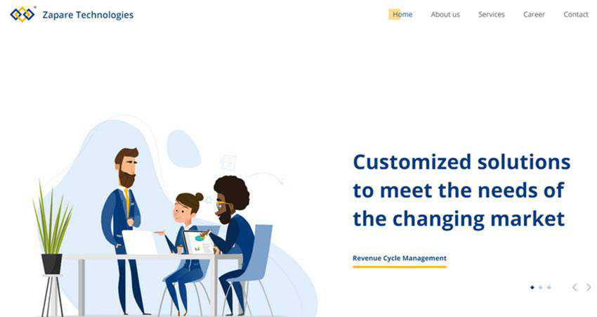
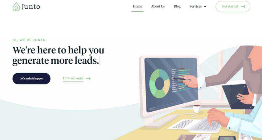
Zapare Tech and Junto employ increasingly short animations. Yet it is enough to spread the idea and create the right feel for the targeted audience. Both websites feature workplaces and people who are engaged in a daily office routine.
While Zapare Tech shows a small team of people who are collaborating on one task, Junto’s team has decided to demonstrate a close view of an individual worker who is engaged in a dialogue with a teammate.
In both situations, you can see small illustrations where only specific details were brought to life. However, these dynamic details make the entire difference. They bring home the right message. What’s more, they create enough aesthetics to complement the design as well.
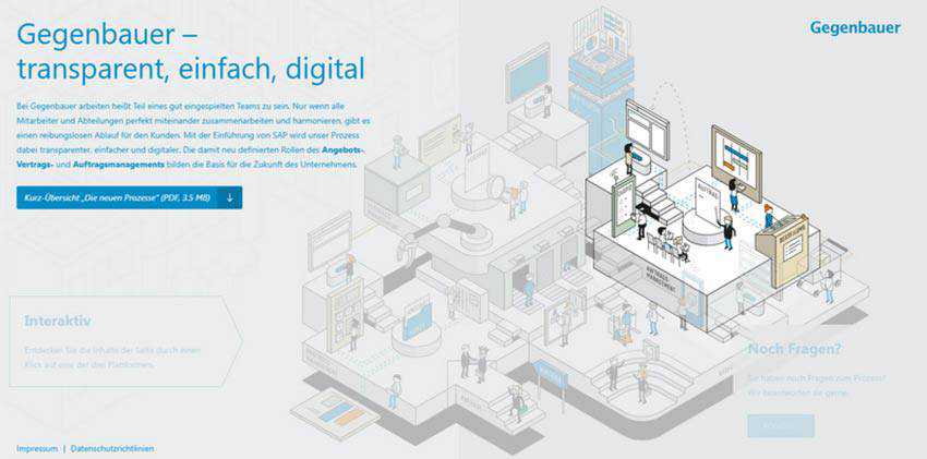
The previously mentioned examples concentrate on a specific situation within agency life. However, the creative team of Gegenbauer has decided to demonstrate not just one, but several departments of the company.
At first, the illustration is barely set in motion – just some minor details are moving. However, when the user singles out the department by hovering the mouse cursor over it, this part becomes dynamic. Characters begin to move and gadgets start to work. Also, all other parts of the illustration become blurred to give the selected part a sharp focus.
This is an excellent example of symbiosis between an interactive element and a short animation. It not only establishes a businesslike atmosphere, but also adds some playfulness to the experience.
This is a vivid representation of a fully-illustrated interface. For some companies this might be too much. But this certainly is not the case for the Creative Canopy team. Their official website is packed with short animations.
The creatives have brought to life not just entire scenes, but also icons and small accompanying drawings. This results in a consistent user experience. Despite the number of animations, their short life span makes exploring the project pleasing and unobtrusive, rather than overwhelming and annoying.
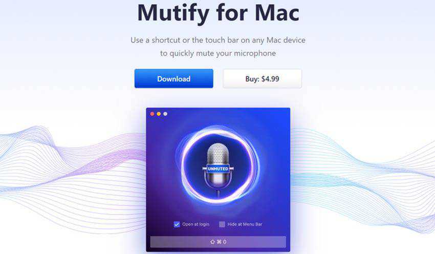
Here you will not find any illustrations. Unlike the previously mentioned sites, Mutify for Mac bets on images and mockups to be its main visual driving force. However, to avoid an overall static appearance, the team has used a short animation that saves the day.
As a result, the hero area exudes an energy and vibrancy that is inherent to the music industry. It perfectly supports the overall theme, serving as an excellent entourage for promoting an application.
The team behind Cortex Copywriter presents their vision of the company nameplate using a small animated illustration with a strong tech vibe. In such a way, the message is well communicated and the theme feels alive.

A Little Movement Can Go a Long Way
Admit it, no matter what, people like animations. They can be highly overused and even dumb, but still, people want them. They are like cartoons, and who does not like cartoons? It is a bit of magic from our childhood that fosters positive emotions on a subconscious level.
Short animations are gaining momentum. It is a trend with a promising future. Being quite concise, it gets straight to-the-point. Paired with the illustrative approach, it is able to make the digital world less “cold” and more “warm”.
The post The Tiny Short Animation Trend in Web Design appeared first on Speckyboy Design Magazine.