Designers and copywriters have a symbiotic relationship. In our modern, web-based industry, one can’t really exist without the other.
Copywriters provide the engaging content that snags users’ attention and prompts them to buy, and designers provide the overall framework that facilitates a great experience for said user.
In fact, designers and copywriters have quite a bit to learn from each other. Having done both for quite some time now, I’m going to let all of you designers in on some important secrets from the copywriting side.
Let’s explore some of the things that you designers can learn from copywriters to improve your problem-solving strategies and communicate better with your target audience.
Headlines Are All Important
If you can’t hook your audience with the first few words, you’re toast. Similarly, if you can’t catch your user’s attention with the initial impression of a design, no one will care how well it solves their problem.
There could be a really useful article behind that bad headline, or a really useful solution behind that ugly design, but no one will care.
Sure, many designers have written and spoken at length about the undue emphasis on “pretty” designs, especially among the crop of so-called “Dribbble designers.” Designers will post work specifically to get praise and positive feedback, and not be concerned about how it actually works.
But there’s something to be said about an eye-catching design. In fact, looking good is part of the function a design serves. You have to get people’s attention somehow, after all. Pretty up those “headline” elements.
Even If You’re Preaching To The Choir
Even if people know and like your work, a copywriter will still need to work to capture people’s attention and keep them coming back. People who subscribe to newsletters will quickly unsubscribe if the content gets boring or unengaging.
It works the exact same with design. Just because people enjoyed your work in the past, it doesn’t mean they will in the future. Especially nowadays, with so many things available to occupy our attention, both designers and copywriters have to work really hard to grab those all-important eyeballs.
Aim For Strategic Hooks
It’s impossible to create a winning piece of content every single time, even within the same project. Not everything can be a winner, as they say. That’s just the reality of any creative endeavor – you win some, you lose some.
Keeping this fact in mind a good copywriter needs to structure their releases to hook people at key times. Holidays and major life changes (buying a new house, weddings, children, etc.) are ideal for your most powerful hooks.
In fact, they might not even work any other time. Same thing for designers. You can get away with certain things for these types of events – crazy type, bold colors, skewed or unconventional compositions – that you would never be able to get away with at any other time.
People Have Less Time Than Ever
People are busier than they’ve ever been before. Everyone is multitasking – checking Twitter and Facebook while skimming their emails at work and texting their spouses about what to eat for dinner.
They don’t have time to slowly peruse your boring or slow website. A copywriter has a very short window to grab someone’s attention, and if they can’t do it, they can kiss that user goodbye.
Designers, you guessed it: the same applies to you. It might not be an ideal situation when someone is only giving an average of three seconds to your content, but there’s nothing you can do about it.
It’s your job to adapt to reality and make sure that people are intrigued enough by your designs to take a closer look.
The post The Symbiotic Relationship Between Designers and Copywriters appeared first on Speckyboy Design Magazine.
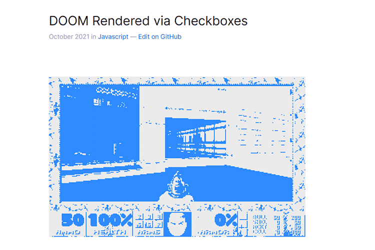
DOOM Rendered via Checkboxes – Check out this playable version of the classic game recreated with checkboxes.
In Web Design, Easier Doesn’t Always Mean Better – Why products that promise an easier experience may not be the best option.

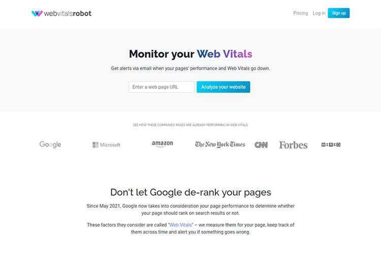
WebVitalsRobot – Analyze your website and be alerted when its Core Web Vitals scores go down.
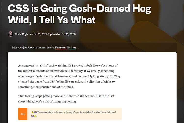
CSS is Going Gosh-Darned Hog Wild, I Tell Ya What – A look at new CSS features that are examples of progress and innovation.
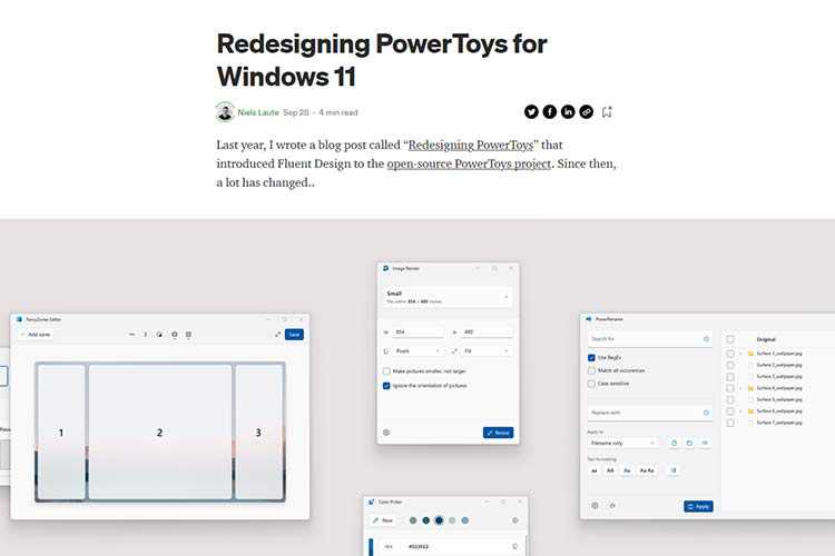
Redesigning PowerToys for Windows 11 – How the PowerToys project adapted to Microsoft’s latest OS.
Building a multi-select component – How to build a responsive, adaptive, and accessible, multiselect component for sort and filter user experiences.

8 ASCII Artwork Snippets That Utilize CSS & JavaScript – How old-school ASCII artwork is being super-charged by the latest web technologies.

futurecoder – This free tool will help you learn Python from scratch.

replace-jquery – A library that locates jQuery methods in your project and provides vanilla JS alternatives.

25 Quirky & Highly Creative Free Fonts for Designers – These free fonts may not be for everyone, but they will undoubtedly help get your creative juices flowing.
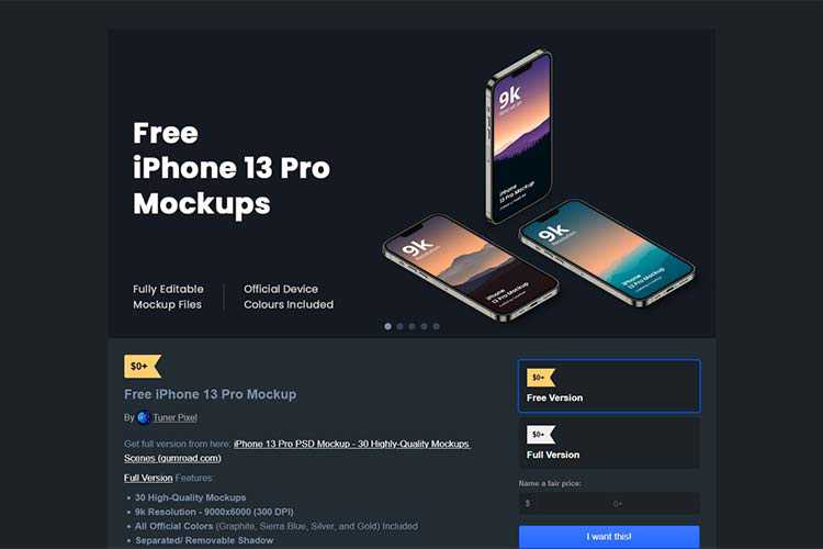
Free iPhone 13 Mockup – Download this collection of 30 high-quality mockups for Apple’s flagship phone.
The Types of Freelance Design Clients You Should Avoid – Why it will always cost you more to maintain a bad client than it’s worth.
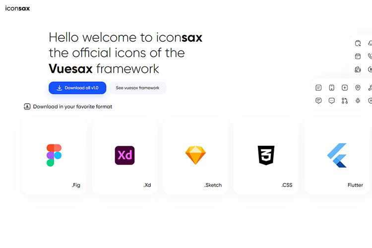
iconsax – A collection of 1,000 icons, featuring six different style variations.
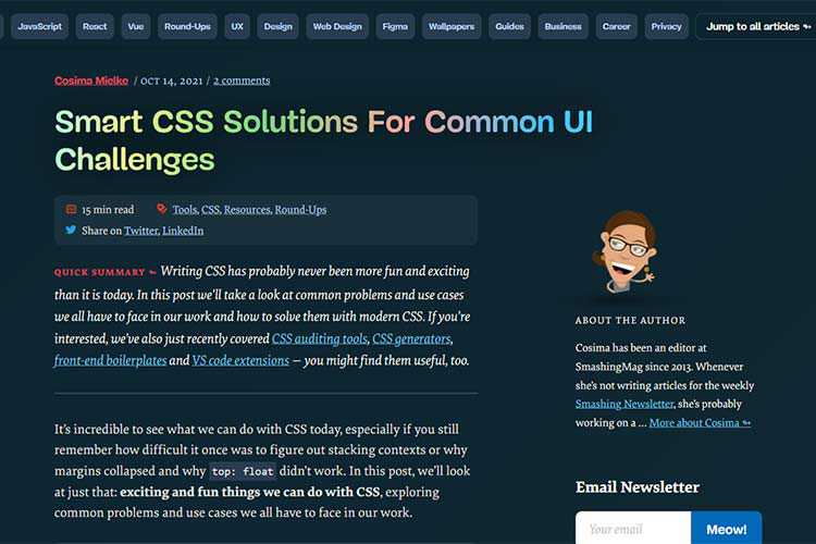
Smart CSS Solutions For Common UI Challenges – Learn how to solve common problems with modern CSS.
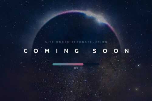
20 Beautifully Designed Coming Soon Pages for Inspiration – Get inspired and create anticipation for your projects with these outstanding coming soon pages.
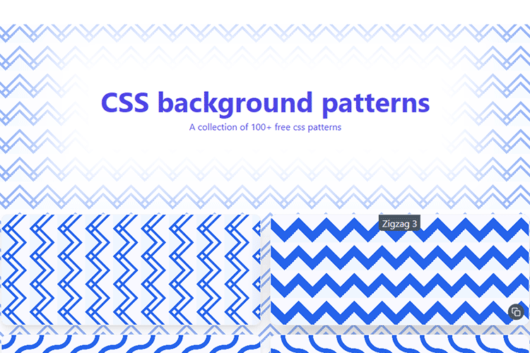
CSS background patterns – Find your new favorite background with this free CSS generator.
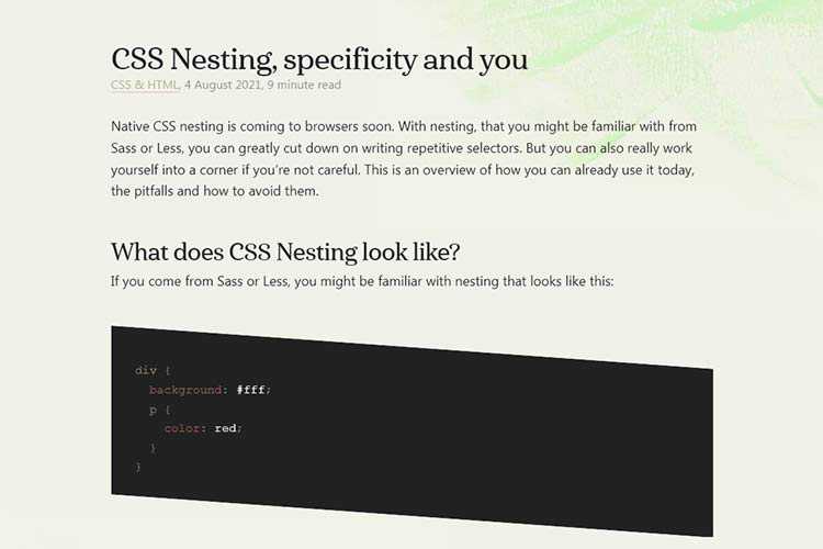
CSS Nesting, specificity and you – How native CSS nesting will impact your workflow.
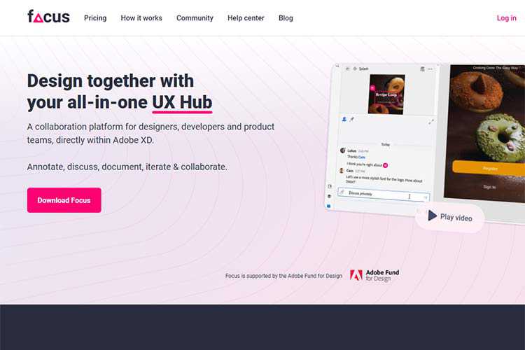
Focus – A collaboration platform for designers, developers and product teams, directly within Adobe XD.
The post Weekly News for Designers № 615 appeared first on Speckyboy Design Magazine.
We all know blogging and personal portfolio sites have been very important for designers looking to increase their visibility to clients and others who admire their work.
But some key developments have risen up over the past decade, which, in my opinion, are threatening to eliminate the need for a personal website.
Information is spread so quickly these days through social media that it’s impossible to keep up with all of it, and the truth is that potential clients and people who like your work are rarely going to take time out of their busy day to visit your website.
A Faster Way To Market
These days, you don’t really need your own website to market yourself as a designer (I don’t have one). You can reach out to the design community via social media, as we saw earlier, but there are other ways to distribute your content.
You can do guest posts on other blogs, create a newsletter list, or even do something like a podcast. All of these things will spread the word much faster than simply creating content and putting your stuff on it.
If you’re looking to market your services as a designer, then time is always of the essence. Yes, you can still build your personal brand extremely slowly, relying on organic search to send you tiny increments of traffic over a period of years. But who has time for that? You’ve got clients to get and a reputation to build, pronto!
Let me be clear here: I definitely think that websites can be an important part of your marketing plan. They do provide a certain legitimacy to a designer’s online presence that social media doesn’t – at least not yet.
At a later date, you can make your personal blog as elaborate and inviting as you please. But if you’re just starting out and need a boost to your visibility, ditch the personal site and start circulating your content in a broader variety of places.
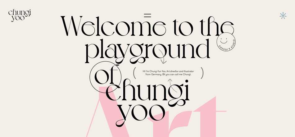 The personal portfolio of Chungi Yoo
What’s Your Ideal Outlet?
You might think that blogging is a straightforward thing: you get a blog, write some posts, and voila – now you’re a blogger. That used to be the case about 8 or 9 years ago, but now, the market is saturated with others doing the exact same thing.
The explosion of social media has also affected the landscape quite a bit. Designers have far more choices through which to spread their message, and each one has its pros and cons.
Should you be blogging on your own website, or is there a social media outlet that’s more ideal for the type of work that you do? The best way to find out is to try a few of the most popular channels: Behance, Facebook, Dribbble, et cetera, and figure out exactly what’s right for you.
Are you an Instagram person, or would Twitter or Pinterest be more your style? What does your audience respond best to?

The personal portfolio of Raffaele Sabbella
Getting The Knowledge Out There
Again, I’m not saying that having your own website or blog isn’t important at all. But there is definitely a right way and a wrong way to blog as a creative professional, and, I’m sorry to say, most people are going about it the wrong way.
The point isn’t to put something on your blog and have it live there forever. If you want to change minds and affect people with your ideas and your work, it needs to float out there in cyberspace, far from home, and find new homes with others who find the most value in it.
Sharing your knowledge and ideas helps connect you with others in the industry whom you can bounce ideas with. They can also carry your message into far-flung corners of the industry which you might not be able to reach yourself.
This is the science behind “viral” content. A group of readers finds your content valuable, and they each share it with their friends. Those friends find it equally valuable and share it with their friends, and so on.
Designers like Jessica Hische, Marian Bantjes, and Michael Bierut are all vocal about their opinions on the design industry, and many people know them as much for that as they do for their beautiful designs.
The more visible you are, the more people trust you, and the more your opinions can be far-reaching – much more so than your actual design work.
The post Is It Really Worthwhile Having a Personal Portfolio? appeared first on Speckyboy Design Magazine.


 The personal portfolio of