In episode 21 of the WordPress Briefing, Executive Director, Josepha Haden Chomphosy, talks all things block themes with developers and theme specialists Maggie Cabrera and Jeff Ong.
Have a question you’d like answered? You can submit them to wpbriefing@wordpress.org, either written or as a voice recording.
Credits
References
Transcript
Josepha Haden Chomphosy 00:11
Hello, everyone, and welcome to the WordPress Briefing, the podcast where you can catch quick explanations of the ideas behind the WordPress open source project, some insight into the community that supports it, and get a small list of big things coming up in the next two weeks. I’m your host, Josepha Haden Chomphosy. See, here we go!
Josepha Haden Chomphosy 00:40
Well, today, folks, in our podcast, I am joined by a couple of special guests. I know it’s been a bit since I’ve had a guest, so I’m very excited to introduce you to who I have with me today. Today, I have Maggie Cabrera and Jeff Ong. They both are working on themes, and especially the future of themes as we move into this low code, no code block based experience of editing things in WordPress. And there have been so many questions lately about what does the landscape of being a theme developer turns into once we move fully into this excellent promise of user empowerment for Gutenberg? I figured who best to come and talk to us about that than these two. So welcome, Maggie. Welcome, Jeff. I’m really excited to have this conversation with you today.
Jeff Ong 01:39
Thank you for having us. Excited to be here.
Josepha Haden Chomphosy 01:45
I’m just gonna hop right in, and we will see what happens. The first thing that I want to chat about, I hear so many questions and so much discussion about patterns in a lot of different places. Like obviously, the work that I helped to steward the most is around like the Block Pattern directory and various other user-facing tools. And so I have never really been able to give a really solid answer about like patterns and how they work inside themes. And so I wondered if you all had anything that you could offer to our listeners to help clarify what is the power of patterns inside themes in the future? Implementation of themes?
Jeff Ong 02:34
I can try to start unless, Maggie? Okay. Well, if you take a look at what I’ve been doing for the last couple of months working on Twenty Twenty-Two. And if you look at that theme, it’s mostly just the collection of patterns. Patterns. As you know, if you read the description, the theme, it’s designed to be the most flexible and kind of like flexible theme ever, dare I say ever created.
Josepha Haden Chomphosy 03:04
I think you can dare to say it.
Jeff Ong 03:03
And, you know, I think a huge part of that is because of the Full Site Editing being launched, introduced in 5.9. And also that theme itself ships with all of these patterns in it that work with the overall design, but really can be configured to your own kind of unique liking and kind of taste and ultimately, what you want to accomplish, whether that’s I want to make a portfolio, I want to make, you know, a single-page website promoting like my podcast, or there are patterns for that kind of shipping with the theme. And they’ve all been kind of designed and tailored to work with the typography choices at a baseline level with the color choices at a baseline level, but can very easily be tweaked. And you can kind of rely on them to work with the editor. And I guess, kind of zooming out for a little bit, not just about Twenty-Twenty Two.
Jeff Ong 04:04
But like patterns as this idea that a theme, hopefully, what it is, it’s a collection of different design options or layout options that are ultimately presented as patterns to the user, the patterns are just a really easy way to basically say “I want you this layout, like two columns of text or with like some images here.” Basically, a theme becomes a way of packaging the patterns together in a way that feels like a coherent piece of a coherent website. And I think that’s a pretty powerful idea. I know that the patterns directory is also opening up making those patterns pretty widely available. But I think a theme you could think of as like a curation of those patterns in a way that makes sense. And I think Twenty-Twenty Two is a really good example. I mean, I’m biased.
Josepha Haden Chomphosy 05:03
I also think it’s a good example. Maggie, did you have anything that you wanted to add to that?
Maggie Cabrera 05:08
Yeah, What I really like about patterns is how it empowers the user, even if they don’t really have like a deep knowledge of code, or they’re not used to the more complex blocks. When the theme developer gives you this pattern about using the query block, for example, it lays out your posts in a very compelling manner. And you can edit it if you want it or just use it out of the box. And you have this dynamic blog that it’s, like, such a big important part of your website. Like if you want to have a page where you have, you have maybe a podcast website, and you want to showcase your podcasts differently than your regular blog posts. So you can use a different gray pattern for that. And it’s like, really, really easy to use, even if you’re not familiar with it.
Josepha Haden Chomphosy 06:07
One of the things that I have found compelling about this new version of themes and kind of the way that themes are planning to look in the future; it’s going to be like a super throwback, so everyone get ready for me to sound old, my guests and my listeners alike. It reminds me of my original days of blogging on the web. I was not a developer and even though I had this really short stint of working with JavaScript in my career, at some point. Like no one actually would ever look to me and be like, that one is excellent at design and fixing everything with code, like I was just killer at searching for the right pieces of code, right.
Josepha Haden Chomphosy 06:57
And so I remember sitting there on Zynga, which is, of course, now powered by WordPress, I absolutely just went out and found bundles of code that are now what we would consider themes and modified the small pieces that I needed to change in order to like really suit what I wanted to have happen on the site at the time. And they’re like, I knew I could break it all. Really easily. But also, it was, it was not scary to think about breaking it. Like it was clear how I could fix it if I really broke it. The content, like what I had written, was separate from everything to do with the way that it was looking. And so like, I wouldn’t destroy all of my work, just because I didn’t put a semicolon in the right place, or whatever it was in that moment. And so like, this future of themes really reminds me of this a lot where someone has curated how it can look how it should look. And you can just like add in modular pieces that will augment what was already intended, but still kind of work. And if it’s not gonna work, it’s kind of easy to fix too. So like, I’m excited. That was a really exciting time in my learning of the web and certainly was formative in my career, as we all now see. And so yeah, I think that’s really exciting.
Josepha Haden Chomphosy 08:20
I did have actually another question that this conversation has kind of brought up for me. I have, obviously just use the term modular, which no one has ever used in the context of themes for WordPress. And I know that there is a lot there are a lot of terms kind of wandering around about themes right now. And especially as we’re moving into what themes can look like in the future. There was block based theme as a term for a while. And now it’s block themes. There was like this floating around the term, universal themes. And now we’re looking at just like block themes forever. And so I wondered if y’all could give us a just like a clear understanding of these terms that had been being used and maybe are going out of fashion? Like, are they important for us to keep knowing?
Jeff Ong 09:11
So yes, the history of terms around themes. And obviously, even my knowledge only goes back so far. But it was around when we started doing the block based themes meeting. And trying to I think that’s where that term kind of came from is like, oh, let’s, let’s start talking about this idea that themes can be completely made up out of blocks. And what does that mean?
Jeff Ong 09:33
I think over time, it wasn’t just block themes, because, you know, previously, there were themes and even default themes that used and took into account the fact that blocks existed. So there was some confusion there. Enough time has gone on where we focus on this idea that themes whose templates are ultimately made out of blocks are block themes. And to me, it’s kind of as simple as that. Its themes that supply a set of templates that previously in the past were a collection of PHP and various template tags and whatnot is all transitioned to themes made up including other blocks, as well as themes that supply styles through theme.json configuration instead of supplying it in raw CSS. To me this idea is really crystallizing around like this is a block theme, one that is really, at its core, supplying a set of templates, and styles through a language that WordPress understands natively, and can allow it to be configured and customized in a really powerful way. And then maybe someday in the future, they’ll just be called themes again. If we do a good enough they will just be called themes.
Josepha Haden Chomphosy 10:57
I’m gonna, I’m gonna take us into a philosophical area now that you’ve just put us in there. You said, someday they’ll be called Themes. Again, I’ve talked about this on this podcast a few times. And for anyone who’s worked with me for any length of time, like you all probably heard this from me as well. But like, adjectives are so frequently the realm of things that are not what you expect, right? Because like you have coffee, and then decaf coffee, no one’s like caffeinated coffee, because that’s what you expect out of it. And so when you’re like themes, and block themes, it makes it look like block themes are secondary, which at the moment, they are, ish. But in the future, I think you’re probably right, there will be a time when the modifier isn’t necessary anymore because it will be hopefully a much better way for people to kind of change the way that their themes work and make it more usable for users and people who are, you know, having to manage their own site without necessarily wanting to or being able to, like, have a Maggie in the room to fix everything that they break.
Josepha Haden Chomphosy 12:08
Maggie is nowhere near me. And so she’s never been in the room when I’ve broken anything. But I believe that Maggie on one occasion, at least, has come in and helped me fix something that I definitely broke. I’m an excellent breaker of WordPress things. Maggie, did you have anything you wanted to add to that question?
12:29
Yeah, I guess, maybe clarify a bit, what universal themes are because, yeah, maybe some people have heard about the term but they don’t really know what they are. And maybe just clarify that. The term was born when developing block themes wasn’t something that you could actually do for production websites like you could build them to test some experiments, but they weren’t really ready for users to use. So universal themes want to grasp the power of love themes while still being ready for users. So the way they do it is they are block based, like we used to call them in the sense that the templates are made of blocks. But they are also able to be customized using the customizer, which is the old way of customizing themes, instead of using the site editor. So they can have a balance between two worlds between the worlds of classic themes and block themes. But they are, at heart, a temporary concept. They are bound to be blocked themes in the future, but with maybe a foot in the past, where they can actually serve users who are not ready for full-on site editor. But they are bound to be full block themes in the future.
Josepha Haden Chomphosy 14:00
There’s a really interesting concept in there. So universal themes, it sounds like are basically kind of like an on-ramp for people who are not really ready to fully commit to this for any number of reasons. Like we never want to say that we know the reason that people would be a little bit shy to get started with this. But like it’s kind of like an on-ramp, it’s a safe way to get back to something that they do know, in the event that what they don’t know, really hinders their progress makes it hard for them to get the work done.
Maggie Cabrera 14:31
I think I wouldn’t say that they are for people shyer to get into new stuff rather than developers who want to embrace the new stuff before it’s even really ready. They really want to embrace the power of the blocks instead of doing things the old way. But even if it’s not fully ready.
Jeff Ong 14:54
They still need to support the old way of doing things.
Maggie Cabrera 14:58
Like being backward compatible and being ready for any kind of user.
Josepha Haden Chomphosy 15:05
So mostly for developers, everyone who heard me just talking about how it was a great thing for users, ignore it.
Maggie Cabrera 15:12
It’s also good for users; If they feel secure in using the customizer.
Josepha Haden Chomphosy 15:20
Well, I think that there’s something important here that we certainly learned with the adoption of Gutenberg in 5.0. Right, which is that there is certainly one method of helping people to adopt things, which is to go like the art of war style, and kind of smash their rice pots and burn all their boats, like, that’s one way. Which works for a lot of companies in the world, I’m sure. But WordPress has always had kind of a commitment, not even kind of, has always had a commitment to backward compatibility. And like, we know that a lot of the work on Gutenberg is going to represent some breaking changes around the around workflows and around the user experience the interface, especially like, we know that. But the opportunity to like have a thing that gives you an early taste of what’s coming but also the ability to keep kind of working in your old space where you need to, I think it’s an excellent way to bring people forward into the future of things, I have never been a fan of the just like cut off all avenues and hope that they stay with your method because of course, like you can’t cut off all the methods. You can’t cut off all the ways people can get away from you. And even if we could, it wouldn’t be in line with how WordPress hopes to kind of help people through some tough stuff like making your first website is hard. If you are doing it as part of, an overall campaign that’s supposed to bring in leads for you or generate revenue like you don’t want to necessarily play with that in a way that could break things and be risky for you in the long term. So I think all the tools that we offer to help people kind of move forward with the technology move forward with the CMS as it’s moving forward, I think it’s really smart. And so universal themes are one of those things, but also not around to stay. As we move into non modified themes, just the word themes that happen to be based in blocks. If I’ve confused anyone, please email me at wpbriefing@wordpress.org. And tell me how I confused you. And I will do a follow-up to unconfuse everyone.
Josepha Haden Chomphosy 17:40
So speaking of the way that we help people kind of move forward with WordPress and with the technology. So much has been done in the CMS in the past 12 months in the past 18 months to be able to move themes into this same future as the rest of the editor. Right. So like, for folks who have not been listening to me for the last five years, you may not know this. So I’m going to tell everybody now, like one of the pain points that Gutenberg overall is solving is the fact that you for a long time had to learn five different editing interfaces to get one thing done in WordPress, right. And so like the advent of blocks and moving it into more and more spaces in the CMS is intended to really flatten the editing experience by making the type of user interaction the type of workflow really similar across all of the editing interfaces in the CMS. And so themes are a natural extension of that, where we can take similar user patterns and workflows, and work them out into themes. So over the last 12 months or so probably a little bit more, there’s been a lot of work on the CMS to move us forward in that that is now enabling the work that we want to be able to do to move things forward ahead. And so, I mean, this is probably our last question. Is there anything that you all want to offer to people who maybe saw themes early on or saw Gutenberg early on and felt like this is just not for me, in that in that context of like, how far it’s moved ahead in the past 12 months or so.
Jeff Ong 19:23
So you’re asking like, what in the last 12 months has maybe like really surprised me or like sticks out to me as something that like, Wow, look how far we’ve come?
Josepha Haden Chomphosy 19:36
Yeah, yeah. So like, if you’re looking at what is the one thing that you saw in the last 12 months, that changed in the CMS that really enabled something wonderful for themes or from the other side of it. Like if someone had looked at themes or WordPress 18 months ago, and now they’re looking at it and seeing this new and different way to do things with the look and feel of their site, like what is one thing that they should be aware of? On either side of that question,
Maggie Cabrera 20:05
I think there’s more than one thing that has really evolved through this last year, year and a half. Like the maturity of some of the blocks is astounding now, like navigation blog, for example, was really bare-bones at the start and now it’s full potential, and it’s really looking really great. I would say the same thing about those days or the features on fire, like how basic it was at the start, was full potential. But now it’s really, really mature in terms of how much you can do with it. Like, I think the example, the perfect example of that is the work that Kjell [Reigstad] has done on Twenty-Twenty Two with the alternative theme.json files, where just changing that file basically feels like a new theme, with just the configuration and the styles. And without writing any CSS without changing any templates. It’s really, really amazing how that can turn into a reality. And it’s so easy for users to tinker with that if they want to. And it’s much easier than having to delve deep into CSS and changing everything in like 2000 lines of code.
Jeff Ong 21:23
Yeah, I probably would echo most of that. What the thing that astounds me is global styles and how the UI can be shipping a theme or default theme with basically like, 20 lines of CSS, and have it be one of them. A beautiful, beautiful, like crisp and sharp, like, experience. It’s super fast. And it’s like, what this is a theme, you know, I thought a theme was supposed to supply all the styles like no, like, it’s just yeah. And workers do for you. Exactly. And like that. That’s pretty amazing to think in the last 12 months, we can go from, you know, shipping 1000s of lines of CSS to you none, it’s like, Wow, pretty cool.
Josepha Haden Chomphosy 22:10
Well, my friends, thank you so much for joining me today. This has been a really interesting conversation. I hope that all y’all out listening. Also find it interesting. As I mentioned, if you have any follow-up questions, absolutely. Send them to me via email. And I collect all of my questions that I get through the year for answering at the end of the year, mostly because I don’t get lots of questions that people want to be answered on this. Everyone just asked me their questions on Twitter and in Slack, which is fine as well.
Josepha Haden Chomphosy 22:41
So, Maggie, Jeff, thank you both for joining me. And I’m sure that we’ll talk to you all again soon.
Josepha Haden Chomphosy 22:56
That brings us now to our small list of big things. In the last episode, I got all excited about being in the beta phase. But today, I’m rolling that back a little bit. As part of our usual open source processes, a group of contributors did a deep dive review on the WordPress 5.9 release and found a workflow that needed some refinement. So we are delaying the beta.
Josepha Haden Chomphosy 23:19
Since we are in the midst of a major commerce slash/sales season, and of course, a lengthy holiday season, that delay also means that it makes sense to delay WordPress 5.9 final release a little as well. And so we are delaying that all the way into 2022 to January 25. For me, the trade-off works really well there. Every decision that we make in open source, of course, has some balance to it. It’s great for these aspects, it is less great for these aspects over here. But for myself, the opportunity to make sure that we have a really excellent experience for our users and also an opportunity to kind of avoid all of the chaos and hustle and bustle of the end of the year. Really, it seemed like a no-brainer for me. So in case you want to learn a little bit more about why we made the decision and get some insight into the actual milestones and where they have moved now, I’ll include some posts in the show notes below in case you want to read more and of course, if you have any additional questions you can always ask.
Josepha Haden Chomphosy 24:33
The second small list of big things is that the first back to people WordCamp. I don’t think that’s what we’re calling it. Our first back to people WordCamp is happening in a couple of weeks actually. WordCamp Sevilla is happening in person on December 11. And I’m so excited I wish I were local, but I’m not so if you are local stop by their website and pick up your ticket.
Josepha Haden Chomphosy 24:55
And the third thing on our smallest a big things is that it is, of course, charitable giving season. I don’t know if you do your charitable giving at the end of the year or if that’s even part of your general ways of giving back. But I can think of two or three charitable organizations inside the WordPress ecosystem. There’s of course the WordPress Foundation, but also Big Orange Heart and HeroPress. If there are others out there, I certainly do want to know about them. WordPress Foundation also does additional giving on behalf of just like the open web and open source as a whole. So if you’re the sort of person who does their charitable giving at the end of the year, just a reminder that you have some options inside the WordPress ecosystem if you were trying to figure out some new places to donate to in 2021.
Josepha Haden Chomphosy 25:42
And that is your small list of big things. Thank you so much for tuning in today for the WordPress Briefing. Thank you again to our special guests, Maggie and Jeff. I’m your host Josepha Haden Chomphosy, and I’ll see you again in a couple of weeks.
Web design is an ever-evolving field. It seems like a new tool or technique arrives every day. And there’s a lot of pressure for professionals to keep up with the times.
Maybe it’s a bit scary. But there’s a certain excitement that comes with it as well. You learn something new and apply it to your daily work. Most of the time, you’re all the better for it.
For example, consider a new CSS layout that makes multiple columns a breeze. Or a JavaScript library that enables you to build a stunning UI. These are the things that help to push us forward.
Yet, there’s also something that holds us back. A twist of fate so cruel that it laughs in the face of the great new thing you just mastered. We’re talking about legacy software.
This ragtag collection of old browsers, operating systems, and server configurations can be more than just a painful reminder of the past. They can also get in the way of true progress.
But don’t let it ruin your good time. Today, we’ll look at some reasons why you may not need to hold back on implementing the web’s latest and greatest.
Look at the Potential Risks and Benefits
It’s never a good idea to throw a new technology onto a website without careful consideration. Otherwise, you run the risk of negatively impacting both users and your bottom line.
Before you dive headfirst into that cool feature, take some time for analysis. Creating an old-fashioned list of pros and cons can provide you with a macro view of the situation. From there, you’ll have a better idea of whether or not to move forward.
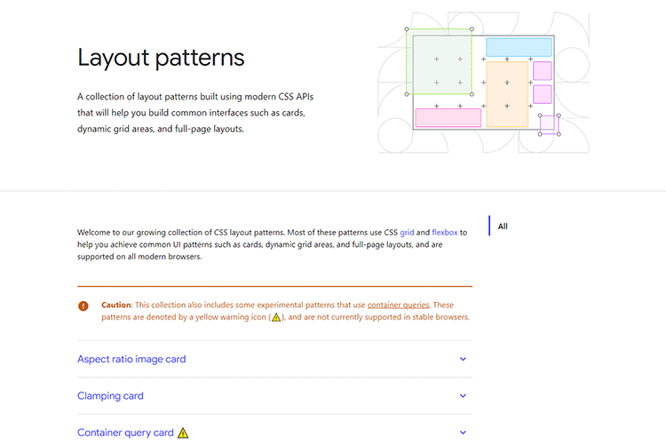
Let’s take CSS Grid as an example. It’s all the rage these days. But is it right for your project? To find the answer, start by writing a list:
Pros
- Makes complex layouts easier;
- Code may be leaner, better performing than other layout methods;
- Lots of modern browser support;
Cons
- No or spotty support in legacy browsers;
- The same layouts may be possible with better-supported methods;
That’s just a partial list, but you get the idea. The mere act of writing (or typing) out your thoughts can lead you to go further in-depth. The deeper you go, the more thorough your analysis will be. The ultimate goal is to make the most informed decision possible.

Usage Statistics Matter
We know there are people out there still using legacy software. And while web designers tend to think in terms of browsers, that doesn’t tell the entire story. Operating systems also play a role. They not only make a difference in what features are available, but they are also likely limited by older hardware configurations as well.
For instance, looking at desktop devices, the version of macOS or Windows a user is running may restrict what browsers are available. On the surface, this might make you think twice about using a newer image format such as WebP.
Mac users who don’t have the Big Sur version of the OS or later or are stuck with a version of Safari that lacks WebP support (Chrome and Firefox support WebP, however). And someone using the aged Windows XP won’t have access to Microsoft Edge.
But that doesn’t necessarily mean that the visitors to your website are among the legacy crowd. By looking at your website’s analytics, you’ll have a better idea of which browsers, operating systems, and devices are being used.
If you find that these users make up a tiny percentage of your overall visits, that may be convincing enough to move ahead with the new technology.

Fallbacks May Be an Option
OK, perhaps you want the best of both worlds. You not only want to adopt the latest web technologies but also keep on supporting legacy users. “Leave no user behind!” is your motto.
This is very much possible with the use of fallbacks. What’s a fallback? It’s a method of switching out code that a specific browser can’t understand with something that it can.
Sticking with our CSS Grid example, we know older browsers aren’t going to do very well with it. But they do understand something like Flexbox or even old-fashioned CSS floats.
Using a tool such as Modernizr, we can detect which features a browser supports. If it supports CSS Grid, wonderful. If not, we can serve up an alternative layout.
The great thing is, you get to decide how it all works. Maybe someone using IE 11 doesn’t need a full-on replica of a fancy layout – just a reasonable facsimile. Either way, this brings some level of comfort in knowing that you’re covering as many users as possible.

Keep Moving Forward
Legacy software is still among us. Fortunately, apps that fail to support modern web technologies are increasingly dying out. As their usage numbers shrink, so do the reasons for holding back CSS Grid, WebP, and other goodies.
Even so, it’s still worth doing your homework with regards to any new technology that interests you. Think about the pros and cons of implementation and use analytics to determine the impact on users.
Fallbacks are also an effective way to mitigate any negative effects for users of outdated software. They’ll still be able to use your site. Meanwhile, everyone else gets the latest features.
The web has come a long way over the past few years. It’s time to start taking advantage of that progress.
The post Don’t Let Legacy Software Stop You from Adopting the Latest Web Technologies appeared first on Speckyboy Design Magazine.


