WordPress 5.9 Beta 4 is now available for testing!
This software version is still under development. Please do not run this software on a production site; install it on a test site, where you can try out the newest features and get a feel for how they will work on your site.
You can test the WordPress 5.9 Beta 4 in three ways:
Option 1: Install and activate the WordPress Beta Tester plugin (select the “Bleeding edge” channel and “Beta/RC Only” stream).
Option 2: Direct download the beta version here (zip).
Option 3: When using WP-CLI to upgrade from Beta 1, 2, or 3 to Beta 4 on a case-insensitive filesystem, please use the following command sequence:
Command One:
wp core update --version=5.9-beta4
Command Two:
wp core update --version=5.9-beta4 --force
The current target for the final release of 5.9 is January 25, 2022, which is only five weeks away. Your help testing this beta is vital: the more testing that happens, the more stable the release, and the better the experience for users and developers—and the entire WordPress community.
Some Highlights
Since Beta 3, 20 bugs have been fixed. Here are a few of the changes you will find in Beta 4:
- Bundled Theme: Fixed duplicate CSS rules in Twenty Twenty-One theme (#53605).
- Customizer: It’s possible to switch to a block theme from within Customizer (#54549).
- Themes: Provide guidance to users seeking to preview block themes on WordPress versions below 5.9 (#54575).
- REST API: The get_theme_item method should respect fields param (#54595).
- Editor: Block Patterns: “Featured” category & patterns missing from inserter (#54623).
- Login and registration: Add a filter to allow to disable the Login screen language dropdown – (#54675).
How You Can Help
Do some testing!
Testing for bugs is vital for polishing the release in the beta stage and a great way to contribute.
Please post to the Alpha/Beta area in the support forums if you find a bug. If you’re comfortable writing a reproducible bug report, file one on WordPress Trac, where you can also find a list of known bugs.
Got questions? Here are some answers
In the coming weeks, follow the Make WordPress Core blog for 5.9-related developer notes that will cover these items in detail.
So far, contributors have fixed 326 tickets and 108 new features and enhancements in WordPress 5.9. More bug fixes are on the way with your help through testing.
Props to @cbringmann, @psykro, @hellofromtonya, @marybaum, @webcommsat, @audrasjb, @cbringmann, @costdev and @meher for contributions to this post.
Latest PECL Releases:
- pcov 1.0.11
- Fix anonymous function coverage
- openswoole 4.9.0
- OpenMetrics and JSON format server metrics support
- Added more OpenSwoole server metrics
- Updated $server->stats() API
- Fix CurlMulti bugs
- Fix type bug in Process->wait
- Added Laravel Octane tests
- Added CentOS build tests
- Support disable Postgres with --with-postgres=n
- redis 5.3.5
phpredis 5.3.5
This release adds support for exponential backoff w/jitter, experimental
support for detecting a dirty connection, as well as many other fixes
and improvements.
You can find a detailed list of changes in Changelog.md and package.xml
or by inspecting the git commit logs.
--- Sponsors ---
Audiomack - https://audiomack.com
Open LMS - https://openlms.net
BlueHost - https://bluehost.com
Object Cache Pro for WordPress - https://objectcache.pro
Avtandil Kikabidze - https://github.com/akalongman
Zaher Ghaibeh - https://github.com/zaherg
BatchLabs - https://batch.com
Luis Zarate - https://github.com/jlzaratec
phpredis 5.3.5
- Fix typo in cluster_scan_resp [44affad2] (Michael Grunder)
phpredis 5.3.5RC1
-
Fixed segfault in redis_setoption_handler [692e4e84] (Pavlo Yatsukhnenko)
-
Fix masters array in the event of a cluster failover [bce692962] (Bar Shaul)
-
Fix 32 bit type error [672dec87f] (Remi Collet)
-
Fix radix character in certain locales [89a871e24] (Pavlo Yatsukhnenko)
-
ZSTD Validation fix [6a77ef5cd] (Michael Grunder)
-
Remove superfluous typecast [b2871471f] (Remi Collet)
-
Updated documentation [f84168657, d017788e7, 20ac84710, 0adf05260,
aee29bf73, 09a095e72, 12ffbf33a, ff331af98, a6bdb8731, 305c15840,
1aa10e93a, d78b0c79d, c6d37c27c, a6303f5b9, d144bd2c7, a6fb815ef, 9ef862bc6]
(neodisco, Clement Tessier, T. Todua, dengliming, Maxime Cornet,
Emanuele Filannino Michael Grunder)
-
Travis CI Fixes
[a43f4586e, 4fde8178f, 7bd5415ac, fdb8c4bb7, d4f407470]
(Pavlo Yatsukhnenko)
-
Minor fixes/cleanup
[2e190adc1, 99975b592, 9d0879fa5, 22b06457b]
(Pavlo Yatsukhnenko)
-
Fix RedisArray constructor bug
85dc883ba
(Pavlo Yatsukhnenko)
-
Moved to GitHub Actions
[4d2afa786, 502d09fd5] (Pavlo Yatsukhnenko)
-
Use more appropriate array iteration macro
[6008900c2] (Pavlo Yatsukhnenko)
-
Clean up session tests
[ab25ae7f3] (Michael Grunder)
-
RedisArray refactors [1250f0001, 017b2ea7f, 37ed3f079]
(Pavlo Yatsukhnenko)
-
Use zend_parse_parameters_none helper
[a26b14dbe] (Remi Collet)
-
Support for various exponential backoff strategies
[#1986, #1993, 732eb8dcb, 05129c3a3, 5bba6a7fc],
(Nathaniel Braun)
-
Added experimental support for detecting a dirty connection
[d68579562] (Michael Grunder)
-
Created distinct compression utility methods (pack/unpack)
[#1939, da2790aec] (Michael Grunder)
-
SMISMEMBER Command
[#1894, ae2382472, ed283e1ab] (Pavlo Yatsukhnenko)
- yac 2.3.1
- PHP8.1 Supports
- yar 2.2.1
- Fixed build with PHP8.1
- swoole 4.8.4
- Fixed compatibility of sockets hook with PHP-8.1
- Fixed compatibility of Table with PHP-8.1
- Fixed bug #4519
- yaf 3.3.4
- Fixed build with PHP8.1
- change to using stub.php generated arginfos
- yaconf 1.1.1
- Fixed build with PHP8.1
- Change to using stub.php generated arginfos
- mongodb 1.12.0
** Epic
* [PHPC-1850] - Support PHP 8.1
* [PHPC-1912] - CSFLE 1.0 KMIP Support
** New Feature
* [PHPC-2009] - Support tlsOptions encryption option
** Task
* [PHPC-1878] - Unexpected primary step down when testing on MongoDB latest
* [PHPC-1880] - Drop support for PHP 7.1
* [PHPC-1931] - Add PHP 8.1 to PHP toolchain
* [PHPC-1997] - Update calls to deprecated bson_atomic_int_add function
* [PHPC-2011] - Upgrade libmongoc to 1.20.0 and libmongocrypt to 1.3.0
** Improvement
* [PHPC-1942] - Support BSON Binary subtype 0x07 (column)
* [PHPC-2004] - Specify string return type in __toString() arginfos
* [PHPC-2007] - Explicitly implement Stringable for PHP 8+
* [PHPC-2010] - Type validation for autoEncryption.extraOptions
Ever feel like you’re getting passed over constantly for new and exciting work by other designers who aren’t quite as, well, good as you are? Don’t worry, you’re not alone – and you’re not a bitter jerk for having those thoughts.
It’s something that most young freelance designers face, especially as they improve their skills and become better designers, yet their client roster is still as uninspiring as ever.
Today, I’m going to give all you young designers out there some tips on what you can do to stop feeling like yesterday’s news, and get in on more of the exciting, high-paying action going on in the design industry.
Gaining Entry to the Clubhouse
I hate to break it to you, good designer wallowing in obscurity, but you’re being kept out of the loop. There’s a secret store of knowledge out there that you’re ignorant of, but that those bad designers around you know all about.
They’re sneaking out at night to attend the meetings, making piles of money while you’re crashed on your friend’s couch with overdue bills and empty soda cans and junk food wrappers scattered around you, like a blanket of sorrow to go with your feelings of rejection and inadequacy.
It’s okay. I know how you feel – but there’s good news! Brew yourself a pot of coffee and read on.
The secret knowledge that these successful designers all share isn’t really all that secret. I was just joking – y’know, for dramatic effect. I’ve got a story to weave here, after all.
These designers really all know just one important thing: how to sell their work to the right audience. That’s it. The “secret sauce” is marketing.
Selling yourself is something that many creatives are famously uncomfortable with, but the truth is that we all already sell ourselves. Every time we meet with a client, we have to sell them on our ideas. Convincing a client to hire you isn’t all that different from what you already do on the job.
Marketing is a skill that tends to be despised, but it really shouldn’t be. It’s the counterpart to good design. If you create the most wonderful, awe-inspiring design in the world, and hide it at the bottom of a drawer, you may as well not have created it at all.
If you don’t make the effort to put your work in front of people who will see it and want to hire you, you’re essentially doing the same thing. You’re creating work and hiding it under a veil of obscurity.

Selling the Sizzle
Marketing yourself to new clients doesn’t mean that the quality of your work has to suffer. Don’t stoop down to the level of the crappy designers around you and create work that’s equally bad.
The solution to your marketing deficiency is not to get down in the mud alongside the bad designers who are outpacing you. Your task is to outperform them with your superior talent and critical thinking skills.
You don’t need to work any differently – you just need to package that work in a way that’s more attention-grabbing to a broader audience.
Many times the biggest marketing issue that talented creatives face is that they’re just too excited about what they can do. Perhaps your code is clean as a whistle and compliant with every web standard known to humankind.
Or maybe you’re a minimalism whiz, with a perfect knack for creating simple, powerful layouts with the perfect balance of clarity, beautiful type, and whitespace.
That’s nice for you, and maybe your mom, to know about, but the cold, hard truth is that most clients couldn’t care less. They’re only concerned about whether you can get the job done competently and on deadline. It’s sad, but true.
The key to marketing yourself well is to sell an experience, not a list of qualifications. You need to be thinking about how, specifically, can your technical skills improve the quality of life for your clients.
It sounds terribly dramatic, but marketing is almost pure psychology. People are motivated, in life and in business, by things most freelancers don’t stop to consider when offering their services.
If you can connect with a client on a personal level – offer them an important benefit that will earn them more money or allow them to free up more time (a huge desire of many overworked business owners and managers), you’ll have more clients than you’ll know what to do with.

Find Your Niche
Sometimes you get beat out by the mediocre competition simply because that person has access to a wider pool of clients than you do. Perhaps they live in one city and they’re doing business all around the world with similar clients.
These competitors of yours have found a niche that works for them and they’re out finding clients wherever they happen to be. If they have to get on a plane and travel, well, it’s worth it to them to have access to clients that others in their niche can’t easily get to.
When marketing yourself and selling your services to new clients, it’s important to get specific – don’t just cater to everyone, or you’ll end up catering to no one. Find a lucrative niche within the design industry, and grow your client base from it.
Perhaps you only work with clients in the legal and medicine industries. Or maybe you work with tech startups, or fashion designers, or boutique ad agencies. Whatever your niche is, make sure there’s enough clients in it to supply you with years of new work.
If it’s hard for you to find clients in your niche (maybe you live in a small town or it’s just too competitive), perhaps it’s time to branch out. Travel has never been easier or more economical – if the clients you want to work with aren’t in your area, pack a suitcase and go to theirs.
Alternatively, you can use your design skills and technical expertise to leverage the power of your local media. Become a local design expert in one area you can master.
Marketing doesn’t have to be scary, nor does it have to be particularly hard. The majority of the effort comes at the beginning – determining your niche, finding the right clients, and establishing yourself as someone who provides just the right experience your clients are looking for.
The rest has to do with keeping yourself at the top of your clients’ minds – updating your email list, sending out mailers, etc.
There are plenty of other articles which cover these things in detail. Once you establish a system that works for you, it becomes much easier for you to accelerate your career at a rate that’s more appropriate for your knowledge and skill level.
The post How Novice Designers Can Improve Their Client Rosters appeared first on Speckyboy Design Magazine.
Just days after its official release, we are thrilled to announce the immediate availability of PHP 8.1 for all Professional plans projects. The new PHP foundation releases a new main version every year at the very end of November, and It’s some kind of early Christmas for us developers and application makers.
Sparks and acceleration PHP 8.1 comes with many new and long-expected features such as Enums, Readonly properties, First-class callable syntax, and new in initializers.
In this last episode of 2021, Josepha Haden Chomphosy takes the time to appreciate those who make the WordPress project a success and offers a carol of thanks.
Have a question you’d like answered? You can submit them to wpbriefing@wordpress.org, either written or as a voice recording.
Credits
References
Have yourself A Merry Little Christmas
Transcript
Josepha Haden Chomphosy 00:10
Hello everyone, and welcome to the WordPress Briefing. The podcast where you can catch quick explanations of the ideas behind the WordPress open source project. Some insight into the community that supports it and get a small list of big things coming up in the next two weeks. I’m your host Josepha Haden Chomphosy. Here we go!
Josepha Haden Chomphosy 00:39
So, ages and ages ago, when I first started this podcast, someone basically requested that Matt and I do a duet for the last podcast of the year. A Christmas carol duet; him on the saxophone and me on voice. I obviously did not get that coordinated I don’t even know why I said obviously. I’ll tell you right now I did not get that coordinated. I was a very busy lady this year. So I don’t have a Matt on saxophone. Still, I did think that maybe it might be nice just for me to sing a teensy little Christmas carol for you all just because it seems especially poignant the words this year, especially after the 2020, 2021 COVID, all the things and trying to get back in person. So I’m going to sing you all one little verse from Have Yourself a Merry Little Christmas.
Josepha Haden Chomphosy 01:35 Singing
Have yourself a merry little Christmas
Let your heart be light
From now on our troubles
Will be out of sight
Have yourself a merry little Christmas
Make the Yuletide gay
From now on our troubles
Will be miles away
Here we are as in olden days
Happy golden days of yore
Faithful friends who are dear to us
Gather near to us, once more
Through the years we all will be together
If the fates allow
Hang a shining star upon the highest bough
And have yourself a merry little Christmas now
Here we are as in olden days
Happy golden days of yore
Faithful friends who are dear to us
Gather near to us, once more
Through the years we all will be together
If the fates allow
Hang a shining star upon the highest bough
And have yourself a merry little Christmas now
Josepha Haden Chomphosy 03:34
Alright, my friends, that was from my heart to yours if you happened to listen. If you skipped a few seconds to get through it, which I would totally understand, that is also fine. But I did want to just kind of wrap up the year to let you all know that I am so incredibly grateful for all of the people who show up for the WordPress project to make it a success. I have made so many friends and wonderful acquaintances throughout my time here with the WordPress project. And especially in my three years as the project’s Executive Director. You all have put a lot of trust in me and a lot of faith. And I know that we have gotten so much done together in the last few years. And I am equally sure that we’re going to get so much done in the years to come. And so thank you all so much for your continued work with WordPress and the way that you just bring your best at all times.
Josepha Haden Chomphosy 04:32
One other little thanks I want to give. Over the course of this year, I’ve had an excellent team that works with me on this podcast. I have editing and design folks and people who’ve joined me here and there, folks who helped me with my production. So big thank you to Dustin, Bea, I realize your name is Beatriz in the actual credits, but I call you Bea, and so thank you. Also, a huge thank you to Chloé, who does all of our production and wrangling every couple of weeks. A big round of applause and kudos to that tiny but tough team that helps me get this all done.
Josepha Haden Chomphosy 05:10
That’s to go on top of the general thanks to the WordPress project. And if you all are celebrators, I hope you have a wonderful holiday season. If you are not celebrators, I hope that you have a wonderful end to your year and that everything you wanted to get done, you did get done, and that you can start 2022 with a fresh slate. Again, this is the WP Briefing. Thank you so much for listening. I’m your host Josepha Haden Chomphosy, and I’ll see you again in 2022.
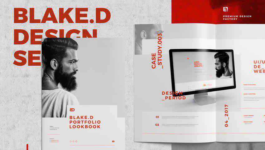
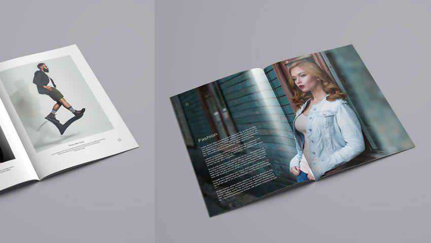
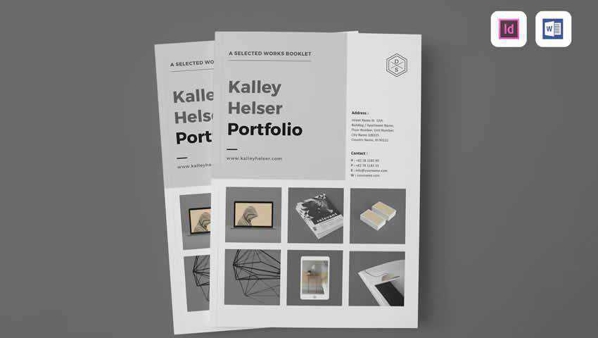
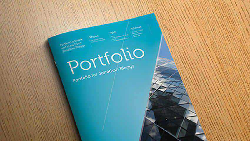
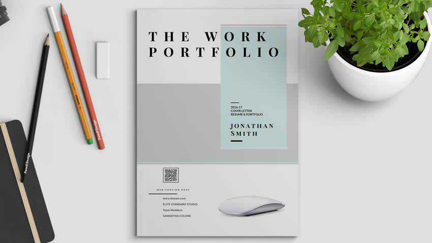
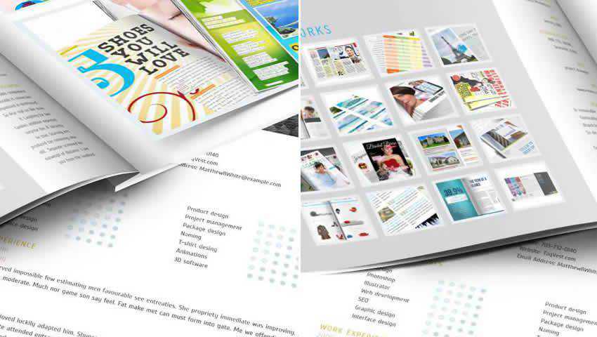
Thinking of putting together a portfolio of your best work? Or perhaps you want to compile a fashion lookbook? If either of these scenarios describes your situation, read on.
This collection of free portfolio and lookbook templates for Adobe InDesign are certain to appeal to a wide audience, all while offering a convenient way to present your latest fashions or photos.
While these templates can be used outside of the photography, fashion, or beauty industries, some feature design elements that appeal specifically to those niches. This is a great asset to those looking for a quick way to create a portfolio or lookbook without having to conceptualize them from scratch
Now, without further ado, let’s get to this collection of portfolio and lookbook templates for InDesign!
More InDesign Templates:
Learn InDesign:
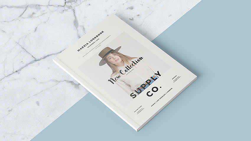
The Free InDesign Lookbook Template offers a simple layout that allows your photographs to shine. It comes with 26 layouts, which is just perfect for cobbling together a spread that works with your mission statement. It support A4 and US Letter sizes and can easily be used for brochures, magazines, company reports, and more. The layouts do support a fashion-feel, however, so keep that in mind when downloading.

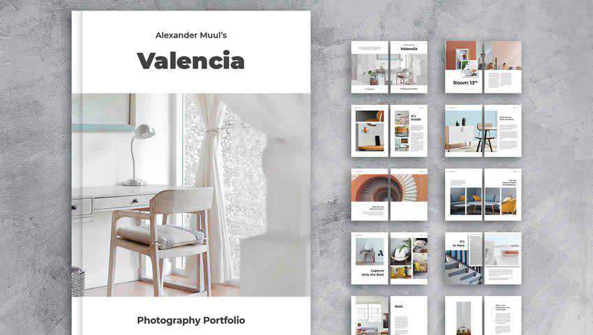
The Photography Portfolio InDesign template is so straightforward in its presentation and yet it’s a real stunner. It supports two-page spread layouts for those larger ideas and fashion moments, and can easily be adapted to suit interior design or architectural fields. This template is print-ready, is fully-layered, and can be customized easily, thanks to a grid-aligned layout. Basically, your edits will not throw off the balance of this template’s overall look.

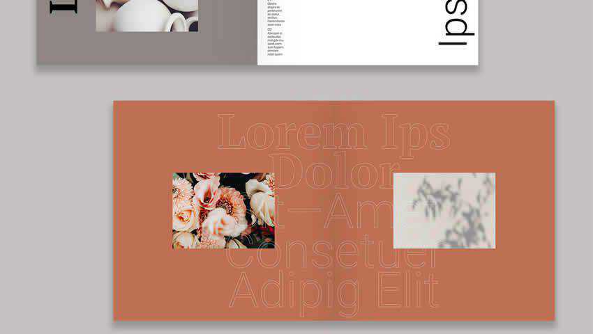
The Modern Design Lookbook Template is another solid choice for those looking for a simple way to present their designs or portfolio pieces. What really stands out here is the really bold background color choices and the way this can be used to compliment the photography to be featured on each page. This template comes with 13 completely editable pages, is print-ready, and it fits the A4 paper size.

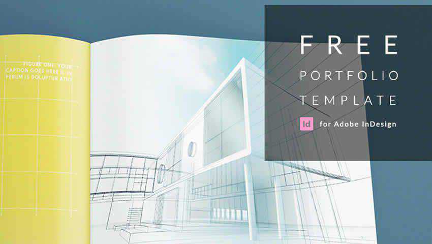
The Architecture Portfolio Template emphasizes clean lines and layouts. It completely embraces the idea of minimalism, favoring full-page photo spreads, solid color backgrounds, and centered text boxes over columns of text or a more magazine style design. This template is print-ready in the A3 size, making for a large portfolio that’s easy to edit. The included color scheme and a multitude of layouts make for a stunning end product here.

What a stunner this template is! The Portfolio InDesign Template can be used for a variety of projects that require a lookbook or portfolio and super easy to edit thanks to its grid-based layout and included vector graphics. This template is customizable in A4 and US Letter sizes, includes 24 pages of layout options, includes free fonts. Vertical typography choices and subdued photographic backgrounds make a real impression.

The Stunning Portfolio Template for InDesign is an excellent choice for displaying graphic design work, photography, or fashion. It can even be used for architectural spreads. This template comes with a variety of page layouts and a front and back cover, making it the complete package. It’s print-ready in US Letter size and includes modern typography and color scheme choices, making it perfect for acting as a backdrop for your latest masterpieces.

The Free InDesign Portfolio Template can be used for displaying portfolio work from any industry thanks to its sleek black cover and editorial style interior. With plenty of page layout options, including many two-page spreads, this template would look fantastic with fashion photography gracing its pages. It’s easy to edit each page layout to include your custom content and the template is print ready in A4 size.

Another excellent template choice is the Clean and Minimal Portfolio InDesign Template. This one has a real corporate look but it could easily be adapted for display fashion looks, graphic design, or photography. This template includes 24 pages that you can customize with your content. It’s print-ready, comes with a vector icon, and can even be edited from within Microsoft Word. It uses free fonts and all text, images, and colors are completely editable, so you’re certain to achieve the look you want.

If all you need is a free stylish pages to present a couple of portfolio pieces, this Eight-Page Portfolio Template ought to do just fine. This template features a an eye-catching and geometric design, highlighting your work with graphical lines and bold colors choices. Beyond portfolios, I could easily see this template being used for a media kit or company report, too.

The Wonder Tour Photobook Template for InDesign is, as its name would suggest, perfect for showcasing photography. This would benefit photojournalists looking to advance their careers, architects wishing to highlight their latest work, and even fashionistas, who want to share their designs. This template has a whopping 31 pages color swatches, paragraph styles, and more.

The Portfolio and Resume InDesign Template includes 32-pages that can be printed in both US Letter and A4 sizes. It’s easy to customize thanks to organized layers and you can add color swatches, and there are custom paragraph and character styles that make it easy to define the look you want. There’s even a help file included that walks you through how to change images, text, and swatches. This multipurpose file can be adapted for use within a range of industries and for a number of purposes as well.

The Designer Portfolio InDesign Template is the perfect choice for a graphic designer or web designer, looking to highlight some of their best works to potential clients. Within the 8 sample pages, you can plenty of layouts to choose from for displaying logos, brochures, graphics, and other examples of your work. The template features a half-fold design and it relies on free fonts, making it easy to mimic the sample pages within having to shell out money on extra resources.

The Interactive Portfolio and Resume Template comes with three page layouts and two color schemes, offering up just enough choice to ensure you obtain the look you want without having to commit a ton of time to design. This template would be ideally used for a graphic or web designer’s portfolio since it has a dedicate page where you can input links to websites you’ve worked on recently. However, it also has a resume page and a case study page, which could be adapted for a number of industries. All in all, a fantastic free choice here.

Before you put together a portfolio or lookbook, and especially before you shell out money on a template, take a look at this collection of free Adobe InDesign templates. Not only are they nice to your budget, but they also feature really nice designs and layout options that make it easier than ever to put together a portfolio in a couple of hours — rather than a few days.
The post 10 Free Portfolio & Lookbook Templates for Adobe InDesign appeared first on Speckyboy Design Magazine.
Advent of Functional PHP: Day 8
Advent of Code Day 8 was, to put it mildly, a pain in the ass. There's a couple of reasons for that. It's a naturally tricky problem, it's hard to genericize, and it's explained fairly badly. It took a while but with some help from others I was finally able to figure out (and refactor to) a good, functional solution to it. So let's dive in.
The problem boils down to one of encryption. Our input is several lines that all look like this:
acedgfb cdfbe gcdfa fbcad dab cefabd cdfgeb eafb cagedb ab | cdfeb fcadb cdfeb cdbaf
Where each letter corresponds to one segment in an LED display for a number. Each number appears once on the left side, which is enough for you to figure out what letter corresponds to what segment. Then we need to use that knowledge to decode the numbers on the right and figure out what the number is.
Package:
Summary:
Generate code for modules for Laravel applications
Groups:
Author:
Description:
This package can generate code for modules for Laravel applications...
Read more at https://www.phpclasses.org/package/12334-PHP-Generate-code-for-modules-for-Laravel-applications.html#2021-12-20-01:02:18
Web designers are always looking for ways to give their business a boost. And whether you have an eye towards bringing on new clients or expanding the presence of existing ones, the main goal is to grow your bottom line. It’s part of the natural evolution for freelancers and agencies alike.
And, although we often strive for growth, it can be an intimidating concept. You might, for example, see it as something that takes a significant investment of time and/or money.
However, growth comes in many forms. You don’t necessarily have to toil away for years in hopes of coming up with that one big idea. There are some simple ways to expand your business that won’t require you to move mountains.
To be sure, these aren’t get-rich-quick schemes. Rather, they’re opportunities that may already be sitting right in front of you. Today, we’ll show you how to take advantage of them.
Prepare Clients for Technological Shifts
The web doesn’t stay the same for very long. Both the technology we use to build websites and user expectations change rapidly. Perhaps it’s a little scary – but it’s also a great opportunity.
We tend to implement these changes into new projects. That makes perfect sense, as you want to start with the latest and greatest. But we shouldn’t forget about existing clients.
Whether it’s a change to Google’s search algorithm or a revamped editing experience for WordPress, existing websites need to keep on evolving. Doing so will ensure that these sites can take full advantage of new technology. More importantly, it also means that they won’t fall too far behind the curve.
This can provide a steady stream of revenue. Yet, not all designers take advantage. They instead train their focus on new clients, thus leaving a potentially significant amount of money on the table.
The biggest hurdle here is communication. But by proactively keeping clients informed of these shifts, you open the door to expanding your bottom line.

Offer Complementary Services
Like peanut butter and jelly, some services just go together. And adding the right ones to your web design business can make for a tasty combination. Or, at least improved cash flow.
And there are several complementary services that web designers can choose from. It might be recurring maintenance, web hosting, SEO, or even consulting.
You can configure things in a way that works best for both you and your clients. For example, you might do the dirty work yourself or contract it out to a third-party provider (more on that in a moment). Signing up with various affiliate programs is a popular solution.
That’s not to say that every service, no matter how natural an extension, is the right one for your business. While you can make some money, there is an added responsibility as well. It’s something to consider before making any decisions.
Still, design and development go deeper than just their respective names. There is a whole world of possibilities to grow.

Team Up with Other Freelancers
Because web design is such a vast industry, many of us have chosen to focus on a particular niche. This allows for more detail-oriented service. However, it can also mean that we’re lacking in other areas that are important to our clients.
One way to tackle this challenge is by teaming up with other freelancers or agencies. Hire them to take on the work that you don’t typically do – and vice-versa. Tasks like email marketing, social media management, and custom coding are just a few potential areas for collaboration.
If you’re contracting outside help, you can add project management fees on top of what you’re being charged. The result is that you’ll make sure the job is done right while bringing in a little extra cash at the same time.
The other side of the coin is the ability to pick up new projects that cater to your skills. In the right situation, it’s a great way to add to your portfolio without having to hunt for new clients.
Again, there are some extra responsibilities involved. And it requires a solid working relationship with someone you trust. Therefore, it may be wise to test the waters on a project or two before making any commitments.

Real Growth You Can Implement Today
The opportunities above are ideal for any web designer who wants to grow without radically remaking their business. They don’t require taking out a loan or spending tons of time developing a new product. They’re off-the-shelf ideas that can be implemented immediately.
And you don’t need to dive in with both feet. Starting small can add up to something over time. It’s possible to create a stable, modest boost to your income. As you become more comfortable, you can aim to take things to a higher level.
The key is in determining which areas will be mutually beneficial to you and your clients. The answer will be different for everyone, depending on your current situation. For some, the potential cash increase may not be worth the cost in terms of maintenance or other hassles.
Still, seizing the right opportunity may be just the thing your business needs to jumpstart growth.
The post 3 Quick Ways to Grow Your Web Design Business appeared first on Speckyboy Design Magazine.
Package:
Summary:
Form inputs to edit values got from a CRUD service
Groups:
Author:
Description:
This package can be used to create form inputs to edit values got from a CRUD service...
Read more at https://www.phpclasses.org/package/12330-PHP-Form-inputs-to-edit-values-got-from-a-CRUD-service.html#2021-12-19-08:39:14


