CMX is one of the largest professional organizations dedicated to community builders. The awards were open to public nomination, and finalists were chosen by panels of their peers in the CMX community.
Andrea has been a vital community strategist for the WordPress project since 2011. Her work to build and support a vibrant community has played a part in the success around the popular open source CMS. Her work is sponsored by Automattic, where she leads a team that focuses on educational efforts, funding, and in-person community-driven events that serve a global base.
Josepha has been the Executive Director of the WordPress project since 2019. Her work to coordinate and guide volunteer efforts spans 20 teams and involves thousands of volunteers. Her work is also sponsored by Automattic, where she leads the open source division that focuses on all aspects of open source contribution including design, development, volunteer engagement, and the health of the overall WordPress ecosystem.
Votes are Open
Final recipients are chosen with open voting — if you feel like either Andrea or Josepha have had an impact on your careers, your trajectory in the WordPress project, or the health of WordPress as a whole, there are three ways you can show your support:
Stop by and vote for them (Andrea here, Josepha here)!
Share this post with your own communities!
Tweet some inspirational thoughts about your time/experience/learnings with WordPress (using #WordPress, naturally)!
Thank You Notes
A lot of care and passion goes into making the WordPress Project as fantastic as it is. I think these awards are a reflection of how wonderful the community and ecosystem are, and I appreciate everyone’s continued trust in my stewardship!
Josepha Haden Chomphosy
WordPress community organizers are some of the most generous and creative people in the world — working with them is exciting and interesting every day. I’m humbled by this nomination; thank you!
When it comes to selling your products, presentation of said product can make a world of difference when it comes to sales. This is even more important when it comes to digital products which aren’t tangible./p>
If you’re looking for a way to take your product presentation skills to a new level, you’re in the right place. In this tutorial roundup, we’ve gathered the best and the most useful product mockup tutorials. You’ll learn tips and tricks that will boost your Photoshop skills and allow you to present physical and digital products in a visually appealing way.
As mentioned earlier, digital products can be a little tricky to visualize but with the help of this tutorial, you’ll be able to effectively give your clients an idea of how the finished project will look like.
Use this tutorial to create an isometric map mockup. This tutorial is perfect for any project dealing with travel or geography. The tutorial will make use of transformation actions in Photoshop so you’ll definitely walk away with some new tricks up your sleeve.
While creating your own product mockup is a great way to add a unique and personal touch to your project, the reality is often different and there will be times when designing a mockup from scratch is not feasible. Use this professionally designed mockup kit to present your digital products.
Need to create a product mockup in a hurry? This tutorial shows you that you don’t have to spend hours creating a product mockup. All you need is your product and the right stock photo.
If you want to stand out, then you’ll want to make sure your product presentation is truly unique. A good place to start is this tutorial that shows you how to create a text portrait poster mockup.
If you’re working on a website or an app and you need to demonstrate how it will look across devices, you’ll need a responsive screen mockup. Learn how to create one with this quick and easy Photoshop tutorial.
Stationery kit mockups are a great way to present a brand identity design to your clients. With the help of this template from Envato Elements, you’ll be able to showcase brand identity on an envelope, a business card, a letterhead, and a folder.
This video tutorial shows you a quick and easy way to create an awesome-looking product mockup in Photoshop. It starts you off with a base image and then takes you through the process of designing a mockup template that you reuse over and over again.
This tutorial comes straight from the creators behind Adobe so you know you’re getting quality and insider’s tips and tricks. You’ll learn how to design a product mockup of a physical product and use 2D image compositing paired with 3D design assets.
For any project that uses a vintage or retro style, you’ll need a matching product mockup. This tutorial will show you how to create a realistic aged and textured logo mockup.
Check out this black branding mockup kit from Envato Elements. This mockup is perfect for any high-end, luxury brand in the fashion, jewelry or any other industry that wants to exude elegance and style.
Designing t-shirts is a great way to earn extra income and t-shirt mockups are important throughout the entire buying process. With the help of this tutorial, you’ll learn how to create attractive t-shirt mockups that will boost your sales.
This tutorial will help you brush up your Photoshop skills and maybe teach you a new trick or two as you set out to create a reusable mockup template in Photoshop.
Use this detailed tutorial to create a beautiful leather stamp logo mockup. This is a great way to show your clients how their logo would look on various branded assets and products.
Save time in creating your own poster mockup with the help of this Envato Elements file. You’ll get a high-resolution file with four different effects so you can pick and choose how you want your poster to look.
While not widely used today, wax seals add a luxury and mystery feel to your brand. Learn how to create a photo-realistic wax seal mockup with this tutorial and make use of smart objects, effects, and blending modes.
In this video tutorial, you will learn how to create a smart object mockup so you can easily reuse your design and mockup for each and every project. The whole tutorial takes 5 minutes so you can easily knock this one out of the park during your lunch break.
Want to add high-end feel to your logo mockups? Then, be sure to check out this tutorial. By using multiple layer styles and a smart object, you’ll create a photo-realistic pressed paper logo mockup.
Use this ArtBox Artistic Mockup Kit to showcase a range of art tools. You can use it in your own projects or simply as an inspiration to help you brainstorm and create your own artistic mockups.
This tutorial will teach you how to make a realistic box mockup. Though the tutorial focuses on a software box, you could easily adapt it for any other box design.
No matter what type of product you want to present, a great-looking product mockup allows you to present your idea to the client even before the product is completed. And in the case of digital products, it gives your clients a helpful tool for visualizing what they will get. The tutorials in this roundup will have you creating attractive product mockups in no time.
It provides a base class that can be extended to create both model classes and controller classes for tables stored in Oracle using OCI, in order to access data records...
Read more at https://www.phpclasses.org/package/11499-PHP-Create-model-classes-stored-in-Oracle-using-OCI.html#2020-01-15-03:10:44
It provides a base class that can be extended to create both model classes and controller classes for tables stored in Oracle using OCI, in order to access data records...
Read more at https://www.phpclasses.org/package/11499-PHP-Create-model-classes-stored-in-Oracled-using-OCI.html#2020-01-15-03:10:44
Navigation in website design typically only includes the same basic menu items, modestly sit in the header, and always greets the viewer from the outset. Since the popularization of the hamburger button, nothing earth-shattering has happened in navigation design.
But some web designers have dared to change that by using the unconventional yet elegant sticky vertical menu. They tend to be more compact, minimal, and beautifully make use of vertical lettering.
There are several reasons why some websites will choose to use vertical navigation:
First, they are compact, making them ideal for those who need or want to use up the entire hero section of a website.
Second, their sizes are typically suited for use on both desktops and mobile devices alike.
Third, thanks to their stickiness, they are perfect guides and anchor points, making the user experience much more comfortable.
And finally, continually displaying the logo or name of the website is an easy way to enhance brand identity.
To experience the vertical navigation for yourself, take a look at the inspiring examples we have collected for you below. You will love the results!
The Web Designer Toolbox
Unlimited Downloads: 1,000,000+ Web Templates, Themes, Plugins, Design Assets, and much more!
Our first stop is to the personal portfolio of Austin McKinney. Here, the vertical navbar includes only the essentials: a hamburger button, links to social media profiles, the logo, and the designer’s occupation. As well as a beautifully designed vertical navbar, this website is also the perfect blend of ultra-minimalism and ultra-narrow design.
The creators of Editorial New show us that vertical navigation works regardless of color, stylistic options, or interactive details. Their navbar includes just one element – the hamburger button. It opens a lovely slide-out menu with a table of contents. Since the navigation has been stuck to the left side of the screen, users always have quick access to the menu wherever they are on the site.
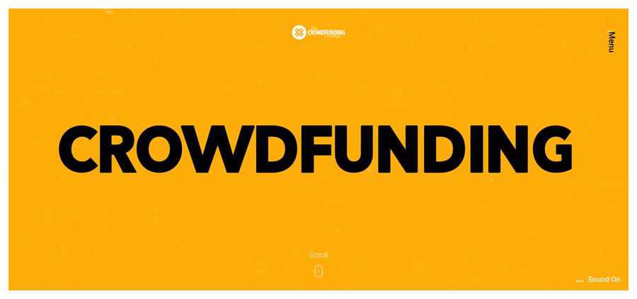
The vertical navbar of Crowdfunding Formula is located on the right side of the page. Although we are not accustomed to seeing it there, it nevertheless works perfectly well. What’s more, thanks to the contrasting orange color of the menu button, it naturally catches an eye.
The team behind NSDI uses a vertical navbar for displaying not just the hamburger button, but also the pagination of a full-screen slider. Another distinctive feature is that all of the elements move with the user. Here, they have an ultra-narrow vertical navbar and corner navigation that co-work together in order to create a comfortable user experience.
The official website of Villa Corvi has not one but two ultra-narrow vertical navigation bars. The first is used for displaying their social media links, whereas the second houses the button for activating the inner menu. Along with the upper header, these two strengthen the subtle boxy feel of the website. Note that only the right panel sticks to the screen and moves along with the user.
Much like Editorial New above, TedCo’s vertical navbar is a part of the corner navigation, looking elegant and informative, and completes the sophisticated design of the UI. The vertical navbar stays where it is, giving users the always useful focal point when navigating a website.
The detailed navigation bar of Rogue Studio is an excellent example of a solution where all of the menu items are on full display to the audience. Although the component looks more cluttered than our other examples, it has one significant advantage over them. It gives users everything that they need to navigate the website without having to perform any secondary function.
Making navigation vertical can breathe new life into any website. Even though they are not something new, they feel somewhat bold, refreshing, and worth trying out.
expect 0.4.0
Added code to support API for PHP 7.x
Updated build scripts, to support 64bit centos
vld 0.17.0
- Fixed segfault while reading of jump tables for SWITCH_LONG/STRING
- Removed support for PHP 5 (Peter McDonald)
- Fixed issue #47: Display for NEW does not mention classname
mysql_xdevapi 8.0.19
WL#13541: Fix admin command namespace usage
WL#13398 DNS SRV support
phalcon 4.0.2
Full changelog can be found at: https://github.com/phalcon/cphalcon/blob/master/CHANGELOG-4.0.md
[4.0.2]
Added
Changed
Changed the logic when logging times for PhalconLogger to use DateTimeImmutable so as to handle microseconds if necessary. #2893
Changed PhalconHttpCookie::send and PhalconHttpCookie::delete to allow for samesite to be passed in the options when using PHP > 7.3 #14627
Fixed
Fixed PhalconMvcModelCriteria Di isn't set when using Criteria::fromInput()#14538
Fixed PhalconDbDialectMysql removing unnecessary parentheses for double and float#14645@pfz
Fixed PhalconHttpCookie::delete to parse the correct parameters - cannot use alternative syntax until PHP 7.3 #14643
Fixed PhalconMvcModel::__isset to take into account non visible properties by checking the getter if it exists #13518#13900
Fixed PhalconMvcModel::__set to return a more informative message if we are tying to access a non visible property #13518#13900
Fixed PhalconMvcModelResultsetSimple::toArray to correctly process virtual fields #14669
Fixed PhalconSessionManager::getUniqueKey to prefix the key only if uniqueId is present #14688
Fixed PhalconDbAdapterPdo::describeColumns to correctly detect ENUM columns #14691
igbinary 3.1.1a1
* Throw when an uninitialized php 7.4 typed property is included in the result of __sleep(),
instead of emitting a notice and attempting to represent the unset/uninitialized value as null (#258).
See https://bugs.php.net/bug.php?id=79002
Uninitialized properties without types from __sleep continue to emit notices and be represented as null.
datadog_trace 0.37.0
### Added
- Target a specific PHP version during install by setting `DD_TRACE_PHP_BIN` #604
- Curl Integration: Add all available information from `curl_getinfo()` as span tags #642
Changed
Move dogstatsd client init to rinit #703
Fixed
Issues related to limited tracing #689
Backup and restore last error (related to error_get_last() issue) #694
Handle out-of-sync spans #702
Sandbox tracer flushing #707
Enhance OpenTracing StartSpanOptions support #708
Ensure errors raised in request init hook do not affect error_get_last() #709
Business cards are a staple for every freelancer and agency. We hand them out to prospective clients and pass them around like candy at design conferences. They are a small, yet tangible, representation of who we are.
If we want to make an impact, then, it stands to reason that our business cards should be memorable. That can be accomplished with top-notch design combined with unique, high-quality materials. In other words: Cards should not only look good but provide the right kind of tactile feedback as well.
For business cards that do it all, check out Print Peppermint. They are an online printer offering a variety of incredible finishes and premium papers. In addition, they provide you with the flexibility to design your own card or use their expert in-house design team.
Let’s take a look at the features that make Print Peppermint the ultimate source for your business card needs.
High-End Features & Attention to Detail
Your business is special, so why settle for the same old business cards? With Print Peppermint, you’ll gain access to the tools and materials that will help you stand out from the rest.
Thick and Premium Papers
It all starts with the paper, and Print Peppermint provides a number of great options. Choose from 100% Cotton, Soft-Touch, Triplex Layered, Clear-Frosted Plastic, Onyx Black Suede, Recycled Kraft and more. Whatever look and feel you’re aiming for, there’s a paper to make it happen.
Special Finishes
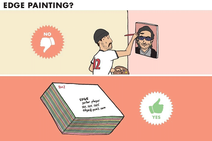
The right finish can turn an ordinary business card into something truly unique. Print Peppermint offers luxurious finishes such as foil stamping, die-cutting, embossing, letterpress, edge painting and more. Depending on your choice, the full CMYK color spectrum is at your disposal.
Create Your Own Card Design
Using Print Peppermint’s free business card maker, you can start with a blank canvas and create your own design. And you can do it all from the comfort of your web browser.
Or, Hire a Graphic Designer
Want your business cards to have a fully-professional look? Put Print Peppermint’s design team on the job. They can help bring your ideas to life. And you’re not limited to business cards alone. Hire their pros to design logos, t-shirts, stickers and a whole lot more.
Quality Assurance
Print Peppermint cares about each and every order. That’s why they take the time to hand proof every single one. Big orders, small orders – they’re all treated with great attention to detail. And, you can rest assured that your order will be done right, backed by a 100% money-back guarantee.
An Online Printer You Can Trust
Over the past 7+ years, Print Peppermint has gained experience through completing thousands of projects. They have worked with 10,000+ companies of all sizes and earned a reputation as a refreshingly creative and reliable print shop.
In that time, they’ve had the opportunity to collaborate with some pretty big names. Companies such as Google, Vice, Wendy’s, Geico and Grammarly have placed their trust in Print Peppermint – so can you.
The team also likes to share knowledge through their design blog. In it, you’ll find product guides, inspiration, along with business tips and assorted off-the-wall topics. It’s a great place to learn and get ideas for your next project.
And, if you’re unsure of the right paper, finish or design – they’ll be glad to help. Just start an online chat, call or send an email. The same goes for getting a quote on a custom project.
Large orders are welcome, with awesome group discounts for businesses and organizations with multiple employees.
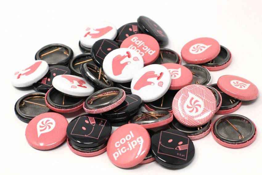
Looking for something beyond business cards? Print Peppermint also offers a wide selection of marketing materials. Get your banners, buttons, stickers, magnets, greeting cards and more – all from one trusted source.
Get a Better Business Card
If you’re in the market for a completely stunning, one-of-a-kind business card, head on over to Print Peppermint. Their meticulous approach separates them from the competition – and their business cards will do the same for your business.
Your website isn’t set in stone, so you shouldn’t treat it like it is.
Technology and the internet change quickly, and often. You should update your website regularly to keep up with the times.
Having an up-to-date and optimized site creates a great user experience, and will likely encourage people to spend more time on your site’s pages.
This contributes to your search engine optimization, or SEO, because Google values good user experience.
If people are spending a lot of time on your website, it’s also a signal to Google that you have something they want, so you’ll likely see a bump in your rankings.
Higher rankings equal more of that coveted web traffic.
But what EXACTLY should you do to update your website’s content?
I’ll tell you…after this intro!
Ok, now let’s get to updating content on your website.
Here are five tips on how to update content on your website.
Before you actually start making updates to your site, check your SEO.
You’ve probably spent a lot of time putting content together, and that time would be totally wasted if people couldn’t find your site in search engines.
There are many, many factors that determine where your site appears in the search engine results pages or SERPs.
To check your SEO, you’ll want to do an SEO audit of your site, which will tell you what factors you’re hitting and which ones could use some improvement.
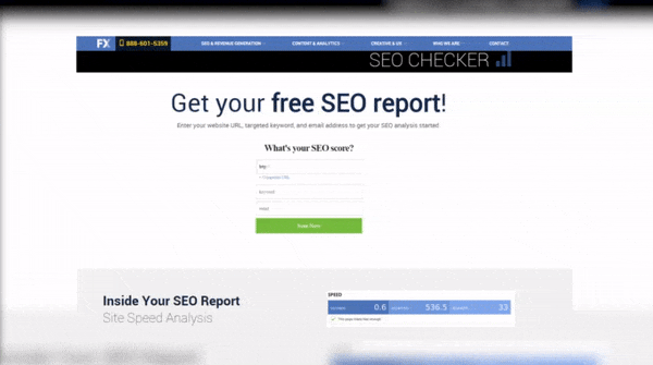
You can use our free SEO checker to get a report of what your site is doing right and what your site is doing wrong for your SEO.
Some SEO factors you should be looking for when updating your website content are:
Keywords: Are you using relevant keywords for your business throughout the headings and content of your pages, and in your pages’ title tags and meta descriptions?
Page speed: Is your site loading quickly on desktop and mobile devices?
Mobile-optimization:Does your site work smoothly on mobile devices?
Site security:Do you have an SSL certificate installed to protect user data?
Broken links:Do all the links on your site work, and are you redirecting old links to new ones?
Again, that list was far from exhaustive. If you want a thorough analysis of your site’s SEO, you should consider partnering with SEO experts.
That leads us to number two.
Look at what your competitors are doing with their websites before updating your own website.
I know, I know. It’s another thing to do before you even touch your website, but it’s important to do a thorough analysis of the competitive landscape before making any decisions.
This also ties in with your SEO audit.
Look at the top results for the keywords you want to target and see what the top pages are doing to get those coveted spots. Are they using their keywords in their headings? Do they have any multimedia elements?
Take a look at the content as a whole on their website. Is there anything your competitor is doing that you can do better? Can you make a video or write a lengthy piece about a topic that will outrank theirs?
Ok! Moving on to number three.
Add some multimedia elements to your site when you’re updating your website content.
This tip is two-fold.
Multimedia elements like photos, graphics, and videos look great on a website and can break up any text-heavy areas of your site to really engage viewers.
Pages with longer pieces of content also tend to do well in search engines, but a block of 1200 words or more can be hard to follow.
If you use multimedia elements in between text, you’re giving readers a visual break and encouraging them to stay on the page longer.
When you’re adding multimedia elements, however, it’s best practice to compress any images and embed videos from a separate hosting platform.
Adding large files to your site can slow it down, which creates a less-than-optimal user experience and hurts your SEO.
Kraken is a great (and free) tool for compressing images, while video hosting platforms like YouTube or Wistia easily generate links so you can embed them in a snap.
All right, so you’ve got your multimedia ready to go, let’s talk about number four.
Test different changes on your website.
When you’re updating content on your website, you don’t have to make changes blindly.
You can test changes to your website to see which resonates more with your visitors.
Tools like Google Optimize and Optimizely allow you to experiment with different elements of your website.
Your changes can be small but still have an impact, like tweaking the copy ever so slightly on your homepage or adding a call to action next to a pricing table.
That takes us to number five.
Refresh old content and design on your website.
If you have a lot of content on your website, it’s definitely worth taking some time to revisit the old and make it look brand new.
Say you’re an accountant and you wrote a popular blog post a few years ago about how to fill out a certain tax form. A few years later, some parts of that tax form change.
Instead of creating an entirely new post, it would save you time to go back and tweak the parts of that old post that aren’t relevant anymore, and then you can re-share it on Facebook, Twitter, or wherever else you might get content to your audience.
The same goes for content using any statistics. After a year or two, the numbers might change, so it would definitely be helpful to make sure your website content is as accurate as possible.
You should also try to keep your website looking modern. Web design has changed dramatically over the last decade, so it’s important your website doesn’t look like it’s stuck in the early 2000s.
So you know what to change, but how often should you update content on your website?
Well, there’s not really a hard answer to that.
It all depends on your internal resources, your budget if you’re working with a team of web specialists, and industry and web updates.
The general consensus for overall site redesigns is every few years, but you should keep track of industry trends to make sure your site can compete with other sites out there. Refreshing your site’s content doesn’t have to be that extensive, either.
For content, some pieces might be relevant for years without you having to make any major changes. But it’s very likely you’ll have to refresh most of the content on your website more often than every few years.
Keep track of your pages and their rankings in a spreadsheet, and see which ones are falling in the SERPs, which are flatlining, and which are doing well.
It might be helpful to set a weekly or monthly schedule to check in on your rankings and make updates to your content’s SEO as needed.
But ok, all of this is easier said than done. Updating your website on a regular basis requires a time commitment, so if you’re already worried you won’t be able to keep up, contact some web professionals.
And that concludes this video on how to update content on your website!
Don’t forget to hit that YouTube subscribe button. We post videos on our YouTube channel every Monday, so you definitely don’t want to miss out on the latest in digital marketing.
And check out our blog for even more digital marketing content from our team of experts!