As a small or midsize business (SMB), your company website is often the first touchpoint for potential clients — and you want it to make a great first impression.
The secret to hitting home with your audience is to have a sophisticated and lively website design that’s aesthetically pleasing and provides great user experience (UX).
Need some company website examples to inspire your design? We made this corporate website mood board just for you!
With minimalist designs and fun interactive elements like playful cursors and dynamic scrolling, these 20 company website designs will get your creative juices flowing!
And if you’re excited to launch your own custom website, WebFX offers web design plans, tailored to your business goals! With an award-winning portfolio of over 1000 stunning websites, we know our way around effective web design.
Contact us online or call us at 888-601-5359 to start building your dream website!
![]()
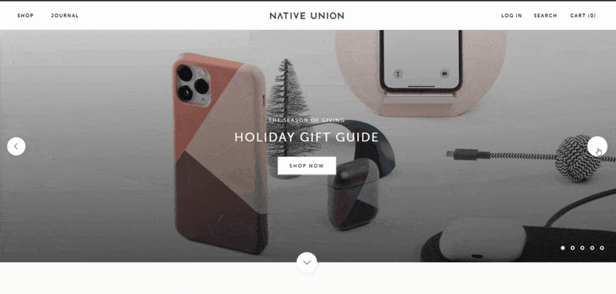
First on the list of inspiring company website examples — Native Union offers tech accessories with a bit of fashion flair.
Why we love it?
- Effective calls-to-action (CTAs) with fun hover animations
- Full-screen header with a carrousel of engaging pictures
- Classy sans-serif type promotes online readability
- Great use of whitespace balances design elements and organizes content
- Fresh organization and easy-to-use navigation menus
![]()
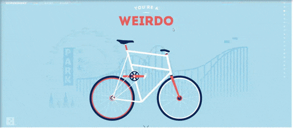
Cyclemon designs illustrative posters of bicycles with a perfect amount of personalization.
Why we love it?
- Fun colors match the brand’s personality
- Stunning illustration style
- Informative website copy
- Exciting, dynamic scrolling with a 3D effect
- Engaging “know more” teaser video keeps people on the site and encourages them to learn more
![]()
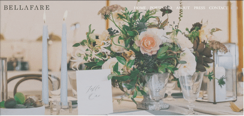
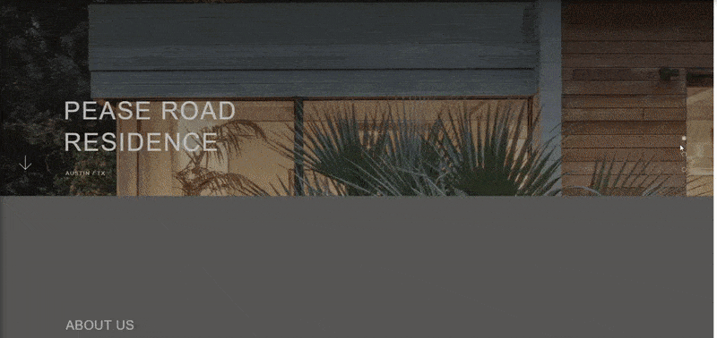
Next on our list of company website examples — Bellefare is a wedding and event architect, designer, and producer.
Why we love it?
- Full-screen slideshow header
- Simple navigation menu with classy hover animations
- Portfolio of images showcases work
- Elegant “About” page with black-and-white photos
- Fun “Press” page adds social proof
![]()
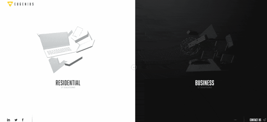
Next on our list of best 2020 corporate website examples is Eugenius — a company that simplifies IT for residential and business clients.
Why we love it?
- Innovative, video game-like design
- Beautiful color contrast
- Captivating loading animation
- Exhilarating, playful cursor hover animations
- Unique navigation sparks interest and makes visitors want to explore the site
- Ambient music with an off switch
![]()
Andersson / Wise designs sleek architecture for residential and commercial use.
Why we love it?
- Cool-toned color pallet matches the industrial nature of the brand
- Pleasant flow and white space
- Beautiful, full-screen image headers with simple animation
- Dynamic scrolling design and overlapping text
- Project portfolio in an animated, scroll-triggered grid
![]()
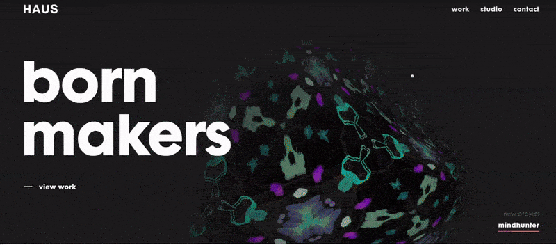
HAUS — our next corporate website example — is an award-winning design studio and full-service creative and technology partner.
Why we love it?
- Entertaining and playful cursor
- Satisfying color, wave, and hover animations
- Fun, chunky type
- Innovative side scroll with background animation
- Engaging videography
![]()
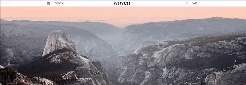
Woven Magazine celebrates artists, designers, and entrepreneurs while exploring the history of design through travel.
Why we love it?
- Smooth navigation allows visitors to quickly find info they need
- Amazing use of white space adds room to breathe
- Crisp, structural layout
- Engaging and effective use of images
- Satisfying videos explore creativity and design
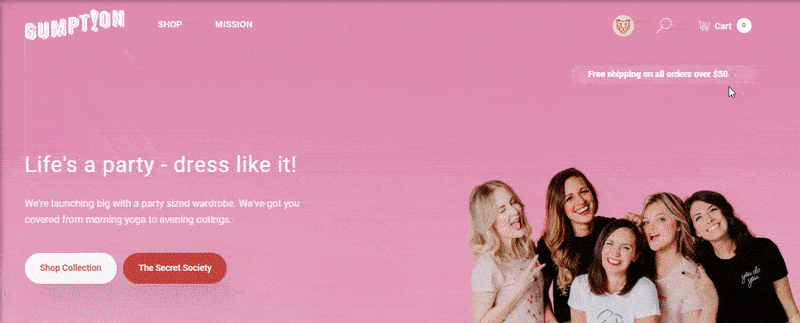
8. Gumption
![]()
Gumption is an ecommerce store that sells women’s accessories and clothing.
Why we love it?
- Bubbly color pallet and design
- Fun hover animations
- Ecommerce catalog promotes transactions
- Appealing “Secret Society” offers discount products protected by passwords, which makes users feel like they’re a part of something special
- Easy-to-use navigation menus
![]()
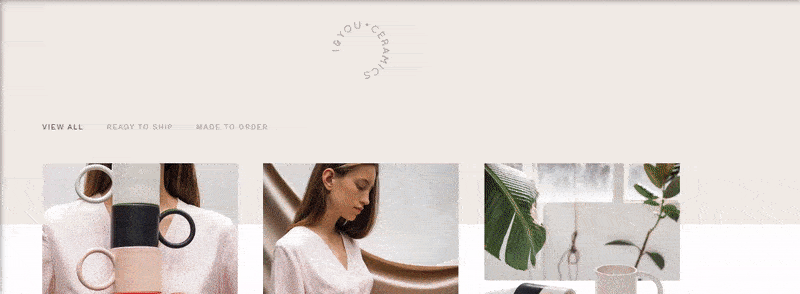
I&You Ceramics is an ecommerce store that offers a collection of handmade modern ceramics.
Why we love it?
- Satisfying pastel color scheme and design
- Classy white space with beautiful pictures
- Minimalistic asymmetrical grids
- Intuitive UX and easy access to gallery and shop
- Smooth checkout process
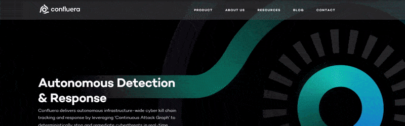
10. Confluera
![]()
Confluera works to protect businesses from cyber attacks in real-time — and we’re inspired by this company’s website design.
Why we love it?
- Tasteful gradient color scheme
- Exciting abstract 2D and 3D illustrations scream “cyber”
- Great about us page with hover animations and social media links
- Simple navigation menu with resources and blog access
- Sleek white space and type
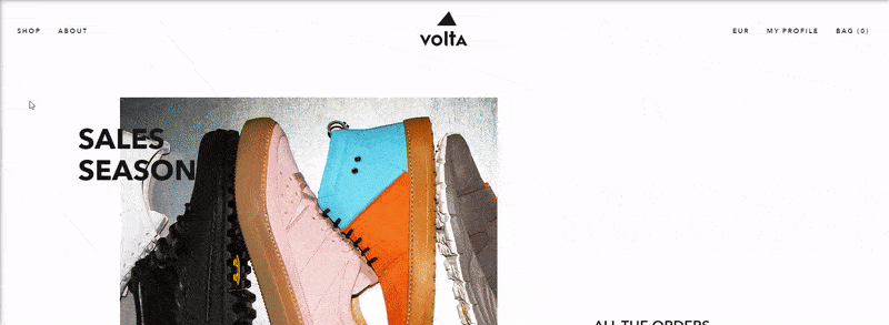
![]()
Volta Footwear provides customers with contemporary shoes that withstand the wear and tear of time.
Why we love it?
- Engaging images showcase footwear designs
- Fun catalog design allows users to see multiple product views
- Soothing dynamic scrolling
- Great use of white space
- Elegant, minimalist grid layout
![]()
Ditto is a virtual try-on and frame recommendation technology for eyewear retailers.
Why we love it?
- Satisfying design layout with text set to the left for easy reading
- Elegant photos clearly depict how the technology works
- Well-employed white space
- Entertaining, grid-breaking layout
- Innovative and thrilling dynamic scrolling
![]()
The next company website example, Hello Monday offers digital ideas, products, and services.
Why we love it?
- Fun and engaging header animation design
- Innovative, full-screen navigation menu animation
- Entertaining, playful cursors and dynamic scrolling
- Engaging image animation and gifs
- Simplistic illustration style
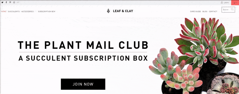
![]()
Leaf & Clay is a beautiful ecommerce shop that offers monthly subscription boxes for succulents.
Why we love it?
- Creative catalog lets visitors easily view products
- Fun and captivating images of beautiful succulents
- Easy-to-use navigation menu with social media links
- Engaging white space
- Stylish sans-serif type
![]()
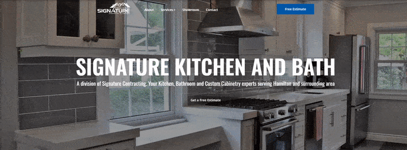
Our next corporate website example, Signature Kitchen and Bath creates custom cabinetry for kitchens and bathrooms.
Why we love it?
- Clean layout
- Fun, animated three-image slideshow header
- Detailed content works great for search engine optimization (SEO)
- Pleasant, overlapping elements and tasteful hover animations
- Simple, easy-to-use navigation menu
AQSystem sells weather-proof solar devices to check wind conditions.
Why we love it?
- Great white space
- Overlapping elements for a fresh twist
- Interactive images with animation
- Slick slideshow shows off products in several environments
- Navy blue color scheme matches the brand’s personality and expertise
![]()
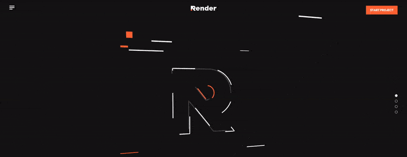
Render is a video production studio specializing in content for streaming, and it’s next on our company website example list.
Why we love it?
- Fun, full-screen animations
- Stylish geometric design
- Satisfying color pallet that’s great for brand association
- Exciting dynamic scrolling and hover animations
- Engaging introductory video
![]()
Court & Rowe sells women’s clothing with an old-sport style.
Why we love it?
- Tasteful, full-screen video header
- Great catalog and shopping cart system for max buying power
- Clean, fresh design
- Warm pastel color pallet for an old-time feel
- Great use of overlapping images and white space
![]()
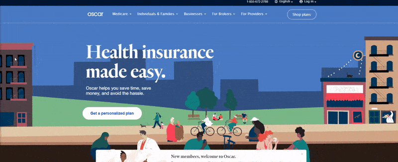
Our next company website example is Oscar Health Insurance — a health insurance company centered around the patient.
Why we love it?
- Bouncy color pallet
- Bubbly illustrations
- Playful design and type
- Great use of overlapping elements
- Pleasant, scroll-triggered animations
- Nice hover animations for buttons
![]()
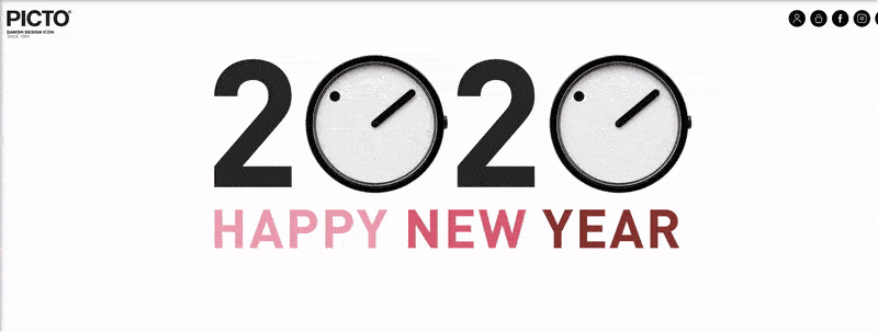
Our final company website example is Picto Watches — a Danish design icon that specializes in building minimalist watches for men and women.
Why we love it?
- Sleek grid layout
- Engaging hover navigation menu helps visitors find the info they need
- Beautiful header images
- Effective use of white space
- Individual pages with vertical image scrolling to showcase products
Create a world-class company website with WebFX!
Ready to get started with your own company website?
Check out our fresh and exciting web design plans. You can use our web design calculator or get a free quote.
For rapid web designs, take a look at our exclusive RainmakerFX! We’ll make you a corporate-ready website in 30 days.
Contact us online or call us at 888-601-5359 for a custom business design for your website.
The post 20 Company Website Designs to Inspire Your Small Business appeared first on WebFX Blog.
Package:
Summary:
Lookup bank issuer number data using BinTable API
Groups:
Author:
Description:
This class can lookup bank issuer number data using BinTable API...
Read more at https://www.phpclasses.org/package/11533-PHP-Lookup-bank-issuer-number-data-using-BinTable-API.html#2020-02-14-06:15:23

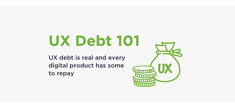
UX Debt 101 – Learn what UX Debt is, how to identify it and how to resolve it.
10 Fantastic Podcasts for UX Designers for 2020 – Stay in the know with these podcasts aimed at UX designers.

Crafting a Cutout Collage Layout with CSS Grid and Clip-path – Learn the secrets to creating this incredible effect with CSS.

Octomments – A tool that enables the use of GitHub issues as a comment system.
Design systems hub – A collection of best practices for…you guessed it: Design systems.
Creating a Custom User Role in WordPress – Custom user roles can provide just the capabilities your users actually need.

Stacking Cards Effect – Learn how to create a stacking cards effect with CSS and Intersection Observer API.

How I recreated a Polaroid camera with CSS gradients only – A look at creating physical objects with a bit of CSS.

Looking Outside of Web Design for Inspiration – Want to create something truly original? Look to areas outside of web design.

Light and dark themed SVG favicon using the CSS prefers-color-scheme media feature – Load a favicon based on the browser’s color scheme.
Glitch Art Generator – Use this online tool to create compelling glitch effects for your projects.

Dot Matrix – Generate a dot matrix screen with animated movements based on mouse/touch events.

Avatar Library – Create a unique avatar illustration using the free Sketch App or Figma library.

25 Best Free Corporate Business Flyer Templates – Get your point across to customers with these stunning flyers.

Eye-Pop Vectors ® – Spice up your projects with these amazingly hand-crafted and open-source vector illustrations.

Neumorphism.io – A tool for creating Soft-UI CSS code.
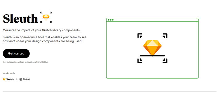
Sleuth – An open-source tool that enables your team to see how and where your design components are being used.
50 Free Wireframe Templates for Mobile, Web and UX Design – A collection of templates that will get your projects off to a quick start.

The post Weekly News for Designers № 527 appeared first on Speckyboy Design Magazine.
Package:
Summary:
Automate the distribution file archive creation
Groups:
Author:
Description:
This class can be used to automate the distribution file archive creation...
Read more at https://www.phpclasses.org/package/11532-PHP-Automate-the-distribution-file-archive-creation.html#2020-02-14-00:00:48

Package:
Summary:
Automate the distribution file archive creation
Groups:
Author:
Description:
This class can be used to automate the distribution file archive creation...
Read more at https://www.phpclasses.org/package/11532-PHP-Automate-the-distribution-file-archive-creation.html#2020-02-13-23:59:37

Package:
Summary:
Cache a script output to avoid running it again
Groups:
Author:
Description:
This package can cache a script output to avoid running it again...
Read more at https://www.phpclasses.org/package/11531-PHP-Cache-a-script-output-to-avoid-running-it-again.html

Have you ever looked through design books or online publications, keeping up to date on what’s happening in the industry, when you happen upon a bunch of work that’s leaps and bounds more creative and technically proficient than anything you’ve done so far?
I don’t mean a little bit better – I’m talking about work in a completely different stratosphere of good.
I know I have. More times than I’d care to admit just now. But let’s stop to consider for a minute why this happens. You’re a creative person. You create for a living – so why is it that your work seems to hit a creative ‘glass ceiling’ every so often, and your peers seem like they’re outpacing you by light years?
I am going to explore some of the reasons why designers can hit creative stalemates and what can be done to get past their limited design skills.
Unlimited Downloads: 49,000+ Print Design Templates
Brochures, Business Cards, Resumes, Documents, Powerpoint & Keynote Templates, Mockups & much, much more!
You Keep Looking At The Same Stuff
This happens in every creative discipline, from design to fine art to writing to music. Creative people tend to look at a lot of creative work they like, and they tend to avoid work they dislike or don’t understand very well.
While this is normal, it has the unfortunate side effect of making your work boring and generic. Just like a command you input into a computer, what goes in is what comes out. So if you only consume a certain type of work, that’s all you’re going to have as the basis for your creativity.
Broaden your design horizons. Read new things and look at new genres of art and design that you wouldn’t ordinarily care to. You never know where you’re going to find inspiration. Even something as bizarre as natural phenomena or old Sky Mall catalogues could spark a creative thunderstorm in your brain.

Bad Design Makes You Sad
It’s true: looking at bad design work is depressing. And when you’re sad, you’re less likely to produce good work. A few years ago, I went through a period of wondering whether I even wanted to be a designer anymore, since my work and all the work I was looking at seemed to be stuck in mediocrity.
It wasn’t until I stumbled upon a treasure trove of amazing work being put out by my peers that my enthusiasm for design returned, and I dove headfirst into a new creative project.
We humans, being social animals, tend to mimic whatever we see our fellow humans doing. If the people around you are doing boring, poorly made, uninspiring work, you’re not only going to start to adopt the mentality that design is boring, you’re also going to start mimicking that kind of work. Don’t get caught in that trap. Seek out great work and be inspired by it!

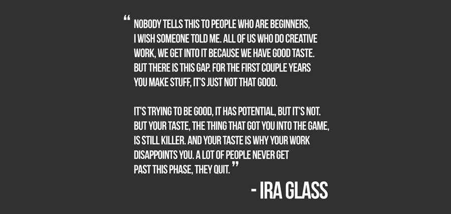
You Have Bad Taste
Ira Glass famously remarked that “your taste is why your work disappoints you.” I would argue that it’s worse if your work doesn’t disappoint you since that would mean your taste isn’t good enough to know when your work is bad.
This is another reason why it’s so important to break out of your comfort zone and challenge yourself to look at new and different work.
This applies even if what you find next is worse than whatever you’ve been looking at. That can actually be a good thing because at least now you know that there’s something worse out there. Just by finding crappier work, your taste and ability to separate good from bad have improved.
The Secret To Really Original Designs
Okay. Now that we’ve gone over some of the reasons why people run into inspiration brick walls, I’m just going to come out and tell you how to create more original designs. Ready?
The secret to originality is to do things that are completely unrelated to design. When you travel, read a book, paint, cook, play an instrument, learn a language, write a short story, or play a sport, you’re doing more than enriching your overall quality of life. You’re actually giving your brain a much-needed rest from thinking about your creative problems.
Many people think that they can simply “force their way” through a challenging design problem, but this is mostly untrue. All you’ll end up doing is wearing yourself out, and your so-called “creative block” will be no closer to being resolved. Many times, a simple break from the workstation will fire up those creative neurons and give you a flood of new ideas.
When you’re busy doing something else, it doesn’t mean that your brain has stopped thinking about your creative challenge. On the contrary, it’s still chewing it over – only now you’re busying yourself with something else and leaving it alone to really think.
By the time you come back to it, just like a download running in the background of your computer, your brain will have worked its way through the tangle and come up with a new solution.
The post Getting Past the Limitations of Your Design Skills appeared first on Speckyboy Design Magazine.
Package:
Summary:
Cache a script output to avoid running it again
Groups:
Author:
Description:
This package can cache a script output to avoid running it again...
Read more at https://www.phpclasses.org/package/11531-PHP-Cache-a-script-output-to-avoid-running-it-again.html#2020-02-12-13:34:01

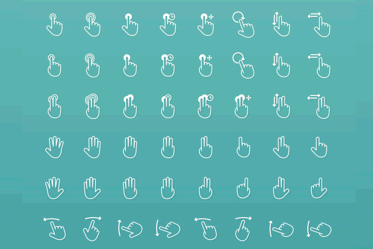
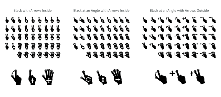
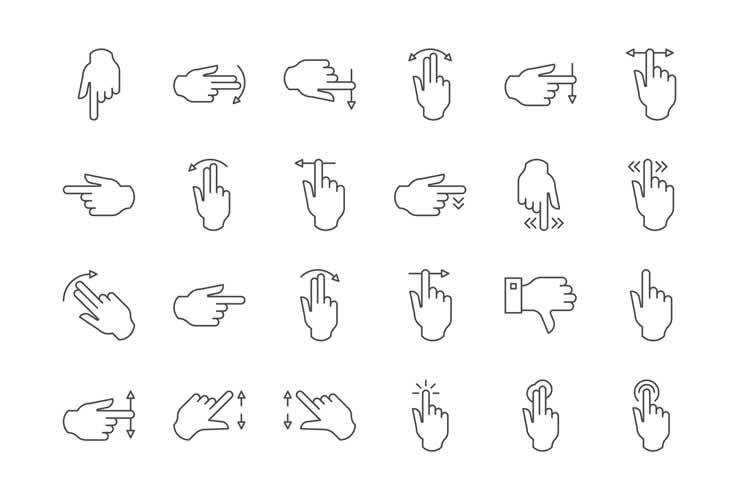
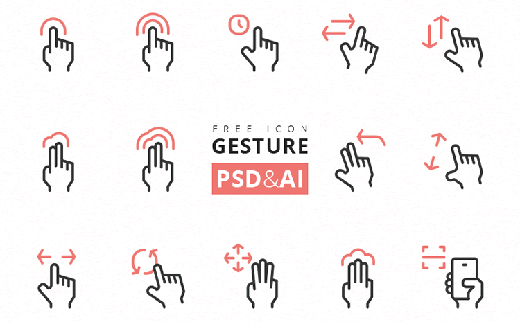
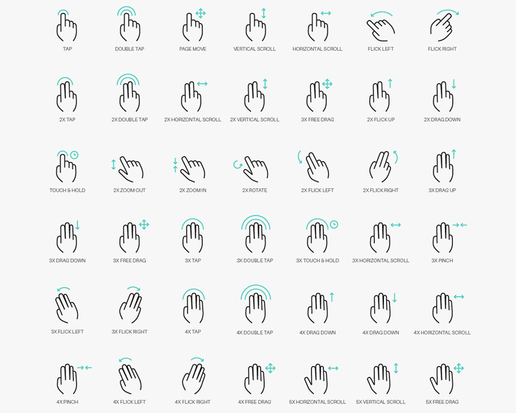
With the rapid rise in popularity of touch devices, from mobile phones and tablets to the many laptops and monitors that support touch, developers need to find a quick way of explaining the many touch-enabled interactions that add extra functionality and improve the experience and productivity of many of the latest applications to new users. Many developers use gesture icon sets, or interaction icons, to teach new users how to use their app.
In this short post, we have collected 15 free gesture icon sets for you. The gesture icons come in many different styles, sizes and, most importantly, formats. And just like all free resources, please do check the license, they can change from time-to-time.
If you’re looking for more icons, you might also like to take a look at the top 50 free icon sets for web design.
The Icon & UI Designer Toolbox
Unlimited Downloads: 1,000,000+ Icon Sets, UI Kits, Wireframe Templates, Themes, Plugins, and much more!
Touch Gestures Icons By Jeff Portaro (100 Icons, AI, EPS, CSH, PSD, PNG, SVG)
Device Gesture Icons By Envato Elements (15 Icons, AI, PSD, SVG & PNG)

Gesture Icons By Frexy (38 Icons, EPS, SVG)

Gesty By Mariusz Ostrowski (43×8 Icons, AI, CSH, SVG, EPS)
Touch Gesture Icons By Envato Elements (39 Icons, Vector SVG)
Gesture Icons By Theme Raid (50 Icons, AI)


iPhone Gestures By Julian Burford (12 Icons, AI)

iPhone Gestures By Suleiman Leadbitter (12 Icons, Sketch)


Righteous Gestures By Martin Cajzer (56 Icons, AI, PSD)

The post 15 Free Gesture Icon Sets for Mobile App Designers appeared first on Speckyboy Design Magazine.
Over the past decade, I’ve worked with WordPress on a (pretty much) daily basis. It’s my go-to solution for building websites for clients of all sizes.
And, as I’ve gained more experience with the highly-popular CMS, I’ve advocated for building WordPress themes from scratch. These days, I use a fairly barebones starter theme based on Underscores. It’s set up just the way I like it and helps me get new projects off to a fast start.
But, just like everything else in the WordPress ecosystem, there are plenty of choices in how we do things. The approach that I prefer isn’t for every developer. Nor is it always the most realistic solution for certain clients (especially those on a tight budget).
Today, I’d like to share my experiences in building a website a different way: Using a WordPress page builder plugin and a companion “blank” starter theme. I’ll fill you in on the pros and cons of the process, along with some tips for getting the most out of it. Let’s get started!
Project Background
I was approached by a longtime client who wanted a redesign of their older HTML website. They wanted the benefits that go along with using WordPress, but didn’t have the budget for a full-on custom build.
The idea of purchasing an industry-specific commercial WordPress theme was mentioned. Now, there’s nothing inherently wrong with buying a theme and throwing some content into it. In many cases it will work just fine.
But it often seems that there are added costs associated with reworking the look and/or functionality to match a client’s specifications (or, worse yet, my expectations). Even then, there’s only so much you can do without completely destroying the theme, the client’s budget, or both.
With that in mind, I began looking into an alternative. I’d recently started playing around with Beaver Builder, a popular page builder plugin for WordPress (Full disclosure: they’re not paying me to say this, it just happened to be the tool I used. There are other, similar products on the market worth considering as well.)
They include a framework theme (and a related child theme) with some of their commercial packages, which allows you to essentially build an entire website – header, footer and content – using a combination of the WordPress Customizer and page builder.
How did it work? Read on to find out…
The Starting Point
The first steps of the process are pretty familiar to anyone who’s built a site with WordPress:
- Create a fresh install of WordPress;
- Install & activate the theme;
- Install & activate the page builder plugin;
From there, you get an essentially blank slate. It’s actually not much different from what I see upon activating my own Underscores-based starter theme.
The advantage of this is that the theme doesn’t have many preconceived notions about what you want to build. This means that a designer could, in theory, create a design mockup and subsequently bring it to life. So long as they understand what the theme can and can’t do, that is.
But, as we’ll find out, there are some options for those who do want something a bit more readymade.
Using the WordPress Customizer
The WordPress Customizer is a built-in tool that allows you to tweak various theme-related settings and see the results in real time. It was meant to bring a universal UI to theme setup, as opposed to the bespoke options panels many themes have implemented.
Here, the Beaver Builder Theme taps into the customizer and provides plenty of options. Among the highlights:
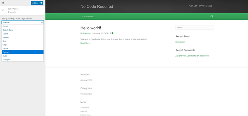
Presets
Choose from a selection of premade color schemes. These styles can be superseded via other Customizer options or CSS.
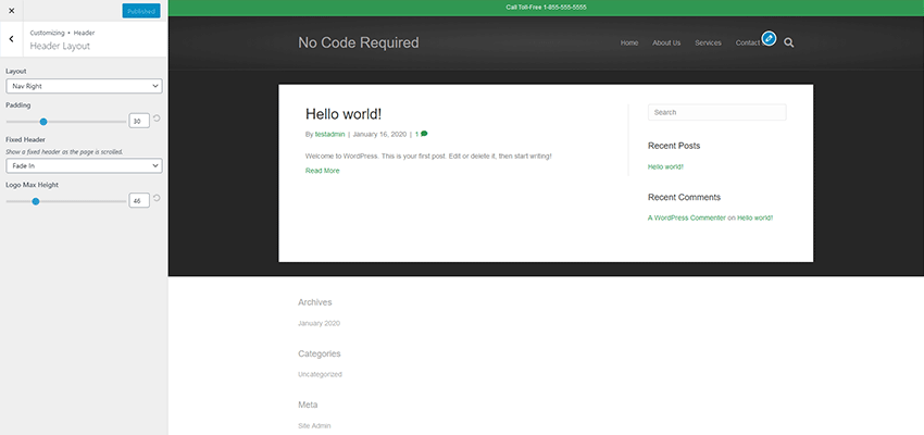
Header
There are a variety of settings here for layout, logo placement and navigation. The option for a “sticky” header is included, which is a nice touch. The layouts cover several common scenarios.
Content
Pick background colors and page layouts for your blog, individual post, post archive and WooCommerce templates.
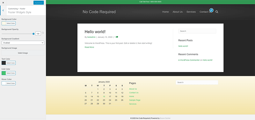
Footer
The site’s footer can be styled and widgets added to handle various types of content. By default, there are some limitations here. For example, I wanted to place built-in social media profile links up into the Footer Widget area (they are set to show up below the widgets) – which isn’t supported. Thankfully, a code snippet I found made it possible via a WordPress shortcode.
Code
If you want to inject specific CSS, JavaScript or other code into your site, you can do so here. This could be of use if you want to add Google Analytics or pixel tracking code.
The Verdict
In all, the Customizer had enough options to help me create the basic look and layout of my website. It’s not quite as robust as what I’m used to with a custom-built theme, but that’s to be expected. The whole point here is for rapid development and to avoid code.
The Beaver Builder Theme did just that, as I was able to get things set up the way I wanted within a half hour or so. Any shortcomings are kind of the price you pay with a lower budget project.
Building Pages
I won’t spend a ton of time going into detail here – for two reasons. First, my needs for the site’s various pages weren’t very complicated. Second, the page builder itself is sort of secondary to the theme. But there are still some items worth mentioning.
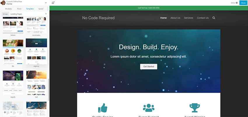
The home page was built rather quickly – and not from scratch. My client liked one of Beaver Builder’s prebuilt page templates. Setting it up was just a matter of importing the template and then hacking away to customize the things we wanted to keep and remove the things we didn’t. In addition, there were a few extra modules to add in via page builder. Features such as post carousels and on-scroll animation added some personality.
Secondary pages were extremely simple. I created a page title module that used a photo background and saved it for repeated use across other pages. From there, it was just a matter of adding the rest of the content and formatting it nicely.
The one sticking point I had was integrating Gravity Forms. Since the page builder uses neither the WordPress Gutenberg block editor nor the Classic Editor (both of which the popular form plugin supports), I had to manually place a shortcode into a Text Editor module. This wasn’t a huge problem, but might be tough for a client who is unfamiliar with the process.
The Verdict
Page building went pretty much as expected. Ease of use is the selling point of these plugins and this one fit the bill. Various modules were easy to drag-and-drop onto the page, and multicolumn layouts were simple to configure. Everything was responsive and could also be customized specifically based on screen size.
The number of modules included were solid and covered virtually everything the project required. If some more fancy features were needed, there are a number of available third-party add-on packs that can help.
Overall Impressions
In all, I have to say that this was a better experience than those I’ve typically had with readymade themes. The fact that I could start from something basic and build up to suit the project’s needs was more in line with my preferred workflow.
Truth be told, I did have to implement a few extra bits of code to achieve everything I wanted. The aforementioned shortcode for social media profile links and a bit of extra JavaScript helped me round out the site. Both were queued up via the child theme’s functions.php file, allowing them to avoid being overwritten during any future theme updates.
I found this to be a viable option for simple projects. There are some scenarios, like the use of custom fields or conditional content, where it may still make more sense to go with a full-on custom theme. But those types of features are often for bigger budgets anyway.
So, if you’re a developer who wants to quickly develop a thrifty new website – but without the trappings of a third-party theme, this may be the way to go. Just recognize that you’ll have to live within the parameters of what’s there. Otherwise, it will be time to fire up that code editor.
* Note: The images in this post are for illustrative purposes only – they don’t reflect the actual project described.
The post Thoughts on Building a WordPress Website from Scratch (Without Code) appeared first on Speckyboy Design Magazine.