PHP Order of Magnitude Prefix
Read more at https://www.phpclasses.org/package/11701-PHP-Get-the-name-of-the-prefix-for-a-measure-value.html#2020-06-28-15:55:10
There’s a reason why so many of us look forward to summer. It provides an opportunity to get outdoors and away from our desks. Then there’s the chance to spend more time with friends and family. As they say, adventure is out there.
Even better is that you don’t need that traditional vacation to get out. Summer can be a blast just hanging out in your backyard or a local park.
In that spirit, we bring you a collection of code snippets that bring a little bit of summer to your screen. May it remind you of warm, lazy days – with your phone turned off, of course.
Watching the kids play in the pool is always fun (until their behavior makes you put down your umbrella drink, that is). This pure CSS rubber ducky swimming amongst the waves is a great reminder of gentle fun.
See the Pen Rubber Ducky goes for a Swim by Heather Taylor
Speaking of tasty beverages, check out this tasty citrus number. What makes this one so special is the fact that it uses a single div element. All of that in one container – plus a slowly-floating ice cube. Sweet!
See the Pen a single div challange by Brahim Baif
One of the most magical experiences of summer is attending a fair. Whether it’s big or small, there’s just something special about being there – especially at night. This slick animated scene shows a Ferris wheel spinning at sunset with balloons floating about. And, clicking on the screen adds more balloons.
See the Pen farewell – pure JavaScript by Toshiya Marukubo
If you grew up back in the day, you know the importance of having a boombox. Not as efficient as a smartphone, but efficiency wasn’t the point. You wanted to blast those tunes so that everybody knew that you had arrived. This faithful recreation offers JavaScript animation and will even play music (tune your speakers accordingly – it’s loud). Even the color scheme screams retro.
See the Pen Music by Ricardo Oliva Alonso
A spontaneous road trip – they can be so much fun. Pile family and friends into the car and see the nature fly by your window. That’s exactly what this beautiful scene mimics. It utilizes GSAP animation to take you through a mountain road as day turns into night.
See the Pen Roadtrip Sunset by Alex Trost
What could be more inviting that a swimming pool on a hot day? This oasis features animated SVGs, complete with rippling water. Take a closer look and the simulated depth in the image is just incredible.
See the Pen Pool Ripple by Sarah Drasner
Seeing nature in its own habitat is one of summer’s true pleasures. Here, we have a lovely forest on a sunny day. As if that weren’t enough, there’s a steady stream of butterflies fluttering away. Want to know a cool secret? The sun and ladybug are emoji.
See the Pen CSS Butterflies by Scott Weaver
Sure, daytime nature is fun. But the real summer fun starts when the sun goes down. That’s when the fireflies bring us a free lightshow. The beauty of this HTML5 canvas animation is in both its smooth flow and the fact that it doesn’t overwhelm with special effects.
See the Pen Fireflies by Michal
Whether you’re chilling out by the pool or stuck in your office, we hope that this collection of summer code snippets brought a smile to your face. Not only that, hopefully, they also pique your interest in learning more about the technologies included. The likes of CSS and JavaScript can bring you back to warmth all year round. And, oh yeah, they’re useful for other things as well.
Need more summer? Check out our CodePen collection for additional snippets!
The post 8 Animated CSS & JavaScript Code Snippets That Celebrate Summer appeared first on Speckyboy Design Magazine.
If you want to give your photography a little bit more impact, turning them into sketches could be a good approach. Doing this stands to look fantastic and also give a hands-on appeal to your work.
How can you accomplish this? Why, through Photoshop actions, of course. What you’ll find here is a solid resource of sketch effects that can be added to your photos via Photoshop actions. These actions take the guesswork out of turning a photo into a drawing, while paying heed to the importance of light and shadow.
So you don’t have to go it alone here, we’ve compiled a collection of incredibly useful ketching Photoshop actions that aim to streamline your workflow and aid in bringing new effects to your photography post-production.
First on our list is this set of Pencil Sketch Photoshop Actions. It actually includes 15 different actions that you can use to turn portraits into sketches. It comes with instructions, is non-destructive, has editable layers, and can be used for photos that will be used on both the web and print media.

The Da Vinci Sketch Photoshop action immediately turns any photo you want into a sepia-toned illustration that looks like it came out of Da Vinci’s sketchbooks. It works best with portraits and objects and creates finished photos that are layered, that can be customized, and more. It also comes with 5 pen color tones and 10 color presets.

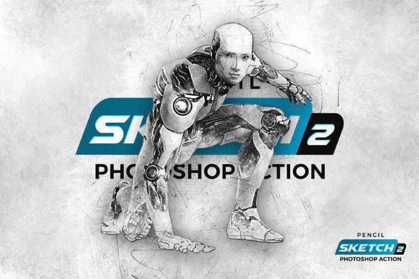
The Pencil Sketch 2 Photoshop Action is another great way to turn a photograph into a piece of digital art quickly. You can edit the individual layers and use it for a wide variety of purposes. This action comes with instructions as well in case you ever get stuck.
Another option is the Architecture Sketch Art Photoshop Actions. This set comes with an instruction manual, full layer control, and is non-destructive. It works for a wide range of photos like landscapes and portraits. This one-click action can be used for both the web and for print as well.

Here’s another interesting choice to consider. The Pen Sketch Photoshop Action gives your photos the look of a hand drawn sketch. What makes this stand out is how the action creates a cross hatch pattern for shading. It includes well-organized layers and full instructions.

Another action you may consider is the Digital Sketch Photoshop Action. This one creates a digital sketch effect when added to your photos. It works best with portraits and has a softness to it that’s really compelling. It comes with 10 color effects as well.

Here’s another interesting choice for creating a sketch from a photograph. This one can be implemented with a single click and the end result is lovely to look at. If you want to play with the available settings, however, you can do that, too. It has editable layers and can be used on a wide range of photos.

The Sketch Art Photoshop Actions work to create a soft sketch appearance on your photos. The end result is a realistic-looking sketch that takes many cues from your original image. Even better, you original image layer remains unscathed, so you can always revert to it if need be. It comes with an instructional PDF as well.

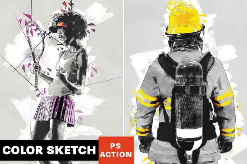
This action really sets itself apart from the pack. The Color Sketch Photoshop Action works to create a professional-looking, colorful sketch from your photographs. It accomplishes this using hatching and abstract effects. It has editable layers and colors and comes with a video tutorial for easier navigation.
The Archi Sketch Photoshop Action is ideal for architectural photos. It turns any image of yours into a professional-looking architectural sketch. It has 10 color effects, includes well-organized layers, and settings that you can adjust to get the precise look you want.

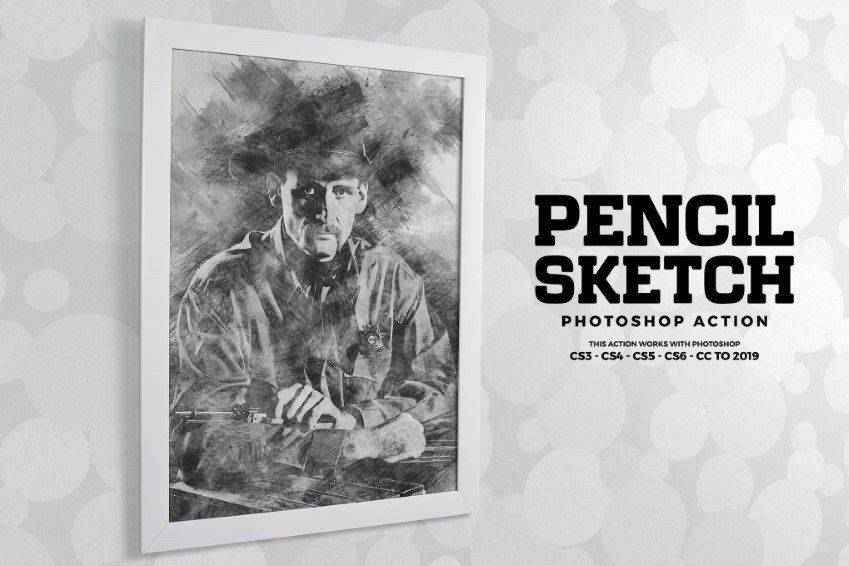
The High-Quality Pencil Sketch Photoshop Action is another easy way to create digital artwork from photos with a single click. It has a multitude of layers you can adjust and tweak. It comes with full instructions. And in the end, you’ll wind up with a photo that looks as though it has cross-hatching, blending, and many more features of hand-drawn art.
Portretum Sketch Drawing Photoshop Action is ideal for adding some flair to your portrait photography. This is a one-click action that can be applied to any portrait and comes with the action file, brushes, 10 color presets, graphic elements, and a user’s guide.
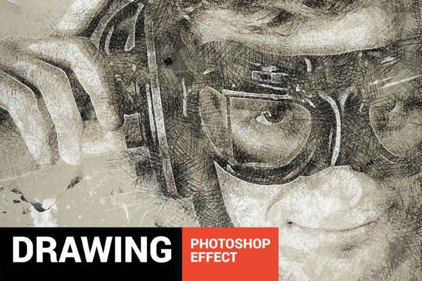
The Sketch Portrait Photoshop Actions provide a sleek hand-drawn effect. The resulting image has a glossy look while still being realistic. It includes well-organized layers, and serves as an excellent time saver. It works best with black-and-white photos.

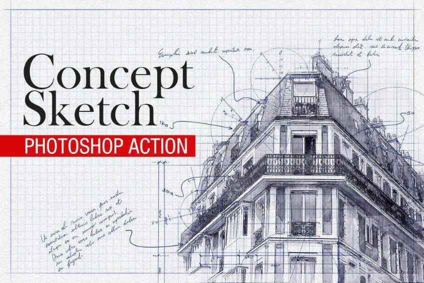
The Concept Sketch Photoshop Action is an engineer or architect’s delight! It makes it easy to turn any architectural drawing into a professional-looking sketch. This could be used for building interiors, exteriors, as well as product designs. It comes with hand-drawn brushes and textures, including 12 brushes and 18 patterns.
The Pencil Sketch Photoshop Action can turn any portrait-style photo into a digital piece of art that appears as though it was hand drawn. It works on objects as well and you can select from 10 color presets. Everything can be applied with one click and the end result is fully layered and non-destructive.

You might also want to consider the Sketch Photoshop Action Presets. Apply this to one spot on your photo then play the action. It’ll turn that area into a sketch with all the subtle shading and details of a real hand-drawn piece of art. This action has fully editable layers as well.

You might also wish to try out the Sketch Art Smart Photoshop Action. With well-organized layers, you can customize this action to suit your specific needs and make selections regarding background, color, and more. It comes with 10 brushes, 5 textures, and a quick start-up guide.

Here’s another great option if you’re looking to add some flair to architectural photos. This action turns your building photos into sketches with just a single click. It offers 10 styles, relies on AI for best results, and is fully customizable to suit your specific needs. It even has an emphasize greenery action for calling out foliage in your original photo.

This is a really interesting option on our list. The Cartoonize Photoshop Action works by turning any portrait-style photo into a digital painting. The end result is an image that looks like a cartoon and you can accomplish this with a single click. you can use the resulting image on the web and in print. Plus, the action is non-destructive.

Last on our list is the Vintage Sketch Photoshop Action turns any photo into a vintage-looking sketch. The end result is a realistic-looking drawing that’s achievable with a single click. It comes with 15 color presets and a video tutorial that make it easy to get this action up and running.

And there you have it! Our list of Photoshop actions designed to turn any photo you choose into a professional looking sketch. These actions are all easy to use and stand to reduce the time you spend on photo edits substantially. We wish you the best of luck in your projects and hope you find these actions useful!
The post The 20 Best Photoshop Actions for Incredible Sketching Effects appeared first on Speckyboy Design Magazine.
Two days ago the first "Alpha" of PHP 8 was presented, and PHP 8 is scheduled to release on November 26, 2020, only 6 months from now.
Looking back, I see how previous major releases took PHP to the next levels. I personally only witnessed two of them:
&= in legacy code from time to time). In PHP 5 classes became usable, you could actually design an object-oriented architecture and not think about huge number of limitations (well, at least not as much).This release is going to be huge! There are so many RFC's already merged and still being discussed, that I can't wait to begin actually actually using it.
Let's see what's out there!
You’ve just set foot in the five-star vacation resort where you’ll be spending the next week.
The lobby smells like fresh linens, the check-in desk is easy to find, and the lighting is warm. The comfort you feel upon entering the resort makes you trust your surroundings, and the beauty makes you want to indulge in a swim — or maybe even a visit to the all-inclusive spa.
The way you feel when you enter a five-star resort is similar to the way users should feel when they enter your website. And a UX website audit can help you determine if visitors are likely to get cozy and spend some time on your site or bounce to the next best thing.
On this page, we’ll give you a UX website audit checklist to help you ensure that users get the best possible experience on your site. We’ll also talk about some ways you can perform usability testing on your website!
To have access to more content just like this, don’t forget to sign up for Revenue Weekly, our email newsletter!
We’ve got a lot to cover, so keep reading for your UX website audit checklist!
As a website owner, it’s crucial to understand UX and why performing a UX website audit is vital to the success of your online presence.
UX is an abbreviation for user experience, which refers to the visit quality users have when they view your website.
UX is important to the success of your online presence for a few reasons:
If you want to ensure that your online presence drives success for your business, a UX website audit can help.
When you perform a UX website audit, you can find the weak spots in your website design and create a game plan to improve them.
For example, a UX website audit could help expose page load issues or shed light on unsuccessful content formatting.
In the next section, we’ll provide you with a UX website audit checklist which can help you understand how to improve your site for both users and search engines.
We don't just want to tell you about the beautiful work we do.
WE WANT TO SHOW YOU
We've built over
WEBSITES IN INDUSTRIES LIKE YOURS
View Our Past WorkBelow, we’ll provide you with a UX website audit template that you can use to improve your website. During each step, be sure to take note of what you learned about your website and how you can improve it.
The first thing you notice when you walk into a five-star resort is the effortless ambiance. Everything works together to create a memorable, unique experience — from the color palette to the location of the hotel restaurant.
Your website should follow the same rule of thumb — when users enter your website, their first impression should be a positive one.
The answers to these questions can help you determine if your website has a positive “ambiance”:
These high-level questions can help you understand where to start when it comes to website improvements. After all, 94% of first impressions come from web design.
UX website audit action item: Write down your honest, overall, first impression of your website and take note of things that you didn’t like. From there, you can come up with a game plan on how to fix them.
Would you feel better walking into a hotel where there are luggage carts strewn about that lobby or one that had them nicely organized in the corner?
Luggage carts cluttering the lobby is comparable to cluttered landing pages and home pages. Whether most people enter your site through the homepage or click an ad that takes them to a landing page, it’s crucial that they’re clean and uncluttered.
Landing page definition: A landing page is where users end up when they click an ad for your products. Your home page is the “front cover” of your website.
If users land on your home page and it’s cluttered and unorganized, they could become overwhelmed and bounce from your site. The same goes for your landing pages.
And while we’re at it, we’ll also suggest that you keep your hallways and rooms clean and organized, too! Just like vacationers want a clean, tidy, and aesthetically pleasing room, site visitors want to see web pages with the same qualities.
That said, you should take the following steps to ensure that you have organized pages on your site:
UX website audit action item: Make sure that every page on your website is organized and easy to navigate.
Nothing is more frustrating than walking into a hotel and being unable to find the check-in desk. Without a check-in attendant, you won’t be able to get the keys to your room, and you likely won’t know where to go.
You can think of a check-in desk at a five-star resort as your navigation bar on your website.
Here’s why a navigation bar is so important:
Ensuring that your navigation bar acts as a front desk for your website ensures that users can find what they’re looking for without becoming frustrated. Without one, users could bounce from your site.
UX website audit action item: Place your navigation bar at the top of your website and make sure that it’s not too cluttered.
If you must wait for room service for more than a half-hour, you may be disappointed in your five-star resort. Unfortunately for websites, you have even less time to keep users happy — site visitors expect pages to load in two seconds or less, and if it doesn’t, they’ll likely bounce.
In addition to making sure your site pages load quickly, you’ll also want to make sure that you offer the best experience possible.
You can do this by:
UX website audit action item: Run page speed tests to ensure that your site loads quickly and take note of low-quality graphics that you could replace and low-quality content that you could update or rewrite.
Signage leads visitors throughout your resort, and without it, it’ll be hard for them to find common locations like the restaurant, bar, pool, arcade, gift shop, or even bathrooms.
Signage of a five-star resort compares to actionable CTAs within your website.
Just like a sign by the pool might say “Come and splash your cares away!”, CTAs on your website encourage site visitors to take specific action as well.
You should have at least two to three CTAs on every page. They could be any of the following, but are certainly not limited to our list:
These are just some of the ways you could encourage users to take the next step in the buyer journey.
UX website audit action item: Create a variety of custom CTAs that you can easily implement on a variety of pages. Think through the messaging to ensure that you encourage users to take the action that you want them to take.
Offering something unique is what makes a five-star resort (and a website) memorable. Remember that infinity pool? Or that restaurant that offered unlimited sushi platters while you were fed grapes by the bunch?
Similar to how you’d remember all of your favorite parts about a resort, users remember their favorite things about a website.
The goal of creating a website is to establish an online storefront, provide a place for you to inform users with content, and to build your brand. Depending on your website’s purpose, you may adopt one or all three of these goals.
Regardless of what you want to accomplish with your website, one of the best ways to do it is by providing something unique.
Here are a few places on your website that offer you the opportunity to blow visitors away with unique elements:
There is no limit to how creative you can be with your website — and if you need help bringing your custom design to life, we suggest hiring a professional web design and development agency, like WebFX!
UX website audit action item: Take stock in your website and make sure that you offer at least one ultra-unique element. If not, make a list of potential updates that would make your website more unique.
Similar to the way that resorts use sales numbers to ensure that they’re on track, you should do the same with your website.
During a UX website audit, one of the most critical action items is to dig into the analytics of your site. You can use a tool like Google Analytics to help.
You’ll want to look at metrics like:
These numbers can give you a well-rounded idea of areas that might need some work on your site.
For example, if your organic traffic is down, it’s a sign that you most likely need to opt for search engine optimization (SEO) services. Still, your website could also benefit from a professional UX website audit.
On the other hand, if your bounce rate is exceptionally high, it should be a red flag to take a good look at your site pages to ensure you’re not overwhelming customers and providing them with the info they expect.
If you’ve dived into Google Analytics to check your website metrics, but aren’t sure how to interpret them, WebFX can help with our Google Analytics consulting services!
UX website audit action item: Audit your website performance monthly to determine what you’re doing right and what you need to tweak. Or, hire a digital marketing agency to do it for you!
Usability testing is one of the most critical parts of your UX website audit template since it can help reveal bottlenecks in your web design. When you opt for usability testing on your website, it means that real people will interact with your website, and you’ll get to watch.
There are a few different kinds of usability testing, and they’re usually paired like this:
These kinds of usability testing refer to a test that is given by a trained researcher who guides the process. They answer user questions and ask follow-up questions.
Unmoderated UX testing is done independently without the input of a host.
Remote UX testing is done from someone’s home — either on their personal computers or over the phone.
On the other hand, in-person usability testing is completed next to a researcher or moderator so that they can physically see how participants interact with a website.
Explorative user testing takes place when participants fully immerse themselves in a website. They can give opinions about the site and give feedback on concepts and specific design elements.
Comparative user experience tests ask participants to compare two different solutions on a website and choose which they like best. This test is typically put in place when you want to compare your solution to a competitor’s.
Each strategy has its benefits, depending on what you want to accomplish.
For example, if you’re looking for instant, real-time feedback on your website’s user experience, moderated usability testing is a great option.
If you’d like to get a full-length synopsis of what users think when exploring your site, explorative usability testing could be a great option.
If you’d like to learn more about usability testing, contact WebFX.
If you feel overwhelmed by performing your own UX website audit, WebFX is here to help!
We offer website analysis services to help you understand the performance of your current site, along with website user experience analysis services, to help you understand how visitors interact with your site.
For a free quote, contact us online, or give us a call at 888-601-5359!
The post UX Website Audit: How UX Tests Can Make your Site Like a 5-Star Resort appeared first on WebFX Blog.
Following on from a PHP 8/JIT benchmark on twitter, I decided to have a look myself.
I've picked an example that I know speeds up really well when reimplementing it in C. I wrote about this RDP algorithm some time ago.
What it does is to take a line of geospatial points (lon/lat coordinates), and simplifies it. It's my go-to example to show raw algorithmic performance, which is probably the best place to use a JIT for non-trivial code. I actually use this in production.
With PHP 7.4:
$ pe 7.4dev; time php -n \
        -dzend_extension=opcache -dopcache.enable=1 -dopcache.enable_cli=1 \
        -dopcache.jit=1235 -dopcache.jit_buffer_size=64M \
        bench-rdp.php 1000
Using array (
  0 => 'RDP',
  1 => 'simplify',
)

real    0m8.778s
user    0m8.630s
sys     0m0.117s
(I realise that the opcache arguments do nothing on the command line here). This runs RDP::simplify (my PHP implementation) 1000 times in about 8 seconds.
With PHP 8.0 and JIT:
$ pe trunk; time php -n \
        -dzend_extension=opcache -dopcache.enable=1 -dopcache.enable_cli=1 \
        -dopcache.jit=1235 -dopcache.jit_buffer_size=64M \
        bench-rdp.php 1000
Using array (
  0 => 'RDP',
  1 => 'simplify',
)

real    0m4.640s
user    0m4.627s
sys     0m0.008s
It jumps from ~8.8s to ~4.6s, a reduction in time of ~4.2s (or 48%), which is pretty good.
Now if I run the same with the geospatial extension which has a C implementation.
With PHP 7.4 and the extension:
$ pe 7.4dev; time php -n -dextension=geospatial \
        -dzend_extension=opcache -dopcache.enable=1 -dopcache.enable_cli=1 \
        -dopcache.jit=1235 -dopcache.jit_buffer_size=64M bench-rdp.php 1000
Using 'rdp_simplify'

real    0m0.695s
user    0m0.675s
sys     0m0.021s
Which gives a reduction in speed compared to PHP 7.4 of ~8.1s (or 92%).
So it looks like the JIT does do some good work for something that's highly optimisable, but still nowhere near what an implementation in C could do.
The code that I used is in this Gist.
This ran on a 4th gen ThinkPad X1 Carbon, making sure my CPU was pinned at its maximum speed of 3.3Ghz. Although I've pasted only one result for each, I did run them several times with very close outcomes.
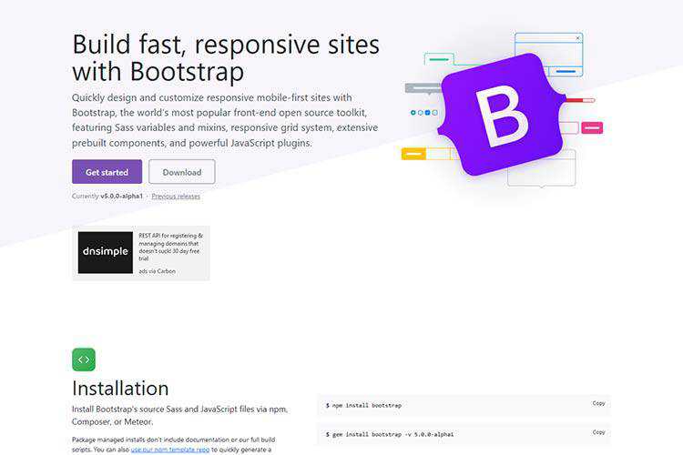
Bootstrap 5 alpha! – Take a look at what’s new with the popular CSS framework.
Working With Good and Bad Design Clients – How to determine which clients are worth the trouble and which ones you should just skip over.

Making Stagger Reveal Animations for Text – A short tutorial on how to recreate a letter stagger animation with GSAP and Splitting.js.

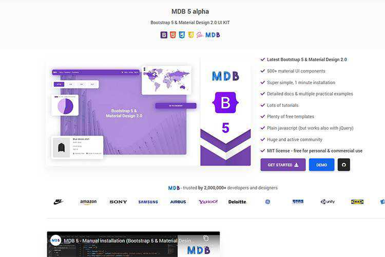
MDB 5 alpha – Use this UI kit to combine Material Design and Bootstrap 5.
Simple Design Tips for Crafting Better UI Cards – Practical techniques for making beautiful, user-friendly card UIs.

Making Time for Your Professional Learning Goals – Waiting for the “ideal” time to learn? Be proactive and make time instead.

LaTeX.css – A minimal, almost class-less CSS library which makes any website look like a LaTeX document.

Spread the Word: Beautiful Testimonial UI Examples – Make your testimonials stand out with one of these exceptional designs.
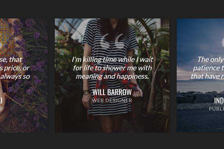
keen-slider – A library agnostic touch slider with zero dependencies – and supports browsers back to IE10?!?
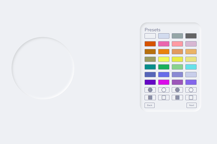
Neumorphic Generator – Create neumorphic shapes for your projects using this handy tool.
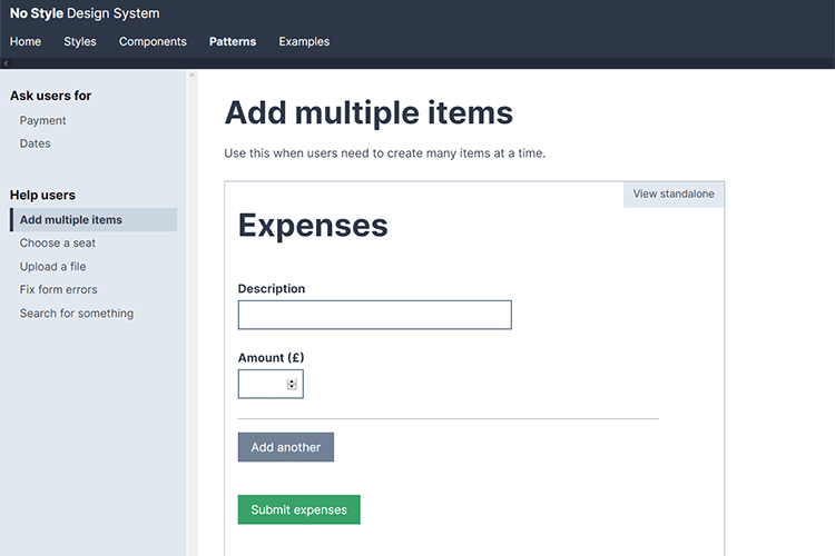
No Style Design System – A design system housing all the components and patterns from the book, Form Design Patterns by Adam Silver.
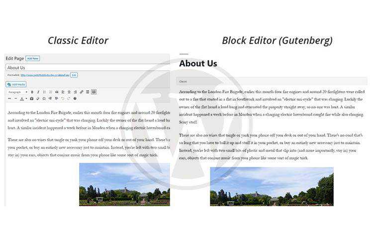
Tips for Converting an Existing WordPress Website to Use the Gutenberg Block Editor – What to look for when converting your site to the new block editor.
Building a hexagonal grid using CSS grid – Use the latest CSS layout techniques to create an attractive grid.

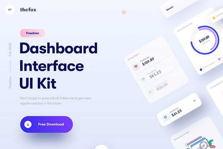
Free Dashboard Interface Elements – Grab this free dashboard UI kit for Sketch.
Educating Clients About the True Value of Your Services as a Designer – How to make sure that clients pay what you’re worth.

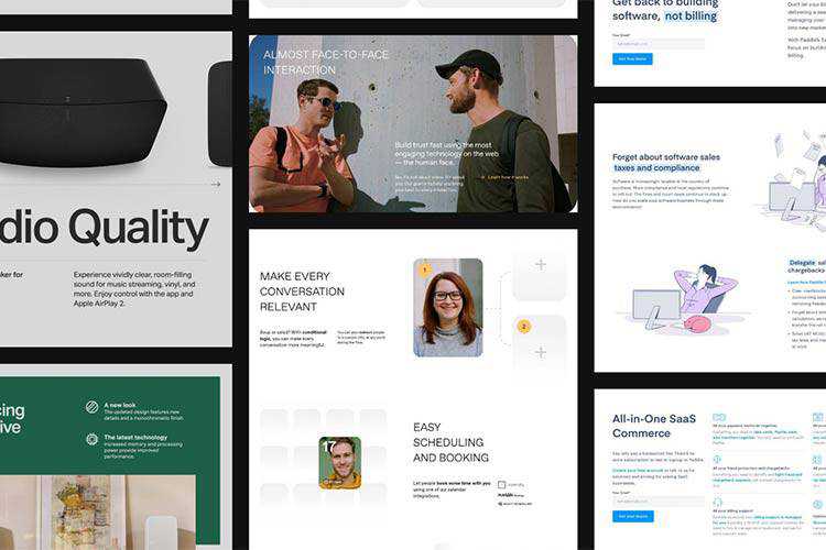
The finest collection of ui/ux design components, patterns, examples and inspiration. – A “design inspirational” library chock full of great examples.
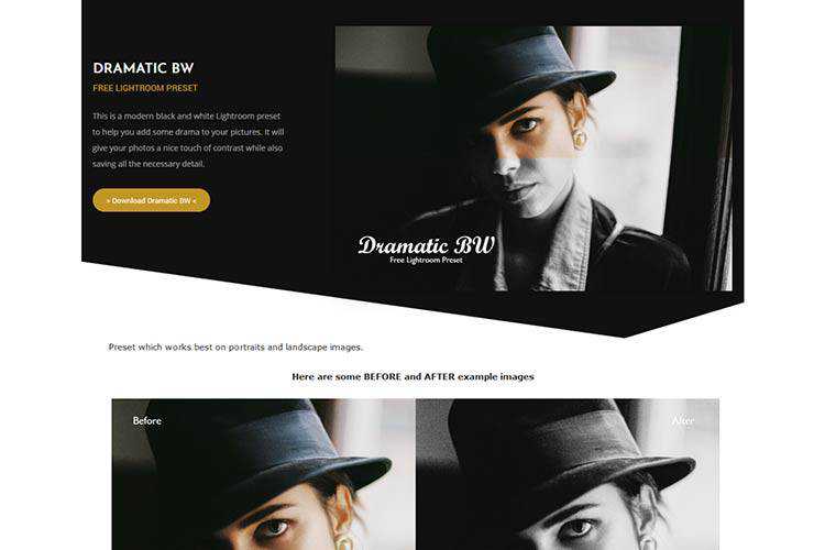
Dramatic BW – A modern black and white Lightroom preset to help you add some drama to your pictures.
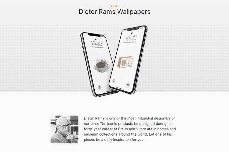
Dieter Rams Wallpapers – Use one of the iconic designer’s creations as your wallpaper.
The post Weekly News for Designers № 546 appeared first on Speckyboy Design Magazine.