Laravel Messages Controller (New)
Read more at https://www.phpclasses.org/package/11735-PHP-Controller-to-send-and-display-received-messages.html
tl;dr: Add data-lazy="true" to your Facebook social plugins that are below the fold and reap the benefits.
In code:
// before
<div
  class="fb-like"
  data-href="https://phpied.com"></div>
// after
<div
  class="fb-like"
  data-href="https://phpied.com"
  data-lazy="true"></div>
The following 18 seconds video demonstrates the difference. Where currently your visitors load Facebook iframe content even if it's way down the page, after you implement lazy-loading, they'll only load the iframes if there's a chance of ever seeing them. Look for the like.php request and its dependencies.
Facebook's social plugins are pieces of Facebook content you can embed into your pages. Like buttons, share buttons, comments, embedded videos, posts and photos and so on.
The plugins are iframes that point to e.g. facebook.com/plugins/like.php, facebook.com/plugins/comments.php and so on. Some plugins allow you to create the iframes youself, where others do not. And in general it's better not to. Why? Because content can vary based on language and other factors and by creating the iframe yourself you risk the content being cut off.
So who writes the iframes then? The FB JSSDK. You load the SDK (asynchronously, of course) and sprinkle divs where you want the plugins to appear. The SDK writes and resizes the iframes as required.
Browsers now support native lazy-loading of iframes.
Facebook now supports native lazy-loading of all social plugins.
All you have to do is add the data-lazy="true" attribute to your plugin div elements.
Quick answer: otherwise your visitors may see some content shift.
Long answer: in order to resize the plugins in the best possible way, based on content, the FB JSSDK initially creates the plugin with visibility: hidden and with a size of 1000x1000 pixels. The iframe itself is inside a 0x0 container. After the iframe loads, it informs the SDK of its size and the SDK resizes the iframe and makes it visible.
In this case visibility: hidden prevents native lazy-loading in Chrome. Reason: analytics should not lazy-load even when the developer sets iframe loading="lazy". This is a questionable decision, but that's how it works for now.
So to support native lazy-loading as currently implemented, the FB JSSDK creates a visible iframe inside a 1x1 container (turns out 0x0 container also kills native lazy-loading in Chrome). So if the content is above the fold a 1000x1000 iframe inside 1x1 container may cause some visible content shift or overlap other content even if not visible outside 1x1.
If your plugin is only visible below the fold (most often), Chrome's aggressive (or "safe" is the right word?) loading gives plenty of time for the loading and resizing to take place.
This should be on developers.facebook.com, no? Right. However two weeks ago was my last day at Facebook. The Sunday prior my last Monday I debugged with the help of Chrome folks Addy and Dominic and managed to send the diff on Sunday, get it approved Monday, land (thanks Brad!) and barely had time to update the docs. No time for official announcement.
Your turn! Go to your plugin implementations and add data-lazy="true" for all plugins below the fold. Comments, embeds, like/share buttons at the end of an article and so on.
Your users will love you for it! Battery lives and data allowances will be saved. The web will be less congested.
Icons can be used in a variety of projects when you need to add extra visual appeal or make it easier for people to visualize a concept or memorize something. While icons are usually associated with websites and printed material, you can also use them in your video projects.
There are a plethora of animated icon packs available online that you can download and use in your projects or use them as an inspiration when creating your own. Browse our collection of the best free animated icon packs for Adobe After Effects.
This creative icon pack has 15 different icons that are perfect for any technical niche. The template makes it easy to customize the icons with your brand colors thanks to the intelligent color controller.
![]()
Consider this social media icon pack if you’re looking for icons with a unique design. This icon pack is a great choice for any food-related business or brand that specializes in children’s products and that uses video as part of their marketing strategy.
![]()
If you need social media icons for your project, then check out this free social media icons pack. You’ll find icons for all major social media networks and you can use the default colors or customize them with your own.
![]()
This icon pack includes an impressive number of 1000 icons that cover almost any niche. You’re bound to use this library over and over in your projects, especially since it was designed using the flat design.
![]()
Technicons is another set of technical icons for After Effects. This icon pack comes with 30+ animated icons to make your projects pop and you’ll also find a variety of business icons which makes this pack suitable for all kinds of projects.
![]()
Consider this lovely pack of animated icons if you’re looking for a stylish design. The icons are done up in a modern, thin line style and are perfect for a variety of different projects such as tech videos, fashion videos, and more.
![]()
This free icon pack includes 20 different icons that can be used for both business and personal projects. The icons are all pre-rendered footage so you can use them in any video editing or motion graphic software and you’ll also get the project file included in the download.
![]()
Another icon pack with a large selection of different icons that can be used in business, technical, and other types of videos. The icons feature a modern, flat design. You can change the size as well as the color of each icon.
![]()
As the name suggests, this icon pack is another flat icon pack. The pack comes with 10 free icons that can be used for corporate and business videos.
![]()
Consider the Anicons icon pack if you want a complete icon library that can easily be customized. The icon pack allows you to easily animate and adjust icon parameters very easily. The pack contains 40+ icons.
![]()
When you need to add extra visual appeal to your video projects, consider using icons. They can help you illustrate abstract concepts and make it easier for people to remember information. With the help of these icon packs, you will be able to make your videos more interesting and you can use them in as many projects as you’d like.
The post 6 Free Animated Icon Packs for Adobe After Effects appeared first on Speckyboy Design Magazine.
The bokeh effect has a multitude of uses within digital art. It can be overused, sure. But it can also be simply stunning. Trying to recreate this look on your own would be a time-consuming task. Thank goodness for Photoshop actions, right?
What you’ll find here is a fantastic set of Photoshop actions that greatly simplify the process for making the bokeh effect. Most of these can be implemented with just one click and offer a wide range of stunning results.
It’s a good idea to try a few of these effects for yourself to see which would best serve your work. You’re certain to find something that works well, and that speaks to your specific needs. Now, without further delay, let’s jump right into the list!
The Dual Light Photoshop Actions set creates a beautiful double light effect on any photo of your choosing and add smoke and bokeh effects. The final image is layered and can be customized in a wide number of ways. This action set also comes with 20 color presets.

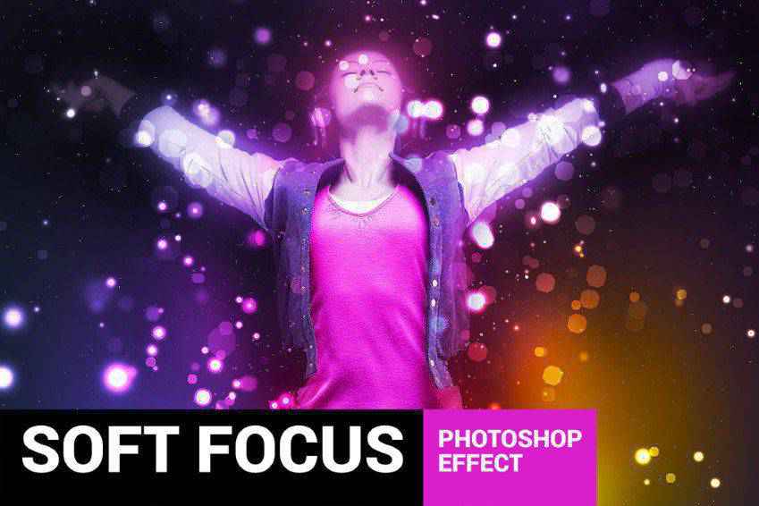
Another action set you might want to consider is the Soft Focus Photoshop Action. This one works quite simply. Just add it to a specific area of a photo that you want to remain in sharp focus, then play the Action. The end result is a soft focus on the rest of the image which provides a bokeh effect.

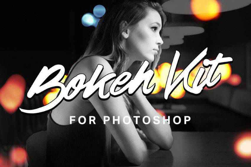
The Bokeh Kit for Photoshop is another fantastic option. It’s minimal in effect but really cool and can transform your photographs in a variety of ways. This kit actually has a lot going for it, in that it’s not just a bokeh Photoshop action. It also comes with 8 bokeh gradients and 40 bokeh brushes to help give you more control over the end result.
Another great option is the Bokeh Bomb Creation Kit for Photoshop. It’s chock full tools and resources for adding bokeh effects to your photographs. This kit comes with eight smoke effects, fast rendering, and snapshot prerendering play. It’s also nondestructive, so you can revert an image back to your original photo if need be. Other features include 20 bokeh gradients and 180 bokeh overlays.

You might always want to check out the Holidays Bokeh Photoshop Action set. This one comes with just one action file and one brush file and is supplemented by a thorough how-to file. It’s completely easy to use, non destructive and compatible with all of the latest versions of Photoshop.

This is another great option designed with selfies in mind. This Photoshop action works by turning your selfies or iPhone photos into professional-looking photos by adding a bokeh effect. The action has 10 color effects that you can use as well to further customize the finished product. A help file and video tutorial are also included for your convenience.

The Brightum Soft Focus Photoshop Action is definitely worth considering as well. This action works by creating soft focus and light effects on your photos. All you have to do is select on area then click play. From there, you can make adjustments to color, contrast, and gradients as well thanks to 10 color presets and well-organized layers.
If you want to leave your viewers dazzled, the Shimmer Photoshop Action is a great option. This action works as follows: brush the area of the photo you want to add a sparkle effect to then click play. That’s it! The end result is bright area of the photo that draws the eye and looks like it’s shining with tiny pieces of glitter.

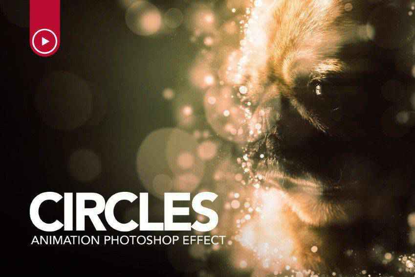
And check this one out! The Circles Animation Photoshop Action is a great one to add to your toolbox. With just one click, you can add soft focus light effects around The end specific area of a photo that you select. The end result is a sparkling effect that pulls in the eye.
The Glory Photoshop Action is super easy to use. All you have to do is fill in your chosen subject with a color of your choice, select a light direction, then play the action. That’s it! You can select from 8 different light directions and the end result is non destructive as well so you can undo the effect if you don’t like how it turned out.

The last action on our list is the Dreamy Photoshop Action. This one adds firefly effects with soft focus to your images. Select the area you want to highlight and click play. That’s all there is to it. This action comes with 10 color presets, graphic elements, and it’s layered and organized for convenient use (and undoing, should the need arise).

We hope you enjoyed this list of the best Photoshop actions for creating the bokeh effect. Bokeh is versatile and relevant for a wide number of photographs and design choices. And in the end, after you’ve experimented with a few of the actions provided here, you’re bound to capture a look that fulfills your artistic preferences. Best of luck!
The post The 10 Best Photoshop Action Sets for Creating the Bokeh Effect appeared first on Speckyboy Design Magazine.
If you’re thinking about switching to direct to consumer (D2C) marketing, you’re probably wondering how to do D2C marketing effectively. D2C marketing involves selling directly to consumers, rather than using a third-party to sell your products, which helps your company reap more profit.
It’s a daunting process, however, to sell your products on your own.
Luckily, you aren’t the first company to take the D2C approach. You can look to other D2C companies for inspiration.
On this page, we’ll provide you with six D2C website examples to inspire your D2C marketing strategy. Keep reading to learn more and subscribe to our weekly newsletter for the latest tips and tricks in marketing!
Over 90% of WebFX clients continue partnering with us into year 2 of their campaign.We Form Longterm Partnerships
First on our list of examples of D2C brands is BarkBox. BarkBox is a dog subscription service that sends toys, treats, and chews each month to subscribers. The boxes have a monthly theme to keep their products fresh and interesting for their audience.

With BarkBox’s subscription service, every consumer gets the themed box for each month. Consumers don’t pick the theme they want or subscribe to a specific theme. This style means that every subscriber receives the same box, creating a sense of community among subscribers.
BarkBox encourages their subscribers to share photos of their dogs with the box on social media using hashtags like #BarkBoxDay or to tag them in their posts. It helps BarkBox generate a lot of buzz around their brand.

Creating a sense of community is key for direct to consumer brands.
Since you don’t have the brand trust from a third-party like Walmart or Target, you must build trust in your brand. By creating a sense of community and encouraging people to share their experience with your brand, you can help build a strong community that trusts your business.
Perhaps one of the most well-known D2C website examples, Dollar Shave Club, embodies the spirit of creating a brand that relates to its audience and appeals to them creatively. This company wanted to create a way to sell razors and other grooming products directly to consumers through a subscription.

Dollar Shave Club came into a market with big competitors, like Gillette and Schick, which meant they had to stand out from these big brand names. As a result, Dollar Shave Club started by taking a creative approach with their marketing.

This video has over 26 million views and boosted Dollar Shave Club’s subscribers. The video launched and went viral in 2012. Two years after the viral video launch, Dollar Shave club raked in $65 million in sales.
As Dollar Shave Club continued to grow and gain steam, it stuck to quirky advertisements that humanized its brand and made it stand out from other companies. This example from Dollar Shave Club’s Father’s Day promotion focuses on “dad bods” and how all “bods” are welcome to join the club.
There are two big takeaways from this D2C website example that you can implement into your strategy.
First, don’t be afraid to get creative with your marketing. Take an out-of-the-box approach that will help your brand stand out from the competition. Being unique will make you more memorable in your audience’s eyes.
Second, stay true to your brand. Dollar Shave Club is one of the best D2C website examples because they’re authentic and stuck to their brand identity from the start. Establish your brand identity and showcase it.
Next on our list of examples of D2C brands is Casper. Casper is a mattress company that aims to take away the frustration of finding the right mattress. It only offers three styles of mattresses: The Original, the Nova Hybrid, and the Wave Hybrid.

To reach interested consumers, Casper utilizes social media to connect with its millennial audience.
Casper posts content on places like Twitter and shares content in a way that resonates with its target audience. This Twitter post about how to fall back asleep with the caption, “You up?” is a prime example of Casper appealing to its target audience.

Casper also partnered with influencers like Kylie Jenner to get more people interested in its products.
Invest in methods that help build your brand and reach your target audience. Don’t be afraid to reach out to influencers in your industry that can help you promote your brand. Whether it’s influencer marketing or social media marketing, use channels that will help you leverage your brand.
Away, a luggage brand, also falls into our list of great D2C marketing examples. To stand out in its market, Away decided to position itself as a travel company. Away shares a variety of travel-related content and media for its audience.

In addition to posting travel content, Away also takes a fun approach with its social media to engage its audience. The company follows fun posting trends, shown in the example below, to resonate with its followers.

Away is one of the best D2C marketing examples because it takes an ordinary and mundane object, like a suitcase, and builds a fun and fashion-forward brand around it. The company creates an experience around the suitcase and make it interesting for its audience.
Create an experience rather than focusing on just selling the product. Creating an experience keeps people coming back to your products and your brand. It will help you build a loyal following and encourage people to buy from your business.
Glossier is another one of our examples of D2C brands that do marketing well.
This brand sells makeup directly to consumers.

The most notable aspect of Glossier is the way the company interacts with its audience. First, instead of giving away products to influencers, Glossier gives away products to “superfans.” Superfans are people who purchase the most products or engage the most with the Glossier brand.
Glossier also encourages its followers to share posts about their personal experiences with Glossier. This company is big on user-generated content, which helps Glossier make itself more relatable for audiences.

Connect with your audience and encourage them to engage with your brand. You’ll want to inspire user-generated content so you can showcase your brand to your followers and build their confidence in your brand.
Last on our list of D2C marketing examples is Billie. Billie is a female product company that makes organic feminine care products. From razors to makeup wipes to shampoo, Billie offers products that are part of many women’s daily routines.

Billie offers subscription-only services for their razors and makeup wipes. Similar to Dollar Shave Club, Billie takes an approach that focuses on making buying these mundane items easy and so that you never run out or forget to get these important items.

Know your target audience. Billie focuses on everyday feminine products that their audience wants.
They know their audience wants products with no toxic chemicals, so they make a point to highlight that product feature throughout their site. You want to ensure you know your target audience well so you can highlight your products and selling points better.
Now that you’ve seen some D2C website examples, you can get inspired and start working on your D2C campaigns. If you aren’t sure where to start, WebFX is here to help.
With our D2C social advertising services, we help direct to consumer brands reach their target audience, engage with them, and drive more sales for their company.
In the past five years, we’ve driven over $2.4 billion in sales and over 6.3 million leads for our clients. We can help you drive the results you desire for your D2C company.
Ready to learn more? Contact us online or call us today at 888-601-5359 to speak with a strategist!
The post D2C Website Examples: 6 Examples of Direct to Consumer Brands appeared first on WebFX Blog.
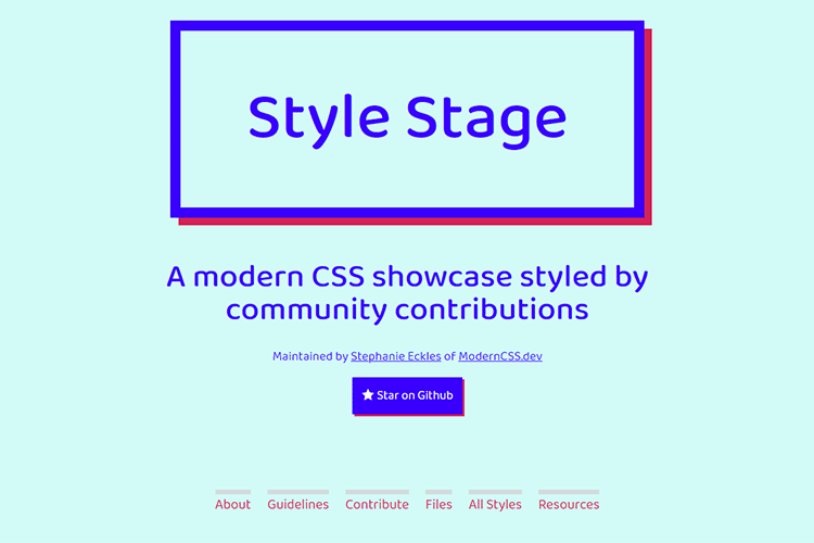
Style Stage – Submit your ideas to this modern CSS showcase styled by community contributions.
Three CSS Alternatives to JavaScript Navigation – Some examples of mobile navigation with no JavaScript required.

WordPress Theme Showdown: Custom Built vs. Readymade – Will a readymade WordPress theme really work for your project? Use this guide to help you decide.

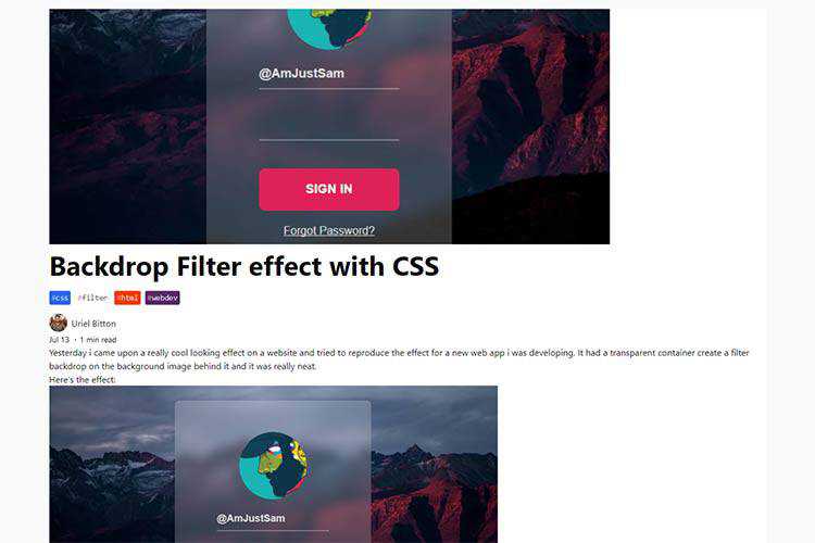
Backdrop Filter Effect with CSS – Create a stunning CSS filter effect with just a single line of code.
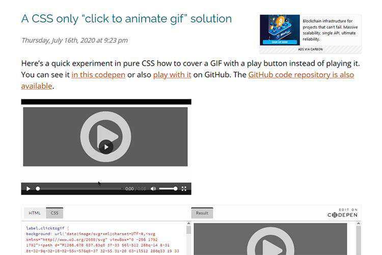
A CSS only “click to animate Gif” solution – Using CSS to let users choose whether or not they want to play an animated GIF.
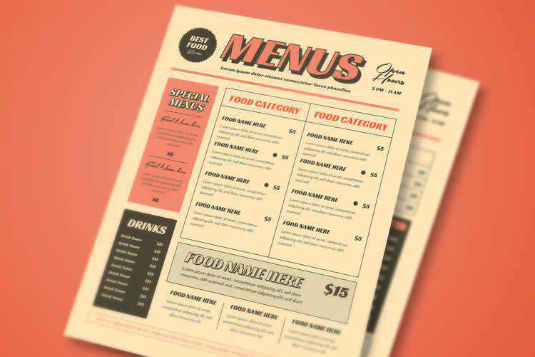
15 Free Restaurant & Coffee Shop Menu Templates – Create the perfect menu using one of these incredible templates.
CSS Breakpoints Used by Popular CSS Frameworks – Confused about which CSS breakpoints to implement? Check out what the biggest frameworks are utilizing for inspiration.

The Trouble with mailto email links and what to do instead – Learn why the venerable mailto link may not be the best solution.
Sketchbooks – The Designer’s Cookbook – Why a sketchbook is possibly the best way to keep track of your ideas and to document your thought process.

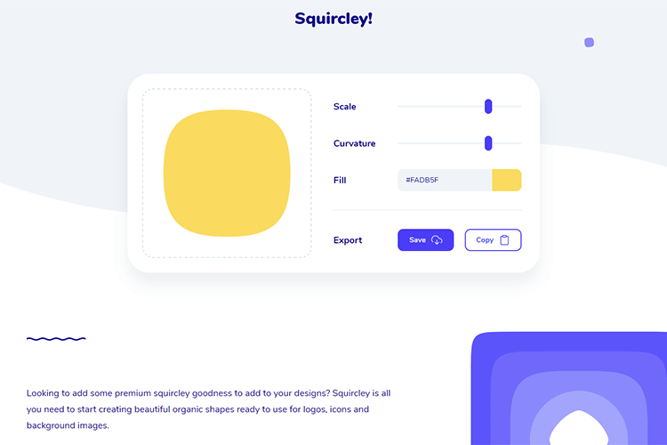
Squircley! – An online tool for creating organic shapes ready to use for logos, icons and background images.
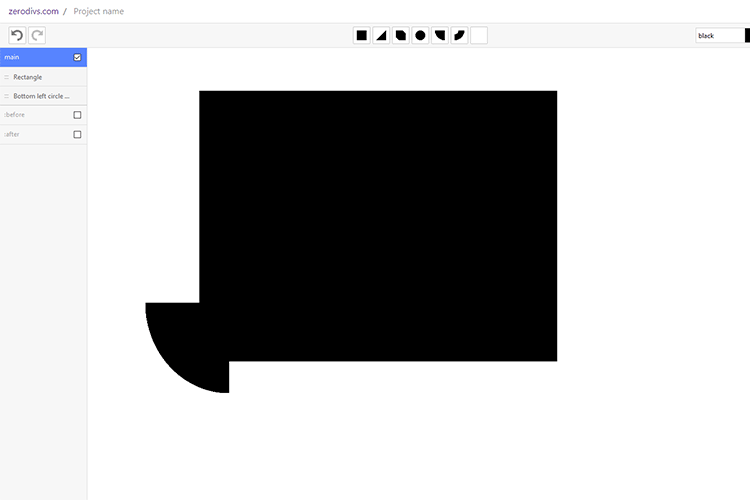
zerodivs.com – Try this experimental UI editor for creating illustrations based applying styles (CSS) on a single HTML element.
Super Expressive – Regular expressions can be difficult. Use this JavaScript library to create them with an “almost” natural language.

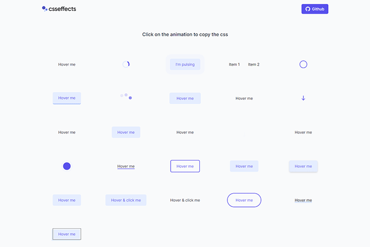
CSS Effects – A collection of click-to-copy CSS special effects.
Things I Wish I’d Known About CSS – A look at the importance of learning the fundamentals of CSS.
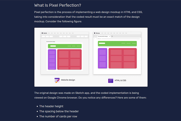
The State of Pixel Perfection – Does a website always have to be a pixel-perfect interpretation of its mockup?
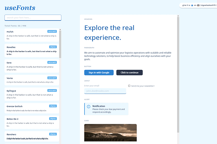
useFonts – Try out this design tool to help designers and developers select their perfect fonts.
The Case for Building Resiliency into Every Website – Creating elements that can withstand whatever you throw at them – and won’t break your website’s layout.

The post Weekly News for Designers № 550 appeared first on Speckyboy Design Magazine.