When it comes to web technology, most solutions tend to come and go at lightning speed. What was once a legitimate benefit to users gets replaced by something else. It’s the cycle of life that we’ve come to expect.
Still, there are a few items that actually do stick around well past their prime. This is often a result of legacy users who still need the functionality and developers who don’t want to rock the boat.
The WordPress comment system is a feature that has survived over the long haul. It harkens back to the early days when the CMS was strictly a blogging platform. In that way, it has achieved an impressive longevity.
The question, however, is whether or not this once-handy feature is still relevant. And, if so, should it still be as prominently featured within WordPress?
Let’s take a look at the current state of WordPress comments, along with some changes that might make sense for its future.
BUILD WORDPRESS SITES FASTER
Announcing Template Kits. Responsive WordPress Designs Built For Elementor.
Comments Are a Conduit for Communication – and Spam
Integrating a comment system on your website is a great way to facilitate communication. Bloggers can post articles about their subject of choice and readers can respond with their thoughts. This is a fundamental tenet of the web.
Yet, for the life of me, I can’t recall the last time I built a website that actually utilized comments. In fact, I try to steer clear of the subject altogether with clients.
That’s because moderating comments are a nightmare. Whether it’s the fact that comment forms are notorious targets for spammers or that some people just don’t know how to play nicely together – the whole practice is more trouble than its worth. I certainly don’t have time to deal with it and neither do most website owners.
I realize that there are a number of plugins that will help to combat comment spam and make management easier. However, this brings up another key component: It’s debatable whether comments are even relevant for a given project.

Not Running a Blog? Comments Might Do More Harm Than Good.
WordPress is now utilized for much more than building blogs. It powers everything from small business sites, eCommerce shops, membership communities to just about anything else you can think of. Because of this, comments may only be worthwhile for a small percentage of sites these days.
Besides the aforementioned hassle with moderating them, comments also have a permanent presence within your content. This isn’t always a desirable feature.
For example, a visitor checking out your About Us page might see threads that go back several years. It makes your content look outdated and may contain subject matter that no longer pertains to your organization. A thread could even include responses from employees who don’t work for you anymore. This is just one more facet of a website that needs to be maintained – one that might easily slip through the cracks.
For your run-of-the-mill business website, there are other forms of communication that are likely more useful. Contact forms and even social media offer more convenience for both users and site owners, depending upon the scenario.

One Potential Solution: Hide Comments by Default
If the WordPress comment system isn’t relevant to your projects, it would be helpful to just do away with the whole thing. After all, turning comments off is just another (albeit small) obstacle when starting a new build.
At the same time, I realize that there are developers and website owners who still utilize commenting. They shouldn’t suffer just because of my or anyone else’s views.
One solution that may be worth considering is for WordPress to simply disable/hide commenting in default installations. If you need the functionality, you’d be able to turn it on. Otherwise, it would stay out of sight and out of mind.
This isn’t without precedent. Back in the day, WordPress also had a Links Manager feature that was used by bloggers. It allowed you to maintain an old-school “blogroll”, which was a list of links to other relevant websites.
As the web evolved, the need for a blogroll declined. So, in WordPress 3.5, the Links Manager was hidden by default in new installations. Those who upgraded to that version still had access, while new sites had to use a separate plugin to activate the feature.
While there are understandably more pressing needs for WordPress core, it would seem to make sense to offer more flexibility with regards to comments. For those of us who rarely (if ever) utilize them, this would save time and maybe a bit of sanity.

Does This Legacy Feature Have a Future?
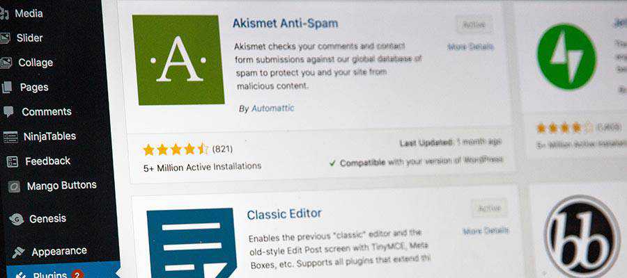
In terms of what users see, the WordPress comment system has remained pretty much the same in recent years. And it’s darn near impossible to safely use it without the help of a spam blocker plugin such as Akismet. Without that extra component, a website will surely be overrun with junk.
This is part of the reason why a number of developers have moved to third-party comment systems such as Disqus, among others. These providers may not be perfect, but their all-in-one platforms do make more sense for those websites that want to include comment functionality. They not only do a better job of dealing with spam by default, they can also take the load off of your web server as well.
So, where does this leave the default comment system? It still offers the basics and can be extended. Yet it seems a bit antiquated when compared to what other services are offering. To remain a compelling option, improvements are in order.
There’s certainly no harm in keeping it around. But, short of a renewed effort to improve the out-of-the-box functionality, perhaps it shouldn’t be as front-and-center within WordPress as it is now.
Maybe I’m On My Own…
My thoughts aren’t necessarily those of the WordPress community at large. In a totally unscientific Twitter poll, a good majority of respondents still utilize the built-in commenting system:
If anything, it does show that the feature is still useful to many. And maybe that provides the impetus needed to improve it.
What do you think? Join the conversation and share your thoughts.
The post Is the WordPress Comment System Still Relevant? appeared first on Speckyboy Design Magazine.
Package:
Summary:
Manage database records with a CRUD interface
Groups:
Author:
Description:
This class can manage database records with a CRUD interface...
Read more at https://www.phpclasses.org/package/10997-PHP-Manage-database-records-with-a-CRUD-interface.html

Package:
Summary:
Drupal module to show currency values with NBG API
Groups:
Author:
Description:
This package implements Drupal module to show currency values with NBG API...
Read more at https://www.phpclasses.org/package/11761-PHP-Drupal-module-to-show-currency-values-with-NBG-API.html


Thumbnail to Full Width Image Animation – Utilize this stunning effect to introduce new content to your readers.

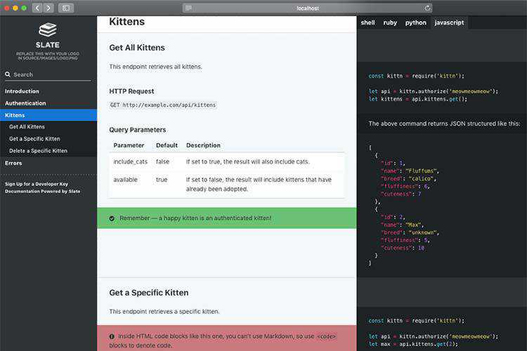
Slate – A tool that helps you create beautiful, intelligent, responsive API documentation.

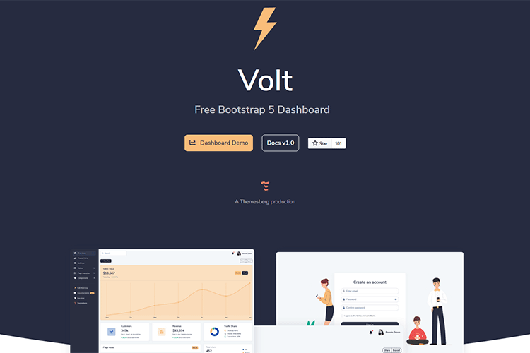
Volt – Create something beautiful with this free Bootstrap 5 dashboard theme.

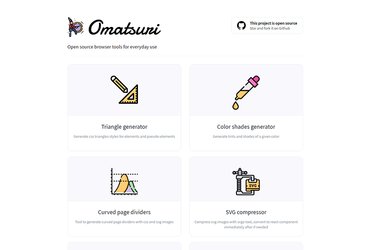
Omatsuri – A set of browser tools to fit your everyday workflow.

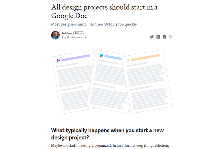
All design projects should start in a Google Doc – The benefits of collaboration before starting up those UI tools.

Should You Use WordPress Auto Updates? – The new feature in WordPress 5.5 may be useful for some – but there are potential downsides.

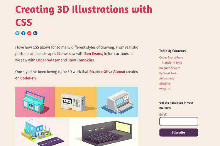
Creating 3D Illustrations with CSS – 3D drawings are indeed possible with CSS. Use this tutorial to learn how.

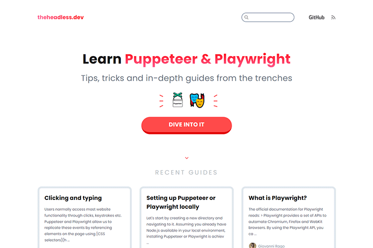
theheadless.dev – Check out this community-driven knowledge base for learning headless browser automation.

Git Concepts and Workflow for Beginners – Use this guide to learn the most popular Git commands and more.

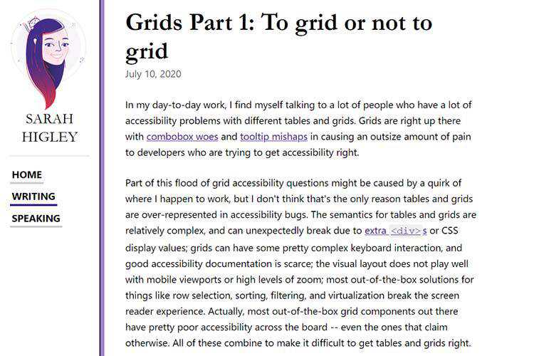
Grids Part 1: To grid or not to grid – A look at making grids and tables more accessible.

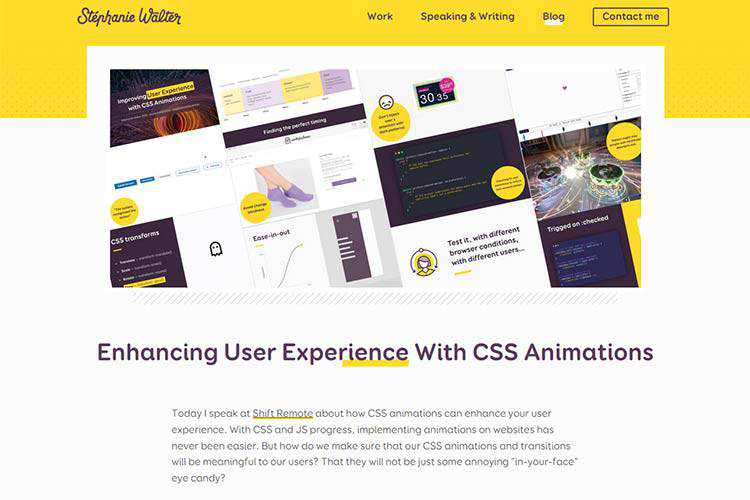
Enhancing User Experience With CSS Animations – Examples of how animation can improve UX.

Dealing With a Panicky Design Client – Maybe it seems impossible, but with a little bit of work on your part, it’s totally doable.

SEA.css – Give this simple and easy-to-use CSS framework a try.

Together at Home: Managing Kids and Your Web Design Business – The challenge of having children in an online school while still trying to run your business.

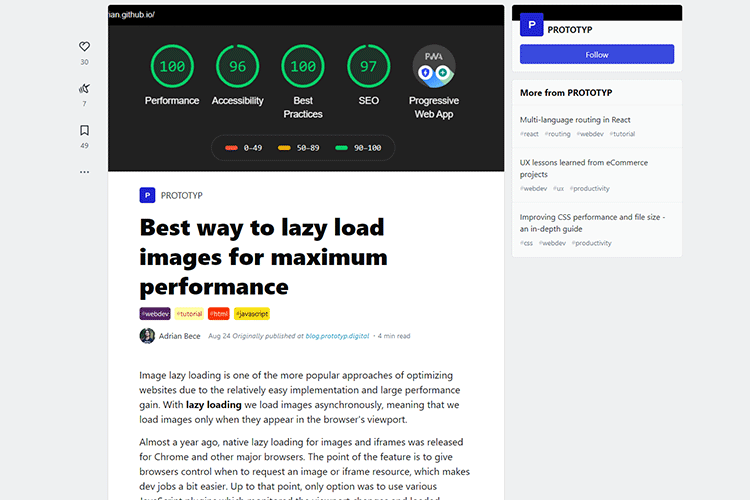
Best way to lazy load images for maximum performance – How to implement lazy loading for browsers who support it natively, with fallbacks for those who don’t.

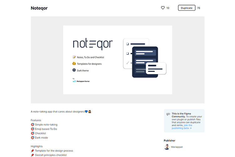
Noteqor – A simple note-taking app for Figma.

Gradient angles in CSS, Figma & Sketch – Learn what really goes on when you assign an angle to a gradient.

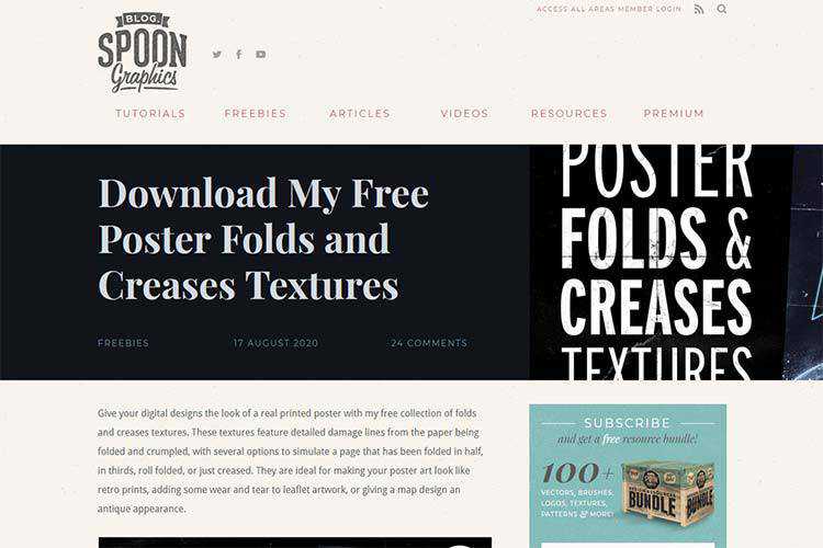
Free Poster Folds and Creases Textures – Grab this free collection and make your digital art look like printed posters.

The post Weekly News for Designers № 555 appeared first on Speckyboy Design Magazine.
A new program has been added to the
Free Static Code Analyzers (Lint)
page. Such tools scan the source code for your program, looking for potential bugs and vulnerabilities (even before
you compile and test it). The latest addition can handle programs written in
Java, JavaScript, C#, TypeScript, Kotlin, Ruby, Go, Scala, Flex, Python, PHP, HTML, CSS, XML and VB.NET.
(If you use a different language, such as C, C++, Fortran, there are other tools listed on that page that can
scan those too.)
Package:
Summary:
Query data about locations in Uruguay
Groups:
Author:
Description:
This package can query data about locations in Uruguay...
Read more at https://www.phpclasses.org/package/11775-PHP-Query-data-about-locations-in-Uruguay.html

Here's what was popular in the PHP community one year ago today:
Designing a responsive layout doesn’t need to be difficult. Especially if you initially wireframe to plan ahead and figure out exactly what you’re creating.
One of the hardest parts of a good responsive site is the navigation. This can take a while to figure out and there are plenty of tutorials to help with that.
But I’m also a fan of using code snippets like the ones I’ve collected for this article.
All of these responsive navigation snippets are free to edit and clone for your own projects. They also feature a variety of styles so there’s going to be something here that’ll work for all types of websites.
The Web Designer Toolbox
Unlimited Downloads: 1,000,000+ Web Templates, Themes, Plugins, Design Assets, and much more!
1. Responsive Fullpage Demo
There’s a lot to say about this fullpage demo created by Johnny Mango. It’s an example of just how far you can take a website’s prototyping phase.
You’ll notice the navigation has an interesting feature when you hover and auto-focus on links. This effect can be altered in a “live” website with the same nav, but it’s useful in this example to show off the page’s UI/UX.
Resize your browser window to see exactly how this navigation gets rearranged. You may be surprised at the final result.
You can even dig into the fullsize preview to get a better look at it.
2. Dropdown Navbar
If you need longer dropdown items in your navigation then this menu might work better.
It’s a strong alternative to the more basic navigations that only feature a handful of links. In this case you’ll find a simple list of links with a very small dropdown.
The sub-menu links only appear on a click event which is handled by jQuery. You could change that to CSS-only, but you’ll lose the click trigger.
Still, for such a clean design I’m surprised at how much versatility this snippet offers developers.
3. Single-Page Layout
Single page navigation menus need love just like the any other.
Thankfully this pen by Jan Czizikow got lots of love with a brilliant design.
This is a perfect example of single-page navigation in action. The links scroll down with a smooth animation but don’t leave you waiting for too long.
Not to mention they automatically resize to the perfect fit regardless of your browser size.
I mostly recommend this type of navigation for a sales page or a simple portfolio site. It’s really clean and features some great animation work alongside the responsive techniques.
4. Red Dropdown Menu
Developer Stéphanie Walter has made some really interesting projects for the web. This snippet is just one example featuring a bright red responsive navigation she built.
The links have a little more pizzazz with a custom selected feature and a nice hover effect to boot.
When resized you’ll notice the nav uses a sliding dropdown menu instead. I’d almost opt towards a block-level list of links for mobile, but this works much better considering the sub-menu.
If you’d like something with some spice on your page this snippet is worth copying & reworking to your liking.
5. Pure CSS3 Design
Now here’s a really unique design using pure CSS3 for the navigation.
It’s a vertical menu with nav links mimicking the periodic table of elements. The snippet was created by Ahmad Hjazy, and it’s a sight to behold.
The hover effects are a bit delayed yet undoubtedly interesting. Not to mention the responsive style is surprisingly usable.
Perhaps the most impressive part is how this entire thing runs solely on CSS3.
6. Responsive Sticky Header
I mentioned single page design in an earlier snippet and this responsive header follows a similar trajectory.
Only difference is that this navigation has a slightly larger block on the page and it handles responsive page design a little differently.
When you resize the browser you’ll notice this uses the hamburger icon with a fun animation. It’s nice considering the style but may not be everyone’s cup of tea.
Still an impressive navigation for single pages or landing pages that need a sleek navbar without all the frills.
7. Responsive & Touch-Friendly
All good websites should be touch enabled by default. That’s what makes this navigation even more appealing to designers.
It supports all screen styles and makes it so much easier for users to browse on their phones.
Each link does lead to a new page but you can tap to hover the dropdown menus with ease on any touch-based device. This is a feature often missing from navigation menus and it’s one reason dropdowns can be so tricky to design.
8. Simple Nav Links
When I think of really simple navigation menus I think of a design like this.
Each link appears as its own block element, even on smaller screens. There is no hamburger menu and no hidden animated menu feature. Instead the links just resize and break onto separate lines.
The trickiest part is handling the dropdown effect on mobile devices. Many of the links do have sub-menus, and they’ll work the same on smaller screens.
I’d argue this works best for sites with little-to-no submenus, but it’s worth a try on mobile just to see what you think of the experience.
9. PS Curtain Menu
Developer Louis Chenais created one of my favorite responsive navigations based on the PlayStation website.
Louis calls this a “curtain menu” where it slides into view overtaking the entire page. This is really common for mobile interfaces and it’s quickly become a hot choice for web designers too.
One thing I really like is the animation style. It’s sleek and fast enough to display the links without leaving users bored.
And best of all this feels like it could work on a production website.
Try clicking the search icon to check out that effect too. Both work flawlessly, and I’d call this a brilliant navigation for any corporate website.
10. Responsive Mega-Menu
You can search the web and find hundreds of mega navigation menus. These typically appear on larger blogs and news websites, but they’re also popular on ecommerce shops or even large agency sites.
The toughest part of a mega-menu is making it fully responsive.
Thanks to this small snippet you can rework the mega menu design to fit any screen with ease.
On mobile it uses a sliding navigation to display all the internal links in one menu. This may seem a tad annoying, but you could also use jQuery to hide the sub-links if that makes sense.
It’s still one of the best responsive solutions I’ve seen for running a mega menu on desktop without alienating mobile users.
The post 10 Pure CSS Responsive Navigation Code Snippets appeared first on Speckyboy Design Magazine.
You can spend days explaining your design concepts, and one thing will still be true: a picture says a thousand words. So instead of wasting your breath, why not show exactly what you had in mind?
Banner mockup templates for Photoshop are a great way to show what your design will look like in reality. From templates perfect for outdoor banners and subway lightbox banners, to storefront mockups, there’s plenty to pick from. No matter what purpose your design serves, you’ll find a mockup to help you demonstrate how it will look in 3D.
These banner mockup templates are easy to use. It takes only a few clicks to add your design to the mockups in Photoshop. They look realistic, and will help your clients understand what you had in mind and how it will fit their aesthetic.
There’s something for all kinds of clients. Traditional ones will love roll-up banner mockups, while urban ones won’t be able to say no to a design featured in the subway lightbox. Prominent placement is no longer just reserved for premium brands.
Forget about back-and-forths and endless frowning required to picture the design in place. These banner mockups will convince even the most difficult clients! And today, we’re sharing 20 best banner templates to help turn your artistic vision into reality.
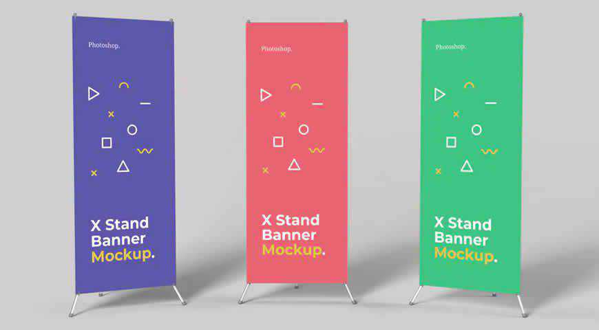
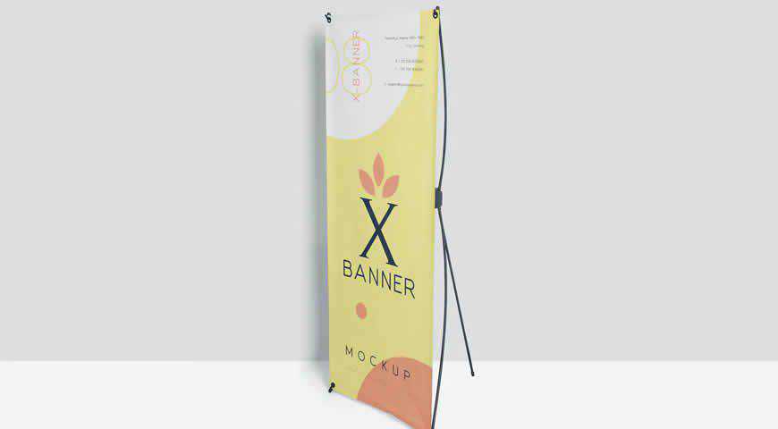
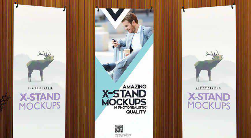
These X stand banner mockup templates come in 3 variations. You can mix and match to make them truly your own! They’re easy to customize because they work as Photoshop smart objects. And with high resolution and customizable background color, these templates will make all your designs shine!

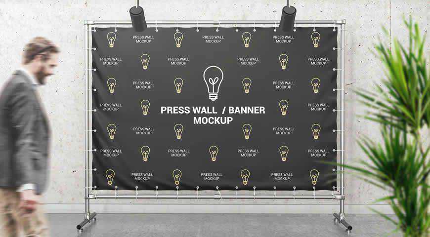
Make a statement with this photo-realistic press wall/banner mockup template. Your design will shine as you experiment with 3 available styles. Then, simply edit the mockup with Photoshop smart objects. With high resolution, it’s never been easier to imagine your design in the background of a high-profile event.

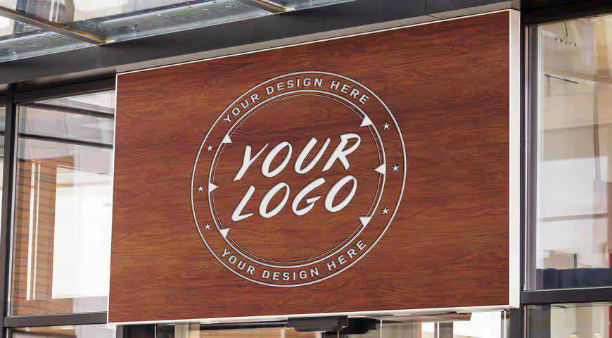
Outdoor signs are the main show-stoppers for brick & mortar businesses. And fortunately, with this outdoor sign mockup template for Photoshop, you can imagine what effect your design will have on passers-by. With high resolution, multiple layout options, and smart objects, your clients will love their new front window signage!

If you design materials for trade fairs and exhibitions, you’re going to love this promo stand mockup template for Photoshop! Your B2B clients will love seeing what their materials will look like when placed on the promo stand, and you can easily customize it to fit your vision.

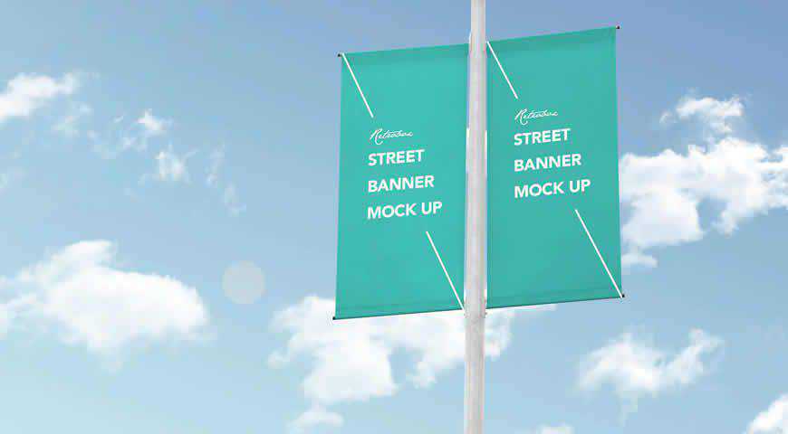
Let your artistic flag fly! This urban, street banner mock up is perfect for eye-catching advertisement designs. It uses Photoshop smart objects to make it really easy for you to add your designs. Street banners are crucial pieces of advertising real estate, so convince your clients with this versatile mockup!

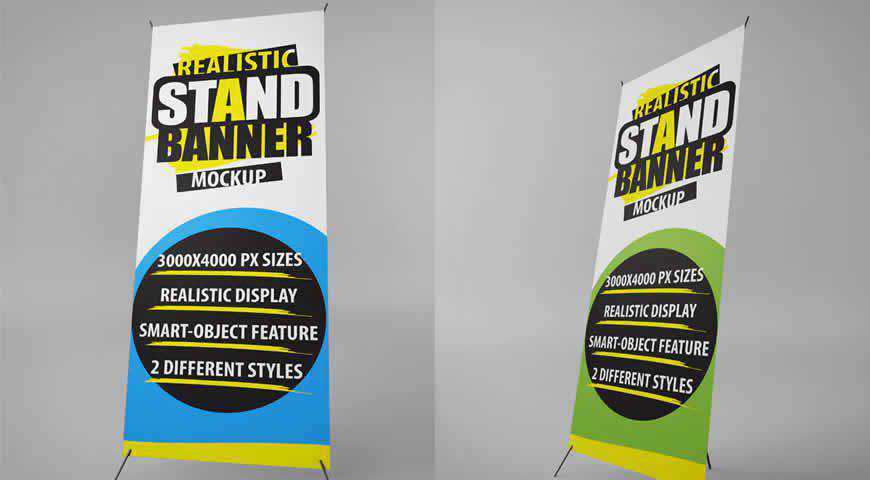
There’s no banner like a 3D stand banner. This stand banner mockup template is incredibly lifelike, and great at helping you turn your designs into reality. You can pick between 2 versions. High resolution will make sure you don’t lose a single pixel. Charm your clients!

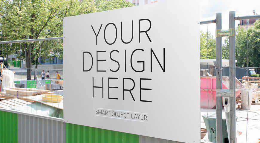
If your clients are construction companies, help them improve their reputation with these outdoor construction site mockup templates. Displaying important information about the company is crucial, so simply use the smart objects system in Photoshop to add your details and designs, and get ready to wow clients during your presentation!

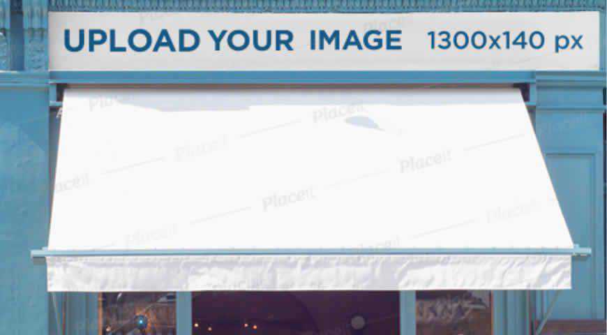
Create an eye-catching storefront design, and then add it to this storefront mockup banner in Photoshop to charm your clients. Easily customizable and realistic, with a background depicting the typical scene, this mockup banner is perfect if your clients are stores, restaurants, cafes, or others who rely on foot traffic.

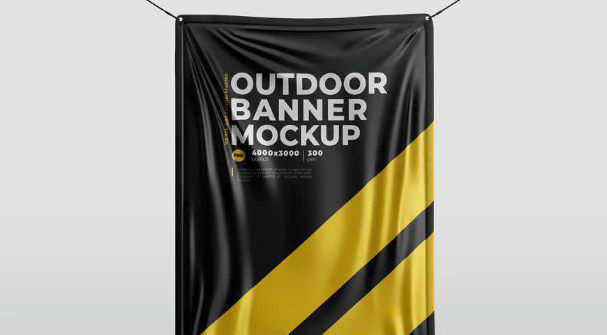
A highly-realistic banner mockup, this template is perfect for your designs that will be displayed outdoors. Mimicking wind effects, and easily customizable (use smart objects, tweak the background and colors), this outdoor banner mockup is perfect for breathing a new, 3D life into your 2D designs. High quality is guaranteed!

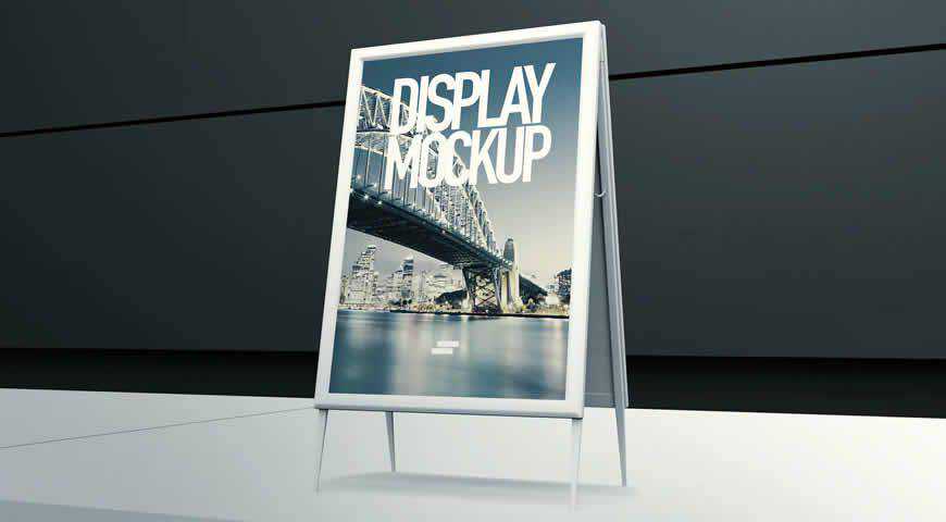
Sandwich boards never go out of style. And if your clients want to get some real attention for their business, they’ll choose your design displayed on this 3D display mockup. Perfect for outdoor settings, you’ll get 10 high-quality PSD files, colorable elements, and unlimited FX effects.

With your design on their store banner signage, your clients are going to grab attention from miles away. This versatile store banner mockup is really easy to customize, and you won’t have to compromise on image quality. Go the extra mile and turn your vision into a reality!

This storefront mockup depicts a restaurant facade. It will be easy for your clients to imagine how your design fits into their aesthetic with this storefront mockup template for Photoshop! Your design is amazing, and now it’s time to create a professional mockup that will convince your clients.

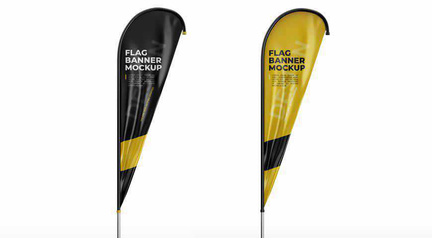
If your clients want to attract as many customers as possible, it’s time to add this flag banner mockup template to your toolbox. Perfect for branding and announcing special sales, this mockup offers high resolution, photorealism, as well as smart objects that make editing a piece of cake!

Perfect for big announcements or improved brand awareness, these photo-realistic X-banner mockup templates for Photoshop highlight your design! With 3 versions (neutral angle, X-banner, X-standee) and editable background, you can customize it to your heart’s content. Tailoring the display to your clients’ demands has never been easier!

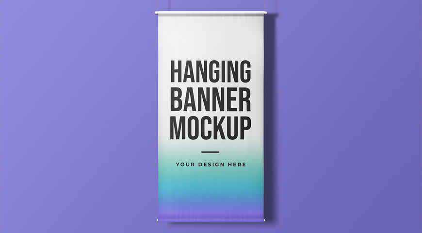
Make your design rise above the crowd and grab everyone’s attention with this hanging vertical banner mockup template. Easily customizable in Photoshop, this banner is perfect for high-quality messaging and designs. The future is vertical, and there’s nothing that captures more attention that a high-quality banner!

These three roll-up banner mockup templates for Photoshop are perfect for simple designs that carry a powerful message. A personal favorite, this lean little template set offers plenty of options for customization: add your design, change the background, and tweak colors to fit your brand. The world is your oyster!

When it comes to graphic design, if I can see it, I can believe it. Fortunately, these realistic X-banner mockup templates for Photoshop make it easy to see the impact of your work. You’ll get 3 customizable stand displays in office environments, perfect for your next corporate event!

These roll-up mockups are sleek and simple to use! If you want to know what your designs and branding will look like at your next event, add them to these roll-up banner mockup templates for Photoshop. With 10 PSD files and well-organized layers, it’s a piece of cake!

Kiosk advertisements are responsible for some of the most creative designs ever! And today, with this outdoor kiosk advertisement mockup template for Photoshop, you can join the greats. Perfect for ads, this kiosk advertisement mockup is easy to use: add your images in a few clicks, and stun your clients!

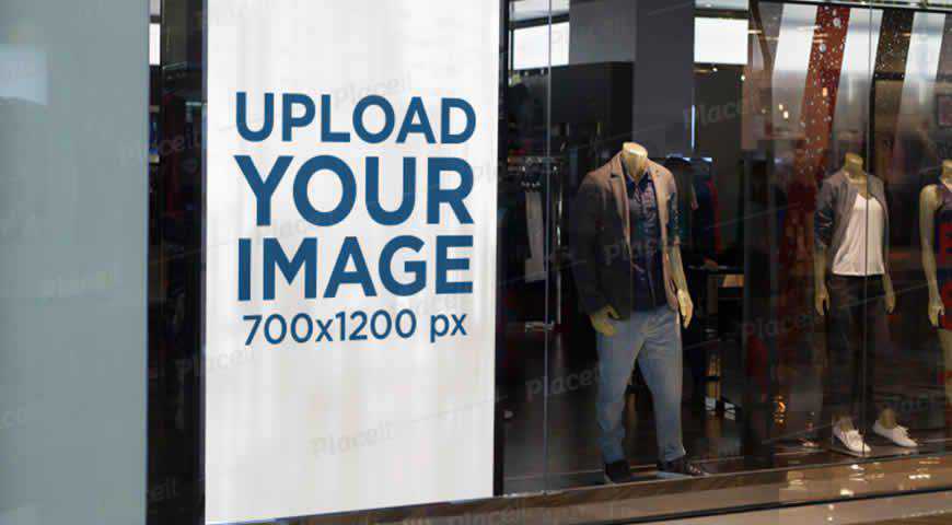
Let’s be honest: we all judge a book by its cover. The same goes for banners in storefronts. So improve your results by depicting your design beforehand with this vertical banner mockup template for Photoshop. Easily customizable, this vertical banner template will help you create the perfect offer!

Unique designs require unique placement. So for your next project, choose this rusty vintage banner mock up template for Photoshop. Easy to customize (with smart objects), it can help you turn your vision into a reality; be it an advertisement, or an artistic project you want the world to see!

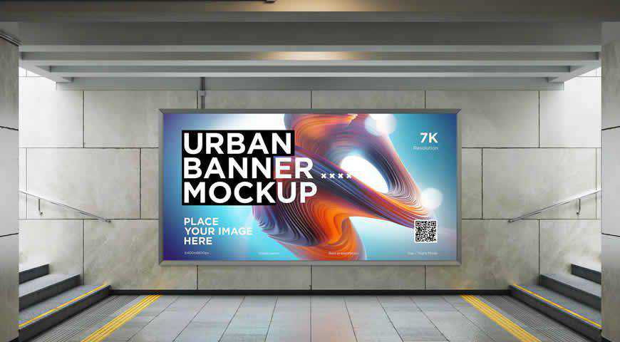
It’s a special day when artists get to see their designs in the subway. And with this city lightbox mockup for Photoshop, you can easily see through the eyes of passers-by. Perfect for artful branding and advertising, this mockup is easily editable, and offers Day and Night modes.

Touch corporate souls, or create strategic partnerships with this vertical banner mockup template for Photoshop, set in a meeting room. High-quality and photo-realistic, this mockup is perfect for branding and strategic messaging. So if you’re planning on making big statements (or your clients are), choose this banner mockup!

Now that you’ve got plenty of banner mockups to pick from, it’s time to choose the right one for your project, and power up Photoshop. Demonstrate your credibility, give your designs a new dash of excitement, and show your clients what makes you amazing!
Or simply have fun imagining what your designs will look like to a passers-by. We promise: they’ll be left breathless!
More Mockup Templates: Books, Booklets, Bottles, Box Packaging, Branding, Dresses, Flyers, Frames, Hoodies, iPads, iPhones, Laptops, Logos, MacBooks, Magazines, Mobile Apps, Mobile Devices, Mugs, Packaging, Sweatshirts, T-Shirts, Tote Bags.
The post The 20+ Best Banner Mockup Templates for Photoshop appeared first on Speckyboy Design Magazine.
Package:
Summary:
Send push notification to Android devices with FCM
Groups:
Author:
Description:
This class can send push notification to Android devices with FCM...
Read more at https://www.phpclasses.org/package/11776-PHP-Send-push-notification-to-Android-devices-with-FCM.html#2020-08-26-09:28:35


