As the WordPress Gutenberg block editor evolves, new features are being added to make content creation easier. And block patterns may just be the most exciting addition for both web designers and their clients.
What is a block pattern? Think of it as a pre-built layout of blocks. They can contain pretty much any design element you’d like. Elements such as columns, images, videos, text, buttons – they’re all able to be placed into a custom block pattern.
Once you create a block pattern, it can be utilized again and again throughout your website. Each instance can be customized with the appropriate content. Plus, you can add, subtract or otherwise edit the included blocks.
They offer a great starting point for building out a page and allow you to craft a more consistent look. Yet they also allow designers the flexibility to make any necessary tweaks.
Today, we’ll introduce you to the concept of WordPress block patterns and demonstrate how to create one of your own. Here we go!
First, Get to Know the Block Pattern API
Building a custom block pattern requires usage of the WordPress Block Pattern API. This allows for adding a pattern to either your theme’s functions.php file or a custom plugin.
Regardless of how you implement it, the API is used for registering both custom block patterns and block pattern categories.
One interesting tidbit when it comes to registering a custom block pattern is that you must use raw HTML within PHP. This means that some characters, such as quotes, must be escaped.
We’ll get into the nitty-gritty of setting things up in just a moment. But it is worth noting that this can be a tedious process, especially for more complex patterns. Hat tip to Rich Tabor for pointing out a tool that will do the hard work for you.

Build Your Custom Block Pattern
The first step is to build your custom block pattern within a WordPress page or post. This doesn’t have to be carried out on existing content – you could create a draft post for this purpose. In fact, this might be the easier path, as you won’t have to contend with any unrelated bits of content.
Add Some Blocks
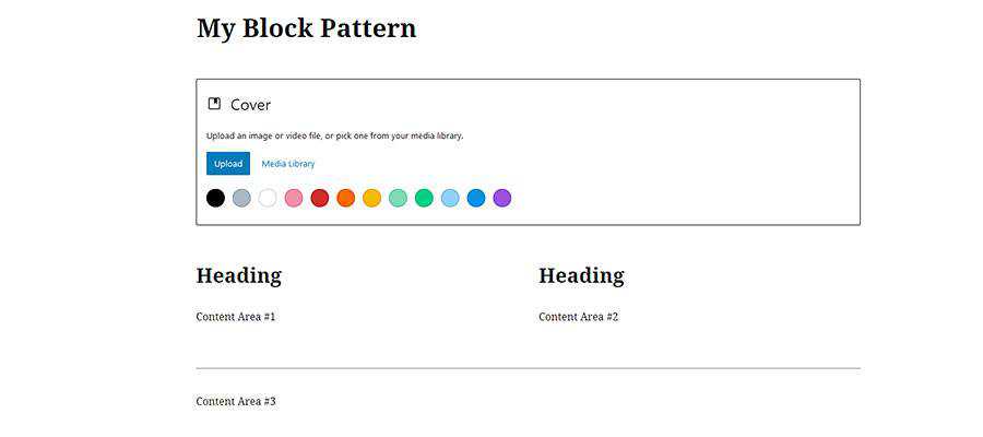
In our case, we’ve created a test page that will allow for some experimentation. Inside, there are the following blocks:
- A cover image;
- A set of two columns, each with headings and paragraph text;
- A separator;
- More paragraph text;

This is something that our fictional website might use throughout each page. A custom block pattern means that we won’t have to rebuild it each time.
We’ve left things pretty barebones here. But you could style each of these blocks up however you like. For instance, you might use the Gutenberg color palette to pre-determine coloring or add custom CSS classes.
Select Your Blocks and Copy Them
Now that our blocks are set up the way we want, it’s time to grab their source code. Thankfully this is easier than it sounds.
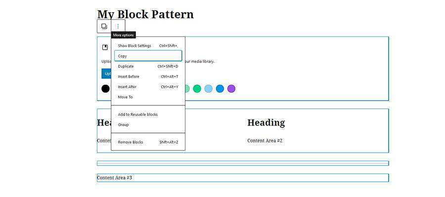
First, it’s a matter of selecting all the blocks we want to use in our pattern. The easiest way to do that is to click on the first block (the Cover, in this case), hold down the ALT key on the keyboard and then click on the last block (Content Area #3).
With the blocks selected, click on the “More options” button, which looks like a set of three vertical dots, at the top of the editor. From the menu, click on Copy. This will copy the source code for the entire selection of blocks.

The result will look like this:
Escape All the Things
As mentioned previously, the HTML output will have to be escaped in order to work with the Block Pattern API.
So, we’ll take our code and run it through the JSON Escape/Unescape tool. That results in the following output:
Now that our code is neat and tidy, we can go on to the next step.
Register the Custom Block Pattern
Finally, we’ll need to register this new custom block pattern within WordPress. Using the Block Pattern API, let’s create a custom plugin for the pattern. This will enable us to use the pattern, even if we change themes later on.
Our pattern will be called “Page Intro Blocks”. Notice that we’re placing the block pattern in the “header” category – which already exists by default. If you wanted to create your own custom block pattern category, refer to the WordPress documentation for details.
Create a file with the above code and place it in your site’s /wp-content/plugins/ folder (just make sure to back everything up first).
Once the plugin is installed, head on over to Plugins > Installed Plugins within the WordPress admin and activate it.
Using a Custom Block Pattern
OK, we have our custom block pattern created and implemented via a WordPress plugin. Now we can start using it anywhere we like.
To get started, we’ll create a new page, though you can use an existing page or post as well.
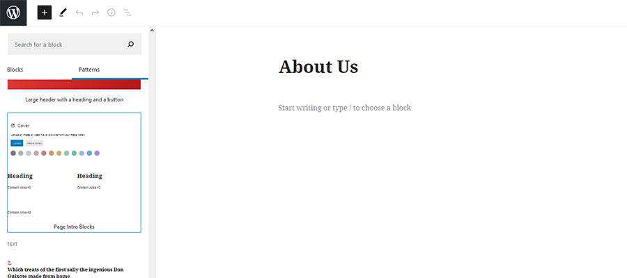
To add the block pattern to the page, click the “Add block” button on the upper left of the editor (a large “+” within a blue box). Then, click on the Patterns tab.
Within the Patterns tab, you’ll see a number of premade patterns that are included with WordPress. Scroll down until you see the pattern we created, “Page Intro Blocks”.

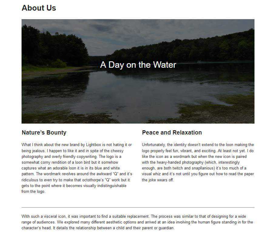
Click on the pattern and it will be automatically added to the page. From there, we can tweak the blocks to our heart’s content.

A New Way to Customize Your Website
WordPress custom block patterns are a huge timesaver. Developers no longer need to meticulously recreate page layouts for use in multiple places. By registering a block pattern, you’ll have a fully-custom starting point anytime you need it. This is also great for content creators, as it takes the mystery out of achieving a consistent layout.
What’s more, you don’t necessarily have to design a custom block pattern yourself. For instance, Gutenberg Hub has a vast template library that you can use to find and implement tons of premade layouts. Of course, you’ll still have to escape and register the pattern. But this opens up a whole world of possibilities.
In all, custom block patterns help to bring a new level of customization to the Gutenberg block editor. Now the editor can be every bit as custom as your theme.
The post How to Create a Simple Gutenberg Block Pattern in WordPress appeared first on Speckyboy Design Magazine.
I write about design rules a lot, but I sometimes forget to:
- Mention that these rules can't always be applied,
- Describe when that would be the case, and
- Add examples of situations where the rule really doesn't matter.
The rules should work in most cases, but sometimes need to be "violated".
Which is too strong a word anyway.
When someone points out to me that I violated a rule, I'm like: Wow! I violated the rule? I'm so sorry! Let's fix this immediately.
Whereas in practice it should be more like: Yeah, I know that rule, but it makes more sense to follow that other rule here, because [...].
In other words, pointing out that a certain rule has been violated should not be a sufficient reason to adhere to that rule.
My favorite example is "But that violates SRP!" (Single Responsibility Principle).
Whoops, I wouldn't want to do that! Or would I?
Actually, I would!
The Dependency rule
The same is true for another rule that I know as Robert Martin's Dependency rule.
Transposed to a layered architecture with an Infrastructure, an Application, and a Domain layer, this rule allows the following dependency directions:
- From Infrastructure to Application
- From Infrastructure to Domain
- From Application to Domain
Dependencies between classes within the same layer are allowed too.
Following this rule, a domain object should never use an infrastructure class (my favorite example: an Order entity should never generate a PDF invoice).
A simplistic way of verifying the rule requires that all the classes live in a namespace that match the name of the layer to which they belong.
To check if we didn't "violate" the dependency rule, we'd have to iterate over all the classes and look at two things: the namespace of the class and the namespaces of the classes and interfaces that are imported in this class.
Let's take a look at an example.
The following class is in the Domain layer.
It only has dependencies within the Domain layer, which is great:
namespace LeanpubBookClub\Domain\Model\Member;

use LeanpubBookClub\Domain\Model\Purchase\PurchaseId;

final class Member
{
    // ...

    public static function register(
        MemberId $memberId,
        PurchaseId $purchaseId
    ): self {
        // ..
    }

    // ..
}
As soon as the class has a dependency from a "higher" layer like Infrastructure (like the Email class in the following example), we should get some kind of warning:
namespace LeanpubBookClub\Domain\Model\Member;

use LeanpubBookClub\Domain\Model\Purchase\PurchaseId;
use LeanpubBookClub\Infrastructure\Email;

final class Member
{
    // ...

    public static function register(
        MemberId $memberId,
        PurchaseId $purchaseId,
        EmailAddress $emailAddress
    ): self {
        // ..

        Email::create()
            ->setTo($emailAddress->asString())
            // ...
            ->send();

        // ...
    }

    // ..
}
Some teams use deptrac to verify the dependency rule, and it works exactly like what I've described here.
This tool will warn you about using the Email class inside the Domain namespace while that class lives in the Infrastructure namespace.
How to make the warning go away?
We could accomplish that by moving the entity to the Infrastructure namespace:
namespace LeanpubBookClub\Infrastructure\Model\Member;

use LeanpubBookClub\Domain\Model\Purchase\PurchaseId;
use LeanpubBookClub\Infrastructure\Email;

final class Member
{
    // ...
}
Then we'll only have dependencies within the same layer, which is totally fine.
By now you should be shouting behind your screen: "No! Entities belong inside the Domain layer, they aren't Infrastructure code!"
Of course, you're right.
This isn't a solution at all.
Heck, we could even move all of our classes to the Infrastructure namespace and be done with the dependency rule forever.
How to fool deptrac
This illustrates that validating dependency directions using deptrac is cool, but there's one thing you should be aware of: deptrac can't verify that your class is in the correct layer.
In order to do that it should look at each class, figure out what type of class it is, and according to a certain rule set make a judgement.
E.g. "This class looks like an entity. It is mutable, h
Truncated by Planet PHP, read more at the original (another 11481 bytes)
Package:
Summary:
Check string to detect and remove bad words
Groups:
Author:
Description:
This class can be used to check string to detect and remove bad words...
Read more at https://www.phpclasses.org/package/11786-PHP-Check-string-to-detect-and-remove-bad-words.html#2020-09-07-03:09:43

Package:
Summary:
PHP version of the code examples of the book
Groups:
Author:
Description:
This package provides a PHP version of the code examples of the book Head first design patterns in PHP...
Read more at https://www.phpclasses.org/package/11785-PHP-PHP-version-of-the-code-examples-of-the-book.html#2020-09-06-19:56:16

Every photo has a unique atmosphere. From the composition to the idea behind the shoot, every photo can become a masterpiece. But if you want to showcase a specific atmosphere or distinguish yourself from other photographers with a signature style, you’re going to need a few tricks up your sleeve.
When it comes to adding extra flair to your photos, there’s nothing like Lightroom presets. Back in the day, we all spent hours brushing up every part of the photo to fit our aesthetic. We got headaches from the saturation and luminance curves. But fortunately, Lightroom presets are incredibly easy to use and give your photos stunning effects that you don’t have to struggle with.
So today, we’re going to show you the best Lightroom presets for adding Instagram effects to your shots. Instagram photos are incredibly noticeable for their aesthetics; from desaturated shots that give photos a soft feel to effects that bring out the pastels and make for colorful feeds and portfolios.
All you need to do is choose your favorite presets and then add them to Lightroom. After that, you can take your photos, and within a few clicks in Lightroom, they will fit your style perfectly. Soon enough, you’ll have a distinguished style that stands out from the crowd and gives your professional branding consistency that customers can rely on.
Give your photos the soft Instagram feel with these Lightroom presets. You’ll get 14 presets with trendy Instagram aesthetics: pastels, desaturated tones, matte effects, soft colors, and creamy skin palettes. These presets don’t change photos’ white balance, so you can use them with diverse shots.

Create stunning and ethereal photos with this Adobe Lightroom and Photoshop presets pack perfect for Instagram bloggers, and photographers who specialize in weddings, portraits, and similar niches. You’ll get 11 easily editable presets that play with shadows and highlights to give your photos the beautiful Instagram glow effect.

Add a dose of retro glamour to your standard shots with these Lightroom presets. These 40 presets offer fadeable color grading, and adjustable tones of some of the most popular Instagram presets such as Crema, Valencia, and X Pro. They won’t disrupt your standard WB and tone settings.

If your most common hashtag is #wanderlust, you’re going to love these Instagram traveler Lightroom presets. Carefully customized to provide soft and pastel tones, creamy skin, as well as the stunning faded and matte effects, these 15 Lightroom presets are a perfect fit for travel bloggers and photographers.

Once you’ve taken that perfect shot, it’s time to share it with the world! Just make sure it’s the best it can be with these Instagram portrait Lightroom presets. Easily add signature Instagram tones with these 11 Lightroom presets for bloggers and portraits photographers.

Create a beautiful and cohesive aesthetic in your Instagram feed or your portfolio with these 15 Instagram blogger Lightroom presets. Perfect for photographers as well as bloggers, these Lightroom presets offer professional and beautiful end results. You can easily customize these presets to fit every photo’s specific qualities.

Vogue who? With these glamorous Lightroom presets, your photos can look just as glossy and fantastic. And you don’t even have to spend hours tweaking the settings! You’ll get 10 professional (and customizable) Lightroom presets with different options: matte, glossy, soft, dramatic, warm, deep, and more!

If you want to place an emphasis on the subject of your shot, you’ll love these clean and minimalist Lightroom presets. These 12 Lightroom presets offer smart and clean options that bring out the colors of your photos. They’re perfect for photographers, as well as bloggers!

Create beautiful and expressive photos for your portfolio or Instagram with this retro Lightroom preset collection. Featuring the best of Instagram retro aesthetics, these 10 film presets are the perfect fit for colorful and dramatic feeds that instantly stop the scroll. They work beautifully for both social media and blogs!

Make your city’s streets shine bright with these street photography Lightroom presets! These 13 versatile presets are perfect for all kinds of urban scenes; from those vivid avenues, to neon-lit facades and dim alleys shot during the night. In any case, your photos will look beautiful and Instagram-worthy.

Bring out the natural beauty of your subjects with these natural portrait Lightroom presets. You’ll get as many as 60 different presets to pick from, all of which come with an organic glow and specially adjusted shadows and highlights. They work like a charm for ethereal wedding photography.

Give your tropical and vacation photos an extra oomph with these tropical Lightroom presets. You’ll get 50 presets and LUTs that give your vacation photos a film-like atmosphere. These presets also offer skin-tone protection for glowy skin, and opacity/amount sliders. They’re compatible with Lightroom mobile, too!

Share that irresistible summer feeling with these summery Lightroom presets! These 30 presets offer warm and colorful filters for your standard photos, so they’re perfect for beach and sea themed shoots, landscapes, or simply a cohesive feed. You can also easily customize them to match your photos perfectly.

Get the best of both worlds with these Lightroom presets that play with both warm and cool tones to give your photos an incredible atmosphere. You’ll get 50 gold and navy Lightroom presets (from film tones, to presets playing with contrast) with opacity/amount sliders, and skin tone protection.

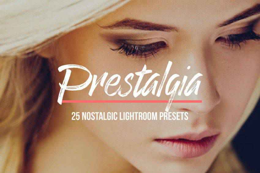
There’s nothing like a little bit of vintage to take your viewers on a journey. Prestalgia is a collection of 25 retro Lightroom presets with 5 different filter strengths. Your original tonal and WB settings are safe, too, and you can choose presets that fit your photos best!

Inspired by the creators’ trips all around the world, the Wonderlust Lightroom preset collection is perfect for travel bloggers and photographers who dream of appearing in NatGeo. You’ll get 10 Lightroom presets, and they fit diverse photos perfectly; from urban settings, to shots taken in the wilderness.

There’s nothing like teal and orange to give your photos an epic, longing feel. And this collection of Lightroom presets gives you 50 gorgeous presets that bring out the best colors. From intense color variations, to natural and soft presets, you’ll get plenty to work with!

Give your photos a bright and clean finishing touch with these minimalist Lightroom presets. Mimicking the Scandinavian-style Instagram aesthetic, these 11 presets are perfect for fashion bloggers and photographers, as well as both indoor and outdoor photo shoots. You can easily edit the final effects to suit your branding perfectly.

Showcase your professionalism and skills with these magazine Lightroom presets. This collection offers 50 chic presets that will give your shots a film-like atmosphere ready to be on magazine covers everywhere. From presets inspired by Kodachrome and Hermes, to bright and retro options, you’ll get the full package!

Create a welcoming atmosphere with Gingerbread, a Lightroom preset collection with 11 presets. These presets play with both cool and warm tones, offering unique and soft results perfect for capturing the charm of special moments. From wedding and indoor photography, to outdoor photography and fashion, they fit various shoot styles!

The world is visual. If you’re a photographer, you understand the importance of having a signature style. Unfortunately, it’s often hard to tweak your photos just so. It’s even harder to do that every single time. With these gorgeous Lightroom presets with Instagram effects, you can easily curate a beautiful gallery with no extra work.
The settings that match your style will be saved – all you have to do is apply them to your photos. So pick the presets you’ve been eyeing, and add them to your Lightroom kit. Your customers will love knowing what they can expect from you, and you will be attracting followers in no time. They also work great for trying out new editing styles. So create a consistent feed, make your photos beautiful, and you’ll have a photoshoot waitlist before you know it!
The post The 20 Best Lightroom Presets for Adding Instagram Effects to Your Shots in 2021 appeared first on Speckyboy Design Magazine.
Package:
Summary:
Controller to handle actions to manage a todo list
Groups:
Author:
Description:
This package is a simple controller to handle actions to manage a todo list...
Read more at https://www.phpclasses.org/package/11749-PHP-Controller-to-handle-actions-to-manage-a-todo-list.html

Package:
Summary:
Parse and edit the URI of a site page
Groups:
Author:
Description:
This package can parse and edit the URI of a site page...
Read more at https://www.phpclasses.org/package/11784-PHP-Parse-and-edit-the-URI-of-a-site-page.html#2020-09-04-16:54:20

Package:
Summary:
Generate code to implement a CRUD interface
Groups:
Author:
Description:
This package can generate code to implement a CRUD interface...
Read more at https://www.phpclasses.org/package/11771-PHP-Generate-code-to-implement-a-CRUD-interface.html#2020-09-04-10:48:52

Package:
Summary:
Manage database records with a CRUD interface
Groups:
Author:
Description:
This class can manage database records with a CRUD interface...
Read more at https://www.phpclasses.org/package/10997-PHP-Manage-database-records-with-a-CRUD-interface.html#2020-09-04-09:43:57


ztext.js – An easy-to-implement 3D typography library that works with every font.

Ground Rules for Web Animations – A look at the conditions and considerations for using web animations the right way.

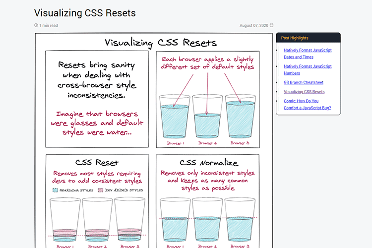
Visualizing CSS Resets – Use this helpful infographic to better understand what CSS resets do.

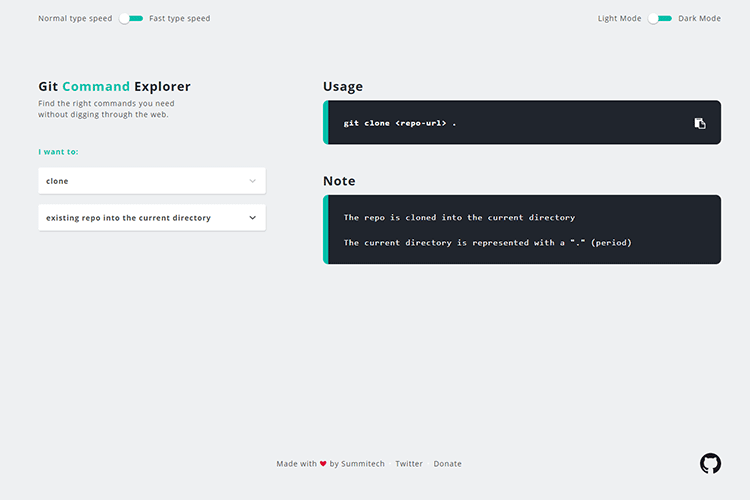
Git Command Explorer – A handy resource to help you find just the right Git command.

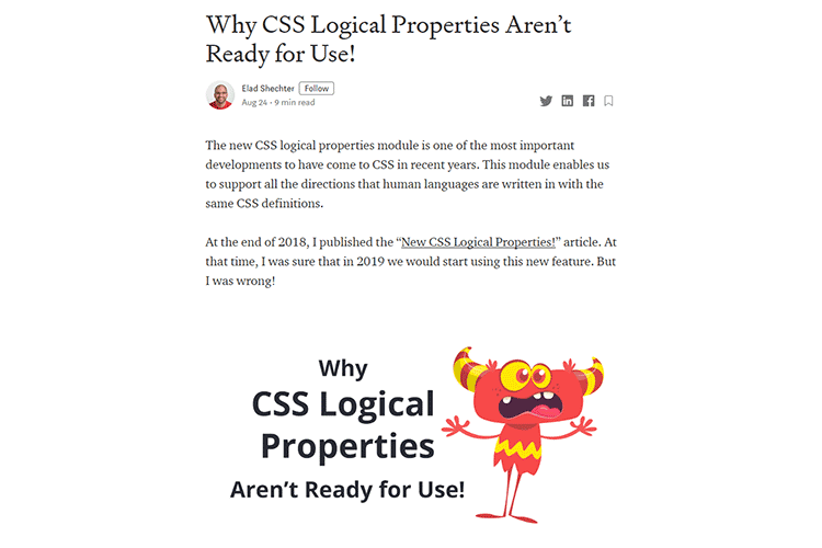
Why CSS Logical Properties Aren’t Ready for Use! – Yes, CSS logical properties are exciting. But the browser support just isn’t there quite yet.

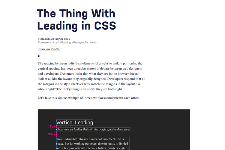
The Thing With Leading in CSS – Getting to the bottom of the vertical spacing of elements.

Is the WordPress Comment System Still Relevant? – Perhaps the comment system shouldn’t be so prominent in a default install of WordPress.

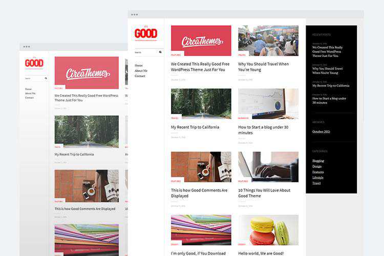
The 22 Best Free Personal Blog Themes for WordPress – Find the perfect free WordPress theme for your blog in this collection.

Experimental Triangle Image Transitions with WebGL – Add a unique transition effect to your UI with this tutorial.

The 20+ Best Banner Mockup Templates for Photoshop – This collection offers an array of compelling choices for mocking up your print banners.

Site.js – Develop, test, sync, and deploy (using a single tool that comes in a single binary).

Bootstrap Icons – Download the official SVG icon library for Bootstrap.

Speed up your website by automatically removing unused CSS from Bootstrap or other frameworks – Less bloat = Better performance!

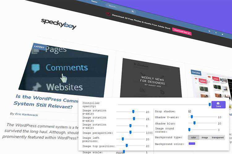
Limus – Upload your screen shots and this tool will let you view and save them at different angles.

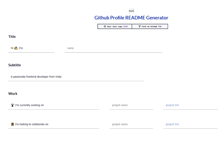
Github Profile README Generator – Provide the basics and quickly generate a README profile.

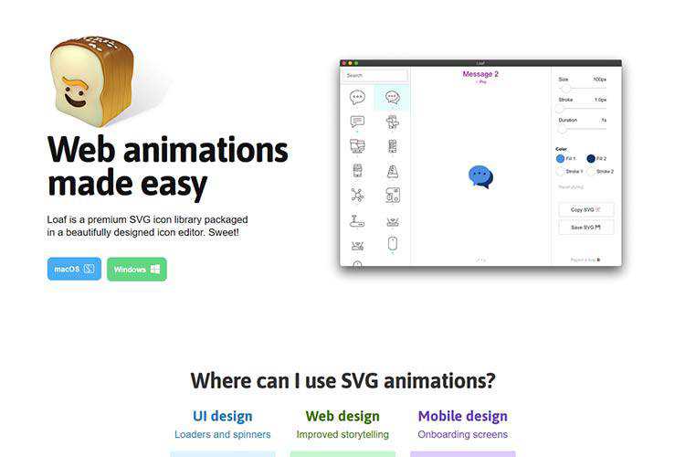
Loaf – A premium SVG icon library packaged in a beautifully designed icon editor.

Unsplash – Easily add images to your website from the stock photography giant with this WordPress plugin.

Big Sur Free UI Kit – Grab this Sketch and Figma Desktop UI library for your projects.

The post Weekly News for Designers № 556 appeared first on Speckyboy Design Magazine.

