Interview with Dave Delaney
Audio
This episode is sponsored by
RingCentral Developers
The post Interview with Dave Delaney appeared first on Voices of the ElePHPant.
The post Interview with Dave Delaney appeared first on Voices of the ElePHPant.
Every font tells a story. Once upon a time, serifs ruled the world. When we look at them today, we can’t shake the feelings of tradition and elegance. Then, we switched to sans-serifs; practical and highly readable. Fonts that amplify your message.
Today, we use all kinds of fonts. Serifs for elegant materials, sans-serifs for making sure that our words resonate, and script fonts for that special aesthetic touch. And while the stakes are always high when it comes to fonts, they are never as high as when it comes to logo design.
If you want to create a stunning logo, you need a stunning font. So today, we’re bringing you a collection of 50 of the best fonts for creating stunning logos that will show your clients how well you understand their brands.
From tall and thin serifs that radiate elegance, to flowery script fonts that stand out from the crowd, there’s plenty to pick from. Find the right font for your next project, make that logo stand out, or simply give your clients more options to pick from when creating their brand identity.
After all, if you find the right font, you won’t have to keep looking. And the font you choose will become a part of your clients’ brands as much as their products are. From logos to web display, let one of these stellar logo fonts become a go-to resource in your branding kit. Let’s dive in!
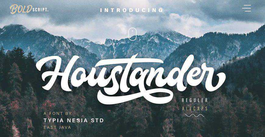
Good things come in pairs, and so does Houstander! Houstander is a beautiful handwritten script font with sans-serif foundations, and it works like a charm for elevating your logos, as well as other marketing materials. It comes in 2 variations: all-caps and regular, with numerous multilingual characters and stylistic alternates.
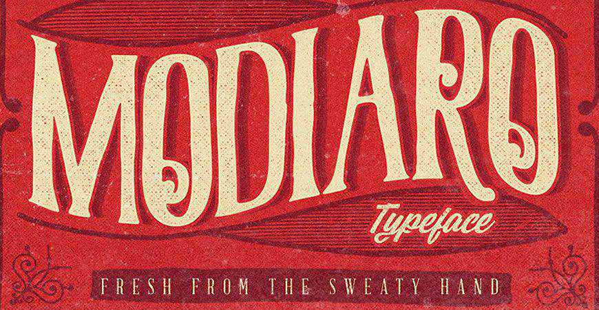
There’s no cool like old school cool! Modiaro is a vintage logo font with numerous swirls and details your clients will love. It comes with multilingual support, uppercase and lowercase variants, as well as numerals and punctuation. It’s the full package for your next vintage logo!
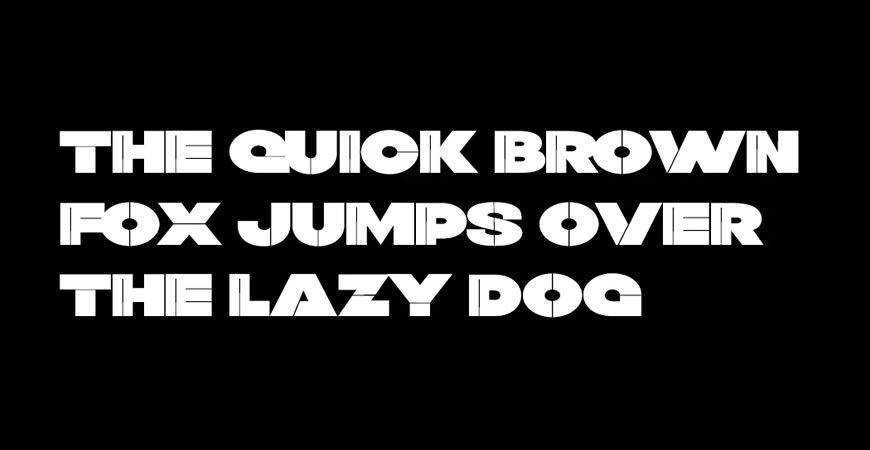
Give your logo a fun personality with Twig, a modern and quirky sans-serif logo font. It’s perfect for big displays, so you can use it for online graphics and product packaging, as well. You’ll get 4 distinct font styles to play with and wow your audience.

Innovative and unique brands need unique fonts, and Artis is the perfect fit! This bold and beautiful sans-serif offers a retrofuturistic vibe that stands out perfectly on logos, displays, and other marketing materials. If your customers are looking for a font tailored to their brand, Artis is a great choice!
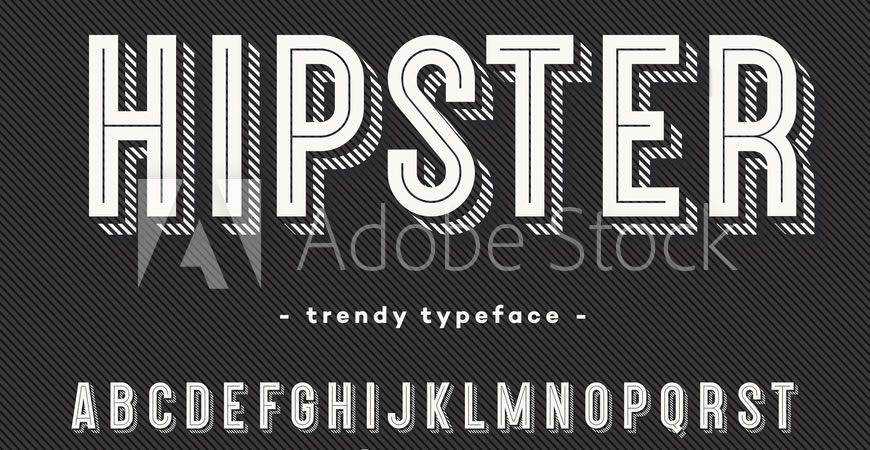
Make your brand’s style stand out with Hipster, a bold logo font. Inspired by the typography we’ve seen in the 80’s, Hipster is the perfect font for brands that want to evoke old school cool with their materials (from logos, to apparel and posters).
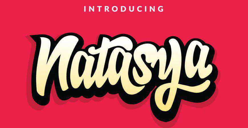
For a personal touch, choose Natasy, a logo font that mimics handwriting. You can also mix and match different glyphs and stylistic alternates to fit your brand; from ligatures, to swash. And in addition to fonts, you can use Natasya for posters and other marketing and branding materials, as well.
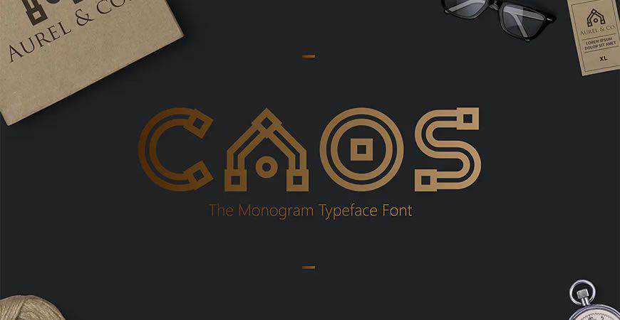
Intricate and unique, CAOS is a monogram logo font like no other! You can use CAOS as the main font for your logo, or use the decorative alphabet letters as symbols to elevate your branding. This decorative logo font is one of a kind, so add it to your kit!
Vibrant and modern, Flix was made to be displayed! This decorative sans-serif font is a perfect fit for friendly brands that want to attract attention, and you’ll love how easy it is to customize. You’ll get 2 styles (Regular and Outline) for all your branding needs.
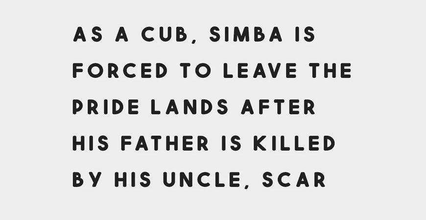
If your brand has a message to shout from the rooftops, make sure you use Squiborn. This hand-drawn logo font is one of a kind, and it’ll give your logo a traditional and cool vibe. It’s perfect for logos and other materials like packaging and posters.
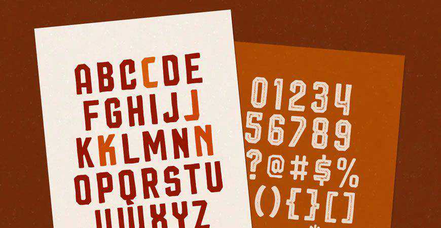
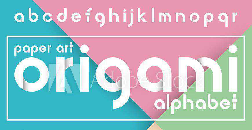
If your brand is as intricate as origami, then you don’t have to look further from Origami – a beautifully imagined decorative alphabet font for logos. It offers a modern and friendly vibe for innovative brands, and you can mix and match to adapt it to your style.
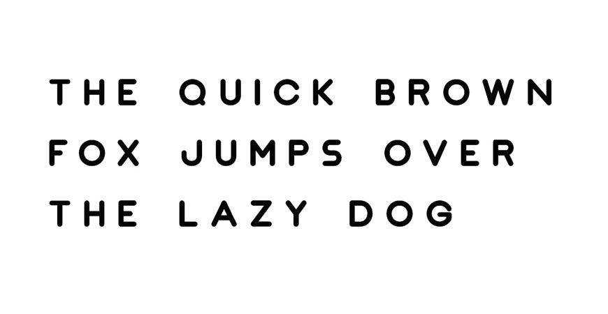
Modern, clean, and yet charming – Jaquel is a vivaciously fun logo font! Inspired by geometric principles and grounded in sans-serifs’ readability, Jaquel is a perfect fit for logos for modern companies; from tech, to fashion. You’ll get 4 different weights, as well as a web font.
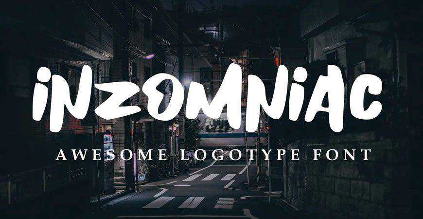
Inzomniac, a modern logo font, will transport you right onto urban city streets with all the incredible vibrancy they provide. This all-capital script font is perfect for modern brands’ logos, especially if the company’s mission is to stand out from the regular crowd. Give it a whirl!
Charming and gentle, the Rossa script is perfect for logos and big displays. Mimicking a natural, yet refined, handwriting flow, Rossa gives every branding material a special aura of tenderness. It’s perfect for blogging, fashion, and health and beauty businesses that want unique visuals, starting from their logo.

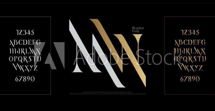
Elegant and luxurious, this logo font set depicting all the letters of the English alphabet is a perfect fit for brands that want to radiate opulence. With neatly and precisely drawn uppercase letters and numerals, you’ll have everything you need to create a refined logo for your clients.
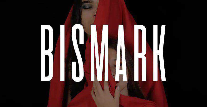
Bold and stunning, Bismark is an all-caps logo font that works like a charm for a variety of styles. With 3 weights, you will get plenty of options for adapting Bismark to your clients’ visuals. Experiment with letter spacing, and you’ll get phenomenal results for product packaging!
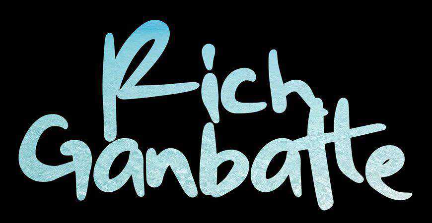
Give your logos a signature style with a personal touch with a little help from Rich Ganbatte, a graffiti-inspired logo font. This unique and bold script font is perfect for capturing attention from the very first glance, and it comes in regular and italic all-caps variants. Ready for an adventure?
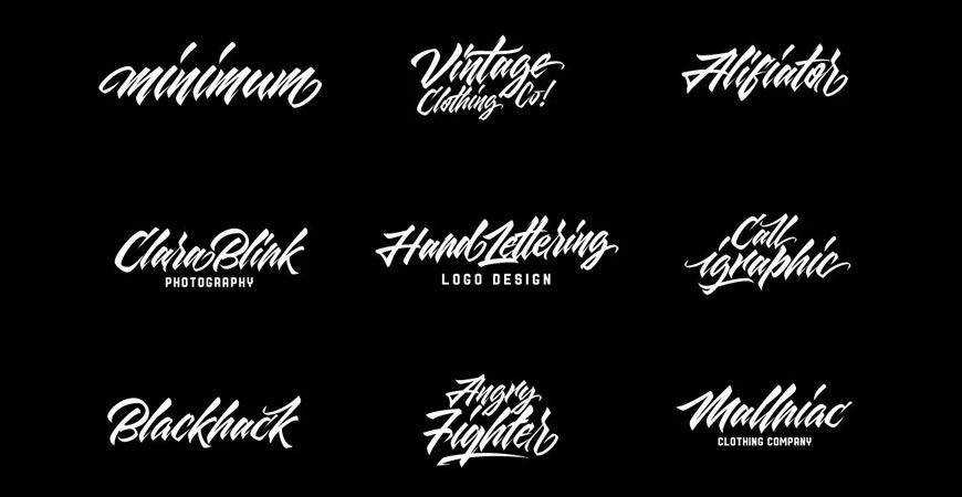
Sharp lines and bold swash come together to present you Maqin Larisa – a script logo font that will look perfect on your products! Maqin Larisa makes the most out of different influences – Gothic-inspired ligatures, and modern visuals. With upper and lowercase letters, it’s the full package!
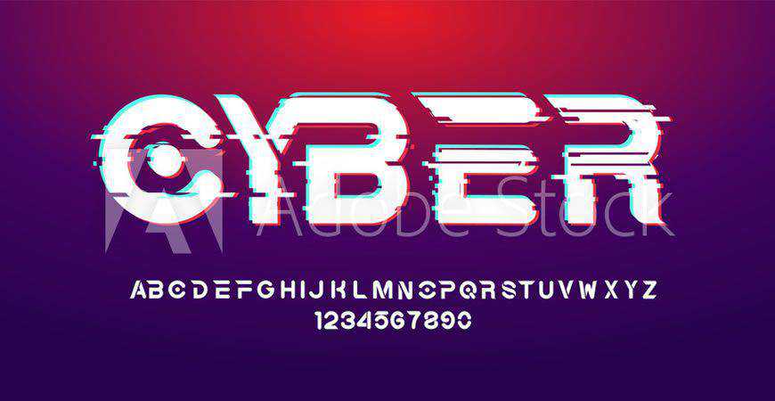
Typography is king, and Cyber is definitely the king of retrofuturism. It stands out with a minimalist sans-serif alphabet portrayal that reminds of sci-fi works. Every letter and numeral is unique, so it can be the main logo font, or you can cherry-pick specific letters to use them as symbols.
Ready to hit the waves? Southwave, a handwritten logo font, fits modern and laid-back brands like a glove. The calligraphy style of Southwave is perfect for making customers relate to the brand from the very first glance, and you’ll love working with it during your next design project!
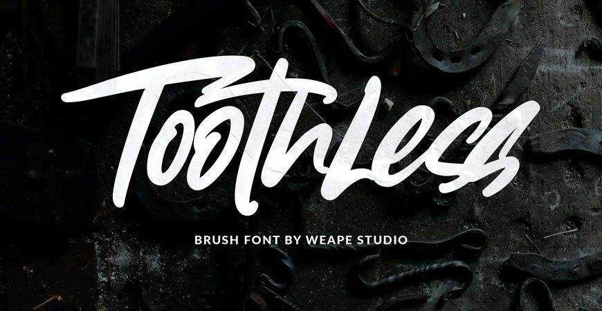
Toothless isn’t afraid to stand out from the crowd, so make sure you download it for the next time clients say: “We want to make a statement.” This urban logo font is the full package: both uppercase and lowercase letters, as well as numerals and punctuation.
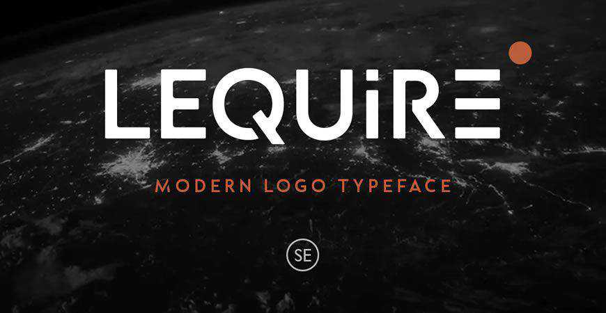
Shoot for the moon with Lequire! This modern sans-serif logo font offers a futurist aesthetic for innovative brands. From fintech to SaaS, and even a more forward-thinking fashion brand, every business will love what this unique logo font has to offer. Every case version is unique and suits logos perfectly!
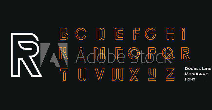
Predict the future by creating it with this stunning and futuristic double line monogram font. Perfect for subtle branding or even large-scale symbolism on the logo, this logo font will give your clients the fanfare every brand deserves. Leverage the orange-golden color palette to create striking and impactful brand visuals.
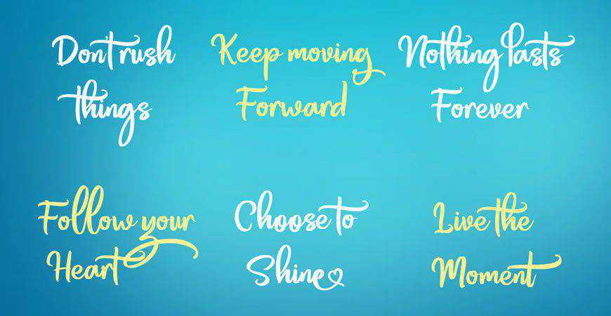
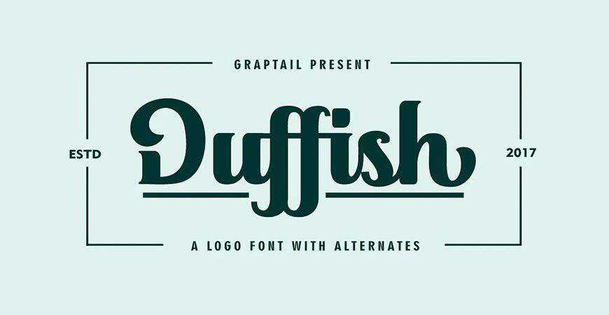
Bold and fun, Duffish is the perfect combination of script fonts’ elegance and contemporary visual brand identity trends. You’ll get plenty of alternates to work with and adapt Duffish completely to your logo. Every letter form in Duffish is uniquely rendered, just like your clients’ brands!
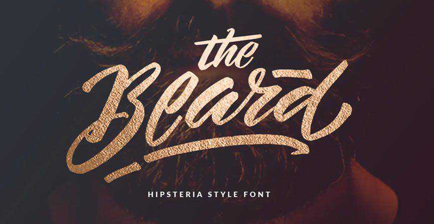
Make a permanent mark with a marker-style logo font, the Beard. This hipsteria-style font is perfect for brands that want to make the most out of vintage-inspired typography, as well as modern and bold visual identity trends. You’ll also get stylistic alternates to adjust this powerful logo font.
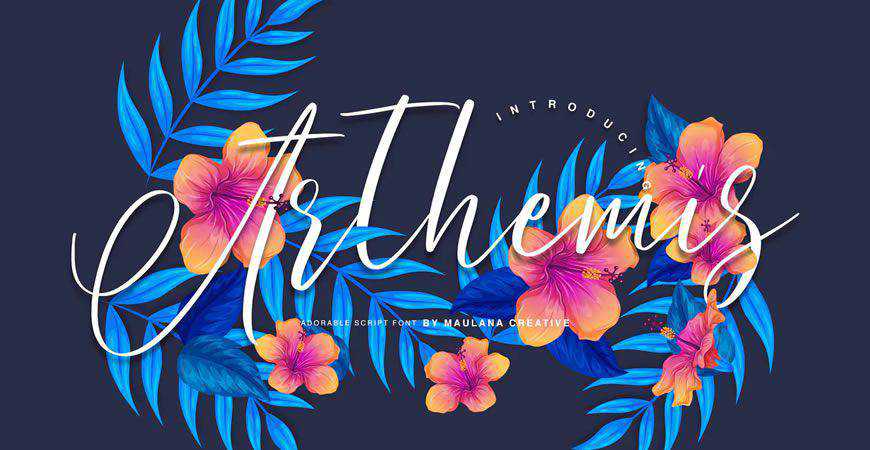
Give your logo an aura of elegance with Arthemis, a stunning script logo font for more refined brands. Every letter offers a unique handcrafted feeling, making it perfect for logos where you want every letter to stand out. You can also use it for social media, posters, stationery, and more.
Abstract and minimalist, the Mountain logo font is perfect for modern brands that prize innovation and quality above all else. Certain letters are rendered in a unique way, so they can also be used for monogram logos. Mountain comes in all caps, with numerals included, giving you everything you need!

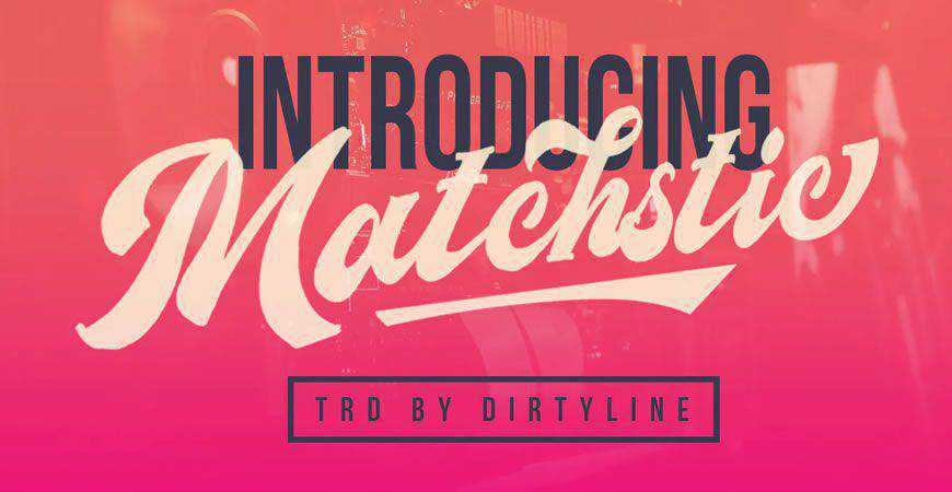
If you want to give your logo a bold and quirky vibe, Matchstic is exactly what the designer ordered! This unique logo font is perfect for emphasizing certain parts of your logo to stand out from the crowd. It comes with uppercase and lowercase letters, numerals, symbols, and stylistic alternates.
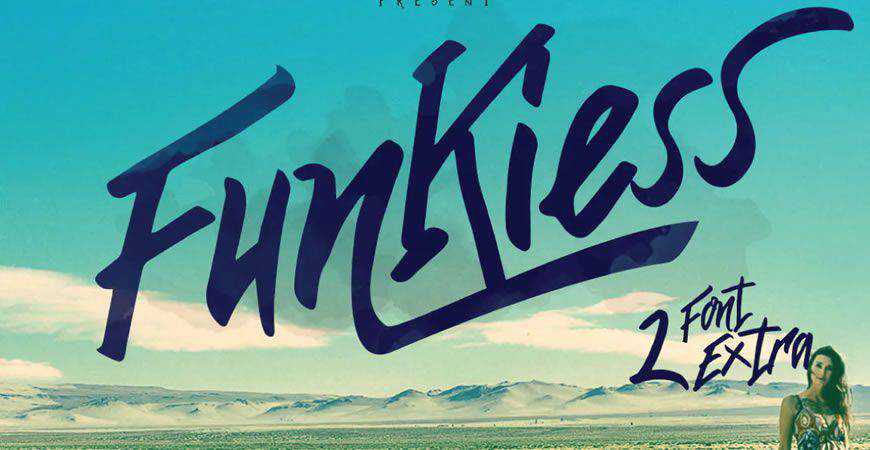
Travel back in time to the funky 70’s with Funkiess, a logo font that’s perfect for big display. The font has a natural and vibrant look thanks to the way it mimics wild and fun-loving handwriting flow, and it’s perfect for your maximalist logos.
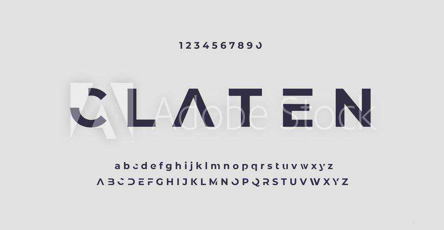
If technology and futurism could be described with just a single font, it would be Claten. This modern and minimal font is perfect for tech and entertainment companies who want their logos to stand out from the crowd. It comes with both upper and lowercase variants, as well as numerals.
Sometimes all you need is a simple logo that highlights your message. Fritz, a rounded logo font, is the perfect choice. A sans-serif with 3 distinct styles, Fritz will do wonders for your minimalist logos (especially with bold color palettes), and other branding and marketing materials such as product packaging.

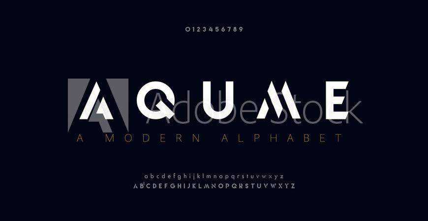
Aqume is one of a kind! This abstract and modern logo font comes with a variety of unique letter renders, so it works perfectly for monogram logos and symbols, as well. Aqume is perfect for modern companies that prioritize innovation, and it will help you send out the right message.
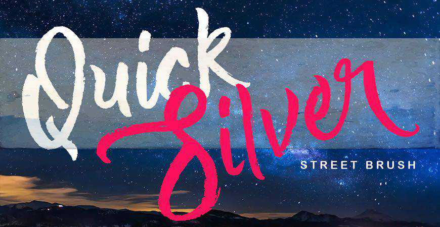
Modern and fun, Quick Silver is a brush font perfect for modern companies’ logos. The handwriting style is very distinct, so it’ll look great both on logos and other materials. You’ll get both upper and lowercase letters, numerals, and a few extra swashes and ligatures.
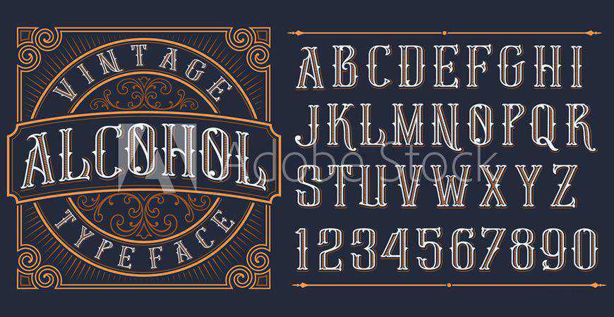
If you’re looking to give your logo a distinct vintage style with speakeasy and the Great Gatsby vibes, look no further than this font! This gorgeous logo font comes with outlined all-caps letters and numerals, so it’s perfect as the centerpiece of your visual brand identity.
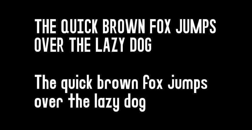
Simple and modern, with plenty of variations, the Impulse logo font is a stellar choice for your next project. Impulse comes with 4 different weights, which give its sans-serif nature an added flair. You’ll also get the web font version of Impulse for all your web display needs.
An awesome font duo for all your vintage-inspired needs, Troyline is the full package. You’ll get two fonts: a beautiful organic script, and a sans-serif font. You can mix and match elements to your heart’s content and create stunning branding and marketing materials for your clients.

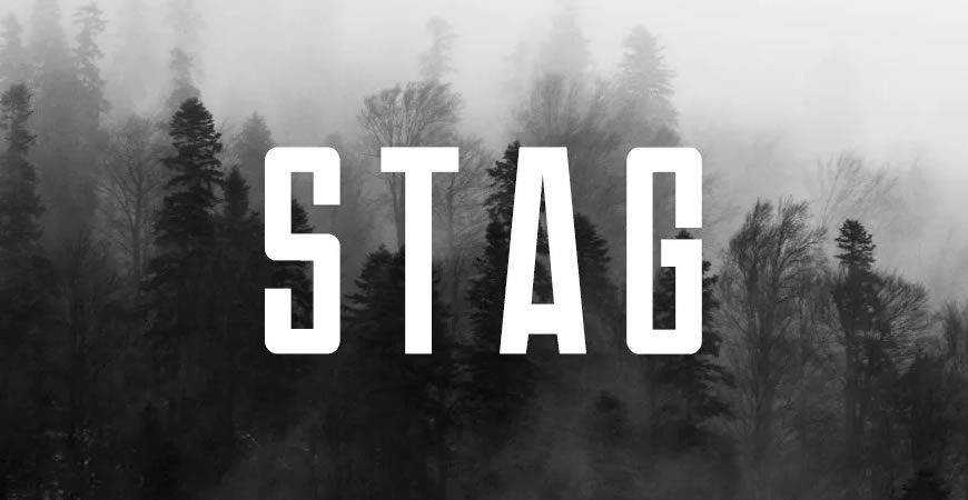
Stand out with Stag, a modern logo font that boldly states your message. This stunning all-caps sans-serif typeface is perfect for a variety of projects, and modern brands will love both the Regular and the Bold version (each has a specific italic version). You will also get a web font!
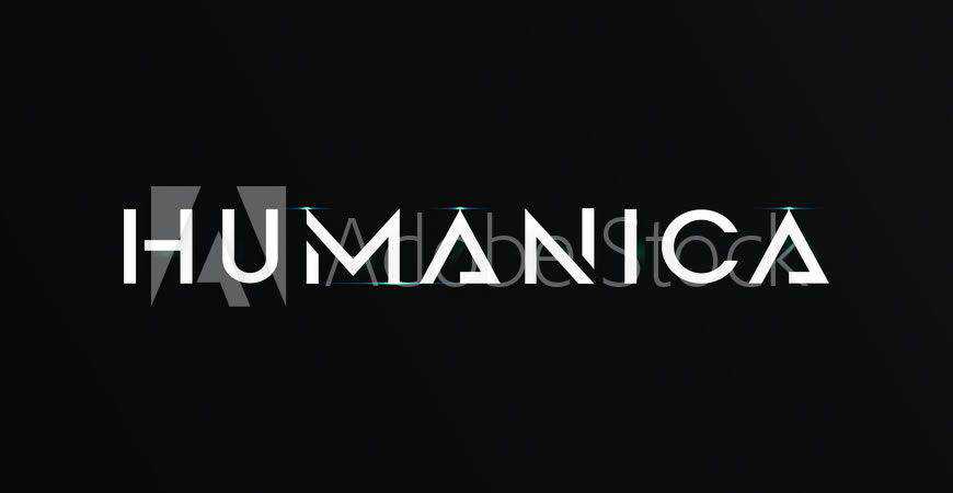
Humanica is an abstract and futuristic font your clients will love if they want to show how forward-thinking and modern they are, even with their logo. With distinct ligatures for all-caps alphabet letters and numerals, Humanica works perfectly as both the main logo font, and as the monogram logo font.
Show everyone the quirky side of the future with Boltz, a unique logo font with plenty of stylistic alternates and groundbreaking alphabet letter renders. You’ll get 6 styles, including 3D regular and italic, and the unique letters will certainly make your next logo infinitely more fun and engaging.
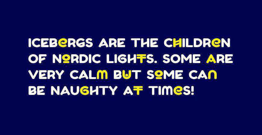
Contemporary and minimalist, Augor is the perfect logo font, especially if you want to create a memorable monogram logo. With unique versions of all-caps letters, Augor works perfectly as the main font for your logo. You can also use it to get memorable symbols for your main or monogram logo.
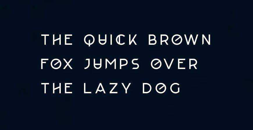
If you’re looking for a more recently vintage logo font, Brewisten is a great option. This sans-serif mimics 1960-1980’s typography style, giving you a unique look while evoking your tradition. It supports over 20 languages, and you’ll get a Sans and a Slant version.
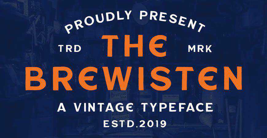
Forward-thinking and abstract, Adegan is an incredibly unique logo font. With appropriate character spacing, it can be a great main font for your logo. However, Adegan can also work as a monogram logo font due to all the interesting alphabet ligatures and glyphs that suit tech and sports brands perfectly.
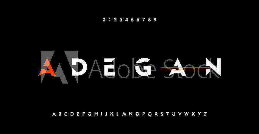
Looking for a modern font logo that’s not sporty, but elegant? You’ve found it! Nord is a minimalist logo typeface that radiates both elegance and simplicity. With 7 diverse weights, Nord is a truly supreme addition to your branding and design kit for all your projects.
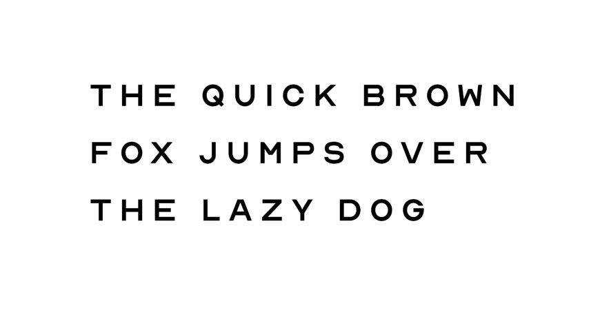
A vintage font duo, the Kingdrops is a supreme choice for your next logo design project. Kingdrops offers 50 hand-drawn objects, as well as 12 logo templates to give you a shot of inspiration. You’ll get alternates, so you can mix and match to make Kingdrops your own.
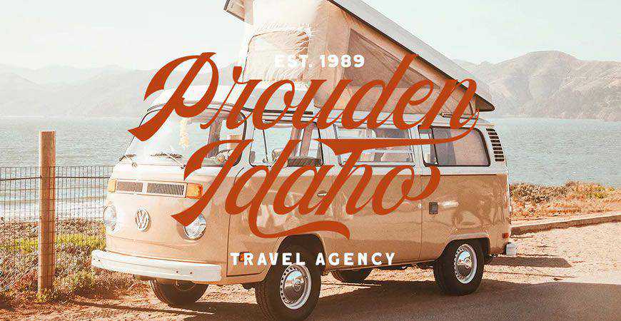
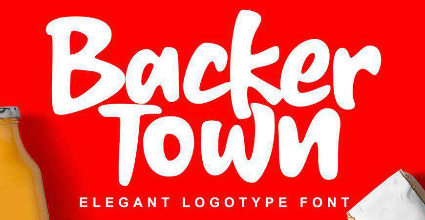
Simple and playful, Backer Town is a great font for all the quirky projects on your plate. It works great as the main logo font, but you can also use it for impactful monogram logos. A funky script, you’ll have the time of your life using Backer Town!
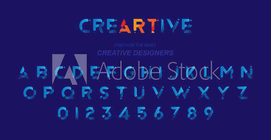
Create art with CreARTive logo font! This little gem of a font guarantees dynamic and engaging results with all-caps alphabet letters featuring gradients and various 3D elements, as well as numerals. Creartive font works perfectly for fun logos, as well as memorable monogram logos for tech and other innovative companies.
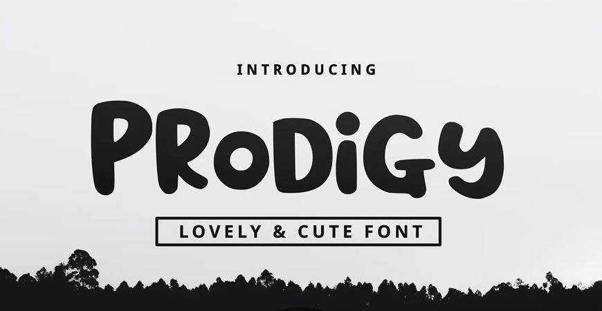
Fun and quirky, the Prodigy logo font is exactly what you’d expect an elementary school prodigy’s handwriting to look like. It’s perfect for brands that prize their childlike curiosity. This sans-serif font offers numerous options (numerals and punctuation included) for you to play with.
Sleek and beautiful, the Futurism minimal logo font is exactly what we’d like the future to look like. This incredibly unique logo font offers special versions of alphabet letters that look stunning on traditional and monogram logos, as well as other branding and marketing materials for innovative companies.

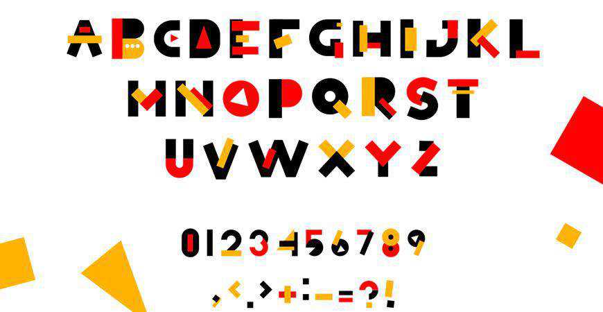
Create a unique logo with Simbox, a geometric logo font. Featuring traditional geometric shapes creatively integrated into alphabet letters, Simbox is wildly vibrant and leaves a long-lasting impression. It’s all caps, but you’ll get various color alternates to help you express the story of your brand.
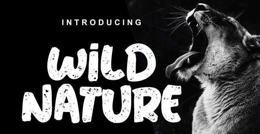
Mimic the power of nature with Wild Nature, a stunning logo font. It can work as a clean or textured font, depending on your style. When textured, Wild Nature truly offers a feral vibe that instantly attracts attention. And if you want something subtler, go with the standard font variation.
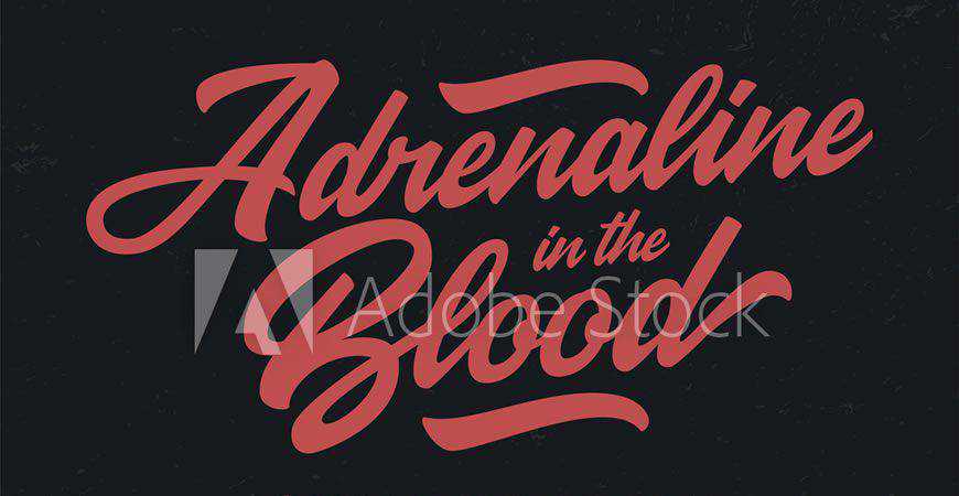
Original and inspired by retro typography, Adrenaline in the Blood is really the logo font that will get your blood racing! This gorgeous brush script is perfect for memorable logos for fun-loving brands; from fashion, to breweries, restaurants, and more. All the letters are unique and vibrant, guaranteeing beautiful results!
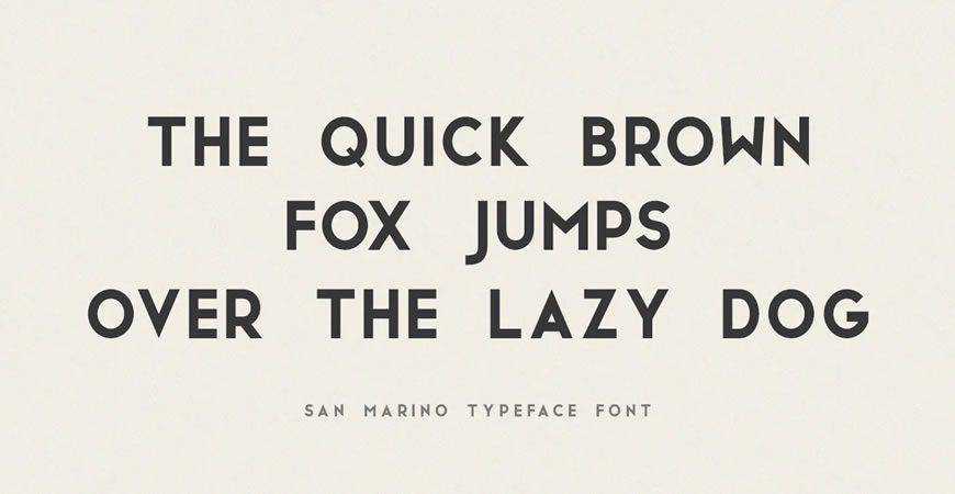
Elegant and now emboldened by geometric shapes, San Marino is a perfect fit for modern brands that want to leave a great first impression. You’ll get different font styles to work with, including versions with vibrant outlines. Unlike any other sans-serif, San Marino promises both elegance and friendliness.
Have you found the right font? Our journey started with scripts. We’ve crossed the rivers of serifs, explored the wild lands of decorative fonts, only to come home to urban sans-serifs. It was quite a ride, and we hope you’ve found the right font for your next design project.
No matter the client you’re working with, we’re sure that there’s a perfect font hidden in this collection. Make sure you bookmark it so the next time you get to brainstorming, you won’t have to start from scratch or feel the pangs of a creative block. Instead, all you have to do is browse this collection, find the perfect font, and show your client the magnificent work you’ve done. You know what they say: first impressions matter. It’s time to make sure your logo shines!
The post The 50 Best Fonts for Creating Stunning Logos in 2021 appeared first on Speckyboy Design Magazine.
Latest PEAR Releases:
If you manage a website that relies on any WordPress plugins or themes that haven’t seen an update for a while, your time with them may be running out. Recent changes to the CMS have left backwards compatibility in the dust – at least when it comes to use of the jQuery library.
With the release of version 5.5, WordPress has started the process of updating the version of jQuery that is shipped with the software. As such, the jQuery Migrate script (which helps to keep older code functioning) has been removed. This has resulted in a lot of bugs for developers to squash.
While many popular, actively-developed themes and plugins have released updates to address any issues, not everyone has been so lucky. There’s a wide array of legacy products out there that still rely on that jQuery migrate script and simply break without it.
To be certain, these items are living on borrowed time. But that doesn’t mean you can’t squeeze some extra time out of them. Today, we’ll show you how to keep things running (at least temporarily). Then, we’ll explore why this is (mostly) a good thing for WordPress overall.
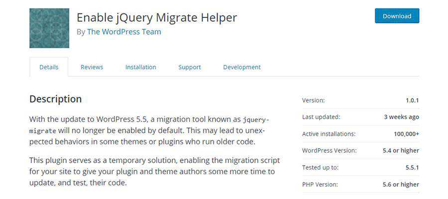
There’s good news and bad news. The good news is that WordPress has released a plugin, Enable jQuery Migrate Helper, that restores the jQuery Migrate script on your website. This should allow any older scripts to run as they did before WordPress 5.5 came into the picture.
However, this plugin doesn’t just run quietly in the background. It also points out errors and deprecated code via the browser console and within the WordPress dashboard. This is a big help to developers who are looking for some hints as to what needs fixed for future compatibility.
The bad news is that this plugin is really only useful until WordPress 5.6 is released. That release will see a new version of jQuery Migrate bundled with core – one that won’t work with these same legacy scripts that broke down with 5.5.
Of course, the WordPress community is pretty skilled at providing alternatives. Plugins such as jQuery Manager for WordPress might keep old code afloat, even after WordPress 5.6 hits the market. And it’s not far-fetched to imagine other similar plugins popping up to do the same.
These solutions can be lifesavers in a pinch. Yet, in the bigger picture, all of this jQuery madness serves as a harbinger of where legacy products are headed.
The overarching point of upgrading WordPress to the latest version of jQuery is that it allows the project to move forward. Backward compatibility has always been a key feature, but there does come a point when it stifles future development.
We also know that WordPress has adopted other JavaScript libraries in recent years. The Gutenberg block editor uses React, for example. Holding onto an old version of one library just doesn’t jibe with using the latest and greatest technologies elsewhere.
That all makes perfect sense on the surface. But tell that to the website owner (and their brave-but-weary developer) who now needs to fix and/or replace legacy code.
To say the very least, it’s an inconvenience. And it might also be expensive to implement solutions that will work now and into the foreseeable future. Because, let’s face it: not every old theme and plugin is going to survive this transition.

Yes, there’s some pain involved. Maybe even a few good memories as well. But just as these old themes and plugins hold WordPress back as a whole, they also hold back the websites running them.
Designers and developers: think about how many times you wanted to implement an exciting new feature, only to be forced into dealing with legacy obstacles in your way. Maybe it’s that 5-year-old page builder or a theme that uses ancient layout techniques. They impede progress.
This jQuery transition may be just the thing we need to kickstart redesigns for older sites. Even if a redesign isn’t in the cards, there is an opportunity for revenue here. Whether it’s a matter of patching up some code or fully replacing an existing piece of software, these tasks can fill up your schedule. That leads to some extra cash in your pocket.
It’s also a matter of eliminating potential troublemakers. Looking through the WordPress plugin repository, it’s easy to find listings that haven’t seen an update in years. While some may still be useful, there are some real risks in using them. Beyond incompatibilities, there could be gaping security holes that are just waiting to be exploited.
This is one way to finally put those ticking timebombs out of reach. That in itself is a positive byproduct of moving away from the old version of jQuery.
The post Why Some Outdated WordPress Plugins & Themes Are Facing Extinction appeared first on Speckyboy Design Magazine.
One of my esteemed professors from Santa Monica College, Dr. Driscoll asked for an opinion on how one can use a sheet of music and reshuffle some measures to generate a unique exercise for each student. This turned out more fun than anticipated and here's a solution I came up with using the free notation software MuseScore and a Node.js script. I hope it can be useful to someone else in the future for music education or why not for generative music too.
For the inpatient, here's the code.
For a template you can create a new file in MuseScore or import some other file into MuseScore for final touches. In my case, the prof gave me a MusicXML file exported from Sibelius (a clunkier commercial alternative to MuseScore).
Once the music sheet is to your liking, export it as uncompressed XML, native to MuseScore (*.mscx).
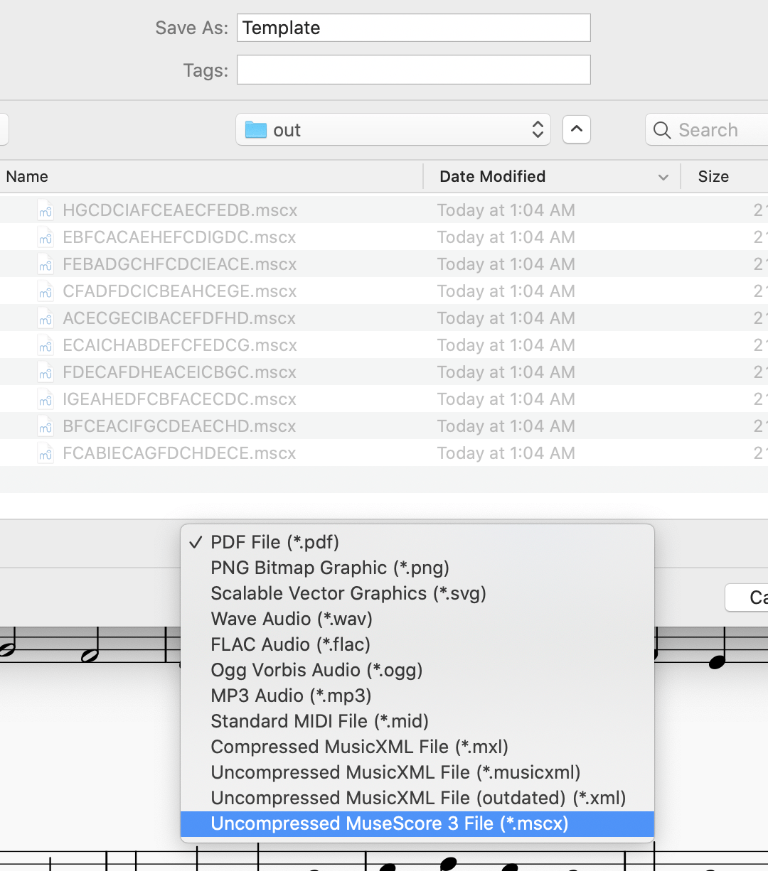
Turns out MuseScore's native files are compressed xml (mscz) or its uncompressed brethren (mscx). I used the uncompressed version so I can look around into the XML and also don't have to deal with compression in my Node script.
Why MuseScore's XML and not MusicXML? I don't have a good answer other than convenience and habit and reducing one more variable.
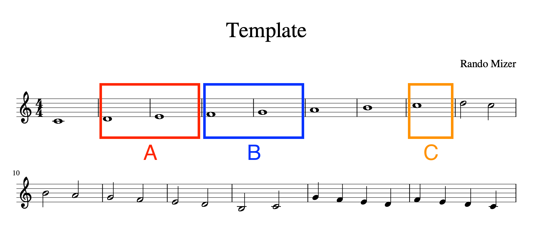
In the template you pick certain measures be reused and reshuffled, for example motive A consist of measures 2 and 3, motive C is just measure 8 and so on. These motives will be defined in the Node script.
The script does this:
But first...
const MAX = 100; // how many combinations to generate
const ADJOK = false; // is it ok to have adjacent repeated motives
const motives = {
  A: [2, 3], // Motive A is measures 2 and 3
  B: [4, 5],
  C: [8],
  D: [10, 11],
  E: [16],
  F: [17],
  G: [19],
  H: [22],
  I: [23],
};
// we want motive A to happen twice in the new score,
// motive C to happen 4 times and so on
const distribution = 'AADDFFEEEBGHICCCC';
const OUT = 'out/';
The funny-looking AADDFFEEEBGHICCCC is a definition of how many times you want each motive to repeat. This is what's going to be reshuffled to create the new combinations.
// imports
const convert = require('xml-js');
const fs = require('fs');

const xml = fs.readFileSync('Template.mscx', 'utf8');
const options = {compact: true, ignoreComment: true, spaces: 4};
const source = convert.xml2js(xml, options);
convert is the XML-JS library that lets you convert to/from XML, JSON and JavaScript objects. Here we convert the XML to a JavaScript object for easy manipulation.
Next, remembering the location of the measures (a Measure array in the resulting object) for less typing:
// an array of all measures
const origMeasures = source.museScore.Score.Staff.Measure;
Then, going through the motives configuration and reading them from the template score:
// extract the patterns from the template
const patterns = {};
Object.keys(motives).forEach((letter) => {
  patterns[letter] = [];
  motives[letter].forEach((m) => {
    // measures start from 1, arrays from 0
    patterns[letter].push(origMeasures[m - 1]);
  });
});
The variable combinations will contain the new reshuffled strings (e.g. ACGFCDCEFIHEDEBCA, GIECBFCADCHAEFCED and so on).
Using a Set prevents duplicates.
// generate MAX random combinations
const combinations = new Set();
let these = distribution.split('');
while (combinations.size < MAX) {
  these.sort(() => 0.5 - Math.random());
  if (checkAdjecents(these)) {
    combinations.add(these.join(''));
  }
}
A helper function to disallow adjacent motives, if desired:
function checkAdjecents(combo) {
  if (ADJOK) {
    return true;
  }
  for (let i = 1; i < combo.length; i++) {
    if (combo[i] === combo[i - 1]) {
      return false;
    }
  }
  return true;
}
Last step - going through each new combination and creating a new array of measures. Here the first and last measure are always the same as this was a requirement, but you don't have to do this.
Writing the new XML is accomplished by reconverting the modified JS object back to XML.
combinations.forEach((combo) => {
  // first and last measures are always the same
  const last = origMeasures[origMeasures.length - 1];
  const first = origMeasures[0];

  const newMeasures = [first];
  combo.split('').forEach((letter) => {
    patterns[letter].forEach((_, idx) => {
      newMeasures.push(patterns[letter][idx]);
    });
  });
  newMeasures.push(last);

  source.museScore.Score.Staff.Measure = newMeasures;
  source.museScore.Score.Staff.VBox.Text[0].text._text = combo;

  fs.writeFileSync(OUT + combo + '.mscx', convert.js2xml(source, options));
});
The VBox.Text[0].text._text = combo; is optional, it writes the combination as title of the score.
Example result open in MuseScore:
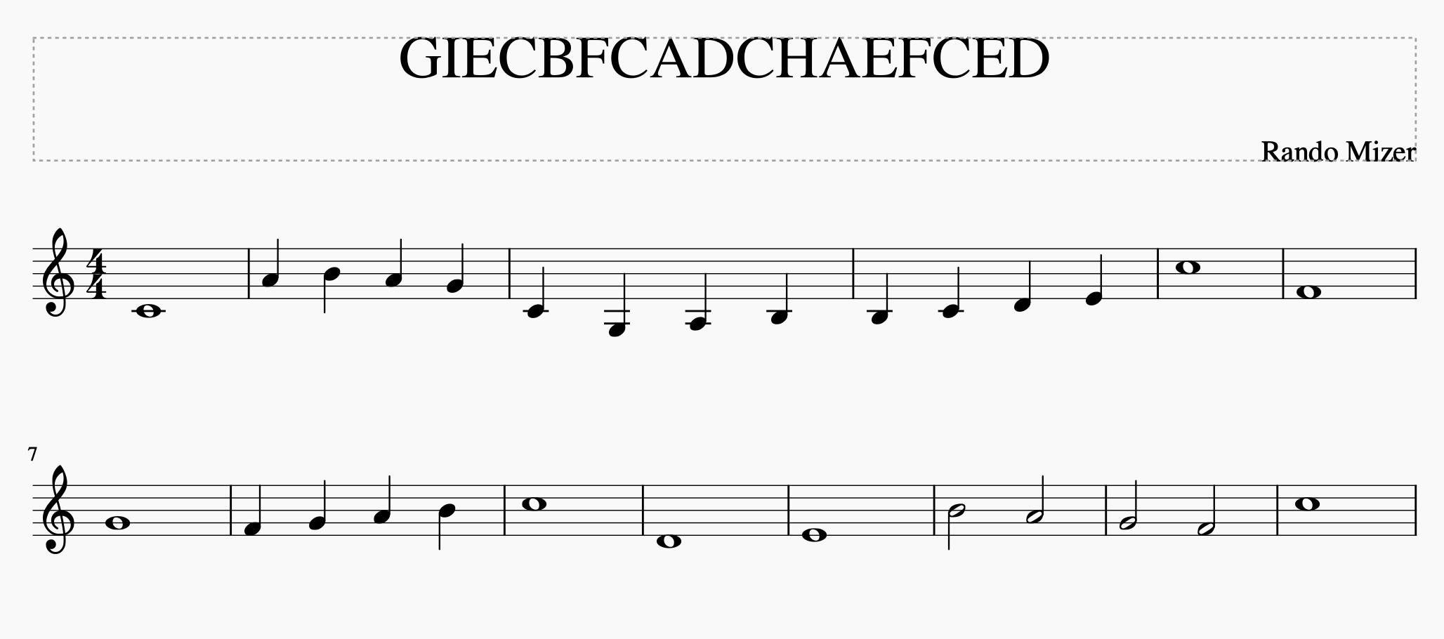
Full code listing is on GitHub.
At this point it's all done. But we can do one better and generate PDFs to distribute to musicians/students who do not use MuseScore. Thanks to the batch-convert plugin, this is quick and painful.

Lots of formats to chose from! You click OK and point to the out directory where the script wrote all MuseScore XMLs.

And this is it. Now the out/ directory contains 100 MuseScore files and 100 PDFs all named after the random combination of letter motives.

What if you want to reuse the script for your own purposes, exercises and genarative music? Why, it would give me the most pleasure!
Just clone the github repo, change the Template.mscx and edit the configuration. Then run...
$ node msms.js
... and find a bunch of files in your out/ directory. Then, if required, do the batch conversion to PDF as described above.
A side note for people who think the section above was mostly gibberish. If you're new to Node.js, here are a few more pointers.
$ npm i
msms.js and change the template Template.mscx, then run
$ node msms.js
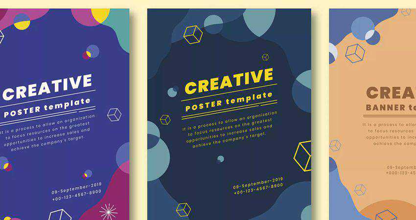
Posters are a great way to promote your event but they can also be used to promote your business or a cause. What’s more, they can be designed in many different ways and make use of illustrations as well as typography to convey all the necessary details.
In this roundup, we’ve gathered the best Adobe Illustrator tutorials for creating beautiful and attractive posters for a variety of projects and industries. Use them to pick up a few new tricks or to get inspired before you start working on a new project.
You might also like these Photoshop poster design tutorials, or these free poster mockup PSD templates.
Bold patterns are all around us. David Popov takes us through his journey in Paris to show us how to make our own bold patterns with his abstract form tutorial. Are you ready to start your own journey in bold pattern design?

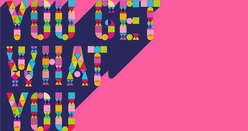
Use shapes instead of letters for your next poster! With this step by step tutorial you will learn how to use geometric shapes put together to make letters, and then transform into your next poster.
Save time making your number poster designs with this template. Ready for immediate use on A4 and A5 sized paper with a 300 DPI resolution. Feel free to adjust colors to your liking and edit the text with your text tools.

Need to unleash your inner creativity with some hand lettered posters? Then get your coffee ready and dive in with this step by step tutorial that will show you how to bring your hand lettering to life!

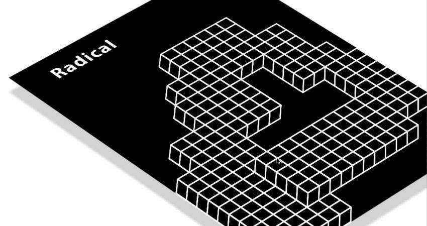
With this video tutorial you will be able to take a simple pattern and transform it into an abstract geometric poster. You will see how to make use of swatches to create a 3d randomized pattern that you transform into a full fledged poster.

Want to make your own Daft Punk inspired artwork? Then you’ll enjoy this step by step tutorial showing you how to make a Daft Punk poster using Adobe Illustrator. You’ll then finish off the design in Photoshop.

Were you ever inspired by the art on the VHS covers? Intrigued to see what that art work was? Well, join us with this video tutorial to learn how to create your own artwork based on that long gone cassette type.

Were you ever inspired by the art on the VHS covers? Intrigued to see what that art work was? Well, join us with this video tutorial to learn how to create your own artwork based on that long gone cassette type.

Jump straight into summer season with this warm summer poster template bundle. They are easy to edit, print ready with .25 bleeds and safety marks, and come in an A3 size.

By combining the capabilities of Illustrator and Photoshop; you will be able to follow along with this video tutorial to create a collage poster reminiscent of album or abstract posters.

Travel back in time with this step by step tutorial to create a 1950’s style poster. You will be drawing everything using basic shapes and tools and then transforming them to give it an aged look.

In this abstract tutorial, Ben the Illustrator takes you through the journey of creating your own colorful vector poster. He highlights the use of his favorite tools and how to incorporate them into the poster design.

This gorgeous photography poster template features a minimalist and modern design. Designed in an A4 format, the template comes with smart shapes and includes a link to the free fonts used in the project.

Creating a colorful retro poster is as easy as finding a photograph that you love, and using Photoshop and Illustrator to change small portions to create a whole new image. Learn how with this step by step tutorial.

Spring into this video tutorial and learn how to use Illustrator to make a simply divine spring themed poster. You will be transforming simple shapes into colorful leaves and wildlife in no time.

Colors and geometric shapes are all it takes to create this wonderful poster. Learn how Chris used a series of tessellating shapes created with the help of Illustrator’s Pathfinder tool, then added color swatches and gradients to bring the design to life.

Ever wanted to create your own desert landscape? Now you can, with this video tutorial. You will learn how to make use of the flat design, simple patterns, and basic shapes to create your own desert landscape.

Want to create a randomized pattern that just pulls you in like the 1950’s book covers did? Then prepare yourself for this tutorial by Simon C. Page as he shows you how to easily and quickly design beautiful geometric patterns.

When you follow this step by step tutorial you will learn how to make a vintage looking theatre poster. By combining clipping masks, vector brushes, basic shape tools, and great typography, you’ll be able to apply your new skills to any poster design project that comes your way.

With this tutorial you will rediscover the golden age of travel posters. You will learn how to capitalize on Illustrator’s drawing tools and then leverage Photoshop’s brushes and blending modes to make vintage looking posters.

Poster design can make or break your event, cause or campaign which is why it’s important to get the poster design just right. With the help of the tutorials on this list, you’ll learn how to create attractive posters for all kinds of projects and campaigns.
The post 20 Tutorials for Creating Posters in Adobe Illustrator appeared first on Speckyboy Design Magazine.