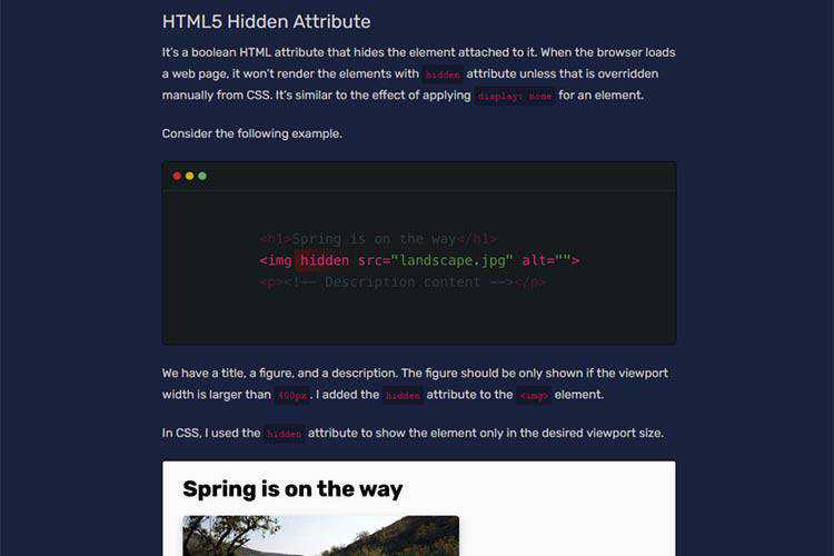
Hiding Elements On The Web – A look at various techniques of hiding elements via HTML and CSS, along with the consequences.

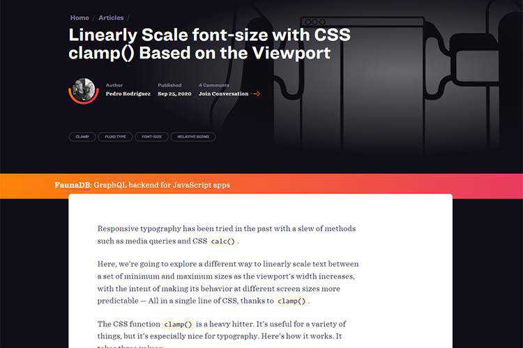
Linearly Scale font-size with CSS clamp() Based on the Viewport – Learn a different way to linearly scale text between a set of minimum and maximum sizes as the viewport’s width increases.

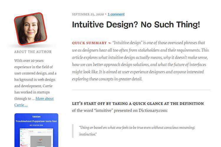
Intuitive Design? No Such Thing! – Why the term “intuitive design” doesn’t make much sense.

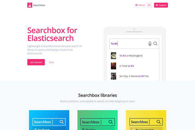
Searchbox for Elasticsearch – A lightweight and performance focused search UI library to query and display results from Elasticsearch.

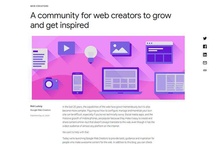
A community for web creators to grow and get inspired – A look at the new Google Web Creators resource.

Does A Designer’s Opinion Mean More Than The User’s? – Ways in which users often give designers a run for their money when it comes to the ideal user experience.

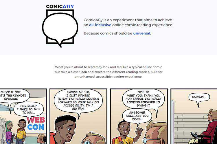
ComicA11y – This comic aims for an all-inclusive, accessible reading experience.

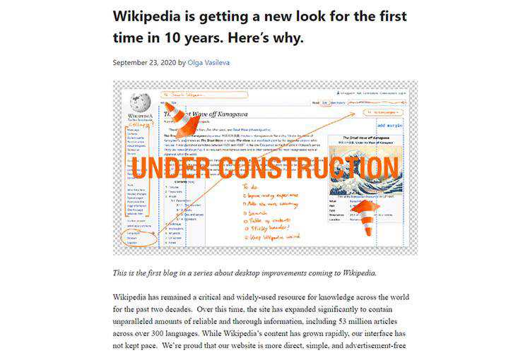
Wikipedia is getting a new look for the first time in 10 years. Here’s why. – Check out some of the upcoming changes to the web’s informational powerhouse.

How to Pave Your Own Path as a Freelancer – Ways to make your freelance web design business reflect who you are.

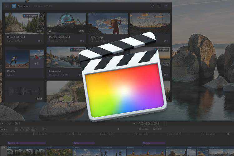
50 Free Presets & Templates for Final Cut Pro – Use these outstanding free resources to improve your video projects.

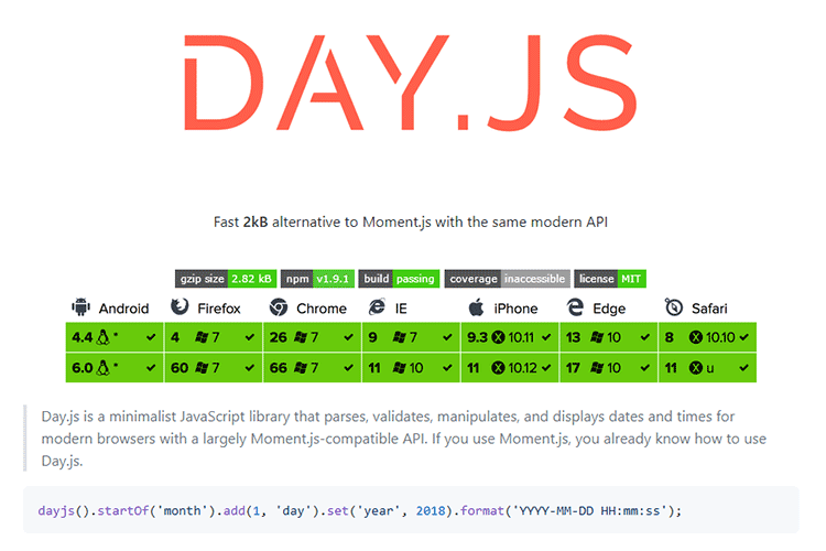
Day.js – Grab this minimalist JavaScript library that parses, validates, manipulates, and displays dates and times for modern browsers.

12 Best Free Style & Fashion Flyer Templates – Stand out with this collection of beautiful fashion flyer templates.

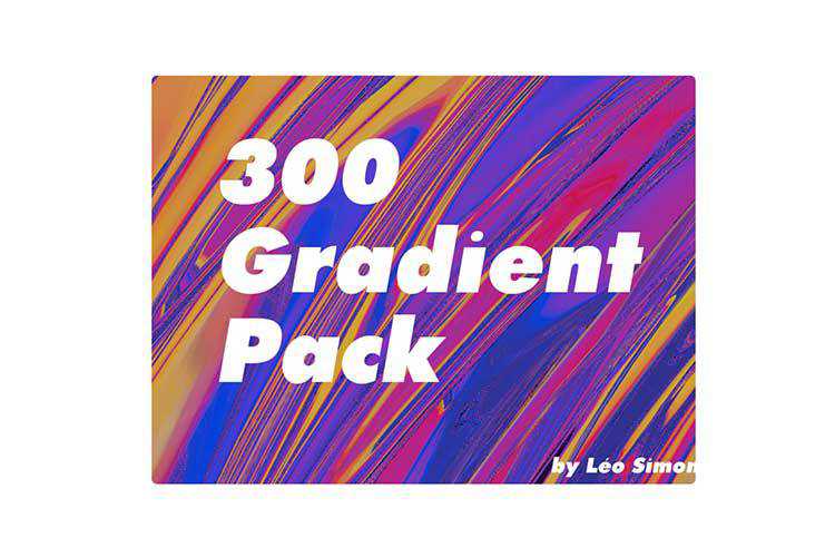
300 Free Gradient Pack – Download this collection of colorful free gradients.

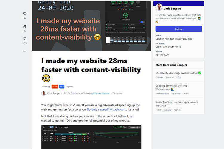
I made my website 28ms faster with content-visibility – How this really simple trick can boost your site’s performance.

Famous Architecture Recreated with CSS and JavaScript – Stuck in the house? Take a virtual trip around the world with these instantly-recognizable snippets.

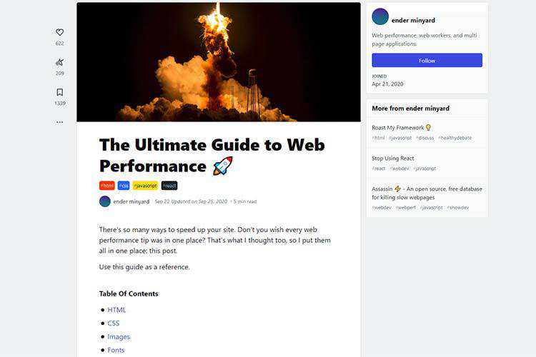
The Ultimate Guide to Web Performance – Learn the secrets behind a blazing-fast website.

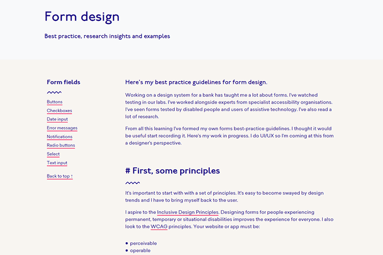
Form design – Dig into some best practices for form design.

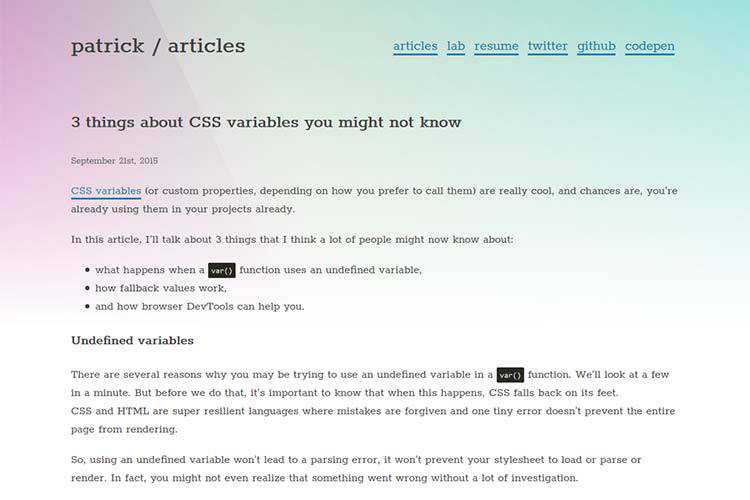
3 things about CSS variables you might not know – Make the most of CSS variables with these helpful tips.

The Useless Web – Have some free time? Why not use this resource to find some useless websites to visit?

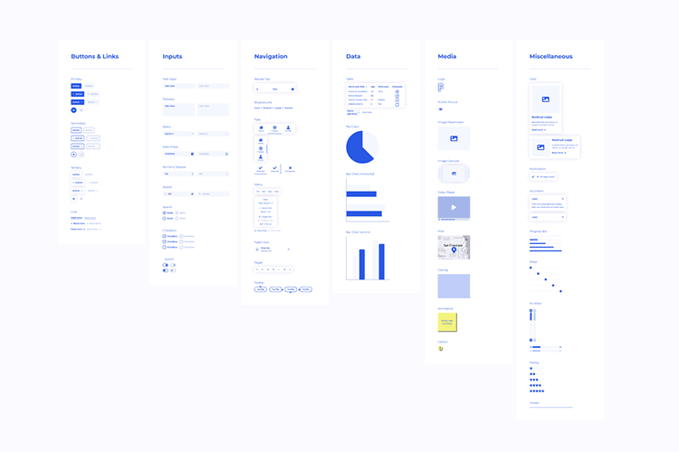
Wirefigma – Download this free wireframe kit for Figma.

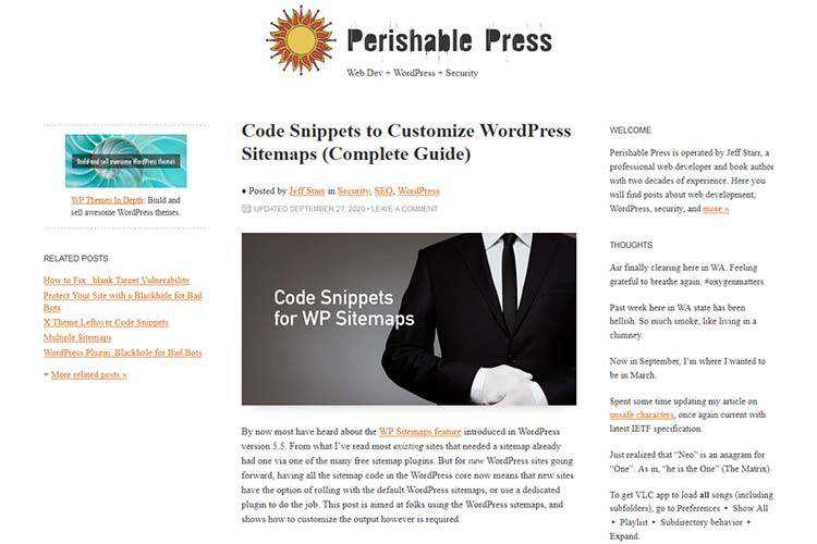
Code Snippets to Customize WordPress Sitemaps (Complete Guide) – Sitemaps are now included with WordPress. Use this guide to customize them to fit your needs.

The post Weekly News for Designers № 560 appeared first on Speckyboy Design Magazine.
This month was characterized by some exciting announcements from the WordPress core team! Read on to catch up with all the WordPress news and updates from September.
WordPress 5.5.1 Launch
On September 1, the Core team released WordPress 5.5.1. This maintenance release included several bug fixes for both core and the editor, and many other enhancements. You can update to the latest version directly from your WordPress dashboard or download it directly from WordPress.org. The next major release will be version 5.6.
Want to be involved in the next release? You can help to build WordPress Core by following the Core team blog, and joining the #core channel in the Making WordPress Slack group.
Gutenberg 9.1, 9.0, and 8.9 are out
The core team launched version 9.0 of the Gutenberg plugin on September 16, and version 9.1 on September 30. Version 9.0 features some useful enhancements — like a new look for the navigation screen (with drag and drop support in the list view) and modifications to the query block (including search, filtering by author, and support for tags). Version 9.1 adds improvements to global styles, along with improvements for the UI and several blocks. Version 8.9 of Gutenberg, which came out earlier in September, enables the block-based widgets feature (also known as block areas, and was previously available in the experiments section) by default — replacing the default WordPress widgets to the plugin. You can find out more about the Gutenberg roadmap in the What’s next in Gutenberg blog post.
Want to get involved in building Gutenberg? Follow the Core team blog, contribute to Gutenberg on GitHub, and join the #core-editor channel in the Making WordPress Slack group.
Twenty Twenty One is the WordPress 5.6 default theme
Twenty Twenty One, the brand new default theme for WordPress 5.6, has been announced! Twenty Twenty One is designed to be a blank canvas for the block editor, and will adopt a straightforward, yet refined, design. The theme has a limited color palette: a pastel green background color, two shades of dark grey for text, and a native set of system fonts. Twenty Twenty One will use a modified version of the Seedlet theme as its base. It will have a comprehensive system of nested CSS variables to make child theming easier, a native support for global styles, and full site editing.
Follow the Make/Core blog if you wish to contribute to Twenty Twenty One. There will be weekly meetings every Monday at 15:00 UTC and triage sessions every Friday at 15:00 UTC in the #core-themes Slack channel. Theme development will happen on GitHub.
Further Reading:
- WordPress plugin authors can now opt into confirming plugin updates via email. This feature will allow plugin authors to approve any plugin updates over email before release.
- September was the busiest month for online WordCamps so far, with seven events taking place: WordCamp Ogijima Online, WordCamp Colombia Online, WordCamp Asheville, NC USA, WordCamp São Paulo, Brazil, WordCamp Virginia Beach, WordCamp Lima Peru, and WordCamp Philadelphia, PA, USA. You can find live stream recaps of these events on their websites. The camps are also in the process of uploading their videos to WordPress.tv. Check out the WordCamp Schedule to follow upcoming online WordCamps!
- The Themes team has added a delist feature to the themes directory. The feature will allow a theme to be temporarily hidden from search, while still making it available. The team may delist themes if they violate the Theme Directory guidelines.
- The Themes Team has also released its new web fonts Loader project. The webfonts loader will allow theme developers to load web fonts from the user’s site, rather than through a third-party CDN. The project lives in the team’s GitHub repository.
- The Support team is discussing the level of control users should have over their support forum topics. The team is thinking of allowing users to archive their topics and lengthen time-to-edit to remove any semi-sensitive data. In a separate, but related, post, Support team members have started discussing how to curb support requests for commercial products.
- The Mobile team came up with a proposal for dual licensing Gutenberg under GPL 2.0 and MPL (Mozilla Public License) 2.0, so that non-WordPress software developers can potentially use it for their projects.
- Since Facebook and Instagram are deprecating oEmbeds, the Core Team will be removing Facebook and Instagram’s oEmbed endpoints from WordPress core code.
- Following extensive discussion, the Documentation team has tentatively decided to allow external and commercial links in the WordPress documentation. The team aims to publish a formal proposal that will be left open for feedback before finalizing it.
- Members of the Polyglots and Marketing teams are celebrating the International Translation Day for WordPress over the week of September 28 – October 4! Community members can join or organize translation events, or contribute to WordPress core, theme, or plugin translations during this period.
- WP Accessibility day — a 24-hour global online event dedicated to addressing website accessibility in WordPress, is being held on October 2. The event is open for all and has experts from all over the world as speakers.
Have a story that we should include in the next “Month in WordPress” post? Please submit it here.
Apple’s Macbook has become a synonym for quality and thanks to these Macbook mockup templates for Photoshop, so can your work!
Illustrating the quality of your design to your clients during a presentation can be hard, especially when you’re in software or web development. Yes, you’ve listed all the features and their benefits, taken the appropriate screenshots, but a picture is still worth a thousand words.
If your clients see a screenshot of the features you’ve designed, they’ll still have questions about user experience. But if you add those screenshots to Macbook mockup templates, they’ll know everything about the quality of your work.
We simply process visual stimuli differently. Especially when those visuals are paired with realistic representations of end results. And today, we are here to help you make your next presentation amazing. You can use these Macbook Macbook mockups for a variety of different purposes.
Choose Macbook Pro mockups for professional results! This Macbook template set consists of 4 different mockups, all beautifully staged in a calming, business casual environment. They’re perfect for website and software design, and deliver incredibly photo-realistic results. You can even customize them and create your own close-up shots!

Showcase the full glory of specific website pages or software features with this Macbook laptop front mockup, perfect for emphasizing your design quality and all the important details. Placed and photographed in a minimalist setting, on a wooden table, this Macbook mockup is easy to customize and delivers delightful results!

Simple and perfect for showcasing design responsiveness, this laptop and smart phone mockup template set will wow your audience! It’s super easy to customize; you just have to replace the smart object placeholders in Photoshop, and add your designs. It is perfect for both B2C and B2B audiences!

Create a unique atmosphere for your unique designs! This gorgeous Macbook Pro mockup is placed on a rustic desk, with plants to the side, making it perfect for designs in neutral and vivacious colors. You can easily add your own designs with just a few clicks, and charm your clients!

Sleek and elegant, this Macbook Air mockup template fits similar designs perfectly. Experiment with colors, placements, and delight your audience. This Macbook mockup is perfect for important app and software presentations, as it returns the spotlight back to the quality of your design. You can easily add your own backgrounds.

Opt for something better: choose this Macbook Pro clay mockup template. Perfect for showcasing two designs at once, this Macbook Pro mockup helps you present your app, software, or web design work in style. It’s really easy to edit with Photoshop smart objects, and guarantees gorgeous, photo-realistic results.

Minimalist and simple, this laptop and smart phone mockup set allows you to showcase not just the quality of your work, but the responsiveness of your design. You can easily add your files to this clean mockup set placed against a white and blue background, evoking trust in your clients.

Bookmark this set because you will be using it for years to come! This versatile Apple devices mockup set consists of: Macbook desktop, Macbook laptop, iPhone, and iPad devices. It’s perfect for showcasing the full range of your design’s responsiveness. You can also showcase multiple designs!

Sleek, with a feminine touch, this Macbook mockup set is perfect for both neutral and colorful UX, software, or app designs. You’ll get 4 high-quality PSD files featuring the new Apple Macbook Pro with a touch bar. You can play with different PSDs to create gorgeous photo-realistic results.

Versatile and perfect for UX and web designers, these Macbook mockup templates offer a wide variety of presentations. All the Macbook mockups are set on tables, and you’ll get 4 different scenes. From casual to professional environments, there’s plenty to play with and get beautiful results.

Create engaging presentations with this Macbook and iPhone mockup set, showing a man using the laptop with a cup of coffee in his hand. A perfect combination of casual and professional, this top-view Apple device set can be easily customized with a few clicks in Photoshop, and deliver beautiful results!

Give your elegant designs an equally refined presentation with this Macbook Pro mockup template. Featuring a woman drinking tea in a cafe while using her laptop with your design on it, this mockup is perfect for stylish web design and UX (user experience) presentations. Customize it in a few clicks!

Graceful and feminine, these Macbook mockup templates offer a variety of scenes to present your designs in. With 3 diverse PSD files featuring work spaces and business must-haves (read: coffee), you can easily create your own beautiful presentations through customization or close-up shots showcasing your web, software, or UI designs.

Present your colorful or minimalist UX and software designs with these Macbook mockup templates. Fitting diverse palettes, these mockups offer soft, rose-tinted environments for your designs to shine in. Pick from 4 Macbook mockups, customize them to your liking in Photoshop, and make sure your clients love every presentation slide!

Show how well your designs fit your client’s branding with these Macbook and business card mockup templates for Photoshop. With three mockup elements: Macbook, iPhone, and business cards, you’ll have everything you need to create branding identity cohesion, and absolutely delight your B2B and B2C clients.

Give your designs an extra dose of realism with these Macbook Pro mockups! Featuring a man working on his laptop in a professional environment (with coffee and cookies beside him), this Macbook mockup is perfect for presenting excellent UI or web design. The best part? Customize it in 2 clicks!

Make your designs fly far and wide with this flying Macbook mockup! Featuring the latest 2020 Macbook Pro edition, this Macbook mockup template is going to help position your designs as equally innovative and exciting. You can easily customize the PSD file, add your own background, and charm your audience!

Make an impact with this premium Macbook Air mockup template for Photoshop! With 5 PSD mockup files and incredible photo quality, these mockups help you showcase your UI, app, software, and web designs in the best possible light. You can easily change the background to fit your clients’ branding!

If your designs are sleek in the streets, and powerful under the hood, use this Macbook Pro mockup to prove it! Featuring a Macbook Pro on a coffee-shop table, this mockup template for Photoshop is customizable and guarantees phenomenal, photo-realistic results for your next UI, software, or web design presentation.

Vibrant and realistic, these Macbook and Apple device mockup templates offer a wide variety of presentation styles. Perfect for showcasing software, app, or UX design, this set comes with 6 diverse PSD files. From iPhones and iPads, to Macbooks, you can help your clients visualize the responsiveness of your designs.

Leverage your creativity with these Macbook Pro isometric templates. You will get 3 scenes (one Macbook, two Macbooks, and a sole – innovative – Macbook standing out from the crowd). These Macbook Pro templates are perfect for showcasing software design, and you can change the colors to fit your branding.

Thanks to these Macbook mockups, you can present your design in the best possible light. With an added dose of realism with mockups featuring Macbooks in professional and casual environments, your clients will no longer ask: “Alright, but what is your design really going to look like?”
More Mockup Templates: Banners, Books, Booklets, Bottles, Box Packaging, Branding, Dresses, Flyers, Frames, Hoodies, iPads, iPhones, Laptops, Logos, Magazines, Mobile Apps, Mobile Devices, Mugs, Packaging, Sweatshirts, T-Shirts, Tote Bags.
The post 20+ Realistic Macbook Mockup Templates for Photoshop appeared first on Speckyboy Design Magazine.
A great example of a logo using symmetry is McDonalds with its golden arches. When symmetry is used in logo design, it’s a powerful way of shaping the image and perception that the target audience will have of the brand in question.
Put simply, a symmetrical logo is a logo in which the left side is identical with the right. However, there are different levels of symmetry used in logo design in order to communicate certain ideas and meanings. For example, Target and British Petroleum both use rotational symmetry in their logo.
Symmetrical logos are often associated with balance, craftsmanship, and engineering so it’s no wonder that car companies such as Volkswagen or Honda rely on symmetry in their logo to emphasize these messages in their marketing.
Interestingly enough, you can also use asymmetrical design to achieve logo symmetry. The best example of this is the Nintendo Switch logo which doesn’t use symmetry at all. This goes to show that while symmetry matters, there’s more to good logo design than symmetry.
In this roundup, we’ll take a look at some of the best symmetrical logo design samples from across the web. Use them as an inspiration to create your own symmetrical logo.
You might also like to check out our showcase of Beautiful & Elegant Logo Monograms, Corporate Logo Redesigns That Work or Flat Logo Designs.


JR logo by Jennifer Reeves


Symmetry is the fundamental part of nature and it makes everything more pleasant to look at. As such, it’s no wonder that symmetrical logos are extremely popular. Not only are symmetrical logos more pleasant to look at, but they are also easier to design when you think about the basic design principles.
The post 30 Creative Examples of Symmetry in Logo Design appeared first on Speckyboy Design Magazine.

