If you aren’t using Shopify extensions on your site, you’re missing an opportunity to maximize your potential to drive leads and sales.
When you search on Shopify’s site, however, you’ll find that there are dozens of plugin options available to your business.
So, what are the best Shopify plugins?
Keep reading to find out!
P.S. If you’re looking for more creative strategies for growing your ecommerce site, subscribe to our Revenue Weekly emails!
Partner with Ecommerce masters!
Campaigns managed by WebFX have earned over
11550403
TRANSACTIONS IN THE LAST 5 YEARS
Read Case Studies
![]()
Cost: $20 per month (free plan available)
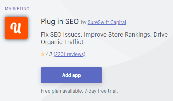
When you have a website, you need to ensure that it appears in search results so people can find your products. That’s why you need Shopify SEO extensions, like Plug in SEO, that help your products appear in relevant search results.
Plug in SEO enables you to improve your SEO rankings. You can check your site’s current SEO performance, as well as fix and optimize your SEO performance.
This SEO app helps you:
- Create SEO-optimized titles and meta descriptions
- Optimize headings, image alt tags, and file names
- Fix 404 broken links
- Optimize blog content
![]()
Cost: Free
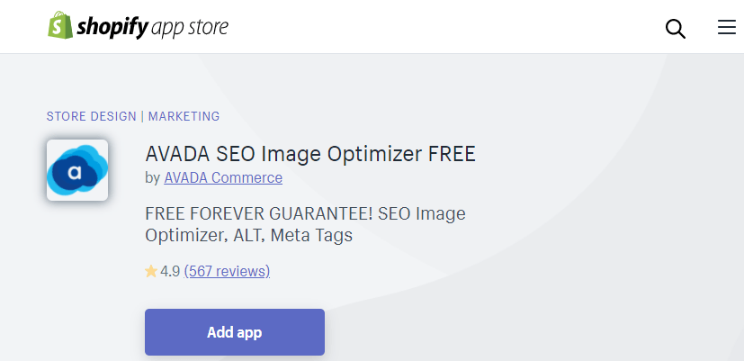
If you want your ecommerce site to appear in search results, you need to ensure you’re following SEO best practices to help it rank. A critical component of successful SEO is ensuring that your images are optimized for search engines. With Avada SEO Image optimizer, you can optimize images properly.
This app is great because it enables you to:
- Optimize your image ALT tags to rank in search results
- Optimize image files sizes to keep your site from slowing down
- Import page structured data
- Optimize meta tags
![]()
Cost: $24.99 per month (7-day free trial available)
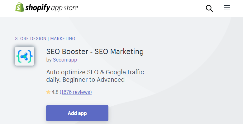
SEO isn’t a once and done process. You need to continually monitor your progress to ensure you’re driving results. If you’re looking to monitor your SEO traffic and performance to make improvements, SEO Booster is the plugin for you.
This plugin helps you monitor your SEO campaign performance and detect errors so you can improve your ranking in search results.
Some great features include:
- No coding
- Insights on your SEO score
- Auto-management of your SEO
- Keyword integration and updating
![]()
Cost: $27 per month (7-day free trial available)
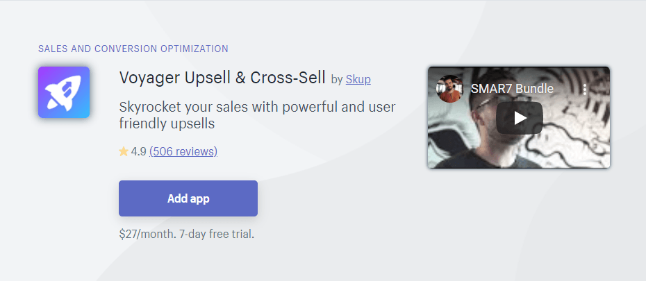
If you want your audience to buy more products, Voyager Upsell is one of the best Shopify ecommerce plugins for your business. This plugin tracks what people add to their carts to target shoppers with relevant products at checkout and on places like your homepage.
You can also offer bundles for specific products. It allows you to choose where you want to make special offers to help you boost sales in the best way possible for your business.
This smart shopping enables you to upsell your audience with more products and increase your average order value. The best part? You can get started and set up this plugin in 30 seconds.
![]()
Cost: $9.99 per month (free plan available)
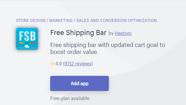
Free Shipping Bar is one of the best Shopify ecommerce plugins for businesses that offer free shipping to shoppers who spend a designated amount of money.
With this plugin, you can promote your free shipping offer with progressive messages. These messages let users know how far they must go until they reach the threshold. It helps you increase sales and get more people to add products to their carts.
This plugin also enables you to display different free shipping offers depending on pages visited, time, devices, and users’ locations.
Additionally, you can add background images to your progress bar to customize the experience, like promoting your free shipping during the holidays.
This tool is great because it helps you track the performance of each shipping bar to see what shipping goals generate the most sales for your business.
![]()
Cost: $10 per month (usage-based fee scale with return volume)
When you sell your products, you’re going to have people that aren’t happy, didn’t get the right size, or didn’t like the product. They’ll want to return it. That’s why you need one of the most important Shopify ecommerce extensions: Return Magic.
Return Magic enables you to make your returns easy for your shoppers. With this plugin, you can set up a branded portal where you can automate cash refunds, gift card refunds, and more. You can provide your audience with multiple refund options.
This plugin enables you to autogenerate labels for returns, making the return process smooth and easy. Return Magic does not deliver automatic refunds — you still have control over approving someone’s return!
![]()
Cost: $49 per month
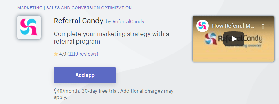
ReferralCandy is one of the best Shopify plugins for increasing referrals and sales. This plugin is great for customizing the look and feel of your referral program. You can design pop-ups to referral pages to fit your brand.
Shopify will launch and run your referral plan for you. As your referral program runs, you can track the performance of your program. You get an overview of who referred who, shares, and sales for your business.
This Shopify extension allows you to customize your reward, too. You can offer a special gift or coupon — the choice is up to you.
![]()
Cost: $19-$59 per month (free plan available)
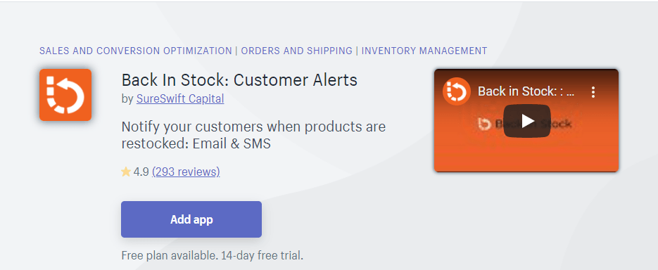
When you’re selling a lot of products, items are bound to go out of stock. Wouldn’t it be great if, when you replenish your stock, you could let shoppers know? With the Back In Stock plugin, you can!
This plugin is one of the most efficient Shopify extensions for your business. You can create a program to send automated emails or SMS texts to people who sign up for them. So, when your product comes back in stock, they’ll get a message and can go by it.
You can create a custom theme for your “back in stock” emails to create a branded personalization message. This plugin only takes five minutes to install, and you don’t need to know coding to implement it.
![]()
Cost: $15 per month (free plan available)
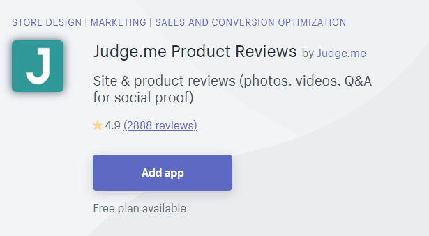
Did you know that 92% of people trust recommendations over a brand? Reviews play a fundamental role in helping you earn more sales for your business. This Shopify add-on enables you to collect more reviews for your business.
This plugin enables your audience to review your products directly in their email. They can submit photos and videos in their reviews too.
Judge.me enables your reviews to appear in multiple places. Your stars can appear in Google Search (through rich snippets), Google Shopping, Facebook, and more.
The best part? You don’t need to lift a finger. The plugin will install for you and import your existing reviews. It’s a great plugin to increase your social proof and earn more sales for your business.
![]()
Cost: $14.99-$99.99 per month (free plan available)
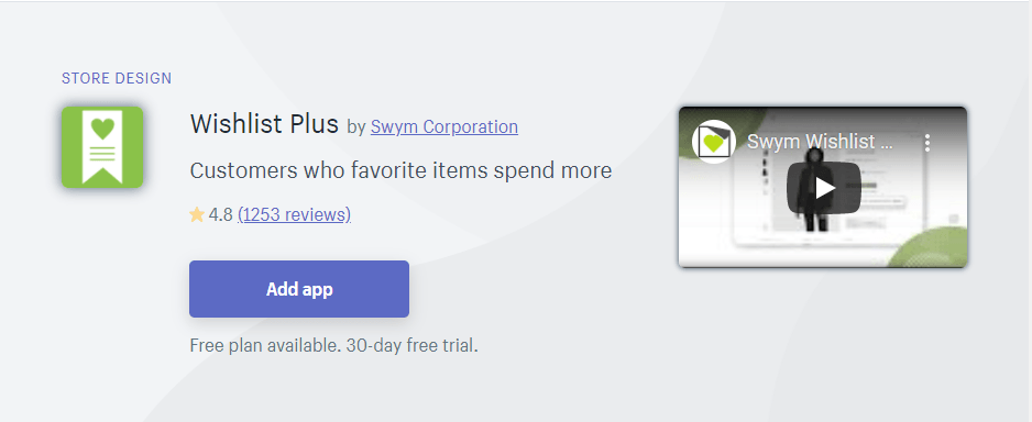
Wishlist Plus is the last of the Shopify ecommerce plugins we’ll cover. Wish lists are a fundamental part of the shopping experience. People may not be ready to buy quite yet, but adding a product to a wishlist can lead to more sales later.
With Wishlist Plus, you can enable shoppers to create a wishlist. This tool allows users to create a full-featured wishlist that doesn’t require a user login. These lists are mobile-friendly, too.
You can send these shoppers personalized emails and social campaigns based on their wish lists to help encourage sales. Not to mention, you can customize the messages you send to make it more personal for your audience.
Let WebFX help you install the best Shopify plugins
Finding the right Shopify extensions can seem like a daunting process. With so many options available, it isn’t easy to know what will work best for your business.
If you’re feeling overwhelmed trying to figure out how to choose and install the right plugins, WebFX is here to help. We have a team of over 250 ecommerce experts that will help you craft and optimize a Shopify store with all the bells and whistles.
When you partner with us, you’re choosing a team that drives results. In the past five years, we’ve driven over $2.4 billion in sales and managed over 11.6 million transactions for our clients.
Ready to dive in? Contact us online or call us today at 888-601-5359 to speak with a strategist about how to promote your Shopify store and our Shopify store optimization services!
The post Best Shopify Plugins: 10 Shopify Extensions You Must Add appeared first on WebFX Blog.
Last time, we looked at ways in which PHP 8.0 has become stricter. Today, we look at the next step in PHP becoming faster.
Some background Computers don’t actually understand programming languages; they understand very low level instructions no human could write by hand. There are many ways of getting from a human-readable language like PHP or Rust to a computer-understandable set of instructions.
The most basic, and usually most performant, way is to compile the human-friendly source code directly to CPU instructions “Ahead-of-Time” (AOT).
WordPress 5.5.2 is now available!
This security and maintenance release features 14 bug fixes in addition to 10 security fixes. Because this is a security release, it is recommended that you update your sites immediately. All versions since WordPress 3.7 have also been updated.
WordPress 5.5.2 is a short-cycle security and maintenance release. The next major release will be version 5.6.
You can download WordPress 5.5.2 by downloading from WordPress.org, or visit your Dashboard → Updates and click Update Now.
If you have sites that support automatic background updates, they’ve already started the update process.
Security Updates
Ten security issues affect WordPress versions 5.5.1 and earlier. If you haven’t yet updated to 5.5, all WordPress versions since 3.7 have also been updated to fix the following security issues:
- Props to Alex Concha of the WordPress Security Team for their work in hardening deserialization requests.
- Props to David Binovec on a fix to disable spam embeds from disabled sites on a multisite network.
- Thanks to Marc Montas from Sucuri for reporting an issue that could lead to XSS from global variables.
- Thanks to Justin Tran who reported an issue surrounding privilege escalation in XML-RPC. He also found and disclosed an issue around privilege escalation around post commenting via XML-RPC.
- Props to Omar Ganiev who reported a method where a DoS attack could lead to RCE.
- Thanks to Karim El Ouerghemmi from RIPS who disclosed a method to store XSS in post slugs.
- Thanks to Slavco for reporting, and confirmation from Karim El Ouerghemmi, a method to bypass protected meta that could lead to arbitrary file deletion.
- Thanks to Erwan LR from WPScan who responsibly disclosed a method that could lead to CSRF.
- And a special thanks to @zieladam who was integral in many of the releases and patches during this release.
Thank you to all of the reporters for privately disclosing the vulnerabilities. This gave the security team time to fix the vulnerabilities before WordPress sites could be attacked.
For more information, browse the full list of changes on Trac, or check out the version 5.5.2 HelpHub documentation page.
Thanks and props!
The 5.5.2 release was led by @whyisjake and the following release squad: @audrasjb, @davidbaumwald, @desrosj, @johnbillion, @metalandcoffee, @noisysocks @planningwrite, @sarahricker and @sergeybiryukov.
In addition to the security researchers and release squad members mentioned above, thank you to everyone who helped make WordPress 5.5.2 happen:
Aaron Jorbin, Alex Concha, Amit Dudhat, Andrey “Rarst” Savchenko, Andy Fragen, Ayesh Karunaratne, bridgetwillard, Daniel Richards, David Baumwald, Davis Shaver, dd32, Florian TIAR, Hareesh, Hugh Lashbrooke, Ian Dunn, Igor Radovanov, Jake Spurlock, Jb Audras, John Blackbourn, Jonathan Desrosiers, Jon Brown, Joy, Juliette Reinders Folmer, kellybleck, mailnew2ster, Marcus Kazmierczak, Marius L. J., Milan Dinić, Mohammad Jangda, Mukesh Panchal, Paal Joachim Romdahl, Peter Wilson, Regan Khadgi, Robert Anderson, Sergey Biryukov, Sergey Yakimov, Syed Balkhi, szaqal21, Tellyworth, Timi Wahalahti, Timothy Jacobs, Towhidul I. Chowdhury, Vinayak Anivase, and zieladam.
Here's what was popular in the PHP community one year ago today:
Package:
Summary:
Generate and expand short URL stored in a database
Groups:
Author:
Description:
This package can generate and expand short URL stored in a database...
Read more at https://www.phpclasses.org/package/11852-PHP-Generate-and-expand-short-URL-stored-in-a-database.html#2020-10-29-04:26:59

Package:
Summary:
Send HTTP requests to remote service APIs
Groups:
Author:
Description:
This package be used to send HTTP requests to remote service APIs...
Read more at https://www.phpclasses.org/package/11840-PHP-Send-HTTP-requests-to-remote-service-APIs.html

The PHP team is pleased to announce the tenth testing release of PHP 8.0.0, Release Candidate 3. At this time, we're not planning to adjust the GA date, however this may change during the course of the RC cycle. The updated release schedule can, as always, be found on the PHP Wiki page about the PHP 8.0. For source downloads of PHP 8.0.0 Release Candidate 3 please visit the download page.Please carefully test this version and report any issues found in the bug reporting system.Please DO NOT use this version in production, it is an early test version. For more information on the new features and other changes, you can read the NEWS file, or the UPGRADING file for a complete list of upgrading notes. These files can also be found in the release archive. The next release will be the Release Candidate 4, planned for Nov 12 2020.The signatures for the release can be found in the manifest or on the QA site.Thank you for helping us make PHP better.
As a small business owner, you want to build a website that provides your audience with a great experience and helps you earn more revenue online. If your website is missing essential features, you lose out on potential customers and revenue without even knowing it.
So, what do you need on your site for it to succeed? Here are five small business website essentials you need to know to help your company succeed online.
Let’s dive in!
comcast
-9
industry average
16
apple
72
webfx
76
Feature #1: Critical company information
First on our list of small business website essentials is critical company information. When people visit your website, they’re often looking for important details about your business, so you need to include this information on your site.
So, what type of critical company information should you have on your site?
Location
If people want to visit your small business in person, they need an address to get there. Including this information on your site can help you drive customers to your brick-and-mortar store (if you have one). Include a map on your site, too!
Hours of operation
Let your customers know when your physical location is open if they want to visit you in person. If you have separate customer service hours, make sure you note those, too.
Business description
If someone discovers your business for the first time, they may not know what sets you apart from everyone else. Make sure you include a description of your business on your site — an “about us” section is a great place to put this information.
Contact information
Include contact information, like your phone number and email address, so people can reach out to your small business. You should also have a contact form to provide future clients another way to connect with your company.
Including this information on your small business website will help your audience get all the essential information they need about your organization.
Feature #2: User experience (UX)-focused elements
Next on our list of small business website essentials is UX-focused elements.
The user’s experience on your site is critical because it determines if people stay on your site or return to the search results. You need to build a site that engages users and makes it easy for them to find what they need on your site.
Here are a few UX elements you can add to make your site more enjoyable for your audience:
Simple navigation
Make it easy for your audience to find the information they need with simple and consistent navigation. Use broad headings and categorized subheadings to create organized navigation that’s easy to use and understand.
![]()
High-quality multimedia
Multimedia is a critical component of creating an interactive and engaging website. Include multimedia like photos, graphics, and videos to make your site engaging for your audience. These visuals add points of interest and break up the text, too.
Fast load speeds
Users don’t want to wait for information to load on your site. Use a tool like Google PageSpeed Insights to find out how you can improve your website’s load time. You can also invest in page speed services to get help with making your site load faster.
Helpful call to action (CTA) buttons
You need clear, actionable, and noticeable call to action (CTA) buttons to guide visitors to the next step. Design these buttons to stand out on the page while also telling your audience precisely what happens if they click.
![]()
Adding these user-friendly elements will help you create a site that’s easy to use and engaging for your audience. It will help you keep leads on your site longer, while will increase leads and revenue for your small business.
Feature #3: Search engine optimized pages
If you’re wondering what to put on a website, the answer is: Whatever it is, make sure it’s search engine optimization (SEO) friendly.
Did you know that only 33% of small-to-midsized (SMBs) have optimized websites? If your site isn’t optimized for SEO, you’re not alone, but it’s time to act!
Users will find your site by searching on search engines like Google — 93% of all online experiences start with a search engine. If your site isn’t optimized for search engines, you won’t drive valuable traffic to your site.
SEO is one of the most critical elements for your small business website because, when used properly, it helps you rank in search results to drive more traffic and revenue for your business.
So, how do you optimize for search engines?
Conduct keyword research
If you want to rank in search results, start by integrating relevant keywords on your site. Conducting keyword research, like with a tool like KeywordsFX, will help you find applicable terms that you can incorporate into your site to rank in search results.
Optimize for long-tail keywords
Long-tail keywords contain three or more words, like “blue insulated water bottle.” These keywords are best because they’re specific, so you know that they’re looking for something relevant to what you offer when people search these terms.
Make your site mobile-friendly
Not everyone will access your site through a desktop. You need to have a responsive website design to ensure that your site adapts to the user’s device. It ensures your site scales to their screens so they can have an enjoyable experience.
Optimize your meta tags
Optimizing your title tag and header tags helps you rank in search results. Google (and users) look at these elements to determine your page’s relevancy. So, by creating an engaging, keyword-driven headline, you can rank better and drive more traffic.
![]()
When you optimize your site for search engines, you’ll help more people discover your small business website and learn about what you offer.
Feature #4: Informative content
Next on our list of elements for your small business website is informative content. Content plays a critical role in helping you drive relevant traffic to your site. People want information, and you can provide it.
When you create content, you establish yourself as an authority in your industry. People will see you as a reliable source of information, building trust with these leads. Not to mention, content helps boost traffic and engagement on your site!
Content comes in numerous formats, including:
You can use numerous content formats to help you drive traffic and engage your audience.
Here are some essential things you need to know to create top-notch content:
Write for humans, not search engines
Search engines focus on ranking content that searchers engage with and spend time reading. If you focus on creating content that your audience enjoys and spends time reading, search engines will pick up on this behavior and rank it higher.
Try different content formats
Don’t limit your content to one type. Your audience is diverse, so you want to deliver content in various forms to appeal to your audience’s different members. It will keep your content fresh and exciting for your audience.
Create content often
Frequent content creation creates new avenues for people to discover your business. You want to create content often to drive a steady stream of traffic to your site. Use a content calendar to help you stay on top of content creation and publication!
Informative content will help your small business website rank better in search results so that you can drive more traffic and credible leads to your page.
Feature #5: Trust elements
When someone discovers your small business for the first time, they won’t feel comfortable buying your products or using your services immediately. They want to know that they can trust your business before they buy — that’s where trust elements come in to play.
Trust elements help you establish your reputation and build your leads’ confidence in your business, which is why they’re on this list of small business website essentials.
Here are some trust elements to include on your small business website:
Testimonials
If you have brand lovers that rave about your products, you’ll want to publish those experiences on your site. Testimonials can help you highlight all the positive features of your brand and business so that new customers can get a sense of your company.
Reviews
Reviews are critical because they help shoppers get an unbiased view of your company. You can have positive and negative reviews on platforms like Google, Facebook, and Yelp. Include these reviews on your site to show new visitors what people say about your brand.
User-generated content
User-generated content is a great way to provide insight into how someone enjoys your small business. It enables you to share a first-hand account, with an accompanying visual, so new visitors get a feel for your brand.
Certifications
If you have any industry-specific qualifications, it’s great to include them on your site. If you own a salon, you might have stylists with color certifications. Either way, including this information can help you build trust and confidence with customers.
Trust signals will go a long way in helping you boost revenue for your small business. When visitors trust your brand, they’re more likely to become customers for your company.
We don't just want to tell you about the beautiful work we do.
WE WANT TO SHOW YOU
We've built over
1000
Websites in industries like yours
Build your small business website today
Now that you know what to put on a website, you can start optimizing your site to create a better experience for your audience. If your website is missing any of these small business website essentials, it’s time to act!
WebFX has been working with small businesses for over 20 years. We know what your site needs to grow online. In the past five years alone, we’ve driven over $2.4 billion in sales and over 6.3 million leads for our clients.
You can rely on our knowledge and expertise to help you build a website that drives powerful results.
To learn more about improving your website, contact us online or call us today at 888-601-5359 to speak with a strategist about our web design and development services!
The post 5 Small Business Website Essentials You Need for Your Site appeared first on WebFX Blog.
Did you know that 94% of first impressions relate to web design?
Your homepage is often the first page your audience sees when they discover your business, so, if you don’t have a well-designed ecommerce homepage, you may not make a positive first impression.
But with these eight ecommerce homepage best practices, you’ll be fast on your way to creating a homepage that keeps people browsing on your site longer!
P.S. Want to get the latest tips and tricks for marketing your business online? Join 150,000 subscribers by subscribing to our email list!
Partner with Ecommerce masters!
Campaigns managed by WebFX have earned over
9000000
TRANSACTIONS IN THE LAST 5 YEARS
Read Case Studies
Ecommerce homepage design tip #1: Integrate your brand’s style
Your homepage is the face of your website. It can be what keeps your audience engaged or causes them to return to the search results. That’s why integrating your brand’s style is first on our list of ecommerce homepage best practices.
You should have a consistent design for your website throughout, but especially on your homepage. Your ecommerce homepage should immediately give your audience insight into your brand, the products you offer, and how you can address their pain points as a customer.
For example, when you enter Lego’s site, you immediately notice their yellow and red brand colors at the top.
![]()
On top of that, you see Lego’s iconic symbols, like their mini figure head, at the top of the page to further solidify their branding.
![]()
As you can see, Lego establishes its brand immediately, and you should take a similar approach with your ecommerce homepage design. First, start by establishing your brand’s color scheme.
Your color scheme typically contains three to four colors. You’ll want to carry that color scheme throughout your site to ensure brand consistency.
It’s also crucial that you decide on other design elements like font style and image style to have a cohesive brand image.
Ecommerce homepage design tip #2: Share your value proposition
If you want to create the best ecommerce homepage design for your business, you need to share your value proposition. The value proposition is what you offer that’s attractive to customers.
When people discover your business for the first time, they want to know why they should pick you and what you have to offer.
You need to be clear and upfront with your value proposition. Billie, a women’s beauty company, immediately highlights their value proposition on their homepage by sharing how they offer clean beauty products.
![]()
They present their value proposition directly and concisely. You can follow a similar approach with your value proposition. You don’t need to post two paragraphs worth of information about the value of your product. If you can show your value in one sentence, do it!
When you integrate your value proposition into your site, make sure that you’re writing it in a way that focuses on your audience.
Notice how with Billie, they say, “Meet beauty that’s so good, you can’t tell it’s clean.” Billie addresses their audience directly when they highlight their value — you want to take a similar approach.
By highlighting your value proposition, you immediately tell your audience why they should be interested in your brand and learn more about your business.
Ecommerce homepage design tip #3: Keep your homepage clean and organized
Next on our list of ecommerce design best practices is to keep your homepage clean and organized. If shoppers visit your site and are immediately overwhelmed with everything on your page, they will bounce from your site.
To keep leads on your page, you need to organize your homepage so that it doesn’t look cluttered or overwhelming.
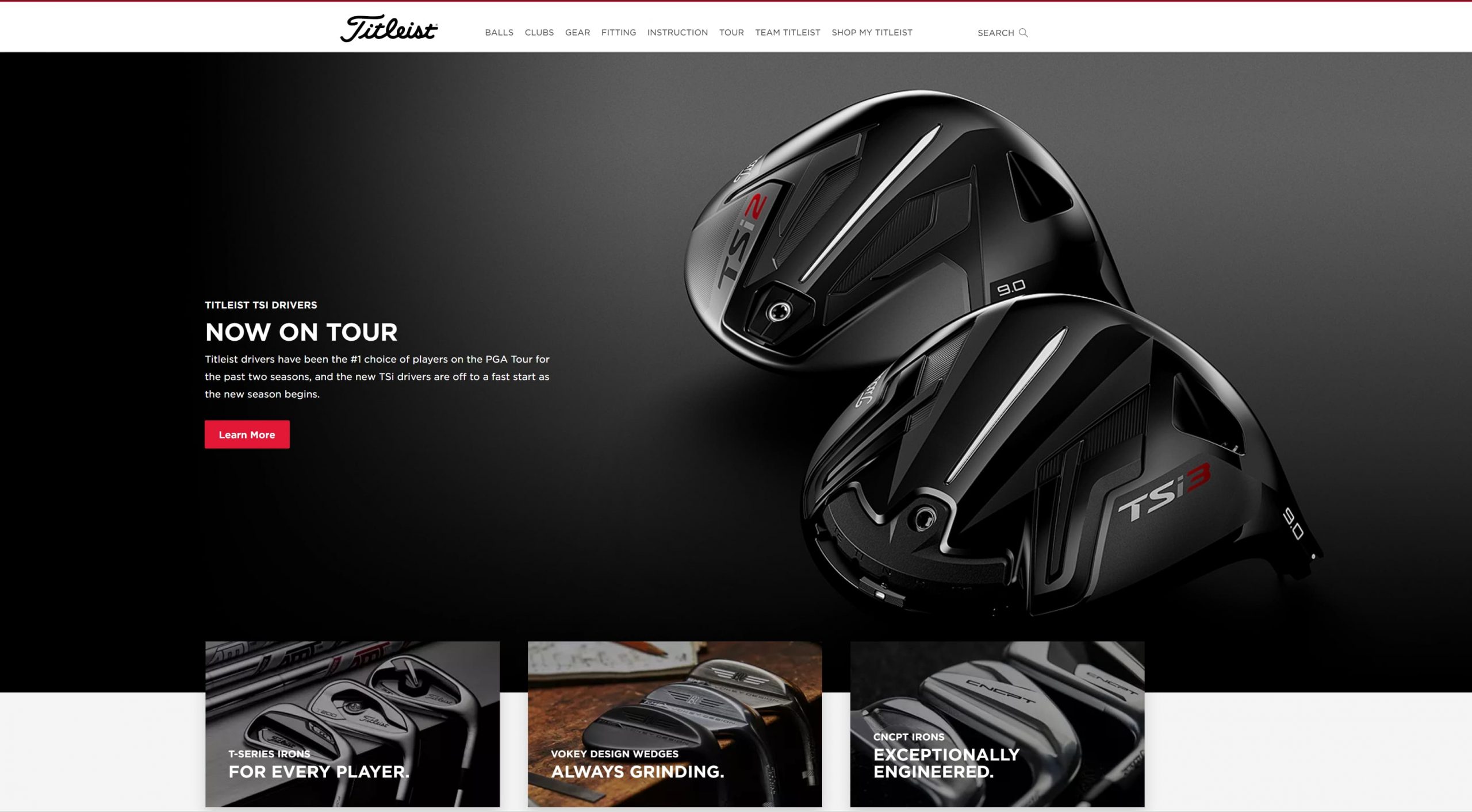
A great way to keep your homepage organized is by utilizing white space. White space is a negative space with no text or visual elements, like photos or videos.
You can see a great example of white space from Titleist. As you scroll through their homepage, you’ll see numerous areas with no text or images. It makes it easy for visitors to scroll through their homepage.
![]()
Ecommerce homepage design tip #4: Use high-quality visuals
Using high-quality visuals is next on our list of ecommerce homepage design tips. You don’t want to overwhelm your audience with walls of text, and visuals, like photos and videos help break up text on your site and make your homepage more visually appealing.
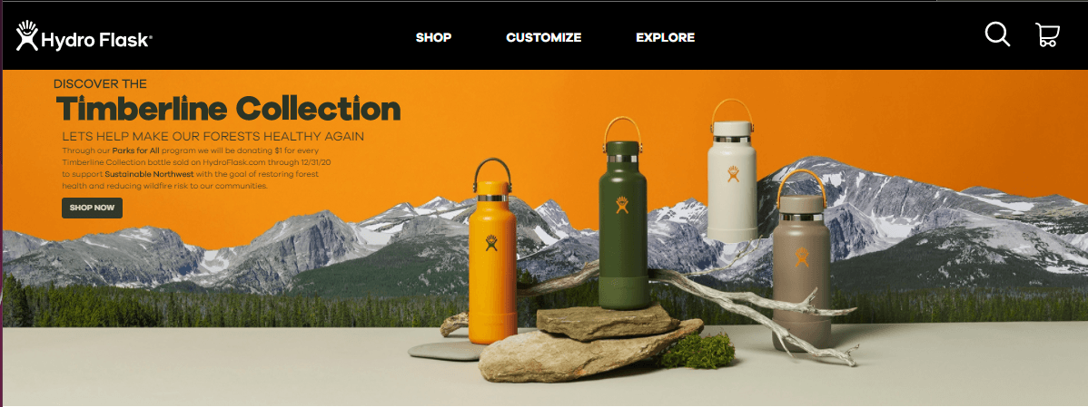
You don’t want to use just any visuals, though. Your visuals must be high-quality and clear, like this example from Hydro Flask.
![]()
The featured image on their homepage is high-quality, colorful, and on-brand.
You can add numerous types of visuals to your site’s homepage, including:
- Photos
- Videos
- GIFs
- Infographics
- Graphics
Ecommerce homepage design tip #5: Create an easy-to-use navigation
One of the first things your audience sees when they enter your site is your navigation. If they can’t easily find the products they want, they’ll feel discouraged and bounce from your site.
Your navigation should be organized and straightforward. You’ll want to use broad headings and create subcategories beneath these more general headings to help organize your product.
Chewy’s navigation is an excellent example of one way you can organize your navigation. They chose broad category options like “shop by pet” and “shop by brand” to help their customers find what they need fast.
![]()
You could also take an approach like Famous Footwear and use broad headings based on customer bases, like “women,” “men,” and “kids.”
![]()
The type of headings you use will depend upon your business and what you offer. Generally, keeping your headings broad will enable you to have more organized navigation that helps shoppers more easily browse your products.
Additionally, make sure you add a search bar to your navigation, so users can search for the products they need and find them fast.
![]()
Ecommerce homepage design tip #6: Make sure your homepage is mobile-friendly
If you want to have the best ecommerce homepage, you need to ensure your site is mobile-friendly. If someone visits your ecommerce homepage on a smartphone and isn’t mobile-friendly, they’ll quickly bounce back to the search results.
You need a site that looks great on mobile because 76% of consumers shop on a smartphone. Without a mobile-friendly site, you won’t keep these leads engaged.
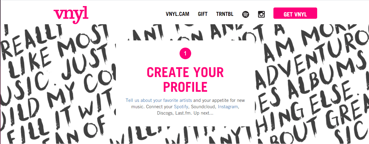
Take VYNL for example. Here’s what their site looks like on the desktop:
![]()
When you access their mobile site, you get the same great experience scaled down to your device.
![]()
To create a mobile-responsive site, you need to integrate responsive design. Responsive design will enable your site to adapt to whatever device a user uses. You can invest in responsive design services from a digital marketing company to help you get your site mobile-friendly!
Ecommerce homepage design tip #7: Make sure your homepage loads quickly
Next on our list of ecommerce homepage best practices is to ensure your site loads quickly. Your audience expects your page to load within two seconds, so if it doesn’t, they may bounce from your site.
To ensure your page loads quickly, use Google PageSpeed Insights to see how quickly your site currently loads. This tool will provide you with information on how to improve your site’s load time so people can shop on your site faster.
Ecommerce homepage design tip #8: Test everything
When you create your ecommerce homepage design, you want to ensure you’re delivering the best experience for your audience. That’s why we’re rounding up this list of ecommerce homepage best practices by talking about testing.
The first version of your homepage won’t always be the best. You may need to tweak some elements to drive better results for your business.
You can test multiple elements on your site, including:
- Your headings
- Your photos
- Your call to action (CTA) button color and style
By testing elements on your site, you’ll produce the best ecommerce homepage design for your audience.
Put these ecommerce homepage best practices to work
Now that you have this list of ecommerce homepage design tips, you can start building an ecommerce website that drives more leads and traffic to your site. If you need help creating an ecommerce site that drives results, look no further than WebFX.
In the past five years alone, we’ve driven over $2.4 billion in sales and over 6.3 million leads for our clients. We’ve also managed over 11.6 million transactions for our clients, too. You can feel confident that our team of 250 marketing experts can help you grow online.
Ready to get started? Contact us online or call us today at 888-601-5359 to speak with a strategist about our ecommerce web design packages!
The post 8 Ecommerce Homepage Best Practices to Keep Leads from Bouncing From Your Site appeared first on WebFX Blog.
For many years, WordPress enthusiasts have filled out an annual survey to share their experiences and feelings about WordPress. Interesting results from this survey have been shared in the annual State of the Word address and/or here on WordPress News.
This survey helps those who build WordPress understand more about how the software is used, and by whom. The survey also helps leaders in the WordPress open source project learn more about our contributors’ experience.
To ensure that your WordPress experience is represented in the 2020 survey results,
You can also take the survey in French, German, Japanese, Russian, and Spanish! The survey will be open for at least 6 weeks, and results will be posted on this blog.
2019 Survey Results
The 2019 survey included some new questions to better understand why people continue to use WordPress as their preferred CMS, as well as a section directed toward WordPress contributors. For the first time in 2019, this survey was translated into 5 different languages: French, German, Japanese, Russian, and Spanish.
The first WordPress Contributor Survey was conducted in 2015, but unfortunately the results were never published. This report includes Contributor Survey results from both 2015 and 2019.
Survey Segments
Major groups in the survey included: WordPress Professionals, WordPress Users, and Others.
The WordPress Professionals group consists of those who: work for a company that designs/develops websites; use WordPress to build websites and/or blogs for others; design or develop themes, plugins, or other custom tools for WordPress sites; or are a designer, developer, or other web professional working with WordPress.
This WordPress Professionals group is further divided into WordPress Company Pros (those who work for a company that designs/develops websites) and WordPress Freelancers/Hobbyists (all other professional types) subgroups.
The WordPress User group consists of those who: own or run a blog that is built with WordPress; own or run a website that is built with WordPress; write for or contribute to a blog/website that is built with WordPress; use WordPress for school as a teacher; use WordPress for school as a student, or are learning to build websites using WordPress.
The Others group consists of those who did not self-identify with any of the options provided for the question, “Which of the following best describes how you use WordPress?”
2019 Survey Results Summary
WordPress remains the platform of choice for future projects among those surveyed. Overwhelmingly, the reasons cited for this are that WordPress is the CMS people already know, and that the community supporting it is valuable. Professionals and users report similar levels of frustration with updates and Gutenberg. Both groups also love the ease of use they find in WordPress.
The number of professionals who report providing a heavily customized experience to clients has increased substantially, while at the same time the amount of time reported on creating those sites has decreased. Regardless of frustrations felt with various features, this seems to indicate that ease of use has been on the rise.
More details on sentiment, usage, and other interesting topics are available in the report: check it out!
Before you go: take the 2020 Survey!
Knowing why and how people use WordPress helps those who build WordPress to keep your needs and preferences in mind.
The survey will be open for at least 6 weeks, and results will be published on this blog. All data will be anonymized: no email addresses or IP addresses will be associated with published results. To learn more about WordPress.org’s privacy practices, check out the privacy policy.
Like last year, the 2020 survey will be promoted via a banner on WordPress.org, as well as by WordPress enthusiasts. Each of the translated surveys will be promoted through banners on their associated localized-language WordPress.org sites. Please encourage your WordPress pals and social media followers to take the survey too!
To ensure your WordPress experience is represented in the 2020 survey results… don’t delay!
(Also available in French, German, Japanese, Russian, and Spanish!)
