You probably know that putting too much food on your plate is usually a bad idea. Since research indicates that you’re more likely to overeat if you fill your plate, it’s not a good thing for your waistline. It’s also not a good thing for your eyes. If there’s no focal point, the food can overwhelm you, and you’ll find yourself lost in a vortex of scary, calorie-filled nightmares.
You’re not going to process your eating experience; you’re simply going to start at the least offensive corner and chow down until it’s all gone and your stomach’s about to burst. That’s why, when you go out to nicer restaurants, the chef portions out your food in small amounts, so that you can take your time and absorb not just the actual eating, but also the sensory experience – the sights, the smells, even the sounds. Yes, people. Food is complicated.
Today, I’m going to talk about simplifying your designs using the very same principles a chef uses to ensure that you have the most pleasant eating experience possible. And just like you’re much more likely to return to a restaurant that serves you an experience, rather than a mess, your users will be more likely to do the same when your designs are clean, strong, and simplified.
Focus In
We humans are programmed to make things complex. In the field of cultural anthropology, there’s overwhelming evidence of this fact, as societies around the world have progressed over the millennia from simple (think ‘hunter-gatherer’ type societies) to complex (modern “post-industrial” countries). It’s in our DNA to want to add on rather than take away, which can make the average designer’s job pretty difficult.
From your end as a designer, it’s generally quite hard to be objective about which information or design elements are “necessary,” versus which are not. Getting a second opinion can help sometimes, but if the person you’re asking is not a seasoned designer, they might not have the experience to tell you what’s not working and why.
When I’m working on a project that’s gotten too out of hand, I usually stop and take out the notes I took at the beginning of my process. The mind maps, diagrams, and lists that illustrate precisely what my main focus was supposed to be for the project. It’s inevitable that you’ll lose sight of your main focus at least once during the design process.
That’s okay, as long as you refer to your notes and refresh your memory. Designing around your main focus helps you to be more discerning about the content you include in your design, as it makes it clear what’s directly related to that main focus and what isn’t.

Use the Pareto Principle
The Pareto principle is something that’s been getting quite a bit of attention in recent years, thanks to personal development gurus like Tim Ferriss. But just in case you haven’t yet heard the basic idea behind it, here’s a quick run-down.
The Pareto principle, or the “80-20 Rule,” as it’s sometimes known, basically states that 20% of any given element is responsible for 80% of the results, and vice-versa. Designers love the 80-20 rule, since it’s so applicable to the design process, particularly in those areas where information or sales are at the heart of the design goals.
While you’re designing your product, website, or other deliverables, here are two important questions to ask yourself so that you don’t “over-design” those elements that don’t need it, and so that you can keep your focus on the 20% of the elements that are the most important:
- Who, specifically, is most likely to benefit the most from this design element?
I’ve talked at length about narrowing down your career focus to zero in on one or two specific markets. This question is one you can ask yourself at any time during your creative process.
If you devote time to researching exactly the target markets you’re best equipped to serve, you’ll have a much easier time finding and understanding the needs of clients. And when it comes time to simplify your designs for this target group, you’ll know exactly what they’re looking for, how they look for it, and how to provide it to them simply.
- How can I deliver the most value to this group of people using the least number of steps?
As an extension of the above idea, your process will become much simpler when you begin focusing on the number of steps it will take your users to get from your design to the information or product they’re looking for.
It’s helpful to write it out in a literal list; start with the key action step on your website, brochure, poster, etc., and document exactly what needs to happen from there to make the sale. Once you’ve done that, the path usually becomes very clear in terms of what’s actually needed to get the user to his or her destination, and what’s not.

Smart It Up
A lot of the advice you may read about simplifying your designs might make it seem like designers think their users are the stupidest people in the world. Skim a few articles and you’ll see what I mean – everything is concerned with making the important elements as obvious as they can possibly be, so that the user doesn’t have to use their brain for anything.
It can actually make you start to feel a bit sorry for the average user at first, since designers seem to think so little of them. But if you understand the underlying principles behind this philosophy, you’ll begin to realize that, not only do designers not think their users are stupid, they’re actually being very smart about creating an experience that caters to the needs of the very top of the user “hierarchy.”
It’s not that you should automatically assume that people are stupid. Rather, your assumption should be that everyone is smart – each of your users is far too busy living productive, interesting lives to waste time where they don’t need to.
Once you embrace this mentality, it will become easier for you to zero in on exactly what makes these smart, productive, interesting people tick, and how you can help them absorb the exact information they need to go on about their awesome lives. This has the added effect of allowing you to go on about your awesome life as well.
Your users should be able to get to the specific information they need with as little effort as possible. Whether that involves less reading, scrolling, or interactivity, make sure you keep your focus on the actual steps required to encourage the biggest results from the least amount of action.
The post Simplifying Your Designs for the Smartest User appeared first on Speckyboy Design Magazine.
WordPress 5.6 Beta 3 is now available for testing!
This software is still in development, so we recommend that you run this version on a test site.
You can test the WordPress 5.6 beta in two ways:
The current target for the final release is December 8, 2020. This is just five weeks away, so your help is needed to ensure this release is tested properly.
Thank you to all of the contributors that tested the beta 2 development release and provided feedback. Testing for bugs is an important part of polishing each release and a great way to contribute to WordPress.
Some Highlights
Since beta 2, 20 bugs have been fixed. Here is a summary of a few changes included in beta 3:
- Added block patterns for Twenty Twenty (see #51098) and Twenty Nineteen (see #51099) themes.
- Added theme support for navigation-widgets (see #51445).
- Fixed incorrect slashes in the URL if the parent is empty for REST API (see #44745).
- Added a test to Site Health to verify that the
Authorization header is working as expected for Application Passwords (see #51638). - 10 additional bugs fixed in the block editor (see #26588).
To see all of the features for each Gutenberg release in detail, check out the release posts: 8.6, 8.7, 8.8, 8.9, 9.0, 9.1, 9.2, and 9.3.
Developer notes
WordPress 5.6 has lots of refinements to the developer experience as well. To keep up, subscribe to the Make WordPress Core blog and pay special attention to the developers’ notes for updates on those and other changes that could affect your products.
How to Help
If you think you’ve found a bug, you can post to the Alpha/Beta area in the support forums. We’d love to hear from you!
If you’re comfortable writing a reproducible bug report, file one on WordPress Trac, where you can also find a list of known bugs.
Props to @hellofromtonya for help and @chanthaboune for final review.
October 2020 was a notable month for WordPress lovers, thanks to the release of several products and updates. Read on to keep up with all the latest news!
The 2020 WordPress Annual Survey is out
The team published the 2020 WordPress Annual survey — to help those who build WordPress to understand more about our software usage and our contributors’ experience. The Annual Survey will be open for at least 6 weeks and is available in French, German, Japanese, Russian, and Spanish. The survey results (once complete) will be posted on WordPress.org/news. The 2019 survey results have also been released and can now be viewed as slides or downloaded in PDF format.
WordPress Translation celebrations spanned four weeks
The last week of September and most of October were focused on recruiting and encouraging polyglot contributors to the WordPress translation project. What was originally envisioned as a single-day event lasted 24 days! The Polyglots and Marketing Teams are exploring how future mini-events can be supported to continue building the momentum. Recordings of the live talks and interviews with contributors are available on YouTube. Write-ups from the different events are on the WPTranslationDay website. The Polyglots team is also working on its 2020 survey and is requesting feedback on the questions.
Want to help WordPress speak your own language? Follow the Polyglots team blog and join the #polyglots channel in the Making WordPress Slack group.
WordPress maintenance and beta releases
The Core team released WordPress 5.5.3 on Oct. 31, following the release of Version 5.5.2 on Oct. 29. Both releases fix several bugs and security issues with WordPress. You can update to the latest version directly from your WordPress dashboard or download it now from WordPress.org. The team also released WordPress 5.6 Beta 1 on Oct. 20, followed by Beta 2 on Oct. 27. When ready, the final release will include improvements to the editor, auto-updates for major releases, PHP 8 support, and the Twenty Twenty One theme. You can test the Beta versions by downloading them from WordPress.org or using the WordPress Beta Tester plugin.
Want to be involved in the next release? Follow WordPress 5.6 updates on the development cycle and sign-up for the code review/commit office hours. You can help build WordPress Core by following the Core team blog and joining the #core channel in the Making WordPress Slack group. If you would like to help out with WordPress 5.6 outreach, contact the WordPress Marketing team on the #marketing channel.
Gutenberg 9.2 is released
Version 9.2 of the Gutenberg plugin came out on Oct. 21. This release offers support for video subtitles, the ability to transform selected blocks into the columns block, background patterns in cover blocks, along with several exciting features such as improvements to the widget screen, as well as bug fixes. You can find out more about the Gutenberg roadmap in the What’s next in Gutenberg blog post.
Want to get involved in building Gutenberg? Follow the Core team blog, contribute to Gutenberg on GitHub, and join the #core-editor channel in the Making WordPress Slack group.
Learn WordPress is gearing up for launch
The Learn WordPress initiative, which offers WordPress video workshops followed by interactive discussions, is aiming to put out two courses by the end of the year as part of its full launch. The team is working on creating courses and is requesting feedback from community members on the planned list of courses.
Want to contribute to Learn WordPress? You can now submit a workshop application (submissions in non-English languages are welcome), apply to become a discussion group leader, organize discussions for your local WordPress meetup group, or update screenshots on existing lesson plans.
Further Reading:
- The Q3 2020 update from the WordPress project is now out!
- The WordPress Marketing team has put together a list of WordPress 5.5 marketing resources consisting of video presentations, slides, questions & answers, social media posts, and more – aimed at both developers and non-developers. The team has also prepared a list of captioned screen-recordings in several languages to aid new contributors. Contact the team on the #marketing channel if you would like to contribute to these and upcoming projects.
- The WordPress Core team has announced a proposal to introduce application passwords for REST API integrations.
- Five online WordCamps took place in October: WordCamp Rochester, NY, WordCamp Austin, TX, WordCamp Italia Online, WordCamp Los Angeles, CA, and WordCamp Bulgaria Online. You can find livestream recaps of these camps on their websites. The camps are also in the process of uploading their videos to WordPress.tv. Check out the WordCamp Schedule to catch up with upcoming online WordCamps.
- Contributor teams have started work on adding dark mode support for the Twenty Twenty One theme. Additionally, the development of the Full Site Editing version of Twenty Twenty One has also kicked-off in the Theme Experiments GitHub repository.
- BuddyPress 7.0 beta, which comes with new administration screens, blocks, and improved CLI support – is now available!
- The Core team is revisiting starter content for WordPress themes as part of the 5.6 release. The team also decided not to ship the widgets screen in WordPress 5.6 and have started discussions on aligning the WordPress release cycle with industry standards.
- WordPress Accessibility enthusiasts all over the world joined hands for the first ever 24 hour WP Accessibility day event on Oct. 2. You can find the recorded livestream of the event on its YouTube channel.
- The Meta team has kicked off a discussion on setting up a Block pattern directory (similar to the existing block directory).
- The Themes team has published a post clarifying how Block based themes will work with WordPress 5.6. Check out the block-based theme tutorial and its documentation to learn how to build block-based themes.
Have a story that we should include in the next “Month in WordPress” post? Please submit it here.
Package:
Summary:
API to retrieve movie details and other resources
Groups:
Author:
Description:
This package implements API to retrieve movie details and other resources...
Read more at https://www.phpclasses.org/package/11859-PHP-API-to-retrieve-movie-details-and-other-resources.html#2020-11-02-02:36:40

Package:
Summary:
Template engine that provides programming controls
Groups:
Author:
Description:
This package implements a template engine that provides programming controls...
Read more at https://www.phpclasses.org/package/11807-PHP-Template-engine-that-provides-programming-controls.html

When updating a WordPress theme or plugin, we’ve long had two choices. Either manually upload the updated files via FTP or install the update within the WordPress dashboard.
In general, both of these methods work pretty well – most of the time. FTP is fairly reliable, but isn’t recommended for non-technical users. Then, some themes and plugins seem to be extra finnicky when attempting to update via the dashboard.
Thankfully, there is now a more convenient solution. WordPress 5.5 introduced the ability to apply updates to a theme or plugin by uploading a ZIP file within the dashboard. Now, the same downloadable file that has been long used for installing software can also be used to update it. It’s about time!
Today, we’ll walk you through the process of updating your website’s themes and plugins using only a ZIP file.
First, a Few Technical Notes
While updating a theme or plugin via a ZIP file is fairly straightforward, there are a few technical items to keep in mind:
Test and Back Up Your Site
As always, the best way to prepare your website for updates is to test them out. This could be done via staging site.
In addition, make sure to keep a current backup of your site on hand just in case something goes wrong.
Check the ZIP
If you’re downloading from the official WordPress theme or plugin repositories, your ZIP file should be good to go. However, software from other sources may require some more action on your part before you can upload to your website.
For example, there are commercial themes that provide more than just the installable files within a ZIP archive. You may have to extract another ZIP archive contained within for installation/update purposes. If you’re unsure, open up the archive first to see what you’re dealing with.
Beware of File Upload Limits
All WordPress websites have a file upload limit. There may be occasions when a ZIP file exceeds that limitation.
In this case, you’ll either have to increase the upload file size or unzip the archive and upload via FTP.
Now that we have these technical details out of the way, let’s explore the update process.
Update a WordPress Plugin with a ZIP File
Let’s start out with updating a WordPress plugin with a ZIP file. It’s nearly identical to that of a theme (which we’ll get to later) – the main difference being the location of the upload screen.
In this example, we’ll update Yoast SEO to the latest version. That requires us to download a fresh copy of it to our device.
1. Within the WordPress dashboard, navigate to Plugins > Add New.
2. Click on the Upload Plugin button at the top of the screen.

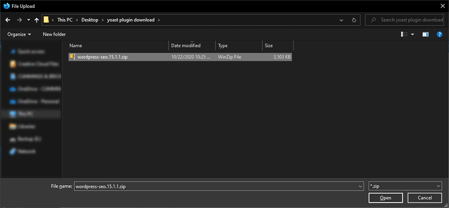
3. Next, click on the Browse button and locate the ZIP file on your device. Select it and click on Open (the look and terminology used here may be different, depending on your device’s operating system).

4. You should now see the file name displayed on the Add Plugins screen. Click the Install Now button to start the upload process.

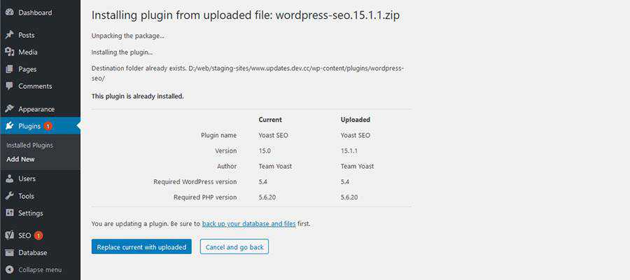
5. Now, WordPress is going to do some detective work. It’s going to check to see if the plugin is already installed (which it is). Once it sees that we already have a version of Yoast SEO, it’s going to give us a comparison of the existing and uploaded versions.

In our example, WordPress correctly sees that the plugin we uploaded is a newer version. We want to go ahead and apply the update, so we’ll click Replace current with uploaded to finish up.
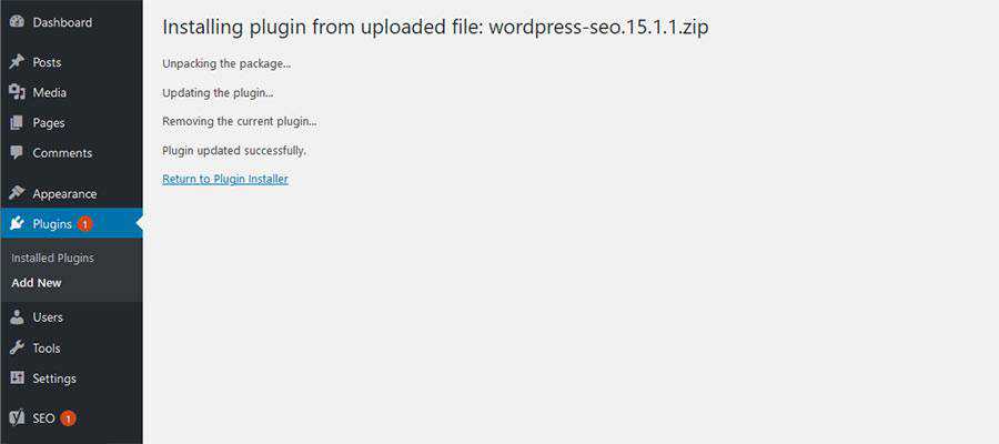
6. Success! The new version of Yoast SEO was updated using a ZIP file.

Update a WordPress Theme with a ZIP File
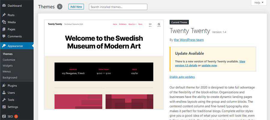
As we mentioned, the process for updating a WordPress theme with a ZIP file is pretty much identical as the one outlined above. Here, we’ll update to the latest version of the Twenty Twenty theme.
Here are the differences:
1. Within the WordPress dashboard, navigate to Appearance > Themes.

2. Click on the Add New button at the top of the screen. You’ll be taken to the Add Themes page. Click on Upload Theme to select the ZIP file from your device.
Steps 3 – 6: Repeat those listed above.
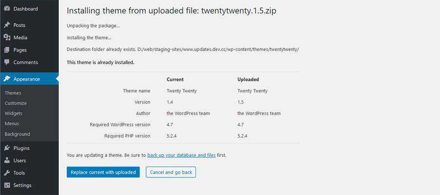
Once again, WordPress will inform us that the theme we’ve uploaded already exists. From there, it will point out the version difference.

Clicking on Replace current with uploaded will apply the theme update.
A Simple Solution for Theme and Plugin Updates
The ability to update your WordPress website’s theme and plugins via a ZIP file is incredibly handy. There are a number of situations that arise where utilizing FTP or the automated dashboard updates either don’t work or aren’t very convenient.
This provides us with another method that just about anyone can do. It will make the process of maintaining your site that much easier.
The post How to Update WordPress Themes and Plugins with a ZIP File appeared first on Speckyboy Design Magazine.
Package:
Summary:
Store and retrieve images in Laravel models
Groups:
Author:
Description:
This package can store and retrieve images in Laravel models...
Read more at https://www.phpclasses.org/package/11857-PHP-Store-and-retrieve-images-in-Laravel-models.html#2020-10-31-18:41:29


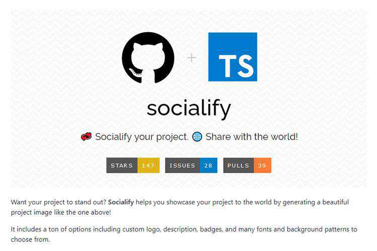
GitHub Socialify – Showcase your project to the world by generating a beautiful project image with this tool.

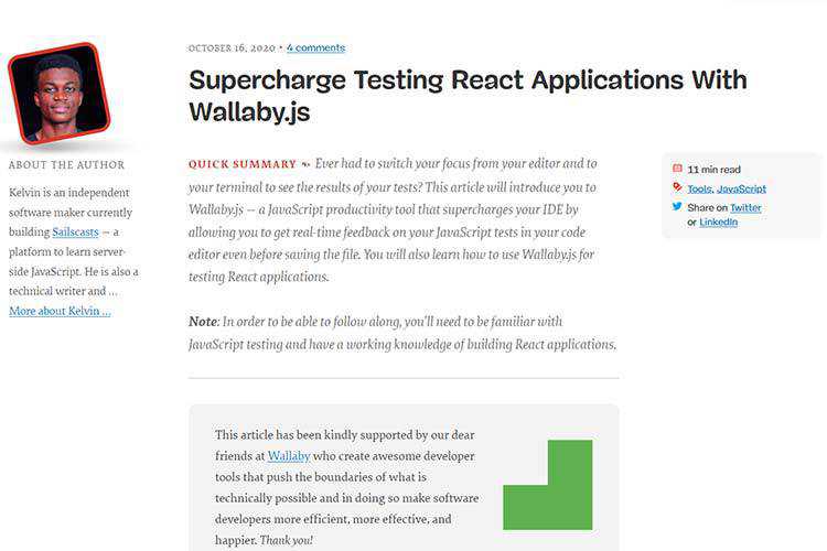
Supercharge Testing React Applications With Wallaby.js – React developers, learn how to get real-time feedback on your JavaScript tests in your code editor even before saving the file.

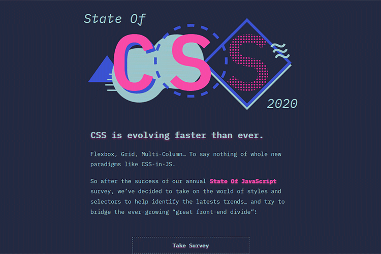
The State of CSS Survey – Take the survey and help identify the latest trends in CSS.

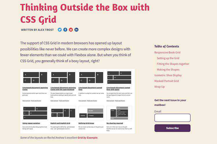
Thinking Outside the Box with CSS Grid – CSS Grid means not having to settle for boxy layouts. Check out these unique examples for inspiration.

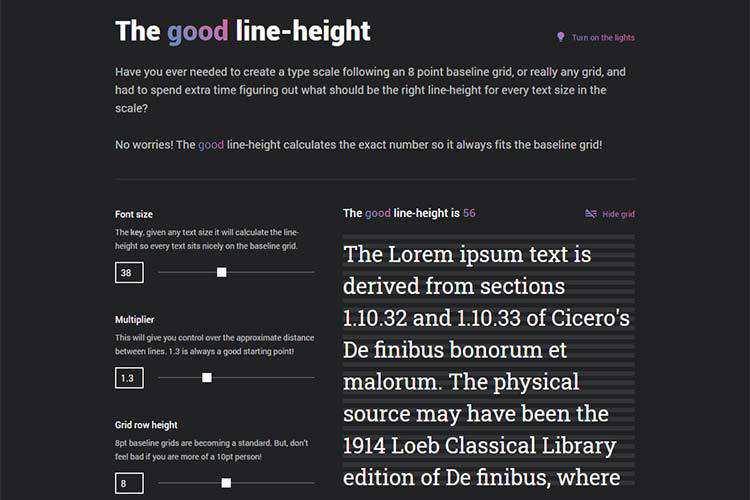
The good line-height – Use this tool to easily calculate the perfect CSS line height for each text size in your scale.

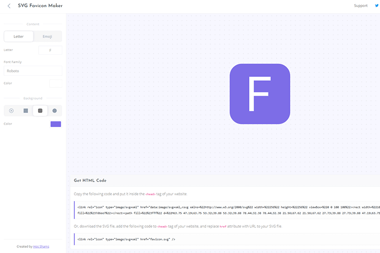
SVG Favicon Maker – Create your own, scalable SVG favicon with this online tool.

TALLBOY™ Typeface – Grab a copy of this free ultra-condensed typeface for use in your projects.

iOS 14 GUI – Download the biggest collection of free iOS 14 screens and components. Works with Sketch, Figma and Adobe XD.

CSS Background Patterns – Generate your own seamless background pattern.

The Grumpy Designer’s WordPress Plugin Pet Peeves – A few of the more egregious and frustrating WordPress plugin behaviors.

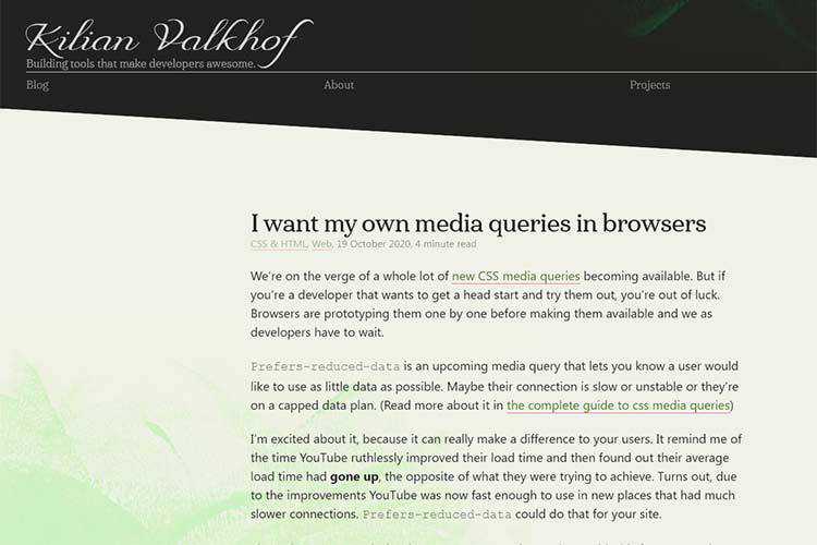
I want my own media queries in browsers – How to test new CSS media queries before they make it to browsers.

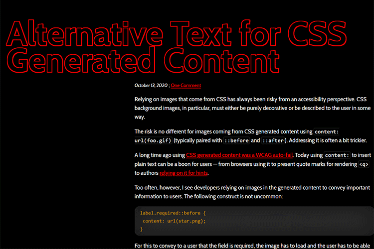
Alternative Text for CSS Generated Content – Find out how images displayed via CSS content can be made more accessible.

UXArchive – Browse the world’s largest library of mobile user flows.

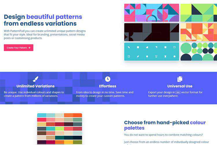
PatternPad – An app for creating exportable patterns using endless variations.

Signs Your WordPress Website Has Outgrown Its Hosting – How do you know when you need a hosting upgrade? Read this guide for telltale signs.

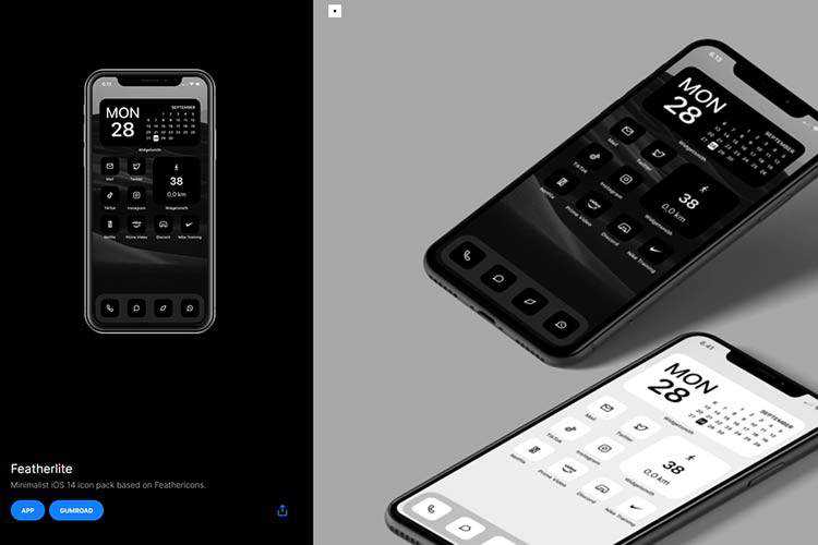
Feather – Download this minimalist iOS 14 icon pack based on Feathericons.

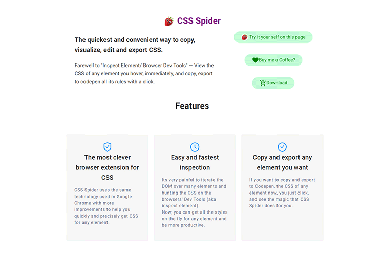
CSS Spider – This Chrome extension is billed as the quickest and most convenient way to copy, visualize, edit and export CSS.

The post Weekly News for Designers № 564 appeared first on Speckyboy Design Magazine.
Package:
Summary:
Route HTTP requests to functions like Laravel
Groups:
Author:
Description:
This package can route HTTP requests to functions like Laravel...
Read more at https://www.phpclasses.org/package/11856-PHP-Route-HTTP-requests-to-functions-like-Laravel.html#2020-10-30-13:57:53

WordPress 5.5.3 is now available.
This maintenance release fixes an issue introduced in WordPress 5.5.2 which makes it impossible to install WordPress on a brand new website that does not have a database connection configured. This release does not affect sites where a database connection is already configured, for example, via one-click installers or an existing wp-config.php file.
5.5.3-alpha Issue
Earlier today — between approximately 15:30 and 16:00 UTC — the auto-update system for WordPress updated some sites from version 5.5.2 to version 5.5.3-alpha. This auto-update was due to an error in the Updates API caused by the 5.5.3 release preparations (see more here). The 5.5.3-alpha version at this point was functionally identical to 5.5.2 as no development work had been started on 5.5.3; however, the following changes may have been made to your site:
- The default “Twenty” themes installed as part of the pre-release package.
- The “Akismet” plugin installed as part of the pre-release package.
These themes and plugins were not activated and therefore remain non-functional unless you installed them previously. It is safe to delete these features should you prefer not to use them.
If you are not on 5.5.2, or have auto-updates for minor releases disabled, please manually update to the 5.5.3 version by downloading WordPress 5.5.3 or visiting Dashboard → Updates and click “Update Now.”
For more technical details of the issue, we’ve posted on our Core Development blog.
Thanks and props!
Thanks to those who contributed to the 5.5.3 release: @audrasjb, @barry, @chanthaboune, @cbringmann, @clorith, @davidbaumwald, @desrosj, @hellofromtonya, @jeffpaul, @johnbillion, @garubi, @metalandcoffee, @mukesh27, @otto42, @punitsoftac, @sergeybiryukov, @whyisjake, and @xknown.


