Mezon PHP CRUD API Service Client (New)
Read more at https://www.phpclasses.org/package/11848-PHP-Client-to-call-an-API-that-provides-a-CRUD-service.html
Mezon PHP CRUD API Service Client (New)
Read more at https://www.phpclasses.org/package/11848-PHP-Client-to-call-an-API-that-provides-a-CRUD-service.html
Diving into WordPress Custom Post Types and Taxonomies
The ability to organize content is one of the most important functions of a content management system (CMS). It offers us a way to clearly define what belongs where. This impacts everyone from content creators accessing the back end to users navigating the public-facing website. And of course, search engines are also a big factor.
WordPress has an array of options for organizing content – but they might be easy to miss when you first install the software. Out-of-the-box, it comes with standalone pages, along with posts that can be further organized via categories and tags.
These items provide a great start and may be enough for a basic website. However, sites with a lot of different types of content can become messy when just relying on the default choices.
This is where a quick look under the hood unlocks the massively-useful WordPress custom post types and taxonomies. With them, you can create all-new and highly-specific ways to organize your content. Instead of trying to fit square pegs into round holes, you simply create new ones that are a perfect fit for your needs.
With that in mind, let’s look at a scenario where a custom post type or taxonomy can be helpful. We’ll also offer up some tips for making the most out of this feature.
Learning About Custom Post Types and Taxonomies
First, it’s important to have a cursory understanding of WordPress custom post types and taxonomies. You don’t need to be an expert, but it’s a good idea to know how they are set up and what options are available.
We have a short tutorial that will help you in getting started. In addition, it’s worth looking into the WordPress documentation regarding post types – and especially the register_post_type() and register_taxonomy() functions.
And, if you’re looking for a tool that makes creating custom post types and taxonomies a breeze, check out both Custom Post Type UI and Pods. Both of these free plugins greatly simplify the process. You can’t go wrong with either pick.
Lumping Everything into Posts Can Be Confusing
Standard WordPress posts are fine if you’re running a blog or news-oriented website. The ability to categorize and tag each post means you can easily separate press releases from opinion pieces.
But let’s consider a different scenario. What if you want to organize staff members by department? Forget about using standard pages, as they aren’t appropriate for this type of situation.
Posts might be a solution. You could create a “Staff” post category, then a child category for each department. From there, you can add a post for each staff member and assign them to their respective categories.
This all works, technically-speaking. But as your site fills up with content, visiting the WordPress Posts screen can become overwhelming.
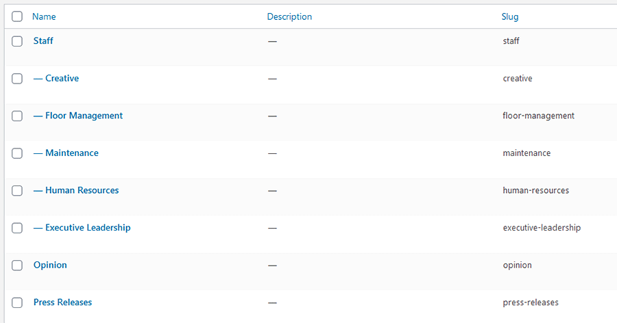
Imagine being a content creator who needs to edit a post. Since some entries are blog posts, others are news items and still others are staff members, it’s difficult to find what you’re looking for. There are simply too many different types of content in the same place.
Then, displaying the staff members on the front end isn’t so simple. While you could create a custom category template, you may well have to create ones for each department to duplicate the desired formatting. The structure is also hard to keep track of. It’s even worse for another developer who comes in later on.
How a Custom Post Type + Taxonomy Can Help
This type of issue is exactly what custom post types and taxonomies exist to solve. In this case, creating a custom post type for “Staff” and a taxonomy for “Departments” will provide a separate area within WordPress exclusively for this content.
It’s a more intuitive experience all the way around. Now, those seeking to add or edit staff-related content need only click the entry within the WordPress menu. It’s much easier to find and just plain makes sense.
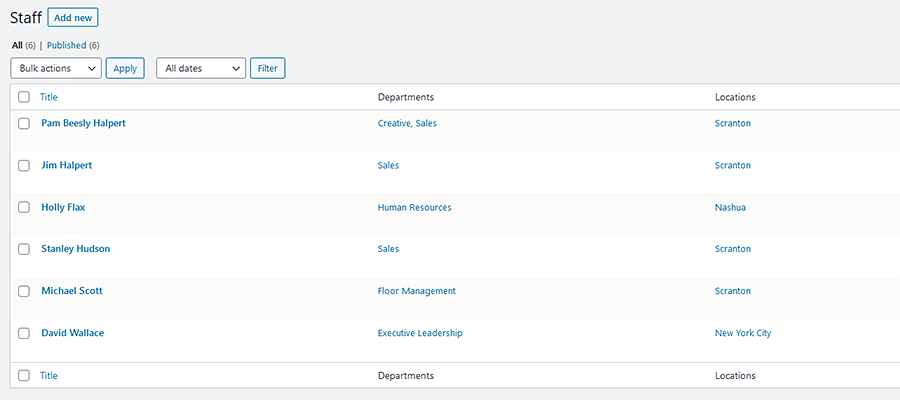
On the front end, staff and department content get their own archives. This would allow designers to create custom templates that better reflect the content in this post type. You won’t have to settle for the same look and layout used for standard blog posts.
The URL structure is also more reflective of content as well. This not only looks better to the end-user but can benefit SEO. Speaking of which, a custom post type also allows for more targeted SEO customization when using a plugin such as Yoast SEO or All in One SEO Pack.
Whether you’re a content creator or a visitor, there are benefits all the way around. Any type of specialty content that doesn’t fit the mold of the traditional post or page is likely a good fit for this type of setup.
Considerations for Setting up Custom Post Types and Taxonomies
The above is just one scenario where a WordPress custom post type makes sense. But things aren’t always so clear-cut. You may have content that could benefit from its own post type and taxonomy, but may be unsure as to the best way to configure it.
Let’s look at a few important factors to consider before you dive into adding content:
Think About URL Structure
We won’t spend a ton of time on this, but how URLs are structured is important. Custom post types require a slug, which serves as the basis for how your posts are organized.
You’ll want to choose a slug that makes sense for your content. Taking our Staff post type as an example, the URL for its archive index might be:
https://www.yourgreatsite.com/staff/
In this case, “staff” is the slug for our post type. Perhaps not the most exciting name, but certainly logical.
Also beware that existing content on your website may already be using a particular slug. Therefore, you may have to change things around in order to accommodate this new post type.
Do Posts or Taxonomies Require Parent/Child Relationships?
There’s a little secret to WordPress custom post types and taxonomies. Whatever you name them, they all function essentially the same as standard pages, posts, categories, and tags. And you can configure them to work within these parameters.
Pages are standalone pieces of content that are hierarchical – meaning they can have parent/child relationships. While a custom post type can be set up to utilize page-like functionality, it’s not all that common. Using the default Pages post type that comes with WordPress often works just as well.
Posts act as a collection of content within WordPress. Ideally, all posts in a custom post type are related in some way. They might be blog posts, staff member profiles, or even products that we’re selling. They are not hierarchical.
Categories and tags are two different ways to further organize post content. And each custom taxonomy we create contains properties specific to one or the other.
The main difference between the two is a hierarchy. If a taxonomy is hierarchical (enabling parent/child relationships), then it behaves like a category. If there’s no hierarchy, it behaves like a tag.
In our example, the “Departments” custom taxonomy is hierarchical. This allows us to:
- Assign individual staff members to one or more departments (Executive Leadership, Human Resources, etc.);
- Add more layers to organize content, such as sub-departments, which act like child categories (Executive Leadership > Finance, Human Resources > Benefits);
- Display content based on departments and sub-departments;

On the other hand, not all content needs to be organized with a parent/child hierarchy. This where tags come in handy. And you can set up a custom taxonomy to behave in the same way. Content is grouped on a singular level.
When deciding on how you want to build out custom post types and taxonomies, determine your needs with regards to hierarchy. You can make changes after-the-fact, but it’s much easier to start on the appropriate path.
Create as Many Taxonomies as You Need
Custom taxonomies give you an easy way to organize content. And there’s no real limit to how many of them you can create to go along with your post types. This can be especially handy when you need to filter posts based on more than one criterion.
For example, let’s say that our Staff post type covers employees in several different office locations. By creating taxonomies for both Departments and Offices, we could easily filter posts based on a combination of the two.
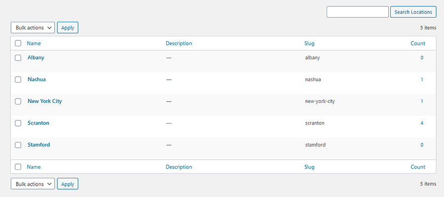
If we need to see only Human Resources employees from the Scranton office, we can. Likewise, if we wanted to list all the Executive Leadership in the New York City and Stamford offices, a query can be built to do so.
Taxonomies provide a means to sort data in a way that would otherwise be incredibly difficult.
Go Further with Custom Fields
There are instances where the content you want to place in your custom post type goes beyond what WordPress offers in a default installation.
For instance, a staff member profile might include information such as the employee’s title and email address. While you could manually add these into each post’s main content area, it could lead to some inconsistencies in formatting.
Adding custom fields for both “title” and “email” would solve that problem. With them, data can be queried separately and allow for a more consistent way to add and display content.

Customize Your WordPress Content
We spend so much of our time customizing the look and layout of our website projects. But it’s also important to pay close attention to how content is organized as well.
That’s what custom post types and taxonomies are there to do. They allow us to put related content together according to need. That, in turn, makes it easier to create, edit, and display.
We hope this guide has helped you better understand when it makes sense to implement these features and how to best use them. It’s the kind of knowledge that can help you deliver a website that is well organized, SEO-friendly, and easier to navigate.
The post Diving into WordPress Custom Post Types and Taxonomies appeared first on Speckyboy Design Magazine.
PHP Doctor
Read more at https://www.phpclasses.org/package/11864-PHP-Scan-PHP-to-find-missing-or-wrong-PHPDoc-comments.html#2020-11-08-16:17:29
Laravel Money Package (New)
Read more at https://www.phpclasses.org/package/11863-PHP-Manipulate-model-attribute-as-money-values.html
Mezon Fields Set (New)
Read more at https://www.phpclasses.org/package/11846-PHP-Manipulate-a-set-of-field-types-and-constraints.html
Weekly News for Designers № 565
OrbitCSS – Check out this modern CSS framework based on flexbox.
How ‘Lazy’ Price Estimates Can Cost Freelancers – Create more accurate project proposals by doing a little research first.

The Principles Of Visual Communication – Why the best way to tell stories might be through thoughtfully crafted visuals.

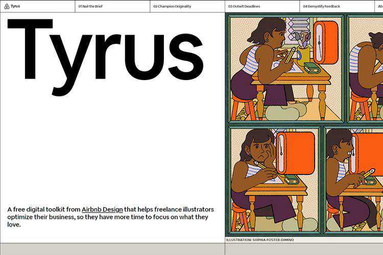
Tyrus – Discover this free digital toolkit from Airbnb Design that helps freelance illustrators optimize their business.
The Caretaker – Here’s a spooky, pure CSS horror/puzzle game that’s perfect for the season.
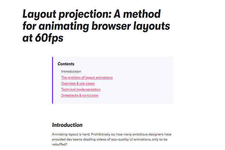
Layout projection – A method for animating browser layouts at 60fps.
UI Coach – Need some practice? Use this UI design challenge generator to level up your game.

Part of your world: Why we’re proud to build a truly native Mac app – The team at Sketch explain the benefits of being a native Mac app.

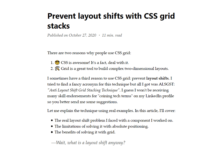
Prevent layout shifts with CSS grid stacks – Techniques to help prevent elements from shifting as a page updates.
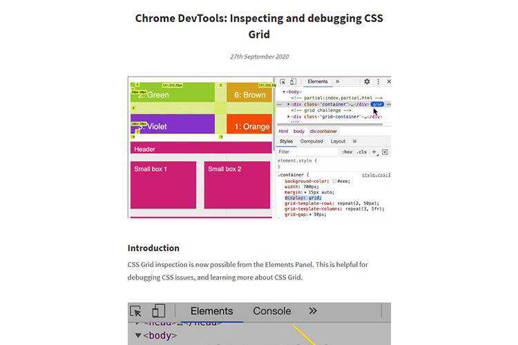
Chrome DevTools: Inspecting and debugging CSS Grid – Learn the basics of troubleshooting CSS grid with this guide.
Free iOS 14 Icon Set – Download this set of 80 custom-designed app icons for the latest version of iOS.

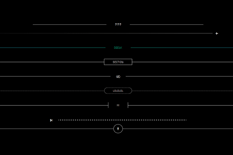
8 Horizontal Rules and Dividers Enhanced with CSS – A collection of stylish ways to divi up your content.
Comparing Various Ways to Hide Things in CSS – Methods and considerations for hiding elements via CSS the “right” way.

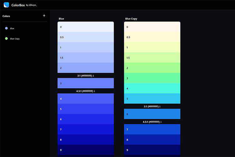
ColorBox – Use this tool to generate and compare colors for your next project.
25 Best Free Corporate Business Flyer Templates – Make your message stand out with these free business flyers.

Windows XP in React – If you happen to miss Windows XP, you can relive the glory days with this react-based UI.

Build a game this November with GitHub Game Off – Participate in this fun exercise and share your work with the world.

JavaScript—still a Ghost – Why JavaScript frameworks and web pages that work without JavaScript not only are not at odds, but can actually complement each other well.

The post Weekly News for Designers № 565 appeared first on Speckyboy Design Magazine.
Tico PHP MVC Framework (New)
Read more at https://www.phpclasses.org/package/11816-PHP-Framework-to-implement-MVC-applications-in-PHP.html
The 12 Best Photoshop Actions for Creating the Duotone Effect
Duotone, double color, or whatever else you want to call it, on this is for certain about this photo effect: it’s cool. And trying to replicate it on your own can be a bit difficult if you’re not well versed in post-production. But as you might’ve guessed, that’s where Photoshop actions come into play.
With as little as a single click, a Photoshop action can create a duotone effect in your photos that makes a real impact and takes your photography to the next level. The level of professional results this type of Photoshop action can wield speaks for itself.
What we’ve done is compile a solid set of double color or duotone effect Photoshop actions here that make creating interesting looks in your edited photos easier and more attainable. Go ahead and take a look at our list. Something is bound to pique your interest!
Double Color Exposure Effect Photoshop Action
First on our list is the Double Color Exposure Effect Photoshop Action. This action is powerful and easy to use. It comes with 6 overlay effects and 27 gradient presets. You can apply it with just a couple of clicks and it comes with a help file to help you troubleshoot should anything go awry along the way.

Advanced Double Exposure Photoshop Action
The Advanced Double Exposure Photoshop Action is another fantastic choice. This effect is also easy to use and creates, as its name would suggest, a cool double exposure effect by combining two photos into one. It includes 18 color presets, customization options, and well-organized layers that are color coded for easy use.

Beautiful Double Color Exposure Photoshop Action
Here’s another great choice for creating a duotone or double color effect. The Beautiful Double Color Exposure Photoshop Action works with any image you want, can be implemented in a single click, and comes with thorough instructions for easy use. It includes 7 color styles and combinations as well.

Four Double Exposure Photoshop Actions
This one is actually a set of four separate actions, each of which help to create a double exposure effect. You can combine them together or use them alone depending on the visual outcome you want to achieve. It works best on pictures with medium to high exposure, comes with a help file, and is optimized to run smoothly.

Trendy Double Exposure Photoshop Action
The Trendy Double Exposure Photoshop Action provides results that are just plain cool. This action is easy to use and can be customized to suit a variety of needs and situations. It has well-organized layers for easier edits, comes with an illustrated guide, and provides a video tutorial as well so you’ll never have to guess how to implement this action.

Double Exposure Photoshop Actions from Sevenstyles
Another option is this Double Exposure Photoshop Actions from Sevenstyles. This action includes a two double exposure action that combines two photos and a single exposure action that applies to a single photo. It also comes with depth of field actions, 235 light effects, 33 textures, and a chromatic distortion action. Finally, it comes with a video tutorial that makes it super easy to get started with this action.

Double Exposure Kit Photo Action & Gradient
The Double Exposure Kit Photo Action & Gradient is another fantastic choice for creating interesting finished photos. This kit comes with Photoshop actions, 30 textures, 10 double exposure gradients, and more for adding double exposure effects to your photos with just a couple of clicks. You can combine these tools or use them alone. It’s up to you.

Double Exposure Photoshop Action
The Double Exposure Photoshop Action makes it super easy to create a double exposure effect on a whim. It only takes a few seconds to implement and the end result is stunning. This action comes with 25 color scripts and custom colors. Plus it’s fully layered, customizable, and comes with documentation. What more could you ask for?

Animated Parallax Double Exposure Photoshop Action
If you want a little more variability in your double exposure effects, the Animated Parallax Double Exposure Photoshop Action is a great choice. It comes with four different parallax shift styles and can be implemented with just a couple of clicks. It’s fully layered, customizable, and shaves off a ton of time from your workflow.

Color Double Exposure Photoshop Action
The Color Double Exposure Photoshop Action delivers professional results in a matter of minutes. It’s easy to use, is fully editable, and grouped so it can be used fast. It comes with 50 color presets and you have control over each layer so you can pick and choose which elements of the effect you want to use. Finally, this action is non-destructive, so your original images remain intact.

AI Modern Double Exposure Photoshop Actions
Here’s another great option. The AI Modern Double Exposure Photoshop Actions use AI to detect faces, which make them faster to implement. It includes layers that are well-organized and editable. You can swap out textures as well. This action set includes 30 textures, skin tone protection, and more.

Double Exposure Glow Photoshop Actions
Double Exposure Glow Photoshop Actions is the last set on our list and it’s just as solid an option as all others listed here. It can be implemented in a single click, has organized layers, and includes several adjustment settings for easier use. It’s easy to edit and includes full documentation as well. Once added to your photos, you can enjoy a nice glow effect on top of a traditional double exposure.

How to Install Photoshop Actions
- Download and unzip the action file
- Launch Photoshop
- Go to Window > Actions
- Select Load Actions from the menu and go to the folder where you saved the unzipped action file to select it
- The Action will now be installed
- To use the newly installed action, locate it in the Action panel
- Click the triangle to the left of the action name to see the list of available actions
- Click the action you want to play and press the play button at the bottom of the Actions panel
This collection of duotone effects and double exposure effects are a logical fit for anyone who works in photo editing regularly. All are fantastic options that would serve you well. The differences are grounded in aesthetic preferences. So go ahead and give a few a try. These Photoshop actions will only serve to make your workflow easier.
The post The 12 Best Photoshop Actions for Creating the Duotone Effect appeared first on Speckyboy Design Magazine.
