If you are thinking of putting a slideshow on your website, take a look at the newest addition to
the Free Image/Photo Slide Show
JavaScript page. This one does not depend on JQuery, and allows for slides that automatically advance after
a specified period of time, or manual advancing by your visitors.
The PHP team is pleased to announce the tenth testing release of PHP 8.0.0, Release Candidate 4. At this time, we're not planning to adjust the GA date, however this may change during the course of the RC cycle. The updated release schedule can, as always, be found on the PHP Wiki page about the PHP 8.0. For source downloads of PHP 8.0.0 Release Candidate 4 please visit the download page.Please carefully test this version and report any issues found in the bug reporting system.Please DO NOT use this version in production, it is an early test version. For more information on the new features and other changes, you can read the NEWS file, or the UPGRADING file for a complete list of upgrading notes. These files can also be found in the release archive. The next release will be the General Availability, planned for Nov 26 2020.The signatures for the release can be found in the manifest or on the QA site.Thank you for helping us make PHP better.
Metaprogramming gets more meta in PHP 8.0. Last time, we looked at one of the three headline features of PHP 8.0: Constructor Property Promotion. Today, we’ll look at the second: Attributes.
A history of change Some PHP changes are proposed, discussed, implemented, and approved in short order. They’re uncontroversial, popular, and have a natural way to implement them.
And then there are the ones that are tried, fail, and come back multiple times before they are finally accepted.
Package:
Summary:
Generate new modules for the XOOPS CMS
Groups:
Author:
Description:
This package implements a module that can generate new modules for the XOOPS CMS...
Read more at https://www.phpclasses.org/package/11871-PHP-Generate-new-modules-for-the-XOOPS-CMS.html#2020-11-11-12:31:51

Package:
Summary:
Interact with Telegram users via a Web based chat
Groups:
Author:
Description:
This package can interact with Telegram users via a Web based chat...
Read more at https://www.phpclasses.org/package/11866-PHP-Interact-with-Telegram-users-via-a-Web-based-chat.html#2020-11-10-20:34:16

Have you ever committed your time and energy to a project only to discover your responsibilities growing far beyond the initial requirements? “This isn’t what I signed up for,” you think to yourself. “If only I’d known what I was getting into.”
You have experienced scope creep, and whether you run into it in your personal or professional life, we all fall victim to it at one time or another.
When left unattended, scope creep in web design, as in any business, causes stress and costs time and money. The solution? Learn how to identify and attend to potential scope creep situations immediately. You will improve communication with clients, keep your web design projects on track, and may also turn a potential project management problem into a new business opportunity.
What is Scope Creep?
Scope creep is a project management term applicable to just about any undertaking in work or life. It results when the magnitude of a project exceeds or creeps past the boundaries of its original goals and objectives. It has a few aliases, including mission creep and requirement creep.
Characteristics of Scope Creep in Web Design
Scope creep takes on many different appearances depending on the nature of your business and projects. For web designers, clients often want to add additional features to their original request as they learn about them from colleagues or when they visit other websites. Some of the common forms of scope creep include:
- Fresh images on each site visit
- Unlimited image slideshows
- Page counters
- Web copy and content
- Additional pages
- Blogging services
- Social media account set up and management
- Periodic updates
- SEO services
These are things that many clients may assume are included in designing or redesigning a website. While these features and services can certainly be offered to your clients, be very careful about casually adding them as the project progresses.
Instead, identify each one in the early discussions with your clients. If they want these services included, add them to your contract or project agreement. Be very specific; if you offer periodic site updates, how often is “periodic”? Most importantly, list them as individual items on the quote and charge for them.
Causes
While scope creep may appear in a variety of forms according to the business and project, these three causes of scope creep are common to all businesses and industries, including web design.
- Poor communication between designer and client. A client may not be able to clearly tell you what they want because they simply don’t understand what you can do for them. Use probing questions to determine the priorities and goals for their website, what their budget is, and when they want it completed. Help them figure it out by showing them your portfolio (or at least a few other sites you have designed), providing them with a range of rates, and giving them an idea of how long a simple or more elaborate website design would take to complete.
- Lack of organization during project completion. Scope creep can magnify a disorganized web design project as it eats up additional time and resources. Knowing exactly what is to be completed, by whom and when keeps designers and clients on track.
- Lack of a detailed contract or agreement. It is much easier for your client to slide in a few extra project requirements if nothing has been identified and agreed to in a written contract or agreement. It is much easier for you to communicate fees for extra work if you can point out that the work is outside of the agreed-upon deliverables.
Impact of Scope Creep on Web Design Projects
Scope creep has many negative results. An increased workload can lead to stress for the design team and a decrease in the quality of work. The added work either pulls you away from work for other clients, or forces you to pay wages to a subcontractor to complete the extra tasks. In some cases, it means going back to make changes to work already completed.
Unless addressed by the designer, scope creep means spending more time doing more work but not making more money, thereby reducing profits. It is also more difficult to meet project deadlines, and the added stress can lead to strained relationships with clients and between members of the development and design team members. At its worst, scope creep results in project incompletion and failure.
How to Avoid Scope Creep
Clear communication, organization, and planning at each phase of the project can greatly reduce the negative impact of scope creep on your next web design project.
- Set clear expectations with your client before the project even begins. Expectations of deliverables, timeline and financial arrangements should be clearly defined prior to starting work.
- Get it in writing in a formal contract or project agreement. Include as much detail as you can here. Items may include design, development, number of pages, number of revisions included, and any web copy or graphic design work.
- Identify and agree to a specific completion date for the project. This is critical as you can refer back to it if your client wants to add more to the project, particularly if they are on a tight schedule and have been advertising the date of the launch of a new business or redesigned website.
- Define, assign and schedule deliverables. Use a PERT chart or Work Breakdown Structure. PERT charts were originally created by the United States Navy in the 1950s to deal with the organization of large-scale projects. A WBS chart format provides a high-level overview of project tasks and deliverables. They are both useful in creating visual representations of your web design project, and help identify each task for completion.
- Set a scope creep allowance. Plan on a few extras to creep into your project, and allow for these both in your budget and timeline. Pay careful attention though, as often it is a collection of small requests from web design clients that can add up to a painful scope creep experience.
Scope Creep or Business Opportunity?
Scope creep isn’t always a bad thing. Expanding the scope of a project means more work, but it can also mean a further business opportunity. Again, communicate clearly with your client. Let them know if you can accommodate their requests, and how fulfilling the requests will impact the budget and project deadline.
Say something along the lines of “Sounds interesting. I’d love to help. Now if you can just give me a few more details, I’d be happy to work out a revised budget and timeline.” Don’t forget to factor in the effect that taking on this new work will have on your other clients and projects, particularly if you are a small design shop.
Take some time to evaluate your last design project. Did your client have requests that you simply completed as part of the original contract? If so, what effect did this have on the project deadline and your profit? Once you become familiar with identifying typical scope creep scenarios, it will become easier to manage them, turn them into business opportunities, or avoid them altogether.
You might also want to check out some other reasons why projects fail.
The post How to Handle Scope Creep in Web Design appeared first on Speckyboy Design Magazine.
Sometimes, the need will arise to make your photographs look like they were produced for a big-budget film. And while you can manually create these looks within Photoshop, it would take you a good amount of time. Photoshop actions to the rescue!
Today, we’ve compiled a fantastic list of cinema and movie effect Photoshop action sets that take your photos to the next level in terms of post-production quality. Why leave this to guesswork when you can so accurately achieve the aesthetics you want with minimal effort?
Be sure to read the terms of use and licensing information on each of these Photoshop action sets before you use them. Otherwise, you should be all set for diving headlong into gaining blockbuster status with your photos.
More Actions:
3D Effects,
Art Effects,
B&W Effects,
Bokeh Effects,
Comic & Cartoon Effects,
Duotone Effects,
Dispersion Effects,
Double Exposure Effects,
Glitch Effects,
HDR Effects,
Ligh Leak Effects,
Retro & Vintage Effects,
Sketch Effects, or
Text Effects.
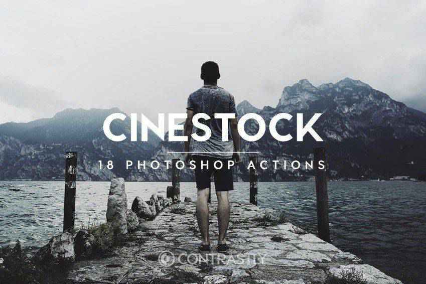
First up, there’s the CineStock Photoshop action. This makes it easy to recreate the look of film and includes 18 actions to choose from. Each of these offers slight adjustments for your photos including modifications to contrast, saturation, and tonal levels. You can use them all at once or pick and choose — it’s up to you. And it’s non-destructive, so your original photo goes unscathed.

Vintage Film Photoshop Actions is another great set to try out. This one adds a film-inspired look but it also has a vintage vibe that creates a retro aesthetic. This set comes with 10 Photoshop actions, each of which were inspired by the effects left behind by vintage film, including Fujifilm, Kodak, and others. These actions also add film grain and vintage tones to your photos.

The Movie Effect Photoshop Actions set is another solid choice. This one works by recreating the appearance of film effects using a variety of filters. It works on many different types of images and can be implemented with a single click. This set comes with 1 Photoshop action file, 11 DNG files, 11 CameraRaw Xmp files, and 4 Readme files for further instruction should you need it.

The Digital Film Supply Photoshop Action Bundle is another great choice. This set comes with 74 total actions that offer some level of film photography effect for your photos. There are matte versions for each of these actions as well. All of these actions work to add a subtle and understated film effects with ease.

The Film Noire Photoshop Actions Bundle is an all-encompassing collection of color grading actions that can offer a vintage and retro look to any photo you want. It’s simple to use and with just one click you can create a grainy look. This bundle includes a variety of actions include 30 cinematic color, 20 black-and-white, and full instructions.

This is another excellent choice for giving your photos a cinematic look. This set comes with 15 ready-to-use actions that you can use to create film effects in your photos. You can customize these actions to suit your individual purposes, they’re non-destructive, and have multiple layers so you can adjust each to meet your required specifications.

Another set you might want to take a look at is the Analog Camera Photoshop Actions set. It comes with 24 analog camera effects and an instruction manual for guiding how to use them effectively. Each effect is implemented with just a single click and are non-destructive, so your original photos are still preserved.

The Film Noir B&W Photoshop Actions set comes with 6 black and white Photoshop actions that look fantastic on portrait, street, and fine art photography. Each of the actions targets a specific end result, like sept, matte, female portrait, or porcelain.

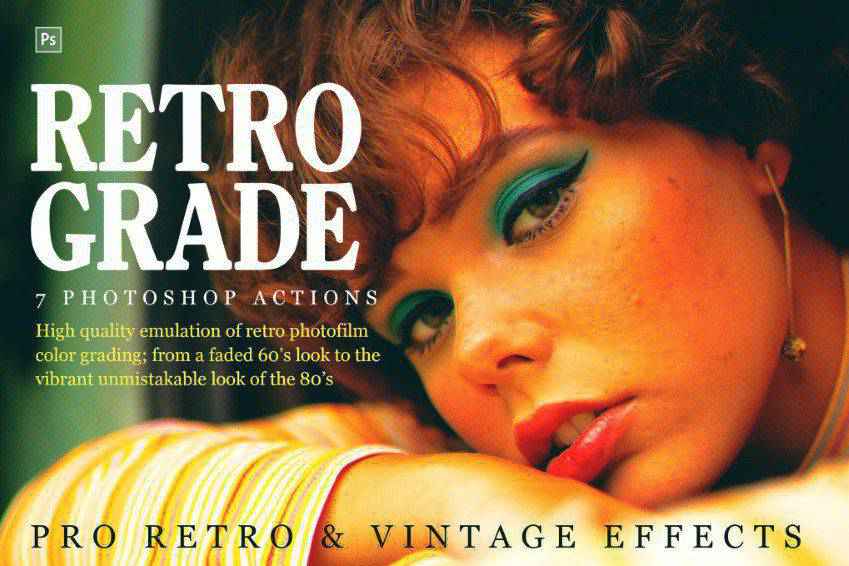
Here’s another great set of actions you should check out. The Retro and Vintage Photoshop actions set instantly turn your photos into works of art that appear as though they were taken sometime several decades ago. All of these actions are non-destructive and allow you to create retro effects in a wide number of ways. Recreate something that looks like Blade Runner. Or Stranger Things. Or The Goonies. These actions make it all possible.

The Matte Film Emulation Photoshop Actions set makes it super easy to create the look of real film with just a single click. This set comes with 33 actions that are fully editable and non-destructive. It also comes with 33 real film grain textures and snapshot prerendering that makes it easy to play one action and pick the effects.

Another great option is the Grand Trend Art Photoshop Action. This one comes with 5 frame templates, 5 collage templates, and 15 overall color presets. This set of actions works fantastic with figures, inanimate objects, and 15 color presets. Each action is layered and fully customizable, everything is non-destructive as well.

The Film & Retro Photoshop Actions set is an all-encompassing option that comes with 75 effects that create faded, vintage-looking effects. You can implement all of these actions with one click. It comes with snapshot prerendering and it’s super fast to add to your images. In fact, most effects only take up two layers.

The FilterGrade Film Series Photoshop Actions set is actually a set of 20 film effects that are realistic and offer filters that give the look of a variety of different cinematic experiences. From horror films to westerns, these actions make it a snap to imitate this look with your photographic artwork. Additionally, this set comes with letterbox and vignette options plus help files.

The Anaglyph 3D Photoshop Action is another great choice. This one makes it possible to add a stereoscopic 3D effect to photos with a single click. The best thing about this one is that it works with 3D glasses! What’s more retro that that? This set comes with 8 actions and they can be combined with any other actions that don’t modify colors.

The Cinematic Photoshop Actions set comes with 25 actions, 19 of which offer cinematic looks and 6 add on tonal adjustments. This set comes with snapshot prerendering, the effects are fast to implement, and the end result is professional and stunning to look at.

Last on our list is the Infrared Photoshop Actions set. This one comes with numerous color presets that are fantastic for using on landscapes, fashion photos, weddings, and more. Let’s break down what it includes: 5 infrared actions, 12 style presets, and it’s non-destructive so your original photos remain intact. This set comes with full instructions as well.

How to Install Photoshop Actions
- Download and unzip the action file
- Launch Photoshop
- Go to Window > Actions
- Select Load Actions from the menu and go to the folder where you saved the unzipped action file to select it
- The Action will now be installed
- To use the newly installed action, locate it in the Action panel
- Click the triangle to the left of the action name to see the list of available actions
- Click the action you want to play and press the play button at the bottom of the Actions panel
Hopefully at least one of these cinema and movie Photoshop actions will appeal directly to your needs. Each has a little something different on offer, and I think that stands to make your overall results extremely compelling. So, enjoy browsing these options and trying them on for size. And we wish you the best of luck in creating unique photographic pieces of art!
The post The 15 Best Cinema & Movie Effect Photoshop Action Sets for 2021 appeared first on Speckyboy Design Magazine.
Technology has disrupted so many things, but its positive influences are undeniable. We use our phones for everything; from communicating with our family and friends, to solving our problems through a variety of apps. So if you are creating something new, it’s time to make the world stand in awe of your work.
How? With these phenomenal mobile device mockup templates for Photoshop.
Let’s be real: it’s one thing to see your design on a screen. But when you can show your clients and customers what it will be like for them to interact with your work, you can convince and convert them.
Creating an app or software? Showcase your features and user interface design with these beautiful mobile device mockups. Phenomenal user experience doesn’t start when they download your app – it starts the very first time they see it.
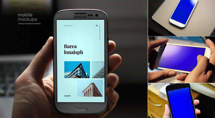
“Showcase the full responsiveness of your web or app design with these beautiful mobile device mockup templates for Photoshop. You’ll get 4 fully editable PSD mockups that feature smart phones, hands, close-ups, and realistic settings. Customize them in a few clicks, and make an impact with your work!
“

Show how your work transforms lives with these versatile iOS device mockup templates. With 6 Apple mobile device mockups (including iPhones and iPads) and different scenes, you can realistically showcase your app design, web design, or UX work. These smart device PSD templates also work great for social media promotion!

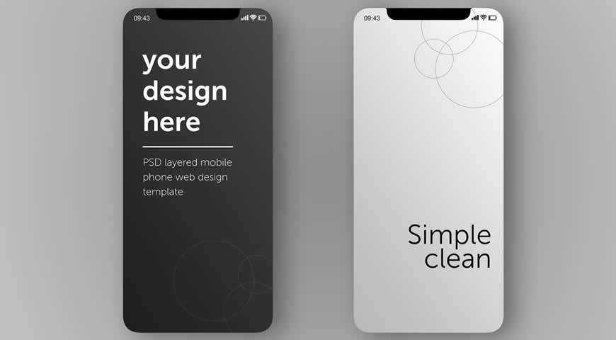
Simple and clean, these minimalist mobile device mockup templates are perfect for emphasizing certain features of your designs. Featuring two screens, these mockups are easy to customize and allow you to highlight all the important details in your app, web, or UI designs. Make your next presentation a resounding success!

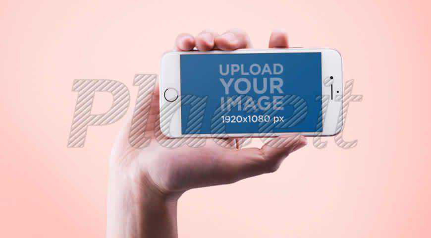
Don’t let your audience get distracted. Keep them focusing on your design with this vibrant mobile device mockup for Photoshop. Depicting a man holding an iPhone in front of a pink background, this smart phone mockup template is perfect for landscape designs; from apps and websites, to artworks.

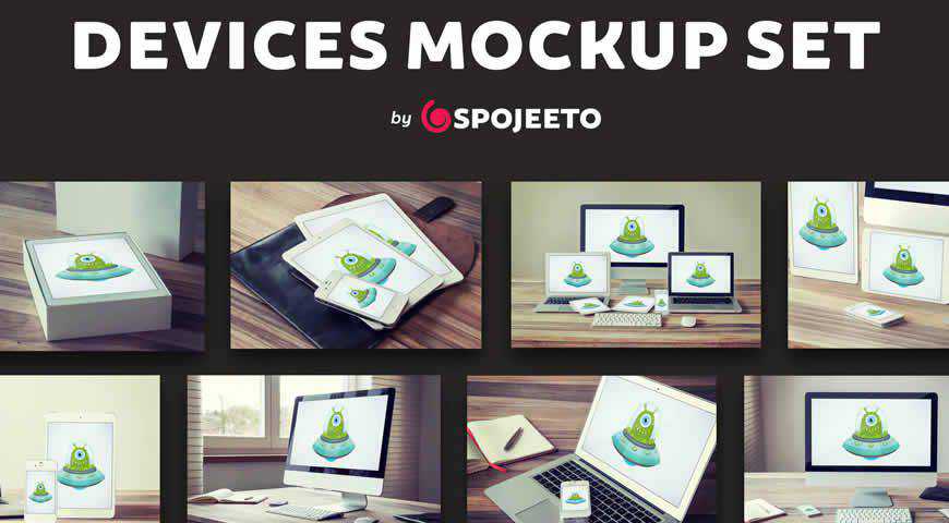
Personable and subtle, this mobile device mockup template set is a perfect fit for communicating with modern audiences. You’ll get 15 professionally photographed PSDs that guarantee photo-realistic results with devices such as: iDesktop, Notebook Air, iPhone, iPad, and more. Simply open them in Photoshop and add your designs!

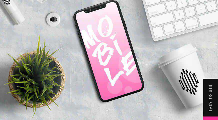
Let your design tell a story with this mobile device mockup template! Aesthetically pleasing, this mockup depicts an iPhone on a textured background, surrounded by elements such as coffee cups, succulents, and more. It’s perfect for presenting your work on social media or websites, and increasing brand awareness.

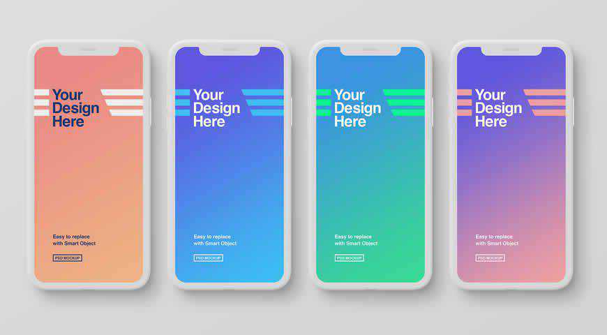
Simple is the new powerful! These 4 white smart phone mockup templates allow you to showcase a variety of designs, or simply highlight multiple features at once. Easily add your own designs, and use these mockups to create gorgeous presentations or social media posts for your business or your clients.

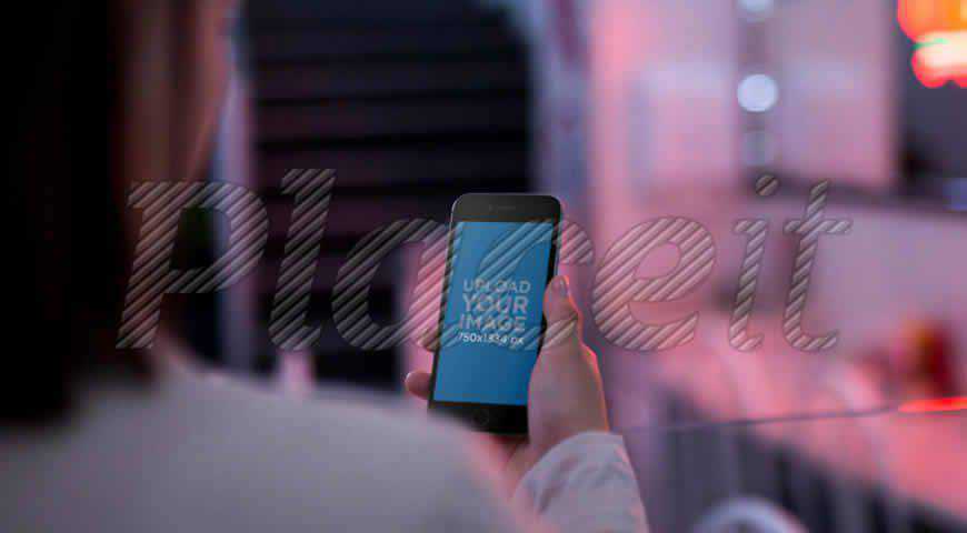
Take a peek over your customers’ shoulders to see what they think about your designs, or websites. This vibrant and modern mobile device mockup is perfect for promoting your products and illustrating what the user experience will look like to your prospective customers. Add your design, and have fun!

Simple and incredibly photo-realistic, this mobile device mockup allows you to elevate your presentations. After all, design isn’t just how it looks – it’s how it works, so take a page out of Steve Jobs’ book and use this phone mockup to delight your audience.

Simple and friendly, these Android phone mockups are perfect for showcasing your app and UI work, as well as creating promotional close-up shots. You’ll get 6 Samsung device mockups, as well as plenty of customization options such as: lighting, different angles (e.g. smart phones being held), and more!

Developing an app for messaging, or just want to motivate your customers to share your product with their friends? Choose these smart phone mockups for Photoshop! Featuring an Android device with 2 messenger screens, this mockup set is easily customizable and guarantees photo-realistic results for your next presentation or campaign.

There’s nothing like a silver iPhone to say: elegant design incoming! Make sure you download this mobile device mockup for your next presentation or campaign. It is easy to customize (2 clicks and you’re done), and you will get incredibly photo-realistic results your clients will love.

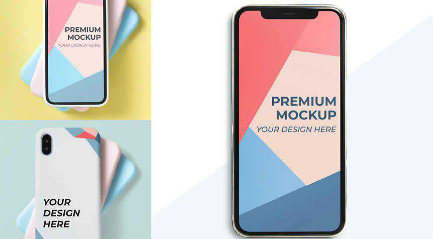
Exclusive designs require exclusive mockups, so download this gorgeous mobile device mockup template pack for your next project. Featuring 3 design options (screens, smart phone case design, stacked smart phones), and seamless Photoshop customization, these mockups can help you present your UI design, art, or apps in the right light.

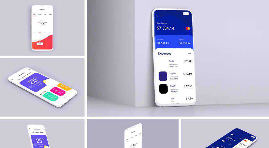
High resolution and a clear view of your designs. That’s the best way to describe this fantastic clay mobile device mockup template set. With 9 mockups, changeable background, and separated shadows, you’ll get everything you need to realistically present your digital work in the physical world.

Start speaking your customers’ language! With this modern mobile device mockup template for Photoshop you can easily add your design to the atmospheric scene. Featuring an iPhone next to a keyboard, headphones, and a notebook, this mockup is great for showcasing your UI design, as well as graphic design.

Give your materials a personal touch with these friendly hand-held mobile device mockup templates. With 8 diverse mockups featuring iPhones, Motos, and iPads, you’ll have everything you need to showcase the phenomenal user experience that your work guarantees. Replace the backgrounds, and add your designs for photo-realistic results!

Phenomenally atmospheric and elegant, this mobile device mockup template set is one of a kind! You’ll get 6 smart phone mockups featuring a man using his phone in an urban environment, and you can even control screen reflections to get incredibly photo-realistic results for your presentations and campaigns.

Make your designs stand out from the crowd with this gorgeous hand-held cellphone mockup set against a pink and blue gradient background. Featuring a woman’s hand prominently holding up a mobile device, this mockup is perfect for launching new apps and designs, as well as presenting user experience.

Modern and minimalist, this mobile device mockup template is perfect for neutral and bright designs. Carefully positioned to fit the serene scene, this mockup effortlessly showcases your designs; from apps and software, to UI and web development. And since the mockup was professionally photographed, you’ll get photo-realistic results!

These mobile mockup templates keep the audience’s focus right where it should be: on your design. These mockups depict 3 different smart phone screens, which makes them perfect for presenting some of the most important features you’ve designed. You can edit the background and the effects.

Mirror, mirror on the wall, which template is the most beautiful of them all? The answer is: who cares? You get 12! This mobile device mockup template set helps you present your designs as a grid consisting of 12 different screens, making it perfect for vibrant and engaging marketing campaigns.

Create photo-realistic and engaging presentations with these mobile device mockup templates for Photoshop. Carefully photographed to emphasize the quality of your designs, these smart phone mockups allow you to easily add your own designs and customize them to your liking. You can even change the background and edit the effects!

Showcase user experience through this fun and vibrant mobile device mockup template. Featuring a man holding his phone in front of a laptop, this mockup is a great fit for UI, app, and web design. Add your own content, edit the details, and you’ll be good to go!

Expand your audience by using this mobile device mockup set for your next presentation or promotional campaign. This smart device mockup set consists of iPhones, iPads, and Android phones, making it the perfect option if you want to delight Android and iOS users with your app, web, or UI design.

Alexa, play something romantic! This mobile device mockup template depicts a couple on a date, having so much fun with your product on their Android tablet. A perfect fit for fun and quirky designs (from UI, to app and web development), this mockup will win over your clients and customers!

Forget about the old way of doing things. Your work, be that graphic or web design, deserves much more.
With these beautiful and versatile mobile device mockup templates for Photoshop, you can win over your customers even before you’ve spoken to them. Simply showcase your work, and help them understand how amazing it will be to interact with your products.
More Mockup Templates: Banners, Books, Booklets, Bottles, Box Packaging, Branding, Dresses, Flyers, Frames, Hoodies, iPads, iPhones, Laptops, Logos, MacBooks, Magazines, Mobile Apps, Mugs, Packaging, Sweatshirts, T-Shirts, Tote Bags.
The post 25 Mobile Device Mockup PSD Templates for Photoshop appeared first on Speckyboy Design Magazine.
Being a freelance web designer means more than just focusing on graphics and code. It also requires communicating with both current and prospective clients.
The thing is, we can take any number of courses to help us learn a new app or programming language. But client relations? Those skills aren’t quite as easy to pick up.
New designers are often unprepared for this part of the job. Back when I started, I certainly wasn’t ready for what I was about to face. And it took years to even begin to figure things out.
While I’m far from perfect, I have learned some valuable lessons about gaining comfort and confidence with clients. Want to know more? Keep on reading for some tips you can use in your day-to-day interactions.
The Web Designer Toolbox
Unlimited Downloads: 1,000,000+ Web Templates, Themes, Plugins, Design Assets, and much more!
Being Yourself Makes a Difference
When communicating with clients, you might feel the need to show just how smart and talented you are. This can lead to overdoing it in a manner that takes you away from your authentic self.
For instance, there’s no need to have an immediate answer to every question a client poses. It may be tempting to use the old “fake it ‘til you make it” way of communicating, where you offer up some abstract answer that has little or no basis. Maybe it makes you sound smart. But what good does that do?
In reality, clients don’t expect you to know everything off the top of your head. So, rather than pretend to know something you don’t, take notes and promise to get back to them with accurate information. That will establish a level of trust with your client that is necessary for a successful relationship.
Beyond dealing with facts, it’s also important to create a comfortable atmosphere for a real discussion. In practice, this means avoiding hyperactive sales pitches and buzzwords. Speak with clients the same as you would a friend – just keep things polite and professional.

Meet Clients Where They Are
No, we’re not talking about geography here – in-person meetings aren’t quite the necessity they used to be. Instead, we’re looking at getting to know who your clients are as people.
One realization you’ll find over time is that no two clients are exactly alike. That makes sense as we are dealing with human beings as opposed to one-dimensional stereotypes.
Individual personalities impact how we approach communication. Therefore, giving the same spiel the same way to each client will be ineffective. Designers must adapt to a client’s personality and present information accordingly.
Technical jargon is a prime example. While it’s probably not a good idea to go too deeply into this with clients, some will inevitably be more comfortable with these terms and concepts. This doesn’t mean we should insult the intelligence of a non-technical client; it just means that things should be explained in more accessible terms.
Also, the depth of the design and development processes are of varying degrees of interest. Some clients want to know the reasons behind every decision, while others are happy to be left out of the nitty-gritty.
Clients also vary in preferred times and methods for communication. 24/7 email will do just fine for some while others insist on early morning phone calls. While you don’t want to get away from your policies, it’s still important to consider these preferences.
This isn’t to say that you shouldn’t be consistent in how you get things done. It’s just that the way you communicate them won’t be the same across the board.

Look for Common Ground
There’s much to be gained by finding some sort of common ground with your clients. And it doesn’t necessarily have to be personal – although that’s recommended, too.
The most basic is the end goal for a given project. All stakeholders should be able to define what makes for a successful outcome and work together towards achieving it. At the very least, designers should strive to meet this need.
However, we shouldn’t totally discount the benefits of something more personal. This type of connection can make the relationship even stronger. It provides another way to bond with clients and can alleviate some of the stress that will inevitably arise at various points.
Building this bond won’t require any profound personal experiences. It could be as simple as both of you being parents of small children or sharing a love of sports, books, or music. Even the smallest similarities will provide that foundation.

Aim for Fairness and Simplicity
A designer/client relationship is not one where you’re looking to gain any sort of upper hand. There’s no need to seek undue control over a client, nor should you cede control. It has to be a partnership in order to work effectively.
When one side dominates the relationship, it’s bad for everyone. If, for instance, a client is intimidating and intentionally uses this as a negotiating tactic – you’re not going to be a happy camper. You’re going to cringe every time you see an email from them and will dread doing your job.
To that end, it’s best to treat your clients fairly and expect the same from them. You’ll still have to do the hard work to please them, but you’ll likely do so with more positive motivation.
Also, look to keep things as simple as possible. Don’t involve yourself with the inner workings of someone else’s business or openly critique their staff. These things complicate the relationship and can lead to hard feelings. Everyone suffers from this type of atmosphere.
In that spirit, it’s also wise to address the bigger issues before they become major impediments. Design politics, for example, is one such area. Do your best to achieve a diplomatic resolution when possible. In other words: try to bring people together, rather than drive them apart.

Client Relations Belongs on Your List of Skills
Becoming comfortable when dealing with clients comes naturally for some, while others need a bit more practice. To be sure, it’s an entirely different skill set than what’s required to build an awesome website.
The great thing is that you don’t need to have a big, gregarious personality. More often, honesty and patience are what is needed. It’s about being yourself and taking the time to listen and learn. From there, you can adjust to match your client’s needs.
Even if you’re having trouble in this area – don’t worry. The more clients you have experience with, the more likely you are to improve your skills. Over time, these relationships will become like second nature.
The post Finding Your Comfort Zone with Clients appeared first on Speckyboy Design Magazine.
Xdebug Update: October 2020
London, UK
Tuesday, November 10th 2020, 09:12 GMT
Another monthly update where I explain what happened with Xdebug development in this past month. These will be published on the first Tuesday after the 5th of each month.
Patreon and GitHub supporters will get it earlier, on the first of each month.
I am currently looking for more funding, especially now some companies have dropped out.
You can become a patron or support me through GitHub Sponsors. I am currently 66% towards my $1,000 per month goal.
If you are leading a team or company, then it is also possible to support Xdebug through a subscription.
In October, I worked on Xdebug for about 75 hours, with funding being around 45 hours. I worked mostly on the following things:
Xdebug 3
Xdebug had its first beta release in October, 3.0.0beta1 so that uses can test out the new speed improvements, new functionality, new ways of configuring things, as well as support for PHP 8.
Some bugs were found, and I'm continuing to work together with JetBrains to make sure all the new configuration methods are also supported with/through PhpStorm.
There are also several anecdotal reports that Xdebug 3 is indeed a lot faster in many environments. I have asked the community for benchmarks, but I have not seen any write ups beyond a tweet, and an article.
PHP 8
Although PHP 8 is now in the Release Candidate phase, some changes are still happening which requires remediation in Xdebug. I expect that to continue until 8.0.0 is released, which means that Xdebug 3.0.0 can also not be released until that happens, likely on November 26th. Xdebug 3.0.0 will however follow quickly after that.
Xdebug Cloud
I have been working on the web site for Xdebug Cloud, and have been testing the integration with PhpStorm. It all seems to work well, although I'm only the one user.
Once I've found somebody to design the site for me, I will open up Xdebug Cloud through a private alpha.
If you want to be kept up to date with Xdebug Cloud, please sign up to the mailinglist I'll let you know as soon as something can be tried-out.
Business Supporter Scheme and Funding
In October, no new supporters signed up, but a few existing supports renewed.
Thank you Dennis Lassiter!
If you, or your company, would also like to support Xdebug, head over to the support page!
Besides business support, I also maintain a Patreon page and a profile on GitHub sponsors.

