Someone stole the domain name Perl.com. They thought it was just a domain name snafu, but in fact it was stolen, transferred from one domain name registrar to another without the owner’s permission.
I am seeing more and more domain names get stolen recently, especially as the value of domain names goes up. After all, some domain names are selling hundreds of thousands of dollars. So, it’s imperative that you protect this valuable digital asset that you own. If you suddenly find that someone stole your domain name from you, then you need to act quickly. The longer you wait the more difficult it will be to recover. Here’s what you need to do if someone stole your domain name:
Is the Domain Name Really Stolen?
First, you need to figure out whether or not the domain name is really stolen or not. What determines whether or not it has been stolen is the status of the domain name. You must register your domain name and renew it every year. If you don’t pay the annual renewal fee, then it will expire. Once a domain name expires, it will be in a ‘holding period’ where you have a chance to renew it for an additional fee. After that period of time, the domain name will eventually “drop” and become available on a first-come first-served basis for anyone to register it. If someone else register it, the domain name is no longer “your domain name”.
Process for Expired Domain Names
A domain name, when it is not renewed by its current owner, goes through a process before someone else can register the domain name. Here is the process:
- Domain Name Expires, it was not renewed.
- Domain Name is on hold, owner can pay a fee to get it back.
- Domain name is in a “pending delete” status.
- Domain name “drops”, and is available for anyone to register.
That is the overall process, and it takes about 90 days to go through that process. If the domain name gets to the “drop” date, there is an actual date and time (and second) when the domain name is available for anyone to register. Some domain name registrars will sell the domain name to the highest bidder before it gets to the final stage.
Domain Name Theft
Theft of a domain name occurs when a domain name has been renewed, and is not currently expiring and has not expired. Someone, the domain thief, will somehow gain access to the account at the domain name registrar, where the domain name is registered. Let’s say you’ve registered your domain name for 5 years into the future (which is recommended), and someone gains access to your account, they transfer the domain name to another account, and then they transfer the domain name to another domain name registrar. Is the domain name stolen? Has someone stolen my domain name? Yes, it is stolen.
Domain Name Theft is On the Rise
In the past several weeks, I have witnessed several domain names that I can confirm were, in fact, stolen from their owners. These valuable domain names were stolen, and as of writing this post, none of them have been recovered and returned to their owners:
- Perl.com – stolen around Jan 27 2021
- Neurologist.com – stolen around Jan 27 2021
- Chip.com – stolen around Jan 27, 2021
- Patterns.com – stolen around December 8, 2020
- Piracy.com – stolen around December 8, 2020
All of these domain names were stolen by a domain name thief. They typically gained access to the domain name registrar account(s) involved and then transferred the domain names to another domain name registrar. In some cases, they will change the ownership record so that it shows that the domain name is under “privacy“, and the contact details are hidden. Then, once they transfer the domain name to another domain name registrar, they will un-hide the domain name ownership details and put the ‘old’ owner details in place of the private details. That way it “looks like” they original owner still owns the domain name, but the domain name is in the thief’s account. In all of the cases listed above, the domain name thief has tried to sell the domain names for about 10 percent of what they are actually worth. They’ll list them on websites such as Afternic.com and Sedo.com.
Why They Steal Domain Names
Why do thieves steal domain names? There are several reasons, but it’s mainly money. I believe they see it as a way to do something that they will profit from. They will hack into an account, transfer the domain name to themselves, and then sell the domain name. They’ll list it for 10 percent or 20 percent of the value of the domain name.
What To Do If Your Domain Name is Stolen
If your domain name is stolen, then, as I mentioned, make absolutely positively certain that you didn’t fail to renew the domain name. Log into your domain name account at the registrar and see if the domain name is still in your account there. Look in your email (such as your spam folder) to see if you have received any emails about renewing the domain name. If you haven’t, and you are certain that it has been renewed for at least a year in the future, then contact the domain name registrar. Check the WHOIS record. Make sure that you don’t still own the domain name. If you want to investigate what happened yourself, you can look at the whois archived records (several services offer this service, such as Domain Tools and DomainIQ). If it’s stolen, then you should contact your domain name registrar, and file a report of the domain name theft at DNProtect.com.
How to Check who Owns a Domain Name
You can check who owns a domain name currently, by looking up the of that domain name. There are several websites, including these, where you can find the current owner:
Stolen Domain Name Checklist
If your domain name is, in fact stolen, there are things that you need to do right away. Don’t wait, don’t even wait until “tomorrow” to do it. Here’s my checklist if your domain name is stolen:
- Check the WHOIS record to see who owns the domain name now.
- Make sure the domain name didn’t expire and just needs to be renewed.
- Log into your domain name registrar account. See if the domain name is there.
- If the domain name is not in your account, contact your registrar using their support system.
- File a stolen domain name report with DNProtect.
- Work with your current domain name registrar to see if they will help recover the domain.
It should only take up to a few days for the domain name to be properly restored in your account at your registrar if it was stolen. The domain name does need to be transferred back to your domain name registrar, so that can technically take up to 5 days for that to happen. But, if you’re not happy with how quickly it’s going, then you need to escalate it.
In the cases of the premium domain names I mentioned earlier that were stolen, a few things happened. A few of the domain names were part of a security breach that occurred at the registrar about a year ago, and the domain name owner(s) just noticed, months later, that they no longer owned the domain names. Someone had used the compromised data (user ID and password) to gain access to the account and transferred the domain name(s) to another registrar in China. With the other domain names, my understanding is possibly the domain names were socially engineered via web chat, and the registrar was presented with fake ID and documents to prove ownership. Those are two different ways that domain names can be stolen. I don’t know for certain that those are the ways that these domain names were, in fact stolen.
Protecting Your Domain Name
There are several ways to make sure that you protect your domain name from being stolen. Protect the domain name at your current registrar, move it to a more secure domain name registar, and take advantage of all of the domain name protections that the registrar offers.
- Register your domain name for at least 5 years in advance. This way there will be no question as to whether or not it expired or not. If expires soon, then it’s possible that a credit card won’t go through, you might not get a reminder, or another clerical issue could come up.
- Use Domain Lock, Executive Lock, or whatever the domain registrar calls that feature. The domain name cannot be transferred unless it is unlocked. Some registrars offer a service that allows you to give instructions. For example, you can tell them to call a certain phone number or you must give them a certain password before it can be unlocked.
- Implement 2FA (2 Factor Authentication) on the domain name. While this is not fail-proof, it can help secure the domain name. Someone cannot log into the account unless you get a text message with a code, for example.
- Move to a more secure domain name registrar. Some registrars keep getting their domain names stolen, and they are using 20-year-old technology and systems for their back processing. Some registrars are just more secure than others.
If someone stole your domain name, then you will lose access to email, your website will go down, and you’ll lose that digital asset that quite possibly be very valuable. Unfortunately I’m seeing more and more domain name thefts occur recently, and it’s time to make sure that your domain name is protected.

You’ve crafted the perfect ad content to entice your audience to click and check out your business. You paired it with a landing page inviting people to submit their information and take the next step. After a few months, you check back and see that it’s not driving the results you desire.
You’re generating clicks, but once people visit your landing page, they drop off. Why aren’t people filling out your form?
It may seem like a simple and easy task but optimizing your landing pages with forms is an intricate and detailed process. You need to craft compelling landing pages with easy-to-use forms to ensure that people don’t bounce from your site.
So, if your landing pages aren’t producing the results you desire, don’t panic! We have seven best practices that will help you create a landing page form that drives your desired results!
P.S. Want to take your marketing to the next level? Join 150,000+ marketers by subscribing to our newsletters!
1. Only ask for vital information
First on our list of landing page best practices is to only ask for vital information. When you get people to click on your ad, you know they’re likely interested in what you have to offer. It may seem like an excellent opportunity to capture as much information as possible, but the opposite is true.
People don’t want to spend time filling out long landing page forms. They want to submit their information fast and go on their way. If you’re asking for too much information, you’ll discourage people from filling out your form.
So, how do you determine what information to include in your form?
Think about the information you absolutely need to know about someone when they sign up. This information will vary depending upon your company and what you’re offering.
For example, let’s say you want someone to sign up for a free trial of your business software. In this case, knowing their name, email address, and company might be beneficial information to you. Knowing their gender or date of birth isn’t as important.
On the other hand, if you own a winery and you’re inviting people to sign up to attend your fall fest, asking their date of birth might be fundamental to your form.
So, when you’re crafting your landing page form, make sure you’re only asking for fundamental information so users don’t feel discouraged to fill out your form.
2. Don’t overcrowd your forms and landing pages
If you want to follow landing page best practices for your forms, make sure you don’t overcrowd your pages. Many companies will try to fill up their pages as much as possible to give their audience tons of information. Taking this approach, however, is detrimental to your landing page performance.
You don’t want to stuff your landing page forms with too much information, as it makes it appear cluttered and disorganized.
To help you keep your landing pages organized, utilize white space. White space ensures that you break up your text and images on your landing page to make it easier to look at your landing page.
On this landing page from Xfinity, you can see that they utilize whitespace to help people focus on their product’s important information.
![]()
You’ll also want to ensure that your forms utilize whitespace too, like Sling did with their sign-up form.
![]()
When you keep your landing pages and forms organized, you make it easier for people to stay focused on filling them out.
3. Highlight the benefits of filling out the form
Next on our list of landing page best practices is to highlight the benefits of signing up. If you want people to fill out your landing page form, you need to tell them why they’ll want to fill it out. When you highlight the benefits of completing the form, they’re more likely to do it.
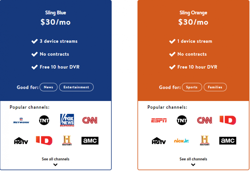
In this example from Sling, you can see that they highlight the benefits of the different packages they’re offering on their landing page.
![]()
Visitors can get all the information they need about their services and know the benefits of signing up for their services.
So, when you craft your landing page forms, make sure you show your audience why they want to sign up. Keep your benefits focused on how it helps them, rather than focusing on why your company is the best.
For example, if you’re trying to get people to sign up for your webinar, highlight some of the beneficial information they’ll learn from it. If it were a webinar on managing finances, you might tell visitors that they’ll discover helpful information like how to balance their budget and how to start a 401k.
By highlighting benefits, you’ll entice more people to complete your landing page form.
4. Craft a click-worthy call to action (CTA) button
When you design a landing page with a form, you want to ensure you craft a click-worthy call to action (CTA) button. If people like what they see and fill out your form, they want to know what happens next when they submit their information. Crafting the perfect CTA will help you earn more form completions.
When you craft your CTA button, you want to ensure it’s informative and tells your audience what happens when they click it. For example, using a generic CTA like “Start” doesn’t tell your audience what happens. A better CTA would be “Start your free trial today.”
Additionally, you want to ensure your CTA buttons stand out on your page so your audience can easily spot them and click on them.
FuboTV has a great example of a CTA button on their landing page. Not only does the orange button pop off the page, but it also tells people what happens if they click the button.
![]()
Whether you’re using a CTA button on your page or at the end of your landing page form, make sure it stands out and informs your audience of the next step.
5. Integrate your brand into the landing page form
When you craft landing pages with forms, it’s fundamental that you integrate your brand’s unique style into the form. You want people to get to know your business, and many people do that through your design. Design helps convey your brand’s tone and style to your audience.
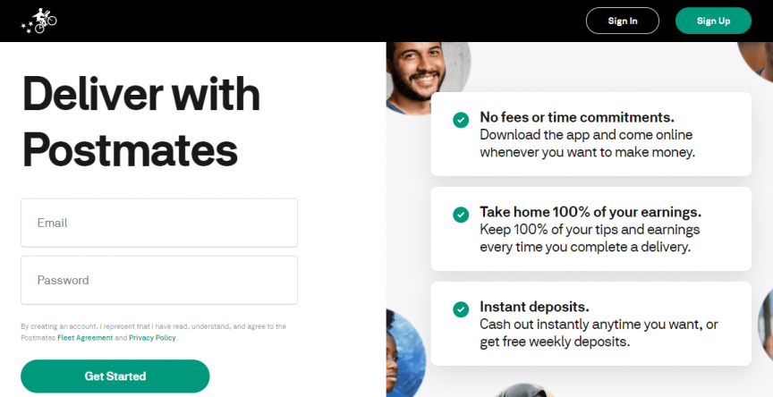
Your design should be consistent throughout the page. Postmates, for example, uses a green, white, and black theme throughout their form page design.
![]()
So, when you craft your landing pages, make sure you have a consistent design for your pages. It will help you create a better experience for people who visit your site and help them get to know your business better.
6. Use visuals to enhance your forms
Next on our list of landing page best practices is integrating visuals into your landing page. A landing page filled with text and submission forms won’t excite your audience. Adding visuals, on the other hand, can entice them to want to engage with your form.
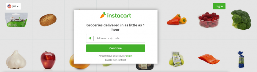
Take Instacart as an example. Their landing page incorporates visuals that make their landing page interesting for their audience.
![]()
You can take a similar approach with your landing pages. Try using engaging visuals that align with your branding and landing page’s message.
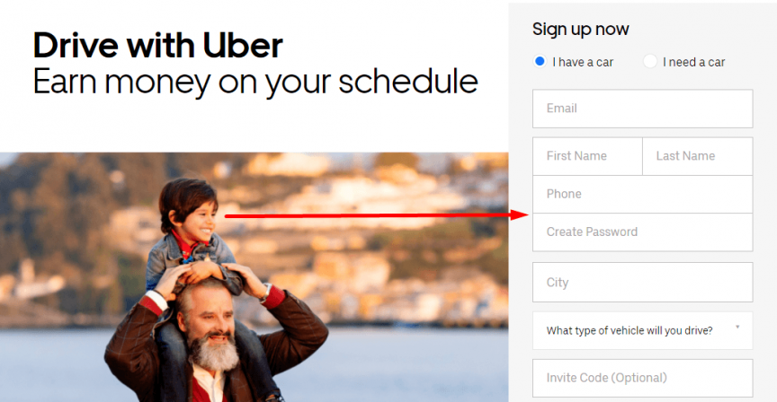
Additionally, you can use visuals that guide users to look towards your forms. In this example from Uber, the boy on the man’s shoulders directs your eyes straight to the form.
![]()
If you want to have impactful landing pages with forms, use visuals that engage and guide your audience to complete their form submissions.
7. Make sure forms are mobile-friendly
Last on our list of landing page best practices is making your forms mobile-friendly. People will access your landing pages from mobile devices. If you don’t have a mobile-friendly form, you’ll risk these leads going back to the search results.
To prevent them from bouncing, make sure you integrate responsive design into your landing pages. Responsive design ensures your site adapts to whatever device your audience uses. It provides them with the best experience and keeps them engaged on your site.
A great way to create mobile-friendly forms is to use stacked form submissions.
![]()
With stacked forms, all the form lines go vertically down the page. It makes it easy for mobile users to submit their information.
By creating a mobile-friendly landing page, you’ll keep more people engaged on your form.
Craft your landing page forms today
Crafting the perfect landing page with a form takes time, but WebFX can help. We have a team of over 250 marketing experts that know how to craft landing pages that drive results.
In the past five years, we’ve driven over $2.4 billion in sales and over 6.3 million leads for our clients. We’d love to drive results for you, too.
If you’re ready to start designing killer landing pages, contact us online or call us today at 888-601-5359 to speak with a strategist about our landing page design services!
The post 7 Best Practices for Crafting Landing Pages with Forms appeared first on WebFX Blog.
You’ve crafted the perfect ad content to entice your audience to click and check out your business. You paired it with a landing page inviting people to submit their information and take the next step. After a few months, you check back and see that it’s not driving the results you desire.
You’re generating clicks, but once people visit your landing page, they drop off. Why aren’t people filling out your form?
It may seem like a simple and easy task but optimizing your landing pages with forms is an intricate and detailed process. You need to craft compelling landing pages with easy-to-use forms to ensure that people don’t bounce from your site.
So, if your landing pages aren’t producing the results you desire, don’t panic! We have seven best practices that will help you create a landing page form that drives your desired results!
P.S. Want to take your marketing to the next level? Join 150,000+ marketers by subscribing to our newsletters!
1. Only ask for vital information
First on our list of landing page best practices is to only ask for vital information. When you get people to click on your ad, you know they’re likely interested in what you have to offer. It may seem like an excellent opportunity to capture as much information as possible, but the opposite is true.
People don’t want to spend time filling out long landing page forms. They want to submit their information fast and go on their way. If you’re asking for too much information, you’ll discourage people from filling out your form.
So, how do you determine what information to include in your form?
Think about the information you absolutely need to know about someone when they sign up. This information will vary depending upon your company and what you’re offering.
For example, let’s say you want someone to sign up for a free trial of your business software. In this case, knowing their name, email address, and company might be beneficial information to you. Knowing their gender or date of birth isn’t as important.
On the other hand, if you own a winery and you’re inviting people to sign up to attend your fall fest, asking their date of birth might be fundamental to your form.
So, when you’re crafting your landing page form, make sure you’re only asking for fundamental information so users don’t feel discouraged to fill out your form.
2. Don’t overcrowd your forms and landing pages
If you want to follow landing page best practices for your forms, make sure you don’t overcrowd your pages. Many companies will try to fill up their pages as much as possible to give their audience tons of information. Taking this approach, however, is detrimental to your landing page performance.
You don’t want to stuff your landing page forms with too much information, as it makes it appear cluttered and disorganized.
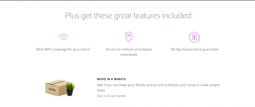
To help you keep your landing pages organized, utilize white space. White space ensures that you break up your text and images on your landing page to make it easier to look at your landing page.
On this landing page from Xfinity, you can see that they utilize whitespace to help people focus on their product’s important information.
![]()
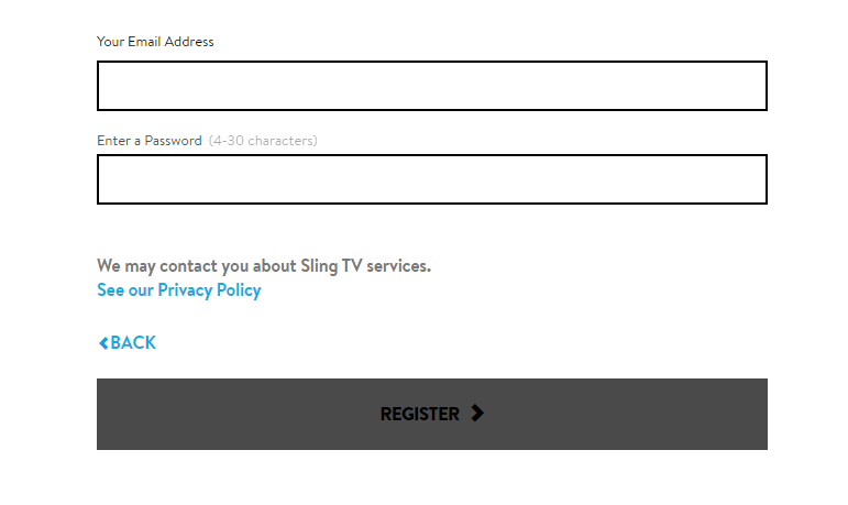
You’ll also want to ensure that your forms utilize whitespace too, like Sling did with their sign-up form.
![]()
When you keep your landing pages and forms organized, you make it easier for people to stay focused on filling them out.
3. Highlight the benefits of filling out the form
Next on our list of landing page best practices is to highlight the benefits of signing up. If you want people to fill out your landing page form, you need to tell them why they’ll want to fill it out. When you highlight the benefits of completing the form, they’re more likely to do it.
In this example from Sling, you can see that they highlight the benefits of the different packages they’re offering on their landing page.
![]()
Visitors can get all the information they need about their services and know the benefits of signing up for their services.
So, when you craft your landing page forms, make sure you show your audience why they want to sign up. Keep your benefits focused on how it helps them, rather than focusing on why your company is the best.
For example, if you’re trying to get people to sign up for your webinar, highlight some of the beneficial information they’ll learn from it. If it were a webinar on managing finances, you might tell visitors that they’ll discover helpful information like how to balance their budget and how to start a 401k.
By highlighting benefits, you’ll entice more people to complete your landing page form.
4. Craft a click-worthy call to action (CTA) button
When you design a landing page with a form, you want to ensure you craft a click-worthy call to action (CTA) button. If people like what they see and fill out your form, they want to know what happens next when they submit their information. Crafting the perfect CTA will help you earn more form completions.
When you craft your CTA button, you want to ensure it’s informative and tells your audience what happens when they click it. For example, using a generic CTA like “Start” doesn’t tell your audience what happens. A better CTA would be “Start your free trial today.”
Additionally, you want to ensure your CTA buttons stand out on your page so your audience can easily spot them and click on them.
FuboTV has a great example of a CTA button on their landing page. Not only does the orange button pop off the page, but it also tells people what happens if they click the button.
![]()
Whether you’re using a CTA button on your page or at the end of your landing page form, make sure it stands out and informs your audience of the next step.
5. Integrate your brand into the landing page form
When you craft landing pages with forms, it’s fundamental that you integrate your brand’s unique style into the form. You want people to get to know your business, and many people do that through your design. Design helps convey your brand’s tone and style to your audience.
Your design should be consistent throughout the page. Postmates, for example, uses a green, white, and black theme throughout their form page design.
![]()
So, when you craft your landing pages, make sure you have a consistent design for your pages. It will help you create a better experience for people who visit your site and help them get to know your business better.
6. Use visuals to enhance your forms
Next on our list of landing page best practices is integrating visuals into your landing page. A landing page filled with text and submission forms won’t excite your audience. Adding visuals, on the other hand, can entice them to want to engage with your form.
Take Instacart as an example. Their landing page incorporates visuals that make their landing page interesting for their audience.
![]()
You can take a similar approach with your landing pages. Try using engaging visuals that align with your branding and landing page’s message.
Additionally, you can use visuals that guide users to look towards your forms. In this example from Uber, the boy on the man’s shoulders directs your eyes straight to the form.
![]()
If you want to have impactful landing pages with forms, use visuals that engage and guide your audience to complete their form submissions.
7. Make sure forms are mobile-friendly
Last on our list of landing page best practices is making your forms mobile-friendly. People will access your landing pages from mobile devices. If you don’t have a mobile-friendly form, you’ll risk these leads going back to the search results.
To prevent them from bouncing, make sure you integrate responsive design into your landing pages. Responsive design ensures your site adapts to whatever device your audience uses. It provides them with the best experience and keeps them engaged on your site.
A great way to create mobile-friendly forms is to use stacked form submissions.
![]()
With stacked forms, all the form lines go vertically down the page. It makes it easy for mobile users to submit their information.
By creating a mobile-friendly landing page, you’ll keep more people engaged on your form.
Craft your landing page forms today
Crafting the perfect landing page with a form takes time, but WebFX can help. We have a team of over 250 marketing experts that know how to craft landing pages that drive results.
In the past five years, we’ve driven over $2.4 billion in sales and over 6.3 million leads for our clients. We’d love to drive results for you, too.
If you’re ready to start designing killer landing pages, contact us online or call us today at 888-601-5359 to speak with a strategist about our landing page design services!
The post 7 Best Practices for Crafting Landing Pages with Forms appeared first on WebFX Blog.
Package:
Summary:
Verify and clean values to assure they are valid
Groups:
Author:
Description:
This is a simple class that can verify and clean values to assure they are valid...
Read more at https://www.phpclasses.org/package/11941-PHP-Verify-and-clean-values-to-assure-they-are-valid.html#2021-01-31-23:37:24

Package:
Summary:
Wrapper to access SQL databases using PDO
Groups:
Author:
Description:
This class provides a arapper to access SQL databases using PDO...
Read more at https://www.phpclasses.org/package/11960-PHP-Wrapper-to-access-SQL-databases-using-PDO.html

Technically, there’s no limit to the amount of design and content elements you can place onto a website. But the reality is that the space for getting a user’s attention is finite.
That’s because a visitor typically reacts to what they see in the first few seconds after page load. Anything not visible within that timeframe will likely be missed. Designers and content creators alike have to carefully consider what is included.
While some items will be effective in getting the point across, others will fail. This is what I like to call “wasted” space. Unlike whitespace, the wasted variety takes up valuable screen real estate without adding any real value of its own.
How do you know what’s worthy and what’s not? Let’s take a look at some telltale signs that point to a waste of space.
The Web Designer Toolbox
Unlimited Downloads: 1,000,000+ Web Templates, Themes, Plugins, Design Assets, and much more!
Large Images That Distract from Your Content
Both designers and website owners alike are big fans of utilizing large photos. Whether they serve as the background to a section of content or the entire page – full-width photos are in fashion.
While this can add some real beauty to your design, the context in which these images are used is important. It’s worth considering how they impact the rest of your content.
For instance, a stunning photograph that fills up the screen may look cool. But, does it serve a specific purpose? Does it provide some context for visitors?
If the image isn’t directly accompanied by content, you’re forcing users to scroll down to look for what they need. And if the image is too busy, it may further distract from your content. Complex images that serve as a background to text and calls to action could negatively impact legibility as well.
It’s great to have images that stand out. But without purpose, they’re likely taking space away from something more important.

Hero Areas That Lack Actionable Information
A well-crafted hero area will draw a user’s attention. By using a photo, video or contrasting color background, this element naturally separates itself from everything else on the page.
This is why we often utilize hero areas for vital information. Within them, our most important sales pitches and messaging find a place to shine. These are the items that we want to be at the forefront of a visitor’s mind.
Unfortunately, there are times when this element isn’t so informative. The included text may be vague and fail to make a coherent point. The design itself could suffer from the same affliction, with no discernable places to click or actions to take.
No matter how compelling a hero area looks, the content must be every bit as detailed. It needs to provide a simple path for users to follow. In essence, it should include a clear message that motivates the user to do something. That could be contacting you, viewing a pricing page or adding a product to their cart.
Otherwise, the risk is in gaining a user’s attention without giving them anything to do. It’s the web equivalent of a bridge to nowhere.

Long Passages of Uninterrupted Text
A user’s time is precious. They tend to scan content in an effort to find something of interest. Thus, their attention spans aren’t conducive to long passages of text.
The shame of it is that, no matter how great your writing is, users may simply ignore it. In that respect, the content may as well not exist. The result is an expensive, time-consuming waste of space.
But don’t throw your hard work in the trash just yet. There are ways to spruce things up in a manner that is easier-to-digest:
Use Headings
Headings are perhaps the easiest way to break up a long passage of text. With sound use of typography, they instantly stand out to users. This makes it much easier to pick out a relevant section and scan it for more information.
Separate Content via Design Elements
The practice of sectioning off content with the use of design elements has become increasingly popular. It allows designers to create some visual separation and develop a rhythm. The idea is to place separate-but-related portions of text into dedicated containers that look differently. By using multiple background colors or text styles, this content can be both appealing and effective.
Add Smaller Details
It’s often the little things that make a design truly great. And they can be quite useful for helping to break down content into bitesize pieces. Elements such as dividers, images and blockquotes are all great methods to implement.

An Effective Use of Space = A Better User Experience
Design and content strategy are very much intertwined. When one fails, they both suffer the consequences. Therefore, it’s vital to think about both when building a website.
Part of the challenge is in making sound decisions. For instance, you’ll have to decide which elements should be front-and-center. What is it that users need to know right from the start? What can wait or be tossed aside? It’s a competition to determine what belongs and what doesn’t.
In practice, it’s about making the most of the space and time you have to make a good first impression. When users have a clear path to find or do what they want, they’re more likely to stick around.
The post Avoiding Wasted Space on Your Website appeared first on Speckyboy Design Magazine.
Technically, there’s no limit to the amount of design and content elements you can place onto a website. But the reality is that the space for getting a user’s attention is finite.
That’s because a visitor typically reacts to what they see in the first few seconds after page load. Anything not visible within that timeframe will likely be missed. Designers and content creators alike have to carefully consider what is included.
While some items will be effective in getting the point across, others will fail. This is what I like to call “wasted” space. Unlike whitespace, the wasted variety takes up valuable screen real estate without adding any real value of its own.
How do you know what’s worthy and what’s not? Let’s take a look at some telltale signs that point to a waste of space.
The Web Designer Toolbox
Unlimited Downloads: 1,000,000+ Web Templates, Themes, Plugins, Design Assets, and much more!
Large Images That Distract from Your Content
Both designers and website owners alike are big fans of utilizing large photos. Whether they serve as the background to a section of content or the entire page – full-width photos are in fashion.
While this can add some real beauty to your design, the context in which these images are used is important. It’s worth considering how they impact the rest of your content.
For instance, a stunning photograph that fills up the screen may look cool. But, does it serve a specific purpose? Does it provide some context for visitors?
If the image isn’t directly accompanied by content, you’re forcing users to scroll down to look for what they need. And if the image is too busy, it may further distract from your content. Complex images that serve as a background to text and calls to action could negatively impact legibility as well.
It’s great to have images that stand out. But without purpose, they’re likely taking space away from something more important.
Hero Areas That Lack Actionable Information
A well-crafted hero area will draw a user’s attention. By using a photo, video or contrasting color background, this element naturally separates itself from everything else on the page.
This is why we often utilize hero areas for vital information. Within them, our most important sales pitches and messaging find a place to shine. These are the items that we want to be at the forefront of a visitor’s mind.
Unfortunately, there are times when this element isn’t so informative. The included text may be vague and fail to make a coherent point. The design itself could suffer from the same affliction, with no discernable places to click or actions to take.
No matter how compelling a hero area looks, the content must be every bit as detailed. It needs to provide a simple path for users to follow. In essence, it should include a clear message that motivates the user to do something. That could be contacting you, viewing a pricing page or adding a product to their cart.
Otherwise, the risk is in gaining a user’s attention without giving them anything to do. It’s the web equivalent of a bridge to nowhere.
Long Passages of Uninterrupted Text
A user’s time is precious. They tend to scan content in an effort to find something of interest. Thus, their attention spans aren’t conducive to long passages of text.
The shame of it is that, no matter how great your writing is, users may simply ignore it. In that respect, the content may as well not exist. The result is an expensive, time-consuming waste of space.
But don’t throw your hard work in the trash just yet. There are ways to spruce things up in a manner that is easier-to-digest:
Use Headings
Headings are perhaps the easiest way to break up a long passage of text. With sound use of typography, they instantly stand out to users. This makes it much easier to pick out a relevant section and scan it for more information.
Separate Content via Design Elements
The practice of sectioning off content with the use of design elements has become increasingly popular. It allows designers to create some visual separation and develop a rhythm. The idea is to place separate-but-related portions of text into dedicated containers that look differently. By using multiple background colors or text styles, this content can be both appealing and effective.
Add Smaller Details
It’s often the little things that make a design truly great. And they can be quite useful for helping to break down content into bitesize pieces. Elements such as dividers, images and blockquotes are all great methods to implement.
An Effective Use of Space = A Better User Experience
Design and content strategy are very much intertwined. When one fails, they both suffer the consequences. Therefore, it’s vital to think about both when building a website.
Part of the challenge is in making sound decisions. For instance, you’ll have to decide which elements should be front-and-center. What is it that users need to know right from the start? What can wait or be tossed aside? It’s a competition to determine what belongs and what doesn’t.
In practice, it’s about making the most of the space and time you have to make a good first impression. When users have a clear path to find or do what they want, they’re more likely to stick around.
The post Avoiding Wasted Space on Your Website appeared first on Speckyboy Design Magazine.
Package:
Summary:
Create CodeIgniter based API and CRUD applications
Groups:
Author:
Description:
This package can be used create CodeIgniter based API and CRUD applications...
Read more at https://www.phpclasses.org/package/11949-PHP-Create-CodeIgniter-based-API-and-CRUD-applications.html#2021-01-31-07:18:20

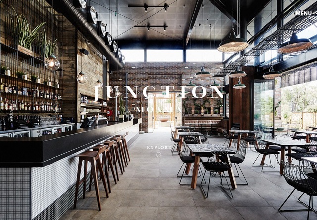
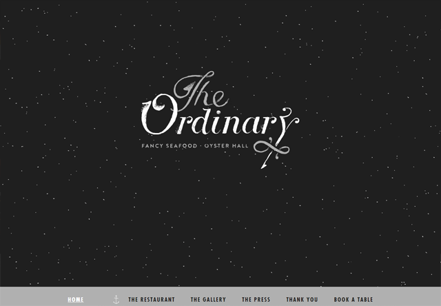
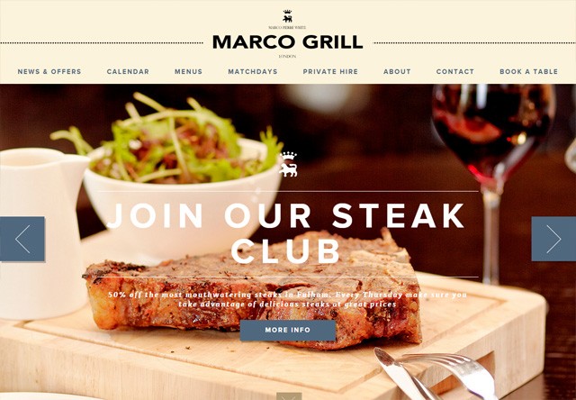
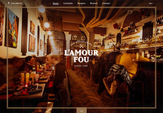
A great restaurant website can help secure people’s attention—and their dinner plans. With millions of restaurant locations to choose from, how do you ensure yours stands out? You create an eye-catching website that draws people in.
Designing a worthwhile website for a restaurant requires more than vibrant colors and pictures of food. When a website is designed successfully it is easy for customers to navigate, aesthetically pleasing, and includes key details such as location, menu, hours, and any other key pieces of information.
If a person has never been to your restaurant before, then your website is their first impression. That’s why it’s so important for your website to highlight all the great qualities about what you offer.
We’ve put together a list of the best restaurant websites so you know where to start with yours.
The purpose of your restaurant website design should not only be to increase awareness of your restaurant, but to also give potential customers a sense of what they would experience.
If you need help creating a website perfect for your restaurant you can contact us today to talk to a design expert! You can also check out our website design tips for restaurants for additional guidance.
Below you’ll see lots of beautiful restaurant website designs for ideas and inspiration!
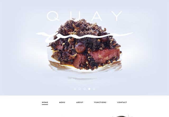
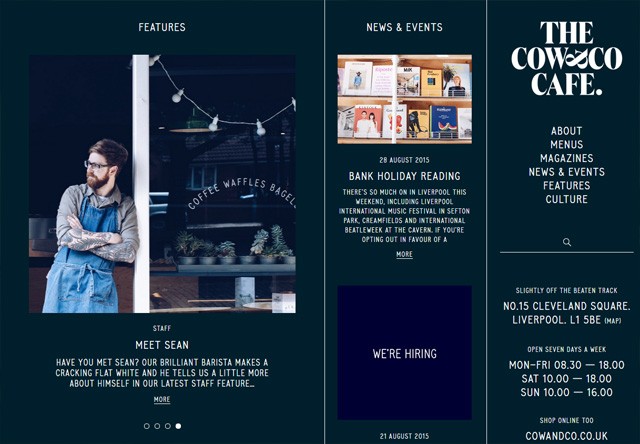
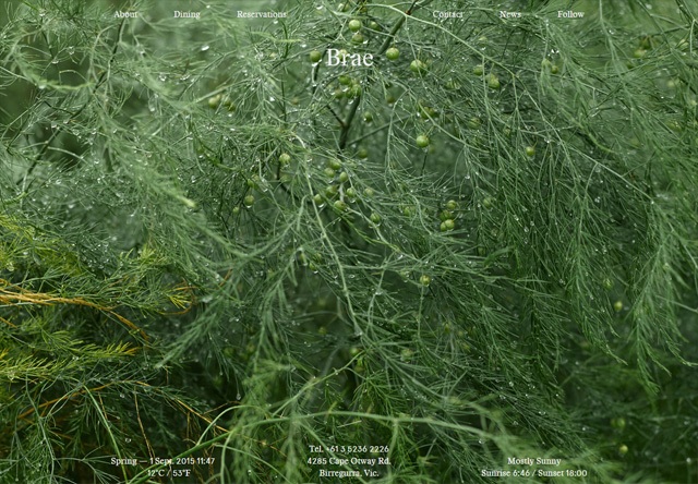
50 restaurant websites that demand attention
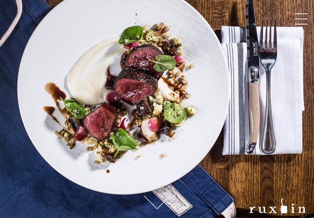
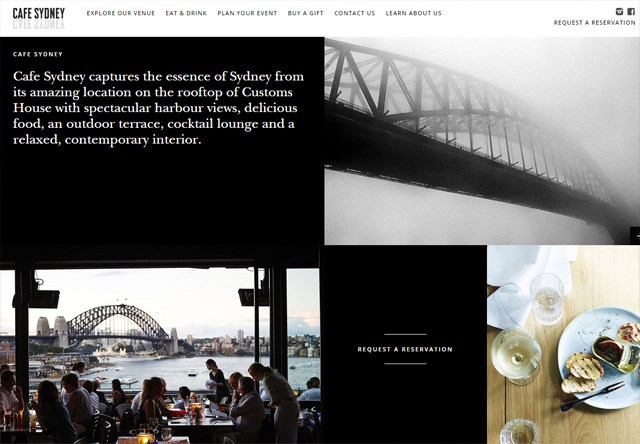
1. Ruxbin Chicago
![Image of a restaurant website: Ruxbin Chicago]()
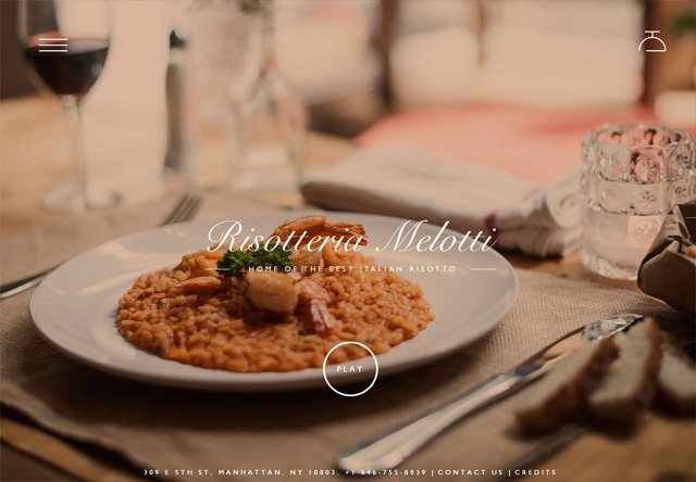
![Image of a restaurant website: Risotteria Melotti]()
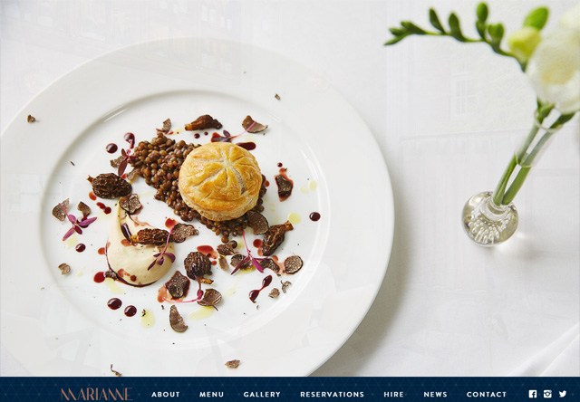
4. Marianne Restaurant
![Image of a restaurant website: Marianne Restaurant]()
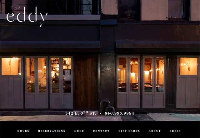
9. The Eddy NYC
![Image of a restaurant website: The Eddy NYC]()
![Image of a restaurant website: Brass]()
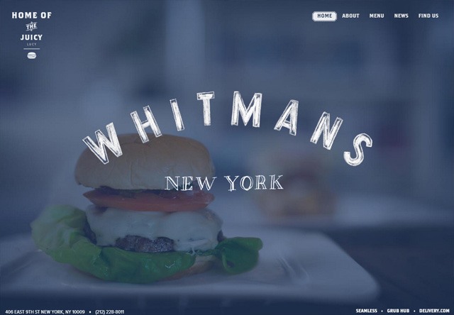
![Image of a restaurant website: Whitmans]()
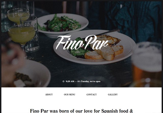
![Image of a restaurant website: Drury Buildings]() 17. Fino Par
17. Fino Par
![Image of a restaurant website: Fino Par]()
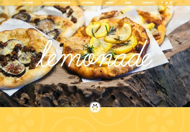
![Image of a restaurant website: Lemonade]() 20. Fuel Cafe
20. Fuel Cafe
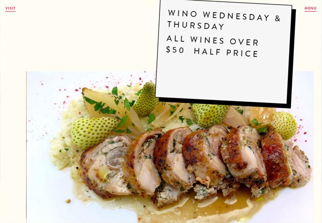
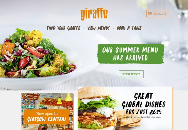
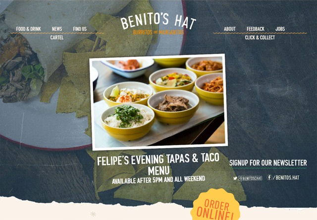
![Image of a restaurant website: giraffe]() 25. Benito’s Hat
25. Benito’s Hat
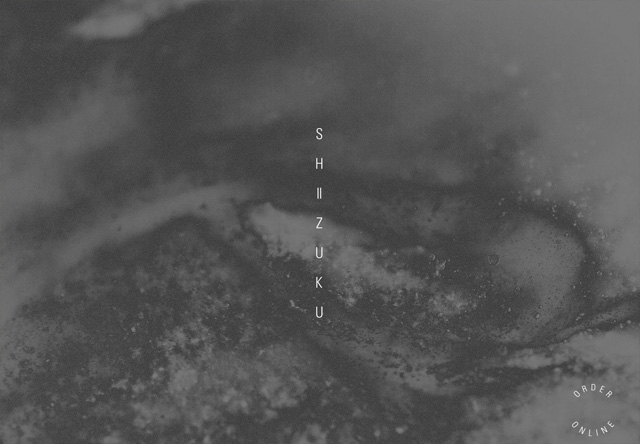
![Image of a restaurant website: Shizuku Ramen]() 29. Jaffle Jaffle
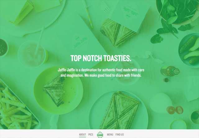
29. Jaffle Jaffle
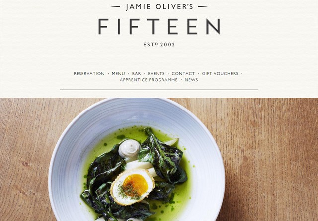
![Image of a restaurant website: Jaffle Jaffle]() 30. Jamie Oliver’s Fifteen restaurant London
30. Jamie Oliver’s Fifteen restaurant London
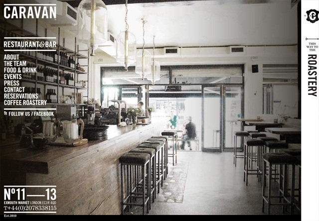
![Image of a restaurant website: CARAVAN]() 32. Wired
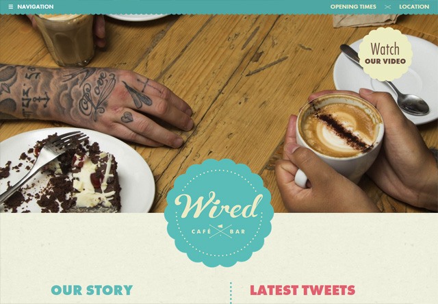
32. Wired
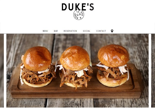
![Image of a restaurant website: Wired]() 33. Duke’s Brew & Que
33. Duke’s Brew & Que
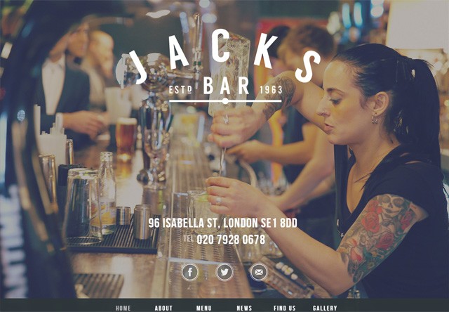
![Image of a restaurant website: Jacks Bar]()
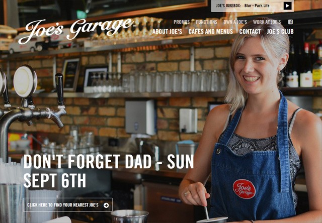
![Image of a restaurant website: Joe's Garage]()
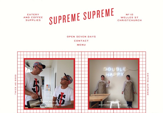
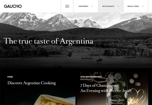
![Image of a restaurant website: Supreme Supreme]() 42. Gaucho
42. Gaucho
![Image of a restaurant website: Gaucho]() 43. Chick’s Fry House
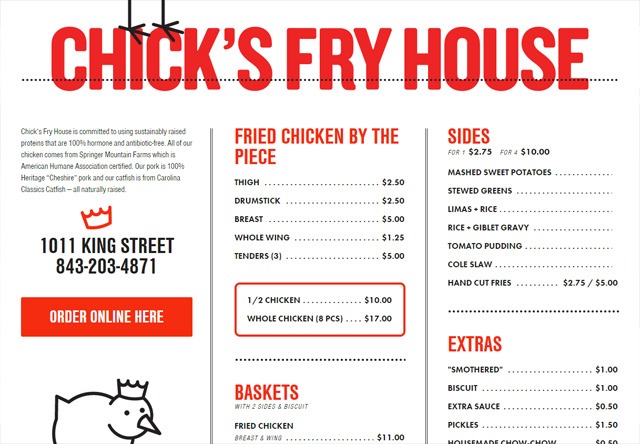
43. Chick’s Fry House
![Image of a restaurant website: Chick's Fry House]()
![Image of a restaurant website: easybistro.com]()
![Image of a restaurant website: Marco Grill]() 49. L’Amour Fou
49. L’Amour Fou
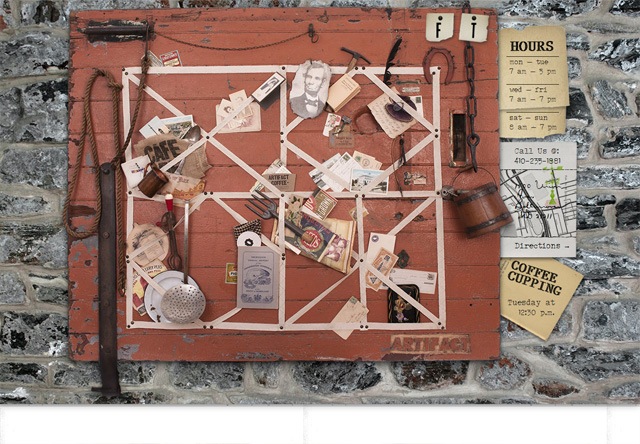
![Image of a restaurant website: Artifact Coffee]()
Your restaurant website is your introduction to potential diners, so you need to make a good first impression. Potential customers are more likely to dine at your restaurant if your website makes them feel engaged and informed. We hope these 50 best restaurant websites were enough to give you a spark of creativity and motivation for your own website.
Four in five restaurant operators agree that restaurant technology helps increase sales, makes their restaurant more productive, and gives their restaurant a competitive edge!
Do you need help creating a website for your restaurant or updating your current restaurant web design? Contact us today to speak with one of our design experts! With over 350 client testimonials and over $700m sales driven for our customers, we have the knowledge necessary to make your website successful.
![]()
Jacob Gube is the founder of Six Revisions. He’s a front-end developer. Connect with him on Twitter.
The post 50 Restaurant Websites for Web Design Inspiration appeared first on WebFX Blog.
Package:
Summary:
Display and validate digits for the user to enter
Groups:
Author:
Description:
This class can display and validate digits for the user to enter...
Read more at https://www.phpclasses.org/package/11932-PHP-Display-and-validate-digits-for-the-user-to-enter.html#2021-01-30-08:30:56


 12.
12. 


 21.
21. 

 30.
30.  31.
31. 
 33.
33. 

 42.
42.  43.
43. 
 49.
49.  50.
50.