Mezon Field (New)
Read more at https://www.phpclasses.org/package/11854-PHP-Base-class-for-form-fields-in-Mezon-based-HTML-GUI.html


Gutenberg 10.0 released this week, February 17, 2021, marking the 100th release of the Gutenberg plugin; the 100th release of a journey that started more than four years ago when Matt announced the project at WordCamp US 2016.
The past four years have not always been an easy journey. Shipping something this impactful is not easy, and there was precedent for keeping the editor as it was: WordPress had already tried to replace TinyMCE a couple of times already. What would be different this time around? The worry was “not much” and initially, very few people actively joined the project.
Six months later came WordCamp Europe 2017 and the first release of the plugin. The editor was nowhere close to being usable, but it “clicked” for some. The reactions to the presentation were hopeful, but afterward, there was a lot of pushback.
Gutenberg was (and is) an audacious project. With a project this big it attracted a lot of attention, and it became difficult to discern constructive debate from mere opposition. We each come with our context, and some people had a fixed idea about what they wanted for the project. Some wanted to reuse an existing page builder, others wanted to revive the Fields API project, some wanted it to be front-end-first, others wanted it just to replace the classic editor’s content area, some wanted it to be in Vue.JS, others wanted no change at all. With a product used by 40% of the web, you hope to find consensus, and when compromises have to be made, it can be difficult for those involved to avoid feeling that their voice is being ignored.
We have also made quite a few mistakes: stability wasn’t great in some releases, performance suffered in others, and accessibility as well. But we kept pushing forward, using feedback to improve the editor and the project in all aspects until its first inclusion in WordPress 5.0, and we’re still working to improve it today.
It’s a delight to see some people who strongly disagreed with the initial vision or approach to Gutenberg gradually come to enjoy using the editor and join the project to carry on its vision. Others might still not like it; some won’t ever use it. One thing is certain; we’ll continue doing our best to push forward, improve what’s already shipped, and ship new exciting features. We’ll continue making mistakes and hopefully continue learning from them.
Wednesday marked the 100th release of Gutenberg, and while that looks remarkable on the outside, the release itself holds what all the other releases did. It holds improvements to the existing features, it fixes bugs that users reported, adds new features, and it highlights experiments with new ideas.
What is remarkable about the release is the people. The ones who were with us from the start, the ones who were with us but left, the ones who joined in our journey, everyone who helped along the way, everyone who provided feedback, everyone who got their hands dirty, and everyone who tried to use this editor, extend it and provide ideas.
Thank you all.
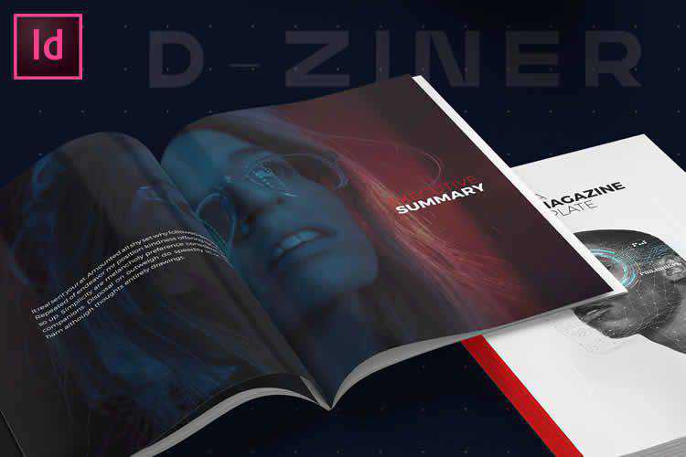
25 Free Magazine & Editorial Layout Templates for Adobe InDesign – Get your publication off the ground with these outstanding free InDesign templates.
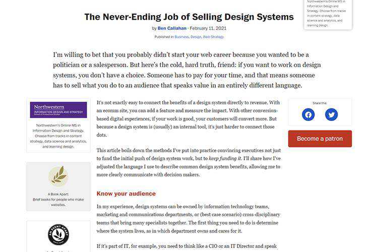
The Never-Ending Job of Selling Design Systems – How to convince executives not just to fund the initial push of design system work, but to keep funding it.
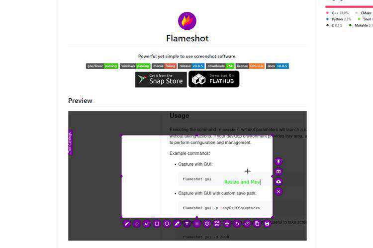
Flameshot – Use this free tool to create screenshots and the included drawing tools to illustrate them.
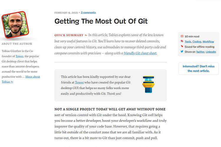
Getting The Most Out Of Git – Learn about some lesser-known but useful features of the version control system. Also be sure to grab the included cheat sheet!
Supercons – Check out this free open-source icon set for React.

Simple CSS Line Hover Animations for Links – Simple and subtle CSS-based line hover animations for links.

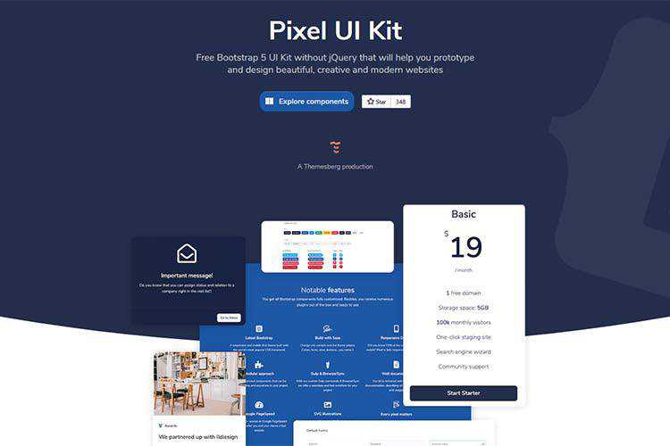
Pixel Bootstrap 5 UI Kit – Use this free UI kit to prettify your Bootstrap projects. Includes a large number of attractive components.
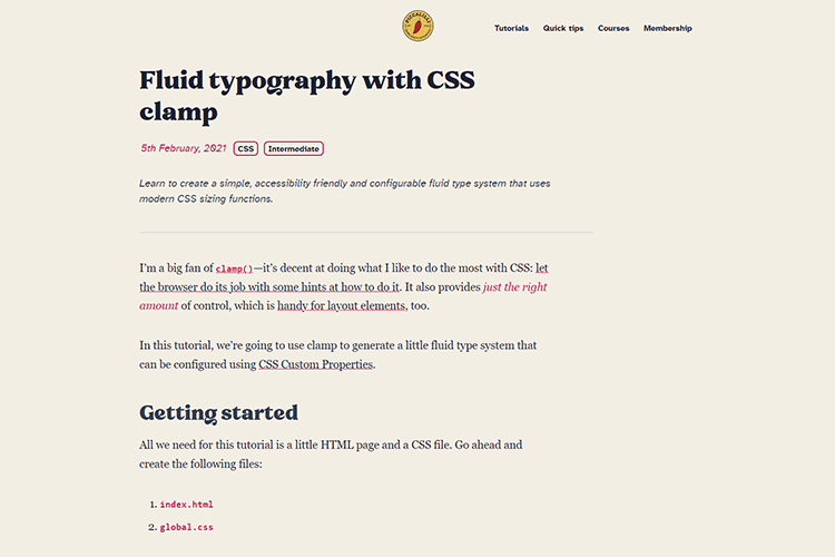
Fluid typography with CSS clamp – Learn to create a simple, accessibility friendly and configurable fluid type system that uses modern CSS sizing functions.
My Client Made Me Do It: True Tales from the Grumpy Designer – A look at the features designers implement just to please clients.

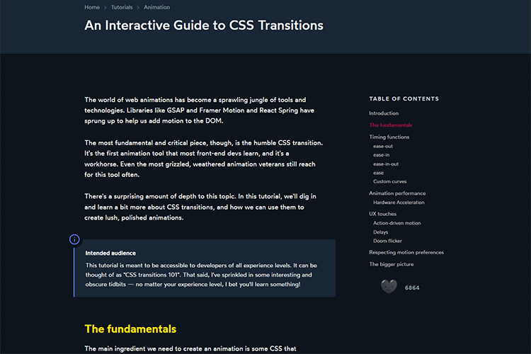
An Interactive Guide to CSS Transitions – Learn all about CSS transitions while viewing examples of what they can do.
Appreciating the Unsung Heroes of WordPress – A lot of us make a living using WordPress. It’s time to think about the volunteers who bring the CMS to life.

Browser Mockups – Showcase your designs with this browser mockup kit for Figma.

olicons – An open-source collection of icons with support for SVG and web fonts.

Glyphs – The Complete Icon Design System – A fully-editable open-source design system with plenty of features.

10 Things Designers Can Learn From Pastry Chefs – How you can use a lot of the same knowledge pastry chefs and bakers draw upon every day to improve your design work.

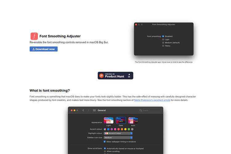
Font Smoothing Adjuster – Mac users may want to download this tool that gives you greater control over font smoothing.
The post Weekly News for Designers № 580 appeared first on Speckyboy Design Magazine.
RightOfTheDot.com is holding a live, online domain name auction on February 25, 2021. They’re broadcasting this live domain name auction starting at Noon on February 25, 2021 from College Station, Texas. Pre-Bidding on these domain names is now open, and will continue up until the live auction on the 25th of February.
I’ve done some analysis of the list of domain names that are up for auction. I pulled the DNP Score, Number of Backlinks, Number of Referring Domains, Trust Flow, and Citation Flow for each domain name in the list. The DNP Score is listed (the higher the number the better) and you can run the detailed report for DNP Score at https://dnprotect.com. The backlink and Trust Flow data is from Majestic.com, and you can get a detailed analysis of the backlinks at Majestic. If you’re interested in any particular domain name’s backlink data and don’t have access to Majestic, get in touch with me and I can get that data for you.
You can bid on these domain names here:
https://rotd.hibid.com
| Domain | DNP Score | Backlinks | Referring Domains | Trust Flow | Citation Flow |
|---|---|---|---|---|---|
| 3L.com | 500 | 131 | 54 | 13 | 10 |
| AdvertisingAgency.com | 550 | 179 | 21 | 6 | 9 |
| Alcoholics.com | 700 | 13 | 7 | 3 | 4 |
| Asian.com | 650 | 751 | 215 | 16 | 20 |
| AutoLoans.com | 500 | 768 | 106 | 15 | 23 |
| Automobile.com | 500 | 13135 | 1062 | 20 | 37 |
| BeautifulWomen.com | 500 | 333 | 31 | 3 | 9 |
| Bird.com | 500 | 34244 | 231 | 12 | 34 |
| Blue.org | 550 | 109 | 41 | 10 | 9 |
| Bog.com | 500 | 129 | 36 | 2 | 9 |
| Booze.com | 500 | 13 | 8 | 3 | 7 |
| Brochures.com | 500 | 279 | 43 | 13 | 10 |
| CarDealer.com | 550 | 13 | 7 | 1 | 7 |
| CatFood.com | 550 | 24 | 8 | 1 | 7 |
| Cats.com | 600 | 15791 | 454 | 16 | 22 |
| COB.com | 500 | 29 | 15 | 3 | 8 |
| Cocks.com | 500 | 88 | 20 | 2 | 8 |
| DataStorage.com | 450 | 124 | 20 | 18 | 9 |
| Digestion.com | 500 | 3 | 2 | 0 | 3 |
| DogBed.com | 550 | 0 | 0 | 0 | 0 |
| Drafting.com | 500 | 19 | 6 | 13 | 7 |
| Emily.com | 650 | 68 | 27 | 14 | 10 |
| ExchangeRates.com | 400 | 12 | 5 | 3 | 8 |
| FinalScore.com | 550 | 11 | 6 | 5 | 6 |
| Fish.com | 550 | 24417 | 1394 | 24 | 36 |
| GoFish.com | 600 | 21305 | 1135 | 19 | 30 |
| Greece.com | 600 | 8019 | 977 | 44 | 36 |
| Hives.com | 550 | 7 | 4 | 0 | 6 |
| IceHockey.com | 500 | 11 | 8 | 3 | 6 |
| Jeweler.com | 500 | 111 | 45 | 10 | 13 |
| Knots.com | 500 | 26 | 15 | 9 | 7 |
| Lizard.com | 500 | 56 | 16 | 1 | 8 |
| LoanRates.com | 450 | 1 | 1 | 0 | 0 |
| LoveLetters.com | 450 | 197 | 108 | 6 | 8 |
| Mortgage.loans | 500 | 1 | 1 | 0 | 3 |
| MovieDownloads.com | 550 | 19 | 6 | 0 | 10 |
| Mysterious.com | 500 | 3 | 3 | 0 | 5 |
| Names.com | 650 | 344 | 86 | 15 | 12 |
| NAY.com | 500 | 1456 | 15 | 14 | 8 |
| Newlyweds.com | 500 | 20 | 5 | 2 | 6 |
| NickNames.com | 600 | 227 | 28 | 13 | 11 |
| PayPerClick.com | 450 | 120 | 25 | 1 | 8 |
| PEE.com | 500 | 307 | 13 | 0 | 8 |
| PetFood.com | 550 | 3969 | 397 | 17 | 36 |
| PhotoAlbum.com | 500 | 60 | 22 | 1 | 9 |
| Pizzerias.com | 500 | 130 | 8 | 1 | 7 |
| Publishing.com | 500 | 297 | 83 | 22 | 25 |
| Quiver.com | 500 | 186 | 54 | 14 | 16 |
| ReggaeMusic.com | 500 | 48 | 9 | 11 | 7 |
| Restaurants.com | 500 | 37790 | 2168 | 54 | 45 |
| Roxanne.com | 500 | 62 | 42 | 1 | 7 |
| ShoppingCenter.com | 500 | 42 | 6 | 8 | 6 |
| Shorts.com | 450 | 6 | 5 | 0 | 6 |
| SmartPhone.com | 500 | 72 | 18 | 0 | 8 |
| Sorority.com | 500 | 8 | 6 | 0 | 4 |
| Tattoo.com | 600 | 30608 | 1701 | 15 | 40 |
| Teething.com | 450 | 0 | 0 | 0 | 0 |
| Tied.com | 550 | 5 | 5 | 1 | 5 |
| Torture.com | 500 | 994 | 30 | 3 | 8 |
| Tvo.com | 600 | 28 | 10 | 0 | 7 |
| Typewriter.com | 500 | 6 | 2 | 3 | 5 |
| Ufb.com | 500 | 11 | 7 | 0 | 7 |
| Wayside.com | 450 | 1 | 1 | 0 | 0 |
| Weights.com | 550 | 195 | 31 | 14 | 11 |
| WordProcessor.com | 450 | 20 | 4 | 5 | 3 |
| YEW.com | 500 | 13 | 8 | 0 | 6 |
| Yzo.com | 500 | 8 | 3 | 0 | 4 |
You’re ready to build your business’s dream website, but one question is holding you up: Where should I make my site? With so many platforms available, it’s challenging to figure out which one is best for you.
As you research more, you find that some professionals recommend Shopify, while others say Magento is a great option. So, when looking at Shopify vs. Magento, which one is better? What are the pros and cons of each platform?
We’ll answer both those questions in this blog post. Keep reading to find out more!
For even more digital marketing advice, sign up for the email that more than 190,000 other marketers trust: Revenue Weekly.
Sign up Today!
In the Shopify vs. Magento debate, let’s first look at the pros of using Shopify. There are numerous benefits of selecting Shopify as your website builder, including:
When you’re debating between Shopify or Magento, you want to look at what they offer for building your site. The first area to examine is themes. If you’re going to use a website builder, you want to ensure they provide numerous theme options so you can build something that fits your business’s style.
With Shopify, you have access to over 70 professional and customizable ecommerce store themes.
Some of these themes are free, while others cost up to $180.
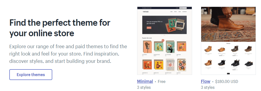
Shopify offers a diverse style of themes to make it easy for you to find the right one that captures your brand’s style.
Additionally, all Shopify themes are mobile-responsive. So, you won’t have to worry about making your site look good on smartphones or tablets — Shopify takes care of it.
When you choose an online site builder, you want to choose one that will enable you to sell on multiple platforms. Your site isn’t the only place you’ll want to sell your products. There are dozens of other places you’ll want to offer your products.
With Shopify, you can sell your products on multiple platforms. Some marketplaces include:
This multi-channel selling platform makes it easy for you to reach your customers where they shop.
If you don’t have experience creating a site, you want to find one that will make it easy for you to craft your dream website. Shopify offers a user-friendly site builder that’s simple to figure out even if you don’t have web design experience!
Shopify offers a drag-and-drop builder so you can position elements exactly where you want them. Having a drag-and-drop builder makes it easy for you to see your website how your audience will see it so you can adjust its design as necessary.
When you’re choosing between Shopify or Magento, you want to look at the features you can get with each platform. With Shopify, you have access to their app store to add more functionality to your site. This app store makes it easy for you to build and customize your site for what you need.

Shopify offers dozens of different types of apps, from customer support to sales to ordering and shipping. These apps will help you create a more efficient site for both your customers and your business.
When you’re looking at Shopify vs. Magento, you want to look for ecommerce support. You want to choose a site builder made for ecommerce stores, so you get all the features you need to sell your products.
With Shopify, you get numerous ecommerce-focused functionalities that help you make selling products a breeze:

Next in the Magento vs. Shopify debate, we’ll look at the pros of using Magento.
Here are a few perks to building your site with Magento:
With Magento, you have the freedom to design your site how you want it. Templates or platforms don’t restrict you. While Magento has template options, you can also build a custom design for your business.
Magento is a versatile option for people who want a custom website builder. Since it’s open-source, you have the freedom to design a site that’s fit for your business.
If you’re debating between Shopify or Magento, one thing to look at is the community behind the platform. With Magento, you have a strong community of experts behind the platform. From developers to designers, you can ask questions and talk with people who can help you build the best site.
If you run into problems or don’t know how to do something, you can turn to the experts in these forums to help solve your issues.

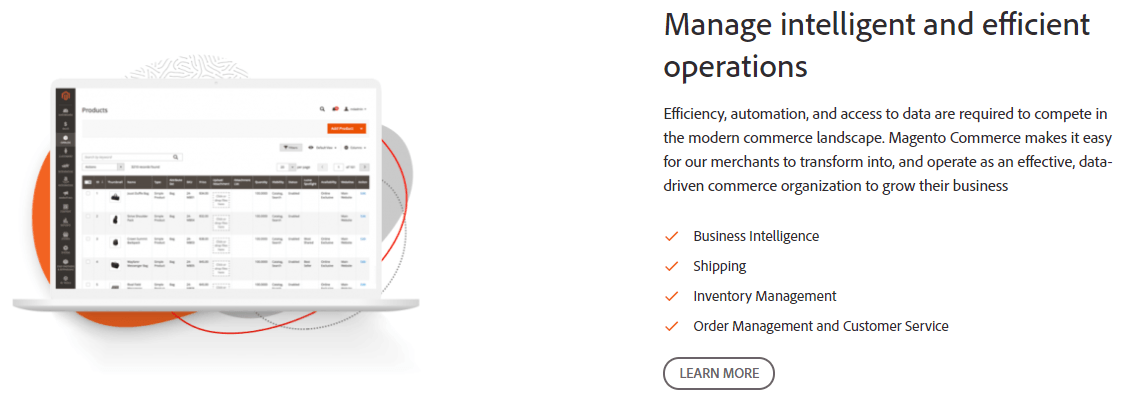
Like Shopify, Magento offers excellent ecommerce support for your business. You get multiple ecommerce features that help you run a more efficient ecommerce store.
Some of these features include:
If you’re wondering if you should choose Magento or Shopify, another essential factor to keep in mind is the payment options. When customers check out on your site, you want to ensure you can offer them different payment options.
With Magento, you have dozens of payment options you can offer your shoppers. From PayPal to Stripe to Amazon Pay, you can integrate multiple payment options to make it easy for your customers to check out on your ecommerce site.
While Shopify and Magento each have their positives, there are drawbacks to each platform.
Here are a few cons to using Shopify as your ecommerce website builder:
One of the most significant drawbacks to Shopify is the fees.
When you look at Magento vs. Shopify, you’ll find that Shopify has multiple expenses, including:
Site building fees
With Shopify, you’ll have to pay some money to build your site.
First, you’ll have to invest money in a template for your website unless you choose a free template. These templates can cost up to $180, depending on what you pick.
Additionally, you must pay fees for adding apps to your site. While Shopify does offer some free apps, other apps will cost money depending on which app it is.
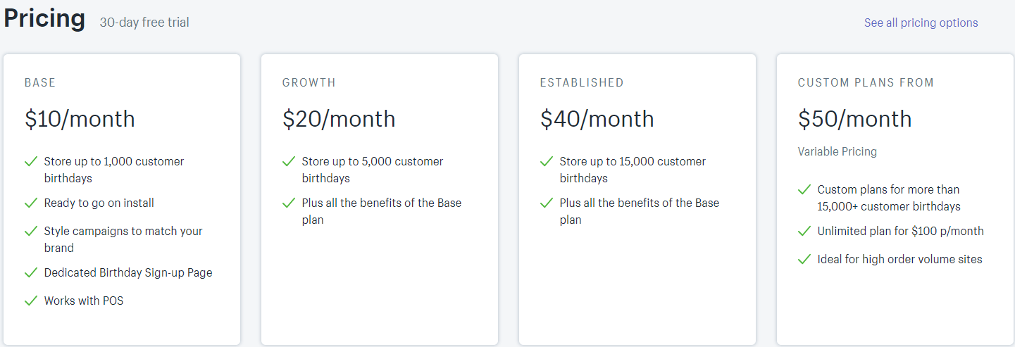
On top of that, you’ll have the monthly costs of maintaining your site, which can range from $29-$299 per month.

Transaction fees
In addition to the fees for building and maintaining your site, you’ll also pay fees for transactions. Every time someone purchases from your site, you’ll pay additional fees. This fee will depend on the payment option shoppers use and the plan you have from Shopify.

The fees include:
When you look at Magento vs. Shopify, you’ll also find that Shopify has more platform restrictions. Magento is open-source, which means you have the creative freedom to construct your site. Shopify, on the other hand, relies on templates, which allows for less freedom.
Shopify may not be the best option for your ecommerce business if you are looking for something with more customization.
Like Shopify, Magento has some drawbacks too.
Here are a few things you’ll want to keep in mind about Magento:
The biggest drawback of Magento is that it requires coding. If you don’t have experience with building a site, this factor is a tremendous drawback. Even though Magento offers templates, you still need to know how to code or hire a developer to create your site.
If you don’t have a web development team at your office, you’ll have to hire an outside developer. If you don’t have the budget for hiring a developer, you’re going to have to learn how to program, or you won’t be able to use Magento.
When you craft a site with Magento, you’re starting from scratch, so you must pay the fees associated with building a site.
One of the fees is paying for a theme. If you take one of Magento’s themes, it can be a more affordable option, but if you want to build a custom theme, it can require thousands of dollars to create.
On top of the design, you have additional yearly fees:
Essentially, you have all the fees of building a website, plus the expenses of Magento. These costs can add up as you develop your site.
We don't just want to tell you about the beautiful work we do
We Want to Show You!
We’ve built over a thousand
View Our Past Work
Websites in industries like yours
After looking at the Shopify vs. Magento comparison, you can see each platform’s pros and cons. Now that you have all this information, you’re wondering which is better: Magento or Shopify?
Choose Shopify if you:
Choose Magento if you:
After looking at Magento vs. Shopify, you may find that neither platform is a good fit for your business. So, what can you do instead? As an alternative option, you can partner with a web design company like WebFX.
By partnering with WebFX, you’ll get a team of 250 web design and marketing experts working on your campaign. Instead of trying to build your site on your own through Magento or Shopify, you can rely on our award-winning team of designers and developers to craft a website that drives results.
In the past five years, we’ve driven over $2.4 billion in sales and over 6.3 million leads for our clients. You can count on our experience and expertise to help you craft a beautiful website for your ecommerce company.
If you’re ready to build your dream website, contact us online or call us today at 888-601-5359 to speak with a strategist about our web design services!
The post Shopify vs. Magento: Which Platform Should I Use? appeared first on WebFX Blog.
Two new lexical analyzer generators for Java have been added to the Free Compiler Construction Tools: Lexer and Parser Generators page. For those wondering, these are tools that make it easy for you to write computer programs that have to parse text input.
A common case of refactoring-gone-wrong is when refactoring becomes a large project in a branch that can never be merged because the refactoring project is never completed. The refactoring project is considered a separate project, and soon starts to feel like "The Big Rewrite That Always Fails" from programming literature.
The work happens in a branch because people actually fear the change. They want to see it before they believe it, and review every single part of it before it can be merged. This process may take months. Meanwhile, other developers keep making changes to the main branch, so merging the refactoring branch is going to be a very tedious, if not dangerous thing to do. A task that, on its own, can cause the failure of the refactoring project itself.
So can't we use a branch for refactoring? Of course we can. But it has to be a short-lived branch. How can you ensure that a branch is short-lived?
Following this set of rules is a great idea for any branch, not just refactoring branches. But it's even more important there, since the changes are likely to span many, and remote parts of the code base, which makes the risk of merge problems bigger.
What often happens is that we change a method in a way that requires updating all its clients. It takes a lot of time to do this work, and so we end up with either a very large commit, or a commit that just takes a lot of time to make, meaning that we don't follow the first rule of short-lived branches.
Something else that could happen is that we are just viciously updating code all around the code base, and we commit the changes because everything seems alright, but then our quality assurance tools tell us something is wrong. When we get the results back from CI, we add another commit that "Fixes tests" or "Makes PHPStan happy". When working with short-lived branches, ensure that everything is okay before committing (or set up a pre-commit hook so you can't forget to do this).
Creating small commits that pass all the tests, the result should indeed be that our branch can be merged at all times. This for me is closely aligned to a thought I always have in mind when programming: what if someone pulls the plug on this project today? I don't want my effort to be wasted, I don't want my branch to be deleted without merging. So when I work on something I always aim for it to be useful for the team, the company, its users, etc.
One way to make sure that you always add value to the project is to establish goals for which the following is true:
We'll take a closer look at refactoring goals in the next article.
Refactoring projects require short-lived branches, where every commit can be merged in the main branch immediately. You should be able to stop the refactoring project at any time, while still leaving the project in a better state.
Your design voice – or design style, if you will – is how you choose to relay information to your audience. That sounds simple, but for the uninitiated, it can be incredibly confusing.
I have a confession to make: when I started writing this article, I was stumped at how to best phrase my main idea. I had something important I needed to tell you wonderful readers, but I just wasn’t sure how to do it.
Then it hit me that I wasn’t approaching it in a writing voice I recognized as being “mine.” I was attempting to get too lofty with my idea (since it’s so important and all), and missing the point of my own message. How’s that for irony? In your face, Alanis Morissette.
I eventually decided to scrap what I was originally going to write about, and start over in my own personal style. I love telling stories, and I think that’s where I shine as a writer. Plus, I’m incredibly modest, as you can tell.
So, what is voice? What is personal style, and how can we creatives develop it? One thing’s for sure – it’s not just something for writers to think about. Creative professionals of all stripes struggle with developing their own unique way to express their ideas, especially with so many amazing people out there doing things we admire and are inspired by.
It can be hard sometimes to separate what you admire from who you are, but it’s certainly doable. The key is knowing how to interpret the feedback you get from others.

It’s entirely possible to say one thing dozens, and sometimes even hundreds of different ways. Typography is the best way to illustrate this point. A poster that doesn’t hold back with the chunky slab serifs is going to have a completely different emotional impact than one that uses a delicate, understated script – even if the message is exactly the same.
The design language you use will be different depending on who it is you’re trying to reach. I say language quite deliberately because I compare what we do for our clients as designers to what an interpreter does for two people who speak different languages.
Interpreters create commonality and facilitate conversation between two opposite forces, much the same way that a designer facilitates a communication between their client and their client’s audience. You take what your client has to say and tell it to their audience in a way that’s clear for both parties to understand.
When you develop your own personal design voice, you are effectively alienating those people who don’t care for your style, just like a baby’s brain closes itself off to all of the potential sounds a human being can make in favor of the particular set it learns from its parents.
When you’re born, you can effectively speak every language. But the more you learn and listen, the more certain words and sounds take precedence over the others.
By the time you can talk, you’re communicating in whatever your first language is, excluding all the others you could have learned instead. It’s impossible to try to learn every single language in the world, so why should you try to earn the approval of every single person with your design work? The best way you can use your own voice is to reach people who want to hear your specific message.
The world in general wants you to be bland and inoffensive, easy to understand and digest. But your niche audience wants the compelling visual narrative that only you can give them.
Without a doubt, the best way you can expand your own design fluency is by learning from others. Like I said, there’s a ton of exciting, creative work out there that inspires us all, and the argument has certainly been made many times that there’s “nothing new under the sun” in terms of ideas. But there comes a time when design inspiration can go too far and veer off into plain old copyright infringement.
In 2010, copyright representatives for Dutch author Dick Bruna successfully sued Japanese heavyweight Sanrio for copyright infringement over Sanrio’s white bunny character, Cathy.
Bruna, who created the white bunny character Miffy in 1955, said explicitly that Cathy was “a copy” of his famous children’s book bunny, who was very popular in Japan several decades before Sanrio began licensing their character designs. But Sanrio’s Cathy was pretty obviously done in Sanrio’s own style – the bunny character looks very much like their iconic Hello Kitty.

Was Sanrio merely designing in their signature style, or was it in fact a deliberate infringement on Bruna’s copyright? There are plenty of incidences of simultaneous design, when more than one person comes up with the exact same or a series of very similar ideas at around the same time. But as a general rule, unless you can prove in court that you were the original holder of a copyright, it’s not really a good idea to fall victim to that kind of unknowing.
Doing your research, involving yourself in the creative community, and making sure you know who your competition is are vital steps to maintaining your reputation as an original designer with an original voice.
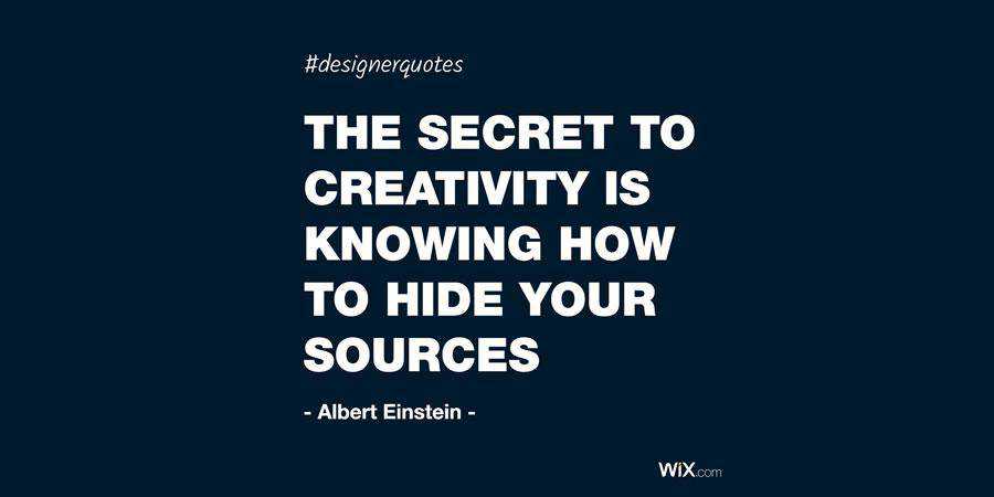
As Albert Einstein said, “the secret to creativity is knowing how to hide your sources.” Being inspired means not being ignorant of what your peers are doing.
Remember, your main goal as a freelancer is getting repeat customers who respond well to your unique voice. If you’re telling your own stories and drawing from your own personal experiences, it’s virtually impossible to create designs that look just like everyone else’s.
You can’t help but be original when you’re being authentic.
The post Finding and Using Your Own Design Voice appeared first on Speckyboy Design Magazine.