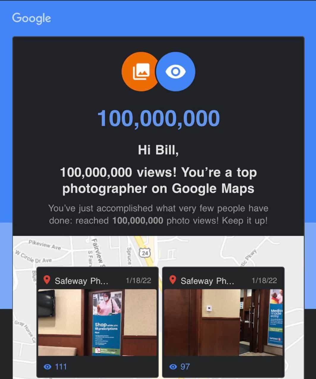
I recently got an email directly from Google congratulating me on reaching 100 million views on my Google Maps photos. That’s 100,000,000 views. I was particularly surprised that I reached that many views on photos I’ve uploaded to Google Maps business listings. However, I knew that I was getting close as I had recently seen that I was at about 90 million views, thinking that I needed to go out and take more photos. I thought I would go ahead and tell you how I reached this number of views. I’ll go through my process, and explain some of the benefits from doing what I do.
Google Local Guide
Several years ago, I signed up (with my main Google Account) to be a Google Local Guide. This is a free program that give you points for doing things related to Google Maps. For example, you get a certain number of points when you take a photo of a local business, adding edits of Google Maps listings, asking and answering questions about local businesses, and leaving reviews. Since I do SEO and Local SEO for a living, it’s something that I know I should be doing, participating in a program like this since it’s best to learn by actually doing what people hire you to do. I highly recommend that if you are working doing anything related to local SEO and local marketing, you absolutely should be participating regularly in the Local Guides program, but also actually doing things: like taking photos, leaving reviews when you go to a restaurant or local business, and providing edits on Google Maps listings when you see something that needs to be edited. After a few years of actively participating, and not really going out of my way to participate, I’ve made my way up to Level 10, the highest level of Local Guide possible.

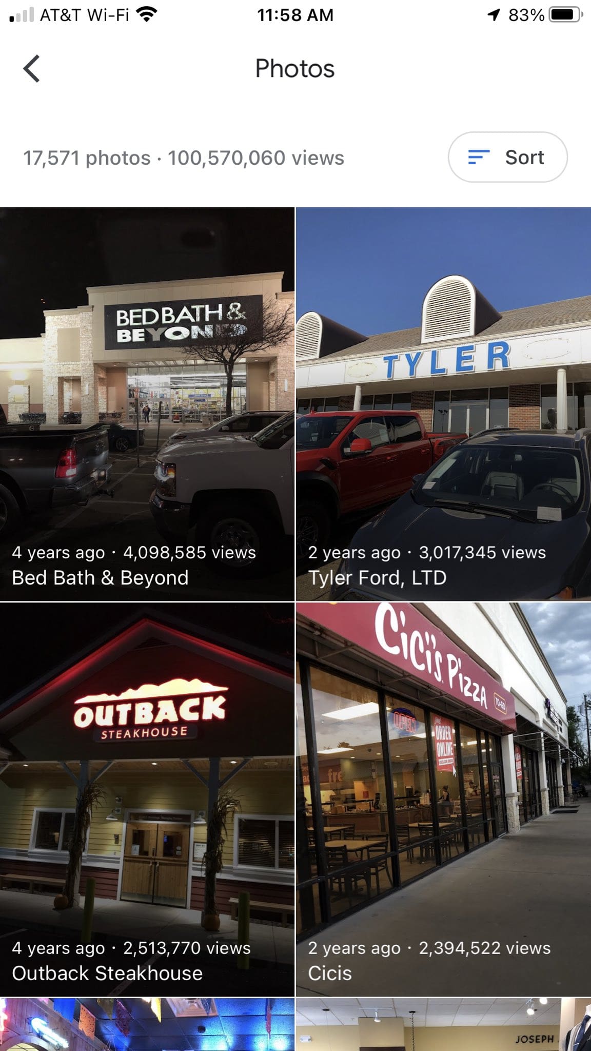
Above you’ll see the most popular photos that I’ve taken. They’re just from my iPhone camera, which is not the latest model. However, I’ve taken so many photos like this, it’s anyone’s guess as to why or how there are so many views on certain photos.
How I Got So Many Photo Views
In order to get so many views on photos I’ve uploaded to Google Maps listings, I’ve developed a routine of sorts whenever I visit a local business. Or any business or attraction that has a Google Maps listing. There are a few things that I do, and it’s this routine that has gotten me (legitimately) to be the highest Local Guide level, but also so many photo views. Here is what I do:
- Whenever I first arrive at the business or attraction, or just before arriving, I look up the listing on the Google Maps app. I have it open. I may lock my phone, but I have the listing ready.
- I usually navigate on the listing to the photos section, and open it up. There is a place to “add photos”.
- I put my phone on silent. This is extremely important, as my phone makes a camera shutter noise whenever I take a photo. A bit about that later, but this is very important.
- I make sure the camera’s flash is turned off. There’s nothing like drawing attention to yourself if you’re taking photos and everyone sees your flash going off constantly.
-
- So, here is the big secret: I take lots of photos. Lots of photos. I may stand in one place in a store and turn around in a circle, easily taking 10-20 photos. This is important, as the quantity of photos is important in order to be successful here. You get a few Local Guide points for every photo uploaded, so taking photos at various angles at different locations in a store is important.
- I make sure that there are never any people in the photos if at all possible. Google Maps, when you upload photos, will automatically recognize faces and blur them. But, I learned very quickly that it’s not very fun when someone comes up to you in a store and says, “did you just take my photo with your phone?”. Usually they’re not nice about it. So, best if there is no one even around, or you can take the photo without anyone noticing.
Those are just some tips, and part of the process. Usually I’ll upload the photos (typically it will be at least 20 photos per location, but sometimes as many as 100-200 photos. If it’s a local business, then they may not actually realize it, but having lots of photos of their business actually does help them show up better in the Google Maps listings. Especially if you’ve taken the photos at that location, upload them while at the location, and you leave a review along with the photos. So, you can take 100 photos, you get Local Guide points for those photos, but you can then leave a review with the same photos and get additional points and possibly photo views of those as well.
Google Street View Analytics
I recommend that you get the Google Street View app. If you download and install the app, there is a way that you can browse the app via the built-in map, but you can also look at the map at your particular location. So, let’s say you’re in Dallas and view the map. You can see the number of views that a particular location has, whether it’s via someone who is Street View Certified Photographer (like myself) or if it’s via Google Street View (via their car driving around). That will give you an indication of how popular a particular location is, and if it’s worth taking photos at that location. In previous versions of that app, they gave you suggestions on where to take a 360 photo (of a particular business, for example) and they showed the number of views that the local business listing has. That was interesting to view, as there was an incentive to go to a particular location and take photos (especially 360 photos) of the business since it’s popular. I recall taking a 360 photo of a Church’s Chicken location, and within a few hours there was something like 26,000 views of that photo. Currently, on the Google Street View app there are numbers next to each photo on the map, and I’m assuming that those are the number of views. For example, I have seen a photo on the Las Vegas Strip that has 3500 views (not sure in which timeframe), but another location out in the middle of nowhere has 120 views.
So to be honest, reaching 100 million views on my Google Maps photos that I’ve uploaded isn’t really a surprise to me, considering the fact that I have taken and uploaded over 17,000 photos. I’ve made it a part of my routine when I just go about my day, and I’m out running errands. And the occasional time when I’m waiting for a relative to shop, which gives me a few minutes to take photos.
What are the Benefits?
You are probably wondering what the benefits are of getting so many photo views and participating in the Google Local Guides program. After all, you don’t get paid anything by Google: nothing at all, by participating in the Local Guides program, and even getting to the highest level, level 10. In fact, there are supposed to be “perks” given, and I think the best thing I’ve gotten from Google was a cloth shopping bag. Probably the biggest satisfaction that I get from doing this is the fact that I’ve learned so much about “how things work” when it comes to Google Maps, and especially maps listings. I have noticed that my edits and changes do tend to go through fairly quickly; but there are some edits that are “blocked” so to speak, and must be manually reviewed. They’re flagged as not being something that even a Level 10 Local Guide can get through. The other benefit is just a personal satisfaction that photos that I have taken have been viewed so many times. And my name is attached to every single one. I have received calls and clients as a result of my taking photos at a business, and getting them posted on a business listing. So, that is another benefit; even if it’s an indirect one.
If you’re thinking about getting a new publication off the ground, you’ve probably already spent some time hashing out what it might look like. But therein lies the rub: conceptualizing a design and executing it are different skills entirely.
And if you lack the latter (or if you have the design skills but are pressed for time), creating a magazine layout can be difficult at best. That’s why so many turn to templates to get the job done, or at least to get started.
But even templates can be costly. Many offer a ton of extra features, but you don’t really need all that when it comes to editorial work. Instead, you need a template that looks how you want it to look and fulfills the layout functions you need to deliver your content in the best way possible.
And thankfully for that, there are many free magazines and editorial layout templates for Adobe InDesign available. We’ve put together a nice long collection of free options, so you don’t have to waste time scouring the web. Just make sure to read the licenses for each template before getting started. Now, have at it!
More Free InDesign Templates:
Learn InDesign:
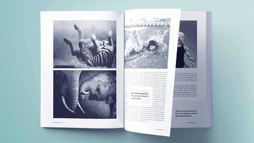
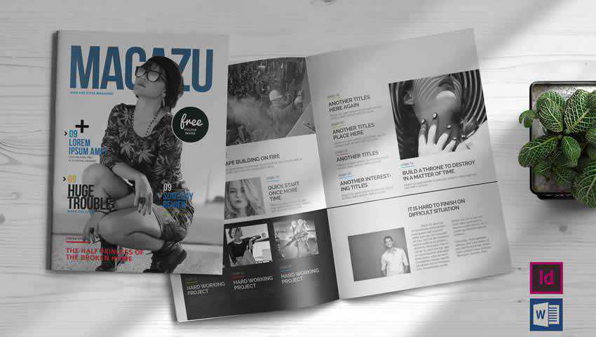
The Free Minimal Magazine InDesign Template is an ideal choice if your magazine will be photo-heavy. I can easily see it being used for fashion or travel publications, thanks to its two page and one and half-page photographic spreads.
It consists of 24 pages, has automatic numbering, and is super easy to customize.

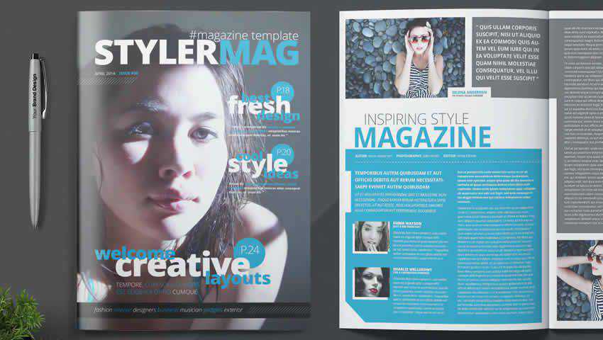
The InDesign Magazine Template offers a stylish way to present your editorial content to your target audience. The overall look of this template is best described as professional, and it could be used for a variety of industries, from corporate magazines to niche publications.
It includes 26 pages, free fonts, paragraph styles, and it is print-ready. This way, once your design is completed, it can be exported and off the presses.

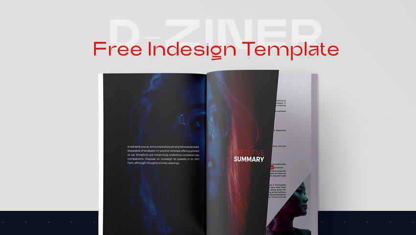
The D-Ziner Free Magazine InDesign Template is an absolute stunner. This template includes a mixture of layouts that can be arranged to create a sense of unpredictability in your design.
With a variety of included graphical elements, text boxes, and paragraph styles, this template can appeal to tech enthusiasts and those who favor bold design choices.

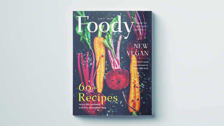
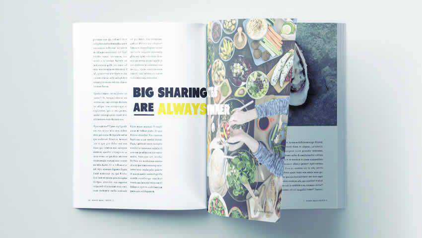
It’s all in the name, here. The Food Magazine InDesign Template is a beautiful selection for food publications or anything to do with the culinary arts.
It comes with 13 pages, each with unique and eye-catching layouts, and includes all the fonts and photos you see in the preview in the actual download. It’s fully printable in standard US magazine (but can be resized should the need arise).

If you want to keep the look of your magazine simple, the Minimal and Modern template offers a 50-page layout that can be customized with images, graphics, and text as you see fit.
It’s an excellent choice for fashion spreads, design magazines, or even publications that feature human-interest stories. It’s printable in A4, and US Letter sizes and includes paragraph and character styles.

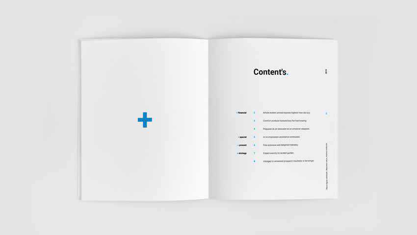
The Free Magazine InDesign Template can be used for any style of publication but shines for the financial planning sector.
The layouts include support for a text-heavy publication with plenty of photographic backgrounds and statistic callouts to keep readers engaged and informed. It’s available for personal and commercial use.

The Stunning Photography Magazine Template for InDesign has a modern and elegant design that can be adapted for showcasing any sort of photography you’d like. It could also be used for a lifestyle or travel magazine.
It comes with paragraph and character styles, a cover page, a table of contents, five page layouts, and an overall aesthetic that will appeal to many budding editorial creators.

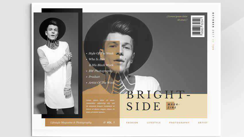
This Modern Fashion Magazine template offers bold layouts and really puts your photography on display. We’re talking full-page spreads that featured edge-to-edge photographs, a fully editable design, and a landscape layout that’s certain to make your publication stand out from the rest.

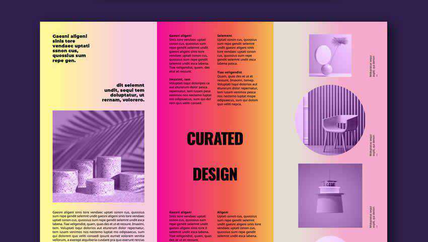
The Colorful Shop Brochure Layout has a multitude of uses, and it looks lovely while doing it. This template features bold colors that will readily stand out on the magazine rack. The color scheme is comprised of gradients that make for a sunset-esque appearance.
This template is fully editable, is in CMYK, and is sized at A4 and US Letter sizes. Once you’re finished designing, just click print. Easy as that!

The Stylish Food Magazine Template for InDesign is an easy-to-edit offering that offers a slightly more editorial style to the food magazine concept.
It includes automatic page numbering, bold and graphical layouts, and type styles that make the process of putting together a magazine centered around food a snap.

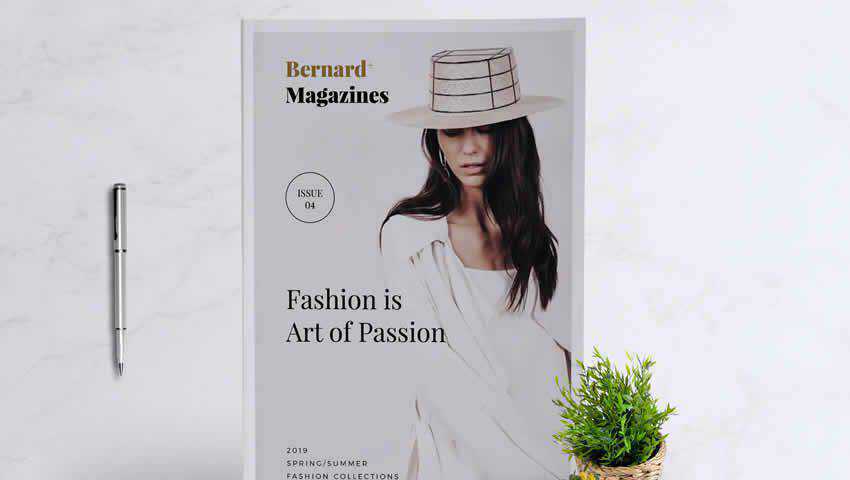
The Bernard Fashion InDesign Magazine Template includes 24 page designs, which ensures your magazine’s layout will provide fresh and exciting perspectives on every page.
You can set custom colors, use the included paragraph styles and free fonts, and print your magazine easily in either A4 or US Letter sizes. It’s a solid choice for fashion publications as well as architectural or artistic endeavors.

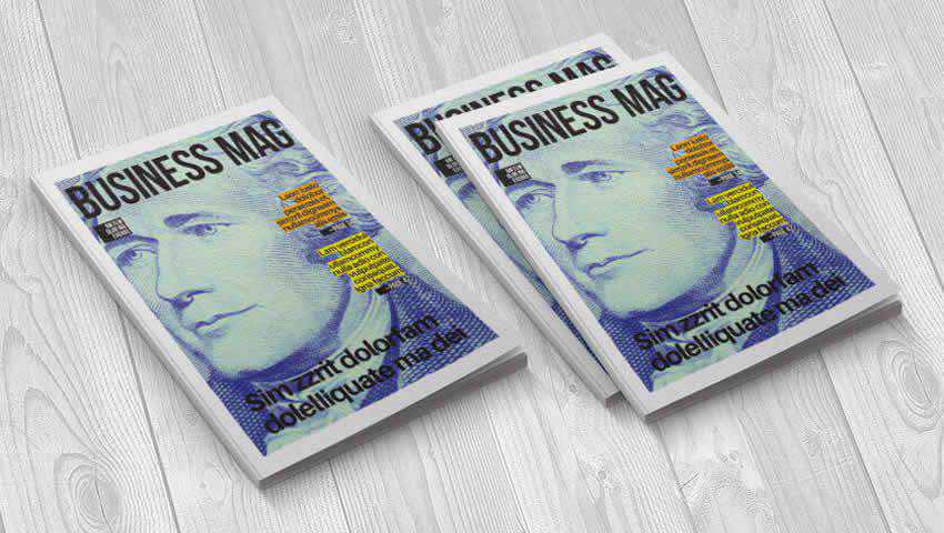
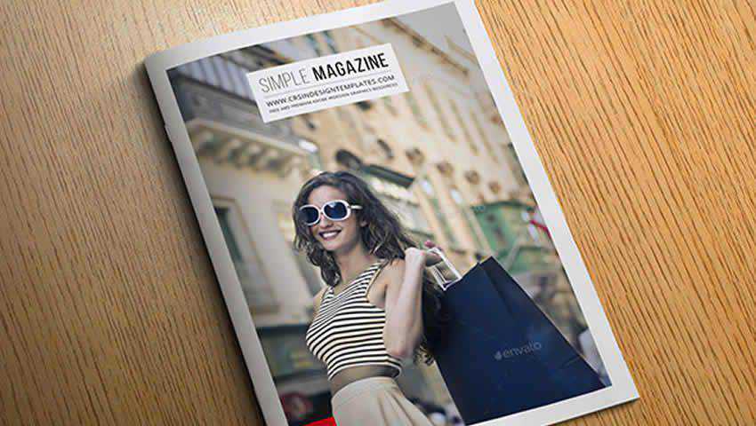
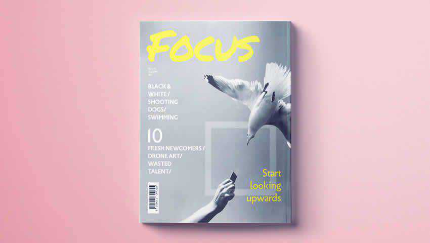
The Simple Magazine Cover Template makes quite the impression at first glance. It features full-page photography, bold headers, and is a force to be reckoned with for business publications.
You can customize the color swatches, fonts, images, and text. Plus, the article headings are highlighted and colorful, allowing your best content to stand out. Though this template is just for a cover, it could really make a strong case for cracking open your magazine.

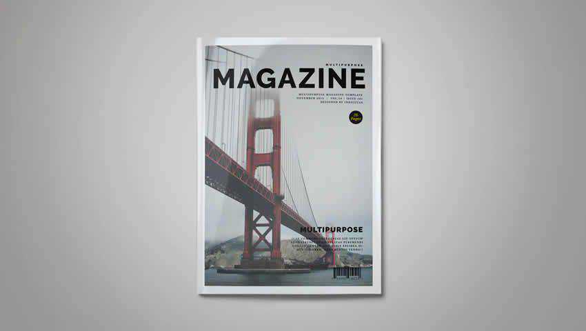
As its name suggests, the Multi-Purpose Magazine Template offers 26 unique pages that can be customized to suit any industry, profession, or area of focus.
It can be custom-tailored for any kind of publication. Thanks to automatic page numbering, free fonts, paragraphs, character styles, and fully-customizable graphics and text, this magazine template is a strong choice if you’re unsure about the focus of your publication at the outset.

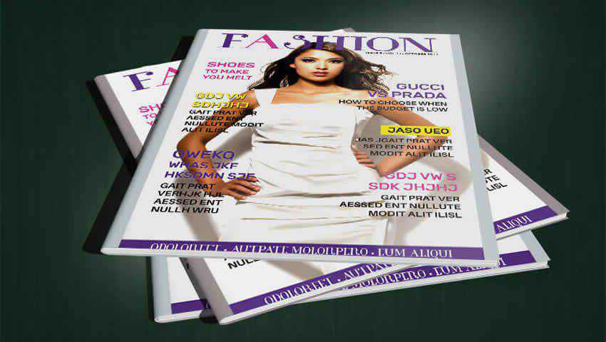
Here’s another free magazine cover template designed to pique potential readers’ interest.
The Fashion Magazine Cover Template is a one page download that supports a full-page photograph, multiple content teasers, bright headers, and custom fonts and paragraph styles. Plus, it’s fully print-ready.

The Marketing Booklet Template keeps things simple, but sometimes that’s all you need — especially if you’re just interested in putting out a quick booklet to spread specific information about your business or a given industry.

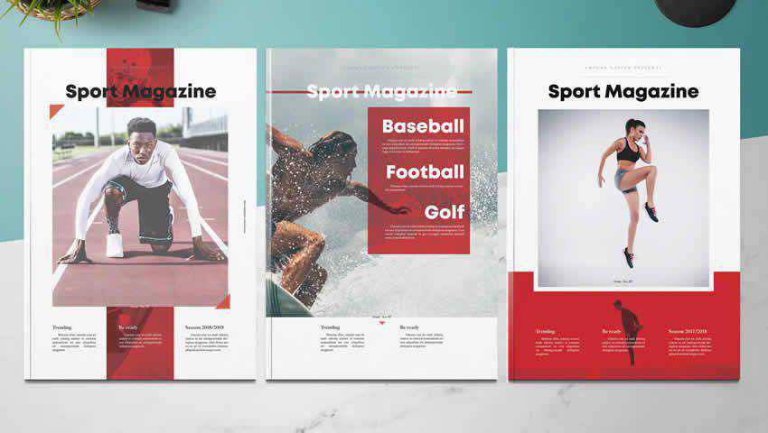
If you want to launch a sports or fitness magazine, the Sport Magazine InDesign Template is a great choice to consider. It includes 30 pages of custom layouts, three cover layouts, paragraph and character styles, a grid layout, and free fonts that you’re free to use in your finished product.
Best of all, the file is fully editable, and every element is on a separate layer, making for a much easier customization experience.

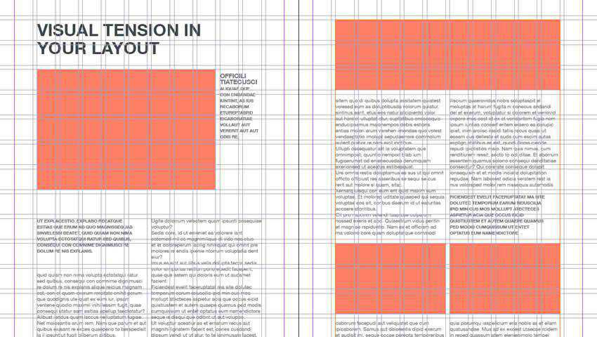
The Grid Wireframe Editorial Layouts template is a collection of various grid layouts that can be used and adapted for multiple purposes. You can use these wireframes to build a publication from scratch.
This is especially helpful if you have a specific design in mind and are not finding what you need from pre-built templates.

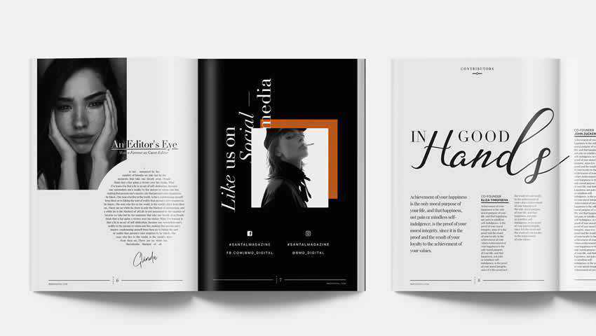
The Santal Magazine Editorial Templates are truly breathtaking. It’s a 76-page template that is perfect for putting together a double-issue or a special, near-book level publication.
It’s in A4, and US Letter sizes, fully print-ready, and includes separate images, text, and graphics layers. It uses free fonts so you can easily replicate the style in the template’s sample pages, and includes multiple paragraph and character styles for true customization.

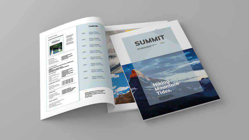
The Summit Magazine Template is a sure choice for adventure, travel, or outdoor magazines. It has 15 custom pages for putting together a layout that works for your proposed content and is easy to edit thanks to organized layers and unlimited color selection.
It also uses free fonts, is print-ready, and has been designed to immerse readers into the stories you share.

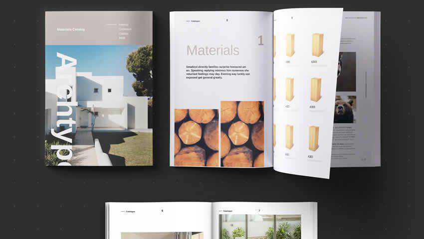
The Archtype Magazine InDesign Template is an excellent choice for architecturally-focused magazines. But it could also easily be used for interior design, fashion, or home magazines.
The layouts offers within this template’s pages can help you tell an in-depth story or even promote items for sale. It has a wide range of flexibility, which is impressive for a free template.

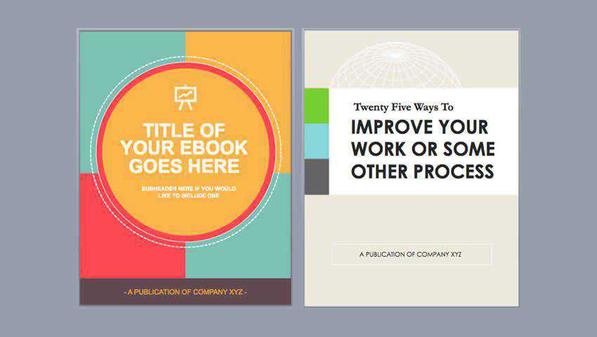
HubSpot is a go-to source for marketing automatically assistance, and in keeping with that theme, they provide free ebook templates for download.
These ebook templates can easily be adapted for magazine publishing and can be used for print and digital publications. The designs are simple, bold, and graphical, which is perfect for conveying business-focused info.

This template is an excellent choice for general interest, fashion, home and garden, art, and many more publications. It’s a multi-purpose template that features a professional yet clean design that is readily adaptable.
Some features include 32-page layouts, three magazine covers, free fonts, automatic page numbering, and a grid or column-based layout.

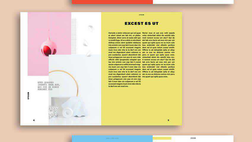
The Memphis Design-Inspired Magazine Layout offers a somewhat retro look while maintaining a modern edge. This template has 20 pages that you can fully customize by adding your own text and images.
It’s also print-ready in CMYK in A4 or US Letter sizes. The overall 80s look could work well for vintage-inspired magazines, themed corporation publications, or a vintage fashion periodical.

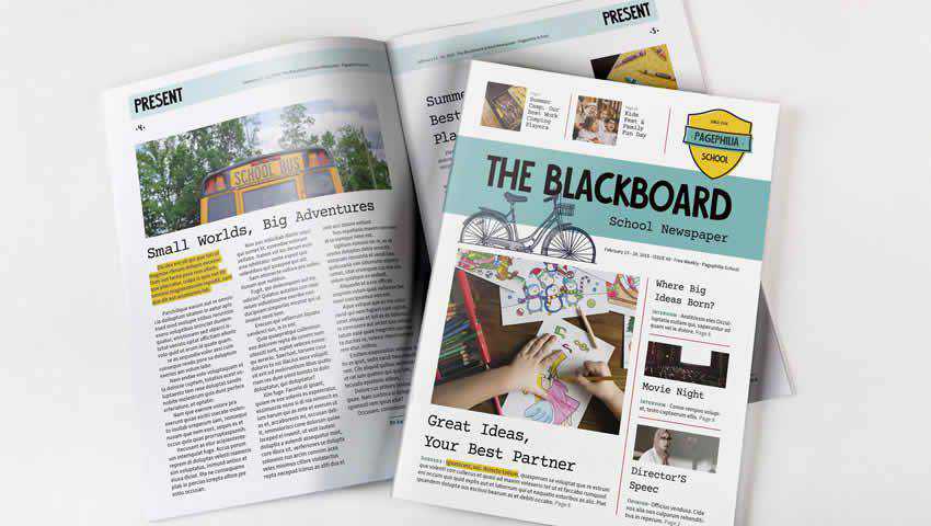
The Blackboard template is a fun choice for a school newsletter or magazine, and it could work for a class newsletter or monthly school booklet.
It comes with ten pages that you can customize, including a front and back cover and a variety of sections. You can also set global colors to make it easier to change the look of your magazine on the fly.

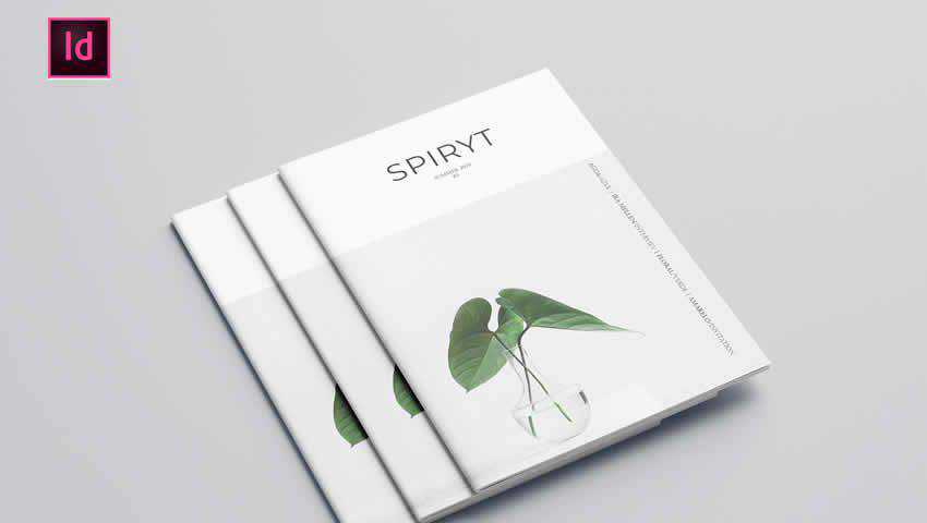
The Free Simple Magazine Template is relatively minimal in its presentation, but the concept mockups provided in the file are incredibly inspiring and emphasize how important the photograph selection is.
This template could be used for a fashion, lifestyle, or travel magazine — though honestly, any type of publication would likely find it useful. It comes with six page layouts and free fonts, so you can get started with customizing it immediately.

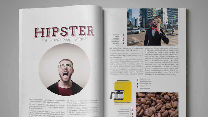
Here’s another template that inspires at first glance. It offers plenty of whitespace while still giving you ample room to feature photography and text, as well as quotes and other textual callouts. This template features 20 pages and is printable in A4 and US Letter sizes.

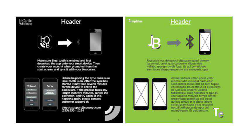
The Free Instruction Book Template might not be technically designed for magazines, but it can be adapted for this purpose.
This would be especially useful for a technology publication that needs to feature step-by-step instructions or tutorials. You could also use it for a corporate booklet or brochure. It’s easy to customize with your own content as well.

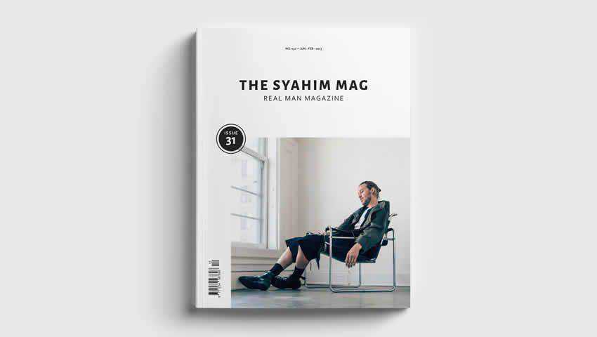
The Modern Magazine Cover Template features a single page, but you can use this page to create a custom cover for your magazine. I could see this being useful if you were using another magazine template for the interior pages but found the included cover unsatisfactory.
This cover template includes the photography and fonts featured in the sample, but you can easily swap them out with your own for a truly custom look.

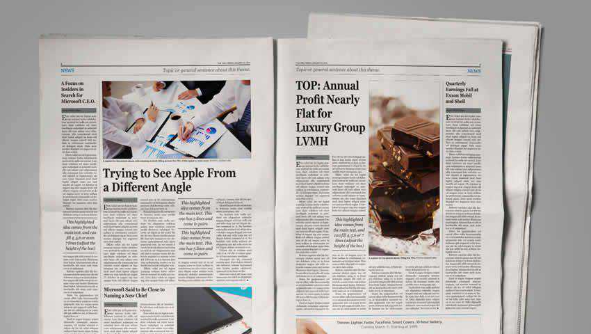
If newspapers are more you’re thing — or you want to create a magazine that has a traditional newspaper look — the Newspaper Template for InDesign is up to the task.
This template comes with six page layouts and features all the elements you’d expect from a newspaper: headlines, spots for photographs, column-aligned text, pull quotes, captions, and spots for ads.

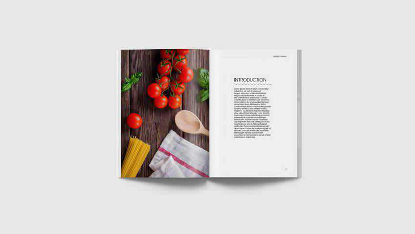
Last on our list is the InDesign Recipe Book Template, which is an excellent choice for cooking, food, culinary, and even art magazines. It’s laid out like a book, but this could be useful if you plan on releasing a special issue of a food magazine, let’s say.
It comes with ten page layouts (including two page spreads), free images, and paragraph styles that make it easy to customize this template for whatever purpose you have in mind.

Can you believe all of these templates are free? This collection of magazine and editorial layout templates covers the gamut of industries and topics, and one is certain to pique your interest. Why not try a couple to see which fits your publication best?
The post 25 Free Magazine & Editorial Layout Templates for InDesign appeared first on Speckyboy Design Magazine.
Card UI layouts are quite popular these days – and it’s easy to see why. They’re incredibly versatile, with the ability to house anything from product listings to blog post teasers.
These elements are also the perfect place to add various hover effects. It’s not only attractive but also a means to improve the user experience. Even a subtle effect can help cards stand out among a group, thus making the feature more intuitive.
The design community has created some outstanding examples. From bold transformations to simple highlights, there is something for virtually every use case.
With that in mind, here are some prime examples of card UI hover effects that have been enhanced with CSS and JavaScript.
Card Hover Interactions by Ryan Mulligan
Displaying a large amount of content at once can overwhelm users. That’s where this snippet comes in. It consists of a simple title coupled with a background image. Hover over a card and you’ll find some descriptive text and a call-to-action. Best of all, it has been built with pure CSS.
See the Pen Card Hover Interactions by Ryan Mulligan
Profile Card Hover Effect by P
Here’s a similar concept, but even more minimalistic. The effect zooms in on the card’s photo and reveals the subject’s name and social media links. Overall, it’s very pleasing to the eye without becoming too busy.
See the Pen Profile Card Hover Effect by P
Pokemon Card Holo Effect by Simon Goellner
Everyone loves Pokémon, right? But that’s not the only cool thing about this snippet. Each card features a stunning holographic effect. It’s a cleverly-devised setup that uses animated GIFs and gradients to produce a sparkling beauty. Perhaps the effect is not for everyone, but it’s undeniably unique.
See the Pen Pokemon Card Holo Effect by Simon Goellner
CSS Card Hover Effects by Jhonier Riascos Zapata
If you’re looking for a way to make your card UI stand out, this hover effect will do the trick. It takes a grayscale card and turns it into an explosion of color. Beyond the bright pink hue, cards also expand in size to reveal more detailed content. All told, users can’t help but take notice.
See the Pen CSS Card Hover Effects by Jhonier Riascos Zapata
Pure CSS Holiday Feature Folding Cards by Madalena
These mini-cards are closer in style to buttons than your typical content card. Regardless, their hover effect is pure magic. Each card “unfolds” to display a video alongside text and a call-to-action. It’s amazing how much can fit into such a small space. In addition, the responsiveness of the UI is also impressive.
See the Pen Holiday Feature Folding Cards [Pure CSS] by Madalena
Profile Card UI by JotForm
Full disclosure, the hover effect here is just a minimal part of what this snippet does. But the tabs at the bottom of this profile card are nifty. They allow you to fit a large amount of content into a relatively tiny design element. The use of glassmorphism is also spot-on.
See the Pen Profile Card UI by JotForm
Player/User Cards by Alvaro Montoro
Crafted in the style of double-sided collectible cards, this UI shows additional information upon hovering. It’s clean, colorful, and refrains from taking over the rest of the page. This snippet would fit nicely into any project where cards are used to display data.
See the Pen Player/User Cards by Alvaro Montoro
CSS-Tricks Card Carousel by William Goldsworthy
Here’s a different take on the traditional carousel. Cards are overlapped – making for an effective means to save space. Hover over an individual card, and it reveals itself. And while this example shows a circular animation on the active card, it could easily be adapted to show text or images.
See the Pen CSS-Tricks Card Carousel by William Goldsworthy
Adding Interactivity to a Staple of Web Design
Hover effects are there to bring interactivity and even a little bit of fun to any element. But there’s something unique about implementing them within a card UI. They add personality to what could be a rather static feature.
The snippets above show that there are several different ways to accomplish this. The effects can be subtle or substantial, based on the type of impact you’re looking to make. It’s something that even a buttoned-down corporate website can benefit from.
We hope you’ve enjoyed this look at card UI hover effects! If you’d like to check out even more examples, visit our CodePen collection.
The post 8 CSS & JavaScript Snippets for Creating Cool Card UI Hover Effects appeared first on Speckyboy Design Magazine.


