PHP Convert Number to Base
Read more at https://www.phpclasses.org/package/12008-PHP-Convert-numbers-between-base-10-to-another-base.html#2021-03-08-09:44:00
Polygons just seem to be a natural fit for web design. For one, they’re incredibly versatile. These shapes can both stand out on their own or be combined to create something altogether different. Whether you want to craft an element that is abstract or realistic – it’s within reach.
At the very basic end of the scale, a polygon may be used to create a button or a simple background. But they can also serve as incredibly detailed UI elements as well. The trick is in leveraging the power of both CSS and JavaScript to put these creative ideas together.
We’ve collected some stunning examples of what polygons can do. You might just be amazed at some of these implementations – let’s get started!
A series of shaded triangles has been turned into…a school of fish? That’s right. This pure CSS animation brings a little bit of ocean right to your screen. Notice the lifelike movement of each fish – complete with a perspective shadow below.
See the Pen Only CSS: Polygon Fish by Yusuke Nakaya.
Here we have a masterful representation of an origami bird. The use of both shapes and shadows makes this look just like the real thing. A gentle animation serves as the perfect finishing touch. This entire piece is done with HTML and CSS.
See the Pen Origami Bird by Simin.
This nature scene uses polygons to create depth and a little bit of fantasy. The jello-like liquid motion is recognizable, but still tame enough avoid conflicting with the content overlay. A fun illustration that lends itself to storytelling.
See the Pen The Great Fall by CJ Gammon.
Ikko Tanaka was a Japanese graphic designer whose work often made interesting usage of polygons. Therefore, it’s only fitting that his creations are remade via CSS. This presentation captures Tanaka’s style and is also a great example of CSS grid, clip paths and other advanced techniques.
See the Pen Ikko Tanaka (pure CSS) by yuanchuan.
Speaking of beautiful tributes, here’s one to the late great David Bowie. The rock music icon is the star of this jQuery-powered low-poly animation. Ever into technology, Bowie himself may well have loved this depiction.
See the Pen Long Live Ziggy Stardust by Joe Harry.
Sporting an eye-catching CSS grid layout, this book display would be a perfect fit for an eCommerce shop. Thanks to the diamond-shaped grid, it’s at once complex, symmetrical and easy to digest. A snazzy hover effect also adds to the atmosphere.
See the Pen Responsive CSS Grid – Books by Andy Barefoot.
Check out this fun memory matching game. It utilizes super-cute polygon illustrations of animals and other common objects. CSS makes it enjoyable to look at, while JavaScript powers all the behind-the-scenes functionality.
See the Pen Tangram Memory Game by Paulina Hetman.
Background textures are a common use for geometric shapes. You can see why when viewing this example. It utilizes Delaunay triangulation to create a colorful-yet-subtle animation that would be sure to grab a user’s attention. Imagine using it in a hero area or other prominent place.
See the Pen Tesselation Transition by Chris Johnson.
The level of detail in the above code snippets are an inspiration. Each takes simple polygonal shapes and turns them into works of art. It’s a testament to the power of both code and creativity.
Looking for even more incredible polygon examples? Be sure to check out our CodePen collection for a complete set!
The post 8 Awesome Examples of CSS & JavaScript Polygons appeared first on Speckyboy Design Magazine.
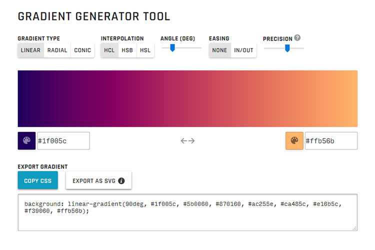
Gradient Generator Tool – Quickly generate a beautiful CSS gradient for your project with this online tool.
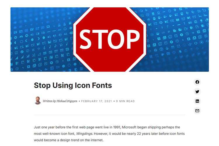
Stop Using Icon Fonts – The downsides of icon fonts and why SVG is a better alternative.
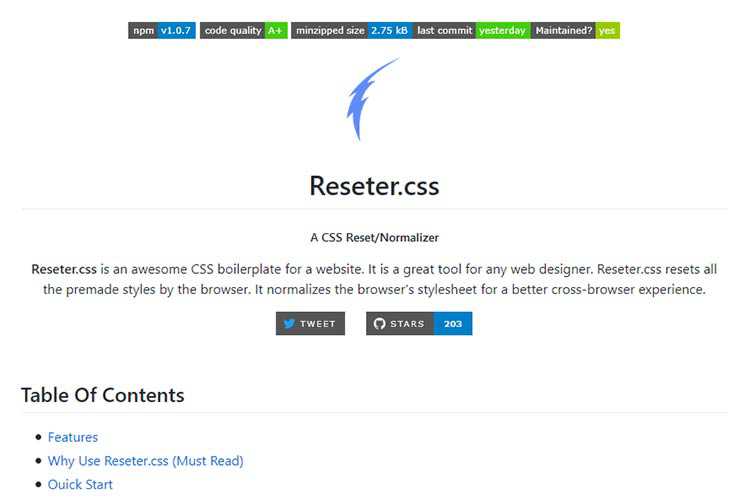
Reseter.css – This boilerplate normalizes the browser’s stylesheet for a better cross-browser experience.
Dealing With Sudden Client Designer Syndrome – How to guide your clients away from a design disaster.

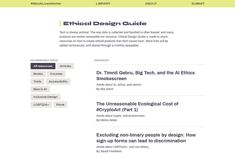
Ethical Design Guide – Learn how to create ethical products that don’t cause harm.
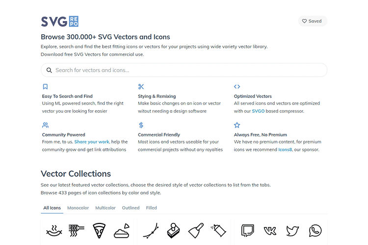
SVG Repo – Explore and search a library of 300k+ vectors and icons.
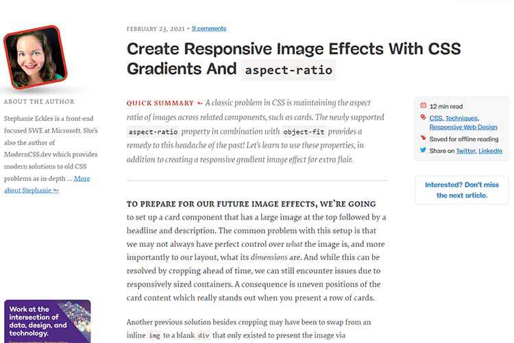
Create Responsive Image Effects With CSS Gradients And aspect-ratio – Learn how to maintain image aspect ratio with some newfangled CSS.
Hiding Content Responsibly – A look at different methods for hiding content and their impact on accessibility.
How to display language-specific quotes in CSS – Switching quote punctuation based on the language being used.
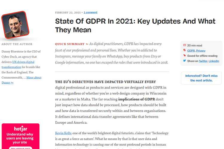
State Of GDPR In 2021: Key Updates And What They Mean – How changes to GDPR impact web designers and clients.
Thoughts on WordPress Achieving 40% Market Share – A look at how WordPress climbed its way to dominance – and how it can stay there.

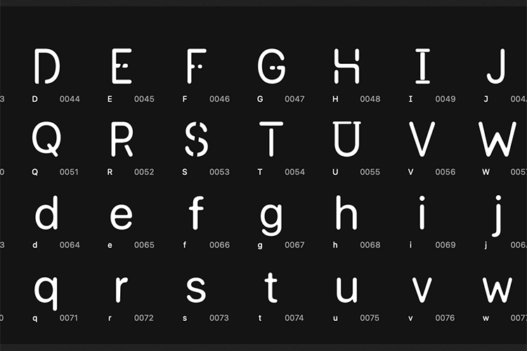
Core Font – Grab a copy of this highly-legible open-source font.
Choosing New Tools and Technology for Your Web Projects – What to consider before you buy into something new and unknown.

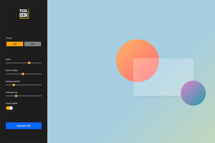
Toolbox Glassmorphism Generator – Craft beautiful glass-effect elements for your web projects.
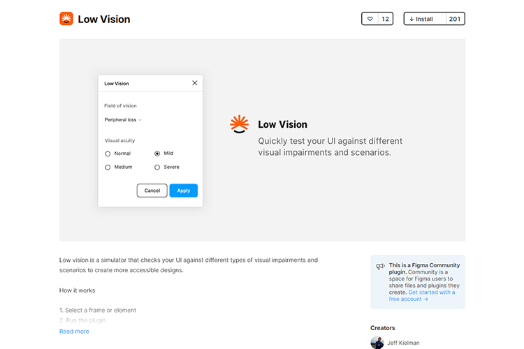
Low Vision – This Figma-based simulator checks your UI against different types of visual impairments and scenarios to create more accessible designs.
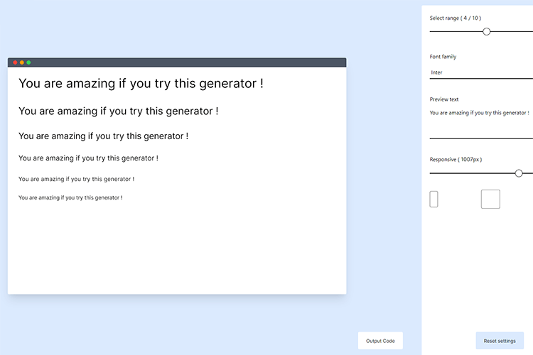
Type Scale Clamp Generator – Use this tool to create the perfect responsive typographic scale with CSS.
The Pudding Cup – Check out the best visual and data-driven stories of 2020.

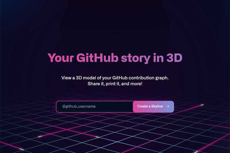
GitHub Skyline – Are you a GitHub developer? Check out your contribution graph in 3D.
The post Weekly News for Designers № 582 appeared first on Speckyboy Design Magazine.
In this episode of the Digital Marketing with Bill Hartzer podcast, I spoke with Henry Kaminski, Jr., the Brand Doctor, about rebranding your business.
Here is the full transcript from this episode:
Bill Hartzer (00:02):
Hi, this is Bill Hartzer, and this is the digital marketing podcast with Bill Hartzer, for Thursday, March 4th, 2021. And talking this afternoon with Henry Kaminski Jr. About rebranding. And I know there’s so many companies, even in the past year of the done basically with all the events that’s going on, we’ll have to do some, or have had to do some rebranding. And so let’s talk a little bit about kind of the process and, you know, whether or not you really need to do a rebrand. So Henry, welcome to the podcast this afternoon. And tell me a little bit about yourself and, and your background and a little bit about your company.
Henry Kaminski Jr (00:45):
Absolutely. Thanks again, bill, for having me on, I really enjoyed our, our last conversation and look forward to this one. So I’ve been in the branding space for 14 years now. I started out as a freelance designer and a brand identity designer doing logos and websites and things like that, you know print collateral, things like that for businesses. And then I matured the business over the years to a branding agency. We’re now I do a lot of the brand strategy and I’ve built out a team to do a lot of the heavy lifting as far as brand identity design though, but we we’ve, we hire the best of the best all over the world to create the brand identities, but we’ve worked with some really cool people like John Bon Jovi. We’ve worked with a fabulous Vivian E from top chef Russell Brunson.
Henry Kaminski Jr (01:32):
We helped brand the click funnels back and, and get them to, to the look and feel that they are today. So we’ve worked with some established businesses and, and, and now we’ve, we’ve, we work also with a bunch of subject matter experts, you know, coaches, consultants, authors, speakers that want to monetize their thinking. You know, they want a product ties their experience and their wisdom. And so we do a lot of sales funnel builds and things like that now to help them really monetize their expertise online. And that’s, that’s the agency that I run now. And it’s it’s been it’s been a beautiful, beautiful ride. So a lot of ups and downs, but worth it well, well worth it. And I’m happy to be here today.
Bill Hartzer (02:21):
That’s great. So I’m more of my background is really more on the, you know, web website and internet marketing and digital marketing side. And I’m familiar with, you know, some of my clients have come to me when, you know, they need to come. Let’s say they’ve two companies are merging and they need, they do a neat rebrand and they need, they’ve already decided, and they need to do the technical things, like, you know, combine websites into each other and do redirects and so forth. And, but, you know, rebranding is actually, you know, as I understand, we need to get somebody like you involved really way before you’re going to be changing, changing domain names and websites and so forth. Is that correct?
Henry Kaminski Jr (03:09):
Yes, sir. Yes, sir. You know, we talked about it before, you know, when, if your business online does not clearly articulate the value that you deliver to your client, then I would highly recommend and consider you doing a rebrand because if you are irrelevant or if you look outdated or if it’s just, you’re, you’re seeing you’re, you’re getting killed by competition and, and you know, what hurts even more belt when the competition has an inferior product to yours, but they’re, they’re still getting all the clients. That is a, that’s just really a, a side sticker that I, I have a hard time with. And I know a lot of my clients do. I had a client in, in, in New York that ran a, a, a $5 million solar panel installation company. And their website looked like it was from 1992 and would never believe that they were running a $5 million business with their online presence.
Henry Kaminski Jr (04:21):
And he said, Henry, we’re coming to you because we’ve done all that we could with what we know of, you know, website design and branding and marketing. We need somebody to come in and really brand us to the $5 million reputable business that we are now. Luckily I think they, they delivered a quality product. So that’s why they were getting the sales that they were getting. And the partners, the principles of the business are very, very easy to get along with and approachable and fun. And, and I think that led to a lot of their success, but they were getting destroyed by competitors because they, they, they were just getting overlooked. So that was one of the reasons why they rebranded. So there was a lot of let’s let’s, let’s back up a second. So we don’t skip over this, but what exactly is branding, right? It’s, it’s not just your logo, your website, your, your, your funnels, your, your color scheme. It’s, it’s the experience that your clients go through. It is the feeling that they get when they interact with your business, whether it be online or in person, it doesn’t matter. So we need to establish that connection, that experience that feeling first, before we can build anything, right? So that’s, that’s the key to a strong rebrand. And and, and the branding process,
Bill Hartzer (05:47):
Even if you, even if you have a website or a present, or you’re doing, you have a business, you, you, you know, don’t realize, but you do have a brand, you know, even, even, even somebody who is a, you know, I would say an influencer on Instagram or something like that. And they have, you know, they, they sell fitness products or something like that. You know, they’ve built their brand just by, but they may come to you and say, or come to me and say, well, I don’t really have any branding, you know, I may have, but they don’t realize that they actually have that experience. They have that you know, they’ve already created that experience for their, for their customers, that you know, that they are the brand, they, they they’ve built that personal brand. And so it may be time to shift that into making it a, you know, into a larger business not take that, you know, take that personal brand and add another brand as a part of it.
Henry Kaminski Jr (06:59):
Right. You know, it’s all about positioning. You know, if you want to charge the part, if you want to sell a high ticket product or service, then you got to look the part, right? You gotta look the part. And, and, and, you know, you got three seconds, you got three seconds these days, somebody hits your website and it looks like a garbage, it looks like from the 1992, they’re gone, same thing with a funnel. You know, if I come to your website or if I come to your funnel and it looks like a funnel, I’m out funnels, get a bad name. They really do. They get a bad rap because there’s so many people out there trying to make a fast buck with them that nobody is going to take them seriously, anybody that’s, that’s got some cash that they want to buy that they want to spend. Right. So, you know, I’m constantly, if I, if I see a spammy looking funnel, I am out in two seconds, because if they’re going to treat their brand that way, how are they going to treat me?
Bill Hartzer (07:59):
Yeah. I mean, it’s building that trust. I mean, trust is a big part of it. And so, yes. And so it’s trust it’s, it’s using the right colors, you having the right logo, having the right, you know you know, design, if that’s, if we’re just talking about, you know you know, just a website or online, but it’s not just about that. It’s about that whole, you know, that whole experience. Cause we talked, you know, rebranding is not just your website, but there still is print there’s billboards. There’s, you know, electronic, you know, there’s electronic billboards. So video billboards, we’re driving and all of a sudden the, you know, we see you know, see those electronic billboards. Those might even be faster than three seconds. I’m not sure, but yeah, those electronic, I don’t know, you know, your ad that shows up on one of those billboards, you don’t have much time there to get that, to get that trust. No,
Henry Kaminski Jr (08:56):
That’s why everything matters. Everything matters. The minute they come into contact with you online, the minute they hear your voice on a podcast, the minute they see a video, they’re going to know they’re going to size you up. And I’m not saying this is right or wrong, but they’re going to size you up. Is this person legit or not? Because if I’m going to spend 10 plus thousand dollars on a low end, on a high ticket product or service, then they better, they better show up that way. Right. And you know, I tell my clients all the time, like if you want, you know, if you want a $50,000 engagement, you better have established a $50,000 relationship in and that’s through your brand, that’s through your brand. That’s everything. That’s everything that they see and everything that they experience and everything that they feel, you know, there’s a reason why I use this camera, this microphone, the lights that are behind me.
Henry Kaminski Jr (09:55):
I know you can’t see this on a podcast, but you know, everything is intentional. My two comma club, that’s hanging on my two comma club award. That’s hanging on the wall. It’s all there on purpose. It’s all there on purpose to establish credibility, trust and authority in my niche. And so that’s what I would encourage a lot of your listeners right now to consider is if I were, if, if you were to Google your name, would you be proud of what showed up? Nope. Do is your credibility and authority established online. Now, if you Google the brand doctor, there’s going to be pages of me. Yep. I’m proud of that. You know, I, I, I, I worked hard for that, you know and you’re going to be, you’re going to be impressed with what you read and that’s brand, you know, that’s brand. So when somebody comes to me and says, Henry, I need help with my branding. You know, by the time they get on a zoom call with me, it’s pretty much a matter of going through the process to get them enrolled into one of my programs, whether it be my one-on-one or the brand accelerator program. Right. that’s the power of brand. That’s the power of brand.
Bill Hartzer (11:16):
Yeah. So there are, there, there are certain other certain businesses that are types of businesses or, or certain industries that, you know, you work that work better or, you know, or some that that, you know, can benefit a little bit more than others with your re rebranding process or can just about any type of business, you know, benefit.
Henry Kaminski Jr (11:44):
Well, you gotta be cool. Like you gotta be fun to work with. Otherwise, I don’t want to work with you. That’s a, that’s a over here, you can’t be a. That’s true. I’m teasing, I’m teasing. But, but no, there is no, I do not have a preference. I, you know, the one thing that I really love about my job, I shouldn’t call it a job. A really thing that I love about what I do is it’s unique. Every client, every client is different, right? And, and that’s the glory of it. And no one brand is a, like I mentioned that before. And so the framework that I use to help serve them is the same, but the customization is what’s different. What we do with that framework is different for every client. So that’s what I love. I love the versatility of, of the client base.
Henry Kaminski Jr (12:42):
Now I’d be lying to you if I, if I, if I said that, you know if I didn’t say that I enjoy working with personality brands. So subject matter experts, coaches, you know speakers, you know, personal brands that really want to establish themselves in an industry. I love working with them because I did and have been doing and continue to do what they aspire to do. And so it comes a lot easier for me to establish that for them, because I’ve been doing it for 14 years where I’ve worked with some medium sized businesses and some big businesses as well, where there’s a little bit more red tape, you know, there’s a little bit more politics you got to play and I’m okay to play that game. But it really needs to be a good fit. Like I’m not, I work with principals.
Henry Kaminski Jr (13:38):
I don’t work with, Oh, we’re going to pawn you off to, to our manager. And you’re going to run the job with them. Now I’m working with the principals. I don’t, I don’t do that. Right. So but yeah, those are some of those are the types of, of, of clients that I work with. And, and to be honest with you, we’re not for the newbie. You know, we’re not for the newbie. And I want to be, be abundantly clear with that. If you have no budget to build a brand, then we can’t help you. Not at this level, you know, you’re better off buying a course and figuring it out on your own. And then when you get some money, come back and I say this with all, honestly, you come back and you get it done. Right. But you know, we’re working with, we’re working with businesses that are generating at least 250,000 in revenue. And they’re looking to scale to seven 50, a million, you know, to, to three to 5 million. Sure. And those are the clients that we’re working with.
Bill Hartzer (14:34):
All right. Sounds great. So we’re just about a time for this episode of the digital marketing with bill Hart’s or podcasts. So tell me how to get in touch or you know, how anybody can get in touch with you and, and talk to you a little bit more about their branding project.
Henry Kaminski Jr (14:49):
Yeah. So it’s unique designs with a Z at the end, not an S not net. And then I encourage you to book a brand assessment because that is the first step of the process. And what it’s going to do is it’s really going to help you understand where you are right now, understand where you want to go with your business. And then what are the obstacles and challenges in between that you may or may not be aware of right now, you may think, you know, but when I bring you through this process, there may be some things uncovered that you were like, Whoa, and then how do we get through, how do we, how do we jump through those hoops to get you to where you want to be so highly encourage you guys to a book, that brand assessment.
Bill Hartzer (15:33):
All right. Sounds great. Henry Kaminski Jr. From unique designs the brand doctor, thanks for joining me this afternoon. And I’m on the digital marketing podcast with Bill Hartzer. Thanks again. We’ll see you online.
