WP Briefing: Talking Full Site Editing with Matías Ventura
In this episode, Josepha is joined by Matías Ventura, also known as “the spark behind the vision of Gutenberg.” Josepha and Matías discuss full site editing and answer your questions, from “is full site editing a standalone plugin?” to “will full site editing break my current site?”
Have a question you’d like answered? You can submit them to wpbriefing@wordpress.org, either written or as a voice recording.
Credits
- Editor: Dustin Hartzler
- Logo: Beatriz Fialho
- Production: Chloé Bringmann
- Song: Fearless First by Kevin MacLeod
References
- Twenty Twenty One theme
- Word Camp Central America
- 2Q21 Listening Hours with Matt Mullenweg and Josepha Haden Chomphosy
Transcript
Hello, everyone, and welcome to the WordPress briefing, the podcast where you can catch quick explanations of some of the ideas behind the WordPress open source project and the community around it, as well as get a small list of big things coming up in the next two weeks. I’m your host, Josepha Haden Chomphosy. Here we go!
Josepha [0:41]: This month, we have a bonus briefing, so I’ve asked my dear friend and colleague Matías Ventura to join me. Matías was recently called “the spark behind the vision of Gutenberg.” With full site editing coming our way in 202, I asked if he would join me for a quick Q&A. Welcome, Matías.
Matías [0:56]: Hello, hello! Thanks for inviting me. It’s a pleasure to be here.
Josepha [1:00]: Well, I’m delighted to have you. And I think that we have a lot of excellent questions. All right, so Matías, we actually ended up with questions in about three different groupings. And so I’m going to start with the “what is it about full site editing,” sorts of questions that people had. We’re gonna work our way into “what are we doing with it?” and then “how are we planning on getting this out the door?” Then, a couple of big picture questions that people asked. We’re just gonna leap right in this full site editing part of the Gutenberg plugin, or is it a standalone plugin?
Matías [1:39]: Okay, we’ll start with the basics. Full site editing is part of the Gutenberg plugin right now. I think it’s important to mention that full site editing is like an umbrella for several projects that we’re working on. They are all aiming to bring blocks into more parts of your site so that editing becomes easier and more expressive, and so on. So full site editing right now encompasses adding a ton of new blocks. I think we have around 20 new blocks coming in, including navigation query, site, title, logo, etc. There’s also the interface to interact with templates outside of the content; that’s another big part of the full site editing project. We also have a lot of new design tools included, many of these have been released in previous major releases, but they still comprise a strong part of what full site editing is. We also have something called Global Styles, which aims to allow people to configure the visual aspects of blogs across the entire site, not just on any individual blog. And of course, then there’s a whole layer of how we utilize these tools. It can get complex because there are many layers and projects that need to come together. So yeah, all of these are accessible through the Gutenberg plugin right now.
Josepha [3:07]: Yeah. So it’s not a standalone plugin. If you wanted to check out full site editing the site editor experience as it is now, you would just have to make sure you had the Gutenberg plugin on your site. Right?
Matías: Yes, correct.
Josepha: So a couple of the questions related to this are how exactly do I enable it on my site? And what is the easiest and safest way to try this on my site? And I think the answer is, is right in there. It’s in the Gutenberg plugin. And so if you have that plugin, you don’t need the testing plugin or anything else to make that work, right?
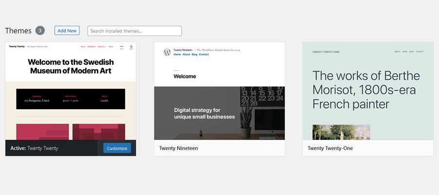
Matías [3:51]: No, you like, you might need to install a theme like Twenty Twenty One blocks that unlock some of these new interfaces that we just talked about. Like other of these pieces are available for anything. But some of these, like the interface to edit templates, right now only talk with things that know how to express their desire.
Josepha [4:14]: And I think we have less than 10 themes right now that do that, but I’ll leave some links to at least 2021 blocks in the show notes. And then, if there are another one or two themes that I can find, I can add those in there as well.
So you have to have the Gutenberg plugin; you have to have a theme that works with that site editor kind of experience. And then you’re safe to try everything out. It shows up in your left toolbar just like any other thing, like if you were working with plugins, or if you were adding a post or anything else, right?
Matías [4:51]: Yes, correct. And so, some of these details are being worked on right now. Like how and where you access things, and so on. These things are subject to change, but right now, you have this site editor beta in the sidebar when both you have the plugin running and a theme that’s capable.
Josepha [5:10]: Yeah. Excellent note. If you are running this on a production website, I would recommend you not do that unless you are very, very good with WordPress. It’s a really safe and easy thing to test and try out. But because it is still in beta, I recommend always putting it on a test site. I have a couple of different test sites that I run on myself. Another question that I had was, “will full site editing slow down my site?” And I think we have some refreshed performance tests coming out about that. And maybe they’ll be out by the time we publish this podcast.
Matías [5:49]: Yeah, I mean, like the performance has been one of the major focuses for the whole project. In many cases, it should speed up things because we’re like, I think one of the big pieces that these projects bring into the picture, especially for themes, is that it allows only the necessary assets to be loaded on the front end. For example, if for a given page, there are, I don’t know, 10-15 blocks being used, you would only get the CSS and scrapes and so on related to those blocks. This can cut down on a lot a ton of CSS that themes used to end queue on a side, particularly if you were trying to customize many widgets and so on, like a lot of themes have the full styles or multiple widgets, even third party plugins, and so on. So one of the advantages of having this blog system is that we can know at the time of rendering what blogs are being used and only load those assets.
Josepha [6:50]: Excellent. Another big question that we have is, “does full site editing work with the classic editor? And does it work with other builders?” I think that’s a really big answer if you’re going to get super deep into it. But I think that the short answer is yes, it does. Is that fair?
Matías [7:08]: Yeah, I don’t think it touches a bit on that full site editing is not like a single thing. There are multiple projects around it. So again, like the template editor that only deals with blogs, it doesn’t have a lot to do with a classic editor. But the classic editor use for both doesn’t change anything at all; like the same way that when the block editor was introduced, it didn’t change how you could still write posts in the classic editor. You will still be able to do that.
Josepha [7:41]: And if you are brand new to WordPress person, or, I mean, I guess at this point, you don’t have to be super brand new. If you’re fairly new to WordPress person and have no idea what we’re talking about when we say the classic editor, you don’t really have to worry about it either. You don’t have to go and find out what that is; the block editor that you have right now works perfectly for what you’re trying to do. So if you don’t know what I mean when I say classic editor, don’t worry about chasing it down either.
I think that this last question we accidentally answered earlier, but I’m going to go ahead and ask it anyway since I received it. “I keep hearing that you can use the site editor with the 2021 theme. But I don’t seem to be able to. What am I missing?” I think the answer is that there’s the Twenty Twenty One theme shipped with the WordPress release 5.6. And then there is the Twenty Twenty One blocks theme; those are two different themes. The link to the Twenty Twenty One block theme is going to be in our show notes this time around. And so, if you have been trying to use the full site editor with Twenty Twenty One and not succeeding, try the link to the one below. And I bet that that will work for you.
Matías [8:50]: Yes, that’s correct.
Josepha [8:51]: All right, excellent. Well, that brings us kind of into our second set of questions, which is about how we are doing it. The first one that folks have is “will full site editing be on by default in the next release. In this context, the next release is WordPress 5.8. But I think it’s a safe question to ask if full site editing will be on by default in the release that it’s planned for.
Matías [9:15]: Yeah, and for this, I need to go back to the same principle of many projects because there are many pieces of full site editing, and we have been merging them in major releases, particularly like the blocks and the design tools. There are more coming in that we want to make accessible as soon as possible. The full experience that requires a theme to opt-in to templates using blogs won’t be by default; it requires a specific theme running. A lot of these details we’re still like determining exactly what projects are ready to be merged and so on. But yeah, if you have a theme right now that works the way you want, it doesn’t change anything there. If anything, it adds some more capabilities and more customization tools, and so on. And the theme can also regulate how much they want to incorporate.
Josepha [10:13]: Matías, you’ve mentioned a couple of times in this podcast so far like this is a really complex and really complicated part of this work. And just for anyone out there who’s either encountering Gutenberg or full site editing or this podcast for the first time, I think a tiny bit of context that’s worth having here is that Matías and I have been working on this together in various capacities for like, five years. And Matías has probably been working on this for practically a decade. So, when we say that this is a really complicated problem, and when we say that this is a complex set of issues that we’re working with like, it is all that we have been thinking about for I want to say at least the last three or four years, but certainly it’s all that we have been trying to untangle for quite a bit of time before that as well. So we don’t take it lightly when we’re like, “this is complicated;” we mean it. It’s really complicated. And we’re trying our hardest over here as WordPress.
The next big question, since we’re all stuck in the “it’s very complicated,” part of things is the question, “will this update break my current site?” Like, if I have a site that is updated and ready, and it’s exactly as I wanted it to be, and it took me two years to get there will full site editing, whichever release it’s in. Currently, 5.8 is what we’re planning for. Will that break anything on my site as I know it right now?
Matías [11:44]: No, not at all. One of the major things that the WordPress team, the WordPress community, always cares so much about, never to break things. Many of these things are stepping stones that you can adopt, as we’ve talked about full site editing. But for example, we also have a few concurrent projects around the widget screen and the navigation screen that are meant to bring blocks into existing interfaces. So again, the theme doesn’t need to change, and a lot of care is being put into making this more like you’re unlocking new features, and nothing really breaks or falls apart.
Josepha [12:23]: This update, like all the other updates, should have minimal, minimal impact on what you have to actively fix on your site. Every once in a while, a bug is gonna get by. We can’t say that we’re 100% perfect with not breaking things. But also, we always and I and I know that we’re planning on this for our remaining releases for the rest of the year. At the very least, I can’t imagine we’d ever change it. But after every major release, we always make a plan to have a minor release within the next one or two weeks. Because we know that a broken thing on a site is really incredibly impactful, even if you’re only 1% of the sites that had that happen to it. And so I think that’s true in this case, too. And getting that feedback back from all of the people who are actually using WordPress is the thing that makes us be able to kind of move quickly when we do see those problems.
One of the questions that we have been getting is, “can I see a live preview without saving the changes that I made?” When I got this question, I didn’t actually understand it. And so I went and looked at a site without the Gutenberg plugin on it, and then a site with the Gutenberg plugin on it. And of course, on sites without Gutenberg, without the block editor, without full site editing, when you are looking to preview, you have the option to open up your preview in a new window. And you don’t have that with Gutenberg because it’s supposed to be a true WYSIWYG editor. A true what you see is what you get, editor. I think that the answer to this is, yes, you can see a live preview without actually saving the changes on the front end of your site. But you don’t actually have to reload anything. You don’t have to open it up in a new window. You don’t have to, like, actively click “please show me a preview” because what you see in your editing screen should be what you see at the end of your app as an end-user.
Matías [14:28]: Yeah, that’s the sort of the main gist to it. Yes, the site editor is built so that it always reflects the front end as truly as possible, so that’s one layer. Also, the preview tools should allow you to see in different devices like mobile breakpoints, and I don’t know if they will have breakpoints and stuff like that. There are a lot of things in the current interface that is just not enabled. There are some challenges in the sidebar. Because the site editor is not just focused on a single post, it’s focused on the entire site. So, there can be many, many changes that need to be shadowed for the site.
If you’re changing the site title, some of the global styles, aspects, and so on need to be orchestrated. So, to see in the previewing new window, there are some challenges there to integrate. Again, the interface is not final yet; a lot of these things are still being tweaked and improved. There are many things from the regular post editor that are not enabled yet. But they will be enabled. So yeah, it’s a, I guess, it’s not a simple thing to answer. Because, again, the idea of previewing the site that’s core to the whole project is that you’re always interacting in the same way that when you’re in the customizer, you’re seeing the preview all the time. That’s the main scope of this project,
Josepha [15:54]: Excellent. Changes like that changes to your workflow can be really hard to get your mind around, especially if part of that existing workflow was there to create some confidence in what you’re seeing with your users. And so I understand. Now that I’ve researched that question a bit, I see where that’s coming from. Based on existing workflows and existing patterns that we have for ourselves in WordPress, will we need to have a theme to use the full site editor?
Matías [16:33]: I think we’ve already covered some of these. And again, they are tools that can work on any existing theme. There is other stuff that needs space-specific themes to opt-in into these tools, like blog templates and so on.
Josepha [16:50]: Yes, I think the question that we have next, because I see that the literal next question I have is actually something we have covered; just because we’re being pretty conversational about it, not because anyone already asked the question. So I’m actually going to skip to the last question of this section that I received. I got this next one via Twitter. The question is, “how do you view the role of themes once full site editing is fully rolled out and all the page elements (content, headers, widgets, footers, etc.) and all the views are managed via blocks and block patterns? Will things become typographic and block styles?”
Matías [17:28]: I think this is a great question because it goes to the heart of, why are we doing all this. One of the main reasons is to empower users more. WordPress has been democratizing publishing for a while; this is another step into allowing themes to get more customization tools and more control over their site if they want to. I think the recent call for testing has focused on the 404 page, for example. That’s something that forever has been locked away from users. And it’s also something that, as a theme developer, and I used to develop themes a long time ago, that was one of the things where you decide what sort of approach you take for the 404 page. Maybe sometimes you want to have something more whimsical. Sometimes you need something more serious. And committing to one when you can have such a diverse and broad user base can be challenging. With these, it becomes as easy as offering a few different patterns for that template. Then the user will always be able to change the copy and modify something. So again, it opens up a lot of these things that used to be locked down. However, from a theme perspective, I think this doesn’t reduce the theme at all. If anything, it allows the theme to focus less on coding and functions and more on design expression and aesthetics. I don’t think that would ever be exhausted. That will always remain as diverse as humans are interacting with WordPress. And so it’s not that I don’t see it’s just as like, typographic and block styles. How do you express a template, how do you express the structure, what choices you quote, what choices you make as a theme builder? And of course, there are many degrees of control there. Because a site maintainer may not want the 404 template to be editable, that sort of control will always be present.
Josepha [19:38]: Yeah. And really fast. I have to add a caveat to a thing that you said in there. For anyone who’s listening keenly, you may have heard Matías say that the users can update any of the content there – any of the copy. In this context, we’re talking about users as in the people who are maintaining the site, not people who are visiting your site. Visitors to your site will not be able to change any copy on your page unless you’ve done something very interesting with your WordPress site, which is also fine if that’s what you prefer to do. By default, your visitors can’t change everything on your website, which is good news, frankly.
So I’ve got one logistics question, which I’m happy to take. And then one is kind of a big picture question that I also got from Twitter. “What about the classic editor block; what is going to happen to that? And when will we know?” So ages and ages ago, before COVID? I think so. Probably maybe a couple of years ago, Matt said that the classic editor plugin would be supported through the end of 2021. And that is still the case; there will be active support on that through the end of 2021. After that, it will not be actively supported anymore. It won’t be removed from any place that you can get access to right now. In a “this is the end of its lifecycle” sort of way, we just won’t have anyone who is currently committed to maintaining that plugin anymore. So that’s what’s happening at the end of the year. And yeah, at the end of 2021. The big question that we have is, “why is full site editing being so rushed?” I think this is a bit of a loaded question.
Matías [21:32]: Yeah, I think I think it’s still a fair question, though. I think we’re dealing with two things here. And one is ensuring that we release things in the best state possible. And also, some of the urgency is to offer tools that we know that people lack right now and that could really benefit from. Making that determination is very tricky. The full site editing project has been in the works for the last couple of years. If we count the initial phase of Gutenberg, that’s four to five years. We’ve been doing many calls for testing, which I think have been super useful to catch issues and reflect as a community on where things are going; how do we integrate with these? How do we use it? What are the shortcomings? What do we need to do? Based on all of these, we’ll continue to make decisions on when things become ready. We’re not committed to releasing something that’s not in a good state. And I think we will always be very careful about that. There are these two competing senses of the urgency – of getting some of these tools out, and because it also benefits from the feedback loops. I always say that, in many ways, the initial phase of Gutenberg, to me, is not finished. We took the initial two years to do the 5.0 release, the initial block editor, and so on. But, it’s still being improved at a very fast pace, among all the recent major releases improvements to the editor were included; that will continue to be the case. In many ways, phase one is not finished. And the moment we choose to release some of these tools or editing tools, it won’t be finished either. They will need to continue to grow, mature, and incorporate a lot of the feedback. Even the things that the ecosystem is building around. I’ve seen a few themes already that are incorporating a blank canvas template so that you can use them in some pages and take over and do everything with blocks. So even the community and ecosystem as a whole is also sort of paving the way for what needs to come.
Josepha [24:06]: I think from my perspective, and of course, I’m on the people side of things, the communication side of things, the logistics side of things; I have a frequently a very different view from what a lot of other folks are seeing. And so from my side of things, I have to say, I’m communicating about this change in a really broad way, which has not been happening since 2019 when we started the work. We’ve been communicating broadly with the WordPress community, but not with everybody who uses WordPress. So, I think that for a lot of people, this looks like a project that we started really actively working on in the last six months or so. And now we’re just racing toward a finish line. I think that there’s, there’s not been a lot of awareness of everything that’s gone into it. And so, on the one hand, it feels a little less rushed to me knowing the full length of the history on this. But also, as you said, I really think that this gets a bunch of tools to people who otherwise have not been able to accomplish these things in WordPress or otherwise. I am so anxious to get something to people who really can benefit from this change the most. And it’s the nature of the open source, right that like, one, as long as you have users, you’re going to have stuff you have to fix in your software. So we’re never really, really going to be done with this; there’s not going to be like a done point of WordPress. And the second thing is, I think it’s generally true that you don’t really start getting full user feedback until after you have launched your major release. I think that we see that a lot in open source software; you can bring in as many people as you think you can in your user tests heading up to it. And in your accessibility tests. And, in general, quality assurance tests. You can bring in a lot of people and still not have gotten the full understanding of the various niche use cases that your users will bring to you. Because at this point, we’re like 40% of the web. And that means that we’re serving this majority collection of increasingly minority voices and niche voices in the space. And so, a little bit I feel a sense of urgency; I feel a bit of anxiousness about trying to get this out there for one, to get the tools in the hands of the people who can benefit the most from them, but also so that we can start really getting the full stress test of this software out and get that feedback in so that we can really build something responsive to what our users need our long tail, “anyone who ever uses WordPress ever,” definition of users. And so, that’s why I feel a sense of urgency around it. Even though you know, as I said, you and I have been working on this for like five years, and you’ve been working on it for a decade or something. I actually don’t know how long it’s been worked on.
Matías [27:35]: Now that makes me feel a bit old.
Josepha [27:40]: Nobody makes Matías feel old. He is a lovely, wonderful colleague. Sorry, Matías, If I made you feel old.
Matías [27:46]: No, that’s totally fine. I also want to add that full site editing is not like a single toggle that’s going to drop into a major release. So I think that’s important to consider, I think this entire year is going to see a lot of these tools being, and sometimes the sort of the end-user is not the, again, the site maintainer. Still, you can also be the theme developer; I think there are many tools that would be empowering for theme developers to use. Again, we mentioned there are like five to ten themes, block themes right now. That needs to grow a lot, and that only grows through these sorts of feedback loops. And the theme community pushing things forward and seeing where things can lead to. I’m very excited about the pattern directory integration because I think that can also combine with blog themes in very powerful ways. Imagine if, I don’t know many of these patterns that are very common on the web and very needed, that if we can refine them together with a second community and make them available across themes, you can combine a header from one theme with a content of another; all these sorts of mixtures could happen. All of this needs exploration, the creativity of the entire community, and so on. In that sense, getting all these tools, even if it doesn’t immediately change anything for like the site itself, starts to unlock a lot of things.
Josepha [29:27]: I’m going to take a bit of your answer from there and tie it all the way back to your first answer that we had when you joined me today. And say, I think you’re absolutely right. We have a set of users in our theme authors and our plugin developers as well that we desperately need to get looking at this set of tools. I hope that what we are shipping in the first iteration of this serves as an opportunity for all of those theme authors and agency owners, plugin authors, WordPress site configurers freelancers. Like, I really hope that this puts it into a really accessible, easy-to-access space for them so that they can do those experiments based on what they know their users need the most. They are the group that has the closest access to site maintainers. And what they need compared to, for instance, me or a potential you like we have a lot of information, you and I, we do a lot of tests, we have a strong sense of what is needed at the moment, but we don’t have as a close connection that our theme and agency and plugin folks all have. And so that’s another part of why I’m so excited to get this out in the current iteration of it.
Josepha [31:04]: That was a lot of questions in a little bit of time. This is going to be officially my longest WordPress briefing. Matías, I am so glad that you were able to join me today. And I think that everyone’s going to be really, really excited to hear your answers to these questions.
Matías [31:23]: Thank you for having me.
Josepha [31:25]: All right, my friends. That brings us into our small list of big things. I’m going to skip our community highlight today just because we had a slightly longer word press briefing in our bonus iteration today. But the small list of big things. The first thing is WordCamp Central America is coming up on April 15; there is a registration link in the show notes that you can access your tickets with. I recommend that you go; we’ve got a lot of excellent speakers coming up there and a lot of good content and good training and learning for y’all. The second thing is that Matt Mullenweg and I have listening hours coming up with the community in the first week of April. I’ll add the link to register for those in the show notes as well; it’s just a few minutes for you all to stop by, check-in, see what’s going on, and share some celebrations or concerns with us. And I hope that I see you there.
So that my friends is your small list of big things. Thank you for joining in today for the WordPress briefing. I’m your host, Josepha Haden Chomphosy. I’ll see you again in a couple of weeks!

