Imagine the excitement of landing a web design job at a government agency. It’s a fresh start and a chance to apply your skills towards public service. Feels pretty good, right?
Now imagine that, a few months into this new adventure, a global pandemic takes hold. Suddenly, you’re charged with building a website that puts critical public health information out to the citizenry. It’s got to be done right – and quickly.
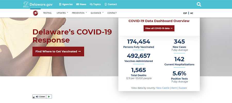
This is the reality Andy Stitt faced in 2020. Just a few months into his tenure with the Delaware (USA) Department of State, he was named lead front-end developer of the state’s COVID-19 website. His job was to lead a team in building a WordPress website that would help residents access the information they needed to know.
Of course, the pandemic is ever-evolving. That means the website has had to keep pace. The details of virus testing and vaccine availability have been added over time. The work is never really done.
What has the experience been like? Stitt was kind enough to fill us in by answering a few questions. The following Q&A has been lightly edited for clarity.

Tell us a little a bit about your background in web design.
I built my first website as a bored teenager in 1998 and learned Dreamweaver in college in 2002. I then had an opportunity in 2008 to manage my company’s website using static HTML and CSS. I’ve held many different web-focused digital marketing roles since then, and I’ve been a full-time web developer since 2016. I spent many years as a solo developer for nonprofits, and now I happily work on a team in state government.
In 2020, you were hired by the Delaware Department of State – just before the pandemic. What was your initial role supposed to be?
My role was to be the lead front-end developer for the Government Information Center, Delaware’s internal marketing agency located in the Department of State. I was supposed to build and maintain WordPress websites for many state agencies across departments as well as municipalities.
When the COVID-19 pandemic arrived, how did that impact your role?
We suddenly had to build a COVID-19 information website, and it became the bulk of my work for quite a while. I rarely worked on other website projects in the first few months of the pandemic. We had to put a few projects on hold due to our help being needed for a national emergency.

What was your first thought after becoming the lead developer for the state’s COVID-19 website?
My first thought was “who, me?” I looked behind me to see if they were pointing at someone else to take on the lead developer role, but there was no one standing behind me! Thankfully I had the front-end development and WordPress skills to take it on, and having a fantastic supportive team behind me sure makes the job much more doable.
What was the process for getting the site online? How much time did you have?
We had about 2-3 weeks. The funny thing is, I was only there for the first week of it. My wife and I had a pre-scheduled out of town trip for her to have major surgery, and then I needed to help her recover.
Initially, we worked with the governor’s office, public health, and emergency management to define the scope, information architecture, content, etc. We got approval to build a WordPress website so that non-technical people could make content edits on the fly if they needed to. The situation was so dynamic that we wanted to allow as much flexibility as possible.
Once we had the basic parameters defined, I created a layout wireframe for the website. Once that was approved, I handed it off to my fellow developers and then went on my trip. They built the website using our existing WordPress theme setup and reused branding from the Delaware Health and Social Services website. The branding allowed us to get a styled website up more quickly and gave it a cohesive look with our health department. We have since developed COVID-specific branding as we’ve gone along.
When I got back from my trip, they gave me the keys to the car, and it became my primary focus at work.
Beyond the quick turnaround, what were the biggest challenges you and your team faced?
The single biggest challenge was not knowing exactly what to do. The virus itself is a thing in nature that humans can’t control as much as we’d like. We didn’t know what exactly would happen, we didn’t know how bad it was going to be, and we didn’t know when it would be over.
So, to the best of our ability, we helped our team communicate information on statewide public health measures as quickly, accessibly, and accurately as possible.
In previous website builds that I was involved with, we had plenty of time to strategize. They were marketing projects with specific goals to increase leads and revenue. This website project was a leap into the unknown that had to be done urgently.
As the pandemic has continued on, were there any unexpected changes you’ve had to make to the site?
Because of the uncertain nature of the pandemic, I’d say pretty much all changes were unexpected. Two that come to mind:
There was growing demand for an easy way to find where you could get a COVID test near you. I had previously used Modern Tribe’s Events Calendar plugin, so I built a testing calendar with a searchable Google Map using that plugin. An external marketing agency that we work with then built a more robust user interface for it using VueJS (yay for headless WordPress!).
The other unexpected changes have been vaccine information-related. We’ve had to update much of that on the fly, based on when the vaccines became available for emergency use, different phases of eligibility based on how many vaccines were being distributed by the federal government, etc.

Having gone through this experience, what lessons have you learned?
I learned two main lessons:
Lesson one: I’m a solid front-end developer and user interface designer. Several months into the pandemic, we redesigned and redeveloped the website based on analytics showing what content people were looking for and public health’s priorities. I actually got to develop the website based on Figma mockups from our lead designer, and I got to make some design decisions along the way.
Imposter syndrome can be a bear, and being a solo developer for so long, I never really got meaningful feedback on my design and development chops from other designers and developers. I finally got that feedback from this project, and I take a ton of pride in the work that I did.
Lesson two: You can do anything with the right team in place. I went from solo developer for small nonprofits to lead developer for the biggest project of my career. I wore 10 different hats in my previous roles, but I couldn’t do that for this role.
Our department leaders maintain our relationships with our partners and manage the requests coming in. Our creative director and lead designer make sure everything is beautiful and usable. Our developers help me with my work when needed, troubleshoot technical issues, and build out API integrations that we have.
The best part is, we unconditionally have each other’s backs. I have the psychological safety to ask questions, ask for help, and make mistakes. With that kind of freedom and safety, you can tackle any task at hand, no matter how big. And this was quite a big one!
Thanks to Andy Stitt for sharing his story! You will also want to check out the slides from his WordCamp Philadelphia 2020 presentation on the subject. Be sure to visit Andy’s website and connect with him on Twitter.
The post Critical Info: The Story Behind Building a Government COVID-19 Website appeared first on Speckyboy Design Magazine.
Package:
Summary:
Create form fields to edit values stored remotely
Groups:
Author:
Description:
This package can create form fields to edit values stored remotely...
Read more at https://www.phpclasses.org/package/11916-PHP-Create-form-fields-to-edit-values-stored-remotely.html

Time to go old-school! Including retro fonts on your website can evoke a feeling of nostalgia. That old “eighties poster” look is very distinctive and easy to replicate with the right font.
If you’re ready to send your visitors on a blast from the past (or back to the future), try out one of these ten awesome retro fonts!
If you’re looking for more fonts, take a look at our 100 Best Free Fonts for Designers.
This font is awesome! It’s rare to see fonts with a gradient, but RM Serifancy pulls it off perfectly. The old-timey, western feel has a universal appeal. But this will work well if you’re going for something epic or masculine.


If you’re searching for a font that can best be described as “groovy”, look no further. Action Is is absolutely perfect for capturing that sixties and seventies vibe. The curvy, mixed-case font is completely non-conforming to the standards of typography, and that’s exactly what makes it so great!


Skinny, tall, and thin, this all-caps font almost seems to be yelling at you through the screen. This is great if you need something bold and artsy. The font comes in four styles that change the line thickness but still keep that distinctive narrow look.


For a font that makes you feel like you’re on Broadway, try out Showtime! This is certainly a unique decorative font. Just type what you want and use brackets on either side to enclose it, creating something like a lit-up banner at a movie premiere.

Want to create a feel just like a vintage burger joint? Try out this font! The hamburger craze of the 1900s stretches back all the way to the twenties and thirties, so this kind of font can help you craft a very classical feel.

MadisonSquare looks like neon text! If you’re creating something meant to look like an electric sign, you might want to try out this font. It’s definitely not something you’ll want to use for entire paragraphs, but it’d look striking in a logo or if used to call attention to a short piece of text.

Inspired by the 1968 Mexico Olympics (look it up and see the resemblance for yourself!), this stripey font comes with two styles: 3D and regular. Follow the link on the page and you can also find even more in the font family! You can use this font for free in graphics such as logos, but you will need a commercial web license to embed on websites.

Now this is a lively font! Budmo is covered in little neon lights – amazing if you’re trying to make people think of old-school Hollywood. There’s a ton of font styles in here: One dark, one light, two solids and one bulb style. The last three are so you can customize the font with layering. You’ll need a web license to use on websites, but otherwise this is free for commercial use.

Inspired by Kool Aid, this font is simple enough to work well in a lot of situations. It looks very much old-fashioned but doesn’t go overboard with it. Try using it in a logo if you want a bit of retro flair. However, brackets, parentheses and international characters produce dingbats that look like the Kool-Aid Man’s face, so this may not work if you need to use these characters.

Looking for something you’d find on the logo of a wine bottle? Try Coventry Garden. The all-caps font is designed so that uppercase letters create a cursive flourish. Definitely worth a download if you love this anachronistic, regal typography!

Old-School Web Design
Retro fonts may not be traditional, but that’s exactly why they can add so much personality to a website or graphic. Many fonts ditch unique designs for something simpler and more legible. But retro fonts’ bold blocks, bubble text, and sweeping cursive script take risks you don’t often see in typography nowadays. Give these old-school fonts a try and see how lively they can make your site!
The post 10 Free Retro Font Families for Designers appeared first on Speckyboy Design Magazine.
Your website is the heart of your digital marketing efforts, so crafting a beautifully designed site is paramount to helping your company grow online. You can use a platform like Shopify to build your ecommerce site.
So, how can you get the most from your Shopify site?
We’ve got six Shopify website design tips to help you get started with designing your site:
- Choose the right theme for your business
- Use apps to build your site
- Make sure your site loads quickly
- Incorporate visuals
- Add elements to connect with leads
- Don’t overdo it
Keep reading to learn more!
For even more digital marketing advice, sign up for the email that more than 150,000 other marketers trust: Revenue Weekly.
Sign up today!
1. Choose the right theme for your business
If you want to know how to design a Shopify store, start by choosing the right theme for your business. The theme is the backbone of your website and determines how your site appears to your audience. Considering that 94% of first impressions relate to web design, you want to ensure you choose the right theme to make a good impression.
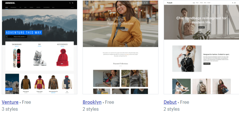
Shopify offers numerous templates you can use for your site. They offer free and premium templates that cost anywhere from $100 to $180.
![]()
So, how do you choose the right theme for your website?
When you’re trying to craft your Shopify store design, you’ll want to ask yourself questions like:
- How do I want my products displayed on my site?
- What features do I need for my store?
- How do I want users to shop on my site?
- What type of experience do I want to deliver for my audience?
- How much can I spend on my design?
By asking these questions, you can determine which design is best for your ecommerce business.
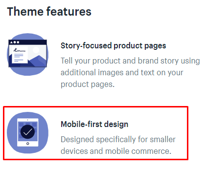
P.S. When you customize your Shopify store, make sure you choose one that’s mobile-friendly! A mobile-friendly theme is crucial if you want to deliver a top-notch browsing experience on your site. You can check in the description of the theme to verify it’s mobile-friendly.
![]()
2. Use apps to build your site
Next on our list of Shopify store design tips is to use apps to build your site. Like WordPress’s plugins, Shopify utilizes apps to help you add features to your site that enhance the audience’s experience.
You can use dozens of apps to build your site. App categories include:
- Finding products
- Places to sell
- Store design
- Marketing
- Sales and conversion
- Orders and shipping
- Inventory management
- Customer support
- Trust and security
- Finances
- Productivity
- Reporting
![]()
Whether you’re looking to optimize your sales process or manage your inventory, you can add an app to help build a better ecommerce site.
3. Make sure your site loads quickly
One of the most critical Shopify website design tips is to make sure your site loads quickly. Users won’t wait for slow-loading sites and will abandon them if they take too long to load. In fact, slow-loading sites cost businesses $2.6 billion in revenue loss each year.
When you use Shopify as your site builder, you want to check your site load time to ensure that you deliver the best experience for your audience.
You can use a tool like Google PageSpeed Insights to help you see your site’s current load time.
If your site loads too slow, you can improve your site load time by:
- Avoiding third-party themes: Shopify enables you to use third-party themes on your site. The risk with this is that they can have additional features that bog down your site. It’s best to stick to Shopify’s themes since you know what you’re getting with them.
- Compressing image file sizes: Adding product photos to your site is a great way to provide a great user experience, but it can also slow down your site. You may need to compress the image file sizes to help your site load faster.
- Analyzing your app and widget usage: When you build your site, you’ll add tons of apps and widgets. If you find your site running slow, you might have too many of them. You’ll want to comb through your apps and widgets to ensure you only use essential ones on your site.
You can also get help with your site load time by investing in page speed services.
4. Use visuals on your site
Next on our list of Shopify website design tips is to add visuals. Since people can’t see the product in person, they need to get as close as possible to seeing it “in person” through your visuals.
You can use both photos and videos to help showcase your products online. When you upload these visuals to your site, you want to ensure you use high-quality visuals that showcase every angle of your product.
5. Add elements to connect with leads
When you do your Shopify store design, you want to create opportunities for leads to link up with your business. You need to customize your Shopify store with elements that enable you to connect with prospects.
One element you’ll want to include is social media buttons. These buttons provide your audience with an opportunity to follow your business on the social media platforms you use. It’s a great way for prospects to connect with your company.
Another element you can add is an email sign-up bar. You can use an email sign-up bar to capture leads for your business. You’ll want to design this bar with a call to action (CTA) button that pops off the page so users see and sign up for your emails.
6. Don’t overdo it
If you want to know how to design a Shopify store, follow this tip: don’t overdo it. One of the biggest mistakes companies make is overloading and over-designing their site.
When you have tons of information to share with your audience, you want to include all of it on your site. The problem with this approach is that it can easily lead to overcrowding on your site.
When you do your Shopify store design, make sure that you utilize whitespace throughout. Whitespace enables you to keep your audience focused on your text and photos while scrolling through your site.
![]()
As you add design elements to your site, make sure they don’t make your site look disorganized or overcrowded, so you don’t overwhelm your audience. You can use A/B testing to help you test elements on your site to ensure they’re enriching the audience’s experience.
We don't just want to tell you about the beautiful work we do.
WE WANT TO SHOW YOU
We've built over
1000
Websites in industries like yours
Get started with your Shopify store design today
Now that you have a list of Shopify website design tips, it’s time to get your Shopify store into shape! With a custom Shopify store, you can drive more revenue for your business. But if you’re feeling overwhelmed, WebFX is here to help.
With our Shopify web design services, we can help you craft a site that fits your business and enables you to boost your revenue. We’ve won over 50 design awards, so you can feel confident that we’ll craft an award-winning site for your business.
Want to drive more revenue for your business? Contact us online or call us today at 888-601-5359 to speak with a strategist!
The post 6 Shopify Website Design Tips to Create a Beautiful Site appeared first on WebFX Blog.
Package:
Summary:
Kanboard plugin to add due date to sub-tasks
Groups:
Author:
Description:
This package is a Kanboard plugin to add due date to sub-tasks...
Read more at https://www.phpclasses.org/package/11990-PHP-Kanboard-plugin-to-add-due-date-to-sub-tasks.html

Package:
Summary:
Manage user groups and their access permissions
Groups:
Author:
Description:
This package can manage user groups and their access permissions...
Read more at https://www.phpclasses.org/package/12014-PHP-Manage-user-groups-and-their-access-permissions.html#2021-04-09-10:42:53

Package:
Summary:
Manage a NoSQL database for users and features
Groups:
Author:
Description:
This package can manage a NoSQL database for users and other application features...
Read more at https://www.phpclasses.org/package/12007-PHP-Manage-a-NoSQL-database-for-users-and-features.html#2021-04-09-10:40:59


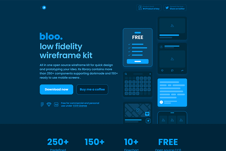
bloo – This open-source “low fidelity” wireframe kit includes over 250 components and support for dark mode.

The Junior Designer Starter Pack – This collection of helpful design tools and resources can help junior (and senior) designers get things done.

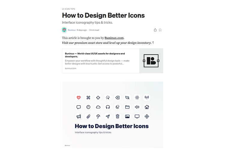
How to Design Better Icons – Tips for creating icons that users can instantly recognize and understand.

How to Gain the Trust of Your Web Design Clients – Trust is vital to the client-designer relationship. Here are some tips on how to build it.

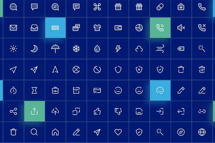
Freebie SWM Icon Pack – Download this free icon collection that includes nearly 300 icons that are available in 3 distinct styles.

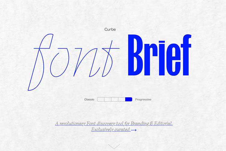
Font Brief – This tool aims to help you find the perfect font based on the attributes of your brand personality.

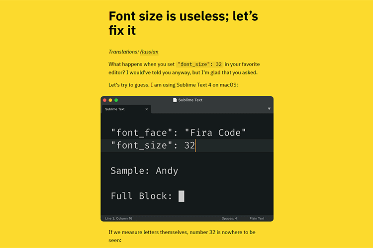
Font size is useless; let’s fix it – A look at why font size is problematic.

CSS Filters Generator – Add compelling filter effects to your images with this online tool.

Deca – A free UI kit for Figma and Sketch with 150+ clean and clear components.

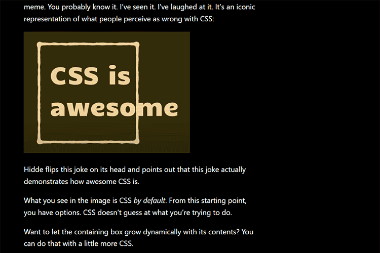
CSS Is, In Fact, Awesome – Why is CSS so awesome? In a word: options.

How a Custom WordPress Plugin Can Help You Manage a Website – Some scenarios where a custom plugin can make maintenance easier.

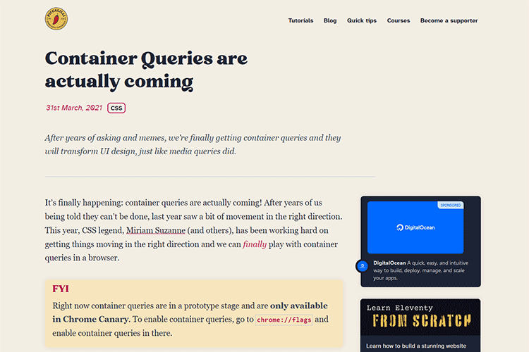
Container Queries are actually coming – How this long wished-for CSS feature could impact designers.

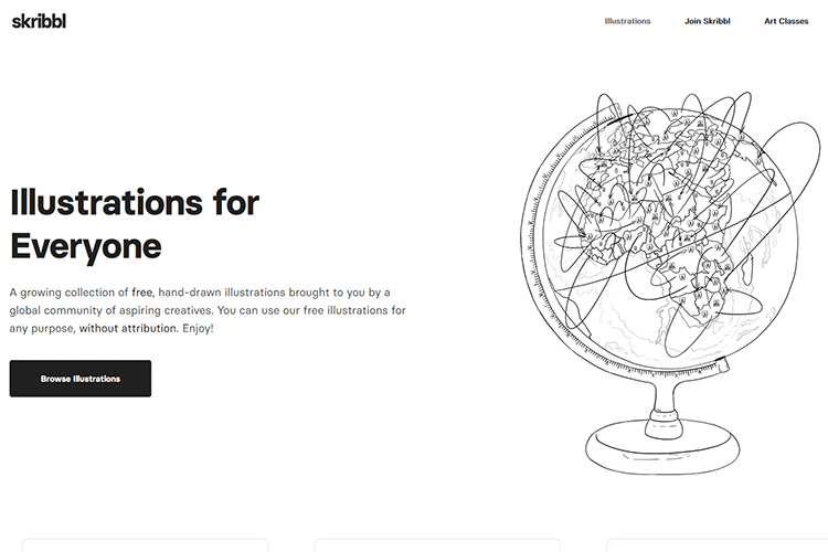
skribbl – A collection of free, hand-drawn illustrations you can use for both personal and commercial projects.

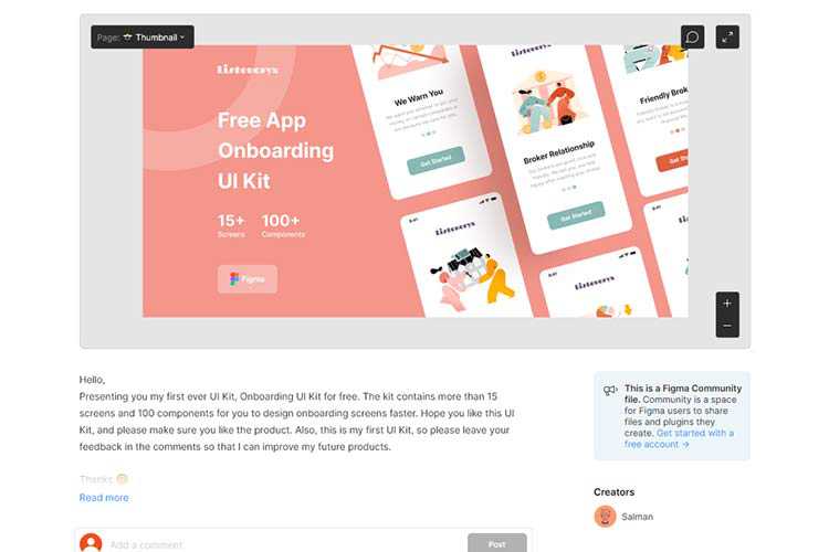
Onboarding UI Kit – Make quick work of your onboarding projects with this free UI kit for Figma.

Overlay Fact Sheet – Everything you need to know about web accessibility overlay technology.

25 High-Quality Free Swirl & Ribbon Photoshop Brushes – Add a touch of elegance to your projects with these beautiful free brushes.

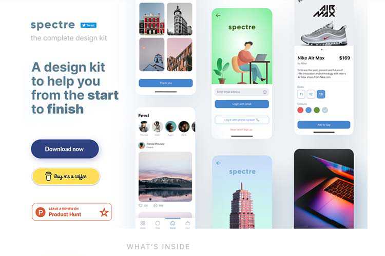
Spectre UI Design Kit – Download this design kit that offers plenty of resources to help you during each step of your project.

The post Weekly News for Designers № 587 appeared first on Speckyboy Design Magazine.
Package:
Summary:
Get formatted time and date in a given timezone
Groups:
Author:
Description:
This package can get formatted time and date in a given timezone...
Read more at https://www.phpclasses.org/package/12045-PHP-Get-formatted-time-and-date-in-a-given-timezone.html

Launching an online magazine is an exciting business venture. Sharing stories and news about topics that interest you is a great way to connect with other like-minded people and build authority in a particular niche.
But, before you launch your online magazine, you will need a magazine or a news theme that will help you share your stories in style. There is no shortage of high quality, free magazine and news themes for WordPress and in this post, we’ve gathered the best of them.
If you’re looking for free WordPress themes for blogging, take a look at this collection.
The Almighty theme has a clean and minimal design and offers multiple blog layouts. The theme is fully responsive and comes with tons of options for customizing the theme and making it your own.

The Metz theme is a great choice if you plan on launching a fashion magazine or editorial. You get access to this theme when you sign up for Envato Elements monthly subscription and you will find features such as various listing styles, several blog layouts, and extensive theme customization options.

Journal Magazine WordPress Theme (Free)
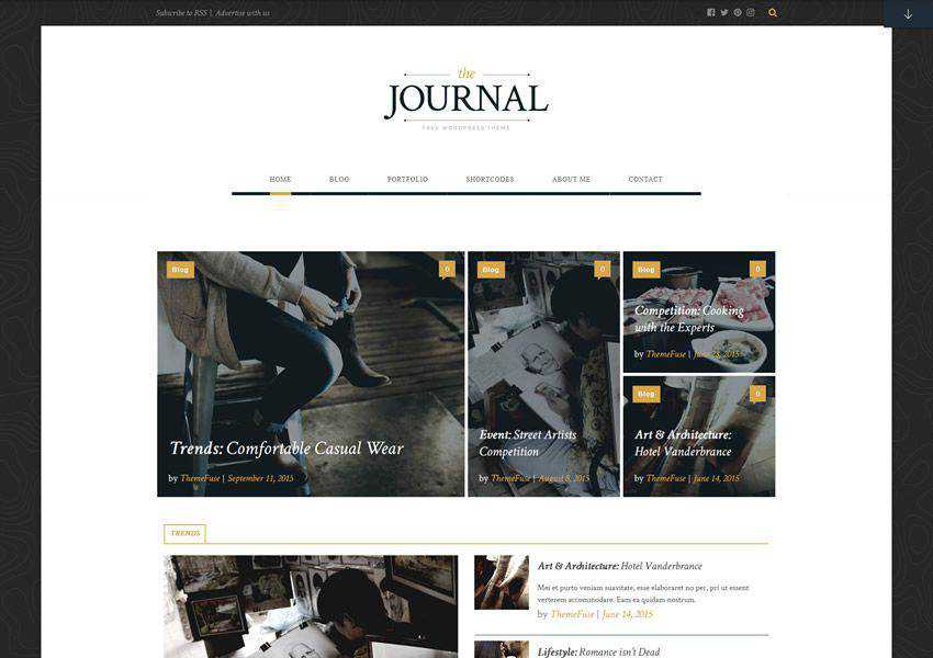
The Journal is a highly customizable WordPress theme designed with magazines in mind. The theme has a built-in slider option that’s perfect for sharing popular stories, a plethora of customization options, and a unique shortcode generator.

The Crowley theme is suitable for any type of online magazine as well as for personal blogs. You can customize every aspect of the theme using the Live Customizer and you can choose between several column layouts for your archive pages.

Semicolon is a simple and clean magazine theme for WordPress. It comes with a responsive layout, elegant and easy to read typography, and a unique grid layout with featured posts support. You will also find several widget areas, a menu for your social profiles, and more.

The Next Mag (Envato Elements)
The Next Mag is a feature-rich magazine and news theme for WordPress that comes with your Envato Elements subscription. The theme offers features such as Ajax post loading, several demo options, mega menus, and a responsive design.

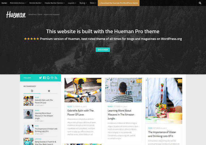
The Hueman theme has a modern design paired with the standard column layout. You can add up to two sidebars and insert widgets such as most popular posts, recent comments, social media icons, and more. It also includes multiple menu locations.

The Brilliant is a stylish WordPress theme that has a stunning slider on the homepage that’s perfect for sharing your latest post. You will also find the ability to showcase your post categories, and there are several customization options to make this theme your own.

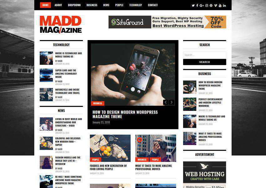
The Madd Magazine offers a traditional online magazine layout with plenty of widgets for popular posts, categories, advertising space, and more. It’s fully responsive and the ability to use videos in sliders.

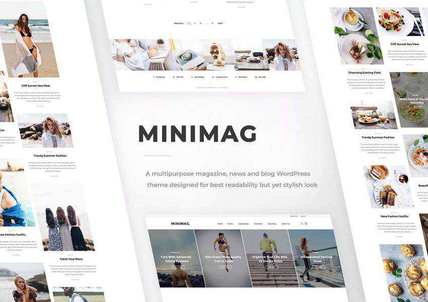
The MiniMag is a minimal magazine theme that can also be used for personal blogs. The theme comes with a number of different demos which can be imported with a single click. It’s fully responsive and offers tons of customization options.

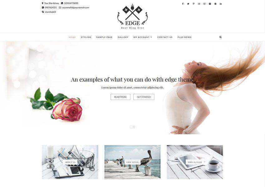
The Edge theme is perfect for blogs and magazines. It was designed to load fast and includes SEO optimization features as well as responsive design and multiple layout options.

The Bootstrap Blog theme is based on the popular Bootstrap framework which means it will be responsive out of the box. It also offers features such as extensive theme options panel, various layout options, and WooCommerce integration.

Split – Magazine, News & Blog Theme (Removed)
The Split theme offers a unique split layout that makes your featured images stand out. It has an organized grid layout and sticky titles and images that remain visible as you scroll down the page.

When it comes to your online magazine, an attractive design that offers a pleasant reader experience is crucial. Make your magazine the best it can be with one of the themes on this list that offer beautiful layouts, legible and elegant typography, and a responsive design that looks great on all devices.
The post The 10 Best Free Magazine & News WordPress Themes in 2021 appeared first on Speckyboy Design Magazine.

